Wosven
-
Posts
4,130 -
Joined
-
Last visited
Everything posted by Wosven
-
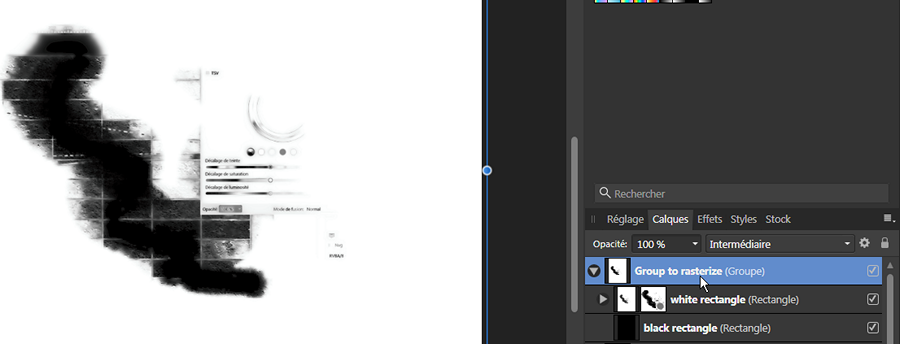
 Hi @Ken Hjulstrom, If the mask is clipped to the image: you can try right-clicking on your mask, and "adjust the mask" (same options as "refine selection"). If the mask is above the image: you can rasterize the mask (this function seem bugged in the beta, and do nothing, so: add a group, and rasterize, see how below), to get a black and white layer you can modify with Levels/Curves/Luminosity&Contrats adjustements before using the option: Rasterize to Mask.
-
HI @Holly M, What do you mean by "whole document"? Assuming it's not "the whole document" but only the text frame that is deleted, are you sure you've got the cursor in the text and not the full frame selected?
-
HI @beren, Are those fonts protected? Some fonts can't be embedded in PDF. Check the licences or try in a dupplicated document with other fonts if the problem keep on.
-
Sadly, I'm not sure 2 years later if I was thinking about that, but it's not difficult:
-
Imagine it's like boxes: [0][1][2][3][4][5][6][7][8][9] You replace "1" by "99": [0][9][9][2][3][4][5][6][7][8][9] The "red style" stay in place, and the line is longer of 1. Supposing it doesn't affect only at line or paragraph level, but at story level, we can imagine next paragraph is modified too. ==== Imagine des boîtes: [0][1][2][3][4][5][6][7][8][9] On remplace "1" par "99": [0][9][9][2][3][4][5][6][7][8][9] La boîte "style rouge" reste à sa position, et la ligne est plus longue d'1 caractère. En supposant que cela n'affecte pas uniquement au niveau d'une ligne ou d'un paragraphe, mais de l'article complet, on peut imaginer que le paragraphe suivant (ou la liste de boîtes suivantes) est aussi modifié/décalé.
-
That's strange. I had this bug in the Bêta in a 1st test. In a second test, I decided to take screenshot before clicking on a result line. I don't know if it was the time parameter, but this way, it was slower, and I was able to go to the end of the file. So I stoped the screenshots and click "up" toward the beginning, without problem. Once at the beginning, I went down again, and this time APub quits again. ==== C'est étrange, j'ai eu ce bug dans la Bêta dans un premier test. Dans un second, j'ai pris des captures d'écran avant de cliquer sur les lignes, et j'ai atteins la fin du document sans problème. Est-ce parce que c'était fait plus lentement ? Du coup, j'ai continué en remontant le document, sans les captures, et sans bug. Revenue au début du document, j'ai re-cliqué au hasard en descendant, et ça a encore bugué.
-
It looks like some errors that can occur in ID when using scripts to search on text value, and not "objects" using regular expressions. The "styles" stay in place (attributed to the same objects’ — characters — positions, but the content/text is different (longer or shorter). === Ce problème est similaire à l'utilisation de scripts dans ID, modifiant la valeur du texte, sans prendre en compte les styles. Les styles restent à leur position, tandis que le texte modifié est plus long ou plus court.
-
Depending of your texts, you can try exporting as PDF and opening it with the option "keep/group lines together" (or similar).
-
Limit scope of Select Same/Select Object
Wosven replied to Cyrisus's topic in Feedback for Affinity Designer V1 on Desktop
*Bump* -
Help! Vector/pdf
Wosven replied to brenagirl2's topic in Pre-V2 Archive of Desktop Questions (macOS and Windows)
You can also try to export to PDF from Procreate, and import those pages in APub to create your book. -
Perhaps @Les ONeill's just using a different skin (windows manager) on his OS. It was possible ten years back to do so after being fed up of the same UI for years... Trying to disable it and check if the Affinity apps behave normally can be a test. If it's not the problem, it need further investigation.
-
Break Curve
Wosven replied to graphicjack's topic in Pre-V2 Archive of Desktop Questions (macOS and Windows)
Select the Pen tool and it'll appear. -
Break Curve
Wosven replied to graphicjack's topic in Pre-V2 Archive of Desktop Questions (macOS and Windows)
Hi @graphicjack, On the context tool bar (on top of the tabs), you'll have a button "Selection" to convert your path to selection. -
Or he find his answer in one of the French forums. The problem with technical subjects and vocabulary, is that a Google translate will probably do a mess of your question(s) and nobody will want to ask the fifty questions needed to try to help... or few people. Sometimes, it's fun and frustating to try to translate a technical term we use all days at work (look at the bad French translation of the apps, it's difficult for both parts). Also, not everyone can write in another language, when barely (?) reading it. The forum's moderators don't mind people asking in their own language (and encourage it) and try responding in the same language, but obviously, this one was missed. Most of the time, people will answer, or translate and answer.
-
Il est tout à fait possible d'avoir des réponses en français, encore faut-il que nous voyions les questions... Pour l'instant il y a les outils "Grille déformante", "Perspective" et "Perspective dynamique" dans AP, mais aucun outil similaire pour les objets vectoriels. On peut les utiliser en ouvrant un fichier dans AP (les 3 appli sont capables de lire et d'ouvrir les fichiers), ou à travers APub avec la Persona Photo. Comme aucune feuille de route n'indique les futurs développements, on peut juste supposer que cet outil pour les objets vectoriels sera ajouté, sans savoir à quel moment... Et il sera probablement spécifique à AD, puisque c'est l'application dédiée au vectoriel.
-
Simple, quick Desaturate layer function?
Wosven replied to zynexis's topic in Feedback for Affinity Photo V1 on Desktop
In this case, yes, B&W is good, since it permit correcting tones when there's yellow or colors that need to be darker. PS’ dessaturate always do a bad job of it, since visually some adjustements should be made to ensure important and strong part of an image appear in a B&W version. For example, red usually is visually important on an image, but end up light grey when desaturated. If the focus of an image is a red lipstick lips, you need to blakened the red to get the same visual result (in B&W, black is the strong tint). B&W is specific, that's why you can't use desaturated logos, but the ones provided by designers to ensure same lisibility. When working on B&W photographies, we needed to play in the lab (red chamber) to get more interesting images... -
Simple, quick Desaturate layer function?
Wosven replied to zynexis's topic in Feedback for Affinity Photo V1 on Desktop
Why not simply set the document to Grey and save? -
A variation and the colors
-
Since I had time, I collected somme doodles and colorized them. I wasn't fond of those colors, so I used a trick like printing a color on another one, to get more tints (usually printing a darker color on another one). Usually, the real printed colors are slighty different than the document, but it give more possibilities.
-
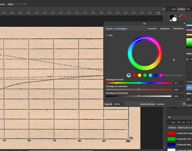
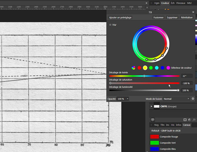
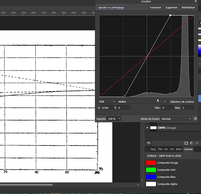
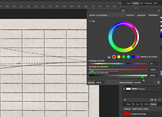
With the TSL layer, it's sort of the same idea: Instead of channels, you've got preselected colors. We want to desaturate (second sliders) the red and the yellow, and also lighten them (third sliders). We can also use a color picker to select the background and do the same: Everything is grey, but the background isn't white, So I add a Curves adjustement, to lighten the background and darken the lines (it could have been a Levels adjustement). ======================= The resulting file: scan0001a.afphoto
-
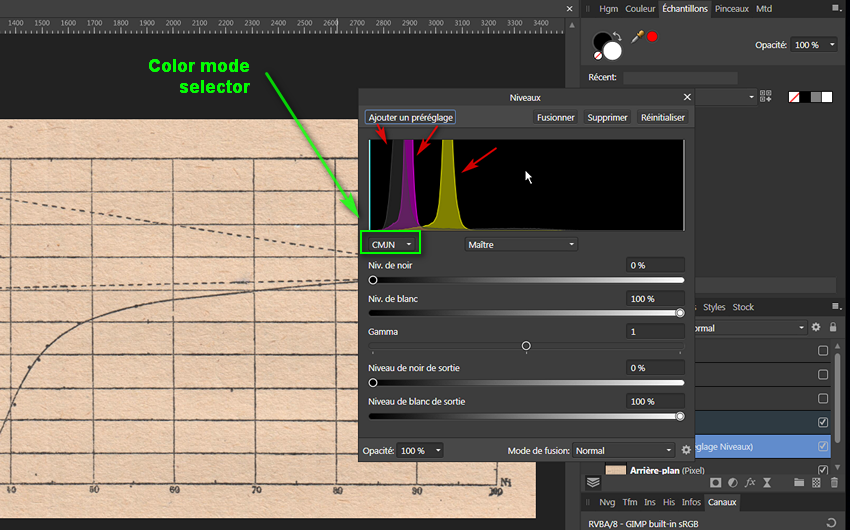
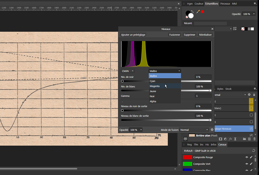
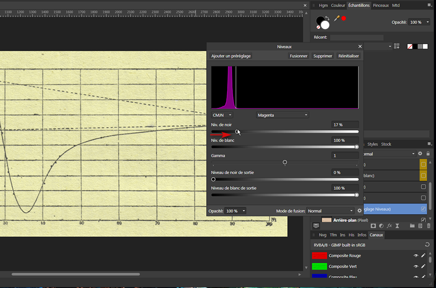
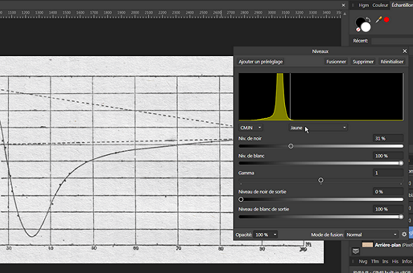
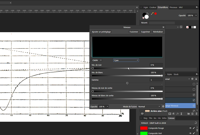
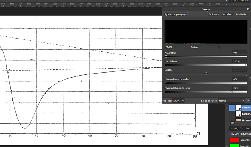
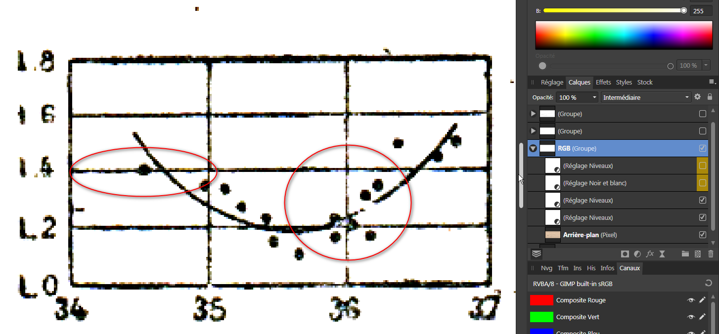
Hi @David Cheshire I spend years working on CMYK image. So, what I did first is what I would have done on a CMYK image, using Level ajustements. I did it directly on the RGB channels, but it's easier on the CMYK ones. And you can do it easily in AP. You add a Levels adjustement layer, and it'll show you the color density for all channels, or for each channels. In CMYK, it's easier to understand: we want less Magenta and less Yellow in the white parts of the image. Once the CMYK mode selected, it's displaying mainly peaks for black, magenta and yellow. We can select the Magenta channel: To get rid of the Magenta peak, we move the Black cursor "before" the peak. We can do the same on the Yellow channel: Nothing to modify on the Cyan channel: On the Black channel, we can lighten the background, and modifying the other slider, we can darken the lines: An old trick is to dupplicate the layer, to check if it improve the result. In this case, I did it and just modified a little bit the Black channel: =========== Doing this in the RGB channels can add colors on the lines: For corrections, I would use a Black and White adjustement to get rid of the colors, and another Levels (but it could have been a Curves or a Brightness and contrast layer):
-
Capital letters on other languages
Wosven replied to 99Combo's topic in Feedback for Affinity Photo V1 on Desktop
Because when you wrote text, you set or follow some rules to get some unicity in the whole text. For example, if you decide to follow a rule instead of another one for each citation, as using quotes AND italic, you'll have to search all citations in the book and apply the same rule to each one. In French, for list, the rule is to end each item by ";", but modern use permit to use "," instead, that is "lighter" to the eye. The copy editor work is to correct/ensure rules apply on 1500 pages, not only few of them. Authors work to develop their ideas, but aren't usually good with spelling, don't know those rules that are more technical that the common knowledge, and usually don't read their texts searching for this type of patterns, etc. That's why you've got journalists/writers and editors/copy editors. Someone writing the content, someone putting it in "good shape". It's the same with every content. It's easy to spot web sites without any copy editors, since the content is less professional. That's why for this list, you need to choose: capitalising or not. Once decided, you apply the rule to each list in the app for the same language. You'll just take some leeway using specific alphabets/characters to help foreigner found easily their own language if the default one use another one. (And it's a good idea, since it was the only way I had, long ago, to put my new screen menu in French after a prank of my coworkers setting it to Russian!) -
There are certainly different ways to do it, 2 to came to my mind... It's only getting rid of the background, other layers to get a better graph can be added. scan0001a.afphoto
-
Capital letters on other languages
Wosven replied to 99Combo's topic in Feedback for Affinity Photo V1 on Desktop
The UI is in English, so the list should follow Englsih "orthotypographie" (spelling+pnctuation) rules. The foreign rules would apply only if it was a citation in this language. -
Really nice, I juste don't understand the perspective of the first one, thé roof shouldn't go up but down.