.jpg.2518c4d7f2c1b1ee0294698857b495b7.jpg)
Mabel
-
Posts
13 -
Joined
-
Last visited
-
 Megnusin reacted to a post in a topic:
Blurring background?
Megnusin reacted to a post in a topic:
Blurring background?
-
4personnen reacted to a post in a topic:
Editing Embedded Files
-
mikeswarts reacted to a post in a topic:
Blurring background?
-
.thumb.jpg.dabc15530a2a67d371244c9bef26f8da.jpg)
Arc warp
Mabel replied to Jack McOck's topic in Pre-V2 Archive of Desktop Questions (macOS and Windows)
Looking forward to this. -
Mabel changed their profile photo
-
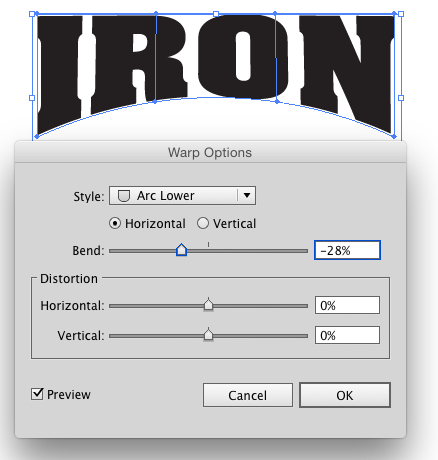
Unfortunately just wrapping to a curve is not quite what I'm after. More like this image where just one side can be curved. Thanks for the reply. Looking forward to the updates.

-
I'm trying to make some sporty text logo and was wondering how best to do the warp effect where the top is straight but the lower edge/baseline of the text is curved. In illustrator you go to Effects > Warp > Arc lower, but was wondering if Designer has something like this?
-
Alfred reacted to a post in a topic:
Affinity Photo and Designer 1.6 have launched!
-
Affinity Photo and Designer 1.6 have launched!
Mabel replied to TonyB's topic in News and Information
@Alfred Thanks for the quick reply, for some reason I hadn't seen that post when I searched. -
Affinity Photo and Designer 1.6 have launched!
Mabel replied to TonyB's topic in News and Information
Where can I see the changelog for Affinity Designer v1.6.3.101? -
Blurring background?
Mabel replied to Johnnymycat's topic in Pre-V2 Archive of Desktop Questions (macOS and Windows)
the ability to drag out a transparent shape to blur underneath would be really useful. Creating mockups for user interfaces would be much easier. -
Editing Embedded Files
Mabel replied to JokeRat's topic in Pre-V2 Archive of Desktop Questions (macOS and Windows)
Thanks for the replies v_kyr and MEB. I've ended up opening the embedded file by double-clicking and copying to clipboard and then editing it (as I'd made some tweaks to the svg original icon within Designer), to have a dark and light version. (as Meb mentioned) Sorry for the confusion. I'm going to go and try mess around with symbols for my next mockup. -
Editing Embedded Files
Mabel replied to JokeRat's topic in Pre-V2 Archive of Desktop Questions (macOS and Windows)
Well when I brought in the icon as an svg file into Designer and then copied it (so as having two icons). I wanted to have one black and one white. However changing the colour of one makes both have the same colour. If I change the colour of one to pink, then both are pink. I was wondering if there is a way to separate one affecting the other though I should probably be using symbols for this. Thanks for the video. -
Editing Embedded Files
Mabel replied to JokeRat's topic in Pre-V2 Archive of Desktop Questions (macOS and Windows)
Hi, I'm still learning about Embedded documents. But I was wondering, about having a copy of the embedded object and unlinking it and so having two copies independent of each other? So I'm making a mockup for a mobile app. I have icons as svg files which I brought in as embedded object. Then I used these to make a Light theme UI for the app. Now I copied the layout for a dark theme UI, the same images, text and these svg icons. However if I edit the colour of an icon (say on the Dark theme UI) it will change colours on both screen mockups (i.e. Light and Dark UI). Is there a way of unlinking them? So that I have two icons that look the same but I'm able to change the colours without one affecting the other?- 12 replies
-
- 1
-
-
- embedded
- live preview
- (and 1 more)
-
I've been trying to create a low-poly/polygonal artwork with lots of triangles like cptnftr and I've enabled 'snap to object geometry' to try and allow my triangles to snap together on points and edges. I was creating my triangles and shapes using the pen tool. Unfortunately, it doesn't seem to work 100%. It snaps to the shape geometry, not just the nodes or edge points but also to the lines. The nice thing is that the shape changes to yellow when snapping but sometimes I've snapped it to the line instead of the intended point. After having snapped some shapes together and it seeming to be correct when I colour-filled the shapes (and removed any strokes), some thin white lines appeared in between. Even my zooming in several hundred percent to check if the nodes/points lined up, there still seemed to be a thin line showing through in between the shapes. Anyone know of a better way to be able to easily and accurately snap to points and nodes with the pen tool directly? Or preferably just to nodes without snapping to the object outline or other areas. I can snap shapes together by selecting both objects and using the node tool to snap nodes together but that is after I've drawn the shapes. In another post on the forum a user mentioned getting around this by adding a tiny stroke around the shapes to remove the thin band showing through, but I'm thinking this would render the whole image less accurate with strokes and shapes overlapping.
-
What about clipping one small shape onto two other shapes? I tried it with groups and clipping to a group like Photoshop but it seems like Affinity Designer works differently.
-
Mabel reacted to a post in a topic:
Best way to create a complex shape shadow for icon.
-
I'm currently learning Affinity Designer and saw a tutorial for making some icons in Adobe Illustrator. I decided to try making some to use and learn different tools and processes. In the tutorial they show how to make a shadow of the icon by moving to the side and using 'Blend Options' to create many steps so that it looks like a continuous shadow and not a duplicate shape behind (In the hyperlinked tutorial on Icon 1, Step 5). Just a shape behind, not continuous. Continuous. What I'm trying to achieve. So basically, I am asking to see what is the best way to achieve this in Affinity designer? Is there a similar feature available to that in Illustrator?
-
I've been using Affinity Designer (on Windows 10) to make some vector art which has large and small shapes. So I zoom in and out primarily using Ctrl + + and Ctrl + -. Say I'm at 100% when zooming in it will enlarge to 150%, if I zoom in again it will go to 200% and then 300%, 400%, etc. Is there someplace to change it to keep using 50% steps? Or is it better if I start using the Zoom Tool with Z? Thanks.