Peter Werner
-
Posts
305 -
Joined
Everything posted by Peter Werner
-
Full-paragraph type composition
Peter Werner replied to Chrysogonus's topic in Feedback for Affinity Publisher V1 on Desktop
I wholeheartedly agree, but someone on the Serif team commented on the forums here a few months ago that this won't be in the initial release and will come later. It's definitely one of the features I'm looking forward to the most. -
3 page spread
Peter Werner replied to Natters's topic in Feedback for Affinity Publisher V1 on Desktop
I can think of the following two workarounds: Create separate artboards in Designer and then place those as linked or embedded files on a single all-encompassing page (Publisher) or dartboard (Designer). That way you can export the whole thing, but you also have the ability to export every artboard as a separate PDF. The disadvantage is that you have two separate files to deal with (though you can at least open both in either application) Have 3 individual artboards next to each other and one overlapping artboard that encompasses the other 3. -
I still remember doing a lot of tables in InDesign/InCopy back when Adobe didn't have this feature, and suffice to say, it wasn't fun.
-
Ability to create a template
Peter Werner replied to Ken Cope's topic in Feedback for Affinity Publisher V1 on Desktop
You could just enable the write protection option in Finder/Explorer for a regular publisher file that you want to use as a template, then it won't save over the original by accident. -
In the latest public beta (1.7.0.57), sliders from some dialog boxes seem to persist on screen, even when hiding Publisher. They show on top of other applications and remain interactive, even if their owner dialog box has been closed/hidden. Quitting Publisher removes them. OS version is OS X 10.11.6.
-
@Aammppaa Thanks for the tip with the rotated grids for angled layouts, I'll have to look into those options! However, what I'm looking for in addition to these settings is a layout grid that allows me to set up guides for text columns and image positioning, such as six columns with an x mm gutter, similar to what InDesign has. It has to work in addition to the regular document grid. Just like the "Margins and Columns" settings in InDesign, but with the additional option to do the same thing also with horizontal divisions, not just vertical ones. For instance, it would be common for a page layout to have 7 grid columns for a 3-column page. Then text frames, sidebars, image descriptions and so on would be created spanning one or more columns of the layout grid. This can be done manually with guides on master pages of course, but adjustments are rather time consuming.
-
@mac_heibu, I by no means meant to imply you are not professional, sorry if it came across that way. Seems like we essentially agree anyway I've actually had issues with Acrobat's separations preview not being accurate in the past. And as many designers are looking at Affinity as a way to get them out of an Adobe subscription, I'm sure that eliminating that last step at some point in the future would certainly be welcomed by many.
-
A designer specializing in layout work who doesn't know or care about separations is an expensive accident waiting to happen. Black RGB text that prints blurry, or black text at 7pt that's not set to overprint, or images with an RGB black background which auto-separates into rich black that are placed inside a CMYK K-only black rectangle in the hope of it looking seamless – the client is not going to be happy. I routinely check anything that goes to print in separations preview, and one out of three times, I spot a last-minute problem that needs to be fixed. Partly this is because of idiosyncrasies of InDesign's quirky transparency flattener, but still, it's an important step in any software that helps you prevent costly situations like re-printing 500 000 copies of a document because you missed a very small but very stupid problem. While in my opinion not absolutely essential for a 1.0 release (a software like Acrobat can be used to check the PDFs if need be), it's definitely far from just a "nice to have" feature.
- 21 replies
-
- 10
-

-
text frame shapes
Peter Werner replied to postmadesign's topic in Feedback for Affinity Publisher V1 on Desktop
You are probably using the Artistic Text Tool instead of the Frame Text Tool (one below). -
text frame shapes
Peter Werner replied to postmadesign's topic in Feedback for Affinity Publisher V1 on Desktop
Just draw any shape with any of the shape tools and click inside with the text frame tool. It even works with the elusive Cat Tool! The great thing is that you don't have to convert these shapes to paths for it to work, meaning you can still adjust the parameters of a shape after you fill it with text. To edit shape parameters, you need to select the shape and activate the corresponding shape tool since the options bar for the select tool will from then on show the text settings. Edit: Seems like StuartRc was faster than me -
Add "Print view" option
Peter Werner replied to Diogenes's topic in Feedback for Affinity Publisher V1 on Desktop
View > Hide All Guides seems to work fine for me – you can even customize the shortcut to be something as simple just like in "W" in InDesign (though then it won't work in text editing mode – that's one of the limitations of the shortcut editor, you can only set up one keyboard shortcut per command). -
I personally like to set these values based on the point size of my text to ensure they harmonize with the measurements of the text as well as things like em spaces. I know it is possible to type in other units into the input fields, but it would be nice if they could also displayed in that fashion. That way, if I change the size of my text in a paragraph style, I would be able to immediately tell whether the indent setting needs adjusting or not.
-
These settings are quite often identical for all sides, thus a chainlink button in all the dialogue boxes where these settings show up would save time.
-
I may have missed something, but it would be incredibly helpful if the snapping options recognized column boundaries as snap targets. I think this is something that should definitely be in the 1.0 release. Also, a grid feature for layout grids with not only support for just vertical divisions for columns, but also horizontal rows would be fantastic. It should be possible to use different grid options per spread or master page. Ideally, there would also be an option to also rotate this grid at an angle and have rectangular text frames, shapes, images etc. be created and transformed and snapped at that angle to make layouts with slightly rotated content really easy without the need to place nested documents (and all the ugly workarounds that come with that like duplicated styles).
-
I'd love to have a command that splits a multi-column text frame into individual linked text frames, one for each column, so that individual columns can then be manipulated individually. It's usually a process of "create guide at column edges – resize frame to one column – set column count to one – create text frame for all additional columns – link all columns", but doing it the manual way gets even more complicated if the original text frame was, say, rotated a few degrees.

-
The ability to dock panels, toolbars, and the main window toolbar, in Separated Mode just like in the Mac version of Adobe products, Macromedia FreeHand, or older versions of Microsoft Office, would allow for much neater workspace organization. It would also make everything cleaner when placing panels on secondary monitors in Non-Separated Mode. A setting to have these screen-edge docks collapsed and only open up when moving the mouse to the screen edge (just like the OS X Dock with "Hide Dock" activated or the menu/toolbar sliding in on regular OS X applications like Safari in full screen mode) would further improve usability on small screens such as smaller laptops. The ability to arrange documents next to each other in all modes would be very useful. The nicest implementation of this is probably in Microsoft Visual Studio, where it is very easy to arrange documents in a variety of different ways just by dragging the tabs. Adobe products can sort-of do this, but not when using floating windows because it cannot dock two views in one window, it only works when activating their Application Frame. Currently, Affinity Photo has a very useful option "View > New View" that opens up a new document tab for the same document, but this is utterly useless in non-separated mode since there is no way to actually put the two views next to each other to work on detail while looking at the whole document. In separated mode, it would be useful to be able to split the tool options from the main window toolbar so one doesn't have to drag the bulky main window toolbar around with it In separated mode, currently the status bar completely disappears, and in non-separated mode on the other hand, there seems to be no way to hide it The Character/Paragraph buttons in the text tool options bar only show these panels, but they don't open them if they are collapsed. Chances are that a user wants to actually use them, so un-collapsing them would make sense. It might also be confusing if these are already on the screen in collapsed state since it will then appear to the user as if nothing happens when they press the button.
-
- 1
-
-
- separated mode
- ui
- (and 3 more)
-
[Photo] Channel Mixer improvements
Peter Werner replied to Peter Werner's topic in Older Feedback & Suggestion Posts
Here is another suggestion: Support for additional color spaces. This very interesting video (using DaVinci Resolve) is a great example of what can be done by using YUV/YCbCr and HSL. It also shows that Resolve has a "Preserve Luminance" setting, which is what I was referring to by "Auto Normalize" in my original post. While calling it "Preserve Luminance" is clearer for RGB, that terminology actually becomes misleading when using color spaces that separate luma and chroma, as seen in the video. -
Dodge and Burn on Masks
Peter Werner replied to Jim Hardiman's topic in Older Feedback & Suggestion Posts
I agree this should be possible. At first, I though that using the regular brush tool in Overlay or Soft Light mode with black or white selected might be a feasible workaround, but it turns out that for some reason the brush blend mode is ignored when painting onto masks. Moreover, even though Affinity supports multiple masks, these masks always seem to blend essentially in Multiply mode, making it impossible to replicate the effect using multiple mask layers (same goes for other things such as performing boolean operations with masks using blend modes). -
Sneak peeks for 1.7
Peter Werner replied to Ben's topic in Feedback for the V1 Affinity Suite of Products
Wow, this looks fantastic! One question – will this allow for working with layouts that are at a slight angle, especially in Publisher, which may or may not get all of the grid options? I have recently had to work on a poster in InDesign that had most elements rotated a few degrees, and it was a pain to adjust things because none of the snapping, aligning and move tools would work properly. -
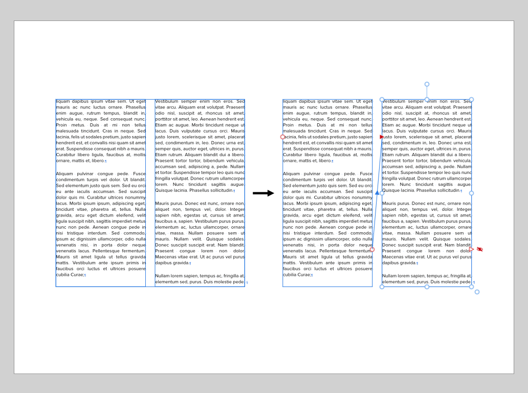
Actually, "Balance Ragged Lines" is not supposed to be used on body text. Balancing and hyphenation are taken care of by the paragraph composer – by default that's Adobe's excellent "Multi-Line Composer", which already takes the effect of hyphenation and composition decisions over the entire paragraph into account, not just the current line. So you don't need to activate any other options to get nice and balanced body text. "Balance Ragged Lines" is intended to be used with small centered blocks of text like pull quotes, multi-line headlines and so on. For instance, you can apply it to your subhead paragraph style so that those two lines of text are always evenly divided between the two lines and you don't have to manually add forced returns for everything to look balanced. If you apply "Balance Ragged Lines" to regular body text however, it will actually usually make the result significantly worse, and it is sure to drive anybody mad who has to do copy fitting with your body copy style. If you look at your example, the only thing that has really improved on the right is that InDesign has balanced all lines so that the last line of the paragraph is filled completely, making tradeoffs in all other lines in order to meet that goal. Also keep in mind that placeholder copy won't always give you the best impression of these things since the hyphenation is not representative when using pseudo-latin. EDIT: There is an article on InDesign Secrets that goes into detail.
-
LaTeX typesetting plugin in Designer
Peter Werner replied to Adrian_M's topic in Feedback for Affinity Designer V1 on Desktop
To my knowledge, there is a free TrueType version of LaTeX's Computer Modern typeface and its variations in existence, but I'm not sure if that would cover all the mathematical symbols and so on. Adobe InDesign can import PDF as a vector picture format with pretty much perfect fidelity and will leave everything intact when printing since it's not attempting to bring it into its internal object model as an editable graphic. Illustrator on the other hand also has trouble when opening PDFs for editing and you'll never get perfect fidelity. Since ads are usually supplied as print-ready PDFs in most professional publishing workflows, being able to place PDFs like any other image format and being able to rely on them being passed through to the final press ready PDFs virtually untouched, even if they contain embedded subsets of fonts that are not available on the system, or fonts that are installed in a different version on the host system, is actually a really important feature that I hope we are going to see in Affinity Publisher at some point. PDFs from LaTeXIt!, other scientific tools, or even specialized graphics/CAD software are obviously another use case. -
Setting Levels to 3 and 253
Peter Werner replied to Chris Anson's topic in Tutorials (Staff and Customer Created Tutorials)
Just in case that this is talking about output levels, not input levels, which seems like the more likely case for precise settings like this to me: You can use the "Apply Image" effect with "Use Current Layer As Source" and "Equations" turned on. If you use 3/255 + ((253-3)/255)*SI as your equation (for Grayscale), that should do the trick. If you want to use RGB mode, use the same formula in each channel and just replace SI with SR, SG, SB respectively and let the alpha untouched. The first part takes care of the offset (the 3), and the second part rescales your values so your top value is 253. We need to divide by 255 since Apply Image always assumes floating point ranges from 0.0 to 1.0 (and beyond for 32-bit HDR mode) and not 8-bit values from 0 to 255, no matter what format your document is in. You can make that into a Macro with sliders instead of absolute values to create your own "Output Levels" tool until Affinity's Levels feature finally gets updated with Output Levels and numerical controls. Alternatively, you can always use the Channel Mixer to achieve the same thing. -
My thoughts about Affinity apps
Peter Werner replied to Petar Petrenko's topic in Older Feedback & Suggestion Posts
I think the current Affinity philosophy is by far the most sensible approach, and the shared code base finally gives us the UI consistency that Adobe has never been able to achieve. It's great to be able to create, say, a movie poster in an image editing application and refine some of the typography in a layout application, then go back and work on some of the raster imagery. Being able to work on a single document all the time and being able to show, hide, and move layers instead of splitting the graphics into three files in Photoshop if they have to overlap text in the layout is a huge advantage However, I have to completely agree with the original poster that having both equation editing and sheet music engraving integrated into the Affinity suite would be extremely useful. It's already been discussed in these forums at various points, but publications that integrate lots of equations or music examples, such as text books, are extremely cumbersome to produce with current professional graphic design tools since every single item has to be integrated as a picture and edited in an external application, then exported to PDF or similar, then relinked in the layout, repeat for any changes. Not to mention you don't have the context of your page when editing the embedded graphics. A dedicated persona with scientific tools for mathematical and chemical equations would also open Publisher up to the eduction market – not just the professional scientific publishing world, it would make it the perfect tool for teachers to create worksheets with. Software like InDesign with the InMath plugins is completely unattractive for individual teachers due to its price point and perceived complexity, but the 50€ or so for Publisher would likely be no-brainer. Thus I'd expect that the development resources required for what most designers would consider a relatively niche feature set could probably be more than recovered through the additional sales in that market. -
The major lag that I'm experiencing with active selections is much better with the 1.6 series now than in the 1.5 series, i.e. it doesn't completely stall the entire system any more, but it's still quite significant. I suspect it might be related to drawing of the marching ants animation (OS X 10.9.5, NVIDIA GeForce 9400M 256 MB, late 2008 aluminium unibody MacBook with external screen). Finally being able to nudge points in the Curves dialog with the cursor keys really is a godsend, though unless I just haven't found the right combination of modifier keys, it's apparently still not possible to select and move multiple points at the same time or type in numeric values – that's still one of the major things I'm missing in Curves. Moreover, being able to move points in larger increments when a modifier like shift is pressed while nudging would also be very helpful. One bug in the nudging feature: Pressing the right arrow key with a control point will make it jump to the very left of the curve widget instead of moving it right by a pixel as one would expect. Goes equally for Curves adjustment layers and blend curves in the layer blend settings. And some nitpicky UI stuff: The baselines of the text in the controls at the bottom of the Adjustment Layer settings popup window (Curves, Levels, White Balance etc.) are all over the place and the cogwheel icon is not centered on the blend mode popup. The same goes for the top controls of the Layers panel, lots of different heights, slightly offset text baselines and text not being vertically centered in its container. And in Light UI mode, the background gradient in the curves widget is a tad strong, not sure if it is even needed at all. Just thought I'd mention it because I was happy to see that lots of these small UI things seem to have been cleaned up since the 1.5 release
-
Green Screen background replace Chroma Key
Peter Werner replied to Bent Rønne's topic in Older Feedback & Suggestion Posts
An indirect way to achieve this if you really need to right now might be with a third party Photoshop compatible keying plugin like Primatte for Photoshop or maybe you can find an old copy of Ultimatte AdvantEdge for cheap. But I don't think the Photoshop versions have seen much development recently, and there is currently no OpenFX plugin support in Affinity yet.