CH Trippe
-
Posts
91 -
Joined
-
Last visited
Recent Profile Visitors


-
 Oufti reacted to a post in a topic:
Floating Studio Window Panel
Oufti reacted to a post in a topic:
Floating Studio Window Panel
-
Floating Studio Window Panel
CH Trippe replied to CH Trippe's topic in Desktop Questions (macOS and Windows)
It worked --- so I'll definitely remember this little "trick" in case it happens again ! -
Oufti reacted to a post in a topic:
Floating Studio Window Panel
-
Floating Studio Window Panel
CH Trippe replied to CH Trippe's topic in Desktop Questions (macOS and Windows)
Thank you, Oufti ! 😊 -
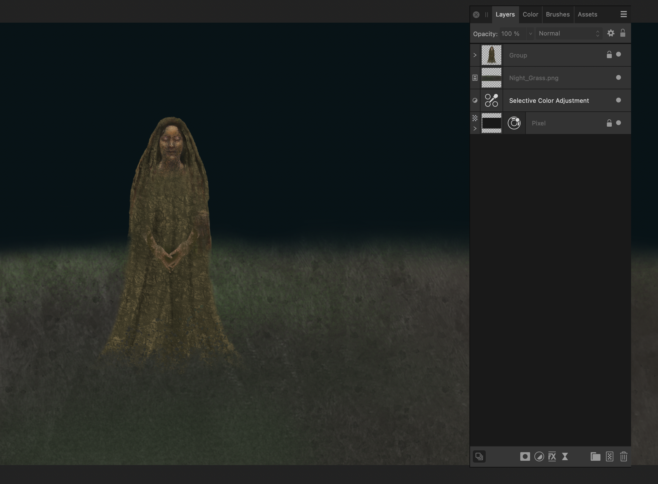
There's this really annoying thing that happens every now and then --- the studio window panel "floats" off the screen when I close Affinity, and remains on my desktop. Then, if I close the panel, then it doesn't reappear as a stationary sidebar when I reopen the app, so I have to go back into Window Studio View to set it up all over again. 🤨 What I'm saying in brief is that this panel seemed to be "fixed" in one spot, on the right side of the screen, and then, for some reason, it's detached and "floating." Usually I have only 4 or 5 views handy on a sidebar --- Layers, Color, Assets and Brushes and Navigator, and I know how to access them, but it's a nuisance to have to do this every single time I open a file. The thing is, I don't know how/why this has happened. Did I hit something by mistake? How do I get that panel to stay put so it's there on screen every time I open a file, instead of floating off by itself like a cloud ? It's that little panel you see at the upper right side of the screenshot below. (Sorry, it's pretty dark, but I think you can see it). In case it's of any importance, I have the latest version of Affinity, and I'm working on a MacBook Pro. I seem to have been able to resolve this little problem when it happened before, but now I can't remember how I "fixed" it. Can someone please enlighten me ? Thank you!

-
Paul Mudditt reacted to a post in a topic:
Change to Creation of Image Brush in Affinity Photo 2.5.6
-
I just want to say that the new Object Selection tool is fantastic ! I've only used it a couple times now, experimentally, but I can see that it has great potential for various aspects of my work. It is able even to select the complex edges of drawn or painted figures better than the old select tool, to create pngs, which I use all the time in making composites. Thank you!
-
Sorry to be so long in replying --- I was mistaken. There was no change to the brush after all ! 🤫
-
In the past, I have been able to create an image brush from a png and have the brush retain the color and detail of the original. Today, in attempting to create an image brush from a png --- after having installed Affinity Photo 2.5.6 --- I discovered that the brush image only appears in black and white, as a silhouette, and although I can chose a color, the brush is still only a silhouette, not a replica of the original image. Is there a way to make an image brush in the " old " way ? Or am I overlooking something ? Thanks !
-
 Patrick Connor reacted to a post in a topic:
Forum Security Alert: Important Information for All Forum Users
Patrick Connor reacted to a post in a topic:
Forum Security Alert: Important Information for All Forum Users
-
Thank you!
-
If we do receive a suspicious email purporting to be from Affinity (I haven't, yet) --- to what email address should we report it? Should we forward the suspicious email? Thanks.
-
Extremely sensitive Selection Brush in V2
CH Trippe replied to CH Trippe's topic in V2 Bugs found on macOS
A belated thank you --- I just saw your answer to my original post. -
Extremely sensitive Selection Brush in V2
CH Trippe replied to CH Trippe's topic in V2 Bugs found on macOS
Anyway, thanks for trying. I was hoping someone from Affinity could weigh in, in case this is a difference in V2. -
Extremely sensitive Selection Brush in V2
CH Trippe replied to CH Trippe's topic in V2 Bugs found on macOS
I am using a MacBook Pro, M1 chip, OS Ventura. I don't know what "reacting linear" vs "scaling logarithmic' means. I don't think I've changed any preferences, but I'll have a look. None of the other brushes are behaving this way --- only the selection brush. -
For the most part I am having no problems with V2, just getting used to some of the differences, but I have noticed that the selection brush tool, which I use all the time, is extremely sensitive -- much more so than I remember it being in V1. In V2, you move it only slightly to the right, it gets HUGE immediately --- kind of like a car going 0 to 60. I can work with this, but it's a bit tricky to get the brush down to a usable size, at least for my purposes, as most of my selections require only a small to medium size brush. I'm just wondering if this is a "bug," or an intentional feature. In other words the range for getting a small to medium size brush is very small indeed. Has anyone else noticed this?
-
lacerto reacted to a post in a topic:
A Soft Proofing Question
-
A Soft Proofing Question
CH Trippe replied to CH Trippe's topic in Desktop Questions (macOS and Windows)
The simplest solution is often the best. Letting color management do its magic --- that's exactly what I want, basically, since I devote a lot of time to getting the images to look right on the screen. But I wanted to be sure I was doing as much as I could to achieve the best appearance for my book images. I've noticed that it's usually in the dark areas of an image that they're apparently "out of gamut," but as I said, they print to my satisfaction. Only if there's a marked color shift would I think I had a bigger issue. I don't use any Adobe apps --- just Affinity Photo, and it has worked very well for me. Finally, I understood how layers worked! You've been very informative and helpful. Thanks again! -
A Soft Proofing Question
CH Trippe replied to CH Trippe's topic in Desktop Questions (macOS and Windows)
Well, folks --- thanks again for all your input --- it has certainly helped me understand this issue better than I did (which was not at all) --- but after all that , I think I am just going to stick with using BookWright's built in soft proof option. Because when I added a soft proof layer in Affinity with the default, and also with Blurb's ICC, not only did the image appear far less saturated, the gamut check showed almost ALL the saturated colors out of gamut --- but they actually printed just fine. I thought it would be instructive to check out and compare some of my earlier illustrated books --- I hadn't even heard about soft proofing yet --- in which I was using photographs of paintings, mostly oil or acrylic on paper, and even some of those colors showed up as out of gamut, but looked fine in print --- the tonal range, because it was in actual pigment, was narrower than in the composites I have been making recently --- and the color accuracy has always been excellent. So the soft proofing in Affinity may be misleading, at least for me, and I'm afraid if I start making adjustments to compensate for what the soft proof is telling me ....well, you know the old saying, If it ain't' broke don't fix it. Some of the images in my most recent books have very saturated darks. Like photographs, my composites actually don't exist outside of the computer or in the printed books, as original paintings or drawings do -- they are temporary constructions, so the only comparable image is the fully adjusted one on my computer screen. I'm thinking that with some of the areas that aren't as bright in the print, I could make additional slight curves or levels adjustments, and not try to yank the entire image and end up with who knows what. -
A Soft Proofing Question
CH Trippe replied to CH Trippe's topic in Desktop Questions (macOS and Windows)
Wow, that is a lot of good information! You know more about the Blurb ICC and how it functions than some of the customer service folks at Blurb, although they always try to be helpful. So thank you! Well, I have installed the Blurb ICC profile --- it was very easy after all --- and now it appears at the top of the soft proof list in V2. I did notice that when I add a soft proof layer, that US Web Coated SWOP profile is always the one highlighted --- but I actually had no idea what that meant. And when I added a soft proof layer with the default highlighted, the images looked less saturated --grayer overall. (This was with Absolute Colormetric checked) But they didn't print as gray. Blurb uses both sRGB and CMYK, but recommends the RGB and that's the mode my images are in. I looked at one image with the Blurb ICC profile highlighted, and the darks also looked grayer in that, similar to the way they appeared with the default profile. But before I was soft proofing anything, making no further adjustments to my images, and using only BookWright's soft proof option, the darks were plenty dark enough, and to my eye, in the printed images. In other words, a little more contrast. But the colors were plenty saturated. BookWright offers an auto-correct for images, but I never use it because it unvariably overexposures them, and I lose the subtle gradations in tone that I work pretty hard to achieve. I've watched some tutorials, so I know I should have the soft proof adjustment layer at the top of the stack, and to turn off the adjustment layer before exporting the image. As my images are multilayered, not every layer needs adjustment. It's the background layers that influence the darkness/brightness of the composite image. For my background layer I now start with a new file and flood fill that layer to a chosen color that will influence some of the other transparent layers. If it needs changing I'll do that with the HSL adjustment. All other layers are pngs, some of which are also constructed out of multiple parts as a new file on a transparent ground. Anyway, thanks again for all that information! All good to know, especially when you're totally in the dark about terminology and such. I might just experiment a bit with some of your suggestions. But then, I don't want to fool around too much and end up worse than before, since it's pricey to get a proof printed, and Ido spend a lot of time and a fair amount of $ getting things right.