thomaso
-
Posts
13,548 -
Joined
-
Last visited
Everything posted by thomaso
-

Left and right margin values switched
thomaso replied to Aleksandar Kovač's topic in V1 Bugs found on macOS
@TheOtherRoland, unfortunately the switch of left/right (or inner/outer) margins, or just their labels, appears to be intentionally and so-called "by design". Although with the previous beta (v502) came improvements for the behavior within the pages panel this left/right issue still exists in the current beta v518 in the way it has been answered already earlier: User: Does that mean a single master in a facing document always is treated as a left page? Serif: For now, yes that is the case. It's just the way it's been designed. https://forum.affinity.serif.com/index.php?/topic/78148-master-page-margins/&do=findComment&comment=529943 -
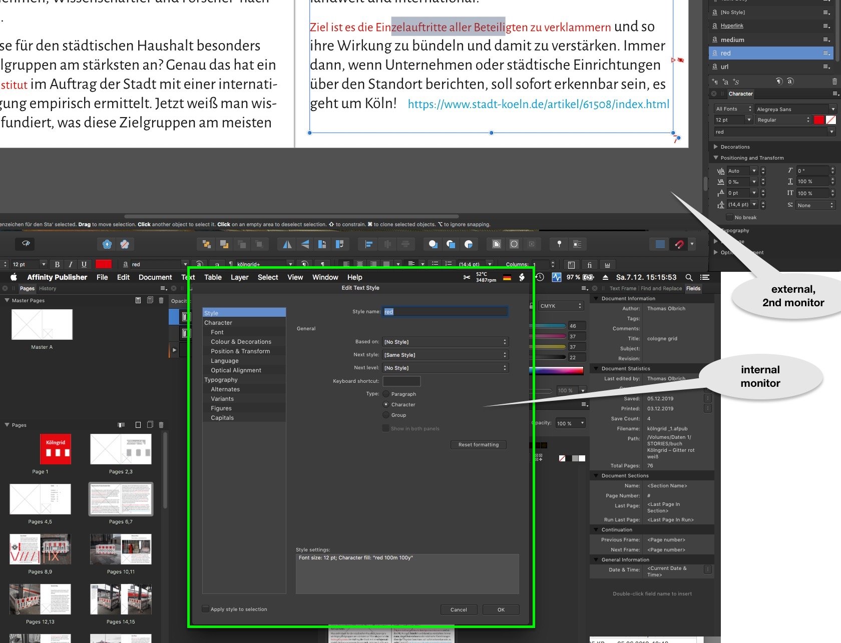
Fixed position of the Edit Text Style window
thomaso replied to wlb's topic in Feedback for Affinity Publisher V1 on Desktop
Interesting: this fixed window's position works like a charm when using two monitors, then its occurrence in center and docked to the menubar appears perfect:
-
Moving object + ALT = copy ... incoherent
thomaso replied to Pattex's topic in Feedback for Affinity Publisher V1 on Desktop
This not-mac-typical behavior is related to the fact that in Affinity opt/alt vs. cmd modifier keys are switched and work vice versa. It was discussed already, as far I know with no Serif respond yet. It is still unknown what made Serif set these two modifier keys that way – though it is always documented in the toolbar info: So, using the cmd key instead opt/alt does ignore the moment of pressing the key and behaves as usual and expected.
-
PNG transparency black when printing compressed PDF
thomaso replied to REL's topic in V1 Bugs found on macOS
Ok, it shows up white – on screen only or when printed, too? If on print then everything is fine, isn't it? I'd say if you do see transparency in various apps on screen (as I do with both your pdfs and the other files as mentioned) then the black on a print would be related to and generated during the printing process and by all involved software, including the app which is used to send the print task. p.s.: to test transparency a white background is less useful than your previous gray because in some apps + printed on paper the white can be the default color which also occurs with no content at all. With a white image background a non-transparent JPG looks the same as a TIF with transparency. Maybe Pauls (from Serif) will come back with more detailed or even different results. -
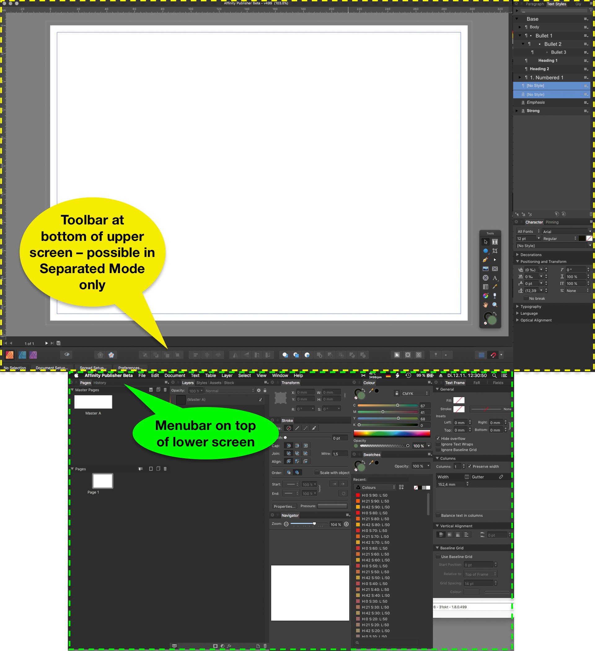
This feature improvement request is currently relevant in Separated Mode and when using two monitors. Some users of a laptop have a 2nd monitor connected which allows to place document windows on the larger screen and panels on the smaller. Unfortunately for a custom panel arrangement Affinity currently demands to switch to Separated Mode. Separated Mode also separates document windows by default. Also new windows get opened on the 'main screen' (e.g. the laptop's internal), regardless of its size (resolution) and of already existing document windows on the other screen. That way any new document window appears covered behind panels and is therefore 'invisible'. To combine these document windows as tabs in 1 window the user needs to select "View" > "Merge All Windows" – every time a document gets opened. Unfortunately to do so it also is necessary to first select (activate) the already existing window, otherwise this command moves all documents to the newly opened document on the unwanted screen and behind the panels. Requests: a.) enable a Separated Mode which does not affect document windows but panels and toolbar only. b.) make new document windows open on the screen which already shows a document window. c.) remind in Separated Mode the document window size and position. d.) allow to auto-fit document windows between panels instead of behind them in full screen size. Or: e.) improve the Not-Separated Mode by enabling custom panel + toolbar arrangement on 2 monitors. This would have the same result as a) + b) + c) + d). Since in not-separated mode the panel docking and sticking works better than in separated mode this option e.) is the preferred towards a.) – d.) for users who still want to arrange panels as groups around the document window and currently use separated mode just to make use of 2 monitors. Example setup of two monitors (macbook internal + larger external): Same example with menubar, Affinity panels, toolbar and document window: New documents open on smaller screen, covered behind panels:
-
PNG transparency black when printing compressed PDF
thomaso replied to REL's topic in V1 Bugs found on macOS
I see in your flower PNG, TIF, .afdesign and PDF transparency on screen for PNG and TIF. Also your "Untitled.pdf" prints both images to me with not black but transparent background and shows the light grey. Possibly your black print result is a printer software issue. Are you aware whether your printer supports postscript transparency? How does the background appear on print if you export as PDF/X-1 (it prevents postscript transparency but flattens)? -
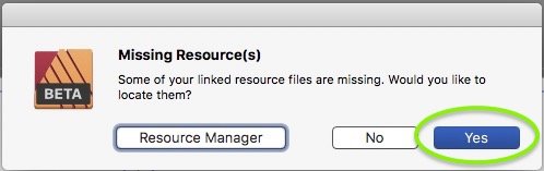
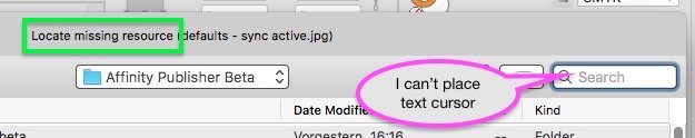
(In both retail v1.7.3 and beta v518) When opening an .afpub which has a missing resource I may choose "Yes" to locate a folder or file in a finder-like window. Unfortunately then the finder's "Search" text field may be selected (highlighted) but is not accessible for my text cursor. I can't use the search though I would need it in particular this situation.
-
Presets – Feedback & Suggestions
thomaso replied to thomaso's topic in [ARCHIVE] Publisher beta on macOS threads
At this moment of this new "New..." window (1st occurrence at all, not finalized yet * ) I see a lot more reason NOT to limit thoughts, fantasy and feedback in a way as it will be useful in a later beta or especially in a retail version. * In particular the occurrence of "Recent documents" in this "New..." window and the layout of only two columns for landscape icons (+ free wasted space) makes me feel of this current window version to be an idea, a trial, a test. -
Presets – Feedback & Suggestions
thomaso replied to thomaso's topic in [ARCHIVE] Publisher beta on macOS threads
Of cause it can. It's just a matter of layout, design, navigation etc., in short: of consequences. It even is possible to treat presets totally different and separated from templates. -
Presets – Feedback & Suggestions
thomaso replied to thomaso's topic in [ARCHIVE] Publisher beta on macOS threads
This may be true for presets, but not for templates. Templates show the picture of a page. This thread is about "Presets" in particular – NOT about templates. -
Presets – Feedback & Suggestions
thomaso replied to thomaso's topic in [ARCHIVE] Publisher beta on macOS threads
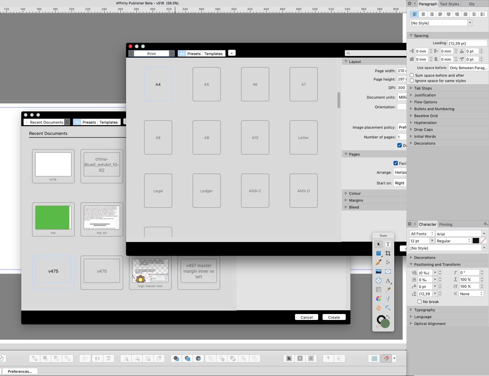
Nevertheless, as you mention, there is no need (and imho no use) to show these large amount of presets as icon view at all. Yes, templates are a different pair of shoes, as Recent files, too. Whereas "Recent documents", appearing in the "File" > "New.." window actually should generate new documents with the properties of a recent file – but without its content. At the moment these "Recent documents" in "New..." rather belong to "File" > "Open..." than to "New..." cause they don't generate anything 'new' at all. I don't understand this thought. Especially a longer preset list wouldn't give more info in icon view style but need more screen space. The icons are rectangles only, in either portrait or landscape orientation. Their dimension info is quite tiny, and they don't give color, margin or bleed info. So you need to check the property area anyway. That way it would be more informative + comfortable to enlarge the properties + values area (currently on the right) and reduce the icon view to a (collapsable) template area only. Finally recent documents should neither not appear here or should get treated as empty templates if mentioned in "New...". -
Quicklook process :: very demanding in v518
thomaso replied to thomaso's topic in [ARCHIVE] Publisher beta on macOS threads
(Sorry, there is no need to let us know what you do NOT know.)
-
Quicklook process :: very demanding in v518
thomaso replied to thomaso's topic in [ARCHIVE] Publisher beta on macOS threads
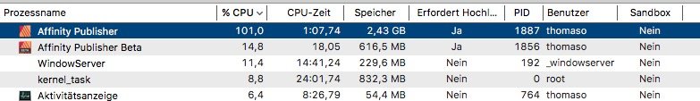
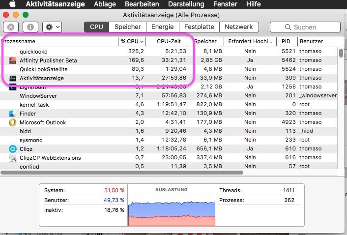
@Jon P, I emptied my recent files for v518. Indeed the quicklook issue disappeared. Thank you! – Now I still would want to reset the path for those .propcol files in the screenshot above – any hint where I can set it again? @fde101, in current Affinity versions + bug reports the "permission" issues are related to saving, exporting or crashing problems, not to a dialog window to set a custom file path. That way to call this "quicklook" issue a "permission" issue would be unnecessary confusing. The info about Sandbox of AppStore versions only was given in the forum by a moderator at least once. Also your Activity Monitor.app gives the info about apps using Sandbox, possibly you need to activate its column first:
-
Quicklook process :: very demanding in v518
thomaso replied to thomaso's topic in [ARCHIVE] Publisher beta on macOS threads
It was asking me to confirm a file path, were it stored 18 .propcol files afterwards (see screenshot above). I have no sandbox Affinity version, did not buy in the AppStore. One might call a file path definition a "permission" (to allow to save at THAT place) – to me a permission on a computer is always just "Yes" or "No", not a file path. -
Presets – Feedback & Suggestions
thomaso posted a topic in [ARCHIVE] Publisher beta on macOS threads
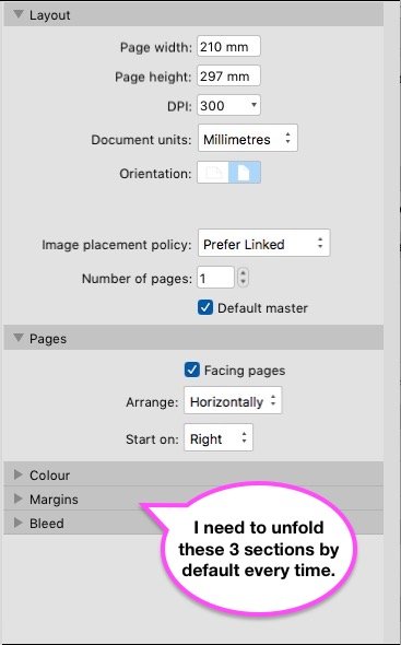
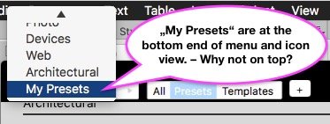
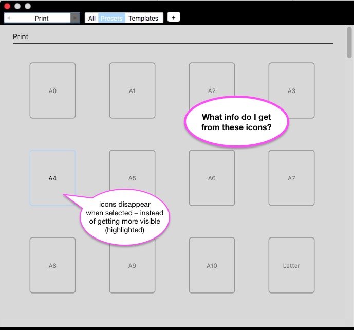
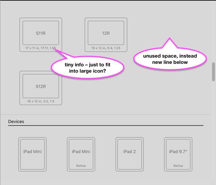
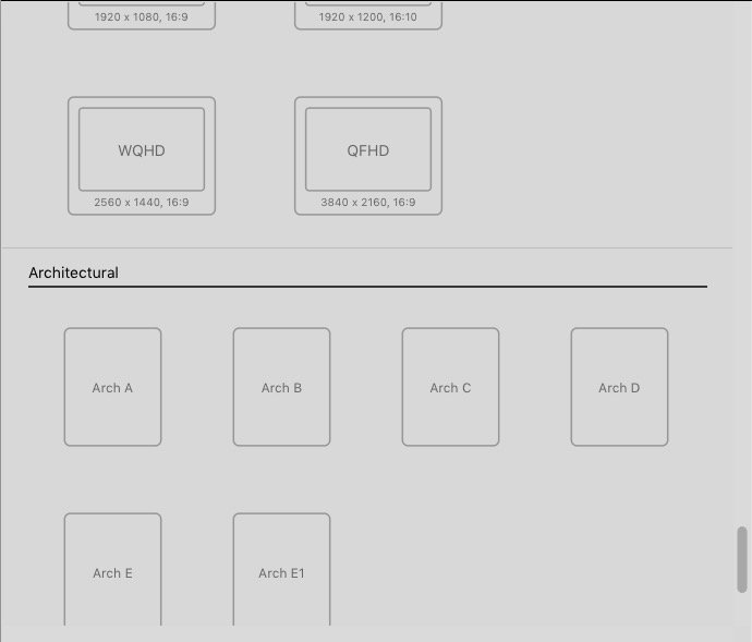
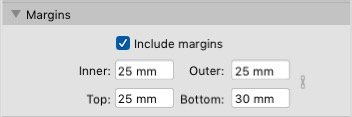
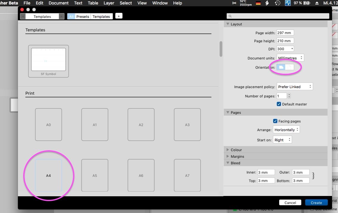
I appreciate that the new "New..." window allows to show all properties for a new document in 1 view after unfolding all their sections. (I don't need to jump between tabs as in previous versions.) A. I would appreciate even more if all properties sections could be set as unfolded. Currently I still need to unfold manually the "Color", "Margins" and "Bleed" sections every time I open this window. Unfortunately it does not keep my recent unfolded use after closing/reopening this window. B. The preset sections don't remind my recent setting and "My Presets" are always at the bottom end, both in the pulldown menu and the icon view. Unfortunately they don't appear as first entry of sections. I'd appreciate to be able to hide some preset sections, e.g. by collapsing like for properties area. No user will need all sections in the same frequency, e.g. "Architects" don't need to see "Devices" presets permanently and vice versa. C. The icons are very space demanding within this window– but give visually not much info. Actually they only show the ratio of a preset (portrait/landscape), which also is given numerically with its dimensions. Unfortunately the icons are quite large whereas the icon's text info (e.g. dimensions) is quite small, text size seems to got reduced to make the text fit inside the icons (by Design, for what reason?). This way to me the icons appear mainly disturbing than as an additional information. I'd appreciate to get rid of the icons and have a text list instead, possibly with tiny icons aside (like file icons in finder list view), that would be large enough to show their page orientation. D. The presets are either in portrait or landscape orientation; some presets have margin of 25 mm, regardless of their size. – Unfortunately any change on a default preset can't be saved, instead I need to save an additional "My Preset". This makes the list of presets and their pixel wasting icons longer, even if a user wants to use e.g. the default "A4" but just as landscape format again and again. A. Three sections need to be manually unfolded each time: B. "My Presets" are forced to the bottom of menu and icon view: C. Preset icons need much screen space – but don't give information besides page orientation...: ... instead their text info (respectively dimensions) appears quite small to fit into icons:
-
A sudden issue made the "New..." window disappear. I used "File" > "New..." again and did not see the window. After moving all panels aside (which cover my internal screen) I discovered two "New..." windows behind them. I could move them to the second screen and also bring either of them to foreground by clicking on one, also I could navigate in both, but both still where partially covered by the panels. The issue occurred while scrolling through the preset icons. I am not able to reproduce this occurrence.
-
Quicklook process :: very demanding in v518
thomaso replied to thomaso's topic in [ARCHIVE] Publisher beta on macOS threads
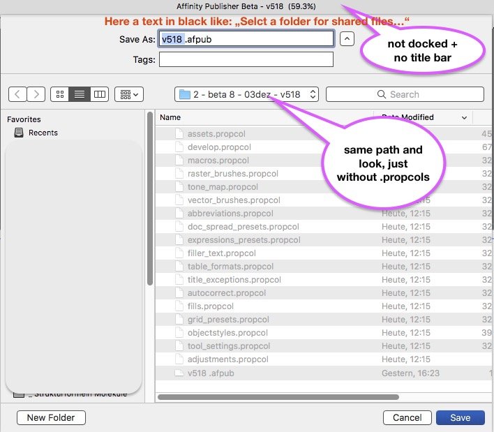
Unfortunately I did no screenshot – I thought I'd get access to that dialogs again at any later time. It was definitely no permissions window, both asked for a file path/folder. Both windows looked the same, just with different line of text in the header. The look was quite the same like a "Save As..." window, but not docked and no title bar and with a text command instead. After confirming the first window ('share') it closed and immediately the second appeared ('application'). There was no other Affinity UI visible at that moment, the document window and panels occurred after confirming these dialog windows.
-
Quicklook process :: very demanding in v518
thomaso replied to thomaso's topic in [ARCHIVE] Publisher beta on macOS threads
@Jon P, unfortunately one of the two finder-like windows (mentioned previously) appeared to be related to application user preferences. I just discovered 18 .propcol files in my documents folder (the one I had selected during the app start). How can I reset this path, e.g. to the former "~/Library/Application Support/Affinity Publisher beta/user" ? Sorry, I can't find a preference to set it. -
Quicklook process :: very demanding in v518
thomaso replied to thomaso's topic in [ARCHIVE] Publisher beta on macOS threads
@Jon P, to me this quicklook processes did not pop up again after a macbook's reboot. * Instead I got after reboot two finder-like windows when opening v518, asking for two file paths (sharing, application). This is a bit odd because I had used yesterday (before reboot) at least one of these folders by exporting an .afpub as template . So the app got at least that path, didn't it? Nevertheless, although I am aware that some betas first issues disappeared after reboot I still forget to reboot. Shame on me. On the other hand in macOS this need is unusual after an app installation - or, if necessary, triggered by the app installer itself after showing an info message before starting the installing process. * EDIT: after running v518 about 30 minutes in background I just got aware (by fan noise) that the 'quicklooked' processes does run again, though now in a little less demanding way then yesterday/before reboot. So, I am not sure at all that reboot had any influence on this processes. -
Swatches Panel :: Delete Palette "Colours" > English only
thomaso replied to thomaso's topic in V1 Bugs found on macOS
Joachim, to load PANTONE by yourself you would need this palette as a separate file. In that case t&c might prevent it, e.g. to avoid sharing or manipulating. Accordingly, if you would be allowed to delete PANTONE then you would not be able to load it later again. -
@radek108, it was requested a few times in the Feedback/Feature Request forum, e.g. https://forum.affinity.serif.com/index.php?/topic/95858-feature-request-publisher-resource-manager-relink-to-folder/ But please don't mix up the word "locate" since it means different things inside/outside the Resource Manager.
-
Suggestions for "New Document" window
thomaso replied to Jeremy Bohn's topic in [ARCHIVE] Publisher beta on macOS threads
For me bleed & color remain whereas orientation & margins don't. ( https://forum.affinity.serif.com/index.php?/topic/103267-suggestion-for-the-new-document-window/&do=findComment&comment=554812 ) I can't see any rule in this decision, it appears like a mistake and kind of buggy. That was an example. See the recording below. If I change the inner margin to 5, then click the link button, nothing changes. They do change already, it just depends on your text cursor position when clicking the link icon. In your video you 1.) type 5, then –> 2.) enter the next field and then –> 3.) click the link. You simply can make your "5" work for all if you activate the link before you jump to the next field (and also before you enter the 1st field). -
Quicklook process :: very demanding in v518
thomaso replied to thomaso's topic in [ARCHIVE] Publisher beta on macOS threads
I still don't think that the recent and template .afpubs cause this massive quicklook processes. For both APu has no need to do a search, and definitly not on the complete disk or for 30 minutes and more. The number of recent files is quite limited (set by the user) and well known to APub (as list of paths like in v.1.7.3). Nothing to search for. Their icons are done in seconds. The template .afpubs are stored at 1 place (you have to define 1 folder for them). APub has no need to look for any somewhere else. As mentioned in my initial post these icons in the Open window did exist already when I got aware about this quicklook processes issue. Besides quicklook it also appears weird that APub itself runs with massive CPU usage even if it is not in foreground use. Compare: The v.1.7.3 can be open but its CPU usage goes down up to 0% if the app is in background. Finally quicklook is no tool for a search, APub can easily get info about possibly according files from macOS's permanently updated "Spotlight" data base (md processes). So I still wonder what APub tries to do when starting quicklook without finishing it. -
Quicklook process :: very demanding in v518
thomaso replied to thomaso's topic in [ARCHIVE] Publisher beta on macOS threads
Still after 30 minutes both quicklook processes and therefore the fan are intense. Though I had been in the browser app (not in APu) I now find v518 with increased CPU use compared to 20 minutes ago. Quite weird for an app which is unused in background.
-
Suggestion for the New Document Window
thomaso replied to Murfee's topic in [ARCHIVE] Publisher beta on macOS threads
For me in retail v.1.7.3 it works like a charm (or even since earlier betas?): Whenever I use "New..." I find my recent setting. Unfortunately v518 it seems to forget my recent settings and always has A4 selected for new documents – even if I save a preset and use this instead. While also v.1.7.3 has A4 selected for New... now v518 behaves different and does not respect/remind my recent settings for Margins and Orientation. The new icon overview in v518 is rather disturbing to me. Neither I may delete or sort some presets nor collapse a section – but always need to scroll down to my custom presets, which unfortunately get placed at the bottom end of the preset lists, both in icon view and pulldown menu. Finally I wonder why 1.) all print presets have a margin of 25 mm, regardless of page size, and 2.) a custom margin & page orientation gets lost/overwritten when I switch page size preset, whereas my bleed and color settings remain as set and wanted. A note to light UI: page orientation icons and preset icons have less contrast. Especially a selected icon in light blue on gray appears to disappear.