radek108
-
Posts
42 -
Joined
-
Last visited
Recent Profile Visitors
2,120 profile views


-
Hi everyone, Here we can send suggestions and wishes :-) so let me suggest to the marketing team and developers that although there are many so-called web builders on the market - Frame, Webflow, Elementor or, for example, Nicepage, which works with Wordpress. - Serif could create such applications on the basis of the three main Affinity applications. Something independent of subscriptions, hosting, someone else's technology, etc. Something integrated with other applications, which would allow not only to design pages, but also to make a finished product in the form of a website with pure code, or pages + wordpress plugin. And as always, many thanks for your great work.
-
I do not know if it has already been discussed. My request concerns the rotation of the entire working area. When we press Comman + mouse wheel we can rotate the working area, but it would be great if Shift would limit the rotation pitch... by some defined amount. And this could be set, for example, in the preferences. This would allow us to more accurately edit documents. Thank you for your great job
-
 Thank you for your answer. I know it, but I mean something that works ... immediately, when you move the slider or change the size - just like the percentages are now shown. Now I move the slider and only AFTER moving it reads the value. It's a bit of trial and error.
 -
 Jowday reacted to a post in a topic:
Affinity Publisher - Suggestion for rolling panels
Jowday reacted to a post in a topic:
Affinity Publisher - Suggestion for rolling panels
-
Hello all, Now we can hide all panels after pressing the TAB key. And that's great. I'm using a MacBook Pro 13 "and it would use the ability to minimize all the tools - as can be done in Adobe InDesign. This is a very handy thing for smaller screens, otherwise there is very little space left to work. It would also be good to be able to define whether the panels are to hide automatically. Thank you for the team's work and all helpful suggestions from other users
-
Hello all, I attach a screenshot so that you know better what I mean. When you move the magnification slider, the percentage of magnification appears. At this point, it would be great to know what the output image size and resolution will be in dpi. You should be able to define this size in your preferences - inches, millimeters, etc. The same values should be displayed on this bar as soon as you click on each image. Or these values could appear under the layer name. Good luck.

-
MarioMello reacted to a post in a topic:
maybe something like ESKO plugins ????
-
Thanks a lot for the suggestions. I need to check the topic of nested styles. It's a big file, import with idml, so I won't upload. But I still don't understand why HSL or Lab at Publisher. Ok in Photo, maybe that's why the printing house wants CMYK files anyway, otherwise it will be a mistake in preparing files for printing.
-
Hello, Why is it so that if I change the color, for example in a paragraph style, then paragraphs with that style do not automatically change color? (ver. on MacOS) After all, that's what styles are for. I change everything in the document in one move. I still don't understand how colors work in Publisher. Why HSL, why Lab ... what do printing houses do with such files? Can anybody explain this Lab and HSL nonsense to me? Print shops need CMYK, CMYK and Pantone. I know that in Photo Persona mode... it can be useful there, but in the end you need either CMYK or RGB What does Greyscale mean for the Affinity band? Once I got the answer that it is RGB color. Again - why in the program that prepares files mainly - Greyscale printing as RGB? In Photoshop we have CMYK, RGB, Greyscale ... Grescale is one channel - BLACK, not 3 RGB channels. Does it not annoy you? In this state, despite many corrections, it cannot be used for professional, large-scale production. Forgive me. Too many incomprehensible functions. From the serious to the strange - for example, a padlock next to a color. It's so hard to make an open padlock / closed padlock icon and some red color or something like that ??? 🙂 I greet the hard working team, I keep my fingers crossed ... Good luck
-
thomaso reacted to a post in a topic:
What does 'lock colorspace' do?
-
Hello "subsequent sessions will use the HSL color wheel as default" hmm ... did anyone from the DTP industry prepare anything in InDesign, QuarkXPress in HSL color space? 🙂 why HSL is in the program preparing things for print or presentation and why HSL is the default mode? when creating a document, the color space should be set. when I create a document, I know why. if I do something for printing I need CMYK, if I click on an object in the color palette it should automatically switch e.g. to RGB if the object is RGB. I do not understand this solution. after all, in all programs of this type it is simple ...
-
Hello Affinity Designer suggestion. To the Affinity team. ESKO is the creator of plugins for Adobe Illustrator https://www.esko.com/en/products/studio A brilliant tool for those who design packaging. If you did something like that right away in Affinity Designer, not as a plugin, probably a large part of the market would be yours. Designer would become a leading application in packaging design. I think we can have dreams 🙂 Greetings to all Thanks for your work.
-
412/5000 I think that would need to be changed. Style palette. when I click on an object and add some style, and then click on another, the previous one that I chose before is still marked. And yet the new building has no style yet ... Styles should be selected by themselves after clicking on the object. There should be a style reset icon - no style. It should be highlighted if the object has no style. Greetings to the team
-
Fixx reacted to a post in a topic:
Important thing about colors in Publisher
-
SillyWalk reacted to a post in a topic:
Important thing about colors in Publisher
-
SillyWalk reacted to a post in a topic:
Important thing about colors in Publisher
-
Jowday reacted to a post in a topic:
Important thing about colors in Publisher
-
In my posts, I mean pointing out to the Affinity team things that for me - as a user - are incomprehensible or bad. The matter of color control in the production program which is Publisher is VERY important. The same applies to all tools for checking and repairing / replacing colors, styles, etc. But I think this is the Forum to help each other and the Affinity team improve the application. I hope that the Affinity team will once again think about the operation of the Colors palette, especially since it is very intuitive in the competitive InDesign. Confidence and trust that there will be no errors in print files will make people more willing to switch from Adobe to Affinity. Thanks to everyone for the hints
-
Thanks very much for the hints, I will try. "The palette named" Grays "contains swatches defined in RGB" Where's the logic here? 🙂 Grays is gray. RGB is RGB. Something with UX went wrong 🙂 Regards
-
1004/5000 Hello, Thank you for your reaction. But why the 100% Black in the Grays swatch is a Rich Black? The name itself - 100% Black - says what this color consists of. And here for the unknown, it turns out that 100% = e.g. C-89 / M-78 / Y-62 / K-97 🙂 It's illogical - I mark 100% black in the Gray palette - which only suggests 1 color and its shades - so I should get only 1 color - black, not something from 4 colors. Gray - for me it's black from 0 to 100% Black - belongs to the CMYK palette. so... if the object is black (no matter whether from the Gray or CMYK palette), then in the CMYK palette it should show us the EXACT value of black and zero other colors! I don't know if I explain it well, English is not my first language. But to understand me, just see how it works in InDesign. I have idml, 100 pages and I need to manually control every element of its color. In a way that Publisher suggests right now, it's a lot of work. And I'm not sure what I'm doing 🙂 It would be nice if you could select an element in some color and replace all the elements in the same color with the one we indicated - in the whole document. And the separation preview. The cost of printing poorly prepared documents is often very high, which is why control is a serious topic. Regards
-
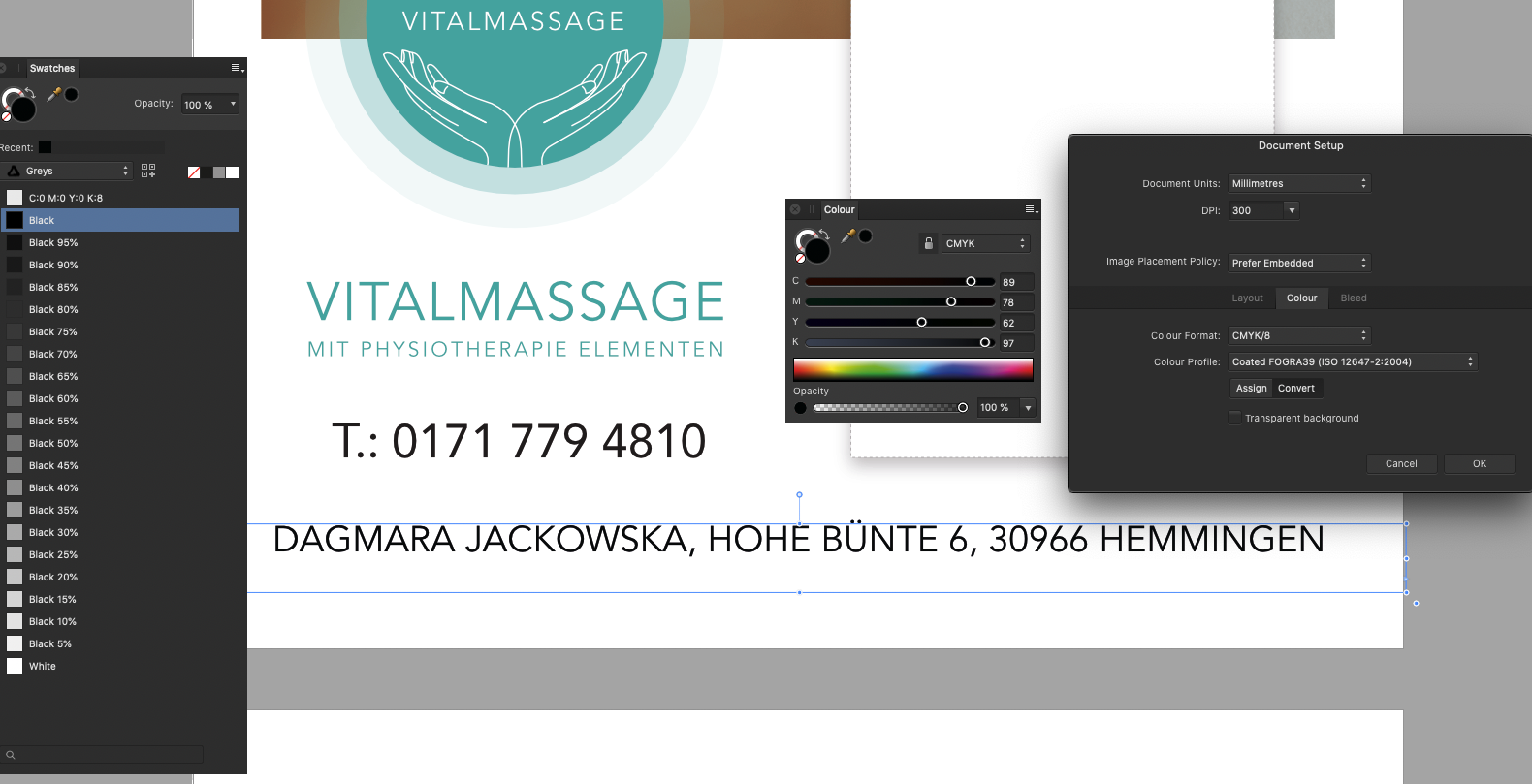
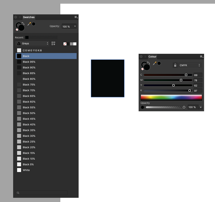
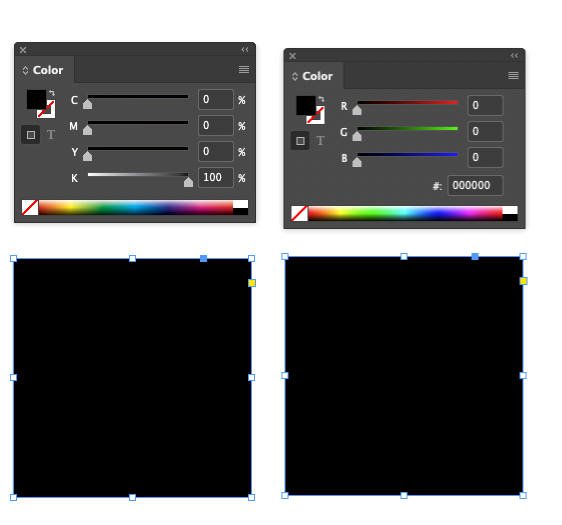
1237/5000 Hi, important thing about colors in Publisher. It is completely incomprehensible to me and very confusing. When I select a frame with text, Rich Black is visible on the Colors (CMYK) palette. Although the text is 100% Black, as seen on the Swatches palette. I include screenshots - 1 and 2 are from Publisher. Screenshot 3 is from Adobe InDesign. There you can see that if I select a frame with text that is 100% Black, then on the CMYK palette you can see exactly 100% Black, not Rich Black. And this allows you to check the color. I don't understand the logic of Affinity. After clicking on the object I should know what the color is !!! And whether it is CMYK or RGB. The palette itself should change from CMYK to RGB. Picture no. 5. Comparison with Adobe InDesign. You can clearly see what color the object is - you can see black on the screen - but the Color palette changes and shows what the color is and what the color space is ... We have controls. Now you can never be sure - basically what color the object is. Screenshot 4 - I drew a frame - what color is it? Black 100% or Rich Black? If this thread has already been raised or you know how to better control and understand these issues, I will be grateful for the information. Best regards to all Affinity users
-
Thanks for your help, but I can't send these files. I'm bound by a contract with a client for whom it's done - I can't share source files. I want to be fair to them.