thomaso
-
Posts
11,641 -
Joined
-
Last visited
Everything posted by thomaso
-
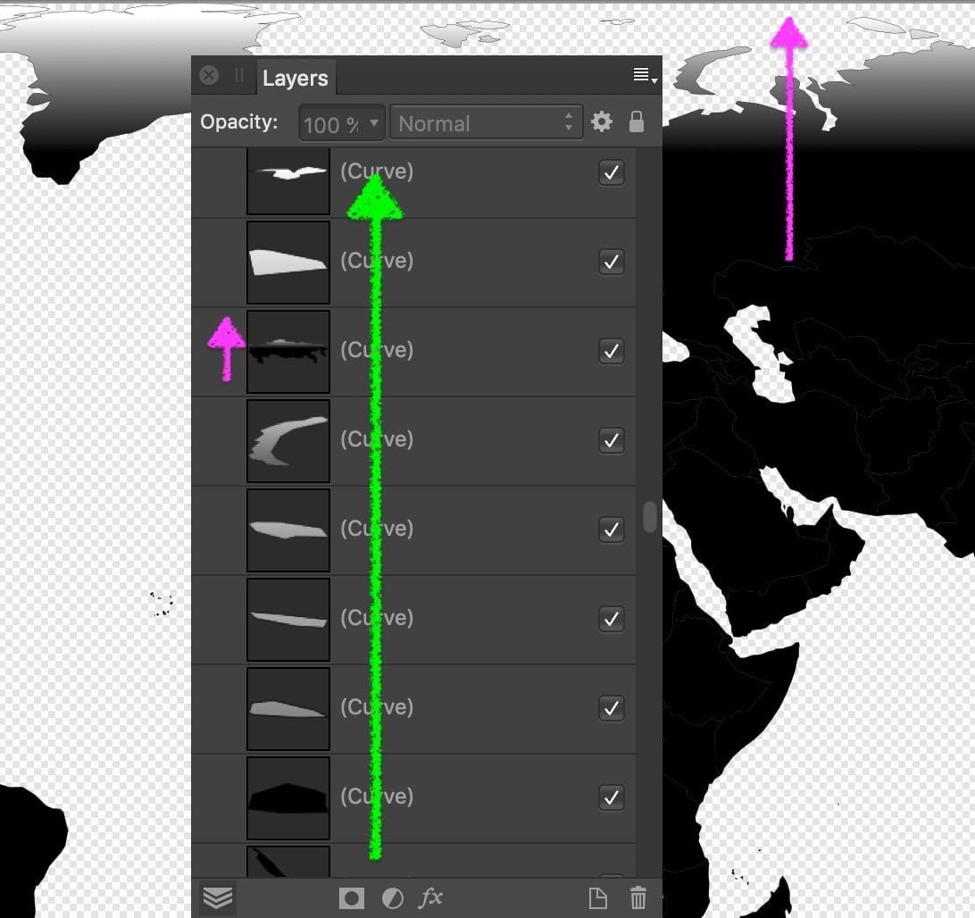
 I still seem to confuse, – Pardon! … New trial: forget about gradient and transparency. Imagine the hierarchy in the Layers Panel represents a hill in a landscape while its height gets visualised by colour intensity (tint) of different layers virtually laid through the hill. A topographic map shows a top view on the hill as a staple of layers and indicates different heights (layers) by different fill colours (… and strokes maybe). Like so … v1105 topograph layer-hierarchy colours.svg topo simulation.m4v Unfortunately I don't know enough about coding or the SVG file format to be able to judge if it can be done with SVG at all. I just notice that the colour tints used in Affinity get exported in SVG as 'simple' RGB values (… though I assume SVG could alternatively set them as percentage of a parent colour like in the Affinity layout). Also, the several curves (layers) aren't specified by a name or layer number but rather as vector coordinates, which might not work if created via text editing instead of Affinity layout. – P.S.: the world map sample just confused me: Its gradient is not assigned to the Layer hierarchy but vertically within the layout, … while no curve overlaps another. •
-
Yes, this works for me, too. The video tutorial seems to have a 10 px grid set. So it requires first to set a grid with the wanted spacing & divisions … and change that for different node distances. This appears cumbersome compared to the Alignment options window from the Toolbar, especially if I want to use it for just 1 line, or maybe several lines but with nodes in different distances for each line.
- 4 replies
-
- 1
-

-
- affinity designer
- measurement
- (and 3 more)
-
Your links are about "x gradients horizontally to 1 image" whereas this topic seems to be about "1 gradient vertically to x layers". e.g.… • top layer: end of gradient • middle layer • bottom layer: start of gradient As far I understand, in topographic maps the size of a series of shapes defines their vertical hierarchy: from small to large / top to bottom (or bottom to top). – My quick workaround is quite limited because of the blend mode used to simulate the gradient. Using transparency limits the options e.g. for the lightest / darkest colour and the possible stroke colours. Alternatively to a gradient or transparency a series of tints of 1 fill colour could get assigned to the layer hierarchy – that is what made me think to scripting: • top layer: 10 % tint • middle layer: 50 % • bottom layer: 100 % No idea if layer names would matter for a scripted solution, however, in the OP's screenshot they appear to be numbered as sequence in steps of 5.
-
Hi @Axfaust, Welcome to the Affinity Forums! As far I know there is no way to assign a fill colour gradient vertically to the layer hierarchy. It might be possible via script (or macro?), maybe @v_kyr will pop-in with an idea. As quick'n'dirty workaround you could create the vertical gradient with 1 fill for all layers + a blend mode to achieve the colour hierarchy (~"gradient"). For instance below with 1 fill colour + "Multiply" blend mode for all layers (and, fwiw, "Exclusion" for the striped version).
-
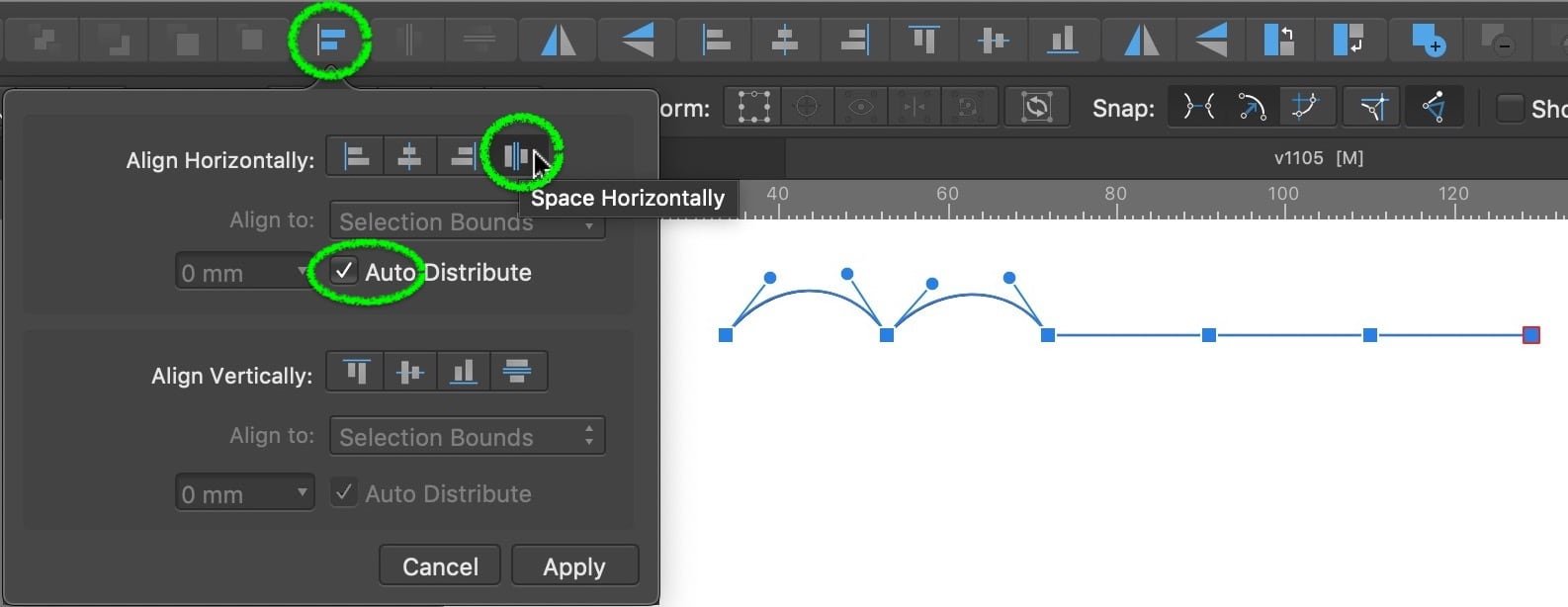
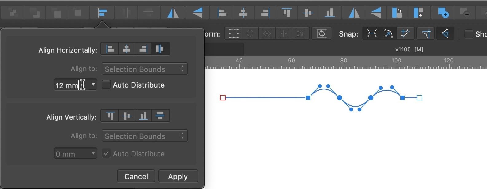
Hi @TomSDM, welcome to the Affinity Forums! Unfortunately I don't know how to get the distance displayed just by hovering – but maybe another option can make it easier to align nodes on a curve. It either distributes the nodes automatically (evenly) … … or by a specific distance you choose (via slider or type): … while it affects the selected nodes only and always aligns from left to right:
- 4 replies
-
- 1
-
-
- affinity designer
- measurement
- (and 3 more)
-
Font downloading
thomaso replied to sue b's topic in Pre-V2 Archive of Affinity on Desktop Questions (macOS and Windows)
@LibreTraining, thank you for the offer! Luckily since a few years either a macOS upgrade or myself could manage to prevent the conflicting duplicates from causing problems. So currently I don't need to replace or fix any font file. Just fyi: the most frequent issues were caused by Arial, while this Microsoft fonts folder contains 155 files (none as family, means each file one weight), all with the same creation date 2015-Apr-06, 9:00 h. -
Hi @IAPO BR, welcome to the Affinity forums! Try menu Edit > Paste Style.
-
Font downloading
thomaso replied to sue b's topic in Pre-V2 Archive of Affinity on Desktop Questions (macOS and Windows)
But these get installed by the app-installer & during the app installation process (either inside the app-package or in a 'hidden' system folder), – correct? <–> Whereas the OP mentioned "on my account there were also some font downloads" which, to me, sounds rather like an optional / additional offer then like part of the app installation or possible app requirements. By the way I had issues for quite a while with some fonts auto-installed by Microsoft Office in Library/Fonts/Microsoft (not user/Library/…). Not being conscious of their fonts I run into 'conflict' error messages from my custom Extensis Suitcase font manager. For no reason Microsoft had installed various fonts which are part of macOS anyway. -
I wish I could simply select a guide like an object … and delete. – A bit like in the Manager, but just not in the Manager. Whereas he seems to be able to place a guide even behind the moon or further …
-
Usually I am glad when the app reopens / restores a current document after an app crash which usually contains the most work since my last save. From this perspective the concept for autosave in Affinity is fine. But I am rather concerned when a simple, usual Save action suddenly appears to trigger one of the various "can't read" … "access lost" … "must be closed" … "file corrupted" error messages (while working in that file did not). Ironically, for the majority of this error situations caused by "Save" an immediate second or third trial is well able to open the file, often, not always, including the recent changes, and at least in the last saved state of the document. – Whereas it also happens that it requires several trails to open a saved document (same set of error messages). So I'd "just" like the existing .autosave feature would work more reliable – and never would lose their contact to the saved version of the document.
-
Font downloading
thomaso replied to sue b's topic in Pre-V2 Archive of Affinity on Desktop Questions (macOS and Windows)
Hi @sue b, welcome to the Affinity forums! I am surprised that you assume a font would get installed per application. Fonts are rather a matter of the operating system. In macOS you can double-click a font file … see also: https://support.apple.com/en-us/HT201749 -
This would not affect a saved Object Style since the "global" colour property isn't saved within the Style. Additionally Global Colour Swatches don't get transferred between documents (e.g. by copy/paste objects that have a global colour assigned) – thus a global colour in a style possibly would not work even if the style would be editable. So, you can use Global Colours in an object style only within the document where it got created from an object with global colours. Once you edited a global colour in this document you need to repeat the edit for any future instance of the style in this document.
-
What "all categories" do you mean? It is sufficient to set a language in the "Spelling" menu. The options "Hyphenation" and "Typography" aren't required for Autocorrect or may get set to any of the available values, in the Text Style Editor window also to "[No change]". And, if a style is based on a parent style for which the "Spelling" language has been set then "Spelling" remained to "[No change]" works for the child styles, too.
-
To me your concern was/is about snapping – different to the initial thread. And rather regardless of the visibility of the bounding box … as your video example appears to demonstrate, whereby not the bounding box visibility is the problem but the lack of snapping.
-
But I guess you can admit that just the initial question "How can I drag an object by the corner to snap it to something else?" was rather misplaced in this thread "How to hide a bounding box?" Since this part of the thread takes more than the half I'd appreciate if a moderator could move that entire part as a new thread.
-
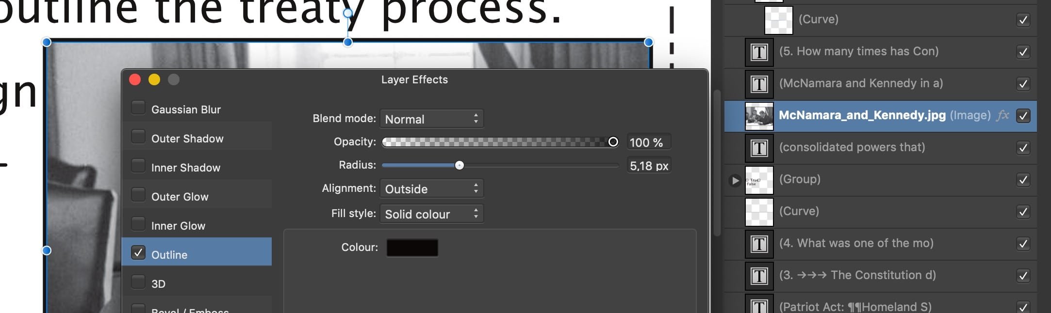
If I deactivate the Outline Effect from the image layer and replace it by a 'normal' Stroke then I can export (preset 'for print') without error. malfunctioning page_stroke.pdf ( ... Aside that, this .afpub with 23 MB appears to contain a lot of data garbage which could be of interest for Serif.) • Before (causes export error): • After:
-
Can you tell what kind of object or setting was causing the issue? Resources, Text, Links, … ?
-
Is AFFINITY dead?
thomaso replied to J.T's topic in Pre-V2 Archive of Affinity on Desktop Questions (macOS and Windows)
-
… this is why I asked 🤓 I assumed something like this … similar to Black in UCR | GCR, plus the complexity of additive | subtractive differences. But it's not enough to really understand (being able to visualize or explain).
-
Here too. 👍 Thank you! Has anyone an idea how this happens? Assuming the command to create a chord is in both panels the same the difference would be in the condition, the color definition. This seems to mean that in Affinity a colour swatch can have a different definition than its corresponding colour well in the colour panel, even if represented by the correct slider / range … ?
-
There is no general reason for this error message. One culprit could be a specific object causing the issues, another reason maybe a font issue, either generally with a certain font file or locally on your computer only. To limit down a possible culprit you could try to export certain parts / pages or selections only. It would be a lot more efficient to get a file uploaded than just a short description. It also might help to know your PDF settings, respectively whether an export works as a rasterized file format (e.g. jpg) and if the affected document did ever export before in a former layout state without harm – and, if yes, what got changed in between. "Other similar files" doesn't help yet as info because we have nothing to compare with: similar to what / in what aspects? All you told us about the failing document is that it's failing. So, similar files would fail, too. Another option to inform the forum about the situation with your document in more details could be a protocol of the export process. This thread tells the way to enable it:
-
A simple way would be to open the exported PDF in Affinity (let it "estimate" the colour space) and hover-click with the Colour Picker Tool on the page. If it displays "Grey … %" below its loupe then the PDF has 1 colour channel as wanted. If it tells several % values for a certain spot it has more than 1 channel. – Just in case: the picker tool does not recognize spot colours but reports them as various channels. I don't use this method usually, so I can't tell whether "Estimate" is fully reliable. In fact you can choose instead yourself a certain colour space from the menu but that would manipulate/convert the PDF on opening and result in according colour picker values, regardless of the "true" PDF contents. Unfortunately there maybe online tools but also for them it's may require various tests to detect how reliable they are. For instance this one seems to convert a 1-channel grayscale + X-4 PDF and shows with its colour picker 4 channels for the grays. Not helpful! https://www.pdftron.com/webviewer/demo/color-separation/
-
Thanks! @NotMyFault Good to know. – But I can't make it work. Can you detect the mistake in my workflow? Also, because you mentioned it literally: Is there any specific difference for this situation (or for any colour setting) in the use of the large Colour Chooser window toolbar? To me it does not enable us to create any colour that can't get created with the smaller Colours Panel, too. tint swatches from CMYK.m4v
-
Is AFFINITY dead?
thomaso replied to J.T's topic in Pre-V2 Archive of Affinity on Desktop Questions (macOS and Windows)
thanks to Sempé 1932 – 2022
-
Activate in the export options "Convert image color spaces".