Petar Petrenko
-
Posts
2,987 -
Joined
-
Last visited
Everything posted by Petar Petrenko
-
 The glass is have empty. OK, forget it.
 -
Like antivirus apps. They upgrade their core app beside their virus definitions. Everything is doable. Core app could be free of charge, just to introduce the potential user with the app and only personas could be sold.
-
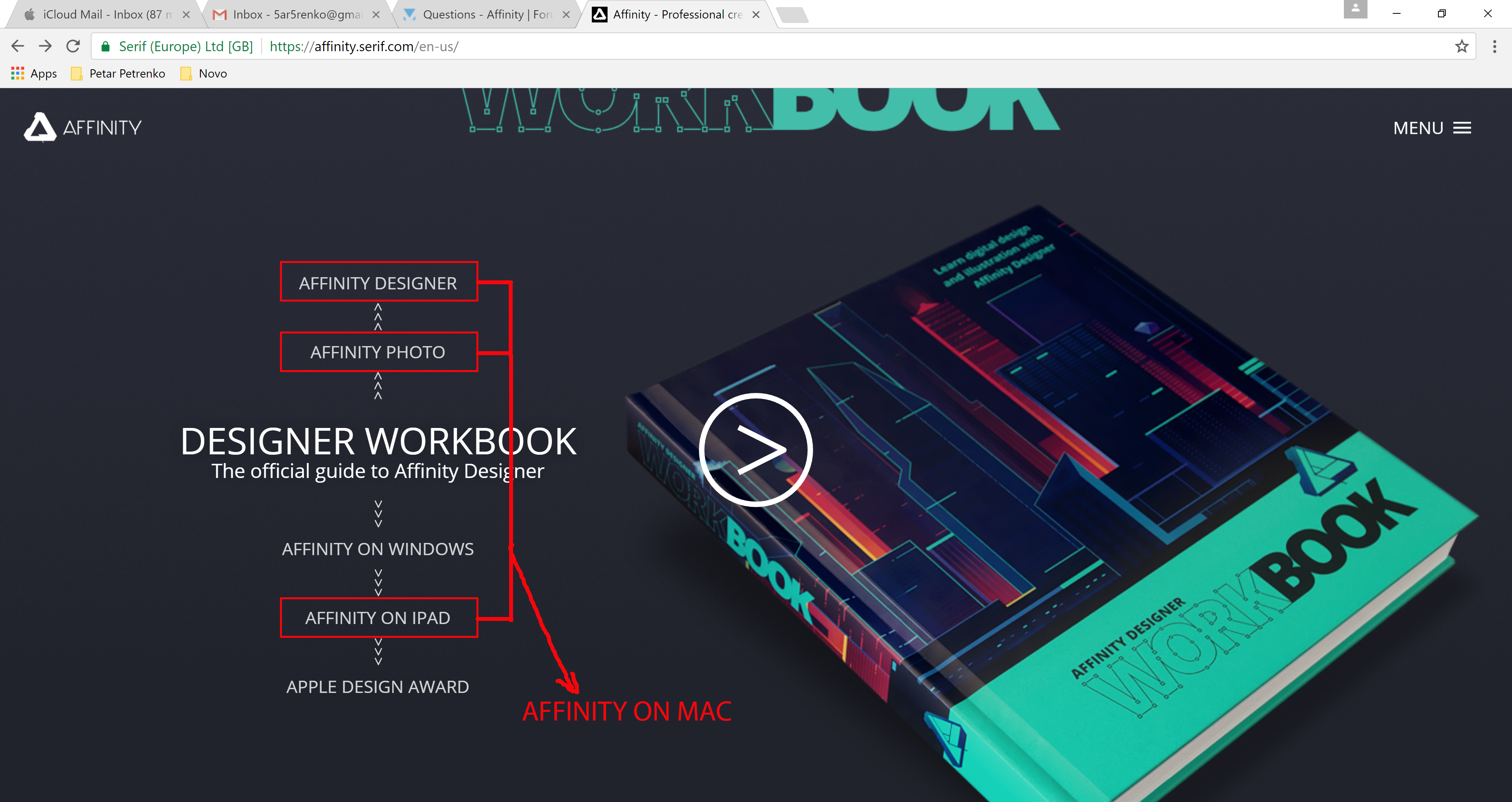
Just a suggestion. Because you already have a menu named "Affinity on Windows" then you should have an "Affinity on Mac" menu with titles like the ones in the attached file. Also, all workbooks should be under "Workbooks" menu?

-
But, it is the same app on different OS's. They can wait until both have the same features.
-
I think it would be much better idea if there is only one core app and you sell only personas, so everybody could choose what (s)he need for design. ;)
-
It would be nice if they come at same time. :)
-
How many features are covered in this book? All, 90%, 50%... just aproximatelly. BTW, I bought it and because it can't be delivered in Macedonia, I had to redirect it to Sweden (to my son's address). :)
-
Hi, would it be a good idea to remove standard colors and keep only globals one (Color system, of course)? They are much more practical to work with. Also, applying fill/stroke color with left/right click of the mouse. It is more obvious, faster and easy to remember, and most important -- anti Adobe way of work. :)
-
linking text boxes
Petar Petrenko replied to Fab's topic in Pre-V2 Archive of Desktop Questions (macOS and Windows)
If they continue to add Publisher features in Designer and Photo, then Publisher will become obsolete because it will be divided between the other two apps. -
linking text boxes
Petar Petrenko replied to Fab's topic in Pre-V2 Archive of Desktop Questions (macOS and Windows)
All the world is based on duality: you are with or against something. So, you can't "blame" people who love even Adobe. They must found something nice in it (I wonder what?). :) -
linking text boxes
Petar Petrenko replied to Fab's topic in Pre-V2 Archive of Desktop Questions (macOS and Windows)
I need to have arguments for that. :D -
linking text boxes
Petar Petrenko replied to Fab's topic in Pre-V2 Archive of Desktop Questions (macOS and Windows)
No one vector/bitmap based apllication hadn't (powerful) layout features when they started. And they need not any of them if the company offers separate layout app. It was OK for Freehand because Macromedia didn't have other kind of apps. What Adobe does is insane. Soon they will have three separate apps with same capabilities but with different approach. You can't work the same way with text in AI, ID and PS. And this is same with other features. PS has some text effects that even ID doesn't have. This is very stupid. And what if I use 3D modeling app? Do I have to ask Affinity to add such features in AD or APh because they are essential for my design work? And they must have it to be Maya or 3D Max killer? So, it would be better if pixel feautures are left to Photo, vectors to Designer and text and layout to Publisher, or much better -- only one app (yes, I know you don't agree). Separate apps with mixed features can lead to many mistakes and problems. -
linking text boxes
Petar Petrenko replied to Fab's topic in Pre-V2 Archive of Desktop Questions (macOS and Windows)
It would be better if both versions, Mac and Win come out in same time. -
Well, you shall inform the printer what you've done. Sometimes I use the same workaround even I use InDesign. :)
-
In that case, resize the document for the size of the bleed, and use margins as bleed markers. E.g. document original size: 100x100 units resized document: 106x106 units set margins to 3 units on all sides.
-
Just use guides instead of rectangle.
-
InDesign uses guides for bleed (and slug), so they are, by default, non-printable.
-
Hey, it was very fast since last update. Thank you very much. Can I say that we are counting days for the final version?
-
TonyB wrote: Please find below the current feature roadmap for Affinity Designer. The list is a selection of features from our own internal roadmap we would like to share with our users. If a feature you would like isn't on the list then feel free to create a new post so everyone can discuss it. We read all the feature suggestions and consider each one very carefully. The idea is the list will never get longer. As we complete and release features then we will replace those features with new ones. But, there are still not new ones.
-
In InDesign there is a toggle "w" to show/hide the pasteboard. Is there anything similar in Designer/Publisher (in the future)?
-
Thank you gdenby. I didn't expect the the discusion will take this way, but I am glad. I learned something new just starting with an "ordinary" question.
-
Once, I used to scan books that contained gold colors and analize them in PS. So, PANTONE is not the only way to find gold color definition. In the other hand, experience has a big influence in defining colors to fit yours expectations. Anyway, thank you for your answer.
-
Once, I used to scan books that contained gold colors and analize them in PS. So, PANTONE is not the only way to find gold color definition. In the other hand, experience has a big influence in defining colors to fit yours expectations.
-
Have you read my post #1?