Dr. Bunsen
-
Posts
4 -
Joined
-
Last visited
-
 Tom Lachecki reacted to a post in a topic:
Canva
Tom Lachecki reacted to a post in a topic:
Canva
-
Dr. Bunsen reacted to a post in a topic:
Canva
-
Dr. Bunsen reacted to a post in a topic:
Canva
-
Dr. Bunsen reacted to a post in a topic:
Canva
-
Dr. Bunsen reacted to a post in a topic:
Canva
-
Well said, I share your sentiments, especially at how this thread has been derailed with personal attacks on both the Serif employees and those with differing opinions from the vocal dissenters. I particularly appreciate Ash's contributions, and the patience shown in letting this thread rumble on as a shock/anger venting mechanism for many, when so many other companies would have shut it down. Quite frankly, some growing up is required. Worth bearing this in mind: For the past few years, the Affinity products have been great for me, for what I do, and have been incredible value. I've trusted the Serif team in that time and they haven't let me down; I'm willing to trust them going forwards too.
-
Dr. Bunsen reacted to a post in a topic:
Canva
-
Dr. Bunsen reacted to a post in a topic:
Canva
-
Dr. Bunsen reacted to a post in a topic:
Canva
-
Tom Lachecki reacted to a post in a topic:
Canva
-
Dr. Bunsen reacted to a post in a topic:
Canva
-
Dr. Bunsen reacted to a post in a topic:
Canva
-
Dr. Bunsen reacted to a post in a topic:
Canva
-
I looked in yesterday lunchtime and was saddened by the tone of the comments. I understand the concern over the potential for a move to a subscription model, but not at all the aggressive and confrontational way in which it has been articulated. Today's clarification is much more reassuring. Remember: change is the only constant!
-
Thanks Bruce. Yes, I agree that page looks cluttered as it is, but it was an example of both types of image/caption arrangements that I'm juggling. I could delete one side image but still the general 'how to handle repeated re-flow gracefully' question remains. I've started adding image placeholders so that the text is re-flowed around them once, the idea being that I work through a section (chapter) at a time and take the hit of disrupting and fixing any current image layout now on the assumption that the use of placeholders will reduce the ongoing work.
-
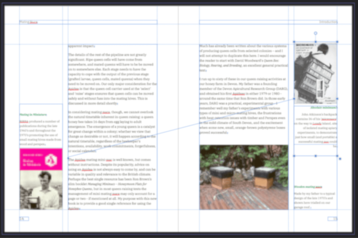
Hello all, First post, be gentle! I'm laying out a textbook I'm writing, combining text with a library of images I've built up on the topic. I'm at the stage where I need to bring the text and images together to finalise the sequence and the text, describing features and procedures shown in the images. Not a publishing professional, but have experience of laying out brochures, newsletters, and booklets over many years. I started with DTP in the 1980's by teaching myself Xerox Ventura in order to lay out a monthly association magazine. Really impressed by Publisher. For the bulk of the content, I've chosen a page layout with text in a 2/3 width inner column closest to spine, with a 1/3 outer column left blank. Images are generally inserted either in the outer 1/3 (caption above/below) or inner 2/3 (caption in the outer 1/3), as shown below. I know there are feature requests outstanding for caption handling. Currently I'm grouping the image with its caption (image wrap set to 'jump') then floating the group with the text. As text is added and sections re-ordered, I am being tormented by having to re-arrange images and captions as they are retaining their previous relative positioning as the text moves, often throwing them off the page, or putting image/caption over a facing page and disrupting text flow there, etc. Using sections for chapters is containing the re-flow issues to an extent, but still these sections are tens of pages. Is there a better way of handling the images? Thanks