smadell
-
Posts
1,151 -
Joined
-
Last visited
Everything posted by smadell
-
 1) Make sure you have “Dither Gradients” turned ON in Settings > General 2) Make sure your document is set to 16 bits. This sort of color banding is really common with 8 bit gradients.
 -
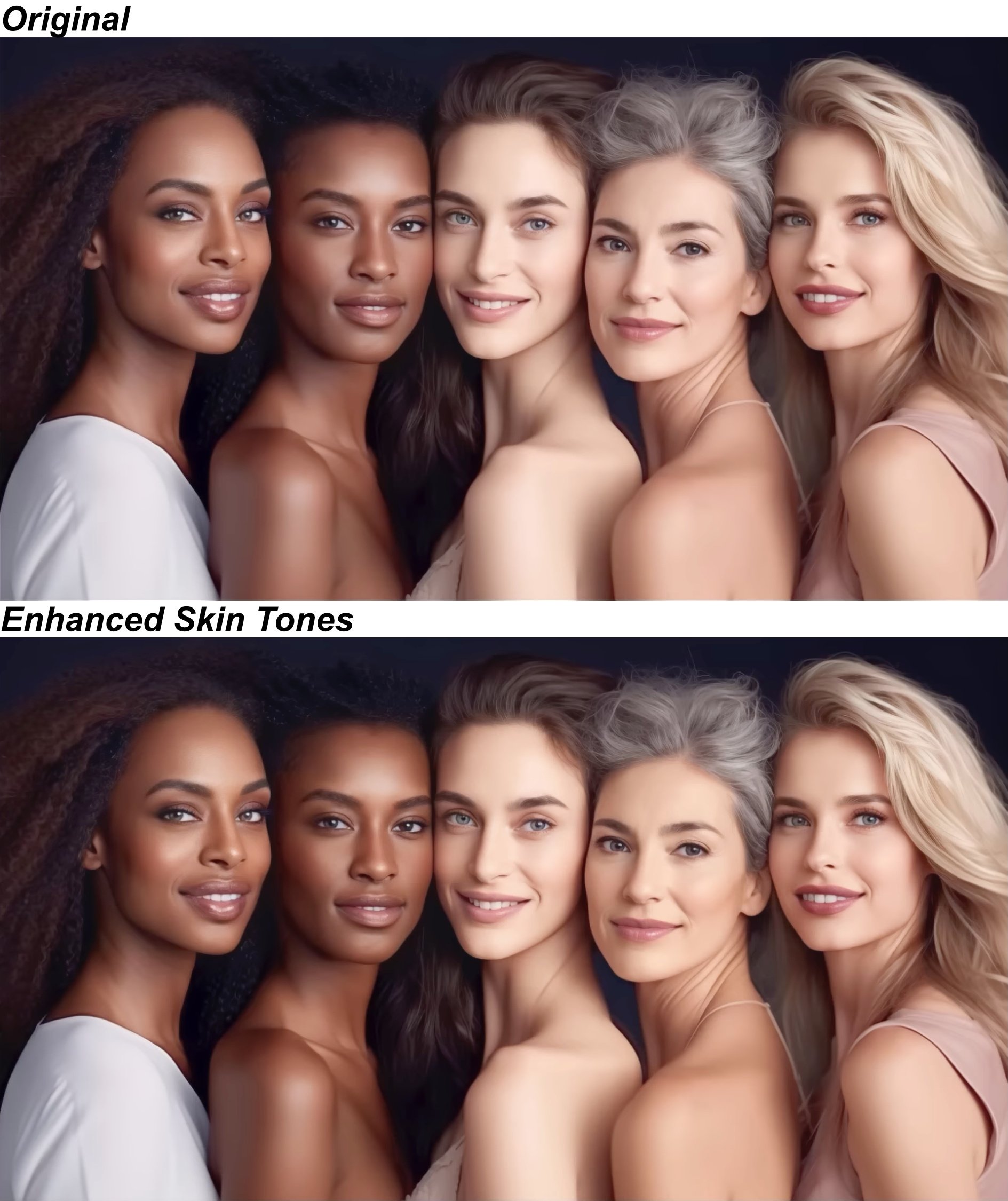
The examples above may just be too subtle. Here's' another photo with Original and Enhanced Skin Tones versions. The results may be a bit more obvious.

-
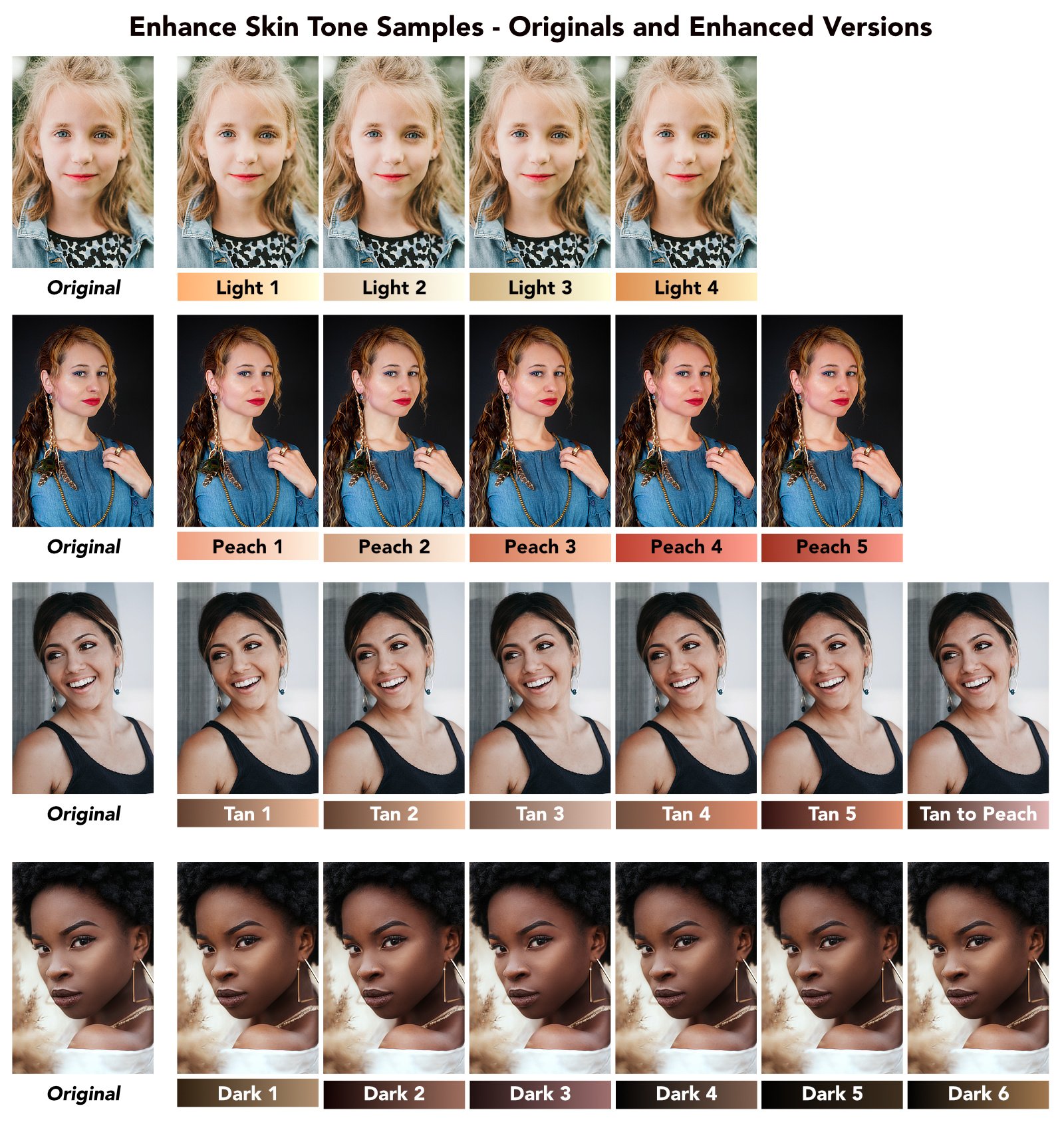
I have attached a macro category called "Enhance Skin Tones." This is a free download which will help add color and tone to the skin of your portraits. There are 21 different enhancement macros included, grouped for Light, Peach, Tan, and Dark skin. These macros are meant to enhance, not replace, skin colors. The macros are all based on the use of Gradient Maps, and use different dark and light colors along with setting opacity and blend mode for each adjustment. While the skin tone macros are grouped into Light, Peach, Tan, and Dark skin groups (roughly corresponding to Caucasian, Asian, Hispanic, and African coloration) they are certainly not exclusive. You may want to experiment using the adjustments from any (or all) of the groups to add different coloration and tone to your underlying portrait. The Light and Peach skin tone macros add a gradient map and set its opacity to 25%. The Tan skin tone macros set the opacity to 30%. The Dark skin tone macros set the opacity to 40%. All of the macros set the blend mode of the gradient map adjustment to Soft Light. You should also experiment with changing the opacity and blend mode of the adjustments, as these will create different effects that you might like. Try using blend modes such as Overlay, Linear Light, and even Multiply. The results can be subtle, but changing the default settings can often make them fairly dramatic. An important note: the macros work best when you have the skin selected prior to invoking the macros. This ensures that the gradient map adjustment uses your selection as a mask, and applies the changes to the skin only. As with all layer masks, however, you can edit the mask (by painting on the adjustment layer in black or white) after the fact. Here is a graphic that includes 4 portraits (labelled as Original versions) along with versions of each of the 21 different skin tone enhancing macros. The enhanced versions are all based on the default settings for the respective macros. Under each example is the name of the skin tone macro used, along with a gradient representing the dark and light colors used in the gradient map adjustment. Remember that these results look very subtle, but your results can be more dramatic simply by increasing the opacity slider. The attached macro category was created in Affinity Photo 2, and probably will not be compatible with version 1. It is a category and therefore should be imported into the Library panel (using the "hamburger menu" at the panel's top right corner). The category includes the 21 skin tone macros, but also includes a macro called "Try All Skin Tones" which will create a group (with sub-groups) that includes all 21 adjustments so you can try them all to see which one you like. There is also a macro called "Instructions - Enhance Skin Tones" which will display on-screen instructions for using the macros. These instructions are placed in a separate layer which you should delete after having read and understood the instructions. [These macros are loosely based on some of the gradients used in a recent YouTube video by Blake Rudis, whose f64 Academy channel has been quite helpful (especially for matters concerning color grading). Blake's videos are exclusively aimed at Photoshop users, but the methods he uses are almost always compatible with similar methods in Affinity Photo. So, a big thank-you to him.] As with all of my Resource uploads, these are the work of 1 person working on 1 computer. I do not pretend to have tested them extensively, but I believe they will function as they are supposed to. Try them and see if they work for you. If they do, they are free for your use without restriction. I have always encouraged users to "pay it forward" and help others in this forum as they themselves become more knowledgeable and adept at using Affinity Photo. This is how knowledge and good will spreads. Enhance Skin Tones.afmacros
-
The best way to do this would be to use the Mesh Warp tool (or Live Filter). I’ve attached a screen grab (from 2019) which shows the use of the “tool.” You can also use a Live Filter layer version of this now, which is non-destructive. Un-Curve a Horizon.mp4
-
I also took a stab at this. I'm attaching a JPG and the .afphoto file. I addressed the face, ignored the background, and took some of the darkness and contrast out of the shirt. Like @v_kyr said, pulling detail out of the existing shirt is not going to be possible without some type of AI tool – it's just too blurred. I first made the photo black and white, and worked from there. At the end, I added a very slight color grade to give it back some of the original color cast. See what you think. vpkumar edit.afphoto
-
Performance M2 Max isn't good enough
smadell replied to deeds's topic in Feedback for the Affinity V2 Suite of Products
Good morning, @v_kyr. I'm out of my league trying to talk about programming, but (1) it certainly seems as if getting Metal support right should be high on Serif's list; and (2) the issues I'm having largely must come down to memory management, since the lag seems to accumulate over time, and seems to clear up incrementally as I close windows or restart the application. Everything I've read (though not really understood) about "memory leaks" indicate to me that that's what happens with flawed memory management. -
Performance M2 Max isn't good enough
smadell replied to deeds's topic in Feedback for the Affinity V2 Suite of Products
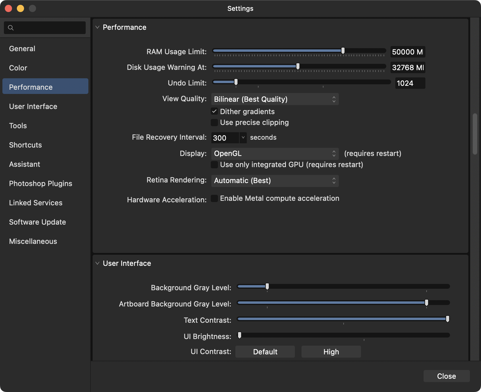
Hi, @Callum and @deeds. I need to add my voice to this choir. I have had ongoing issues with lagging in Affinity Photo, and it seems to be worse in version 2. I am shooting with a Nikon Z7ii, so I am creating 45 MP images. I normally develop the raw files in Capture One, and use Affinity Photo to finish up using TIFF's exported from Capture One. Response time from AP suffers (sometimes greatly) if (i) there is more than 1 document open at the same time, even as few as 2 or 3 will slow things down quite a bit; (ii) virtually ANY use of live filter layers slows responses down to a crawl, even if only 1 or 2 are used in a document; (iii) longer editing sessions, on the order of 30 minutes or more, show degradation of the response time as the session gets longer. I just recently purchased a Mac Studio with an M2 Max, 2 TB SSD, 64 GB of RAM, and am currently using macOS Ventura 13.4. I am running version 2.1.1 of Affinity Photo, which is the most recent available retail version. I am including a screenshot of my Performance settings, as you requested of @deeds above. Please note that I have turned Metal compute acceleration OFF, and have turned the Display to OpenGL (instead of the Metal option). These settings are definitely better, as using Metal in ANY capacity slows things down to a crawl and makes me want to tear my hair out. But, still, the lag seems to get worse and worse over time, and is really annoying with any documents that introduce any real degree of complexity. I am not tech-savvy enough to even guess what to do next. Do I turn off system stuff that runs in the background (things like Dropbox, Little Snitch, etc)? I'm not at a point where I want to toss Affinity Photo and try to find something else; I am way too invested in AP and way too happy with everything about it other than its speed. I eagerly look for suggestions.
-
COMPOUND MASKS IN PHOTO 2
smadell replied to Starchy97's topic in Affinity on Desktop Questions (macOS and Windows)
oops… -
COMPOUND MASKS IN PHOTO 2
smadell replied to Starchy97's topic in Affinity on Desktop Questions (macOS and Windows)
Your Compound Mask is not masked to the adjustment. Drag the compound mask layer over the thimbnail of the Curves layer. That should get you the desired result. -
Photo - Batch/Macro Features
smadell replied to Phil360's topic in Feedback for the Affinity V2 Suite of Products
The Tone Mapping persona is, as you note, a no-go for macros. But, you can move layers, using any of the commands in the Arrange menu. Specifically, menu choices like Move Forward, Move Backward, Move Inside (to put a layer inside a group) are accessible and can be very helpful. -
Talk about "too much information"! I assume (since you are thinking about moving over from Photoshop) that your Affinity application of choice will be Affinity Photo. And, to answer your question in the simplest manner, what you want to do is exquisitely simple. You can start Affinity Photo with the "sublime" and progress all the way to "the ridiculous" (not really ridiculous, but AP is certainly capable of things such that no single person would need all of them). Since a picture's worth a thousand words, watch this… Simple Edit.mp4
-
They haven't, but a Keystone filter (on its own or, perhaps, as an addition to the Perspective filter) would be wonderful. Even it only handled a pair of verticals or a pair of horizontals, that would work well. If, in addition, such a keystoning filter could apply itself as a "percentage" of the stated correction (in order to leave a little bit of keystoning in order to look more natural) that would even be better!
-
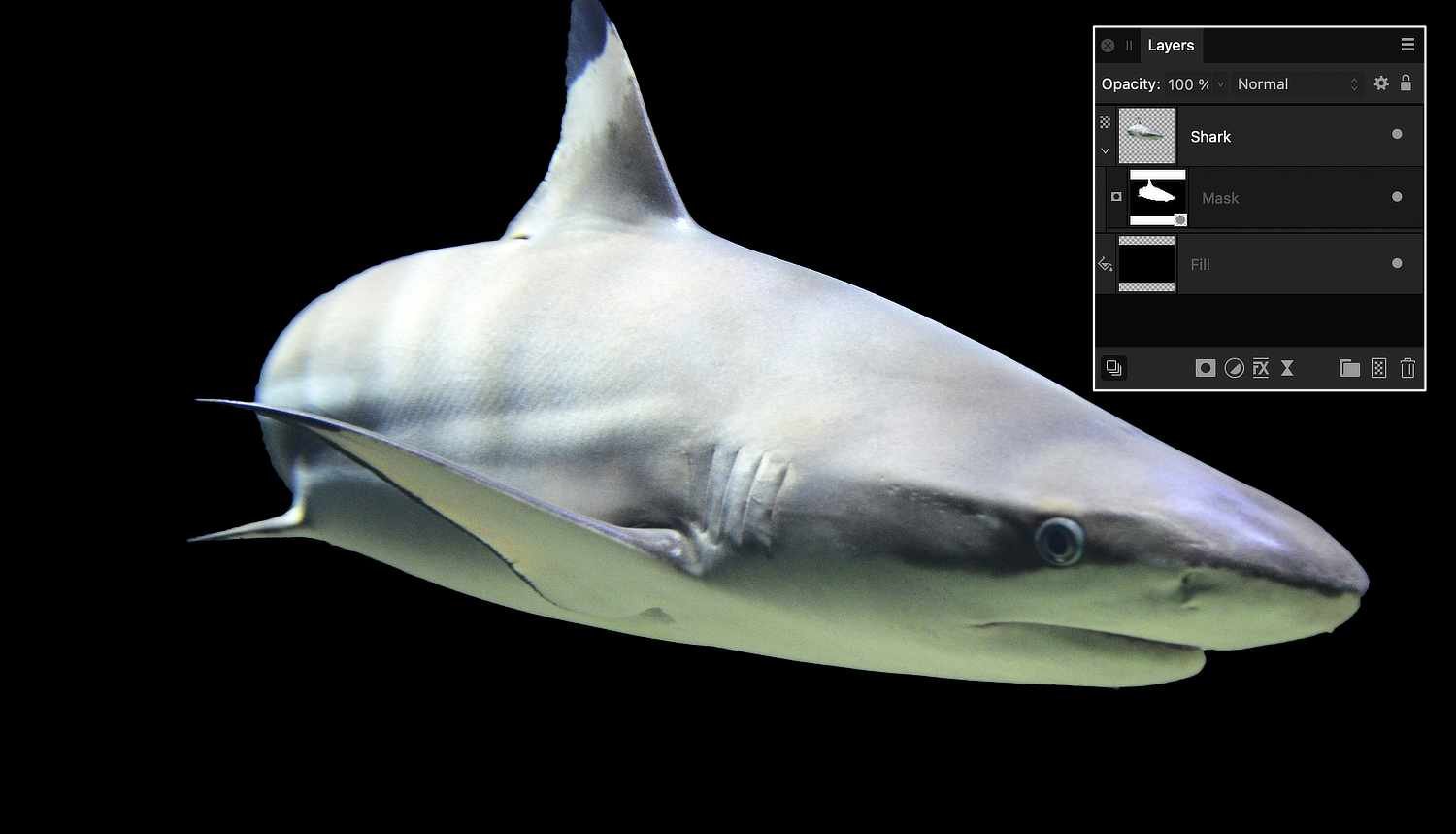
No need to apologize at all! Masks are tough to conceptualize. Here's a few suggestions. (1) If you want a cut-out photo on a background (like a shark on an otherwise black background) put the shark on top and attach the mask to the shark layer. (2) Instead of a black Pixel layer, put a black Fill Layer on the bottom instead. A Fill Layer is basically a vector object, and takes much less "overhead" to compute. Instead of putting millions of individual black pixels down there, just tell the layer to fill itself with a single color. Here's a sample of the layer structure you might want to consider:
-
Black is “revealing” the pixel layer underneath because it conceals the layer to which the mask is attached. That’s what it’s supposed to do!
-
Brush Outline Cursor disappears during Refine Selection…
smadell replied to smadell's topic in V2 Bugs found on macOS
@Callum Thanks for responding. I never noticed that behavior in version 1 (although I just looked at my copy of v1 and it does, in fact, act that way). I for one much prefer the behavior that @Return demonstrates. Chalk it up to faulty memory, I suppose, but alternating between the arrow cursor (while over the settings dialogue) and the brush cursor (when over the canvas) would certainly be preferable. -
This was not a problem in Photo v1, but is a current problem in the latest retail version (2.1.1) and the latest beta version (2.2.0 build 1903) of Affinity Photo. During a Refine Selection operation, the brush outline can be made to revert to an arrow if the user clicks anywhere (I think) other than dirrectly on the image. Once a selection has been made (I have done this with the Selection Brush and by invoking a selection stored as a Spare Channel) and clicking the Refine button, the cursor appears as a thin round circle which indicates the size of the brush stroke to be used. This is the behavior I am used to, and the one that makes sense. However, if the user clicks anywhere else (for instance, using the mouse to reposition the Refine Selection dialog, which is frequently necessary) the cursor immediately turns into an arrow. The cursor will not respond to resizing commands (such as with the left and right square bracket keys) and there is no indication of the size of the brush stroke to be used. This situation corrects itself once the first mouse click is made on the canvas, but of course by then it's too late. Also, any subsequent mouse click off the image (e.g., to reposition the Refine Selection panel again) once again reverts the cursor to an arrow. A screenshot video is attached. My system: Mac Studio with M2 Max, 64 GB RAM, wired Kensington mouse, Apple Studio display, macOS Ventura 13.4 Photo Performance settings: Hardware acceleration OFF, Display set to OpenGL, "Use only integrated GPU" is UN-checked. Wrong Cursor during Refine Selection.mp4
-
This was not a problem in Photo v1, but is a current problem in the latest retail version (2.1.1) and the latest beta version (2.2.0 build 1903) of Affinity Photo. It involves an incorrect cursor that occurs immediately after the Picker button is chosen in several of the adjustment panels. I have attached a video screenshot showing this behavior. In short, in (at least) the White Balance, HSL, and Curves adjustments, clicking in the "Picker" button leaves the cursor set to an arrow instead of the more appropriate crosshair. In all of these cases, the cursor is drawn correctly once a mouse click is made. However, the incorrect cursor is shown from the time the button is clicked until the first click is made on the image. My system: Mac Studio with M2 Max, 64 GB RAM, wired Kensington mouse, Apple Studio display, macOS Ventura 13.4 Photo Performance settings: Hardware acceleration OFF, Display set to OpenGL, "Use only integrated GPU" is UN-checked. Wrong Cursor after Picker.mp4
-
I wanted to keep my aperture tight (for depth of field purposes) and my ISO low. I took a few series of shots like this that day. This one had 15 stacked images; another used 35 images. The more images in the stack, the smoother the result. Also, on that particular day there were very choppy waves, so smoothing all that out required more images in the stack. If I had used a longer exposure, I could have relied on fewer images. The number of images-to-smoothness ratio would have changed significantly!
-
As another example, I was in Daytona Beach last year and did not have an ND filter. I wanted to take some "long exposure" photos at the shore. For this particular shot, I put my camera on a tripod and took 15 exposures similar to this one (below). It was taken at f/22, ISO 64, and 1/40 second. So, nothing fancy about the camera settings. Later on, at home, I stacked all 15 photos (used "Mean" as the mode) and did some extra editing to soften it up. The result is nice and "creamy smooth" and I was really happy with it.
-
If you are trying to emulate an ND filter, stacking is your best option (setting the mode to Mean or Median). If you are taking 6 second exposures, your ISO is probably already pretty low, which would minimize noise. Also, the mere act of stacking multiple images would mitigate noise on its own. Long story short, turn OFF the camera’s Long Exposure Noise Reduction. If your camera has a built-in intervalometer or the equivalent, use it. Your goal should be to have as little time between exposures as possible. That should let you avoid the “clumping.” (Also, from past attempts at ND emulation with clouds, using more than 6 images is often better!)
-
Localizable Sentences and Esperanto
smadell replied to William Overington's topic in Share your work
That's really not a fair statement, William, since 32 of those replies are from you.- 59 replies
-
- 1
-

-
- affinity publisher
- affinity designer
- (and 1 more)
-
Localizable Sentences and Esperanto
smadell replied to William Overington's topic in Share your work
I hesitate to suggest that this post be “report(ed) to the moderators,” but it remains true that @William Overington has posted quite a number of times regarding so-called “Localizable Sentences” and I have never quite understood why. 1 These sentences seem to be not appreciably different from simply writing in any foreign language. Although this “language” is written in graphic symbols rather than alphanumeric glyphs, why invent a new language when there are so many others that would suffice? 2 The OP is consistently the author of the majority of the posts in any of these threads. Often, days or weeks go by with only post after post from him alone. 3 I am baffled by the number of responses that these posts do generate. These graphically encapsulated sentences really don’t seem (to my mind) to have any significant benefit. Why not just write in English (or French, or Greek, etc.)? If I have to learn a new language to understand what is being written, why not learn an established language which is already spoken by many thousands (or millions) of people? 4 Most confusing of all, what does any of this have to do with any Affinity product? I apologize for seeming to disparage Mr. Overington’s obvious passion. I don’t understand its importance, but the list of things I don’t understand is quite lengthy indeed. Perhaps the only thing I would ask is that he explain (in “layman’s terms”) why the average Affinity software user needs to know about any of this.- 59 replies
-
- 4
-

-

-
- affinity publisher
- affinity designer
- (and 1 more)
-
I'm going to suggest that you start with your scanner's settings. If you are scanning black and white negatives, you can still save them as color TIFF files. Although this may seem like a contradiction, it will make subsequent use of Affinity Photo easier. I have an Epson photo scanner, so the screenshots I'm including are from that scanner. But, your scanner will probably have a similar ability. In my scanner, I can specify how to save the file that the scanner creates. Here are screenshots of two different settings. The one on the left will create a file that has a greyscale profile. The one on the right will create a file with a 16-bit color profile (even if the thing being scanned is only black and white). Once I have created these files, I can open them both into Affinity Photo. Now, look at the Context Toolbar. (Make sure the "Show Context Toolbar" is checked in the View menu.) The Greyscale TIFF file (whose settings are above, left) is the document whose context toolbar is on top, in the screenshot below. The Color TIFF file (above, right) has a context toolbar which looks like the one on the bottom. Note the red arrows, which point to the ICC Profile of the document as it is opened in Affinity Photo. If your image opens with a profile that includes the letters "RGBA" then you have a "color RGB" layer, and you should be able to open this image in the Develop persona without any difficulty. If your image opens with anything else (such as my greyscale scan, which is noted to be a "Grey/16" file) then you must use the "Convert Format/ICC Profile…" choice from the Document menu. Choose that menu choice, and then choose "RGB/16" (or RGB/8 or RGB/32) from the dialog box that opens. Once you do that, your document should now be a color document, and the layer which includes your scanned image should open into the Develop persona.
-
Buying a new Mac Studio
smadell replied to smadell's topic in Affinity on Desktop Questions (macOS and Windows)
Some really cogent advice, @v_kyr. Thank you. I’m almost certain that my purchase will go as follows: M2 Max Studio with 30-core GPU - the possibility of increased performance in Affinity Photo would seem to be marginal, at best (extrapolating from the video you referenced) and the benefit in Capture One sounds to be non-existent. 64 GB of Unified Memory - Going up to 96 GB of memory would require me to upgrade to the 38-core GPU. That’s an added expense of another $1,000 and I have serious doubts as to whether that kind of upgrade would result in a palpable benefit. 2 TB SSD Storage - I toyed with the idea of bumping my SSD storage to 4 TB, but I can always add an external SSD without too much of a speed downgrade. Guessing at a lifespan for the computer and amortizing the cost over that lifetime might make good financial sense, but my goal is simply to put my money toward a machine that will improve my day-to-day enjoyment without feeling like I flushed that money down the proverbial drain. And, since I am in this for my own enjoyment (and not for income) I will leave the amortization tables to those for whom they make more sense. Thank you so very much for your help. I think I’ll be online tomorrow morning, putting my order in! -
Buying a new Mac Studio
smadell replied to smadell's topic in Affinity on Desktop Questions (macOS and Windows)
Thanks for the rapid input, @v_kyr. Actually, if I upgrade to 38 GPU cores, I can then go as high as 96 GB of RAM. That sounds like overkill, but what do you think? (NB - I haven’t watched the video yet, but will do so in a bit! Thank you.)