Palatino
-
Posts
406 -
Joined
Everything posted by Palatino
-

AI -> AD2 -> SVG -> Fusion 360
Palatino replied to TheRazor's topic in Affinity on Desktop Questions (macOS and Windows)
These elements are already contained in the AI file.
-
Probleme mit Schatten bei Druck
Palatino replied to FeliM's topic in Affinity on Desktop Questions (macOS and Windows)
Es war schon immer eine gute Idee, eine Kopie komplexer Hintergründe vor der Weiterverarbeitung auf eine Ebene zu reduzieren – ohne Schriften und mit Anschnitt – natürlich. -
Layout Community?
Palatino replied to SusB's topic in Affinity on Desktop Questions (macOS and Windows)
That's all you need to know and it's perfectly logical from a typographical point of view. -
Layout Community?
Palatino replied to SusB's topic in Affinity on Desktop Questions (macOS and Windows)
That is correct. An example to show what else you can consider (a design grid is a science in itself):
-
Menü > Ansicht > Anschnittbereich einblenden
-
Yes, sometimes the border is annoying. Then I simply place a slightly larger rectangle than the page in the background colour under my graphic. And the border is gone. It really isn't rocket science.
-
Pixel layer v duplicate
Palatino replied to Davg's topic in Affinity on Desktop Questions (macOS and Windows)
I always use a new empty layer because then I can see exactly where I have inserted which changes. -
Affinity Designer bought in 2020
Palatino replied to Mat Duch's topic in Affinity on Desktop Questions (macOS and Windows)
The purchased programme is listed in the App Store under Purchases and can be downloaded again from there. -
It's exactly the same with the trackpad. But: The "character" works, while "paragraph" does not.
-
Affinity Photo - Adding to EPS
Palatino replied to Jsh's topic in Affinity on Desktop Questions (macOS and Windows)
Woe betide you if the file is (eventually) sent to a film plotter. -
Affinity Photo - Adding to EPS
Palatino replied to Jsh's topic in Affinity on Desktop Questions (macOS and Windows)
That won't work (the branch on which the eagle sits). Disassemble the red element into individual parts and the formerly transparent parts can be coloured white. -
Version 1.10.8 was released a week ago (App Store).
-
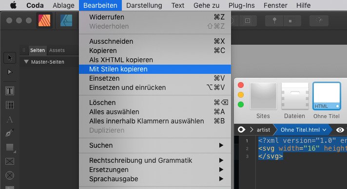
Designer vs Inkscape
Palatino replied to itgeek8088's topic in Affinity on Desktop Questions (macOS and Windows)
Open the SVG file in an editor:
-
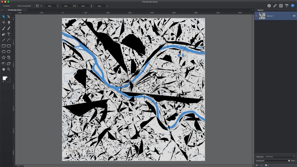
Designer vs Inkscape
Palatino replied to itgeek8088's topic in Affinity on Desktop Questions (macOS and Windows)
Oh yes, I've heard something like that before. 😇 -
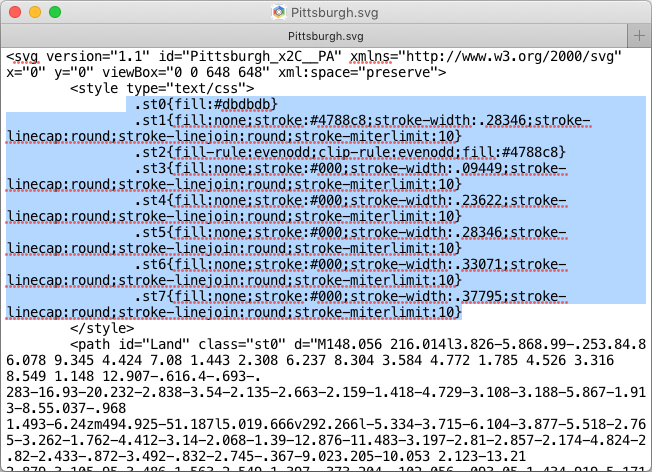
Designer vs Inkscape
Palatino replied to itgeek8088's topic in Affinity on Desktop Questions (macOS and Windows)
Just tested again - red bar. Never mind. For SVG files that cause problems, a check with the validator is a good thing. Boxy SVG and Coda can display the original file correctly, iDraw/Graphic cannot. The error is at least not exclusive to Affinity (if it is an error at all).
-
Designer vs Inkscape
Palatino replied to itgeek8088's topic in Affinity on Desktop Questions (macOS and Windows)
The svg file is corrupt: Sorry! This document cannot be checked. Rewritten with SVG Cleaner: OK Pittsburgh_cleaned.svg -
Farbabweichung beim Import
Palatino replied to zuiui's topic in Affinity on Desktop Questions (macOS and Windows)
Bildschirmfotos werden mit dem Profil des Bildschirms gespeichert und so auch von Affinity geöffnet, im vorliegenden Fall einfach nur „Display“. Vorschau sagt „Farb-LCD“. Zwischen Vorschau (Markierung) und AD gibt es tatsächlich auch einen Unterschied.
-
In principle, it can work. (That was actually already clear. Should have read more carefully.)
-
Enter button pressed?
-
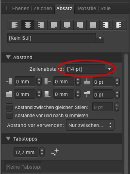
Paragraph spacing
Palatino replied to Margaret H's topic in Affinity on Desktop Questions (macOS and Windows)
I still don't understand the problem, but I remembered that I once had a problem with the line spacing because there was a fixed and wrong value:
-
Paragraph spacing
Palatino replied to Margaret H's topic in Affinity on Desktop Questions (macOS and Windows)
Shift and Enter? -
Virtual colour strips
Palatino replied to PeterBreis's topic in Affinity on Desktop Questions (macOS and Windows)
Bitteschön. Scaling: 100%
-
Frage 1 lässt mich an einen Anwenderfehler denken. 🙂 Zu Frage 2 schau dir mal diese beiden Diskussionen an:
-
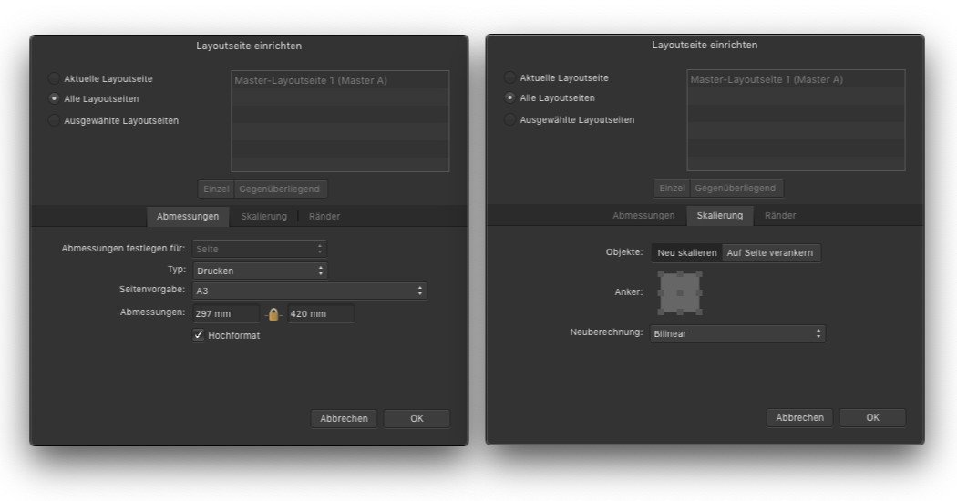
A4 to A3 conversion
Palatino replied to Plasmazone's topic in Affinity on Desktop Questions (macOS and Windows)
Like this and not otherwise (Master pages). Then check everything.