NoLongerHere
-
Posts
773 -
Joined
Everything posted by NoLongerHere
-
New Icons Too Similar
NoLongerHere replied to 000's topic in [ARCHIVE] Designer beta on macOS threads
Part of the reason is that graphic designers, especially tech ones, are sheep these days. One lot comes up with the latest fad and they all copy it regardless if it's any good or not. It didn't used to be that way. Having said that a few of those have been like that for ages and some make total sense. But I do find the current dumbing down of design really sad, it's just easy and quick. Saw this the other day, an old article and it makes realise, if you didn't already, what rubbish people are churning out now. https://theultralinx.com/2013/10/highly-skeuomorphic-icon-designs-incredible-detail/ There was another I saw comparing old versions of app icons with the current faddy ones, sad too. It's even more sad that all the UI/UX research shows the current flat fad is worse in every way. It must be horrible being a graphic designer at some of these companies. (sorry for all the sadness!) I've made Mojave a bit more pre-Yosemite, changing all the icons, traffic lights etc, and it's so much nicer. -
affinity designer Tin Toy, Rocket Racer (AD, finished)
NoLongerHere replied to NoLongerHere's topic in Share your work
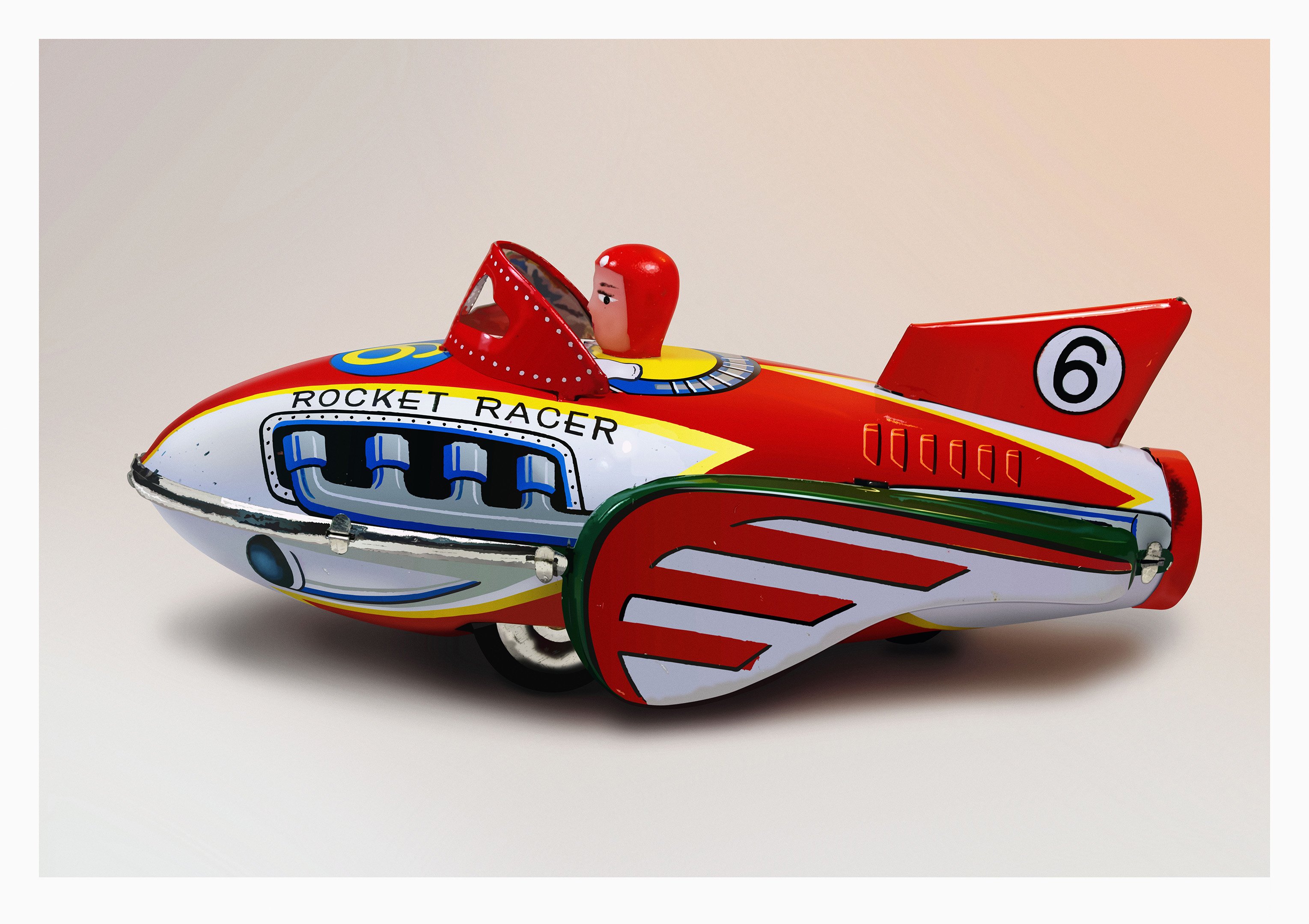
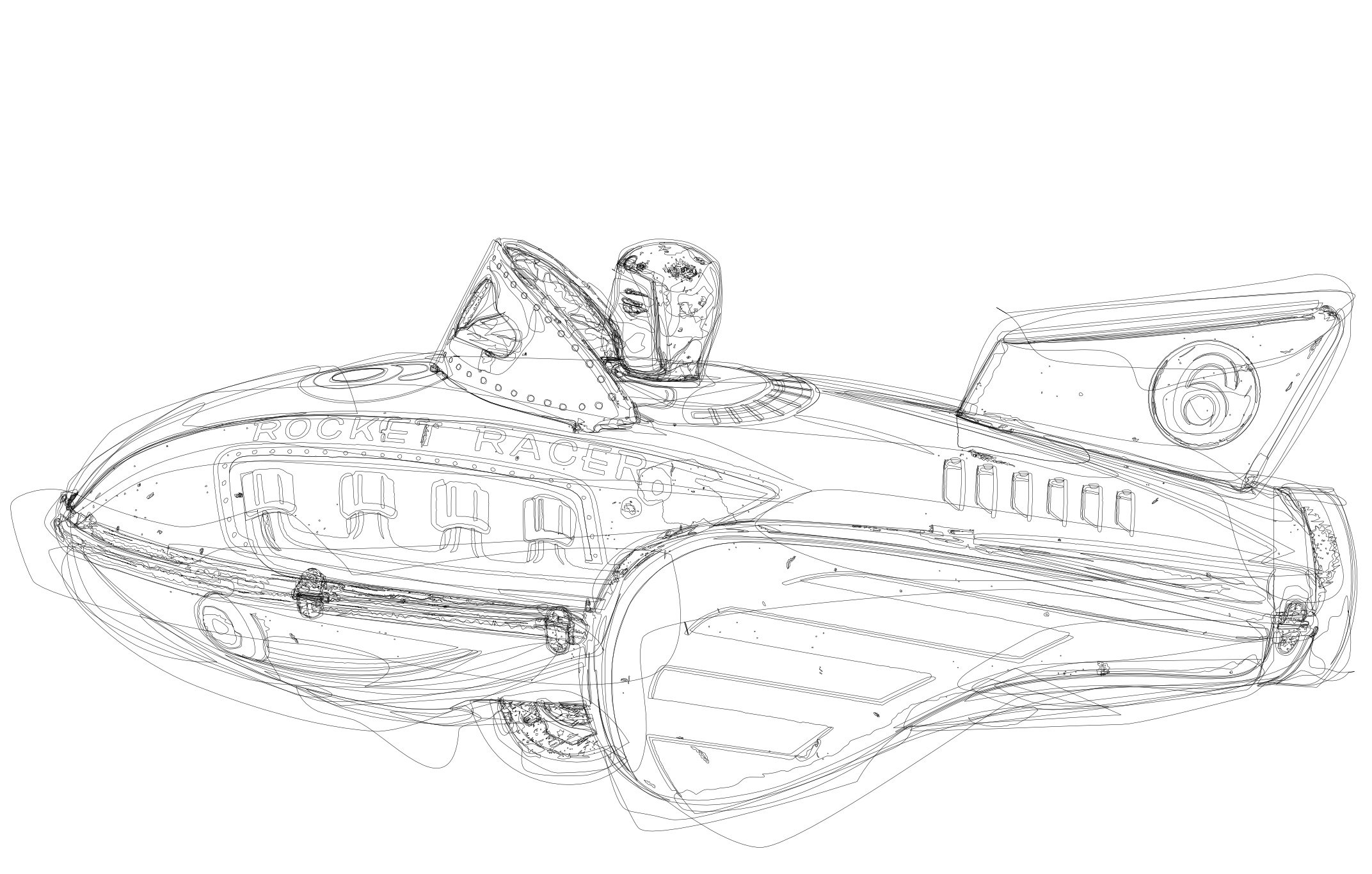
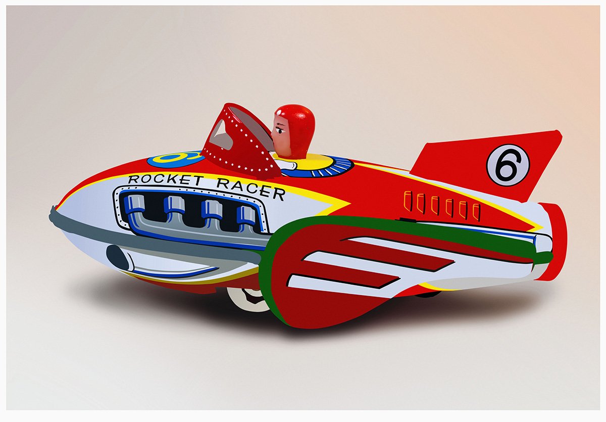
This is the finished version. I could have done more but it's pretty close, it's hard to tell between this and the reference in most places. The main difference is I didn't do the really strong reflections as I didn't like them. I added a little bit of film grain to the jpg and included a quite large version. I've also included the AD file so you can see how I organised it and in some places didn't. Rocket Racer AD.afdesign
- 28 replies
-
- 16
-

-

-
affinity designer Tin Toy, Rocket Racer (AD, finished)
NoLongerHere replied to NoLongerHere's topic in Share your work
If anyone want to try photorealism then pick something with a good size reference photo, bigger the better really and draw it large too, like A1 or A0. Something contrasty is easier than if parts of it merge together and sharp is also easier than blurred. Remember to do any corrections, levels etc, before starting and not realise later that you didn't. Even a fairly simple subject is quite a big job so think about that when picking something. Instead of a whole something you could choose to do a bit of that something that looks interesting. If you decide that you really, really want to do a face then a lady wearing makeup is far easier than a someone without. Makeup hides pores which is a big thing and makes areas more uniform and is why most realistic faces are ladies. You see many trying to do men or children and most end up looking like plastic because there's no texture or enough variation to the skin. There are no details too small to add if you want, well within reason. All the little bits that aren't too obvious all add to the realism. Nothing's just a plain gradient, there's always variation. An example is the 6 on the tail fin of the toy, you could do it as basically a stroked oval and a 6 and it would be roughly right but that's not how it really looks. Even though at screen size the little bits aren't obvious it is obvious when they're not there. I don't do much post processing but adding some film grain with Nik Color Efex Pro is worthwhile. Some add a little bit of chromatic aberration.
-
affinity designer Tin Toy, Rocket Racer (AD, finished)
NoLongerHere posted a topic in Share your work
I've not had time to play recently but sort of do now so decided I fancied doing a couple, possibly three, of tin toy illustrations. Something a bit different than I've tried before. I was going to post an in progress version and the completed one. I'm doing them A1 size, roughly 10k pixels wide. The first is a Rocket Racer tin toy with plastic pilot. I started with this one as there's a lot less to it than the second one and I'm a bit out of practice now. The pilot is done but the rest is just roughly flatted in. So now need do all the tweaks to the shapes, as none of the paint edges are clean in the real thing, and add all the bits of texture, highlights and shading.
- 28 replies
-
- 23
-
-
-
New Icons Too Similar
NoLongerHere replied to 000's topic in [ARCHIVE] Designer beta on macOS threads
I wasn't too fond of the previous ones but prefer them to these. Too low contrast and not exactly pretty (I'm being polite lol). At least they're very easy to replace on the Mac. Does anyone have the really old AD one, the original? Think it might have only been in the pre-release Mac beta, I can't find it or a link to the original beta to get it from. -
So you start off with more than one of each colour and have to remember to use the same swatch each time, not too hard in theory but bet you make a mistake. Then you make it worse by, say, redefining a blue to green and having some original green and some new green. And then what if you just wanted to swap blue strokes to green and leave fills alone? I'll let you do it that way but that's not my idea of fun. Plus, like I said, there's more to it than just colour changes. I use it for selections, opacity and stroke widths more than colour swaps, and that's why I count it as a fundamental tool.
-
So how many dupes are you going to have? That's not a realistic solution that would just end up as a mess.
-
That doesn't come close to the only reason why you select same... It's isn't all about changing colours, plus even if that's what you want to do then you often don't want to ruin your colour swatches and what if you want to change, say, blue fills but not blue strokes? Globals can help in a very limited number of cases. But often it's nothing to do with simply swapping a colour, I use it more for selections and stroke weights. That's why it's such a fundamental tool for a vector app and why it's so disappointing that's it's still not in after getting on for 5 years and seems it won't be in 1.7 either. This plus a list of other things and very little progress being made are making wonder if it ever will be a real AI alternative and whether I'll ever be able to switch to it for my work.
-
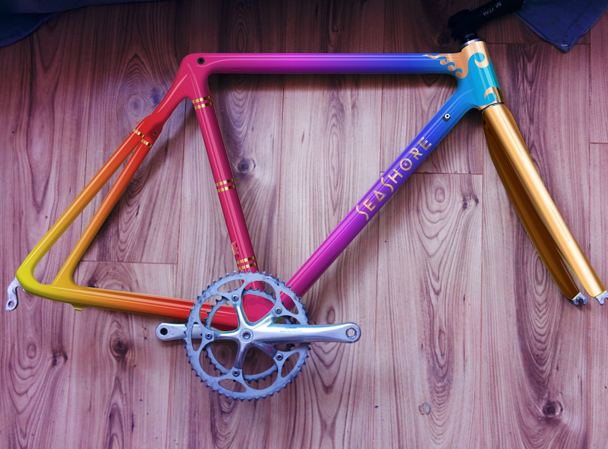
affinity designer Bike Frame Paint Templates (AD)
NoLongerHere replied to NoLongerHere's topic in Share your work
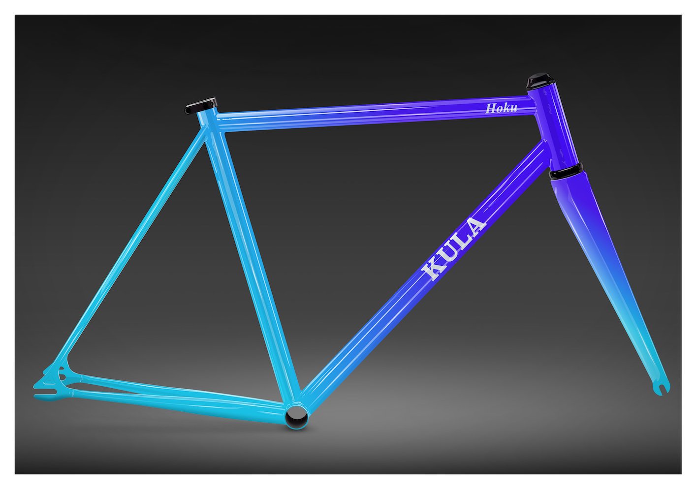
The same idea but mocking up a paint scheme for a frame he's going to work on this time using a photo.
-
That's good to know about SmugMug but there's no getting around how awful Yahoo/Oath are, breaches and lack of privacy. But everyone can use what they want. Anyway I've added a few of my AD car pics to the gallery for a starter, I can bore some new people with them!
-
Yeah Yahoo does suck and I don't have anything to do with them either. However SmugMug recently bought Flickr. Whether they're any more trustworthy I don't know but certainly can't be worse.
-
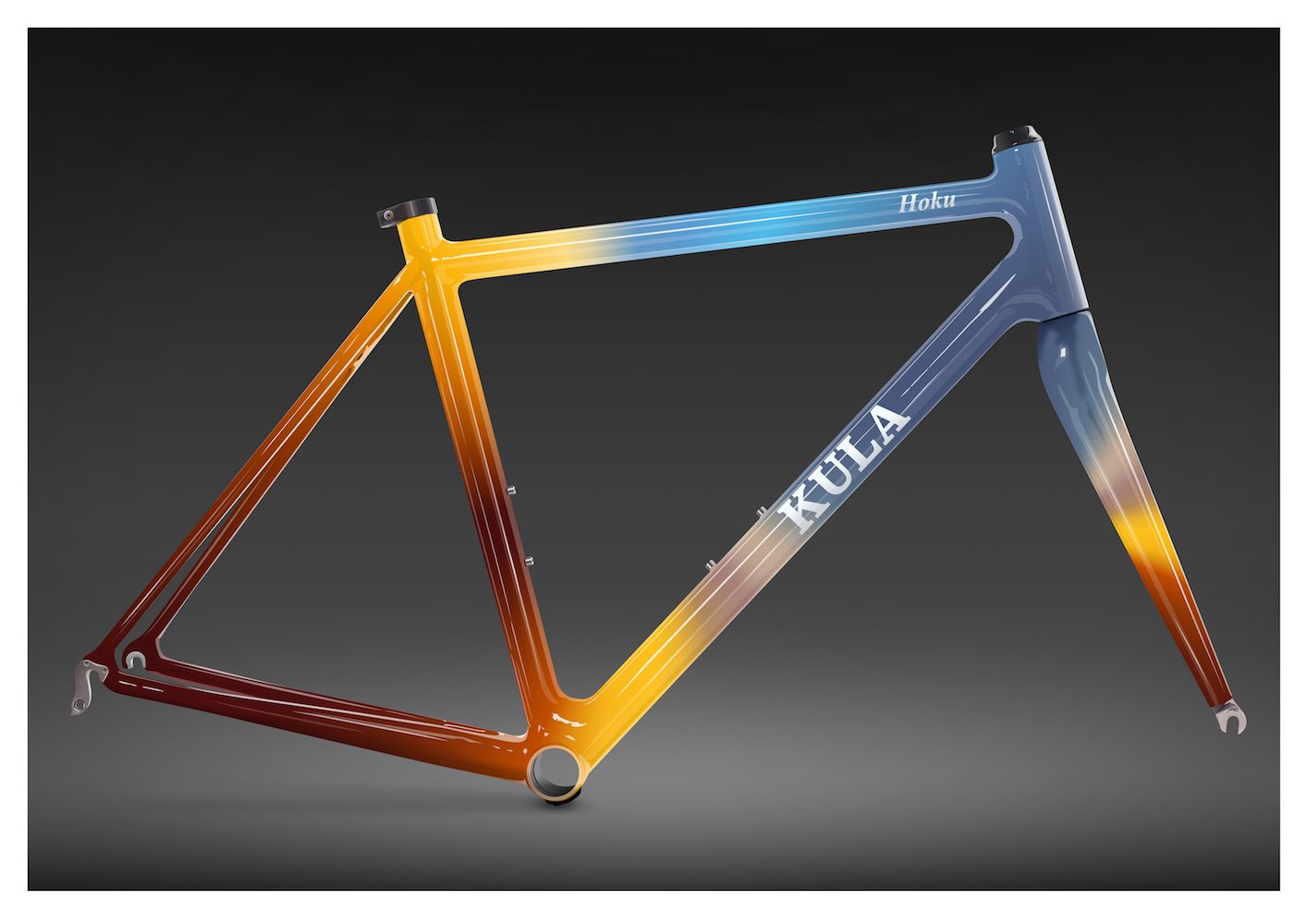
My brother's started to get in to painting bike frames and I thought it would be nice to create some templates that would show potential designs in a slightly more realistic way. Often it's just a flat drawing which doesn't give you quite the idea of what it would look like all finished and shiny. So here's the first two I've done, road/track frames with fairly random default paint applied. The highlights and shadows are blend modes so will work with any colours. They're not extremely detailed but enough to give you a better idea.
- 9 replies
-
- 19
-
-
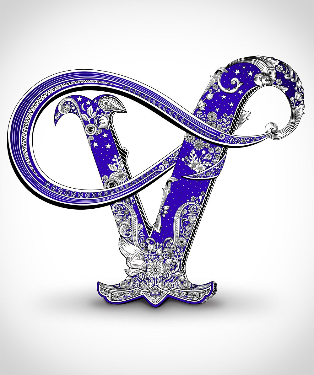
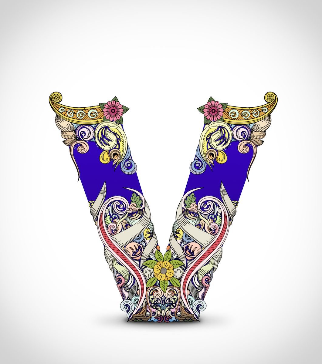
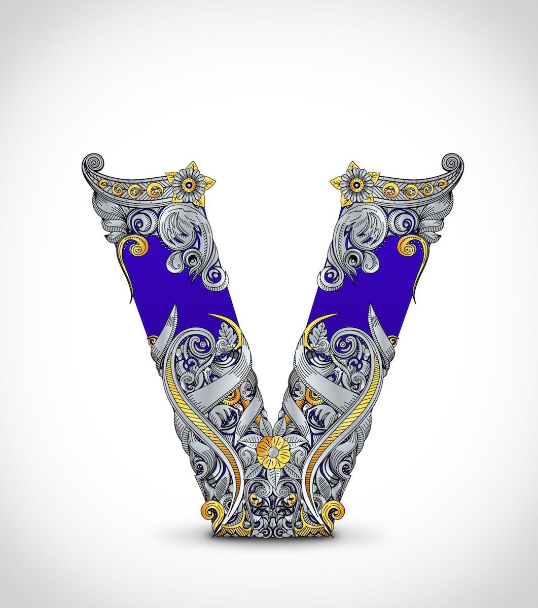
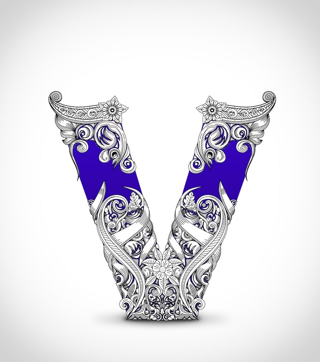
affinity designer Letter V is for Vector (AD)
NoLongerHere replied to NoLongerHere's topic in Share your work
Just some more messing around.
- 14 replies
-
- 23
-
-
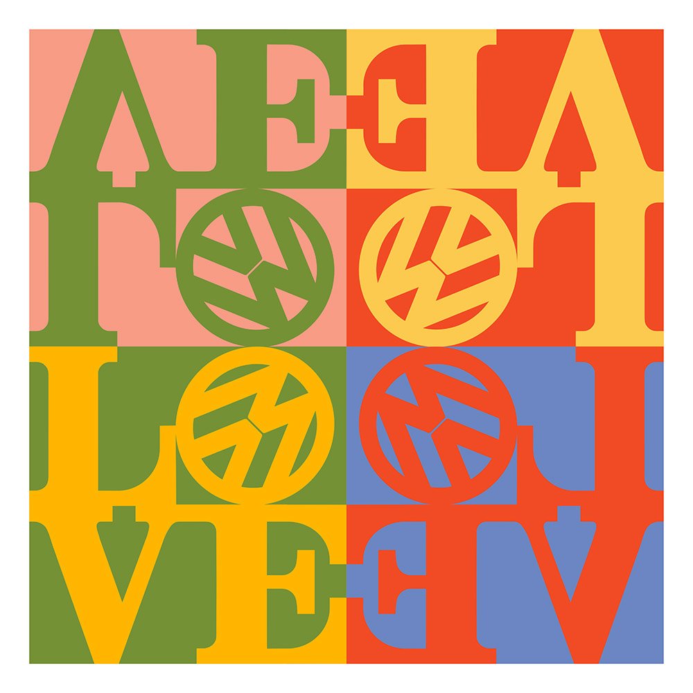
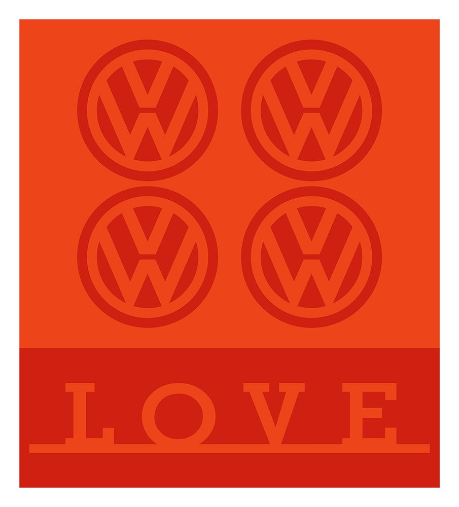
Just messing around. If you look it up people say to use the Clarendon Black font for the Love style. But it isn't really that close to what he used so I altered it a fair amount, it's not exactly the same but closer.
-
- 9
-
-
affinity designer Letter V is for Vector (AD)
NoLongerHere replied to NoLongerHere's topic in Share your work
Not seen those before,. Had to do a quick google and looks like they still make them. I do quite like the idea of trying to doing the whole alphabet, a bit fancier and more refined. But soon won't have time for play for quite a while, will be too busy with AI work, so will have to see. -
affinity designer Letter V is for Vector (AD)
NoLongerHere replied to NoLongerHere's topic in Share your work
I did try stippling instead of the purple section but it wasn't an improvement. I'll have a play with another V when I get the time. -
affinity designer Letter V is for Vector (AD)
NoLongerHere replied to NoLongerHere's topic in Share your work
Thanks, it's fun trying new stuff but I do need to have a look around at other works including engravings and improve as it's a bit crude and doesn't flow well enough. I'm not sure how it would look, I assume that's stippling? I'll try tomorrow if I have the time, another thing I've not done before (but that's one of a very, very long list). -
affinity designer Letter V is for Vector (AD)
NoLongerHere replied to NoLongerHere's topic in Share your work
I probably do too. It's not great but it's not something I've really tried before, will have to do some more practice. -
affinity designer Letter V is for Vector (AD)
NoLongerHere replied to NoLongerHere's topic in Share your work
Thanks. You could do that now as SVG fonts are starting to be supported, so you can can have colour, gradients etc. Would be quite fun but would need some planning to give them a consistent look. A quick go at colouring it.
- 14 replies
-
- 21
-
-
Or most things starting with V! Bit of a doodle, I was going to have it as a solid pattern but liked the look of sort of capping the top and bottom and leaving some background.
- 14 replies
-
- 31
-
-
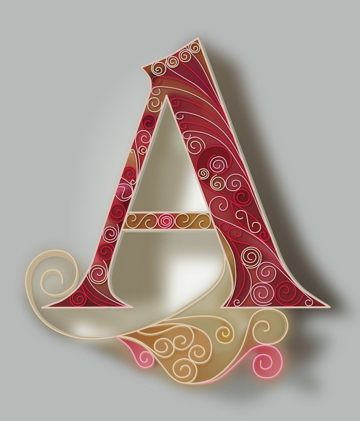
affinity designer Quilling, Letter A (AD)
NoLongerHere replied to NoLongerHere's topic in Share your work
It didn't take long I was doing it while listening to/watching DS9. I could have spent more time on it and add more detail and made a bit more 3d but it was really to see what it would look like. It's not complicated, or I wouldn't be doing it lol, It's only filling in a letter shape, I split it in to the outline and background and put the spirals and stuff in between. I was thinking about doing some stylised, arty letters but not sure yet. -
I wasn't in the mood to do any proper work this evening so was messing around and tried emulating quilling in AD with the letter A. As it was trying to copy hand curled paper it also meant I didn't have to get the curves or spirals perfect.
- 3 replies
-
- 22
-
-
It's all down to what you can do with it, nothing to do with which you're more comfortable with, it's not different enough to make a difference to comfort. One person's complex project AD might cope with whereas another person's it might not. If it copes with all your pro work then that's good (I didn't say that no one can do pro work in it), nice app and cheap, but you're not everyone. Think we're going around in circles, so will stop there.
- 161 replies
-
- 2
-
-
- subscription
- adobe
- (and 1 more)
-
It depends what I'm doing. Sometimes basic things like select same.... or transforms or offset path (don't think there's a workaround for negative offsets only positive), that I think should be in any vector app, all the way up to things like scripting. If I'm doing styles then only being able to have one fx per type can often be limiting plus AD has fewer fx's. A recent one was wanting to roughen the edges of objects, easy in AI, you have to do it by hand in AD. Then there's things when I'm creating icons that I don't think you can do in AD, like snap to pixel after you have, for example, resized (only snaps as you're drawing) plus the artboards/export works better for me in AI for icons too. It's a long list but it just depends what I'm doing, sometimes I'm not missing anything at all or probably wouldn't be using it. It's a bit sad how AD's progressing so slowly but they've decided on multiple apps and platforms which you can understand. So as it stands I mainly do stuff for fun in AD which is fine but AI isn't going anywhere.
- 161 replies
-
- 1
-
-
- subscription
- adobe
- (and 1 more)