VectorVonDoom
-
Posts
704 -
Joined
Everything posted by VectorVonDoom
-

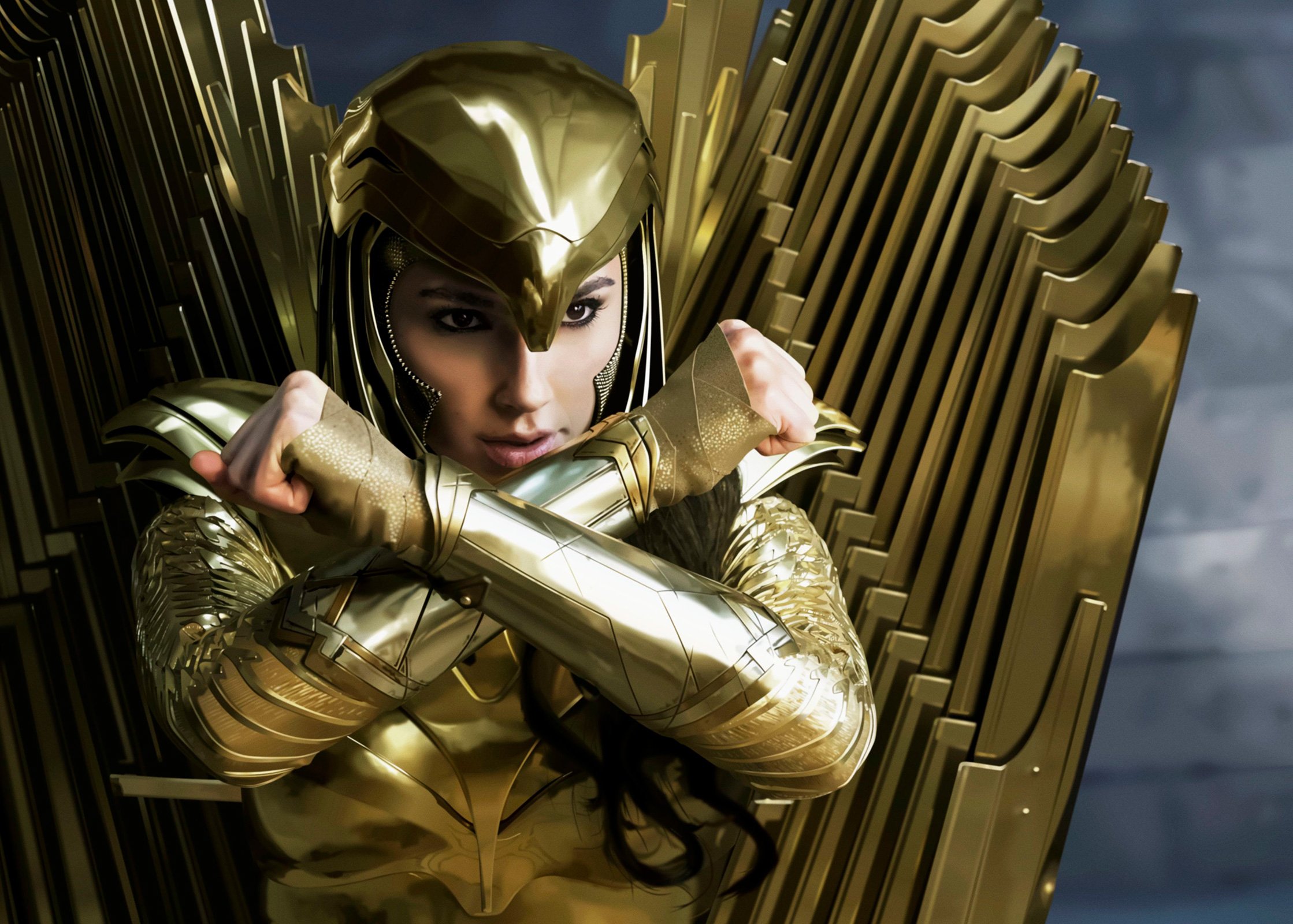
affinity designer Wonder Woman 1984
VectorVonDoom replied to VectorVonDoom's topic in Share your work
haha, I promise not to again, for a while at least. -
Illustrator image trace to AD or something else? When I need to do that the best I've found is Super Vectorizer but only for low'ish colours, usually does a better job than AI.
-
affinity designer Wonder Woman 1984
VectorVonDoom replied to VectorVonDoom's topic in Share your work
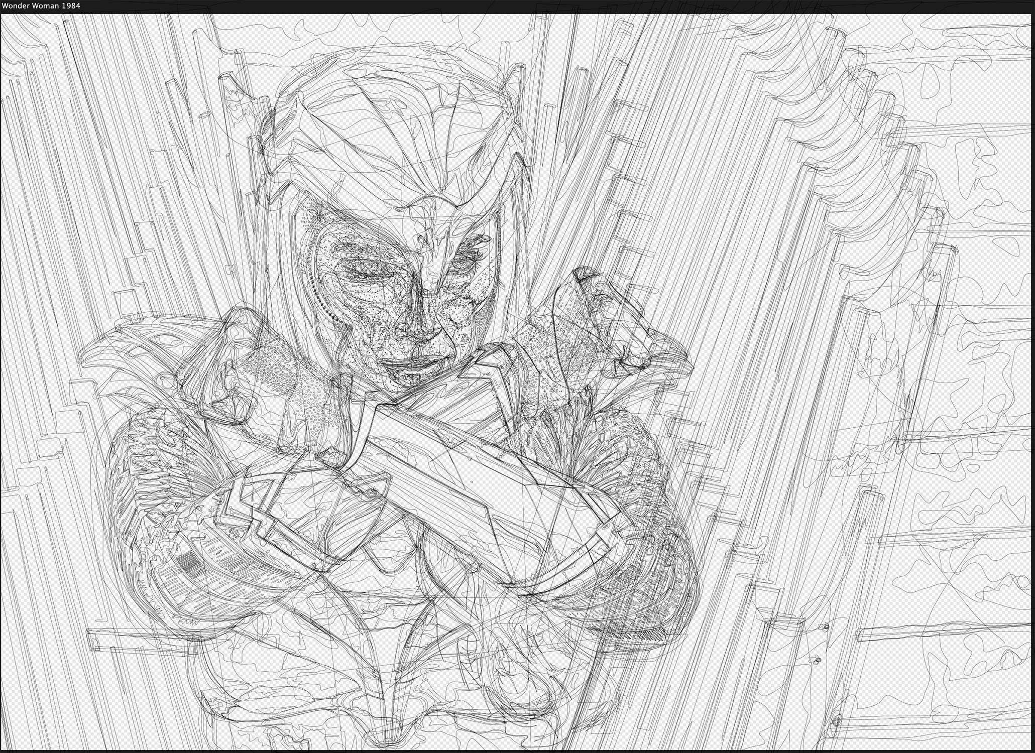
The afdesign file for anyone who wants to look at it. Not sure you'll learn much though, it's pretty straight forward and obvious. Wonder_Woman.afdesign -
affinity designer Wonder Woman 1984
VectorVonDoom replied to VectorVonDoom's topic in Share your work
Not sure about that but thank you. First time I'd finished a face or hands properly and was happy how they turned out. Although in a week or two I might look at it again and not be so happy. Of course not having to do much hair made it a lot easier. The photo was noisy so it was difficult to work out what was going on with the "chain mail" so I had to simplify it but it's not too terrible. Two weeks is speed drawing for me -
What about resetting pram and/or smc? My old backup macbook had a similar problem and that sorted it. Big Sur, as usual, has broken and part broken a bunch of apps but AD is fine. By far the worst thing about being on a mac, the annual breakages. You're not going to run out of ram any time soon.
-
I fancied doing something shiny, not too easy but not too complicated either, 2 weeks max, so decided to see if I could get this done. Shame it turned out to be such a horrible movie. There was too much background on the photo I used so I cropped it to something a bit more interesting. Who needs fancy pants gradient meshes when there’s the pen tool Sorry about the equally horrible compression.

-
affinity designer Shades,3d and perspective
VectorVonDoom replied to FraGar's topic in Share your work
As far as 3d and shading goes then neither are right if that's meant to be a dome. In a way his is closer and in a different way yours is. Look at something that's dome shaped or find a photo with lighting from the side and see the underlying highlights and shading. Not sure what perspective has to do with it, if it had any it wouldn't be round. If it's nothing to do with any of that and it's just a shiny circle then OK. Just checked his video previews page, personally I'd find someone else to follow. -
affinity designer Porsche 911 - Realistic Drawing
VectorVonDoom replied to sacboi's topic in Share your work
All of Isabel's tutorials are worth checking out, some on youtube. I had a watch of the previews of this one, the only thing I'd say is I wouldn't work on a reference of only 1000px tall if you are aiming at realistic. It's a lot easier simplifying than it is adding details that are just a blur in the reference. Of course it somewhat depends on the subject and how realistic you are aiming for but for me you can't have enough resolution. Having said that some large images are saved with a lot of compression so the largest version you can find isn't automatically the best quality. Download, zoom in and compare. -
affinity designer First run at vector drawing
VectorVonDoom replied to ShawnInTheUk's topic in Share your work
I just meant something like this. Whatever the background is then you have shadows underneath and more so under the tyres. It's your car so you can look and see the shape of them and where they are darker when the light is the same as when you drew it. Use multiply blend mode for them with shades of grey, start with the lightest part of the shadow and work towards the darkest. They will then work even if you decide to change the background. A dark coloured car on a dark background can look good when there are big highlights on the bodywork, something to make it pop out, otherwise it looks a bit bland to me.
-
affinity designer First run at vector drawing
VectorVonDoom replied to ShawnInTheUk's topic in Share your work
Good first attempt, perhaps move the shadow down so it doesn't look like it's floating though. You should be pleasantly surprised how you continue to improve. Perhaps decide on the style you like, whether it's realistic or whatever and have a look at vector work that use that style on here, behance, dribbble or just web image searches. That gives you something to aim for. Of course you don't have to stick to just one style forever if you don't want to but to start with I don''t think that's a bad idea. -
affinity designer Mandalorian Character Fanart - Portraiture Series
VectorVonDoom replied to sacboi's topic in Share your work
A mixture of vector, raster and the original photo for the fur? -
affinity designer Second vector attempt
VectorVonDoom replied to Skygod1095's topic in Share your work
Depends. Sometimes for highlights you can be better off with a grey (or grey gradient) and screen blending mode if it's across an underlying gradient or multiple objects. But then if you have a reference image you can just do it as a gradient and match the highlight which is what I do for most things. The trouble with white and lower opacity is it doesn't give bright highlights unless you use multiple objects although you might have to do that whichever way you go about it. I pretty much always use 100% opacity but once in a while knock it down a bit if it's a bit too much. For shadows I sometimes use multiply blend mode but again usually just use gradients with the right colours. Having said that your highlights and shadows aren't bad at all, some could perhaps do with a bit of a gradient though rather than a single colour and blur out the highlights on the trousers more. So do whatever works for you, there's not really a correct way to do many things, as long as it looks like you want in the end. -
Live Paint Bucket equivalent
VectorVonDoom replied to bruised_blood's topic in Feedback for Affinity Designer V1 on iPad
Some users think it's an AI killer, Affinity have never said that. It has a small subset of AI's features and that may always be the case. If it meets your requirements then great but ignore the people who get carried away pretending it can replace AI for everyone. You just have to look at the requests to see where it's lacking. Of course it does kill AI on price and being locked out of your work if you don't want to keep paying their tax, which is why their subscription model is horrible. If you're thinking of AI for iPad you must have AI for the desktop too as it's part of the subscription, you can't get the iPad version separately. So use that unless the iPad is your only device. AI on the iPad is pretty basic at the moment and it's unlikely to ever be feature comparable to the desktop version and unless Apple change their direction in some areas it's impossible to be.- 51 replies
-
- 3
-

-
- paint bucket
- bucket
- (and 1 more)
-
affinity designer Cycling Legends, Lego (AD)
VectorVonDoom replied to VectorVonDoom's topic in Share your work
Was thinking of doing some stat versions too, something like this
-
affinity designer Cycling Legends, Lego (AD)
VectorVonDoom replied to VectorVonDoom's topic in Share your work
They look rubbish but some in their gallery look ok. Perhaps should have Hinault throwing a punch lol I'm slowly going through lists of requests as I get time from retrobike.co.uk if you know of it, there's a thread on the mtb and road forums. But you can request. I tidied up the Juli poster and uploaded it for printing today, have printed stuff off myself but never done it online before, hopefully it will look good. Someone suggested custom mini figures but sometimes it's hard enough working out what the front of the jerseys look like logo wise especially on the early mtb side of things never mind finding pics of the rears and it's not really something that interests me at the moment, bit boring as far as drawing goes plus plenty of these I can do. -
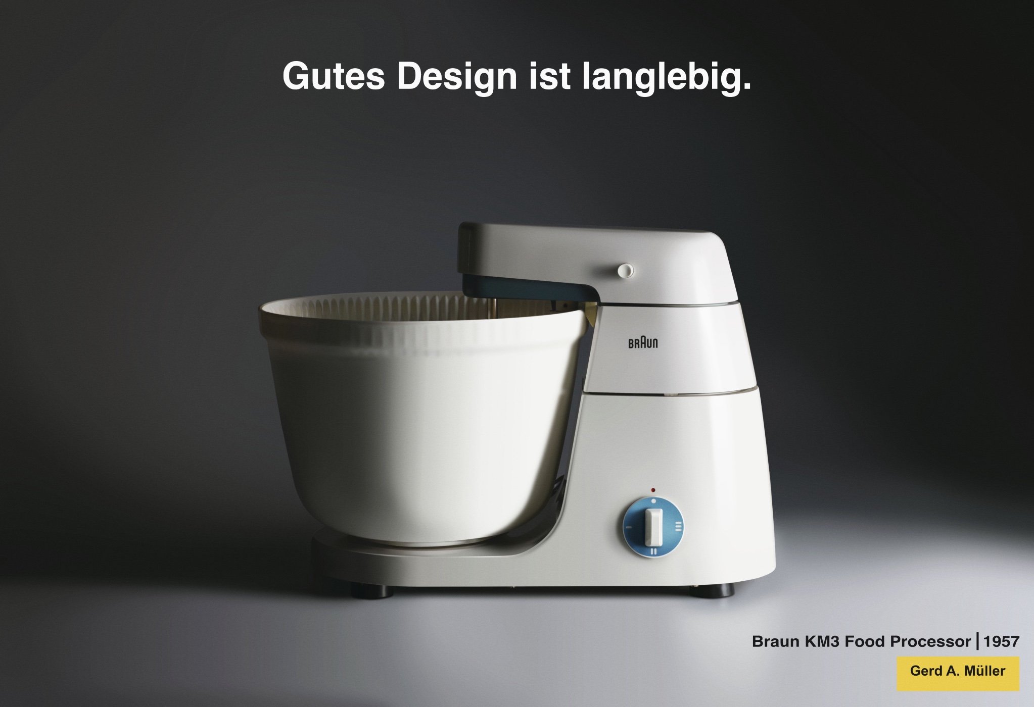
I read that this was designed by Dieter Rams so thought about doing something for each of his 10 design principles. But then found out it wasn't, oh well. Not particularly complicated.
-
affinity designer Car all vectors
VectorVonDoom replied to MichaelMeeuwissen's topic in Share your work
Really good but don't understand how the main underlying body matches the outlines, I'm sure it does though.- 25 replies
-
- 3
-
-
- car all vectors
- photorealism
- (and 1 more)
-
Just bought AD, a few comments
VectorVonDoom replied to VectorVonDoom's topic in Feedback for Affinity Designer V1 on iPad
On the big group I tried it on it was 10 seconds plus depending how frantically you swipe! On screen it looks like a big swipe and let it scroll then swipe again spins though faster but if you time it it's even slower than lots of smaller swipes. -
Deselect on Double Tap
VectorVonDoom replied to dirac's topic in Feedback for Affinity Designer V1 on iPad
There's the X icon, bottom left that deselects isn't there? Quicker than long pressing. edit: You knew that, it's late, didn't read, ignore me. -
Just bought AD, a few comments
VectorVonDoom replied to VectorVonDoom's topic in Feedback for Affinity Designer V1 on iPad
Or perhaps expand the colour tagging/highlighting use them like bookmarks, click on the colour tag and it goes to the next occurrence in the layers, even quicker and you don't have to remember what to search for (but you do have to remember the colour instead so ...) plus more touch friendly. Or a dropdown of user named layers, looks like that's how corel works going by the pic, not used it for years. -
AI has been out on the ipad for about 2 minutes and is a new code base so you are basically stating the obvious. It sounds as though it is going to be developed in the same way as XD, new features being regularly added. The coming soon list is: • Sketch to vector • Improved precision • Variable-width strokes • New brushes • Drop shadow and other effects As it can't even do drop shadows yet shows how early they are in their development cycle.
-
Bought AD today for my new 12.9 iPad Pro and a had a quick play (waiting for the pencil to arrive). A few initial things I noted. 1. The tool and especially the palette icons are very low contrast, even worse if you set them to monochrome. Using the desktop tool ones would be an improvement, at least they have some real colour and so you can pick them without really looking. 2. Palette pinning that isn't (unless I'm being dumb). I can't imagine many who don't use both the colour and layers palette all the time. However it seems as though pinning is temporary until you use a different palette then you have to re-enable, re-pin. Perhaps give the option of an always on layers palette, it's not such a big deal that the other palettes don't stay put. 3. Scrolling through the layers (unless I'm being dumb again). Sometimes you click on the background by accident, add a shape and it gets put up the top. If you have a ton of layers on the mac it's not too big a deal you use the scroll bar to get down the bottom or wherever it needs to be and only takes a few seconds. With the ipad layers palette it's a 100 swipes to get to the same place. 4. I was expecting to perhaps sometimes use the pencil tool for areas rather than always using the pen but two problems. The first has been mentioned before, an option to auto close the area would be helpful for that use. However that doesn't really matter as it sometimes takes 10 or so seconds to finish drawing the shape, it does it in slow motion. That seems to depend on how many objects you have. On a blank canvas it works as expected but when I opened a complex one it was unusable. It looks like I might end up doing what I half expected and use the desktop app and sidecar on anything remotely complex.
-
affinity designer Cycling Legends, Lego (AD)
VectorVonDoom replied to VectorVonDoom's topic in Share your work
Someone said they'd like to see a lego bike too. The lego bikes are very basic and a weird shape to allow the mini figure to fit on them so I just gave a hint of it. They are also normally a single colour and no decals so I cheated a bit or it would have been a bit boring. If I still like it when I look again in a few days I'll get it printed off.
-
affinity designer Jaguar E-Type Lightweight (AD)
VectorVonDoom replied to VectorVonDoom's topic in Share your work
That's good. No I am not, it was just for fun until it stopped being fun when it took so long.