Search the Community
Showing results for tags 'panels'.
-
 I've tried manually dragging them apart and back to their original locations, as well as searching the 'View' and other main menus but haven't yet found how to uncouple them. Additionally, when I select something from the Color-panel...it 'leaps' in front of the now combination Layer/Transform-panel. I'd love to know the 'How & Why' to this as it may come in handy in the future. But for now, I'd like to return the 'studio' to its original default panel set. *AD 1.5.4 on a MacBook Pro* Would someone please enlighten me? Thanks much, -Christo
 -
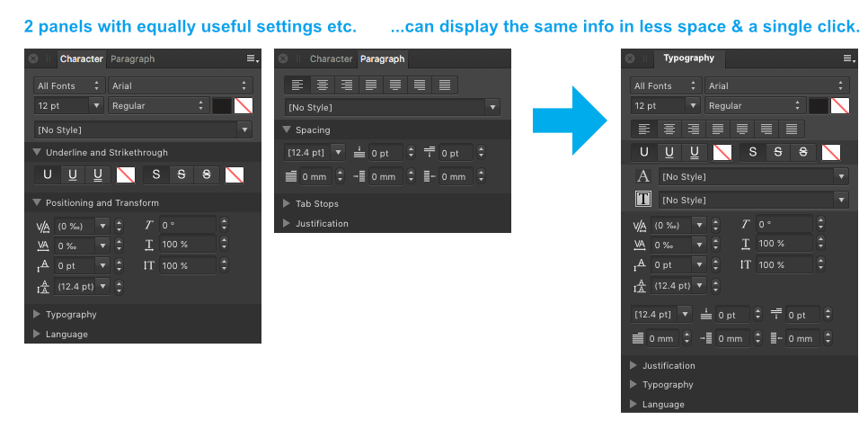
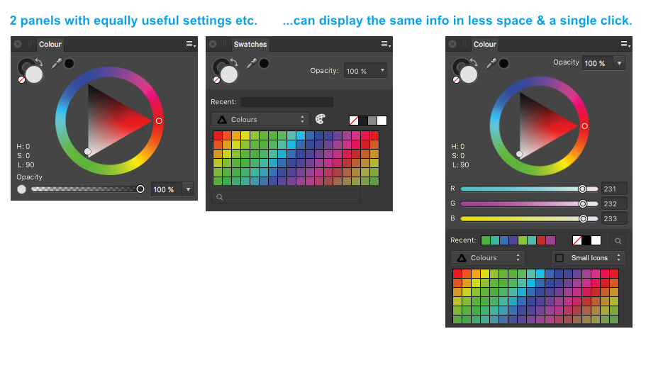
 Just a wild, crazy thought... why do paragraph and character have to be separate panels at all? Can't we have just one single, long panel with all text settings together. We could call it "Typography". If I'm editing text, I inevitably have both panels open at the same time anyway and it will remove some redundancy. Here's what I'm thinking: The same thing with colour and swatch panels. I also always have both of them open at the same time so they might as well be in the same panel like this... (Note the pull down menu for choosing different swatch display styles – small icon, big icon, list view etc. Just a little idea thrown in for good measure) Since your roadmap includes multiple fills and strokes, perhaps strokes & fills should also be crammed into 1 panel. I'm worried you're going to take Illustrator's approach to multiple fills & strokes... 1 panel for stroke 1 panel for fill 1 panel to list them to define which you have selected. and another panel for for effects, just for good measure?
-
 Ok Serif / Affinity guys... This is driving me crazy! Previously I have submitted this suggestion, though I don't believe I was heard. IMO Affinity products desperately need the ability to auto-hide panels. See [https://forum.affinity.serif.com/index.php?/topic/31218-multi-uiux-suggestion-auto-hide-panels/] I am using a very large notebook computer with a 17" screen. Large screen for a notebook, though smaller screen size for graphic design work. With this monitor using the panel controls in Affinity products is frustrating. There simply isn't enough room! I group panels needing more vertical space (layers, effects, history, brushes, etc.) together. Panels needing less vertical space are also grouped. Regardless how it is organized I do not have enough vertical space to effectively use the panels. Some of the panels require large vertical space, some medium, some smaller. With 3 stacked sets of panels the larger panels are way too cramped. Even if I group the medium and smaller panels together (which puts way too many panels in the smaller panel group), there still isn't enough vertical space for the larger panels. With smaller monitors, having panels on both sides of the screen (without auto-hide) is obviously impractical. Working with cramped panels is extremely clumsy and frustrating. Affinity UI panel design is not elegant for smaller monitors!!! If I could auto-hide panels (as was implemented in Serif *Plus applications), I could put panels on both sides of my monitor and have all the panels I find useful easily accessible. Current implementation forces users with 'smaller' monitors to make significant concessions in their use of panels. Regardless of screen size, the ability to auto-hide panel groups would be useful for all/most users, as this would allow users to better organize their application interface, and enable users to have more panels immediately accessible. This would make the use of panels in Affinity applications significantly more elegant. PLEASE consider implementing an auto-hide feature in panel groups in Affinity applications.
 -
What is really missing in Affinity Photo for a Pro user is the ability to create customized workspace. Especially now that many retouchers work on the set, this is very important. We go back and forth from our normal place with our usual monitor layout to many other places with many different monitor layouts. It's very annoying to rearrange every time all the panels to have our desired workspace. So, having the ability to save and recall custom workspaces would be a great feature. Professionals love to be fast and productive in the shortest time possible, so I think this is important for all the pros. Thanks again for your attention! Alex
-
Please add the ability to auto hide control panels. Without the ability to auto hide Affinity [Designer/Photo/Publisher/etc.] control panels it is not possible to configure the application interface as desired. Currently control panels are either open or closed, without an option to put panels in a 'stand-by' state while not taking up significant screen space. Serif *Plus applications had the ability to auto hide control panels, I am surprised this capability has not yet been incorporated into Affinity products. With most applications I am a power user, as such I like to have all the most useful controls immediately accessible. My Affinity Designer and Photo control panels are all on the right side, most of which are very cramped, making them disorganized and difficult to use (e.g. Layers are displayed in a small window which shows only a few at a time.) I would love to incorporate the use of the Assets panel more fluidly into how I use Affinity Designer, though the current UI design makes that less practical. Several control panels are better presented with full or near full vertical space. I would group these panels on the left with the auto hide feature turned on if that were possible. The ability to auto hide/pin control panels would provide me with the flexibility I need to configure the UI in a manner that makes me most productive and comfortable. This feature request is extremely important to me.
-
Currently the vector scope isn't scaleable, it's quite small. It's been my screwup meter for years and in Photo it's just damn hard right now to see things close to the centre because it's so small. While at it. Once the scopes are bigger, they could be used to mask colour ranges. Just draw a selection on the scope with the selection brush (or regular brush) and the colours within their ranges are masked.
-
 I can't see the transformation and layer panels... How I do it? Please help me. Thanks in advance.
 -
Please consider adding user-defined Shortcuts for the individual Panels in Studio. It would unclutter real estate for those of us with smaller screens (21" in my case) and save so much time now used in dragging panels in and out of the stack so that I can see ALL of the entries or options. Rather than clicking on a (drawer?) to open it, scrolling to find the option or entry, then clicking to close it again, I could simply use my non-drawing hand to hit a key combo to open the panel full length, make my selection, and close it again with the shortcut to return to a full uncluttered work surface. There are a number of functions/tools that I have little to no use for that I could use more productively for the Panels. And no, turning the whole Studio On or Off does not solve the scroll problem. To end on a more positive note, the work you have already done on Shortcuts is fantastic. And we do appreciate all the time and effort you guys put into trying to make things as easy and smooth for us as possible.
-
Having to scroll through selections and options because there is not enough room in the open panel to show them all is a right royal pain. It would be extremely handy if there was an option to collapse each panel to a single label row then have one (or more) expand when selected. There are a number of panels that I don't use that often but take up room that squeezes panels I'd like to see all of. I could turn those off but turning panels on and off is also a pain when you have to go to View>Studio>panel each time you open or close one. There are other panels that I would like to see all of without scrolling when selected. Swatches, for example, and Brushes. Layers and Adjustments. I don't need those all open at the same time; I do need to see all of them when they are open.
-
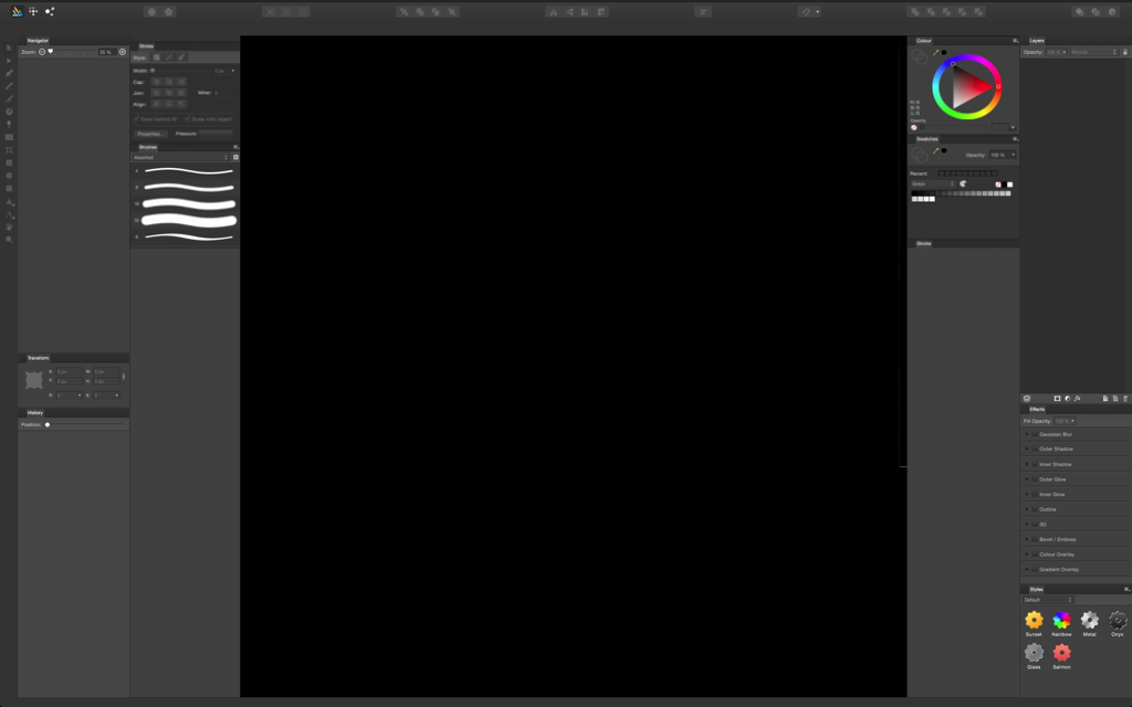
 Hello, the Panel/Toolbar that is usually on the right side of the screen is no longere there. I don't know if it disappeared or I accidentally closed it but it was very useful when trying to change levels, modify individual layers, etc. Could you please let me know how I can get this area back? Attached a screenshot of the area where this panel/toolbart is.
-
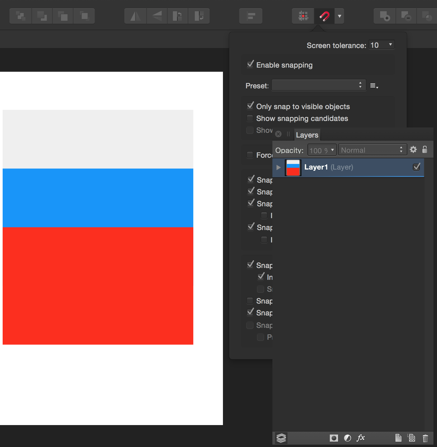
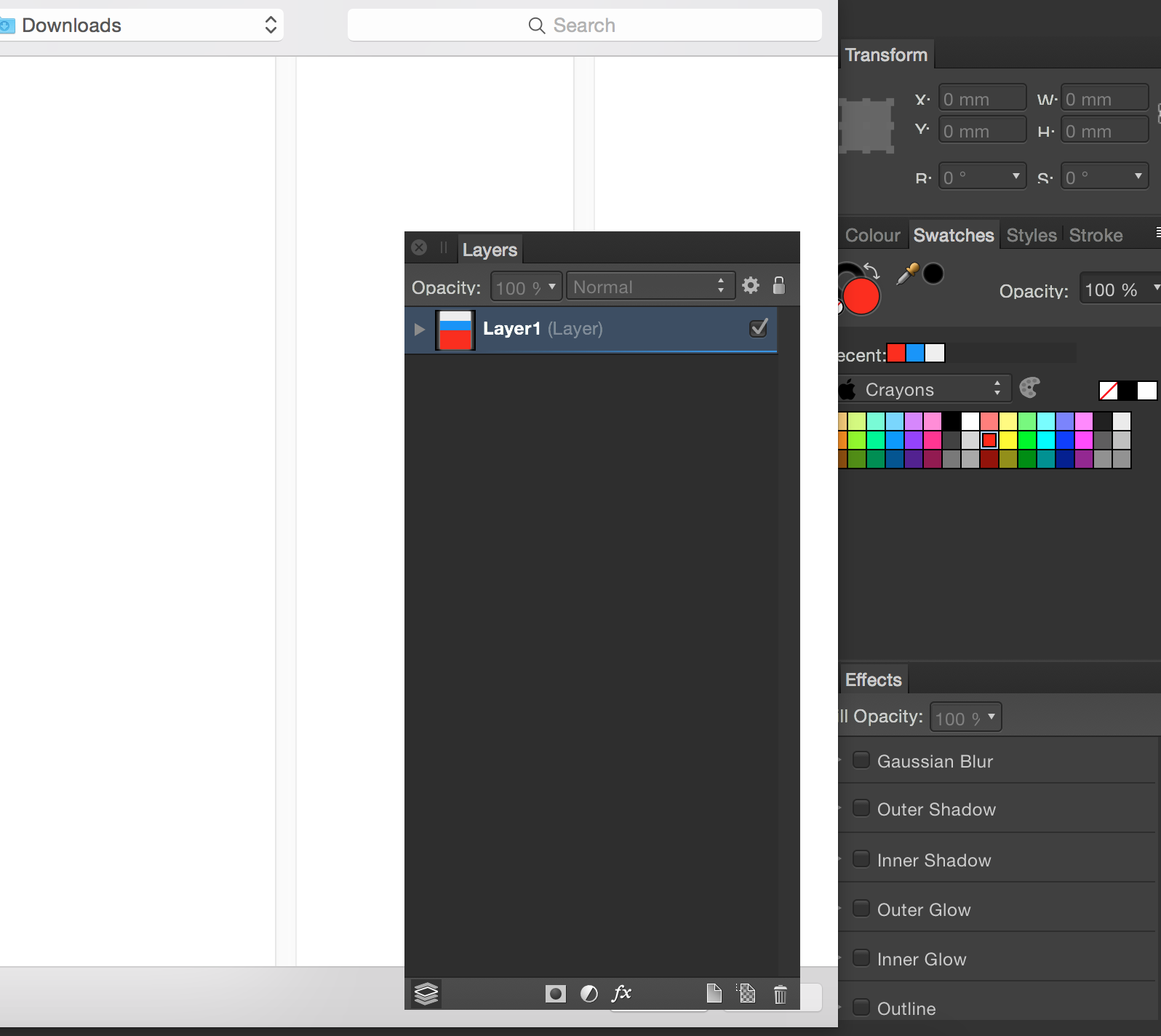
Hi, It seems that detached panels stay always on top even if another panel is invoked. See screenshots. It’s so hard to align or place an image because the layer panel always gets in the way. See attached. Thanks
-
Hi guys, I would love to be able to do this: Actually, only one docked column on the left + one docked on the right is possible. The rest has to be floating panels, while some people prefers fixed UI elements (reason I really can't get into Pixelmator UI). This trigger another question :) • How about being able to dock elements like "character", "paragraph", "media browser" (this one have been ask already), etc.?
-
 I noticed when I move over to the draw persona that the colour, line, swatch, and brushes palettes vanish. I was wondering why this is? It doesn't seem like any of the tools are raster specific, in fact those tools seem to be available under the fill and line boxes on the left side of the screen when working in draw persona.
 -
 Is there a key short or any way to toggle all panels hidden? Is this planned?