Search the Community
Showing results for 'logo' in content posted in Share your work.
-
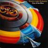
I found Affinity Designer after deciding not to continue with Adobe Illustrator's monthly subscripton fees (after using it for several years). To learn the interface and tools, I decided to hand trace the classic Electric Light Orchestra logo from the 1976 "A New World Record" album cover. I love using AD, and looking forward to more features that will make it even better than Illustrator :)
-
Affinity designer is my first AI type program Ive used (as AI is too expensive) - heres a quick logo mockup for a design competition - they're an electronics company... Still wondering when they're or if they already have put a save as png option? z-icon.afdesign
-
-
I've made two variations of the same logo using only my first and last initial. I'm looking for some feedback on which catches the eye better. P.S. Can someone tell me how to make a perfect equilateral triangle?
-
Hi all, here is a recent client project and my first logo/illustration piece done in Designer. It's for the CD cover of the Derwent Brass, a brass band in the UK. The title of the disc is "Diversity" The idea here was to try to suggest or display some of the many instruments in a stylistic way that are included in the band as a grouping that forms the backdrop for the CD's title banner. My usual process was adhered to here, approved sketch followed by vector buildup of elements on separated layers. See below for screenshots. I made use of the "erase" blend mode to hide certain areas which worked perfectly. Each letter was "skewed" individually, to conform to the contours of the banner. Colour palette was kept to a minimum of blues and golds and a heavy black outline style was used to delineate and visually connect each element. As usual, it was a delight to create in Designer. I am looking forward to the up-coming distort and warp tools mentioned in the "road map" to be able to do more of this kind of work with type in Designer. :)
- 24 replies
-
Hi! I've done this logo for a friend, he has a online-shop of warhammer and other similar games. Hope you like it :)
-
This mock design has been flying around my head, since 1984. It was my attempt at designing a logo, that contained letters that create shapes. This is the firm that supplied the helicopters for Airwolf. It still takes me ages, but I'm learning...I have used theses filters, glass and onyx. These give the desired effects. peter Ps is Hilary the only forum member to have a filter named after her? (Sunset) jetcopters inc.afdesign
-
A very quick hand-trace of my original logo sketch for my upcoming comic Thingies: First I placed the hand-lettered concept sketch into its own layer. Then, I just made simple pen lines (with a stroke of 30 pt/px) and made each individual stroke the curve I wanted. Next, expanded strokes and added shapes together to form completed letters and then with the "i" letters I did an combine on each one and the letters they overlap. Finally I made the whole word a combined shaped. Added a conical gradient to a layer underneath it all to make sure the combine/compound shape was the way I wanted it. Pretty happy with it. BTW, Thingies is about sentient salamanders and I really kept their biology in mind when I made them into "funny animals". Depending on how Affinity Publisher works, I may want to use it to letter my comic rather than ComicLife (which is a fine app, but somewhat limiting in how it can fill shapes with bitmaps and such.
-
-
Sometimes a job takes so long; especially with no tablet. That it takes weeks and weeks: resulting in a sloppy rushed finish. This is not my best, but definitely the toughest. :unsure: I felt had to be done now, as it was getting to the point of never being finished and no longer fun. Hats off to those you who can knock something like this in an hour or so...no wonder I love my camera. Hilary this did faze me!
-


