PaulG
-
Posts
13 -
Joined
-
 PaulG reacted to a post in a topic:
Interactive Colour Chords
PaulG reacted to a post in a topic:
Interactive Colour Chords
-
shizuka reacted to a post in a topic:
Need a way to replace all colors by full white still keeping black lines
-
PaulG reacted to a post in a topic:
How to Install Nik Collection 4 to Affinity Photo
-
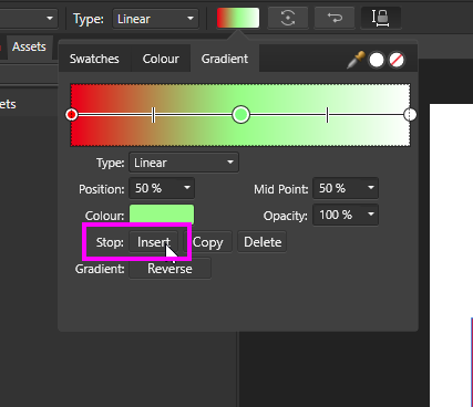
Hi Samsonite, There is a button called Insert under the colour swatch. In your screenshot it's hidden by the colour picker dialog . Clicking that will add a new node/stop to the right of the currently selected one (if you have the right most one selected the button will be disabled because there's no space further right to add a new one). Select the new node (though it is probably already automatically selected) and you can use the dropper to pick a colour from the image or use the colour picker dialog to select the desired colour.

-
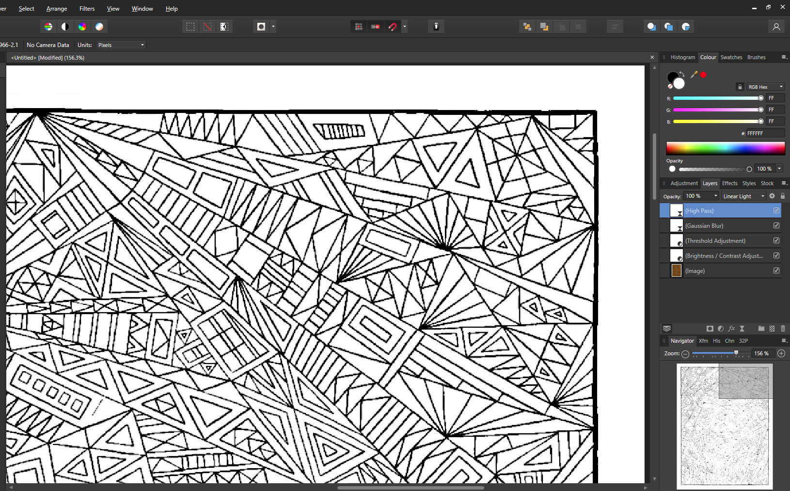
Given this thread is about changing to White rather than a specific colour, I'm posting the steps that achieve this here instead of the other thread. Create a Brightness and Contrast adjustment, don't change anything yet. Create a Threshold adjustment, don't change anything yet. Return to the Brightness and Contrast adjustment Increase the Brightness until you're left with mostly the black lines. Don't go too far or you might break some of your lines. There will be black dots here and there (a result of the scanning producing irregular colours). Decrease the Contrast to address black dots Return to the Threshold and with the adjustment's dialog open, pan around your document to look for any remaining black dots inside your shapes Decrease the Threshold slider until you're satisfied you've removed all the dots Be careful not to go too far, it'll break the lines, so make small adjustments and keep an eye for broken lines as you pan around looking for dots. Find a balance you're satisfied with This will leave you with very jagged lines Add a Gaussian Blur live filter layer Increase the radius (a tiny amount should be enough) to take the hard edge off the lines Add a High Pass live filter layer Set the Blend mode to Linear Light Increase the Radius to thicken the lines to your where you are satisfied Using those steps, this is what I ended up with. If you're going to be doing this frequently, you could create a Macro to produce those layers quickly. Then tweak each one to suit the image you're currently working on.
-
Hi Meb, Is there a reason it was chosen to have the drop zone a "small" black square? Would it be more convenient for the user to have it the entire row the square belongs to as the drop zone (a bigger target is easier to hit rather than a small one)?
-
 PaulG reacted to a post in a topic:
Masking groups with checkerboard pattern
PaulG reacted to a post in a topic:
Masking groups with checkerboard pattern
-
PaulG reacted to a post in a topic:
Masking groups with checkerboard pattern
-
TEcHNOpls reacted to a post in a topic:
Same image renders differently in Beta
-
Chris B reacted to a post in a topic:
Same image renders differently in Beta
-
Mark Ingram reacted to a post in a topic:
Same image renders differently in Beta
-
Same image renders differently in Beta
PaulG replied to PaulG's topic in [ARCHIVE] Photo beta on Windows threads
Hey Chris, Just tried the new 333 beta. The Legacy approach has definitely solved the problem. Tried with multiple files, and each one looks the same in 1.6 and 1.7. So just wanted to say thanks for effort! -
Same image renders differently in Beta
PaulG replied to PaulG's topic in [ARCHIVE] Photo beta on Windows threads
Thanks Chris. That sounds like it'll be helpful. -
Same image renders differently in Beta
PaulG replied to PaulG's topic in [ARCHIVE] Photo beta on Windows threads
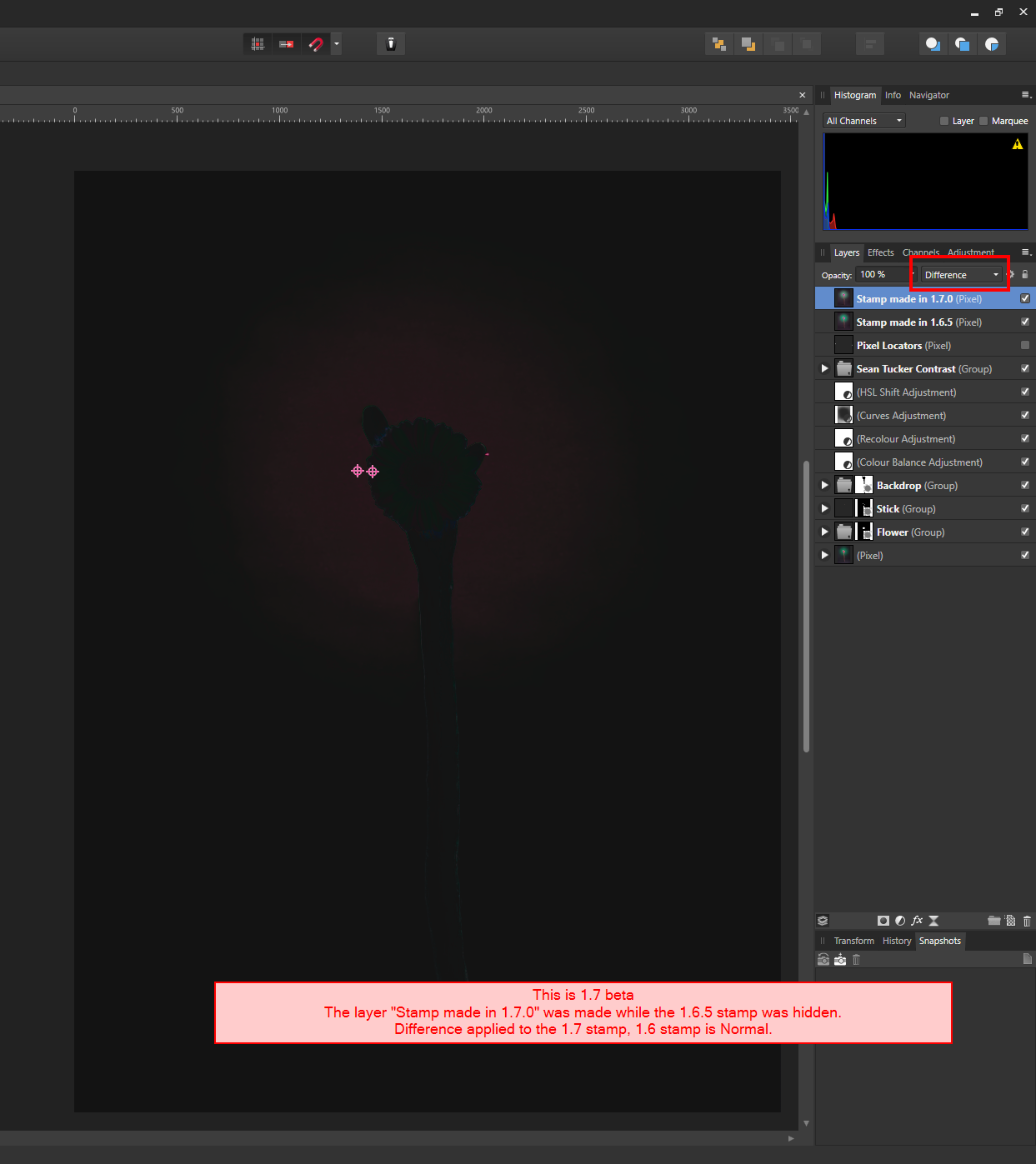
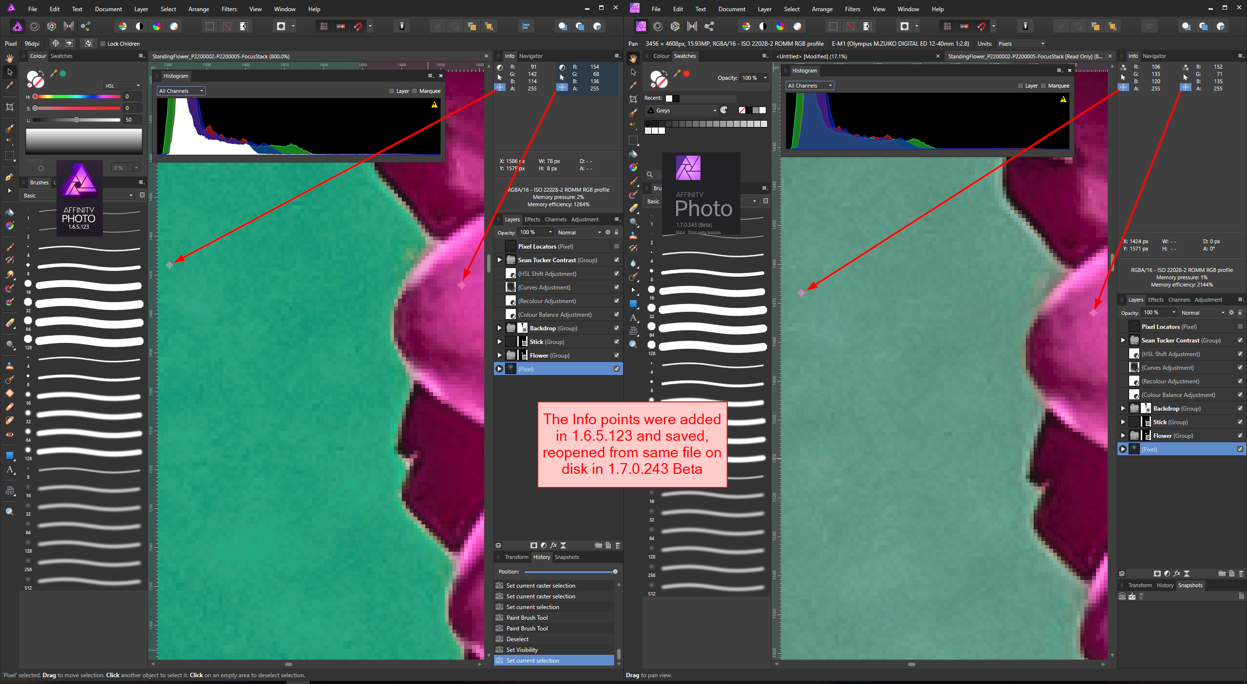
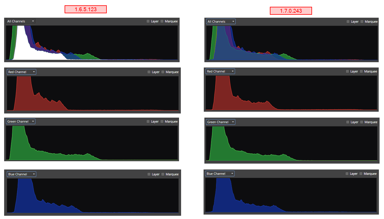
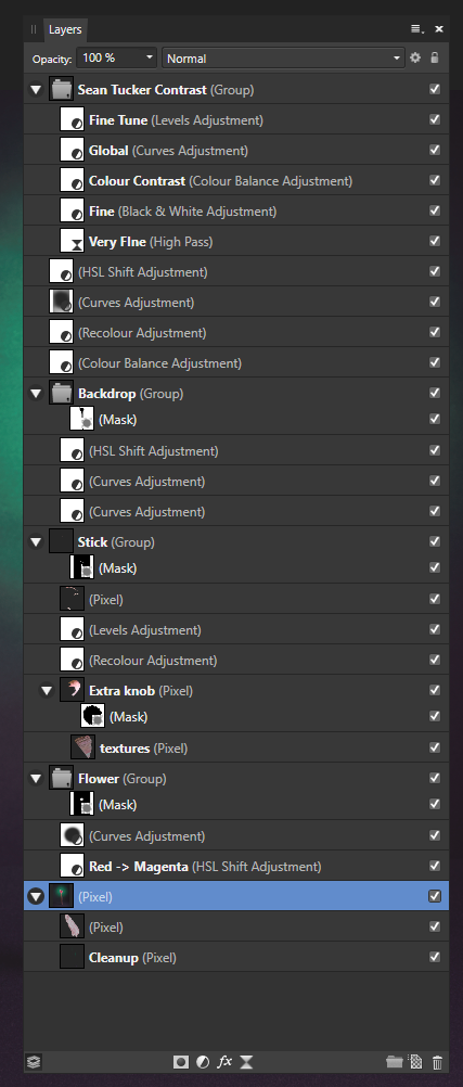
Hey @Chris B, Got to do the additional checks that were indicated in that similar thread you linked to. Screenshots attached. One is the difference blend mode. I took a Stamp in 1.6.5 and saved. Opened the file in 1.7 (using the Make Copy option so that it would be editable). Made the 1.6.5 stamp hidden and took a new stamp. Set the 1.7 stamp to the Difference blend mode Unhid the 1.6.5 Notice the dark megenta pixels indicating that there is a difference In the second, are Info Points Took two Info Points and placed them on the image in 1.6.5 and saved Opened the file in 1.7 (using the Continue option, it opened in Read Only) Notice the different pixel RGB values The final one is a screengrap series of the Histogram in both application versions. All channels are different, but the biggest is in Red. I checked the Preferences panel. With the exception of the new options available in 1.7.0, the Disk Usage Warning, and some keyboard shortcuts I hadn't bothered to reconfigure, there's no difference between the two versions. I've also included the expanded layer stack so you can see exactly what I've used. If I can get you any more info to help in your investigations please just ask.
-
Same image renders differently in Beta
PaulG replied to PaulG's topic in [ARCHIVE] Photo beta on Windows threads
Hey Chris, I've read that similar thread, and will try some more tests and upload them here when I get home this evening. Thanks for chasing it up. Regards, Paul. -
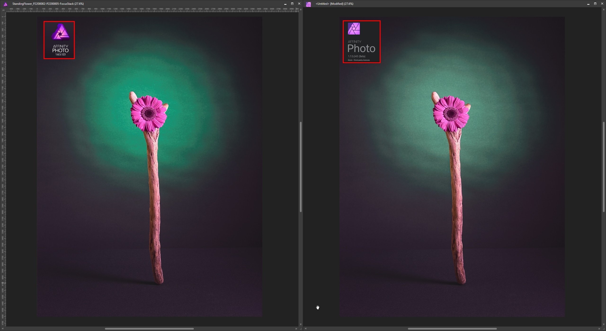
Hi, I noticed that the same .afphoto file opened in 1.6.5.123 and in 1.7.0.243 Beta looks different. (searched for, but couldn't find an existing post about this, apologies if it has already been discussed.) The file was edited in 1.6.5.123 and saved. Then opened in 1.7.0.243 Beta (making a copy at the non-Beta prompt). The Windows version of the applications. Could this difference be down to the rewrite of the HSL and/or Recolour adjustments? To test this, I created a stamp layer in 1.6.5.123 and saved, then reopened the file in Beta. They looked the same. This suggests that the adjustments are rendering things differently. Going a bit further, with an instance of each application version open, I hid all layers except the Background, which like the Stamp layer looked exactly the same. Then turned on layers one by one in each instance. When I encountered the first HSL adjustment, the differences started. There's a few HSLs in my document, and they are the ones that appeared to have the biggest rendering difference. The ICC profile is the same for each image. I've attached a side by side screenshot. Is this expected? The concern is that images edited in an older version of AP will no longer be as they were intended when opened again in future (e.g. to reprint for a client). I can provide the .afphoto file if required?