
woefi
-
Posts
410 -
Joined
-
Last visited
Everything posted by woefi
-

Panels are overlapping/too tall (after update to 2.5.3)
woefi replied to woefi's topic in V2 Bugs found on macOS
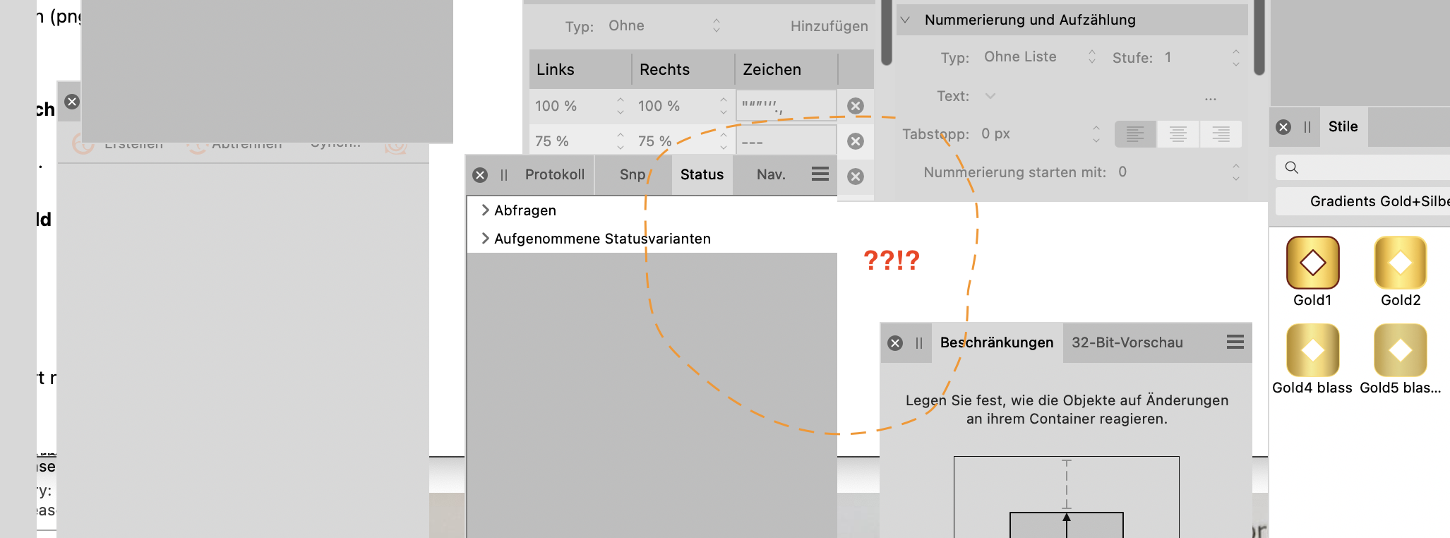
Oh I realized: there is an outline around the panels. But only in dark UI, -> it is missing in the light UI! This is what the light mode looks like (comparison):
-
It seems, after updating to the latest version 2.5.3, my free flowing panels on my second display are redrawn with slightly higher dimensions. (maybe adding the height of the panel title bar a second time??) I initially didn't notice the missing button row because Affinity does not draw shadows on the panel UI. And, please, draw a 1px border around each panel, ffs! So my carefully curated panel setup of all three Affinity apps including the panels of the personas are missing buttons and are sometimes not even rescalable until you drag it aside and put it back again. The page panel of Affinity Publisher came up way narrower and did not accept making it wider until I also adjusted the height... So please fix this now so that I and others are not wasting time correcting their panels and then after the next update maybe they are too short again...
-
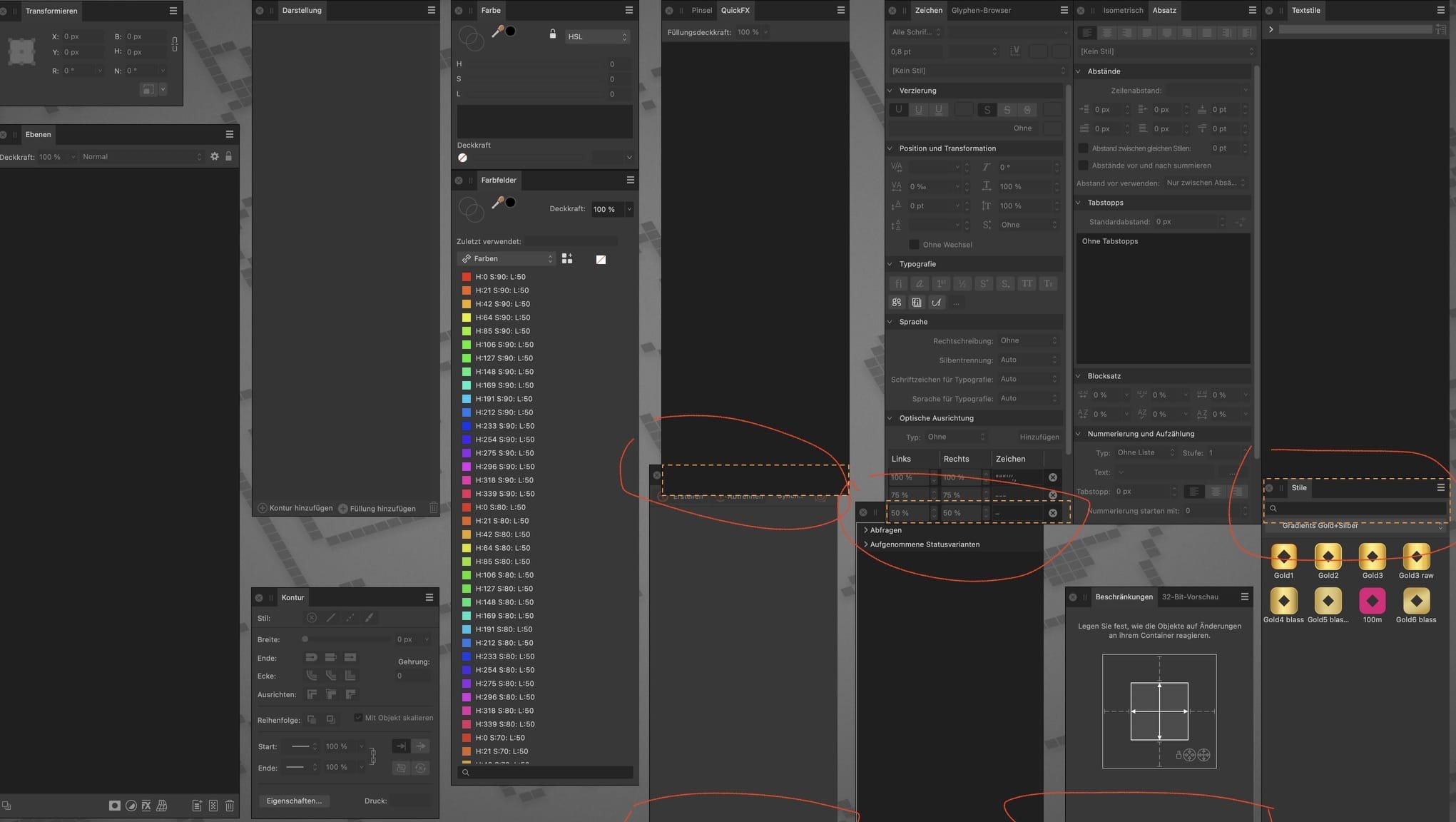
Seriously Affinity, this is getting annoying. Can someone try to standardize the dark mode / light mode appearance of those pesky icons?? Obviously there are some icons which are hardcoded to a specific color tone only for dark mode and nobody cares to test the light mode. I mean one would think this costs precious developer time and still breaks every n-th time...
-
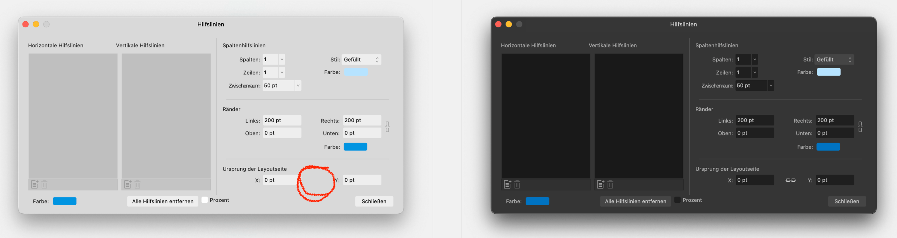
Maybe these lock icons are easter eggs after all...
-
for me it's the Spread Origin lock, margins is fine... (Publisher 2.5.3 on Sonoma)
-
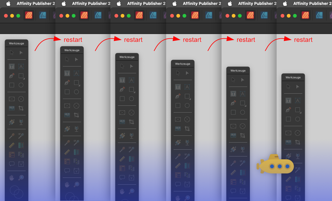
I always thought that I only imagined this but now that I tested it I see that this is really happening... If I close the app and reopen it then the tools panel is slightly below the original position. If you repeat this then you get this:
-
to clarify: it hovers the _name_ of the swatch. It could be that you first created a HSL swatch, then later correct the values to ideal RGB values of choice, but the name and the hovering will not reflect that! That's how affinity's swatch panel works, although I wish I could change it so that it always displays the color values on the tool tip. (And in my use-case that should not be the color values it would have in the locked space but according to the color space that I defined for that specific swatch, as one can have RGB swatches and CMYK swatches side-by-side for example in a RGB document.)
-
Because that's not the (current) function of the lock. In your thread I see your misunderstanding that the hovering "NAME" of the color swatch has a direct connection to the colour space. It's just a name that is given when creating the swatch and, as you know, can easily be renamed. (We all are used to other creative apps that usually display the real color values when hovering, not the name...) Back to the lock: It locks the state of your "color mixing tool" and thus the "future" handling of colors (creating, editing). So if you locked it to RGB and edit a HSL or CMYK created swatch, it converts it to this locked color space. -> As I've written, maybe that's the goal of one's specific workflow. It is definitely not mine when working with CMYK. And even more so when working with global swatches that, in my opinion, should have explicit safeguards to prevent accidental color space changes.
-
Of course there are many different workflows or use cases, but Affinity *could* look over the fence and see what other *ahemn* Creative Suites have done for years: "Handle these locations as belonging to the document and not to the app." Which means: If I open a document I created 2 weeks ago from Folder_A and try to save a modified version of it... ->then don't offer Folder_X which was the last folder the app saved to (you could call it app centric) -> but use Folder_A as this originating document belongs to this folder. (not because it was the last folder _used_) When I then export several slices or PDFs -> remember each documents last export target folder. I imagine it would require an addition to the affinity file format to save such (relative) destination or source paths inside the document. So excuse if I sound like that would be "easy to implement". But as I said: My dusty old CS5 was able to do this in 2010. Also: when looking for missing linked images why not suggest a relative folder path, eg. current_document_directory / images / *.jpg ?
-
This has bitten me too often. For me personally, it would be best if either: A) the lock and color space setting was saved and loaded with the document (also when switching to another document tab, change to corresponding state in the panel...) B) at least in the preferences let me pick the initial state (for me: set to unlocked) Reason: Working in desktop publishing, you choose your colors wisely. If you create a color swatch in CMYK then it should primarily be handled as CMYK unless you choose to convert it. With a falsely locked color space, I very often ended up accidentally converting a perfectly mixed RGB or CMYK global swatch to another colorspace ->just by checking it.* *this is another bad behavior: when you want to see the color specs of a global swatch you have to EDIT it to see the values, but with the wrong locked space it is immediately converted without warning...
-
I'm also seeing this. Please, @Lee_T fix/bump!
-
OK, so this (suspected) similar issue looks to be logged, hopefully this part will be included as well. (paging @Callum )
-
I imagine this is related to AF-3298 where objects copied from an 72dpi document are inserted at wrong scale into a 300dpi doc (or vice-versa...) I would strongly advise affinity to consider fixing some underlying architectural misconceptions. I suspect the Affinity apps are internally still structured with a "pixel first metric" mindset (like Photoshop in the 90s). In desktop publishing the "physical" dimensions always come first and only after that, when rendering/exporting/rasterizing, the resolution is to be considered. <Rambling mode: on> thinking about the effect dialogs with the unchangeable unit: pixel and shaking my head... <Rambling mode: off>
-
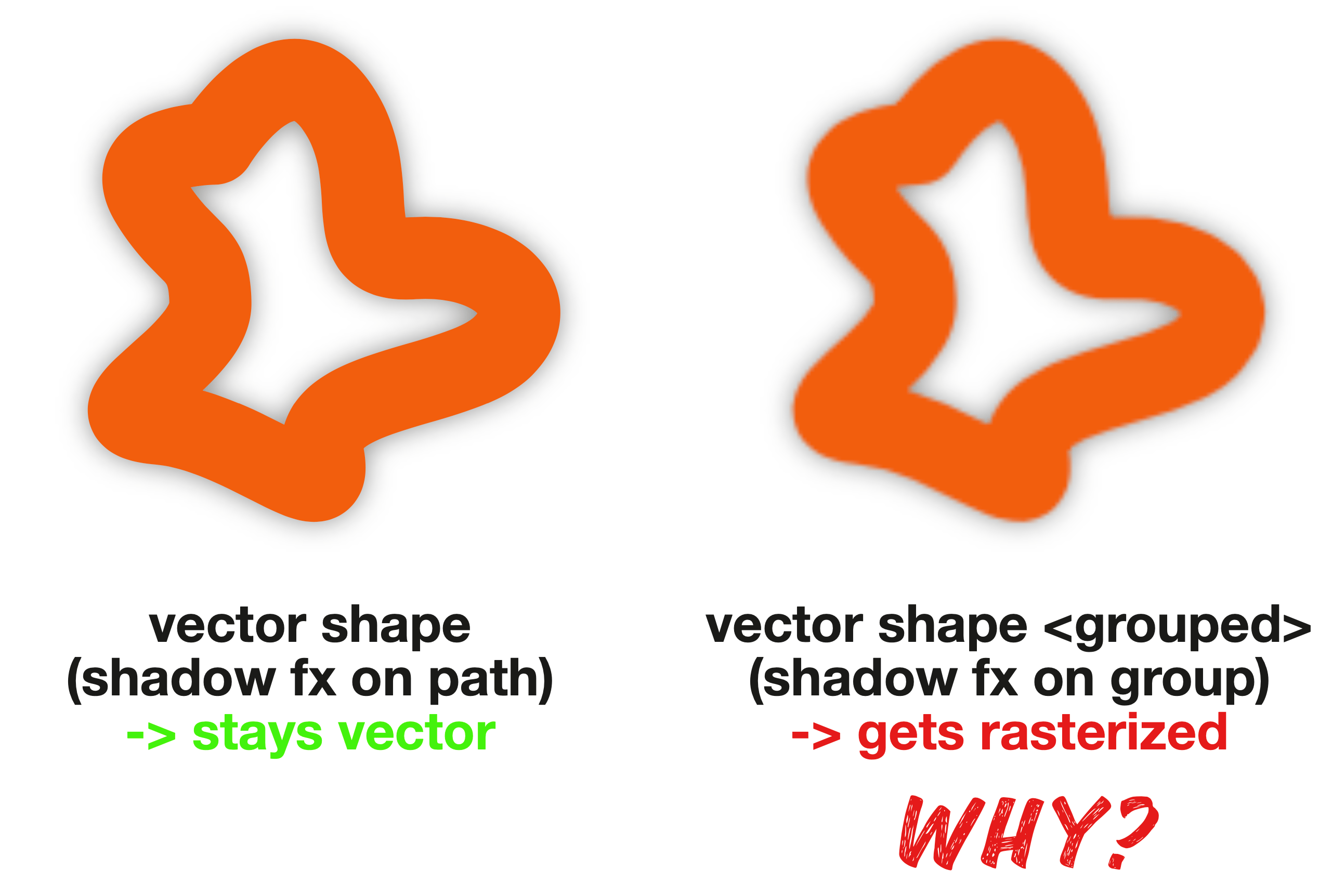
vector shape + shadow fx gets rasterized >if grouped<
woefi replied to woefi's topic in V2 Bugs found on macOS
This is very unfortunate. I'm 100% sure, absolutely nobody doing design work would expect this difference in behaviour by simply grouping vectors. After all, these vector shapes are not modified by the fact that they are grouped together. When encoding the PDF, they should internally be treated as one "shadow casting shape" and the original vectors then put on top of the (rasterized) shadow. It looks like Affinitys "fx" are not analogous to the effects of InDesign but more like the pixel based filters of Photoshop. Which is of little use in a Desktop publishing software... 😟 Thank you for your explanation, though. -
vector shape + shadow fx gets rasterized >if grouped<
woefi posted a topic in V2 Bugs found on macOS
This is a very common use case: You place a logo on a page and (to increase visibility with the background) you add a subtle, barely noticeable, shadow effect. Turns out, it matters whether you put the fx on the bare vector (if you are lucky the logo is a single shape or compound path) or on the containing group (because the logo is more complex) -> in this case you're out of luck and it rasterizes when exported to PDF. See screenshot which I exported with 100dpi for better demonstration (no, 300 dpi will not save your bacon on a vector logo, sorry...) shadow group rgb.pdf shadow group.afpub
-
Adobe Acrobat Pro v9: "All is Fine"
-
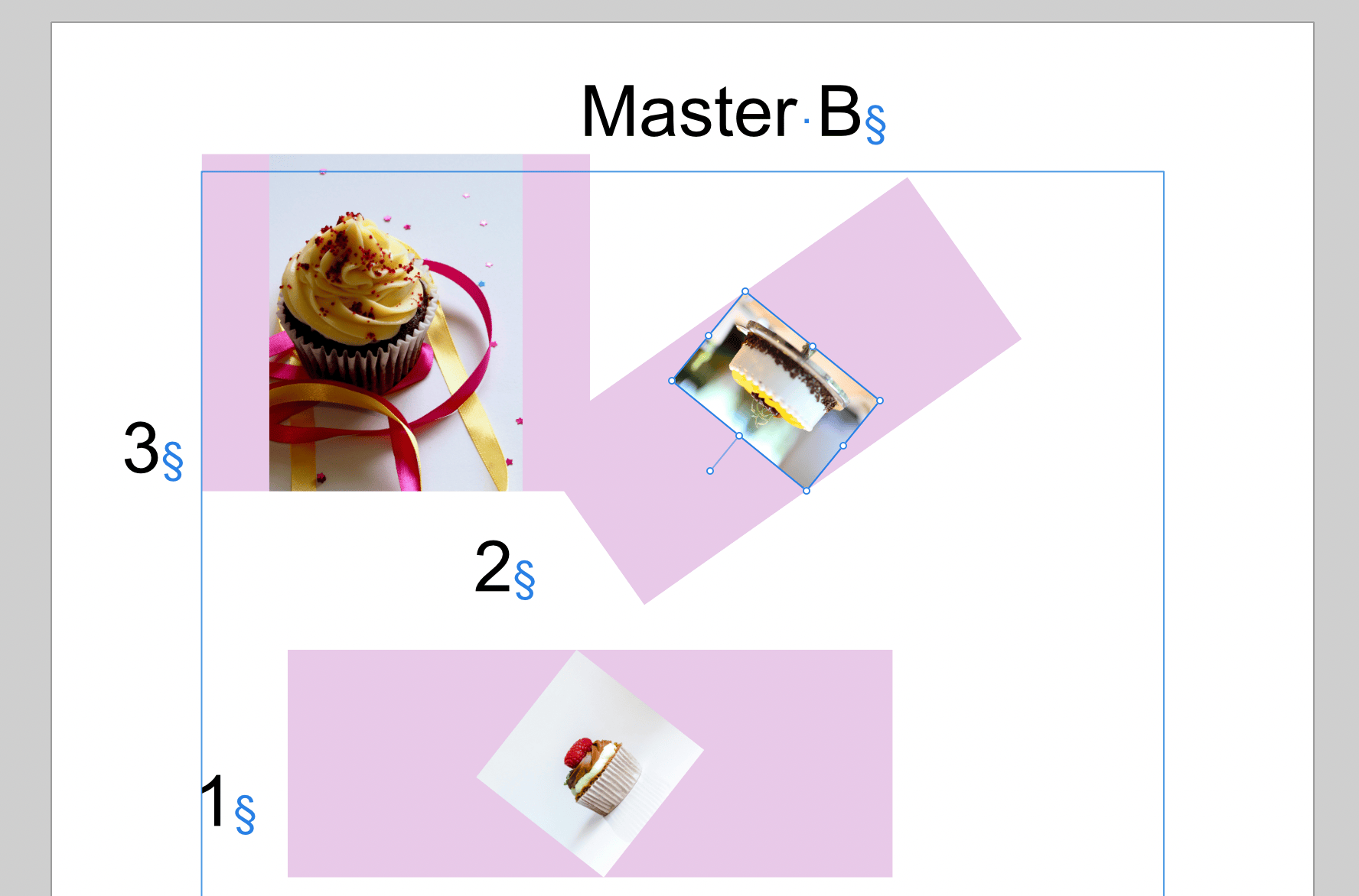
Hi! Today I wanted to create a brochure the advanced way by using master pages and what's called "Smart Master Pages" in your Video: https://www.youtube.com/watch?v=W3Hl4ST84Ac -> But when I used slightly rotated image boxes I realized that there is a bug that doubles this rotation every time you apply or change the master. see my video and Screenshot: AfPub25 Master 2024-05-31_1000.mp4
-
100.01%
-
Jup. When doing designing/DTP work (mostly text and vectors), one should never have to worry about dpi. That's to be considered upon exporting, if rasterizing has to be applied. I'm assuming that's a thing that comes from Affinity apps historically coming from an image editor state-of-mind and only later tacking vector tools and desktop publishing onto it...
-
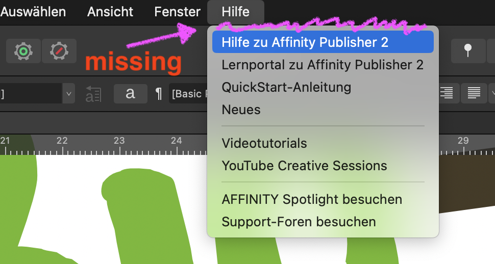
This. So after clearing up that this does not interfere with the decision to move help to the web, can we please get just the search for menu items back? Thank You very much in advance!!
-
since the last release version (2.4.2) and todays 2.5 release it seems to be missing the searchable help menu. see video/pics: Version 2.4: 20240523 v2-4.mp4 Version 2.5:
-
I can confirm this bug. ...although in your use case it could have been a feature rather than a bug... 😆
-
I noticed this too, several times (– I'm now on macOS 13.6.6, but it has a history back to macOS 12). -> Even worse, sometimes a dialog (save or export – can't remember) comes right out of the layers panel! ...which forces the panel to slide to the side to have enough space around it... I think I have seen enough to use this occasion to kindly ask the dev team: Please reconsider all UI elements regarding the z-positions and also get rid of the "sliding out" save sheets and use proper dialog windows which you can move around. As much as I love the Affinity Suite and its multiOS approach, the lack of love for the native Mac UI is frustrating at times.
-
I observed a lot of these anomalies, too. My theory is two combined factors: (A) some programmer(s) do not use light mode and therefore simply "forget" that they are working on a light/dark universal UI project so the icons and assets have to be universal/interchangeable and (B) testing is done mostly in dark mode so only we are seeing it. In an ideal workflow, one of the two stages should catch this from shipping, though... (but I also suspect they are the same pair of eyes)
-
Questions on Canva acquiring Affinity
woefi replied to kaffeeundsalz's topic in Customer Service, Accounts and Purchasing
Well, given how the "Figma-situation" went down, I think this is not a realistic scenario...