
kenmcd
-
Posts
2,228 -
Joined
-
Last visited
Posts posted by kenmcd
-
-
OK. Got just the JunicodeNoOT Roman VF to export. No Italic.
NoOT = No OpenType features at all.
JunicodeNoOTVF-Roman.v2.209.zipAPub Export to PDF does work with this stripped font.
Takes about a minute and a half to show the preview.
Then takes about a minute and a half to export the PDF.
Because it is slow - seems to process all the glyphs.
And it does appear APub is choking on the OpenType features.Below image is from APub Export to PDF, and then export a PNG from the PDF.

Note: The LibreOffice Export to PDF of the full original fonts (image above) takes seconds.
-
Without the OpenType features it does export to PDF.
Could not find the old VF version without the OpenType features.
So I removed all the OpenType features from the current v2.209 VFs.
But not all the instances are correct.
Will post the fonts when I get them fixed - for testing.Guess we could also test static fonts without any OpenType features.
Also - there are 5,832+ glyphs in v2.209.
-
It did Export to PDF when I removed all OpenType features from v2.209 VFs.
Have not got all the instances working in these modified VFs.
Will post them here when I do - for testing.With the original v2.209 VF and static fonts - APub crashed on Export to PDF
This below did Export to PNG - but crashed on APub Export to PDF
Works fine in LibreOffice Export to PDF.
This below did Export to PNG - but crashed on APub Export to PDF
Works fine in LibreOffice Export to PDF.
LibreOffice Export to PDF - and then to a PNG.
From a previous test done with Junicode v2.208.
-
3 hours ago, Morbus Iff said:
Junicode has over 3000 glyphs
Actually closer to 4500 glyphs.
And the number of glyphs does affect APub as it appears to always process all the glyphs in font rather than just those being used.
3 hours ago, Morbus Iff said:If I install non-variable TTF/Junicode-Regular.ttf and attempt the above, I CAN REPRODUCE.
Junicode also has a huge amount of OpenType features. Much larger than most fonts.
During the Junicode 2 beta phase I accidentally created a version of the VF fonts with no OpenType features at all (while helping fix an issue). So we can test with that font to see what happens.
On my phone at the moment but should be on computer in about an hour.
-
2 hours ago, Swami B said:
The characters are different, which when carefully observed would highlight the difference. What suggestion would you advance to set right the mistakes. .
Affinity applications do not currently support the Indic script/Devanagari.
It is not supported in the text shaping engine.
So certain OpenType features required to "shape" the text are not supported.
Which is why you see differences in the text.There are many requests for this, but no timeline on possible support.
-
6 hours ago, Sam Neil said:
I am trying to use the attached font with Designer and all I get is blank. Any ideas?
Affinity currently only supports COLRv0 color fonts.
LiebeHeide has two color formats - SBIX and SVG.
Neither of which is currently supported.Some color SVG fonts can be converted to COLRv0, but LiebeHeide is not a good candidate as it is all images with transparency (not vectors).
-
There should be a way to turn-off fake small caps.
Only real small caps from the topography panel.
Only fake small caps from the text panels.
Like the way superscript and subscript work.
This way is confusing - and buries missing characters errors.
You cannot test a font to see if all the required substitutions are there.
In LibreOffice you can test hundreds of characters instantly.
Enable small caps and the missing substitutions are obvious.
Fake small caps just hides the errors.In QuarkXPress the Bold and Italic buttons indicate if fake Bold or Italics is used the instant the button is pressed. It just shows a small icon in the button.
Instant feedback.Also in ID and QXP characters missing from the font are highlighted.
While you are typing.
Instant feedback.
-
1 hour ago, Woodpig said:
If you could point me in the direction of how to do it, that would be great. I'm going crazy. I have a font I own a licence to that I can't use.
Quickest and easiest is to use TransType.
It's visual, uncomplicated.You can also use python tools like FoundryTools-CLI which are free, but more complicated.
Any font editor - FontLab is easiest for name changes.
-
1 hour ago, Woodpig said:
OK, so having just had an argument with an idiot on the Apple Support forums, I can confirm that they don't think it's their problem, and they're not going to do anything, because system file supplementary fonts still work with Apple apps.
The issue is with fonts which Apple has now designated as "Document-support fonts."
This includes some fonts which previously were Core System fonts.
This includes some fonts which previously were Supplemental fonts.
Some of the fonts are commercial fonts.
Some of the fonts are free OFL-licensed open source fonts.Affinity has stated they are not going to implement Apple's font controls.
I agree with this.
It is beyond stupid to support Apple placing controls on OFL fonts.
It is beyond stupid to support Apple placing controls on commercial fonts you own.Even if Affinity did implement this, you would end up with none of these fonts appearing in your font menus, and you would have to manually enter the font names.
For fonts you own.
That is ridiculous.#### Apple.
-
Other options...
Export PNG at 1200dpi from PDF:
Edited PDF and converted all text to curves.
Then cropped the PDF.outlines from indesign_mt.cropped.pdf
Then converted the cropped PDF to an SVG.
outlines from indesign_mt.cropped.svg
That SVG looks like this in the browser:
Happened to use the ID PDF above, but it works the same with the MT PDF. -
8 minutes ago, Woodpig said:
Wow. And there is no sign of resolution to this?
The only work-around is to change the font name (properly). Apple apparently keys on the PostScript Name inside the font - so I have heard that changing just that field (nameID 6) works.
If you would like, I can make you a test font to confirm this.
-
5 minutes ago, Woodpig said:
So does that apply to all those fonts in the support font list?
All the fonts in the "Document-support fonts" section. Which is insane.
They are even blocking the free OFL Noto fonts in that list. The arrogance is stunning.
-
1 hour ago, Woodpig said:
OK, an update on this. I think the problem may be that Athelas is a system font on Mac OS. It doesn't appear in Font Book in the system files fonts, but you can see it if you go to HD>System>Library>Fonts>Supplemental.
Athelas is now an Apple-designated "Document-support font" - and Apple blocks access to it.
https://support.apple.com/en-me/108939#document
Even though Apple no longer supplies this font - you cannot buy the font and use it because the commercial font has the same name. So Apple is blocking your own fonts.
Only work-around is to change the font name.
Note: search this forum for "Athelas" to see other similar discussions.
-
20 minutes ago, Woodpig said:
Or is it simpler to buy the fonts directly?
Always better to own your fonts rather than rent them.
Far less problems in the long run. -
@tm19 Please attach a document which has this issue.
Then we could see the settings and the specific fonts used, and test it ourselves.
-
That is strange...
30 minutes ago, Hangman said:I don't believe the version of Nunito Sans Regular is a Google Font...
It could be.
For the most part, Google Fonts stopped including optical sizes in the static fonts included in the download packages.
So font families which used to have many static fonts, including for different optical sizes, now only have the one normal optical size, in the one normal width.So I am surprised to see Nunito Sans has two optical sizes, three widths, and eight weights. 160 static font files.
I thought they stopped doing this completely.
But this is actually a somewhat recent change.
The download package from 2024-04-02 had just the 16 static files.
This would include the Nunito Sans (regular).
Then the variable fonts were added (in my 2023-06-22 download).
Which also added optical size.
And the optical size statics were added for 7pt and 10pt.
Those are the Nunito Sans 10pt Medium and Nunito Sans 10pt Semibold.
And the variable font could be Nunito Sans Regular if a named instance was used.Anyway, I think he had the old statics installed, and the new optical size statics installed, and the new variable fonts installed.
And APub got a bit confused.But, it's working now.
-
18 hours ago, Berlina said:
Glad to see this has been solved... info for the future...
When the garbage text looks like the characters are on top of each other,
the problem is often duplicate fonts installed.Google Fonts makes their fonts so the static fonts and the variable fonts are interchangeable. This means the static and variable fonts will conflict with each other as the static styles and the variable instances (styles) are named the same.
You probably had both the static and the variable fonts installed.
With GF fonts only install one or the other.Note: in commercial fonts usually the variable font family name is different - with VF in the family name for example.
Some GF fonts have differently named variable fonts in the source repository.
Typically those font families made by an independent font developer.
Font example, the Inter font you are reading right now has Inter VF in the repository.Development of Nunito Sans has been taken-over by GF, so no VF font in the repo.
-
@Chicky It may get the correct font if you always select them from the font menu. That is using the typographic family and typographic style to select the fonts. Hopefully this may avoid the bad style-linking.
But, that dumb auto-Bold-button thing may still mess it up. Will test this tomorrow.
We are going to need to know if the work-around actually works - for the rest of the expected users with the same issue.
Another work-around is to only install the fonts actually used. Not convenient, but if ya got a deadline...
And always check the PDF to see if the correct fonts got embedded.
-
You posted this is the feature requests, but this is really a bug.
Known issue(s).
No response from Affinity to previous discussions.
I was hoping that with the previous fonts/topography person gone that stuff like this might get fixed now.
Oh well... maybe some day.Happens with:
- font families with multiple RIBBI style groups
- large super-families in one Typographic Family
- non-generic RIBBI style groupsThe Bold and Italic buttons activate the style-linking in the fonts.
In a style group the Regular font is linked to the Bold font by the Bold button.
This was a big upgrade from the old individually selected fonts.
Just press a button to get the Bold or the Italic.The generic style-group is RIBBI - Regular, Italic, Bold, BoldItalic
But an RIBBI style group can include any four fonts/weightsOf course Apple has never supported this simple system, and even today purposely sabotages some of their fonts to make sure this does not work.
Apparently Affinity has chosen to support a handful of mediocre Apple macOS fonts at the expense of properly supporting advanced, well-made, standards-compliant font families used throughout the graphics design industry.Adobe and Microsoft do support the proper implementation of this system.
Which is why your fonts do work properly in Adobe InDesign, and in Microsoft Word, and LibreOffice, and many other applications.
Unfortunately Affinity Publisher is not one of them.Part of the problem is supporting iStupid macOS nonsense like enabling the Bold button for all fonts equal or above 500 weight.
This ####s-up the style linking for non-generic style groups.
For example this breaks the style-linking in Avenir, Avenir Next, and Avenir World.
Hugely popular fonts that work properly in InDesign and LibreOffice.
Broken in Affinity Publisher.Arno Pro is designed one large typographic family with many style groups.
There is an RIBBI style group for each optical size.
So there are five RIBBI style groups.
This appears to confuse APub.Cronos Pro is designed one large typographic family with many style groups.
It also has multiple RIBBI style groups for each optical size.
So if you only installed one optical size, such as Caption, there are two RIBBI groups.
RIBBI 1 - Regular, Italic, Bold, BoldItalic
RIBBI 2 - Light, LightItalic, Semibold, SemiboldItalic.
This appears to confuse APub.
Install all five optical sizes, and APub is really confused.Warnoc Pro - all in one large Typographic Family, one RIBBI group per optical size.
Minion Pro (and Minion 3) - one large Typographic Family, one RIBBI group per optical size.
Kepler - APub has no chance of getting this right.
All in one large Typographic Family.
All fonts are in RIBBI style groups.
Three RIBBI style groups in single optical sizes.
Three different widths.
Never gonna happen in APub at this time.
Works fine in InDesign and LibreOffice.Adobe Jenson - IIRC this has four RIBBI style groups in the family
Cannot find it at the moment.Adobe Garamond Premiere Pro - one large family, four optical sizes, four RIBBI groups
Other hopeless font families in APub...
ITC Avant Garde Pro - two non-generic RIBBI style groups.
RIBBI 1 - Book (300), BookItalic (300), Demi (600), DemiItalic (600)
RIBBI 2 - Medium (500), MediumItalic (500), Bold (700), BoldItalic (700)
There is no Regular (400) weight font in the family.
APub's little brain should just explode on that one.
Works as expected in LibreOffice.IIRC Helvetica Neue LT Std has the same issue as Avenir.
It has two RIBBI style groups.
Would have to check it to see.Long ago I tested Avenir by only selecting the base style in each style group and then applying the Bold and Italic buttons to get the other styles.
Things did not look right.
Export to PDF embedded the wrong fonts.
That discussion was over two years ago - and had no response.Until they get rid of this iStupid macOS Bold nonsense, its never going to work 100%.
That would be a sign they actually care that this is still broken.
But given that there has been no response to previous discussions... oh well.
Maybe it is hard to fix and the "strategy" is to ignore it pretend it is not there.
Or maybe it is smooching Apple's behind at the expense of Windows users.
But it also does not work correctly for APub users on macOS.
Dumb.Pretty bad situation as anyone established coming from Adopey is going to use these fonts.
And they are all broken in Affinity Publisher. -
7 hours ago, Wazyx said:
The names of my work plans are illegible because of the font, but I can't find a way of changing or defaulting to this font.
Find the font you have installed that looks like that text - and un-install it.
Some free fonts were created from old versions of Arial and incorrectly still have "Arial" in some of the font internal name fields. This confuses Affinity and it displays the other font. So un-installing the bad font should fix this.
Note: if you actually need this bad font for something else, it can be easily fixed.
-
2 hours ago, ShenaJ said:
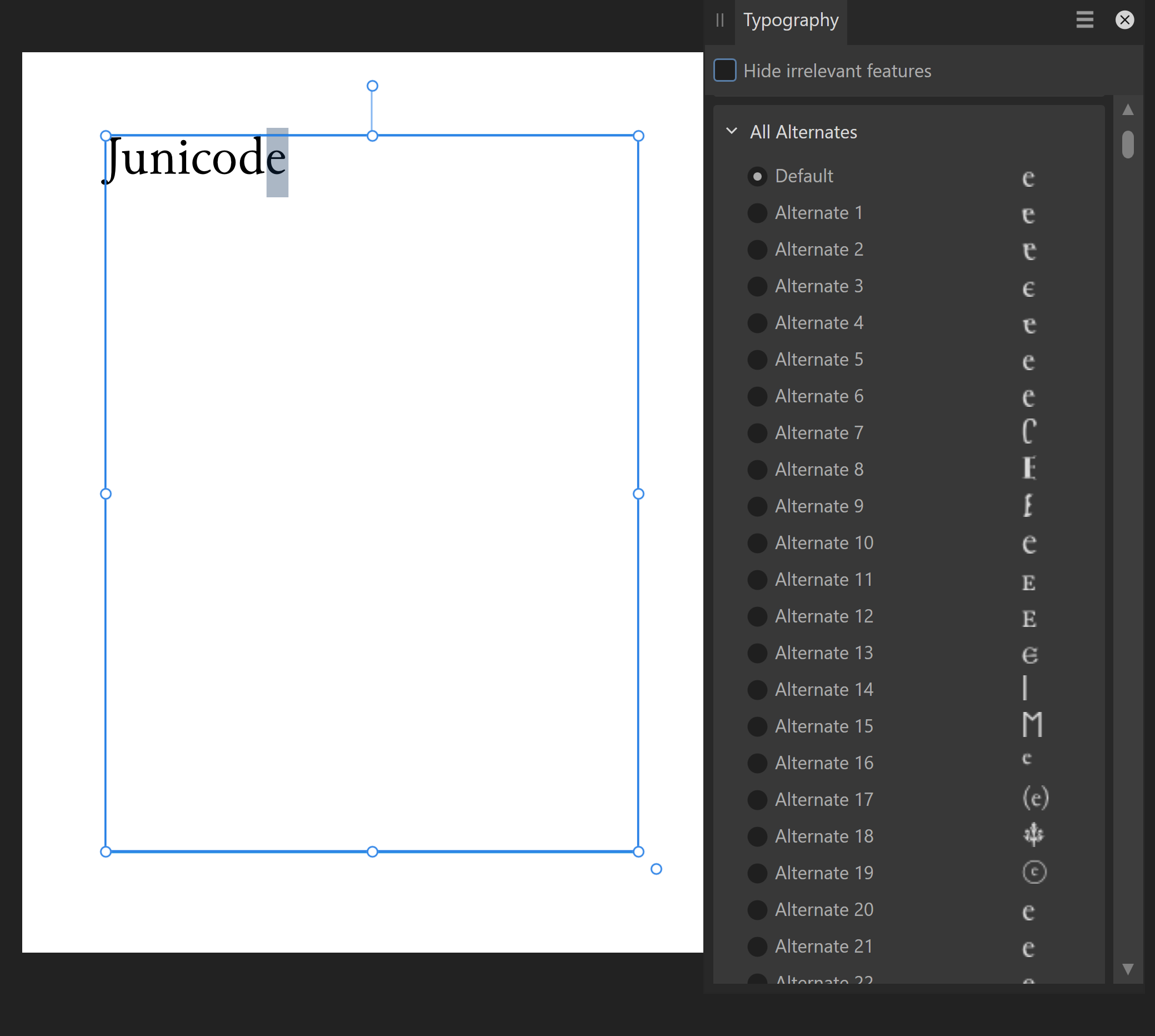
I'm really trying to transition from Illustrator to Designer and have a quick question. In Illustrator, if I highlight a letter, a box will pop up underneath showing me all the glyphs available for that letter. The only thing I see in Designer is the glyphs panel on the side, where I have to scroll through the various sections to see all the options, but can't see them next to each other to make an informed decision. Am I missing something?
That pop-up box in Adopey applications is displaying the results of the OpenType Access All Alternates (aalt) feature.
The closest thing to that helpful box in Affinity is in the Typography Panel.
Highlight one character.
Then look for the All Alternates section in the Typography Panel.
The result is going to give you all the OpenType alternates for that character in that font - in one long list.The Junicode font has a lot of OpenType features and thus has a lot of alternates.
The list is so long for this font you need to scroll to see them all.
Below is a screenshot with the Typography Panel in Designer v2.5.3 on Windows 10.
Note: the font does need to have the aalt feature. Many do not.
So a font may have other OpenType features, with alternates, and not have an actual aalt feature (which is basically a summary of alternates from other features).
I think Adopey will gather the look-ups from other features, even if the aalt is not actually there.
So it makes an aalt feature for the pop-up box even if aalt is not there in the OpenType features.This feature (the pop-up box) has been requested many times.
So far it has not happened. -
★
On 10/1/2024 at 11:43 AM, Episaga Games ltd said:I noticed as well when I pasted a star the undid the paste and then redid the paste I got an option to redo a square symbol.
That box is the .notdef symbol - which means the character is not defined in the selected font.
On 10/1/2024 at 11:43 AM, Episaga Games ltd said:Also it may be of interest if I paste a star and then begin typing it is in the webding font.
The webdings font does not have a star symbol.
Webdings is an old style symbol font (not a modern Unicode font).On 10/1/2024 at 2:28 AM, Episaga Games ltd said:Some symbols may be from a symbol font (not Unicode). ............................No clue what that means
Once upon a time... back before Unicode... fonts had collections of characters called code pages. And all the different vendors had different code pages. A freakin' nightmare for cross-platform compatibility. This included collections of symbols, and they are all different. These are unfortunately still around for legacy compatibility reasons.
Using a symbol font for anything cross-platform is going to be a potential problem.On 10/1/2024 at 2:28 AM, Episaga Games ltd said:Need to know what font is used on the star in that pasted chart..........................Wings dings either 1 or 2
Wingdings 1 does have a black star symbol, but it too is an old symbol font.
No telling how an old Office application is going to embed a symbol.LibreOffice (LO) had a similar issue with the symbols used in Word bulleted lists.
LO on Linux or Mac did not have these same old Windows symbols fonts.
And the way these symbols were embedded did not make replacement easy.
They made a sort of hybrid font from OpenSymbol (opens___.ttf).
And the doc import code in LO fixes the mess.
Office 2003 is an antique and I have no idea how the chart app embeds a symbol.
That is why knowledgeable people want to see a source document.
Images are useless.
Since you are using Office 2003, there is only .doc and no .docx.
With a .docx we could look inside and see exactly what is in there.
Or with an export to PDF we could at least see if it is just a shape.But it can all probably be avoided by using a modern Unicode font for the star.
As I suggested above.
This ★ is a Unicode character (blackstar, U+2605).
Since this character is not in the Inter web font used in this forum, my Firefox browser is smart enough to substitute it (in my case with Segoe UI Symbol).
Even Safari can probably get this right as this character is in the Apple Symbol font.So replace the star symbol in your source document with an actual Unicode black star symbol (U+2605).
Noto Sans Symbol 2 has the blackstar (U+2605) - free OFL font
Segoe UI Symbol (a Windows standard font) has the blackstar (U+2605)
In addition, BabelMap gave me a long list (126) of my installed fonts which support this character.If this does not work, and you still will not provide a sample doc - I'm done.
I have no idea how a 20-year-old version of Office is embedding symbols.
That is still in the GDl/Uniscribe era before DirectWrite.
Who knows what they were doing back then.p.s. Ignorance with Attitude is not a way to make friends, or get help.
-
1 hour ago, JamieT said:
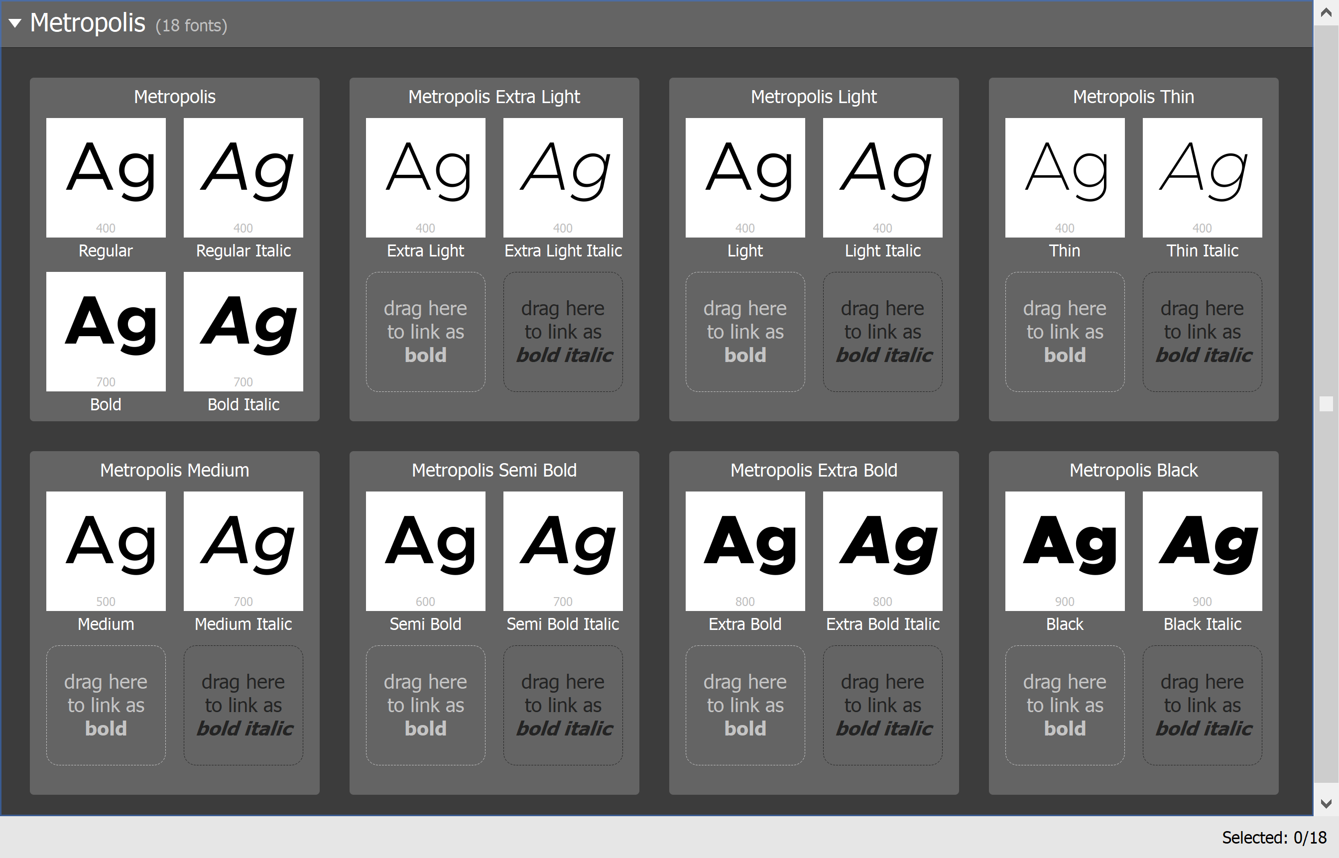
My version in case useful to anyone:
- Version 1.000;PS 001.000;hotconv 1.0.88;makeotf.lib2.5.64775. Modified 14 September 2016 at 13:50
- Not sure where I got it from now, could have been https://github.com/typehaus/metropolis/tree/main/dist/ttf or https://www.1001fonts.com/metropolis-font.html
Yes. Those are the bad ones.
The image below shows eight of the fonts are set to 400, and four are set to 700.
There should only be two for each weight (one for the roman, and one for the italic).
As you have found, the fonts @MikeTO linked to above are correct.
-
What version of Metropolis do you have?
And where did you get it?
Note: the version always says v1.000.
So you need additional info like release number, date.Some versions of Metropolis have the same weight settings on multiple styles.
So that could be the issue.
I have a version in which the weight settings are correct.Please attach the fonts you have here (they are OFL).
I want to check them and see if that is the issue.
If they are the same as my "good ones" then the issue is something else.


Wrong emoji's showing up from Iphone to Publisher
in Desktop Questions (macOS and Windows)
Posted
Emojis are often sequences of characters (i.e. 2, or 3, or 4 Unicode code points).
That is how they get skin tones, regional flags, etc.
And those sequences may be different on different operating systems.
Some applications use short-codes (i.e. :emoji: ) and those are different depending on the application, or if supported at all.
When you use the emoji tool in your iPhone it is using some system the phone OS understands.
That may or may not be the same as the system used in the macOS emoji tool.
When you copy-and-paste the emoji, who knows what is actually behind that emoji.
Some codes? Different codes? A short-code? Dunno.
Apple Color Emoji is an SBIX format font.
It is a bitmap format, so many small PNG images, which are sometimes layered.
Affinity does not support color SBIX fonts.
So they have some sort of special handling which works together with the macOS emoji tool to embed those little emojis into APub.
After all that...
Cutting-and-pasting the emojis cross-platform is probably never going to work.
Use the emoji tool on your macOS to insert the correct emoji in APub.