AffinityJules
-
Posts
793 -
Joined
Everything posted by AffinityJules
-

Geometry (Layer Tab)
AffinityJules replied to AffinityJules's topic in Desktop Questions (macOS and Windows)
Thanks for taking the time to post this, very useful to know and to have explained in detail. I don't have Designer - it's all too much for me, I'm strictly a Photo user who uses nothing else. -
Geometry (Layer Tab)
AffinityJules replied to AffinityJules's topic in Desktop Questions (macOS and Windows)
I see the tutorial here is for Designer, is it the same as the functions in Photo? -
Geometry (Layer Tab)
AffinityJules replied to AffinityJules's topic in Desktop Questions (macOS and Windows)
Nope. I have trouble with the help section, I can never find exactly what it is I'm looking for. A video would be preferable. -
Are there any tutorials out there that explain or show how the geometry tools work in Photo, and what they actually do? It's something I've only used now and again - mainly through lack of understanding, and some of the terms baffle me as to what they mean. Like Xor for example, what the hell is that?
-
That's true for a lot of those early Sci-fi novels. In my youth I was all about Frank Herbert, Robert Heinlein, and Samuel R. Delaney who wrote "Dhalgren" . . .a book that had a profound effect on me, a book that even to this day I still think about from time to time.
-
That's an interesting thought. I have read some James Blish novels in the past, and I definitely know about "Cities in Flight," but I can't remember if I've ever read it or not.
-
It's the mind that's amazing! 😉
-
Now what are you going to do with it?
-
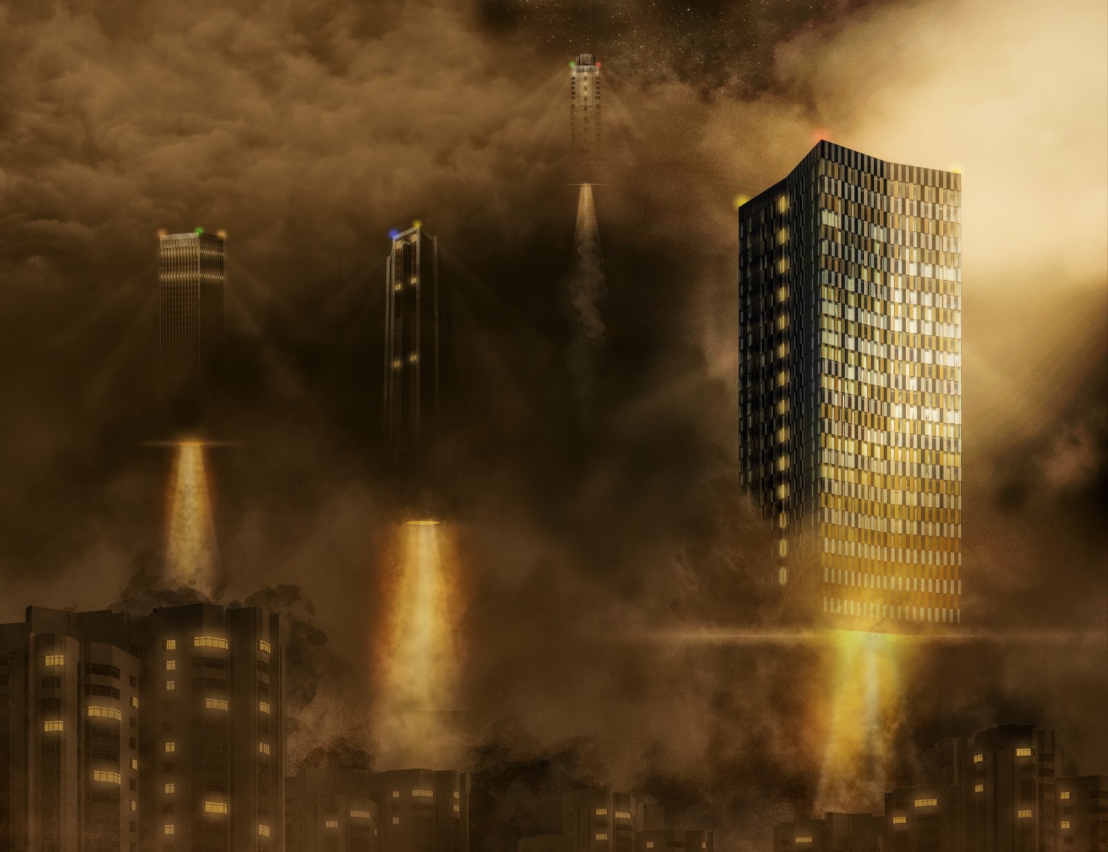
Thanks, and I hope you like my solution for getting rid of those damn high rises. 😄
-
I came across a picture on Unsplash of a tower block (right tower). The aspect ratio was portrait but as soon as I saw it my mind took off and visualised the picture here. I had to widen it to widescreen but that didn't really work - I had to make the picture taller to fit everything in. Bit whacko I'll admit, but imagination is its own creator, and I've just learned to run with it when it feeds me the inspiration.

-
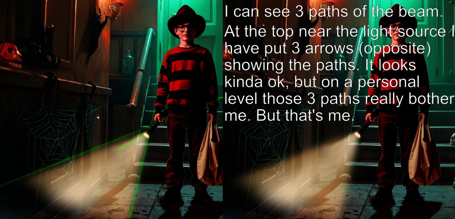
What was I saying about using a guide before creating light beams?
-
It's coming together slowly but surely, but you really need to start being a bit more observant in what you're doing. There is clearly a conflict regarding the travel of the beam. As my example shows, I can see 3 lines of travel. I think you used too much blur at the top end near the torch and that has caused the dip in continuity with the beam. Try using a live blur filter then use a mask on the main layer and set a gradient to smooth out the beam as it leaves the torch. This will sort out your troubles. . .hopefully.
-
Now you're on the right track . . .a bit more thought, application. and experimentation will get you far. But I can still see a notch in the same top left hand side of the beam, it spoils the overall look. . .get rid of it. EDIT: I think the most likely cause of that dip is over-blurring, try using harder edged copies and use blend/opacity/blurs to help seat them better within the composite. You need a definite line to create the beam which should get softer the nearer it gets to the ground.
-
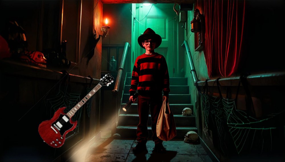
The first thing that struck me was how much the light beam resembled a Gibson SG! What do you think.
-
To my eyes it looks very jagged. Top left close to the torch the beam has a significant cut-out which is very noticeable. But you can see that, surely?
-
Thanks for that - I just hope I gave you a few pointers to help you along the way without becoming a dictatorial director! (sorry, just my humour). It's all very well telling/advising people how to do things in AP - that's why I post actual examples so the person can see exactly what I mean. That's not to say there's only one road leading to Rome, it's just one route of many that I prefer to travel down. With a little patience, thought, and careful application, you can get anything to sit well within a composite. Some of my earlier attempts at light back in the day were laughable to say the least, so I set about trying to figure out a better method for applying it to my composites. The multiple layer approach has given me the best results. Your latest update is ok, but I can clearly see 2 distinct shapes forming the light beam. . .can you?
-
Makes me wonder if anyone of any importance at Serif will now listen?
-
Pen Tool Affinity Photo
AffinityJules replied to Colin Red's topic in Desktop Questions (macOS and Windows)
Now that is currently a very good question which should, by right, be simple to answer but it's not. Ever since those 2 damn buttons appeared on the context tool bar that seem to do what ever they want - when they want to do it, the pen tool behaviour has become intolerable and very annoying. Yes, you can turn off the fill from the context tool bar, but as soon as you use a fill on a layer, the next shape or curve you create will default to fill again. And it goes on and on and on. Before those self destruct buttons appeared the pen tool was a joy to use, but now it's just an annoying pain in the posterior. # gives us our pen tool back. -
To my eyes it looks ok to a degree, but what I think is not the issue here. The issue is how does it look to you?
-
I would extend the triangle shape so that it almost goes off screen; depending on its strength, light would just keep going until it hits a surface. In my example I placed 2 circular shapes, 1 either side of the main beam and squashed them out of round. I used a blur brush (although the tool is pretty much rubbish) to blur out the lower part of the main beam to soften the beam line before it contacts the floor. As with all things relating to composites, one must experiment until the moment arrives when something looks good to the eye. Does this look good to your eye? If it does then go with it.
-
Hexacode? If I knew it i'd tell you. All I did was to choose a light hue from the yellow part of the spectrum.
-
If I open a picture and use the pen tool to cut out a segment the pen tool selects a stroke (I don't want it to default to that) I am forced to turn it off. I again use the pen tool on the same picture and this time it selects a fill regardless if I have turned it off or not. I am forced to turn it off again. I continue using the pen tool for a couple more selections and at some unknown random point it begins to auto select a stroke again. Those 2 annoying buttons on the context tool bar should be removed along with their function and allow the pen tool to be as usable as it once was. As I use the pen tool a lot, this function? . . has made me decide to not use the program anymore. Thumbs down to the developers.
-
There was a time when using the pen tool was a flawless joy. You clicked the button and off you went without hindrance. Now however, the pen tool has become stroke and fill mad and insists on interfering in everything. I also have to say that I never. . .NEVER. . .EVER. . .use strokes or fills when using the pen tool - never have done, never will, I don't work that way. Please can we have the pen tool behaviour set back to where it was, to a time when it was user friendly and functional. Right now it's an interfering, annoying mess. 🤬
-
Perspective Tool Pane
AffinityJules replied to clownfish's topic in Desktop Questions (macOS and Windows)
How odd! Moving the panel and having it stay where I put it has always worked for me. It's an Affinity mystery. -
Perspective Tool Pane
AffinityJules replied to clownfish's topic in Desktop Questions (macOS and Windows)
When the use the perspective tool try moving the dialogue box to where you want it, then close and reopen it. It should now open in the same place you just dragged it to. This will work until you close the program, when you reopen it you will have to do the same thing again. That's as good as it gets. As far as I'm aware there is no such setting which relates to where dialogue boxes open.