AffinityJules
-
Posts
795 -
Joined
Everything posted by AffinityJules
-

affinity designer March of the Robots and Comic Book Template
AffinityJules replied to StuartRc's topic in Share your work
They're all good, as usual, but boat floats my boat! 😉 -
affinity designer March of the Robots and Comic Book Template
AffinityJules replied to StuartRc's topic in Share your work
Very creative as usual. 😀 -
Inpainting brush tool is disappointing
AffinityJules replied to T Chalklen's topic in Desktop Questions (macOS and Windows)
Now that would BE something if the Inpainting tool could remove the van AND replace the entire background to boot. Something as good as that might help save Serif from its woes. -
Realizing you can duplicate masks
AffinityJules replied to Taxicab Messiah's topic in Share your work
There's nothing quite as satisfying when inspiration and discovery converge to create something special. Very nice effect. -
Yes, you got it. A play on a word/name of a popular book that found it's way to cinema and tv. Although nothing to do with the subject matter of the book, the inspiration did come from it.

-
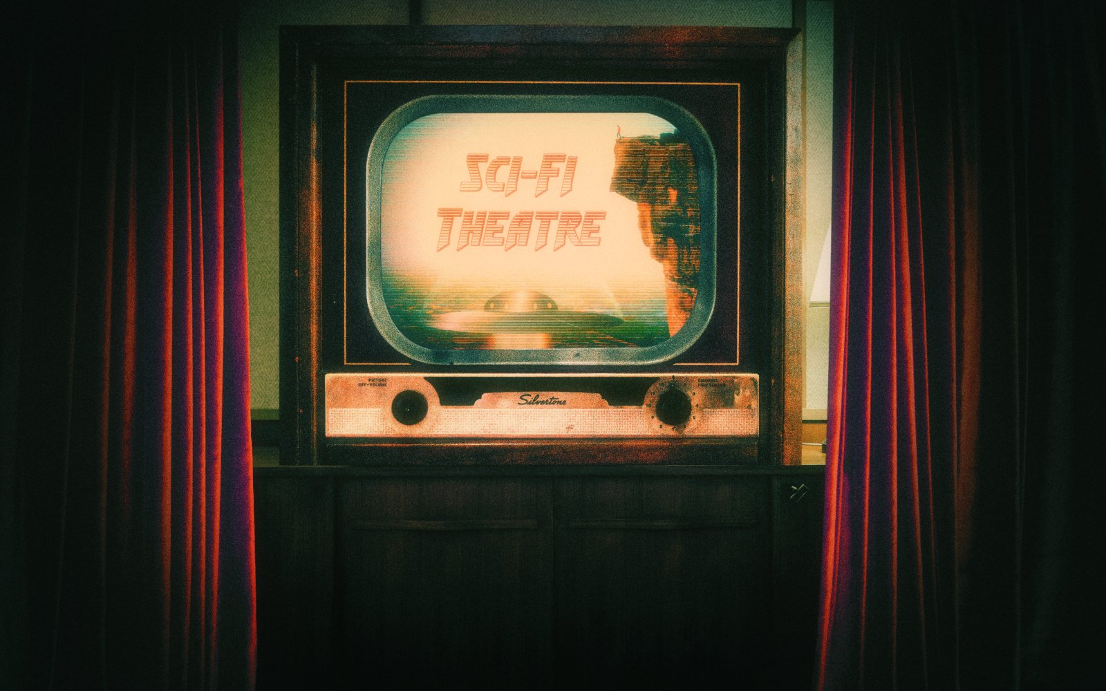
TV's with rabbit ears! The perfect thing to watch 50's sci-fi films on.
- 7 replies
-
- 1
-

-
- affinity photo
- composite
- (and 3 more)
-
Oh wow! Never heard of anything like that before, it must've looked horrendous. And it rather befits my title doesn't it? An external gimmick = Outer Gimmick.
- 7 replies
-
- 1
-
-
- affinity photo
- composite
- (and 3 more)
-
Geometry (Layer Tab)
AffinityJules replied to AffinityJules's topic in Desktop Questions (macOS and Windows)
Nope. . .not really getting this at all. I'm at the point now when I revert back to simply rasterising the shape/selecting it/then removing the unwanted part. Update: double nope! Decided to revert to old methods which I know will work for me. I don't think I'll ever visit the geometry tab ever again. What a faff!
-
As I'm sure it is for everyone. 😄 I toyed with the idea of a black & white image on the tv but it spoilt the whole aesthetic.
- 7 replies
-
- 1
-
-
- affinity photo
- composite
- (and 3 more)
-
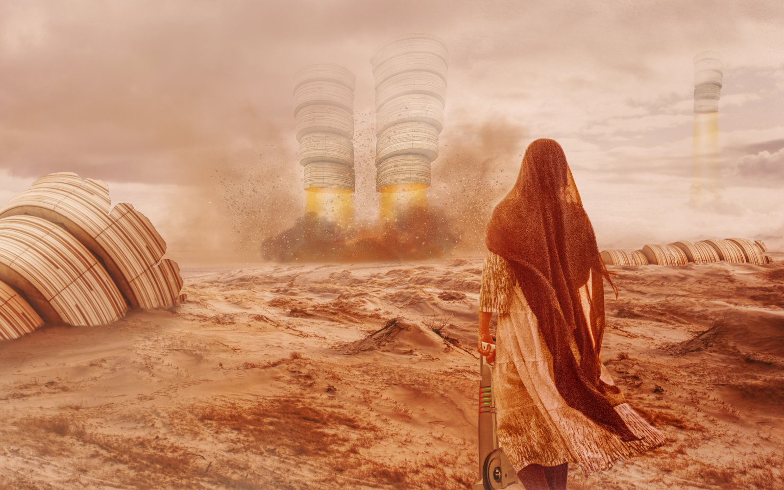
I was thinking about that old tv show "The Outer Limits" the other night, and before I knew it I started making this picture with my 60's hat on. It is 2 composites in one. The main backdrop measured 5120 x 3200px, and the composite on the tv screen measured 2560 x 1600px. The final composite was reduced in size down to 2560 x 1600px so it would fit my laptop's widescreen dimensions.
- 7 replies
-
- 5
-
-
- affinity photo
- composite
- (and 3 more)
-
affinity designer Infected & Comic Book Toolkit
AffinityJules replied to StuartRc's topic in Share your work
DO IT ALREADY!- 77 replies
-
- 1
-
-
- affinity 2.0
- inking
- (and 3 more)
-
affinity designer Infected & Comic Book Toolkit
AffinityJules replied to StuartRc's topic in Share your work
Looks like I missed one. 👍- 77 replies
-
- 1
-

-
- affinity 2.0
- inking
- (and 3 more)
-
Artistic text tool in AP2 photo
AffinityJules replied to DaleL's topic in Desktop Questions (macOS and Windows)
You can use the live mesh warp filter on artistic text without rasterising.
-
affinity designer Infected & Comic Book Toolkit
AffinityJules replied to StuartRc's topic in Share your work
Lol. . .taking the family out for a stomp and a stroll.- 77 replies
-
- 2
-
-
- affinity 2.0
- inking
- (and 3 more)
-
affinity designer Infected & Comic Book Toolkit
AffinityJules replied to StuartRc's topic in Share your work
Now you've lost me! I was under the impression that it was a vector drawing? But heck, I know nothing at all about the 'V' word. -
affinity designer Infected & Comic Book Toolkit
AffinityJules replied to StuartRc's topic in Share your work
He seems to have a lot of moving parts with the added weight of an Elephant. 😄 -
Ah got it! I saw that game when it came out - definitely, without a shadow of doubt, Giger inspired.
-
Hi StuartRc. Yes, I will give it a look see.
-
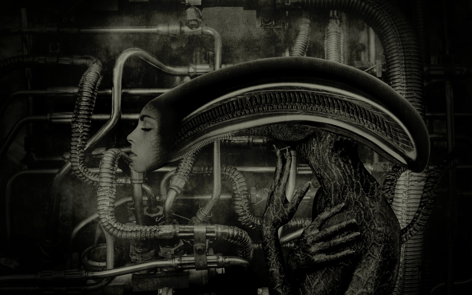
Hi smadell. Believe it or not I did actually toy with your suggestion when I was compositing the picture, but after many trials and errors decided to go for photo-real approximation. But you never know there might be a Mark 2 at sometime. And in a collision of worlds, my previous picture was inspired by the cover of "Brain Salad Surgery." I dragged it from my collection nesting place and the idea took off and gave flight. here
-
I just had to get this out of my system after my last Giger inspired picture. I appreciate that this will not be to everyone's taste - so sick bags on standby. I totally winged this picture with absolutely no sampling from online pictures to help it along the path of Giger authenticity. It all came from memory with wide lashings of artistic freedom bunged in for good measure. Accuracy was not my goal for this venture but overall look and feel was. 2 source photographs plus loads of shapes and Channel Mixer adjustments contributed greatly to this image.
-
affinity photo Ephemeral Line Prototype
AffinityJules replied to AffinityJules's topic in Share your work
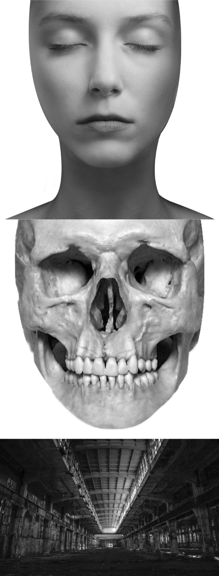
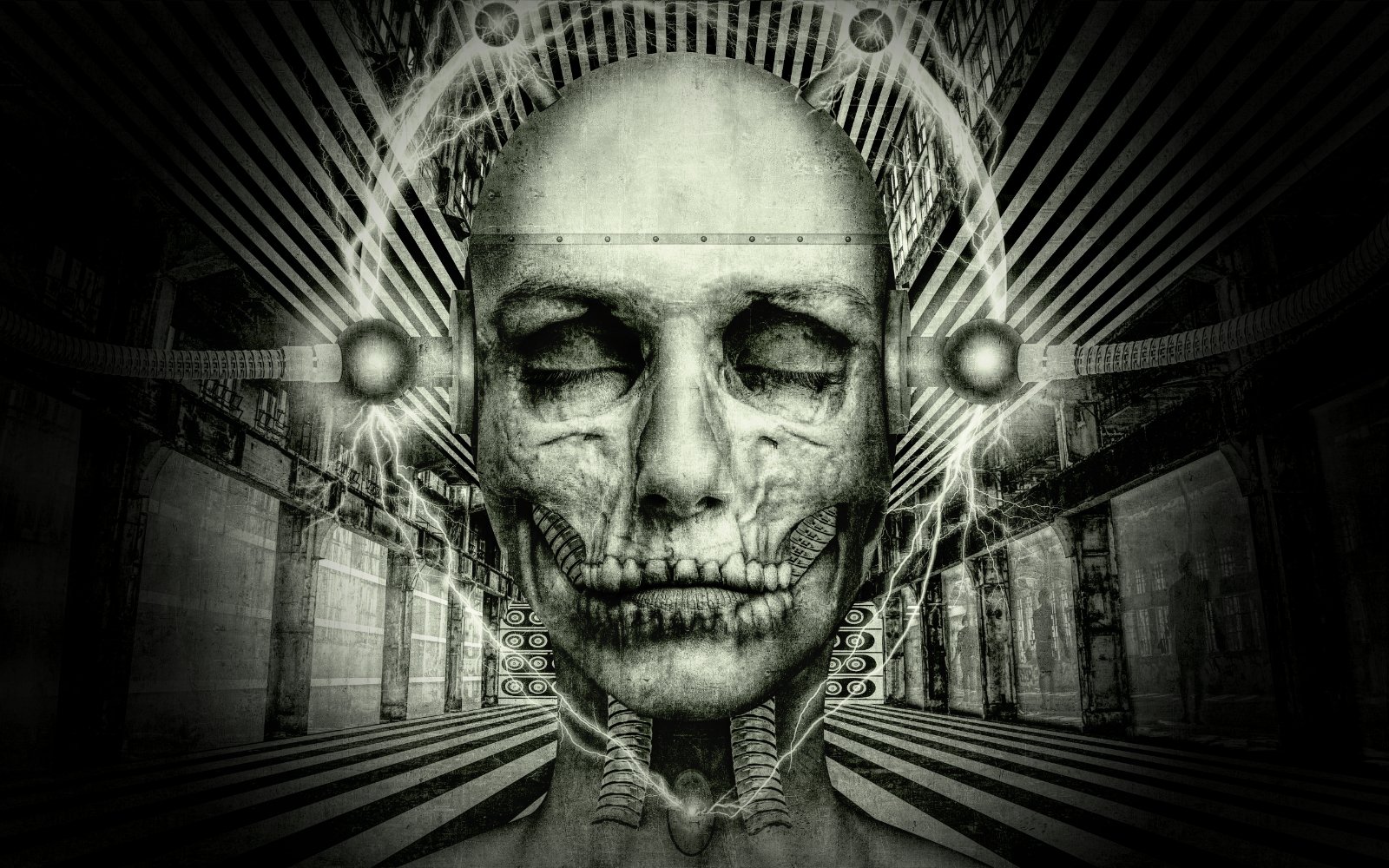
I just remembered that I do have the original files on the master composite - what a cement head that I forgot that. Anyhoo. . . the woman had some hair that has been removed and I duplicated her neckline and flipped it horizontally. The skull has been cropped, too, which was then size matched to the woman's head. The main backdrop was a disused factory which had a ton of graffiti on the pillars - these I removed by inpainting. These are the 3 main photographic elements, the rest was done by using shapes and grading them with light and shadow etc. I used a lightning brush for the electric effects around the head, and I used procedural texture on separate files to create the lined walls just to cover up ghastly points in the backdrop picture. It took me about a week to finish (I don't work continuously on my images) I take many steps back to give myself time to think about things. In total there are 57 layers which make up the finished composite.
-
Every time I see reference image designs like these for sheet music and the like - including your previous post, I can't help but think of Dad's Army. I know that this version 2 has no contributions by Flanagan and Allen, but perhaps it's the approximate time period that triggers them in my mind? Lots of big names from the time period loomed into view across both posts. . .talk about a blast from the past.
-
affinity photo Ephemeral Line Prototype
AffinityJules replied to AffinityJules's topic in Share your work
Greg Lake and King Crimson are held very high in my esteem. I always loved listening to Greg Lake with just him and his acoustic guitar. Anyway, I have since deleted (as I always do) all photos I used in this composite, but I will endeavour to explain it the best I can. The picture of the woman was originally black & white and cropped as you see it so I had a 3/4 high face to work with. The skull was full scape, but as the woman's was cropped so was the skull. I had a brain wave to include a domed scalp with a joining fixture to the actual face itself - this worked rather well so I kept it. The face and skull were both masked - as you might expect, and then it was a matter of blending the wanted parts in, and blending the unwanted parts out until an aesthetically pleasing balance was achieved. I used the Channel Mixer across the entire image (all layers) set to target greys to keep the tones in check which also helped with the blending process. I also added some light and shadow to the parts that needed it to help seat the face and skull together. Then it was a matter of finding a good opacity level as far as the skull was concerned, this turned out to be 78%. I also used another Channel Mixer adjustment on top of the layer stack but this time I set it to target colour, namely blue to set an icky looking yellow with a dash of green for the finished image. And in addition, I used a stone texture just underneath the Channel Mixer -set to Overlay with a lowish opacity to give the image a touch of grain and visual mystery. And for one final adjustment I sent the finished image to the Tone Mapping Persona to add a bit more texture and detail. I don't understand the Tone Mapping Persona that well but what ever it does. . .I like it. My target, or idea, was to suggest to the viewer that the flesh on the face was being created - in real time as it were - and my image is a snapshot of the process involved in creating a Gigeresque Bio Mechanoid. I hope this explains it well enough, I don't usually dabble in technical explanations, I'm just an 'on the fly' compositor who doesn't dwell that much on technical detail or knowhow - I just press the buttons when I know what they do. 🤪 -
How the hell did I come up with a title like that, and why? Well, the initials are E.L.P, and this just happens to be the same initials as the British prog-rock band E.L.P = Emerson Lake and Palmer. On the 7th December, 1973, E.L.P released "Brain Salad Surgery," and H.R. Giger (of "Alien" fame) designed and created the artwork for the album cover. I was always drawn in a strange way to H.R. Giger's work, it attracted me and repulsed me at the same time. If you're not familiar with the cover art just punch in the title in your search engine. Anyway, my inspiration for my latest foray into compositing comes from that album cover design. I never intended to directly copy it - that would be pointless but, the inspiration came directly from it. I tried to leave out all the icky and disturbing elements that Giger included in most of his artwork, but I think a few have crept in. 😜
-
Ah! The old transparency technique. 😀 Coincidently, the current composite I'm working on will require a bit of that.
- 1 reply
-
- 1
-

.png.43306bae7ecc18d864ff9f734974c44f.png)
.jpg.598b84b05d40550d2b07d39430741dd2.jpg)