TestTools
-
Posts
85 -
Joined
-
Last visited
Everything posted by TestTools
-
I haven't worked on this in a long while, but opening it today for a project I noticed a few things to change...and on finishing (hours later), I thought I would post it here.

-
- 3
-

-

-
Car Poster - Vintage Automobile Show Poster, Paris
TestTools replied to GaryPF's topic in Share your work
Excellent find for the font, as well. Nicely done. -
Terrific…thanks (I think…now I have to learn about this world of Brushes, something I know nothing about.)
- 20 replies
-
- 1
-

-
- free brushes for affinity photo
- free nature brushes
- (and 8 more)
-
I think your instinct is correct. (…though I would drop it down a pixel so it doesn’t touch the dot/grid.)
-
Zounds – totally captivating.
-
Phew!!!! Beyond Astounding…thanks. I can do technical illustrations, but I wouldn’t know where to even start with making such subtle softness. Well Done
- 21 replies
-
- 1
-
-
- affinity designer
- butterflies
- (and 2 more)
-
Thanks! Well Done
-
Really Spécial.
- 1 reply
-
- 1
-
-
- gold
- gold brushes
- (and 3 more)
-
Great imagination on all those nuances. End of the wood pièces, the réflections…very nicely done.
-
Publisher; Hyperlinks; Export; PDF…links not working
TestTools replied to TestTools's topic in V2 Bugs found on macOS
You mean the one that says, « Include Hyperlinks »? Why would I want to do that??? Many thanks Old Bruce. I knew it would be something completely obvious to everyone but me… -
Hello; I took the attached affinity Designer 2 file and opened it in freshly updated Publisher 2 for Mac and for iOS. On the right side bottom fricative lines, you will see that I tried to add hyperlinks to some single characters…they appear as hyperlinks when exported as a PDF, but the links don’t appear on roll over, nor do they appear to be attached to a working link. Any advice would be appreciated. Musical Instrument Range Chart_Publisher1a.pdf(Of course, I have never used Publisher before, only Designer, so doubtless, I am missing something obvious.) Musical Instrument Range Chart_Publisher1.afpub
-
Thanks GarryP – appreciate the idea ! I'll give it a try. So much fun nuance to learn.
-
I’d like to add my list to this. Just like we can make the RGB colors 16 bits, I’d like to allow luminosity and other similar parameters to allow at least a few decimal places. Since our monitors are now in the thousands of nits, we should be able to adjust 10,000:1. …and while making that change, predict the future and let it be higher. LED walls in cinemas and on the Strip and in concerts are at a million:one.
-
Issue solved – I just made a line composed with dashes then duplicated them with the move duplicate tool. Now, it opens and saves fast, it moves around fast. I didn't get to learn Procedural Texture, but there is always next time...
-
Cog and Circle not the same size
TestTools replied to abject39's topic in Desktop Questions (macOS and Windows)
Yes to all these things. But if this ‘orange where it should be yellow’ edge shows up at all, it stands out. You’ve certainly seen fringing where it shouldn’t be regardless of if it is in the jaggy – and the blur is unacceptable if it is a 3rd color when it is supposed to be 2. Of course, if it is a motion picture, it is unnoticeable. But if it is a test slide, then the anomaly shouldn’t be there. On a straight horizontal or vertical line, if the color isn’t exactly on the mirror, its non-edge stands out and the wrong shade stands out. Sure, a line at a diagonal will have a jaggy aspect regardless (especially if seen to close). But if colors or shades leak in that aren’t what they should be, it will look like the alignment is wrong, (the appearance of fringing) – and the tech will wonder why. And now with extremely fine LED screens and laser projectors, precision is even more required. Fringing shows up on the LED screens in different ways with different colors depending on the pixel element placement and algorithm anyway – so it is appropriate that the test material is not a factor. -
Cog and Circle not the same size
TestTools replied to abject39's topic in Desktop Questions (macOS and Windows)
Indeed; sometimes it sticks out like a sore thumb, sometimes I am the only one who sees it – it depends on what the viewers eyes get entranced with. I, of course, get entranced with the error, and I just cannot un-see it ! Since the slides are usually made for evaluation of a system – trying to make objective an inherently subjective system, it just can't be released with a flaw. The user might think that it means there is something wrong with their display, then they spend the hours that I should have spent making things perfect, only to find it is not their issue. Long ago I shared this drawing < https://cinematesttools.com/download/primary-and-secondary-radial-squares/> when I was wondering what I was doing wrong when squares wouldn’t align perfectly – the size of the square would be off just enough. I don’t know if that is still the case. I seem to remember that the solution was to add a lot of zeros in the dimension boxes, so instead of 1.5, make it 1.5000000000. …or so it seemed at the time. Good luck to us all. -
Cog and Circle not the same size
TestTools replied to abject39's topic in Desktop Questions (macOS and Windows)
It seems insignificant until that one little thread of an uncovered color appears when the image is magnified on a much larger screen. I have Command-D duplicated circles that then become different colors and in Command-0 mode it is all fine. But when that 20 cm tall image is suddenly 20 meters, these insignificant and obscure theoretical bugs make something unusable …or sucks hours and hours of work to disguise an issue.
-
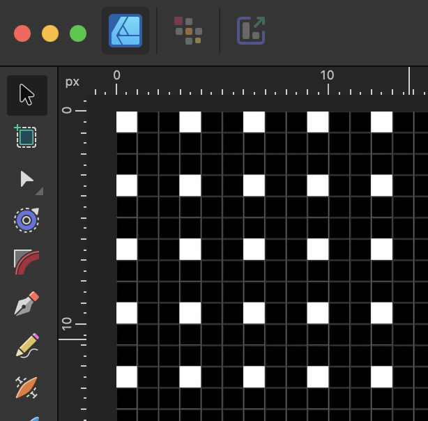
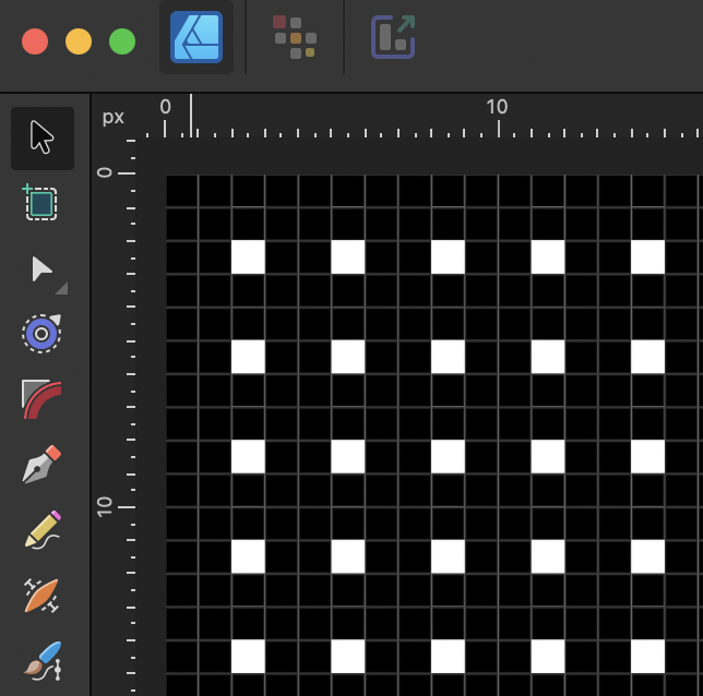
Hello. I have read many of the Procedural Texture tutorials and can make a Checkerboard fine. But what I need is a slightly different variation. I need rows and columns of 1 pixel white, 2 pixels black across and down a 4096x2160 document. I need the first pixel in the 0,0 position for one slide, then move everything one pixel to the right in another slide, then move that another pixel to the right for a third slide. Then again the same three, but one pixel down, and again another pixel down for a total of 9 slides. I have done this in Designer by actually making rows upon rows of white and black and grouping them (and grouping the groups) but it gets very slow and cumbersome and prone to mistakes when I make a change but forget some group. I figured there is a way to do this with PT but haven't figured the right variation of the Checkerboard formula. The math is just not obvious for me. After a couple hours of this I figured I should just ask. Any ideas or clues? Many thanks in advance. Below is to screen grabs, slide 1 and slide 9.
-
Assistance Printed Grid Creation
TestTools replied to TestTools's topic in Desktop Questions (macOS and Windows)
Good idea Carl23. I do have Publisher, so I will try that next time...sounds like an excellent tool to use. As it was, I ended up making a grid with lines at exactly the right dimensions, then making that into an SVG. Later I needed to open it to change the color to a lighter grey, and save that into a new SVG. A tiny bit cumbersome, but it makes the .afdesign file a lot lighter too. Thanks! VisibleSpectrum-Mask-Numbers.afdesign -
Assistance Printed Grid Creation
TestTools replied to TestTools's topic in Desktop Questions (macOS and Windows)
Thank you v_kyr. I poked around those assets that you linked to (many thanks), and in the end I made the grid again myself with lines that I eventually turned into an SVG file and imported. I would never have thought of that simple solution. It also allowed me to easily extend the UV section which was a little off. Just starting to export the variations but didn't want to delay that thanks any longer.
-
Hello. I have created a drawing that I want to add a grid on top of (…actually, layer 3). I made one the most cumbersome way, individual small boxes – a lot of boxes since the document is 4096x2048 pixels large. I ended up having to resize them which caused them to fall off the native pixel lines of my dislay, aliasing horribly. (It is used to give the eye help locating the Just Noticeable Difference between colors). I resized them to align with the tic marks on the main line. I will have to recreate a new grid so it displays correctly (on a 4k laser cinema projector) and place the tic marks based upon the tics. But I would like advice on how better to create a big grid without so many individual items. It prevents me from exporting in PSD FCP layers. (The dialogue box) said it had exceeded 8000 layers!) Appreciating any advice with thanks.
-
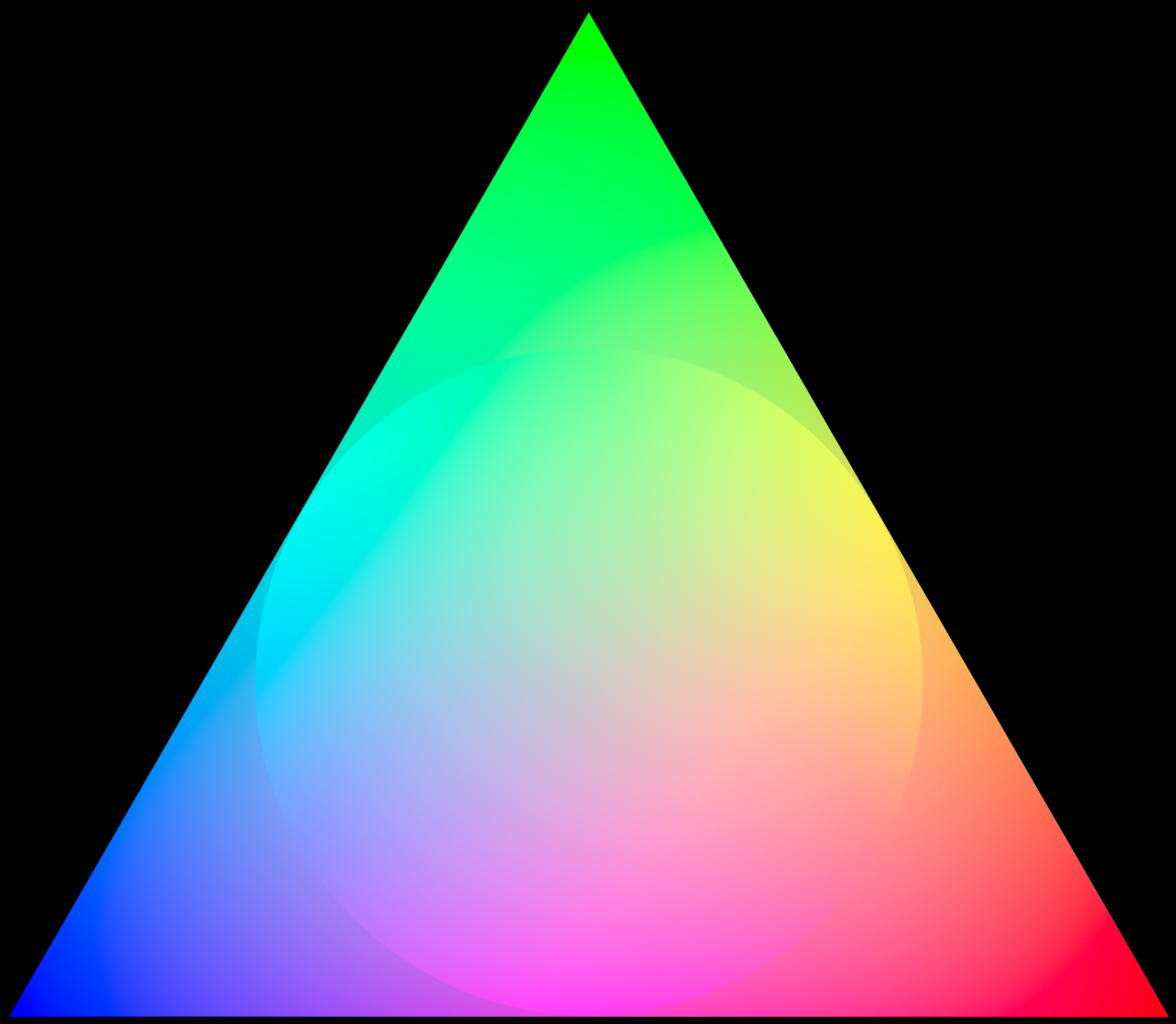
Hello – I want to get my document layers into Final Cut Pro, but it doesn't accept PSD files over 8 bits RGB. This drawing is 16 bit 2020 color space. I need to maintain that from AD into FCP. I have experimented getting the drawings out with the Export Persona Slice tool. It can be done. But the slices are all seperated at the dimension of the object in the layer. They don't maintain their position in the whole document, which means that I have to reposition them after importing them into FCP. I tried by putting an Artboard as a layer beneath everything in the hope that everything would come out in relation to that – but no go. The ideal would be that all the slice layers were the full size of the bottom layer, transparent except for the drawing of the layer. Is there a way to do this? Bartleson-Breneman_Triangle16Nov.afdesign Bartleson-Breneman_Triangle_Circle.tiff ball4.tiff Bartleson-Breneman_Triangle.tiff
-
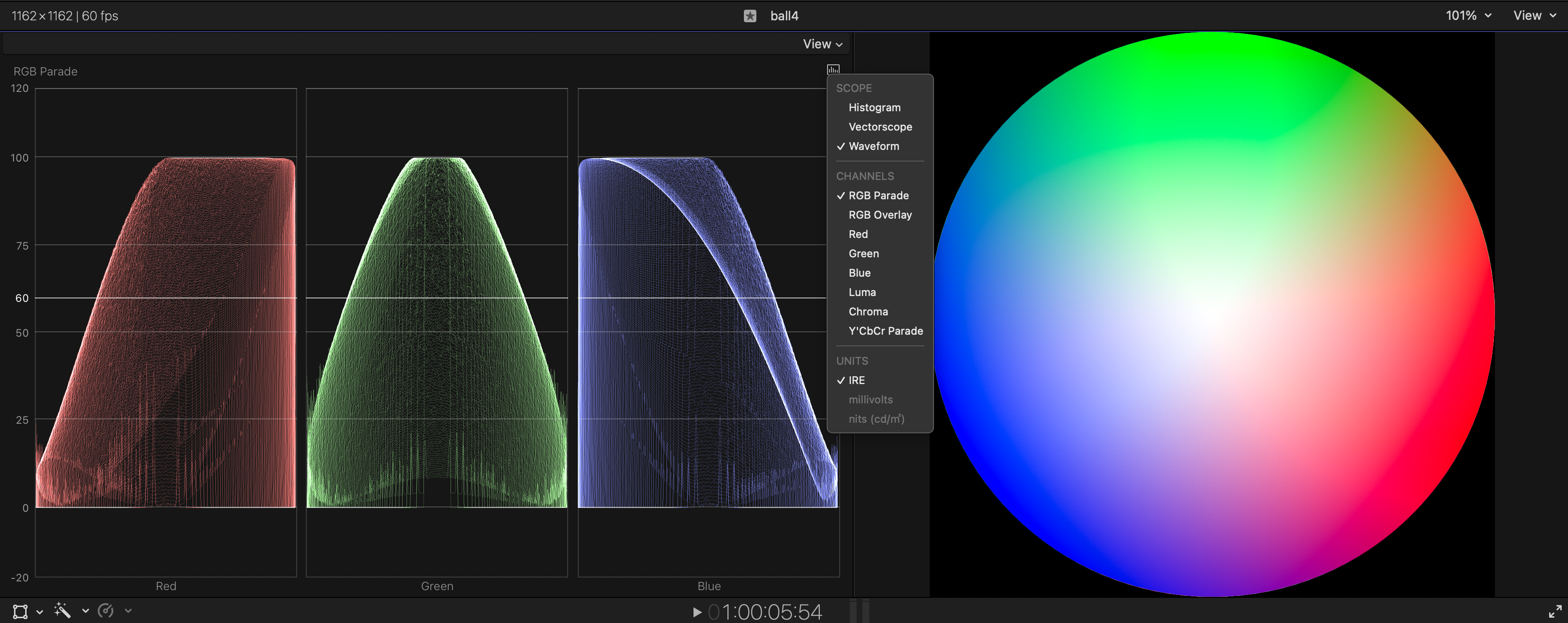
Hello – I brought the attached drawing – exported as a TIFF file, 16 bit RGB/2020, into Final Cut Pro, which was set up for HDR. Looking at the the scope readout it seems that all colors are hitting 100 nits. Why? And if I can control this in Affinity Designer, how can I make it export TIFFs at 300? or 48? …for example. …or 1000? Thank you PS - Knowing full well that this may be an FCP setting that I have to dig into. Bartleson-Breneman_Triangle16Nov.afdesign
-
David, hi. Did you ever figure a clean way out of this problem? Since FCPx still doesn't accept PSD layers in more than 8 bits – and I need 12 and Designer allows 16 – I have been trying this slice solution and came up with the same problem you did, that the images don't stay placed.