JGD
-
Posts
549 -
Joined
Everything posted by JGD
-
Hi guys, Any thoughts on MPEG/Apple’s brand-spanking-new High Efficiency Image Format support? Affinity seems to be a logical choice for people who want to stay current on the latest and greatest standards, all with its fresh codebase and support for macOS-specific technologies… And let’s not forget about PC and iPad folks as well. Having Affinity support that format on all major platforms would greatly boost its adoption rate. What do you say?
- 8 replies
-
- 1
-

-
- heif
- high efficiency image format
- (and 2 more)
-

Affinity Designer Customer Beta (1.6 - Beta 8)
JGD replied to MattP's topic in [ARCHIVE] Designer beta on macOS threads
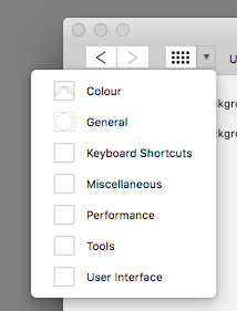
Guys, you have a UI bug on light mode; some of the icons in the preferences window, on the drop-down menu, are not fully visible unless you hover above them. I'm guessing you kept the positive version unchanged, and the white on white parts are, thus, rendered invisible. Check it out:
-
Well, we'll have to agree on disagreeing. That would only make sense if the modifiers affected the action after the click, such as, say, the Alt-to-duplicate mid-drag operations on the Finder. In this particular scenario, pressing Alt does indeed switch to a different mode temporarily, and even though it sticks if you click and drag around for a brush selection, you absolutely must press Alt before clicking. Functionally, it works, yes, but the UX is *broken* because the UI does not fully reflect said changes as they are happening (and, no, as I said on another post, a tooltip is not enough to make it feel right *as you are using it*. Just because you, as a professional user, may get used to that, it doesn't make it any less broken). The right way would to give feedback be: press Alt, and the appropriate tab in each tool is highlighted; if you let go before clicking, it will revert to its default state, if you click and let go of Alt, it will still reflect their temporary state until you let go of the mouse/trackpad button, and if you don't let go of Alt, it will stay put until you do. Is this that hard to grasp and implement? It seems like a no-brainer, IMHO. Photoshop does this almost right (it isn't perfect because it only gives you the appropriate feedback after clicking, but at least it does eventually give you some UI feedback), while Affinity plainly doesn't even try to when using either the Brush Selection tool or the Refine Selection brush. This is one of those cases where Serif's attention to detail could very well allow them to, once again, one-up their competition.
-
Well, I'm running the Mac version, and I just checked on that. My bad, it really does, and thanks for pointing that out! I guess I was just distracted, maybe because of all the pressure I was under while doing that job. However, I still stand by the suggestions I made on this and the other thread. Though the “cheat-sheet” is indeed there on the status bar, I still think that the selection mode separator should reflect which modifier is pressed. And some sort of iconography next to the brush cursor outline would be a nice plus, too.
-
So this request is a follow-up to the one I made on this thread: Apparently, according to fellow forum user @toltec, this feature was already implemented, which is absolutely great. What is not so great, however, is its discoverability (or, in this case, its blatant [edit: partial] lack thereof). [edit: user @R C-R made me realise that the Status Bar already has a “cheat-sheet”/tooltip with said shortcuts, but I still feel that is not enough and that my suggestions are very sound, so please bear with me…] Please, for the sake of other users who may not frequent the forum or wish to spend hours perusing user manuals and tutorials (because this feature is, after all, something that pro users expect and may try for themselves [edit: even without, as was my case, paying any attention to the tips provided ], as it is a staple in brush tools not just in AP but also in other competing packages), make it [extra] visible and [even] more obvious. Basically, when pressing each modifier, please do make the appropriate tab (Matte | Foreground | Background | Feather) become temporarily highlighted/selected. This feature would, then, become easily discoverable to more seasoned users like myself, because as it stands, the UX feels “broken”. I mean, it will still feel that way to me even if I already know the feature is there, because visual feedback is just nice to have, as it shows that the app is working as it's supposed to. As it currently stands, you always display the same tab selection and, when pressing modifiers, you get a different, incongruous and non-explicit – even if completely desired – behaviour, which is indeed confusing, muscle-memory notwithstanding. It really is important for us to always have a “sense of place” when it comes to our tools. If I may offer another completely on-topic suggestion, I wonder if you could add some further visual feedback to the brush cursors themselves (and that would obviously be extensible to the Selection Brush tool), such as plus/minus signs floating outside of their outline (quite unlike their current behaviour in Ps – which centres them inside of said outline –, so as not to conflict with the cursor crosshair for those users who may have it configured to be visible)? I know that small as this suggestion may seem, it would add some visual clutter (I guess it could always be off by default and be selectable on the preferences dialog, just like the crosshair), but it I believe it would further enhance ease-of-use and differentiate AP from the competition. Thank you for your attention and keep up the good work!
-
Well, what do you know, @toltec, you are absolutely right! Thank you for your feedback! But now comes the hard part for Serif devs, who are never exempt from my cutting criticism. The feature is there, sure, but the UX is just disastrous (and that's why I was a bit skeptical at first about your reply, sorry ). It is not in the least bit discoverable, as the toggle *is not visible* to the user. It just magically happens behind the scenes with zero visual feedback. If the team had implemented that small but crucial detail, I would have found out immediately that pressing Alt was doing what I expected and this whole post would be moot. So, I'll either change the title of this request accordingly or, if that isn't possible, create a new one. [Edit: I went for the latter option; you can follow the new topic here: Make Refine Selection modifier-activated toggles visible to the user ]
-
Oh really…? Well, the last option seems to be just what I was looking for. Let me just check on it…
-
The title of the thread says it all: in AP, it would be nice if pressing Option toggled between one of the two additive selection brush modes (Matte or Foreground) and the subtractive mode (Background) in the Refine Selection dialog box. It's just that having to move the cursor or the pen back and forth just to change the selection mode gets rather tedious quickly and breaks the flow. Also, while on this subject, it would be nice if one could do further refinements without screwing up with other parts of the selection, but maybe it's just my workflow that isn't properly set up. Please bear with me, as I started transitioning to Affinity Photo in a production environment only very recently, and for now only when the tools I need are superior enough (the Refine Selection brush being one of them). IMHO, the greatest thing ever would be being able to just use the refine selection brush and the refine selection parameters independently of one another (or being able to undo them in separate steps in History), in order to achieve the most perfect selection possible. If only there was a way to use the brush without applying any effects, or certain effect slider values in said dialog box that produced zero changes and allowed me to refine the selection in many independent passes and apply said effects only when I was completely satisfied with it, I'd be a happy[ier] camper. That being said, the tool as it stands made one heck of a difference in a self-initiated emergency change, on a crazy-ass deadline (I could never have finished that in time using Ps, that's for sure), I made for a big project I just finished last month; I basically treated a landscape shot, which was used as the main theme on all media for an arts festival, in order to change the orange-y colour of the background clouds to a more neutral blue-gray independently of some trees in the foreground, because our country's forests had just started burning earlier that day – and have been burning almost continuously for a while now –, as leaving it untreated could mess with some people's sensitivities because it looked waaay too much like the photos and videos of said deadly fires circulating on the media. The only reason I didn't send this photo to you for your recent call for professional work done with AP was the fact that I do not own the rights to the original, and even though the author retroactively authorised the modifications I did to it after I explained him my reasoning behind them (I mean, given how serious the situation was, how could he not?), he didn't seem all too happy about the whole thing at first (especially considering that I did that on a rush, the night before sending that job to the print house, without consulting him first – I obviously negotiated it with our mutual client, which can ultimately propose and decide that kind of stuff at its sole discretion, but still), so I didn't even consider asking him for permission to share it with you. But anyway, I digress; Affinity Photo and my loyal Bamboo tablet saved the day and made doing this on a single all-nighter possible. Just to think that I could have saved some 10+ hours of work in a similar trees-vs-background selection task I did back in 2013, for the very same client, if only this app was available back then makes me value it even more because I now know how much more time I'll be able to save in the future… But I also know for a fact and from experience that I could save even more time if you implement that toggle shortcut.
-
Affinity Photo Customer Beta - 1.6.4 (Beta 4)
JGD replied to Andy Somerfield's topic in [ARCHIVE] Photo beta on macOS threads
I don't really think APFS will seriously mess with most apps… Stuff that deals directly with the file system, like file recovery (Disk Drill, Disk Warrior, File Salvage) and backup apps (SuperDuper, Carbon Copy Cloner), will most definitely break and require an update, but the rest? Apple would never pull off a smooth transition like the one from iOS 10.2 to iOS 10.3 if apps were really influenced by the change in the file system. As for the rest of what you said, well… No, it is not a waste of man power or money; allowing your users to upgrade to the latest major OS release if not on day one, at least shortly thereafter is part of any developer's job. That's why the really early-access builds are called *developer* builds… If anything, the latest stable release of Affinity apps, currently sold and distributed in the MAS, could and should run at least on the latest macOS *Public* beta or at least an attempt to make it run should be made. Public beta builds are always a bit behind closed developer-bound builds for a reason, you know? If you meant that these Affinity Customer Beta builds do not really have to run on macOS Public Beta or even the GM release on day one, well… I do agree with that. We are warned time and time again that these aren't intended for production purposes, only for testing, so we can't reasonably demand that. As for said MAS releases, as far as I can remember, Serif devs have made compatibility fixes to the current stable branch in the past, independently of the beta branch. I wouldn't be surprised in the least if we saw High Sierra-specific Affinity Photo 1.5.3 and Affinity Designer 1.5.6 builds hit the MAS on or around day one of the new OS release… -
Affinity Designer Customer Beta (1.6 - Beta 5)
JGD replied to MattP's topic in [ARCHIVE] Designer beta on macOS threads
Ben, the Alt+dragging method is not just the “Mac way” (even though it probably originated in the Finder at some point), but the “Adobe way” as well… And one of those Adobe choices that aren't that unintuitive, because they, duh, mimic the most popular OS' (for creatives who run their products, that is) behaviours. Anyway, while I would love to see that being the other way around (the default setting being Alt+drag as the “cancellable duplication” operation), just having the option is great. And if I survived through working with different modifier+drag/scroll behaviours, like in my FreeHand+QuarkXPress days or even today with MS Office, I can certainly survive working with Affinity and InDesign for a few years until Publisher comes along. I'm all for overhauls that add options and make my workflows easier, and I'm a click-and-drag duplicate kind of guy, so this is great news for me personally! -
Affinity Designer Customer Beta (1.6 - Beta 1)
JGD replied to MattP's topic in [ARCHIVE] Designer beta on macOS threads
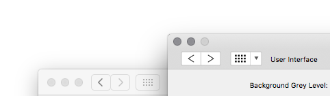
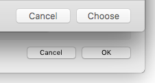
Yep, I second your comments, but I also have to add a few more thoughts on the title/toolbar gradient; it does indeed seem a bit weird when compared with the native “flat Aqua” style… Not only is it much more marked at all gamma levels, and only vaguely similar to the OS in the darkest setting (shouldn't the equivalent look to the native mac OS UI be maybe at the lighter end of the slider and the latter allow for a neutral, OS 8/9 Platinum / Windows 9x gray, just like Adobe CS6/CC?), but the tint itself is off. Also, the selected, radio button-like dark background should apply also to the Persona buttons, don't you think? As it stands, it seems as if the other Personas are deactivated and non-selectable, and the selected Persona isn't distinctive enough at a glance. And I'm noticing this only now: the Preferences window and other modal dialogs (like the New Document window) look distinctively non-native, including but not limited to the anti-aliasing, the titlebar gradients and the fact that these don't even have an inactive state look consistent with the rest of the OS… Up until now, when using the dark interface, those weren't very noticeable, but now that one can compare the interface directly with the native OS interface, the differences became jarring. Should the Preferences dialog really have a “Close” button (not to mention that the look is really weird, with the non-changing titlebar (something which is commonplace on Mac app preference dialogs) and lack of alternating line shading commonly found on list views? And why do the Back/Forward chevrons and the square grid on the toolbar buttons look that much different from the ones in System Preferences and Safari? And… aren't the Cancel and OK buttons in the “New” dialog too tiny? Aren't the search boxes super weird, as they are tiny and have a left-justified magnifying glass icon on a blank field instead of the HIG-mandated centred (until you select it, that is) magnifying glass icon+“Search” string? I don't want to be too much of a nitpicker, seeing that the dark interface grew on me to the point that I switched to it also on CC and doesn't, like I said, look as jarring, but… You can either go the Adobe route (which I loathe, by the way, but I do respect that at least their interfaces are now turning a bit more consistent across apps as of late) and do completely non-native interfaces (and the dark interface kind of went in that direction and masked all the imperfections, sort of), or go the extra mile and make it completely consistent, because leaving it in this uncanny valley kind of makes it look a bit weird and unpolished (you can of course do the same for the dark interface mode and even for the Windows version – which I suspect may have some inconsistencies of its own with the OS itself especially if the Preferences dialog looks in any way like the one on the Mac version, but I can't really comment on that one because I haven't tested it lately). I'd go as far as saying that not even iTunes, of all apps, looks this out of place (to be fair, with the advent of the flat design trend, it has been refreshed to the point that it no longer looks like a Carbon app in a Cocoa world, though some non-native controls like the non-expanding scroll bars still give it away). I know that you use a very specific set of tools and are maintaining and greatly expanding a cross-platform suite of apps, but if you're still aiming for Adobe's turf (and everything seems to point that way), you really need to address all these issues. I mean, many of your current and future clients are the same who created and contributed to blogs like Adobe Gripes, we are nitpickers at heart. ;) Anyway, kudos for finally getting the 1.6 betas out of the door… I'm still holding out for Publisher and advanced OpenType support (more on that later, on a different thread) to make a complete and clean switch but, so far, I'm impressed with Affinity.
-
I have to add something else: I know Affinity is being heavily sold towards UI designers and digital illustrators, so having digital screen presets makes sense, but it is also a print-geared app… It would be nice to also have print-sized presets (DIN A-series formats, US formats, offset formats – 50x70 cm, 70x100 cm –, etc…) and maybe have Affinity only show the appropriate formats depending on colour mode/document preset (as in “Print/Print (Press-Ready)” vs. “Photo/Web/Devices” and/or RGB vs. CMYK). If a user is working in a mixed media project demo for a client (such as a corporate identity that includes both printed stationery and UI mock-ups), switching between presets would be a minor inconvenience, but the net gain for most users when working in most projects (in which the print-bound and screen-bound artboards would probably be segregated anyway so as to allow the assignment of the proper colour modes and profiles for each use case) would be great.
-
Recognizing commas as valid decimal separators
JGD replied to JGD's topic in Older Feedback & Suggestion Posts
I thought I should chime in again, too. Definitely either giving more refined options for parsing delimiters and separators or allowing the user to at least specify which assumptions Affinity apps should make (and, if possible, automatically honouring the macOS' regional settings) would still be the best course of action. Also, think of it this way: besides the main user's muscle memory, most of the time that we will be copying and pasting values gathered from outside of the app those will, yes, either come from people from our own country, or from the macOS calculator app / Spotlight calculator results generated on our very own computers (yes, I am aware that Affinity apps allow, like Adobe apps, simple operations, but sometimes we need to calculate proportions with the rule of three, square roots, golden section, etc., or may just wish to perform and keep track of our calculations elsewhere – personally, I use plaintext files in TextEdit), which also honour said regional settings. It's people on fringe/niche cases, like designers working abroad or with people from multiple countries that have to adapt and manually swap decimal separators and delimiters (or just remove the latter and have Affinity convert them to the appropriate, customised setting), and not us boring folks who don't collaborate that much with foreign colleagues (I actually have foreign clients, interestingly, but my cooperation with them doesn't go into that level of detail). ;) -
Affinity Publisher
JGD replied to Yogi9409's topic in Pre-V2 Archive of Desktop Questions (macOS and Windows)
Ah, yes. As I said, I'm fully aware of the limitations such a developer blog would present. But I was speaking purely from a developer-customer relationship standpoint, which already seems to be very peculiar in Serif's case. If you think of it, at least that option would give the eager potential users a sense for the scale of the project, and… dare I say it, of its actual progress, even with the expected setbacks and all. It would be kind of like watching a progress bar in a torrent download, with its variable DL speeds (and the sometimes bizarre ETAs they generate) and the occasional scrapped packet because of data corruption which does, indeed, make it actually go backwards. A moving, unpredictable goal, yes, but a hypnotizing one nonetheless. ;) -
Affinity Publisher
JGD replied to Yogi9409's topic in Pre-V2 Archive of Desktop Questions (macOS and Windows)
R C-R, I totally understand your point. In that sense, software development is not at all unlike, say, typesetting itself; in a less dramatic sense, little, apparently innocent and unavoidable changes may cascade through a supposedly "finished" or at least stable project, and force one to rethink and redo it entirely and on the fly, multiple times even and to the very last moment before sending it to the printer… We've all been or will be there at some point in our professional lives, am I right? ;) To be fair, *a lot* of APub is already done in the form of an excellent rendering engine already found in AD, but APub will probably be, to put it into very simplistic terms, AD on very strong steroids, with more advanced typesetting tools (not as advanced as Adobe's Multiline Composer, though, the devs said as much before, but I'm hopeful they will make it a top priority after the first release and get it ready for v2) including high-quality and an easily customizable and manageable typographic grid system that may put Adobe's convoluted one to shame and obviate quite a lot of must-have plugins (to their respective devs and to Adobe itself, which enables that situation: I am very sorry for their future loss of business, but that kind of stuff should be built into any self-respecting professional-grade DTP package, not just available as a paid add-on, because it lets lazy and/or less qualified designers get away with equally lazy designs that don't adhere to any semblance of a grid or to good typographic practices, nor do they eschew those visibly and intently like Carson and Brody did – thus residing on that uncanny valley of mediocrity and being worse even than sometimes comparatively illiterate but masterful typographers, taught by their own masters from an early age – and, as such, disregard 500+ years of accumulated typographic history and knowledge – hence my offer, a few years ago, to work for Serif as a typography consultant; I am finishing my final dissertation about, of all themes, Modular Type Design and Typography on, of all degrees, an MFA in Contemporary Typographic and Editorial Practices this school year and intend on looking for work and move to the UK, preferably Scotland, on the next, so my offer still stands and if you ever reach a point in development where you think you may need someone with those qualifications, by all means do send me a message –, which the software itself could help to reinstate in an intuitive fashion – cross alignment of columns with differing leading values by calculating common divisors or multiple-field-grid calculators are two features which come to mind and are incredibly bothersome to replicate manually), an easier to program alternative to GREP Styles (easier as in as easy as AppleScript or Automator, maybe in addition to GREP Styles themselves for those who like that kind of thing), artboard/page management along the lines of a more conventional spread model (though I am very much yearning for Serif to surprise us with different modes – personas? document presets? – that allow us to do folded leaflets more complex than three-page fliers and multi-page accordions, that would be awesome) instead of the free-floating artboard model we have now (though a hybrid model or even a free model like that of FreeHand and, indeed, AD itself may be desirable in some projects), a strong linked document management panel, and above all an excellent master page system (are Symbol and Asset support, along with Constraints and other tools/capabilities, repurposeable for DTP? Maybe…). The common document model will take care of the rest (though I am not so sure how are you supposed to be able to open an arguably more complex APub document in AD or APh without losing some information and what for, honestly… Seamlessly editing – in-line or otherwise – linked documents and assets seems to be more useful, IMHO, since APub will be, for all intents and purposes, the “end” of the print design production line, combining elements created on the rest of the suite) and, of course, APub can have a modicum of live, non-destructive filters and effects that may even allow foregoing the other elements of the suite for lighter stuff and reusing the same assets in different documents, with different filters and effects applied in each, much like you can do in InDesign already. But I digress; even if there are twists and turns in its development, actually getting to see how the process goes (at least for non top-secret features go, because as AD and APub have shown us, some 80% of the features are obvious and very similar to those found in competing offerings) would still be better than being left completely in the dark. Heck, even Apple cuts features and re-adds them later from time to time when performing transitions on release-quality software (iWork and iPhoto/Photos for macOS come to mind, and even OS X in the early years was a prime example of that) and most users end up eating those up, so why would Affinity users be mad if Serif said “sorry, we had to redo features x and y because of conflicts and dependencies”? On final, paid-for creative software we would probably go mad about it on the forums and never buy it again, but these would be Developer Alphas, not even Betas… On that note, it's also interesting that I mentioned iWork and Photos, since it was the effort towards achieving feature-parity with iOS that motivated said feature culling in the first place, and I wonder how Serif will manage feature-parity and feature creep management when their iOS apps hit the App Store. Anyway, I, for one, wouldn't mind witnessing a convoluted development process, especially if said dev blog came with a big, fat disclaimer expressing that it would be perfectly normal and expectable. And this isn't the Apple Watch or the Apple Car we're talking about, a DTP package is a perfectly obvious, necessary and doable addition to the suite, it's not like Serif doesn't have the chops to do it or will can the project any day (otherwise it would be a company secret or a half-promised-without-a-schedule app like the DAM; they wouldn't have announced with such fanfare it in the first place, nor would they have discontinued PagePlus development altogether like they did). It may come out super late, but come out it will eventually and, if the other components of the suite are any indication, it will be worth the wait. ;) -
Affinity Publisher
JGD replied to Yogi9409's topic in Pre-V2 Archive of Desktop Questions (macOS and Windows)
This proposition intrigues me and I must say I agree with it almost fully. Serif devs would do well by at least giving us a roadmap with the features that are already available on InDesign and Quark visible, and the rest redacted, as they are better kept as secret features until beta testers can get at them and their release schedule can beat Adobe at it's copying game (we saw them doing it with smart corners in Illustrator already, so we all know they can't be trusted and are probably running all the Public Betas at San Jose, California). Think of us, AD and APh owners (and AD+APh+APub+…A[DAM?] potential owners) and users as sort of Kickstarter backers, waiting for a still-pending (and extremely vital) part of the initial deal; that would at least keep the backers informed, happy and confident, even if we don't get to test, buy and professionally use the software in the schedule we were promised. I am well aware that a DTP app that wishes to rivalize with InDesign as well as AD and APh rivalize with their Adobe counterparts is a tall order; InDesign is, in fact, probably the tightest of them all, seing it's the most recent app of the bunch and nearly killed the incumbent Quark, and not just because the latter was developed and sold by bumbling idiots who price-gouged their user-base and consistently let them down during Apple's OS and CPU transitions, InDesign is really that good and the only part of CS/CC I'd kind of miss if I was forced to switch to, say, Quark, PagePlus running on a VM or *gasp* Scribus. But, IMHO, these odd, sparse forum posts with announcements of further delays are a bit out of character, especially when compared with the extremely fast development rate of the other components of the suite, including a Windows port that seems to be on a good track (I haven't tested it lately, but last time I checked, it was surprisingly stable even on a VM, even if a bit rough around the edges UI-wise). A good, consistent developer blog would keep people on their toes, assail their fears that Affinity Publisher might one day become the Duke Nukem 3D of DTP packages (look, I still trust you, because I know software is hard to get right and really want you to succeed, but other people may not be as forgiving or patient), and maybe even make them take the plunge and buy the other apps (you've seen a few examples here already of people who are holding off until Publisher is a tangible or at least believable product). I fully concur. Releasing half-assed products is a surefire way of alienating customers, even if the rest of one company's offerings are pristine. One rotten apple may ruin the whole bunch and break customer confidence, so to speak (just ask Samsung about their exploding Note 7s and machine washers :P ). As for said features, I already addressed that on my answer above; they really should be some kick-ass surprises, dropped on us, the media and Adobe only when the Public Beta hits the forums. As for subscription or no subscription, well… Users can either pay for CC and make a softer transition from Illustrator, Photoshop and Lightroom (yes, Lightroom… You are still working on that DAM, aren't you?) as well, running both those and Affinity apps side by side, maybe converting old stuff into Affinity formats, etc., or they can use an alternative like InDesign CS6, Quark or (in the case of Windows users) PagePlus. I might suggest, too, that you offer some deal like “buy PagePlus now, get a discounted/free license of Affinity Publisher for Windows later” (and I say APub for Windows only because I'm aware that the MAS is not as flexible when it comes to that kind of deal, but since PagePlus is available for Windows only anyway, I wouldn't be too bothered about that as a Mac user myself as it would force me to use a VM and not being able to spread my palletes on my secondary monitor, buy Parallels or VMware and a W10 licence). And, on the flipside, since CC is now a subscription, well… the cost of jumping ship is not as big as leaving a perfectly good CS6/7/8/9 license (the latter three suites do exist, they just aren't called nor licensed that way, alas) gathering dust. Just terminate your payments to Adobe and boom, you're off the subscription train for good and can then feel the utmost Schadenfreude by knowing then and there that Adobe's licensing strategy may, in fact, end up decreasing consumer lock-in and backfiring spectacularly (I hadn't thought of this angle before, but it is now making more sense than ever). ;) As for the transition, namely from InDesign to APub, and the conversion of your archives, well… aren't we lucky that InDesign is probably the only Adobe app that can also use an XML-based format? Just give us a best-in-class IDML importer and we'll be all set. Then, there's feature-parity (or its lack thereof), sure, but for more common stuff and student use APub will be a fine piece of software even if it has some limitations equivalent to those that AD and APh exhibit as of now (I am still waiting for those properly separated spot-colour-to-spot-colour and spot-color-to-0%-opacity gradients when exported to .PDF, but that is an extreme and very specific use case ;) ). Dude, are you high on something? Or, with all due respect to thirteen-year-olds, a thirteen-year-old banging frantically on a keyboard? I know I shouldn't feed the trolls, but this isn't YouTube or Facebook either, so here goes nothing: first of all, Windows and macOS marketshare are heavily distorted and skewed towards the latter by dumb clients, POS machines, ATMs, etc. Interestingly, macOS *and iOS* (where Serif will also leave their mark, rest assured) marketshare among creatives is exceptionally high, I would say way above the magic marker of 50% (I studied and worked at a fine arts faculty as the Mac Room monitor – nay, it was the Communication Design laboratory, “Mac Room” was its nickname because we only had Macs there and 70%-80%-ish of my colleagues and users/clients were Mac users anyway – and I can assure you that is, indeed, the case… Also, the last last company where I worked, which only used MS Office and FileMaker Pro on the admin and account management department and could very well standardize on Macs across the board, at least had only Macs in the graphic design department – it was a publishing and events company so graphic design was of the utmost importance there – and they broke less often and less spectacularly than the PCs). So, while THE WORLD [sic, didn't your mom tell you it's rude to shout on the Internet? She should've, clearly] may “have windows”, creatives do use mostly “Macrappy”, and you are either a student who never used one and/or envies his colleagues, or a little kid with no sense of regard for personal choice nor any knowledge on both OSes' technical merits (yes, I am a staunch Mac user and evangelist, but I started out on the PC side of things and I must concur that Windows has gotten pretty decent as of late… though not enough to woo me back, and if you had at least a smidge of knowledge and respect I would just need to utter “Registry” for you to at least give us and our Macs the benefit of the doubt). Oh, and it's not like Serif isn't offering you already a Public, free, pre-release Beta of Affinity Designer *for Windows*, and you still have the gall of questioning Serif's more-than-reasonable Windows roadmap (in case you didn't know, Affinity started out as Mac-only and though Windows users could be justifiably more pissed than you, especially Plus suite users, none of them behaved as badly and childishly on the forums as you did here on this thread, not that I can recall) just because some user made the recurring and a bit unfair judgment that Windows development greatly delays Mac development… Maybe it does delay it a bit because of added complexity and cross-compatibility checks, but the costs are marginal when compared with Serif having the chance to go head-to-head with Adobe, which is Affinity's whole point. Serif is betting the whole company on it, haven't you noticed? Nope, I am betting you didn't even bother to check their website about it. Finally, I take it from your user name that you are either portuguese or brazillian; I could've written all this in our native, common language, sure, but this is an international forum and that would've been disrespectful (besides, there's already another portuguese user around and a portuguese moderator, MEB, who both write in perfect english as well). If you can't even write english properly and add something useful and constructive to the discussion (and failing to do so is, suffice to say, disrespectful itself, especially the latter), please keep it to yourself, will you? You bring shame to us all protuguese/lusophone people by showing such rude behaviour on an otherwise civilized forum. /rant -
For people wishing to run Affinity Designer on an older Mac under VMware fusion, I discovered something that looks like a bug more than anything else, but which works: unintuitive as it may seem, turning off 3D acceleration will switch from DirectX 9 to DirectX 11 behind the scenes (I don't really know why, but it does). So… at first I though I would be left out of the Beta because I got the dreaded “DirectX 10 (Shader Model 4.0) hardware not found” but, lo and behold, it runs and (mostly) doesn't crash. The mouse cursor is, by default and in Windows as a whole, super glitchy (each time I switch desktops, it flickers between the Mac and Windows cursor, and even jumps around a bit, until it eventually settles down), and scrolling and dragging objects in Designer is laggy as hell, but that is to be expected and, besides, I am not using the Windows build to thoroughly test the tools but mostly just stability, the UI/UX, and file rendering. I have already managed to crash it while messing with the Studio panels (much like I did back during the pre-release Mac Beta) and found a few UI/UX glitches, so I'll be sure to post my feedback in the appropriate thread. ;)
-
Affinity Designer Customer Beta (1.5 - Beta 1)
JGD replied to MattP's topic in [ARCHIVE] Designer beta on macOS threads
Oooh, I must've skipped past that option… I'll definitely give it a look later on, as it seems like it would solve my issues in many scenarios, thanks! ;) However… 20 snapping candidates would still be too limited for some projects. Sometimes I make geometric textures (more specifically, tesselations) with up to hundreds and even [tens of] thousands of objects, via iterative duplication and snapping. Having a “snap to everything” (and I really mean *everything*, performance and intuitiveness be damned) mode could still be useful for some users in some use cases. Maybe Affinity already has such a mode and I'm just missing something? -
Affinity Designer Customer Beta (1.5 - Beta 1)
JGD replied to MattP's topic in [ARCHIVE] Designer beta on macOS threads
Hi Ben! Yes, indeed I do have Snap to Guides turned on, as all other snapping options… It's not the snapping to the guidelines that is broken, but the opposite: snapping new and existent guidelines *to* other objects and nodes, which breaks the whole manual guideline workflow. :\ Maybe it's just an issue with my setup, but we should probably give a look into it, since it's working fine in the 1.4 MAS version. Is there anything I can do to help diagnose the issue? I can tell you upfront that this is happening on a new, blank document created in the 1.5 Beta, so it's definitely not a file format issue with 1.4-created documents. And yes, I'll definitely thank you in the end… I am already thanking you for the promise of great performance, as using CC 2015 is an absolute nightmare (buggy, slow… especially Illustrator and InDesign) even on my maxed-out 2009 Quad-Core i7 iMac (I even swapped the processor, put a whopping 32 GB of RAM and a decent Fusion Drive). Much, much worse than CS6, for not that many new features (many of them lifted straight out of Affinity, eh), it's insane! And this 1.5 Beta (!!!) is still delivering, still smooth as butter, on my vintage (yes, it's officially vintage), nearly obsolete (it's the last model to be officially macOS Sierra-compatible… *shudders* ) but still powerful iMac. Expecting anything less from your development roadmap choices would be not giving you enough credit. Still, since I know a thing or two about UX, and belong to a slightly different target group than most of your featured designers (they are mainly digital illustrators, and I am more of a type designer/branding specialist who does a lot of geometric stuff), I probably notice a different set of issues than them. And now, with the upcoming “Windows explosion”, users like me will no longer be a niche of a niche, but will actually become a sizeable group. ;) -
Affinity Designer Customer Beta (1.5 - Beta 1)
JGD replied to MattP's topic in [ARCHIVE] Designer beta on macOS threads
Guys, first of all, congrats on finally getting the 1.5 Beta out! :D The new Text Styles panel surely looks promising (and, if implemented in the same fashion in Photo, will run circles around Photoshop's text engine, which can't even handle the full scope of OpenType properly)… It already gives us a whiff of what Publisher will bring, am I right? ;) As for snapping, I've been testing it, and though I will always repeat my position on wireframed/phantom dragging and self-snapping until you eventually add it as an option, it works much better now. It's still a bit hit-or-miss, though, especially when working with bigger numbers of objects (apparently, Designer has an extremely limited buffer for snapping candidates and starts “forgetting” objects after you selected more than six of them in a row… which always forces me to convert everything to curves and use the Node tool as a subterfuge; at least I finally got the hang of it, though it entails selecting all objects with the Move tool, then switching to the Node tool and pressing Cmd+A to select all nodes, then manually selecting the snapping target and, finally, dragging from the desired source node to the target node… Phew, in Illustrator I could actually do that in only two steps, and having the ability to temporarily switch from the Selection Tool to the Direct Selection tool by pressing Option makes it even easier, so couldn't we at least get that shortcut? At least Affinity makes super clean and rigorous snaps, so there's that), so I'll be sure to send you a video demo of my experiments later on. I also have a thing or two to add when it comes to guidelines: they aren't snapping properly to points and objects at all (they are working fine in 1.4, so I'll consider that a bug), and – something I only now realized, after mentioning my node tool subterfuge – you should definitely be able to add (or even drag pre-existing) guidelines with the Node Tool (that never worked in Affinity, as far as I can recall, and should be fairly easy to implement), which could be very useful in complex geometric illustrations (smart guidelines and snapping are very useful, yes, but sometimes having visible and permanent guidelines can come very handy). Oh, and by the way, I noticed a terrible inconsistency in the Node tool that could and should be solved, and which would make object selecting and snapping *that* much easier… When you select a curve (or various curves) and a shape (or various shapes) with the Move tool and then switch to the Node tool, or when you select both directly with the Node tool, the nodes in the curve(s) are individually draggable, whereas the “nodes” (not that they are editable as such, but they *are* there) in the shape(s) are not only non-draggable, they are not even selectable (but can serve as manual snap candidates, hmmm). On the other hand, when selecting one or various shapes with the Node tool, you will get the exact same size and rotation handles as you get in the Move tool. Now, this makes absolutely no sense whatsoever UX-wise; the Move and Node tools are supposed to be different “modes”, and if you're not supposed to individually edit a shape's nodes, at least make it an all/none proposition (selecting one node selects all of them, de-selecting one does the opposite); likewise, if you're not supposed to resize and rotate objects with the Node tool, you should also make the resize/rotation handles just disappear for *all* objects when selecting them with said tool. As it stands, the Node tool is just extremely confusing to work with when selecting, moving and snapping stuff around (because it just stealthily behaves the same as the Move tool when selecting and dragging shapes, and plainly ignores them when curves are thrown into the mix), and even though you love to tout your smart guidelines and snapping, there are times and projects that call for finer control. If you think about it, investing in great automated features *and* manual control (as you did with your snapping manager, but taking it a step further without even further complicating the UI panels) aren't mutually exclusive propositions… I will also add that you should really fix this glaring inconsistency before Affinity hits the Windows market. It's already bad enough that Mac users are getting used to a tool behaviour that doesn't make much sense; it'd be even worse if it became an entrenched standard… It would be Illustrator all over again (except much speedier and with different nags), and I believe Serif is aiming much higher than that. :\ Afterwards, I shall do all my spot colour transparency, gradient and cross-gradient testing to see how far along it is as far as print production is concerned. I haven't read anything related to that in the release notes, but one can always hope for a surprise, right? ;) Finally, symbols and assets really do bring it on par with other competing packages and will make managing larger projects a breeze. I've done a lot of stuff before in Illustrator where symbols made a huge difference in keeping files lean, so I can certainly see myself, little nags notwithstanding, using Affinity for more complex stuff as soon as 1.5 hits the RC stage and the MAS. So far, even with all my complaining (I'm sorry… I just want to make the permanent switch to Affinity ASAP, and I want it to be perfect ;) ), I must say I am very impressed with what I've seen. Kudos for your great work! -
Looking through the Windows...
JGD replied to MattP's topic in [ARCHIVE] Designer beta on macOS threads
Sorry Matt, no can do. I am running quite a peculiar setup (an iMac with a CPU upgrade, way more – and faster! – RAM than the machine officially supports *and* a Fusion Drive which, all combined, preclude me from even considering BootCamp, and I don't believe I'd be willing to put up with security issues either way). For performance testing, I am pretty sure that you will have more than enough Windows users to validate your betas… I'll be just checking if the files created on the Mac side of things render properly and if there aren't any glaring bugs. -
Looking through the Windows...
JGD replied to MattP's topic in [ARCHIVE] Designer beta on macOS threads
I will be running it on Windows 10 x64, on top of VMware Fusion 8. ;) -
Affinity Designer Customer Beta (1.4.2 - RC1)
JGD replied to MattP's topic in [ARCHIVE] Designer beta on macOS threads
This mythical 1.5 beta almost sounds like the PowerBook G5 rumours of yore. :P Let's hope the devs don't skip directly to Affinity v.2, though… For all that is in store, it will be good enough to carve out a decent user base, especially after the Windows beta is released. ;) -
PANTONE gradients that properly separate
JGD replied to JGD's topic in Older Feedback & Suggestion Posts
So, I suppose that by doing a convoluted manual plate separation (in separate files, that is), I could conceivably achieve the same two spot colour cross-gradient effect… It wouldn't be as straightforward as I would like, but it certainly beats separating those plates in black, as print shop people may get confused with spot colour reassignments; having the final artwork exported in .PDF with the proper PMS codes embedded is a way safer bet. Actually, I used that same technique when doing something similar in Corel Draw, way back in 2001, for my very first poster. Nevertheless, I expect you to get around that at least on Affinity Designer v2.x, which I will probably buy if you keep this development pace and if it becomes the industry standard I reckon it will on account of the Windows port. ;) Anyway, do you think I could overlay those two objects fading to 0%, in the same document, without having them become separated into CMYK, or is that a default PDFLib behaviour? -
Good News for Fontlab Users
JGD replied to A_B_C's topic in [ARCHIVE] Designer beta on macOS threads
This is, indeed, great news… FontLab has always been the gold standard for cross-platform digital font design, and VI, judging from the beta, is shaping up to be a great release (even though they went about implementing cross-platform support in a less than optimal way, by using Qt… Alas, one couldn't expect much better from such a niche app anyway). However, Glyphs.app is also a strong contender (especially when compared with the arcane FLS5), so I shall try importing vectors made in AD into it if you wish. ;)