JGD
-
Posts
549 -
Joined
Everything posted by JGD
-

Tables inside text frames - mandatory
JGD replied to Jowday's topic in Feedback for Affinity Publisher V1 on Desktop
It seems this has been discussed at least in a different post already. Is it just me, or these requests should be compiled into a wishlist and voted on by the forum goers in order of importance/priority? By the way, I second the motion. I used this way too much in the past to be able to forego it (can you believe that for a while I didn't know it was possible and I moved objects in InDesign by hand? Aha, fun times… but no, I'm not going back to that ). -
Must-have-suggestions
JGD replied to StevenSchindel's topic in Feedback for Affinity Publisher V1 on Desktop
Steven, you should change the thread name (if you still can) to include these two features in a more visible fashion, or at least add them as keywords; I was about to post something similar and I had to scour the forum and take a leap of faith just to find your thread. To all the Serif devs out there in the forum, pay attention as they are absolutely essential. I used both of them for the same client, every year. Without them I just couldn't use Publisher for those projects, I'm afraid. By the way, while you're at it, please come up with a better name than “Allow document pages to shuffle”; that has got to be the stupidest, most unintuitive name in the entire history of DTP software. By the way, I must say I don't really like the default, continuous page view instead of the more sensible and intuitive spreads-aligned-along-the-spine view; the default should be the latter, and if you think about it, it's also the only view in which that option would be usable (otherwise, you would have to add centre/spine lines to each and every separate spread, don't you think? That would make it look a bit cluttered, if you ask me). In fact, if you got rid of the continuous option altogether, I don't think many people would shed a tear (it would probably be useful only for vertical spreads, I'm guessing, and perhaps you could even have a horizontal mode for the pages panel, or just allow it to stretch infinitely along the horizontal axis). While I'm at it, the maximum page thumbnail size is still a bit too small for my taste (I'm using a 27'' iMac, plus an external screen where I have all my panels, so space is definitely not an issue), and perhaps you could have a continuous size/zoom slider instead of discrete thumbnail sizes? I will also add to them another big one, which is directly related to the first: variable page sizes. I used to use this one a lot for book covers, for a different client (and even once at the company I worked at, now that I think of it), as they allowed me not only to do the cover flaps as separate pages (which would also allow for, say, easily exporting just the book cover to send to the author, to upload it to a website or social media, or whatever), but also to customize the book spine width as per the specifications the print works sent me usually very late in the production cycle (I was working on a collection, and the spines would all look the same but their widths would obviously vary unpredictably from one volume to the next). I will finish my post with the inevitable question, because these three features are really that important: do you guys have any ETA on them? Can we expect them by the 1.7.0 GM MAS/Serif Store release? Or will they come out further down the line? Because there's really no way around them (and no, using Designer for some of those projects instead is not an option, as it starts getting reaaaaally sloooooow when you get into ersatz DTP territory; also, forcing people who may want to do an entire, more complex book to buy Designer just to be able to do the cover – especially if the artwork is done by someone else – or to have to deal with separate files – a cumbersome workflow that used to be the norm until a few years ago, when Adobe fixed it by adding that feature to InDesign – isn't very nice, either). -
Ahh, you see, this is where I believe Apple, Google and Microsoft may play a hand… All three offer the main operating systems (and, hence, the APIs) currently in use today, all three have decent typography departments (though I still have some doubts about Google Fonts and Google's commitment to typography and type design… Actually, I have serious doubts about their commitment to anything, as besides being positively evil sometimes – unlike their stupid and telling motto professes –, they are the masters of vapourware and killing off popular products at their prime – *cough* Google [RSS] Reader *cough* – just because they can't extract enough money from them), and at least two of them (Microsoft and Apple) partnered in the past to create an interoperable format (TrueType) which basically finished off what Bitstream started (by reverse-engineering the very Type 1 format you've mentioned) and definitely robbed Adobe out of its monopoly on decent, easy-to-use digital typefaces (Kinross, R. – 2004 – Modern typography: an essay on critical history, pp. 170-2). If these three heavyweights end up throwing their support behind a decent format (would that be OT 1.8, then?), and if you get proper variable font support on the new 800lb gorilla in town (iOS App Store+Mobile Safari), well… it may very well turn out differently than QuickDraw GX (a nice format on a niche OS) and Multiple Masters (a nice, but utterly proprietary format). One can hope! [Yep, I know it's been over a year since the last reply in this thread, but I've been reading a lot about this subject recently for my MA research… Back then I didn't know precisely how things went “back in the day”, but now I get it: Adobe has been trying in earnest to advance digital typography since its inception, yes, but always in an extremely closed and self-serving fashion. Some things never change, I guess…]
-
Hi guys. Maybe this has been mentioned before elsewhere, but I find the Tab shortcut behaviour on the Transform panel to be complete nonsense. The field selection order shouldn't be an absurd from left to right, top to bottom (i.e. X position > Width > Y Position > Height), but instead a more logical from top to bottom, left to right (i.e. X position > Y position > Width > Height). The way it is, it feels a bit broken whenever you feel the need to manually input values. And it should't take you more than changing a line or two of code to fix it, so… maybe you could do that for the next release? Thanks! Edit #1: Even though the “constrain proportions” link-thingy button is, indeed, selectable via tab (and, very logically so if I may add, after all the others), I just noticed that the Rotate and Skew fields aren't. Also, having the “Tab to hide the Studio” shortcut activated instead of cycling from the last field back to the first one doesn't make much sense and isn't very friendly, IMHO. Edit #2: I've just noticed another thing: In fact, the Rotate and Skew fields are indeed selectable via Tab. And you can tab from the Skew field to… the X position field?? This means that even though those two fields are visually on the bottom part of the panel, if we consider the whole “Tab to hide the Studio” thing, they seem to be coded as if they were on top. Which actually makes it a bug/error/oversight on your part, oopsy-daisy. But the best solution would be to not only change the ordering and getting rid of that cycle-breaking behaviour; that way, it wouldn't really make any difference. Edit #3: It gets even weirder still. If you press Shift-Tab instead of Tab, you can infinitely cycle backwards (as it should be, anyway) through the panel fields… So, did you actually hard-code that break when tabbing regularly on purpose?
-
I'm writing here as well to bump this thread. I really, really do not like this behaviour, as it feels more like a bug/baseless limitation based on a wrong choice by the Serif team than any of the other quirks in Affinity apps. Check this post for details:
-
View objects outside artboard.
JGD replied to celionicoli's topic in Feedback for Affinity Designer V1 on Desktop
Hi! I just wanted to chime in… Even if you don't change a thing on the way AD treats artboards and layers, this feature (being able to toggle “Clip to Canvas” in multiple-artboard documents) absolutely must become available at some point in the future. Even if things may look a bit messy in certain documents, because of artboard positioning, that should be our choice to make. This modal logic that determines that a document can be in either single- or multiple-artboard “mode” (and it's an invisible mode, at that, not like your well-thought-out personas), with different tools available depending on which “mode” you're in, adds unnecessary complexity and makes the app feel a bit broken. And I'm not using the word “broken” liberally here; having access to objects that extend past the artboard edges, even if temporarily, is of paramount importance; how else are you supposed to be able to easily select (and drag) objects that may have only a smidge inside the artboard? But wait: it gets worse. I was playing around and reading the forums here, and I found out a few things about AD that left me utterly dismayed. I understand that you can still make objects visible, even with the “Clip to Canvas” option grayed-out, by dragging them outside of the artboard they're in in the Layers panel, but then they won't export because the corresponding slices will be empty… even though it doesn't seem like it visually; when looking at the working area, the artboard/slice will seem to have content, but only after exporting the files or by looking at the layers panel thumbnails will the user realise they are, in fact, empty. In my book, this is a big UX no-no. It feels as if AD is working against you, in a quite frankly illogical fashion. Yes, I know it makes sense from a database/file structure standpoint, but from a visual standpoint it's a mess. So… artboards are these transparent, diaphanous entities that allow objects to show through, but unless you manually specify on a panel which ones belong to them, they won't show up when exporting. Are we working with a modern and supposedly WYSIWYG vector app with full PDF and pre-press support, or with AutoCAD ca. 1992? Also… is there any replacement for artboards in AD, as in a proper slice tool that actually slices things in half but still shows up on the Draw persona? Because it seems you can't really slice an object between two adjacent artboards, as it can only “exist” on/belong to either one of them. That turns “Slices” into a bit of a misnomer when applied to artboards… I hadn't done any complex, multi-artboard documents in AD before, but now that I started trying that out I realised just how limited AD is and… to be honest, I feel a bit cheated. Ai's implementation, all with two different panels, may feel cumbersome (I mean, all of Ai *is* cumbersome, the whole thing), but AD's implementation seems dumbed-down and broken by design. Lumping artboards with objects doesn't really make much sense if you think about it, and having your objects jumping around in your Layers panel without direct user intervention in said panel (that isn't creating, deleting or locking objects) is a big, BIG UX no-no in my book as well. If I'm working on a complex multi-layer document (like, say, a map or a diagram), already spent quite a bit of time grouping objects into different layers, and need to use artboards/slices for some reason, that will completely screw up my workflow… I can either fight against AD by duplicating all my layers, moving them to the new artboard, etc. etc., or just cave in, fire up Ai and get it done in ten seconds flat (basically the time it takes to press Shift+O, select an artboard size and place it where I want it) and, even accounting for its excruciatingly slow opening time, I will still get it done faster (and in a cleaner fashion, without having to expand the file size and complicate it further with all the duplicates) than in AD. I understand that you wanted to make artboards into “mini-AD documents” inside of a bigger AD document, but shouldn't users be given some kind of choice on how to use that feature? I honestly don't know how you can fix this and make AD more flexible without having to completely rework certain technical and UX assumptions (which might also break other people's workflows and documents). But, IMHO, I think you've screwed up royally with the multiple artboard implementation, as it feels extremely counter-intuitive and, frankly, useless for a sizeable proportion of your current and/or potential userbase. Please add a different type of artboard-like “thing” that doesn't mingle with (and screw up) layers, if you will, because these artboards, as they stand now, are utterly broken. Freehand (and even – *GASP* – Ai) got it somewhat right, so there's no reason AD shouldn't as well. Even though I have strongly complained on occasion about the lack of certain features in AD (I still think the Option+drag duplication behaviour feels wrong, and I still miss the option to have an object snap to its nodes on the “ghost” of its original position when dragging) or AP, I never thought I would ever write this on such strong terms: I believe you've out-Adobe'ed Adobe on the unintuitiveness department on this one. Come to think of it, you were probably thinking illustrators and web designers would appreciate your approach, because it is indeed orderly and saves on panels, but I think it is too much left-brainy for either group, and especially for print designers and students (that may need to do certain imposition jobs by hand and absolutely need proper slice support for those). It really forces you to respect an excessively rigid hierarchy on the layers panel that both adds unnecessary extra steps and may not even make much sense from a functional standpoint. Philosophically speaking, this reminds me of when Apple decided to remove the ability to have windows spanning different screens because of the revamped Mission Control. The difference being that they more than made up for losing that ability, because that multi-desktop system now feels tighter and more intuitive than ever. I mean, should you even be able to have part of a window overlapping a full-screen app? And how could they reconcile multiple virtual desktops with multiple screens? They did the right thing, IMHO, because they had to contend with two levels of 2D complexity, one virtual and one physical, that conflicted with each other. On the other hand, having that kind of behaviour (i.e. objects that can't show up/exist on two different pages and be exported on both of them at the same time) on a WYSIWYG vector drawing app, which presents us with a single, rigid virtual 2D plane made of multiple content layers, makes absolutely no sense whatsoever. And considering different sections of that plane as different layers makes even less sense; if anything, if you really wanted to have them on the Layers panel and simplify the UI, they should all co-exist in a single special “Artboards” layer. Now THAT would make more sense. Your approach, sadly, turns something that should feel like an emulation of a physical working canvas into a… I don't know, a “Microsoft Windows 3.1's File Manager”-like thing, with boxes inside of other boxes? I'm really sorry for sounding so harsh, but… yep. I do feel cheated. I can't really use nor recommend AD as unreservedly as I thought I could. And I'm also sorry I hadn't noticed these limitations during the beta process, because I would've strongly made the case for a better implementation like the one I've just suggested. Anyway, if you want, I can send you some old multiple-artboard projects I did both on Freehand and Ai that would be nigh on impossible to make on AD (without getting seriously frustrated with your app, at least), with some context on all the workflow (including printing, trimming and mounting). If you are serious about print, you absolutely must try to fix this in some way. Even if you make slices accessible and visible in the Draw persona to make up for it (and yes, a user may wish to be able to work while seeing its slices, especially for planning around, you know, actual physical seams on the printed matter, without having to resort to extra guidelines and other fluff), I still feel that the route you've taken needlessly complicates using AD for daily, multi-artboard work. It is so weird and cumbersome that I actually considered using white rectangles and slices as faux-artboards to work around ADs implementation, really, but… oh, wait; slices can only be exported into raster files, not PDFs, so… yeah, you definitely have to fix this. -
Guys, the beta expired! And seeing that as per your recommendation it should be used in preference to the current MAS build, which isn't available yet, that's a bit of a bummer…
-
Thanks for the reference, Mike! I probably won't be reading those threads thoroughly, but I'll be sure to start at least looking at them regularly (and I'll read them in earnest probably as soon as I turn in my thesis in April, ha! ). Yes, I totally get the “herding cats” thing. And the whole being tight-lipped stuff, yep. Serif is, too, with their own tools, and it can only keep them safe for that long (just look at how Adobe has been blatantly ripping them off lately… Even the rounded corners functionality – but hey, at least I HATE those in Ai with a passion, as I can no longer select nodes on small zoom factors without accidentally selecting the corner-rounding handles instead more often than I'm willing to accept…). But surely you must agree that these guys could develop some of this stuff as proof-of-concept, to give their own clients some head-start on the type design process, with incomplete or semi-proprietary implementations on platforms like Adobe TypeKit, and we could, on our side, have at least the OS and non-Adobe design app guys (which aren't really competing on the type design tools arena) having a look at what's already available on most type design apps and standardising it afterwards and ASAP, no? And when I say “standardising”, I *really* mean standardising, not proprietary, OS-specific stuff like the AAT format (and I have much more faith in Microsoft, Apple and Google engineers sitting at a table to discuss typography than any of the other type design software guys, of course…). As for the GUI implementation being consistent or not, I mean… who gives a damn, really? Sad as it may be, I know I don't. I say, let them come up with solutions, and may the best become the standard. The money is really on getting variable fonts to *work* consistently across different apps and OSes, and I'd say that at least the rest of the OT features are a bit of a success in that regard… amirite? I'm not holding my breath either, but I'd be super sad if the guys at Serif, after all the accolades they've got recently, let themselves be left in the dust on this tiny (but hugely important) revolution. If anything, they should be at its forefront, even considering the commendable history Adobe has on typography… Actually, I'm wondering whether Serif shouldn't be teaming with some indie font developers to distribute their fonts permanently bundled with Affinity apps, and not just the temporary offerings they've made. Those would be a good differentiator, add more value to the apps and allow them to include samples typeset with said fonts, to safely showcase Affinity's (hopefully ever-improving) type tools across OSes. The only condition would be that those fonts would have to support the entire character set for the current localisations (except perhaps for Japanese, which would probably mean exceptionally higher bundling costs because of the thousands upon thousands of kanji it would have to include – fellow users from Japan: sorry! ) and a few OpenType features, to make them usable to most users and better than most of the free fonts you can find around the web. I'm not saying they'd have to include a metric ton of fonts like Adobe does, but throwing in a few cool ones just to get novice users started would be nice, yes. And having at least one variable font in the mix, if and when said features are implemented, would also be a no-brainer.
-
You know what, Mike, I completely understand where you're coming from. I do some type design myself (mostly modular geometric fonts, but I make a point of making complete character sets including advanced OpenType features like discretionary ligatures and contextual alternates) and I'm now starting to give type design workshops to college students, first to my MA colleagues and, come next month, commercial ones to MA and BA students on the other school from my joint-MA programme… And it seems to be a wildly complex issue with many ramifications. We must get it right ASAP, lest we develop fonts into yet some new dead-ends (the old multiple-master fonts come to mind), or into potentially proprietary and/or undocumented formats (can you say “.PDF”? To this day, even though the format spec has been freely available since '93, there are still some compatibility issues; once again said spot-colour gradient turned into CMYK issue comes to mind). I'm mostly focusing on Glyphs both on my personal projects (hey, it's super cheap, much like Affinity apps, and I'll soldier on using Macs for the foreseeable future) and on said workshops (though I did give the FontLab VI beta a good look, as it's the only decent cross-platform offering right now, but I've since figured they are similar enough that PC-using folks can just follow the workshop on FontLab VI provided I explain them the [small] naming convention differences between them) and am currently in direct contact with Rainer Erich Scheichelbauer (who I've met last month on our annual national [Portuguese] typography meeting), one of its lead developers (the other being Georg Seifert, which I don't know personally but could easily get in contact with if I so wished). As for Adam Twardoch, from FontLab, I unfortunately never had the chance to talk with him, though my teacher, who I'm collaborating with on said workshops, did, and he was mightily impressed with the way they finally got out of their recent, protracted rut (mostly thanks to the Glyphs team giving them a swift and well-deserved kick in the nuts, I'm guessing). And you know what? I'd be willing to bet that if these guys, along with Frederik Berlaen from RoboFont, could cooperate amongst them and with Serif, Corel, Pixelmator, Sketch et al. to standardise on *something* and send Adobe and their TypeKit nonsense (I mean, it's not that big of a nonsense, it's actually a decent – or even cool – idea, but since it's tied to that CC albatross and will probably end up becoming yet another near-monopoly, I and many designers *and type designers* – and I happen to have a foot in both camps – won't touch it with a 10-foot pole) a big F. U., they probably and gladly would. All it takes is *some* goodwill from one or a few of these design app developers to tell the others, “you know what, guys, we'd like a typography framework for variable fonts – if you ask me, it could work a bit like Glyphs internal variable component feature, and also like its multiple-master interpolation feature, in addition or to or in combination with the multiple axes you've mentioned – as cool as or even cooler than Adobe's, can you come up with one for us? And make it open and well-documented, while you're at it”… That's how I think it should be done, in a concerted effort to move the market as a whole forward. Heck, throw in the big heavyweights like Monotype while you're at it: they would have a blast competing against TypeKit and pushing their FontExplorer X Pro font manager and integrated font shop… And I'd love to see Serif, the new guys in town going against the 800lb gorilla (hey, they remind me a lot of the Glyphs team going against FontLab, now that I think of it), be the ones to kickstart the whole thing. One can dream… but guys, seriously, please surprise us. I for one, am more than willing to do my part and bridge that gap.
-
Just a teensy little bump to this thread… I'm guessing implementing the underlying frameworks needed for this format must be easier said than done, but it's something all kinds of users (be they designers/illustrators doing posters with loads of decoration who may wish to use some wild font like this: https://twitter.com/typotheque/status/933797656966717446 , or typesetters working on long, complex documents in the upcoming Publisher who may wish to have a finer control over their text styles) will have a use for, and… we mustn't forget this is a font file format we're talking about. Serif devs pride themselves in the wide, industry-standard format support offered by Affinity apps (and I'd venture to say the advent of variable fonts is a tiny revolution in the making and they will become an industry-standard sooner rather than later), and this should come way ahead than other tools in your list of priorities. People can always get around the lack of a certain tool by, say, using an older version of a CS app for a specific workflow (personally, performing image tracing in CS5 and exporting them to Designer, or re-doing spot colour gradients before exporting stuff to press come to mind), or by devising some other convoluted workflow inside Affinity apps alone, but not being able to use a format outright can be a deal-breaker for many people. Thus, not supporting these may equate to handing down potential clients/users to Adobe on a platter, I'm afraid. Then again, I'm extremely biased as I'm a Typography MFA student. But I'd still say typography and all things related rank (or at least they should rank) *extremely* high on most designers' priorities. On photographers' and illustrators', not so much, and we all know there's this weird oxymoronic dichotomy between Affinity Designer and Adobe Illustrator, wherein the former seems to be more geared towards illustrators (the strong emphasis you put on illustration in your choice of sample files is living proof of that – seriously, you only feature five files, “Edit '16”, “Artboards”, “Prison of Arts”, “Forma Playing Cards” and “Orbit”, which include typed text at all, and it's not much for that matter and on the last one, which is probably the one which features the most text, and on at least the other two before that which weren't set in Helvetica/Arial, it's all converted into outlines –, and perhaps you've even entered a feedback loop where you can't really get neat demos of graphic examples with text anymore because users aren't just submitting them or, worse even, creating them at all in the first place… or is that all on you and your curation? If so, if you do really have a choice, I feel it's a bit misguided to feature illustrations disproportionately, IMHO, and I'd be more than happy to submit some examples of my own, even if they have to be converted to curves, or even design some examples from scratch with web- [and OS-] safe fonts) and the latter more geared towards designers (even though they do the same with their splash screens, their type tools are now, much to my chagrin, second to none) and even wannabe technical draughtsmen (guilty as charged!), but c'mon guys, please honour your app's name a bit more.
- 42 replies
-
- 3
-

-

-

-
- variable fonts
- variable
- (and 3 more)
-
I think another issue here with the Studio is the fact that it doesn't have a main, top group header like the Adobe CS/CC panels have (you know, the one with the x/close and chevron/collapse buttons). With their current scheme, you can clearly and easily click and drag: a) one individual panel, b) a sub-group of tabbed panels by clicking to the right of the last tab, or c) a super-group made up of sub-groups (either stacked vertically or horizontally) of panels by clicking said header. Affinity apps, on the other hand, have to sort of figure out the users' intentions on their own. As you can see from my video, that method seems to work good enough when just dragging them around in the middle of the screen, but they end up breaking apart and regrouping in weird, undesirable and irreversible ways when reaching the edges and triggering the snap-to-the-edges translucent overlay (or is it the inter-monitor transition that triggers it? I can't seem to be able to figure it out, because the two phenomena go hand-in-hand). Once you reach that state, it's game over, as leaving it isn't very forgiving. And boom, it's back to either manually putting everything back into its right place, or force-quitting the app again to reset them in one fell swoop. Oh, by the way and if I may add, you can only drag the whole Studio super-group if you grab onto the top-left tab/panel sub-group, which can be troublesome if you have too many tabs on said sub-group. The space between the rightmost tab and the panel properties (in case the currently selected tab features one) is so small a clickable target that more often than not you end up selecting the rightmost tab instead and dragging it out of the sub-group by accident. Affinity apps should, thus, have a hard-coded gutter between those interface elements, to allow for easier sub-group and super-group drag operations.
-
Affinity Designer Customer Beta (1.6 - RC1)
JGD replied to MattP's topic in [ARCHIVE] Designer beta on macOS threads
So… yeah, those videos are now up and posted in the appropriate thread. I see that even though those Studio issues are not completely fixed yet, you've been making some good progress. Kudos and thanks for looking into it. -
So, yeah, here are a couple of updates on the state of RC1. It seems that my complain about the gutters has been addressed, yay! But moving the panels manually is still less than optimal… In case you're wondering, the second time when I clicked and dragged the panels back and forth between screens, I never let go of the mouse button; they just went crazy on their own. On the other hand, we finally have Fitt's Law working in our favour, as moving the cursor along the y axis further than the edge of the monitor no longer wreaks havoc. Now, if only they were as stable on the x axis when being moved across monitors…
-
Affinity Designer Customer Beta (1.6 - RC1)
JGD replied to MattP's topic in [ARCHIVE] Designer beta on macOS threads
I mean, I know it's apparently unrelated, but the wording is exactly the same (“bla bla because permission was denied”). Oh, actually (my bad!), it's when *saving* .txt files (after having saved them properly several times before, with them still open) that I get the error. But still, in 15 years of using Mac OS X/OS X/macOS I had never seen that error message before. And I did check file ownership/permissions. Pardon my ignorance, but I just gave some feedback because I have no idea whether that's a hard-coded but bog-standard Affinity Designer message, or a system-produced one. Anyway, I get why some people have been complaining about stability/usability issues on the Mac side of things, as I've been getting those lately too… It's nothing critical, but nagging nonetheless. Just see the other thread I'm posting on about multiple monitors, it has bothered me for years now (by the way, on that topic, this RC1 reverted to the earlier, less-than-optimal but still not-as-bad behaviour; it would be nice if I could drag the whole studio panel grouping back to its rightful monitor without it going crazy and regrouping in undesirable ways; I may make a small video showing it in action). -
Affinity Designer Customer Beta (1.6 - RC1)
JGD replied to MattP's topic in [ARCHIVE] Designer beta on macOS threads
Just a heads-up: Affinity Designer never gave me this error message, but TextEdit *is* indeed showing it very often when opening .txt files (via double-clicking, in my case). Maybe it's related to iCloud Drive or some other issue in macOS (again, in my case, in Sierra)? By the way, the files usually open perfectly fine after quitting the app and reopening it. -
AHA! Eureka! I seem to have found a common pattern! Whenever Affinity Designer or Photo is the current, topmost application, whether it has open windows or not, its panels will also move from one screen to the other when I turn off the secondary monitor or the whole setup goes into sleep mode, yes (and the Betas will exhibit that extra-garbled behaviour), but they *will* always revert to their proper place. It doesn't help me much personally, because I'd have to remember to always switch to either one before putting my Mac to sleep (and believe me when I say that's a usability issue; I always have a lot of open apps and I would consistently forget about that, as I already did when it came to quit them, which I thought was the only remedy), and if I have both open [and it's only bound to get worse once Publisher comes out], with open documents… at least one of them [or, when Publisher *does* come out, two of them] will end up with a messed up studio, and force me to save everything (even if I don't want to because of… reasons) and force quit it [them] to make it right again. But maybe that helps you or Apple to isolate the issue. By the way, I've been fooling around with my iTunes mini player window (one of the affected by this bug), and I think I finally figured Apple's API for multiple monitors and window positioning upon screen disconnection. It works as follows: at first, upon turning off a secondary monitor, windows will jump from their current coordinates on monitor 2 to the exact same coordinates on monitor 1, taking the top-left corner as the origin; but then, macOS, trying to be all user-friendly and whatnot, moves the window to the closest possible coordinate so as to have its right – or left, depending on screen arrangement – edge adjacent to the corresponding edge – and former inter-monitor boundary – on the main screen, and adjusts the y coordinate according to said screen arrangement, to make it seem as if the window was “pushed” from the secondary screen into the main one, instead of superimposed (like in a “flatten layers” command, using a photo editing analogy). The thing is, sometimes something ends up completely borked in the process (especially if the app, in Affinity's case, isn't the topmost one; so much for multitasking!), and I believe it's up to Apple to figure out why. Also, I noticed that *some* older apps, like Singer Song Reader (which I have always open underneath my iTunes mini player, right under the Up Next list so I can seamlessly toggle between said list and that lyrics viewer/fetcher), don't seem to honour that “being-pushed-from-the-other-side” behaviour (even though it sometimes ends up in the right place after turning the screen on, and sometimes it doesn't, as if macOS “forgot” about the y axis readjustment, and so does iTunes and Adobe apps, because I obviously configured my arrangement to make mouse movements as seamless as possible even with the slight PPI difference between both screens), which leads me to believe that this API is either a recent development, or something that developers have to actively implement. I should also add that this app, though apparently out-of-date, is already a 64-bit app, so it must've been coded in Cocoa, which means this isn't a Carbon vs. Cocoa issue (or so I think; could it still be?). Oh, I should also add that, per iTunes' behaviour and when turning the secondary monitor off and on again, Illustrator and InDesign always end up with their panels on the “wrong” x coordinates (i.e. zero; they stick to the left-hand side of monitor 1, just like they would on monitor 2) but on the right y coordinates (i.e. more than zero, accounting for monitor arrangement, so… they show an “in-between-ish” behaviour), and Photoshop gets the y coordinates right and tries to do so with the x ones as well to simulate said “pushed-from-the-other-side” thing but fails miserably, because the panels edges aren't adjacent to the right edge of the monitor (in fact, only 1/3 of them is visible, because Apple has decided to crop out-of-view elements instead of showing the rest on the secondary monitor ever since they came up with Mission Control and solved the conundrum of having multiple desktops in multiple monitores with, dare I say it, nearly enough aplomb, if not for these weird-ass bugs). Also, none of them revert to their proper positioning when turning the monitor on, so it seems that Affinity apps are, indeed, better coded in that regard, as they behave somewhat like Apples' first party ones, but would be perfect if they did so even without being the topmost app when waking up from sleep, and would be even better if they matched Adobe's customisable Workspaces (and, of course, allowed for an also customisable keyboard shortcut for resetting/toggling between them). I know that instead of being a full-blown permanent bug fix, going the Workspace route would be a palliative, and a temporary and incomplete solution that could end up becoming permanent, but seeing that you *may* be dependent on Apple to get this right, please do consider implementing those features if all else fails. Or even regardless of that, because they could indeed be useful for some professionals, as adding more and more Personas may not be the right way to go about managing different workflows or be enough (or desirable) for some people. Take, for instance, eclectic designers who work both for print and UI, and who Affinity seems to be tailored to or to encourage to become and do just that; they would likely love to have both print-bound and UI-bound custom workspaces, with the same Personas customised for different functions/jobs. That would keep the apps simple for *most* customers, and allow a certain subset of pro users to make it more complex if they really need it. Plus, it would make Affinity a better choice for multi-user office/school environments, where sysadmins, art directors and/or educators may not wish, for some reason, to configure separate, full-blown OS user accounts for separate people, and make their life easier if they need to reset workspaces/preferences, or copy them over from one machine to another (and, no, copying preferences from weird iCloud/MAS app ~/Library/Containers/* folders is *not* user-friendly at all, I'm afraid; cumbersome and archaic as Adobe's products may be – even going so far as sometimes requiring full preference resets to open at all because they become corrupted –, their Workspace tools are indeed useful); I speak from experience, as I had to give workshops at the Mac Room in my Faculty back when I was a monitor there: those tools are indeed useful in that kind of setting.
-
Great! Now I can't even reproduce it on my own main setup, even after waiting for the computer to fully go into sleep. I absolutely, positively, hate this kind of bug. If it was predictable and easily reproducible, I could probably learn how to live with it, but it consistently catches me off-guard and I haven't been able to precisely pin-point what's causing it so as to at least avoid it.
-
Hi again, Steve. Thank you for looking into the issue… This seems to be a tricky one. :\ I suspect this should really be escalated to Apple (or at least it could be useful to involve them in the conversation in some way or let them know of our findings). You see, I can't seem to reproduce the issue on my MacBook connected to the crappy Crown TV, but other people are complaining of the same thing, on different brands of monitors, and also with different apps. If I had to venture a guess, Occam's Razor tells me that the trigger is most likely a timing issue (it seems that the secondary monitor is taking too long to wake up, and macOS just thinks “eff it, I'll just slap these around elsewhere”); what doesn't look as clear cut is the reason why afterwards some windows revert to their proper positioning, some don't, and some do end up on the right monitor but shuffled around. You'd think that macOS would do all of this [near-]instantly, and not in separate steps, one app at a time, or that it would have some mechanism to be able to put them in the right place even if you forcibly disconnected and reconnected the screen or turned it off and then on, but… alas, if it has one, it's messed up in some serious ways. Oh, actually… it *does* have one. I just turned my monitor off, and the palettes promptly jumped to the left-hand side of my main screen as a snapped-on bloc (as they did on the MAS release), then shortly after jumped to the right-hand side immediately as separated entities with said gutters (as they do on the latest Designer and Photo betas). But when I turned it on again, everything reverted back to normal. What. the. hell. I will do some further testing on my part, and try other computer-monitor combinations as well as cleanly turning the monitors off and on (during normal usage, after the wake-from-sleep bug manifests itself, etc.), and let you know how it went.
-
Oh, I should also add that I also have a spare screen just like this one lying around (I ordered two, one for my and one for my father, but he didn't like having it connected to his MacBook Pro and never made much use of it, so it's just sitting on a desk at my parents' place as a dust-gathering back up in case this one fails, or in case I feel the need to use my own MacBook Pro over there instead of my main iMac setup), and two more Mini DisplayPort to HDMI + HDMI cable pairs to test with, in case you really think there may be something wrong with any of the individual components themselves. And I can use the MacBook Pro with the other one right away (it's an Early 2011 13'' model, also running macOS Sierra 10.12.6), as I said, and also with my cheap-ass 1080p Crown TV (its colour reproduction and contrast ratio are terrible and its PPI count low, and, to top it off, it has a ginormous bezel; that's why I would never consider using it alongside the iMac for any serious work, and in fact got it as a hand-me-down from my brother to plug into my cable DVR and other HDMI sources to watch video, and free up the Philips for precisely this secondary monitor use), to check whether I can reproduce the bug on other setups. My gut tells me there isn't (maybe with the monitor model, yes, but it seems to work just fine otherwise), but if you think it's worth giving it a shot, do let me know.
-
Hi Guys (@Andrew Tang, @steve_m)! I'm running macOS Sierra 10.12.6, on a 27'' Late '09 iMac, with an upgraded 2.93 GHz Core i9 and the original 512 MB ATI Radeon HD 4850. My external screen is a 24'' 1080p Philips LCD TFT, model no./ID 237E4LHSB/00, connected through a bog-standard HDMI cable and a Delock Mini DisplayPort to HDMI adapter. I mean, maybe it's something on my setup, but… I've been running external screens on Macs and they tend to flash a bit and be undecided about window positioning before they settle down. On the other hand, I don't remember the 21'' LG Flatron CRT I used to have connected to my 21.3'' iMac, back in 2010 when I was working on the Mac Room, ever doing that to Adobe CS5's palettes and other windows, so… Yes, maybe something is wrong with my setup, but I can't honestly guess what. macOS and other apps should really play nicer with standard components, and fully respect the Arrangement tab settings on the Display panel in System Preferences (otherwise, what good is that for?). As for the behaviour @VIPStephan mentioned, I didn't state it as eloquently (or at all), but I can confirm I also experience that, with Adobe apps, iTunes, and others, at least (not Affinity apps, though; those will always appear on the main monitor), their respective windows and panels will move to the proper monitor but to the wrong place (and I know I said they shift a bit, but “a bit” is a bit of an understatement, as sometimes entire panels will get cropped)…
-
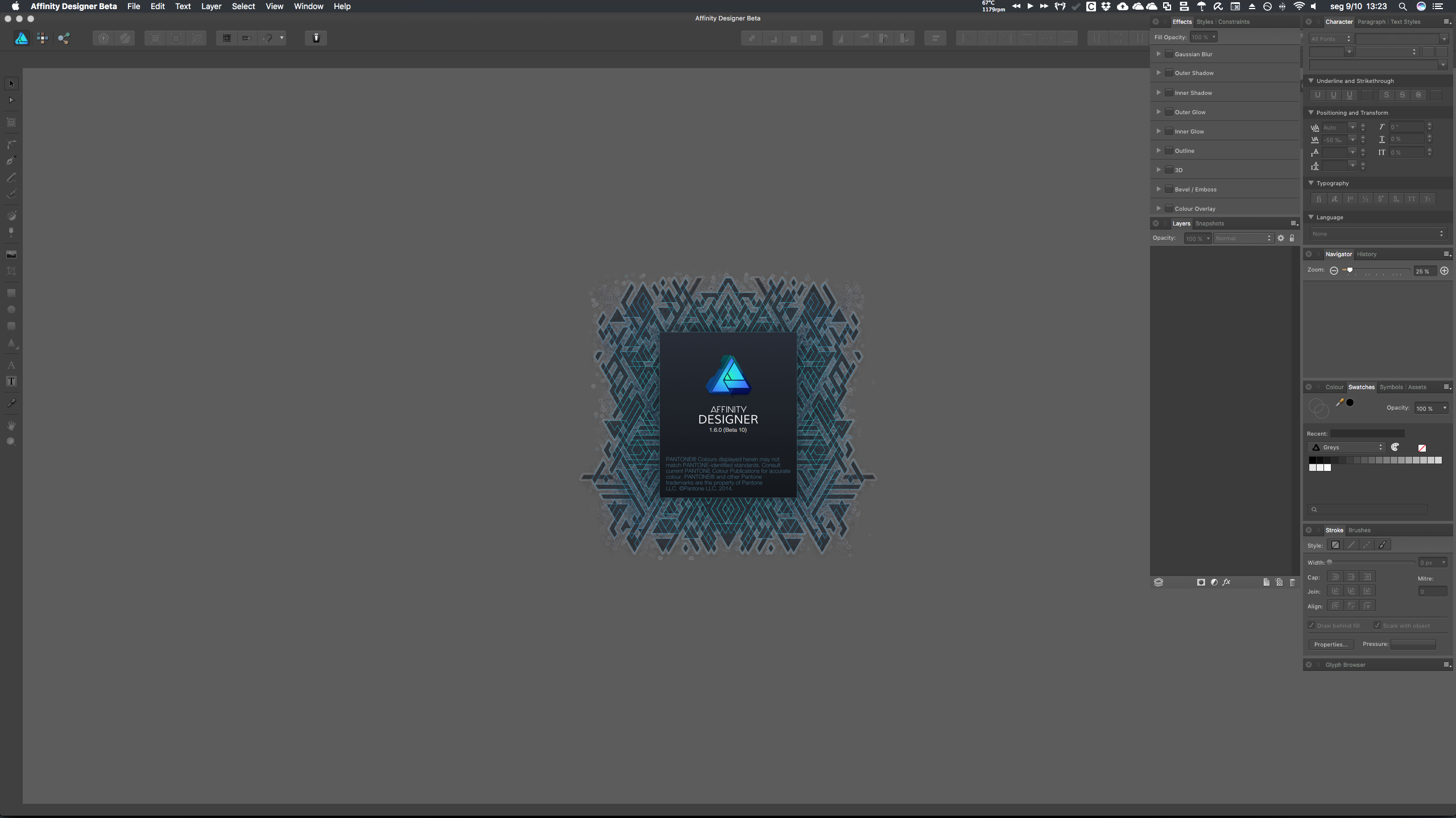
Hi guys, I know it's at least the second time I'm complaining about this, but this time Affinity's behaviour is really irking me big time. Just to freshen up your memory (and because the earlier behaviour, while still undesirable, wasn't all that bad compared to the current one), last time I mentioned this nagging issue, this was what happened: When waking a dual-display Mac from sleep which had parts or the whole of the Studio on the secondary monitor, said panels were moved to the primary monitor, as a snapped-on block , in a similar location as they would appear on the secondary one (see screenshots “Designer” and “Photo”, below), which is conveniently located to the right of my main screen and only shifts the panels a bit from their default location. The only way to avoid this issue would be to quit Affinity Designer/Photo before putting the Mac to sleep, but at least if you forgot about that you could drag all of your panels to the secondary monitor. [By the way, while I'm at it, another bug/undesirable behaviour that I detected back then and which still hasn't been fixed in 1.5.x or in these 1.6.x betas is that if you drag the panel group from the topmost panel and push it even one pixel above the lower edge of the menu bar – regardless of whether you are doing it on the main monitor or on the secondary one –, the whole panel group will start breaking apart and grouping panel tabs in undesirable combinations all by itself, which is a serious abuse of Fitt's Law (it should be applied in useful functionality like hot corners, menus and other UX interactions like maximising or snapping, not semi-random, uncontrollable interactions that feel more like bugs rather than features; in this case, dragging the panel group against or above the menu bar should obviously result in, well, absolutely nothing besides it stopping its movement along the y axis).] Enter screwed-up scenario #2, under the 1.6.x betas: Now, when you wake up the Mac from sleep, the panels will reappear on the right-hand side of the primary monitor, in a semi-snapped state (they are not actually snapped but spaced with 5 px gutters between them), and some of them even lose their width info (I like to expand the Glyphs panel, for instance, so it opens up as a large window covering almost the entire remaining space in the secondary monitor, but it reverts to its default, minimum width) which screws up my setup even further (see screenshots “Designer Beta” and “Photo Beta”, below). Whereas before, I could just drag the whole thing back to its rightful place, now I have to either piece them all back together from scratch, or force quite the apps so they purge their current, unsaved – and patently undesirable – preferences and revert to their earlier state (which, while already an option before, is something I'd rather avoid doing, especially if I have open documents). To add insult to injury, InDesign, Illustrator and Photoshop CC do not even put the panels in the wrong monitor (they just shift them around a bit, but enough to render them unusable), and I managed to fix the issue by assigning an easy to remember keyboard shortcut (Cmd+Opt+hyphen) to the “Reset Workspace” command, which works a charm. I know this is actually a macOS issue (because besides Adobe apps, iTunes and other apps will sometimes also forget where they are supposed to draw their windows and shift them around the secondary monitor or redraw them on the main one) but please, oh please, can't you try to make Affinity play nice[r] with multiple monitor setups, on the Mac at least? There are a lot, and I mean *a lot* of professional Mac users who run such setups… And if you can't make it put the panels in the right monitor automatically (because macOS and its APIs, or its lack thereof), can't you at least make the apps revert to their older 1.5.x behaviour or implement some sort of Workspace functionality, to give us more advanced customisation management options and compete head-to-head with Adobe? [P.S.: I'll be sending Apple feedback on macOS and link to this topic thread; it's a damn shame that the OS which offers what is currently still the best multiple monitor support in the market can't get something as simple as this absolutely right and provide developers with the tools to do it as well].

-
Let me add my €0,02: expecting Serif to fully support all native .indd files is wishful thinking… But InDesign can currently export XML-based .idml format files (and used to export the equally XML-based .inx format files up until CS3), which should be easier to interpret or reverse-engineer by the Serif team. And since InDesign itself can open old files and most people who have a sizeable library of .indd files either have access to an older version of InDesign or can pay one month of an Adobe CC subscription without issue, converting all of your stuff from .indd/.inx/.idml to .afpub would be, in a best-case scenario, as easy as running a batch processing script. The only real issue I foresee with that kind of mass migration stems from Affinity Publisher's announced lack of a counterpart to Adobe Paragraph Composer on v.1.x; most of your converted .afpub documents won't look the same as the original (and they never would, even if and when Serif can come up with their own advanced typesetting subsystem) and will end up with a lot of overset text or other weird artifacts, I reckon… Personally, I do a lot of manual fine-tuning to tracking on a line-by-line basis to get rid of orphans and widows, so I'm dead sure most of mine would be (nay; will be, but I'm willing to live with that since I'll just be reusing layouts for new content) utterly screwed up after conversion.
-
Ohh, I see… I had a suspicion I was doing something wrong. Thank you for pointing that out!
- 8 replies
-
- 1
-
-
- heif
- high efficiency image format
- (and 2 more)
-
(By the way, Apple seems to be lagging a bit behind itself with their own FCPX update, and it will take 10 years for most browsers to support those formats, so… do take your time. But I’d love to try them out on a proper DTP package sooner rather than later, if you know what I mean )
-
Hi MEB, Cool! Weirdly, a search on the forums for “HEIF” didn’t produce any results… And I don’t lurk much on the iPad forums, seeing that I only own a 3G/Retina. Thanks for the heads up!