R C-R
-
Posts
29,869 -
Joined
Everything posted by R C-R
-
 OK, that makes sense, so thanks for that tip about the tooltip. I cannot get a tap & hold to consistently make them stick after I remove my finger, if that is what you mean. So far, I have managed to do that maybe 50% of the time, & never if I use the Apple Pencil instead of my finger. It seems to be sensitive to exactly where I place my finger (usually my right thumb) on the ? icon area & how much of it is touching the screen, but I am not sure about that.
 -
I did, but did you consider the relevance of my comment about the difference between color temperature & correlated color temperature when trying to determine an appropriate temperature setting? It is an example of what I meant about "clearly defined" things often not being as clearly defined as they seem.
-
As the title says, I cannot figure out why when I tap on some tools a yellow tooltip briefly appears but for others it does not. I also wondered why tapping on the ? sometimes caused the tooltips to persist after I lifted my finger but I eventually figured out that is because in iOS 11 slightly dragging over the ? when tapping on it starts to activate the dock, control center, or sliding in a second app, so (I guess) Affinity Photo never 'sees' me lift my finger. Does that make sense?
-
Delay applying filters in Affinity Photo iPad
R C-R replied to Danbb's topic in Pre-V2 Archive of iPad Questions
Which iPad do you have & what filters are you applying? BTW, there is a sub-forum for iPad related questions. It is better to post questions like this one there. -
I might say the same about what you & others have said (both about opinions & understanding). Anyway, to summarize my position on this as briefly as possible, I believe it is always beneficial to understand what the science (for want of a better word) tells us about the quirks of human color perception & its affects on our work, just as understanding the differences between what a camera "sees" & what we do is beneficial for the same reason. Taking that into account, what seems "clearly defined" often is not, or is considerably more complicated & context sensitive than it otherwise might seem. I would never be satisfied with that image but I already posted the result of a very simple edit & how I did it using Affinity Photo. Did you miss that?
-
Note that the Status bar (the line of text at the bottom of the window) is context sensitive & will tell you which modifier keys (Shift, CMD, etc.) do what if you hover the Move Tool pointer directly over any of the handles. It also tells you which modifier keys will do what if you hover the pointer over the area just outside the handles where shearing or rotation will occur, & where applicable what a double-click on a handle will do.
-
But that depends entirely on what you consider to be the "proper" white balance, right? So for your example let's say you remember an object to be white (whether physically it is or not) & use that with what would be considered to be a "correctly" working white balance tool. Would that really put you 'where you want to be' for whatever you want to do next with the entire image, particularly for the overall magenta-green tint correction? Or maybe more to the point, consider the image that started this discussion & the various WB adjustments people have tried with it. Do any of them look like they are properly white balanced? Maybe it is just me but none of them look like where anybody would want to be because perceptibly nothing in them I would expect to be white (whether it is physically or not) actually looks white. So sure, not everything requires a highly detailed scientific approach but at the bare minimum I think it is important to understand that the "color temperature" parameter is really just a "correlated color temperature" & that is an imperfect approximation of most real world lighting, as is the secondary magenta-green correction. Absent that, I do not understand how anybody expects to choose the right tool to achieve whatever it is they want to achieve, much less how to use it to do that.
-
So for an old fool like myself, please explain as simply as you can what you would consider to be the "correct" way for these tools to work, one that somehow has nothing to do with the variability of the human perception of the color & intensity of light, or any of the other factors that are inherently subjective about it. From what several of you have been saying, that should be easy, right?
-
So what exactly do they actually intend to achieve with these tools? It is all well & good to say is to remove a color cast from an image for one reason or another, but what does that really mean? As you say, it is all based on perception, so how can that possibly have nothing to do with it?
-
Nope. The reality is that our ability to "know" what is pure white or completely neutral in any objective, observer-independent sense is quite unreliable. That is because the references we use are not based simply on the physical properties of the light that reaches our eyes but also on the properties of the sense receptors in our eyes (which are non-linear & have different sensitivities to different wavelengths), how their output is processed by our brains, & what prior experience tells us about how things appear under different lighting conditions.
-
NEF RAW issue
R C-R replied to chrisday10's topic in Pre-V2 Archive of Desktop Questions (macOS and Windows)
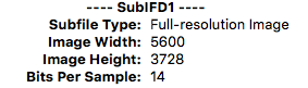
You & me both! To begin with, when I open your .NEF file in Mac apps like Apple's Preview or GraphicConverter 9, I get the same image (visually) as in your Image3.jpg from AuroraHDR, which is the only one of your 3 image jpegs that shows the outward tilted mast on the leftmost boat & two columns of windows on the white building on the right. So that is my 'uncropped' reference. Apple's Preview app says the image is 3712 px X 5568 px, just like your image1.jpg from Windows. So far, so good. However, that first image seems to have excluded the same amount of the outward tilted mast & almost all of the white building on the right compared to your image2.jpg from Affinity Photo, so it is the most 'cropped' of the bunch. Opening the NEF file in Affinity Photo, I get the same missing stuff on the left & right edges as you do, yet AP says the image is 5599 x 3728 px. Weirder still, in the EXIF metadata window set to "All" the tiff:ImageLength value is 3728 & the tiff:ImageWidth value is 5600, which agrees perfectly with what I see using EXIFTool based apps like GraphicConverter: So this suggests that Affinity Photo is showing more pixels but less of the image than Preview or AuroraHDR ... or equivalently that it is showing less of the image at a slightly higher pixel resolution ... or something.
-
I think you will find that only works with RAW images, ones that include certain EXIF metadata about color temperature, tone curves, & such created by the camera when the photo was taken. Once developed, tint probably won't change if you go back to the Develop Persona & use the tool again. It is I think related to how RAW images show color temperature in the Basic White Balance in Kelvins until the RAW file is developed, but after that as % if you return to the Develop Persona.
-
But it is not at all straightforward because our eyes do a very poor job of objectively judging what actually is white or neutral gray. We see as much with our brains as with our eyes. Our eyes send our brains color information only from one type of photoreceptor & intensity information from two kinds. Each has different sensitivities to light & are not evenly distributed on our retinas, so we don't even experience color information the same way under bright lights as dim ones & that also varies depending on where we look. Our brains integrate this information & prior experience to form a highly subjective opinion about the color or lack thereof of everything we see. In fact, almost nothing we see really is a completely neutral gray, which is why photographers serious about objectively accurate color correction use gray cards because they know their eyes can't be trusted for that.
-
Considering the limited color gamut of computer screens & that most of the the colors we see on them actually are an illusion created by closely spaced triads each emitting light in only a narrow spectrum of colors, perhaps that is not such a good idea?
-
Perhaps I should start by asking you not to misrepresent my comments so dramatically? Never have I said or implied that "color adjustment tools" are not useful. I just question the usefulness of this particular one.
-
But it would save time only if it actually corrected for the uneven spectrum of the light(s) in some way that was acceptable as "natural looking" or somehow "true to the original."
-
Some may consider the WB picker not affecting the tint slider to be a bug but I think it is just a reasonable design decision. It is hard to explain why I think that but as the Understanding White Balance Cambridge on Colour tutorial mentions, WB adjustments are based on "correlated color temperature," an approximation that resulted in the addition of the traditional secondary green-magenta shift parameter to help correct for light sources that depart significantly from true blackbody radiation. However, the green-magenta shift is just a secondary approximation. Unless it is 'tuned' to the spectrum of the specific light source, it probably won't work very well, particularly when mixed light sources with different spectra are involved. I also suspect (but by no means am sure) that a green-magenta shift was chosen because once the most common light source that needed WB correction was fluorescent lighting, which gave everything a greenish cast. These days, not only do we have fluorescent lights with different (but still uneven) spectra, we also have energy-efficient LED lighting, which also do not output 'pure white' light & are equally poorly modeled with a "correlated color temperature,." (Special purpose LED lights with balanced spectra are available but they are very expensive.) Anyway, the bottom line for me is the tint slider should be something reserved for the user to adjust manually if they want to use it, & never adjusted automatically with the picker. But that is just my opinion.
-
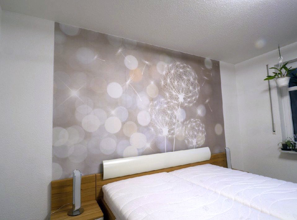
After applying the two auto adjustments there is still a reddish color cast, most noticeable on the mattress covers, & the headboard looks a bit too green to me. I suspect some of this is because the jpeg is a bit noisy & has quite a few compression artifacts, so it would probably work better on a cleaner image with lossless or no compression. I also played around with setting the WB manually on the whole image using the picker & then adding a second WB adjustment confined to the headboard, for both using the rectangular picker sampling option. That produced marginally better results. Considering the relatively low quality of the original, it just did not seem worth the effort. This is more or less equivalent to the "I can fix it in the mix" philosophy in audio work. Maybe you can but it takes a lot of time & it probably won't be as good as getting everything right to begin with would have been.
-
On the Mac versions, use the alt/option modifier key for this rather than the CTRL one. However, for some field values expressed in percent values it does not work. For example, in the HSL adjustment it works for Hue shift but not for Saturation or Luminosity shift. Possibly this is because the latter two only seem to accept whole number % values. Using Shift + mouse wheel sets percent values in 10% steps, & elsewhere in 10 unit steps. That makes it very quick & easy to set zero values.
-
If nothing else, as references they suggest that the PSE 14 white balance adjustment is no better than the Affinity one, just different. Using the original 958 × 710 px jpeg from the first post, Affinity Photo, & a minimal amount of effort, I get this: The only tweaking I did was to first apply Auto Levels & then Auto White Balance. Auto levels is responsible for almost all the changes; auto WB just gave the image a slightly cooler color cast. It is far from a perfect fix for this photo, but I think it is a much better one than futzing with a lot of manual adjustments would be, particularly considering the jpeg source file & the few seconds it took.
-
Particularly when the only image we have is what seems to be an odd sized jpeg with an unknown amount of lossy compression applied.
-
As a mouse user, are you aware that you can use a mouse scroll wheel to change numeric field values by placing the pointer over the field & moving the wheel? You might find that easier than dragging the slider.
-
If you mean the picker in the White Balance adjustment, it is working here on the Mac version, exactly as described in https://affinity.help/photo/en-US.lproj/pages/Adjustments/adjustment_whiteBalance.html. It does not change the tint slider, but I don't think that is what is supposed to do.
-
In the stroke size/type dropdown on the Context Toolbar with the object selected, tick the box for "Scale with object."
-
Support for PS plug-ins is quite limited. For example, no plug-in that requires PS Actions to function will work in Affinity Photo (because there is nothing comparable to them in Photo). There is also no support for exporting or creating animated GIFs, or any 3D features.