000
Members-
Posts
930 -
Joined
Everything posted by 000
-
CMYK Black Overprint regression ?
000 replied to BigStef's topic in [ARCHIVE] Publisher beta on macOS threads
@BigStef 1.8 Beta, works as expected with a gaussian blur and a drop shadow applied with the PDF settings you asked for (1.5, FOGRA 39 profile). @thomaso Didn't upload screenshots for this, but when I select "generic CMYK" profile, I get the same, incorrect, result as you. Puzzling. *sigh* export_fogra.pdf test_new.afpub -
CMYK Black Overprint regression ?
000 replied to BigStef's topic in [ARCHIVE] Publisher beta on macOS threads
Last week I helped a lady from a Facebook user group with her overprints (book cover) and we discovered, that 1.7 has some issues with overprinting, but 1.8 works much, much better -- that's why I started playing with a new file. 1) Not sure -- I can create ,normal' black swatches but no ,global' ones with just black. Gonna re-install the software, restart the computer and update this post / paragraph. -- EDIT: WORKS PROPERLY AFTER RE-INSTALLING THE SOFTWARE AND RESTARTING MY COMPUTER 2) Understand -- I usually use a generic profile for all my work and tell the printers to apply whatever profile they want for their machines and paper when they are ripping the file and creating their plates. Easier for me and I can be sure to send them the ,cleanest' files possible as well as do a last quick colour check on my calibrated screen. -
CMYK Black Overprint regression ?
000 replied to BigStef's topic in [ARCHIVE] Publisher beta on macOS threads
I think, I have cornered the problem ... please find attached a Publisher file, a screenshot of my PDF options and a PDF file with correct overprinting (I checked it in a trial of Callas ToolChest ... very slow on macOS Catalina but I like it better than Acrobat, thinking about maybe buying it now ...). Good news first: Overprinting black works correctly in Publisher 1.8 beta. Bad news: It's not compatible to Publishser 1.7 files (which has its issues with black and overprinting). I believe, the problem is, that you (BigStef) are using an ,old' Publisher file that has been created with 1.7 -- the attached file is created with 1.8 and works properly. The idea to create and test with a new file came, when I noticed that I cannot create a "Black Global Colour" in version 1.8 (other colours work fine, but when I try creating a global colour / swatch from CMYK 100% black, nothing happens and the document swatch panel stays empty) and your test file contains one, so the global black swatch must be an old one from version 1.7 (tested this as well, in 1.7 I can create a simple black global swatch). test_new.pdf test_new.afpub -
CMYK Black Overprint regression ?
000 replied to BigStef's topic in [ARCHIVE] Publisher beta on macOS threads
Yes, I know what you expect ... basically the blue sky behind the black text, not ... more black text ... I thought this was just a problem with Affinity Photo (again, I don't have Acrobat at the moment, so cannot do a proper separations preview). Sorry. I'll download an Acrobat Trial and play some more. -
CMYK Black Overprint regression ?
000 replied to BigStef's topic in [ARCHIVE] Publisher beta on macOS threads
Thanks for the Publisher File.0 I made an export with the following PDF settings: honor spot colours disabled, so everything will convert to CMYK / overprint black / generic CMYK profile and got the attached PDF file -- when I open it in Photo (don't have Acrobat) and look at the color channels, black is overprinting A LOT (when I open your PDF file, test 4, I see that black is NOT overprinting, so I guess Photo works for this quick check). test.pdf -
CMYK Black Overprint regression ?
000 replied to BigStef's topic in [ARCHIVE] Publisher beta on macOS threads
Actually, i have an idea ... is it possible that "Black as Global Colour" is not properly recognised as "Black"? Can you try, using a "normal" black (no spot, colour, just 100% black from the CMYK slider) and exporting with overprint again? Should that work, there's still a problem with overprinting black from spot colours and / or honorig spot colour overprinting, but we can at least pinpoint the issue a bit better. -
CMYK Black Overprint regression ?
000 replied to BigStef's topic in [ARCHIVE] Publisher beta on macOS threads
Well ... we can certainly open it in Photo and review the channels ... yes, black is not overprinting here, but the entire page is just one CMYK image. Very strange ... which colour profile did you select for output? Would you mind posting the original Publisher file, so I can open it, play around and export myself? -
Affinity Publisher Customer Beta - 1.8.0.531
000 replied to AdamW's topic in [ARCHIVE] Publisher beta on macOS threads
@AdamW Thanks for the answer and the hard work ... it's a MASSIVE update. -
CMYK Black Overprint regression ?
000 replied to BigStef's topic in [ARCHIVE] Publisher beta on macOS threads
Have you checked "overprint black" in the PDF export settings? -
Affinity Publisher Customer Beta - 1.8.0.531
000 replied to AdamW's topic in [ARCHIVE] Publisher beta on macOS threads
Don't get me wrong, there's lots of nice stuff in the 1.8 update and it's much more than most other companies provide with a paid upgrade ... I'm SUPER happy with the progress. The question was just for information to see how far the betas are ... and, off course, to maybe, possibly get a subtle hint on when and if the ONE feature I'm desperately waiting for is coming. -
Affinity Publisher Customer Beta - 1.8.0.531
000 replied to AdamW's topic in [ARCHIVE] Publisher beta on macOS threads
Thanks!! Are there any more new features coming for 1.8 or are we in the polishing phase? -
It would be very beneficial, if it was possible to apply a different style to each character of the drop cap feature (e.g. three dropped caps = three style selection fields). Here's a sample of what this could be useful for:
-
Sorry, just noticed that you can only drop one cap ... however, this has already been changed in the new 1.8 beta, so it should be available for everyone, as soon as the next update for Publisher releases. Currently you need to create one single new text frame with your drop caps (same method as described above) and pin it to the start of your paragraph. I have put a feature request in for an enhancement of the current feature, which would make life even easier:
-
Write every letter two (in your case three) times and use kerning to position your letters perfectly on top of each other. Below a screenshot using the free font "Romanique Initials" with two colours and a marker where you can see which value to edit for the second (and in your case third) letter -- for this sample I set it to "-880", but it may vary from font to font. Make sure to use what Affinity calls "global colours" so you can set them to overprinting if needed and also change the colour without "unfiddling" your letters manually. If you use a text style, you can also adjust the size (or even font) later on; And when you even use two (in your case three) text styles, you can apply and reapply the kerning values and colours by simply switching styles. This method works without ANY extra text frames, you can just put your text in any Frame you like and even place them in the middle of your text if you want. In combination with the drop cap feature (in you case set to three characters), that should make your life much easier.
-
UI Interface Legibility
000 replied to gary danang's topic in Feedback for Affinity Designer V1 on Desktop
Agree, there could be a bit more contrast ... since there are a light and a dark UI the selected buttons could just switxh (change from lightnto dark and vice versa). -
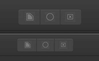
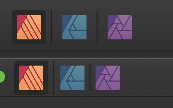
Here are three screenshot I took from Publisher ... same machine, same screen settings and resolutions. I opened both (1.8 beta and 1.7.3) next to each other and as you can see, the newer interface is noticeably smaller (if you look for the 1.8.499 beta tread, you'll find that I'm not the only one having this issue).
-
Maybe it's just on high res screens? I have a 5K iMac and the difference is significant. I know about the font size option, the problem in my case is that is has gotten harder to quickly "aim" and click on the buttons and options. Only solution for my screen is to reduce the resolution, but when I do, my whole system gets "larger", not only the Affinity software, and I don't want that. When the Publisher beta came out last year, I took screenshots -- I'll dig them up when I'm back on my office on Monday and post them here.
-
Already posted this in the initial Publisher .8 beta thread: The UI (buttons and text) are roughly 20% smaller than in the .7 versions -- hope this is a bug and not intentional, because it makes the software harder to use.
-
Already posted this in the initial Publisher .8 beta thread: The UI (buttons and text) are roughly 20% smaller than in the .7 versions -- hope this is a bug and not intentional, because it makes the software harder to use.
-
Smaller PDF Files, please!
000 replied to 000's topic in Feedback for Affinity Publisher V1 on Desktop
Michael, make aure that you are not using a font manager, but install the fonts using the OS -- that's what fixed the problem for me (see my post above). It's a strange one, hope this gets fixed at some point (by either Serif or the font manager people). -
Have a great time and a good start into 2020!
-
This is not ready for pro production yet :-(
000 replied to redlik's topic in Feedback for Affinity Publisher V1 on Desktop
@redlik While I agree that there is still a lot of things missing that other software has and all the points you list are absolutely valid, I think "not ready for pro production" is a bit harsh -- I have just sent my first 92 page product catalogue to the printers and couldn't be happier. I cannot transfer all my work to Publisher yet, but for a lot of jobs (professional work) Publisher is suited. -
It would show what pages and which frames text contain more text than fits in the frame.
-
Text overflow
-
Deleting with Backspace Key deletes Paragraph Indent
000 replied to 000's topic in V1 Bugs found on macOS
Thanks Jon P!!!!


