dominik
-
Posts
2,936 -
Joined
Everything posted by dominik
-

Affinity PHOTO export to .bmp *HELP*
dominik replied to Max Mitty's topic in Desktop Questions (macOS and Windows)
That is the point of my posting. I do not argue against future development of new features. I'd welcome these. d. -
Affinity PHOTO export to .bmp *HELP*
dominik replied to Max Mitty's topic in Desktop Questions (macOS and Windows)
Just to clarify if you didn't look closer into XnConvert (or XnView). It has a feature called 'Hot folder'. Basically it is a folder that monitors for new files and if some arrive (e.g. after an Export from Affinity) it automatically converts these files. In other words once you set this up according to your needs there is virtually now slow down at all. And the solution is instant and there is no need to convince Affinity to implement this. Just a practical suggestion to help. On a side note: I do not oppose your arguments or suggestions. I just want to point out - as others in this thread - that there are working solutions at hand. No need to wait. d. -
Affinity PHOTO export to .bmp *HELP*
dominik replied to Max Mitty's topic in Desktop Questions (macOS and Windows)
This has been discussed before. There are two aspects to this: 1) .bmp is a rather old file format that in some way does not play a big role anymore. I assume this is the reason why the developers decided not to implement this format for export. Especially as there are different ways for those who really need this format to convert rather easily. 2) There are still some scenarios where .bmp files are still required, as you experience yourself. In that case it is a more practical approach to develop a workflow by converting with tools that are available right now instead of waiting for Affinity to implement this. I would not hold my breath to see this implemented in the near future. Still you can post a feature request over in this section of the forum. I hope this helps. d. -
Affinity PHOTO export to .bmp *HELP*
dominik replied to Max Mitty's topic in Desktop Questions (macOS and Windows)
As I said, it is a matter of taste. I won't discuss this any further. d. -
Affinity PHOTO export to .bmp *HELP*
dominik replied to Max Mitty's topic in Desktop Questions (macOS and Windows)
Thanks for explaining. Yes, I missed in my first reply to mention to first export from Affinity to JPG. I added this information in my next post. Using XnView or XnConvert is a matter of taste. I've been using XnView for some time and can recommend it. But just for conversion purposes XnConvert does a decent job ... and it is free. Cheers, d. -
Affinity PHOTO export to .bmp *HELP*
dominik replied to Max Mitty's topic in Desktop Questions (macOS and Windows)
I do not understand. Which 'included thumbnail' do you refer in a JPG-file? d. -
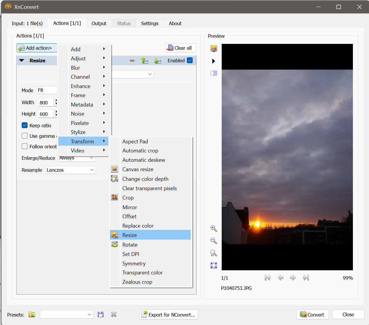
Affinity PHOTO export to .bmp *HELP*
dominik replied to Max Mitty's topic in Desktop Questions (macOS and Windows)
Sorry for the delayed reply. I missed to mention that I did export to a JPG format first out of Affinity. In XnConvert's Tab 'Actions' you can add a 'Resize' command. See screenshot. d.
-
Affinity PHOTO export to .bmp *HELP*
dominik replied to Max Mitty's topic in Desktop Questions (macOS and Windows)
Hello @Max Mitty, look into the 'Convert' tab. There you can select an option to resize the image and enter it's dimensions. There you can type in output dimensions that fit your needs. d. -
Affinity PHOTO export to .bmp *HELP*
dominik replied to Max Mitty's topic in Desktop Questions (macOS and Windows)
Hello @Max Mitty, in addition to all the above good suggestions I want to point you to XnConvert. It is a cross plattform tool that is specialized in converting images across a large amount of file types. Please see here: https://www.xnview.com/en/xnconvert/ d. -
You have to type into the Width field "=500" without the quotation marks. On a side note: I wish you had choosen to use images of cats or daisies. But to each his own d.
-
Hello @PixelHead, I can confirm that this should work. Of course you have to select all objects first. Also, if you lock the aspect ratio in the Transform Panel the images won't get distorted. d.
-
Using "traditional" layers in AD
dominik replied to MickM's topic in Desktop Questions (macOS and Windows)
States are available in all three applications. d. -
Using "traditional" layers in AD
dominik replied to MickM's topic in Desktop Questions (macOS and Windows)
Sorry for the not correct link. Thanks for helping here. d. -
Using "traditional" layers in AD
dominik replied to MickM's topic in Desktop Questions (macOS and Windows)
Hello @MickM, I think you are on the right track. In Xara Designer there is a concept of 'soft groups'. These are groups of objects (= Affinity layers) that are spread across object hierarchy. This concept is not available in Affinity. In Affinity, though, there is an additional organizational feature called 'Layer States'. This is a very powerfull feature and can simulate 'soft groups' as mentioned above. Basically it is a way of querying all layers according to some of their attributes and select them. Once you created a Layer State you can select all elements across the entire layer hierarchy with one click and modify them. A very simple way is to use layer names to assign them to a certain Layer State. Referring to your initial post you could name individual layers 'red group' or 'blue group'. Once you created Layer States that query just for objects that are called 'red group' you can select these with just one click. The only drawback is that you have to name your layers. There is no drag and drop way to do that. But personally I find this feature pretty slick. Please see this help page for an explanation: https://affinity.help/designer2/English.lproj/index.html d. -
Hallo @kiyoshida, ich weiß nicht, ob es eine Option ist, ein zusätzliches Gerät zu kaufen. Es gibt Fußschalter mit z.B. drei Tasten, die man wahrscheinlich mit CTRL, STRG und SHIFT belegen könnte. Ein Beispiel wie das aussieht ist dies hier bei Amazon. Aber ich nehme an, Du bist in dem Thema viel besser informiert, als ich. Grüße! d.
-
Well, the concept of guides is that they 'guide within the program' not in terms of 'guides that are part of the design. If you want guides that are part of your design you have to create and possibly style them as real vector objects. Guides are no vector objects but rather visual elements. You could place your 'vector guides' in a seperate group and thus turn them on or off for export. It has quite some advantages to do it this way. d.
-
Hello @omarvelazquez, guidelines are elements that can not be exported. What you can do instead is use the guidelines and place along them vector lines and style them as you want them to look like in the exported document. Snapping will help you to place these lines very exactly. Then you can export and those lines will show up in your exported PDF. d.
-
Hello @LotharP, the latest version of Publisher supports spreads with multiple pages. This is the reason why I would design in Publisher. You may want to look at my sample file. d. Bucheinband Beispiel.afpub
-
There are some keyboard shortcuts in this context that you may want to integrate into your workflow. X switches between stroke and fill colour. You still have to think about where you want to assign the current colour but you don't have to move the mouse. SHIFT+X switches the assigned fill and stroke colour. This could be handy if one accidentially clicked stroke instead of fill. D resets to default colours white as fill and black as stroke. I just double checked with my old copy of Xara Designer. Click on a swatch assigns to fill and SHIFT+click assigns to stroke. d.
-
If you think of it you can first change to fill by clicking on the fill colour. But, what you describe happens to me as well I am not aware of another way than choosing first fill or stroke and then select the colour. It's matter of routine. I think I rememeber in Xara you can left or right click to assign fill or stroke. This would be a good feature request. d.
-
Affinity Photo and Curves
dominik replied to blackxacto's topic in Desktop Questions (macOS and Windows)
Hello @blackxacto, as R C-R already mentioned the tutorial was done with a V1 edition of Photo. In V2 the panels were moved to the Window menu. I forgot to mention this, sorry. I think to get a very good result from your original picture you have to do a little more adjustments because it looks faded and has that strong colour cast. Good luck! d. -
Affinity Photo and Curves
dominik replied to blackxacto's topic in Desktop Questions (macOS and Windows)
Hello @blackxacto, you might look into the technique in this video tutorial: Using the colour balance adjustment offers a lot of detail adjustment. You can also use a curves adjustment. In my opinion it is a little less powerfull but is a little better to handle. d. -
how to fill pixel layer (AP)
dominik replied to wintermute's topic in Desktop Questions (macOS and Windows)
Hello @wintermute by default you can press ALT+backspace or CTRL+backspace. You find these commands in the 'Edit' menu and you can assign custom shortcuts under 'Preferences'. d. -
How can i "fill all selected area"
dominik replied to Hythus's topic in Desktop Questions (macOS and Windows)
I think on Windows it is by default ALT + backspace and CTRL + backspace that does the trick. d. -
It makes sense to learn a little before just playing around. I mean this honestly due to my own experiences. There is a very comprehensive video tutorial by Elaine Giles with an index from which you can jump directly to certain topics, if needed. d.