JonathanBowen
-
Posts
14 -
Joined
-
Last visited
Recent Profile Visitors
844 profile views


-
I was thinking about creating a .gif for my Facebook Page Profile Photo using Affinity Designer. I was going to use my company's logo as the basis of the .gif. Any thoughts?
-
Hello. I haven't had a chance to study the replies yet but I want to thank everybody for their quick and concise replies. I've posted questions to this forum before and I've only got good things to say about the community. Thanks.
-
Hello. I want to create a favicon but I have a circle that extends beyond the boundaries of a square at some points. How do I cut those extended sections out of the circle? I've attached the file. I don't want somebody to do it for me. I'd like to learn the steps. Thanks. Hub Edge Realty - Slice, Inner (20170119).afdesign
-
Hello. I want to create a circle and the top half of the circle needs to be black and the bottom half of the circle needs to be another color. I'm using stroke since the inside of the circle will be white. Do I create two circles? What's the best practice? Thanks.
-
So you're saying that I've violated two of the most basic rules by creating a perfectly round logo using only black and white. Sigh...
-
 JonathanBowen reacted to a post in a topic:
I created a logo at 1201 x 1201 pixels.
JonathanBowen reacted to a post in a topic:
I created a logo at 1201 x 1201 pixels.
-
Understood. Would it have looked better if I created it at 150 x 150 pixels and then enlarged it? Are there any techniques I can use to maximize the smoothness of the smaller images? I appreciate your insight.
-
JonathanBowen reacted to a post in a topic:
I created a logo at 1201 x 1201 pixels.
-
And then I exported it at 400 x 400 pixels and 150 x 150 pixels in order to resize it but the 1201 x 1201 pixels looks, by far, the best. What did I do wrong? Help!
-
I was directed here after posting a feature request on Affinity's Facebook Page. Here's the text: "I just discovered your OS X Photos Extensions today and they're awesome. I used Retouch Healing to fix a blemish in a photograph and it looks seamless. It's much better than Photos' own Retouch. I would love to see some sort of percentage system on your sliders. For instance, I was fooling around with the Strength slider on the Miniature tool and felt that it would've been much more useful if there was a 0% to 100% scale." I hope this request will be implemented. Thanks.
-
I just bought Affinity Photo today after being pleased with Affinity Designer. Why didn't I buy it sooner?! By the way, I just watched the "For Beginners" video and it was fantastic. I can't wait to watch the rest of them. I'd be so happy if you could continue to regularly add videos for both Designer and Photo on a regular basis.
-
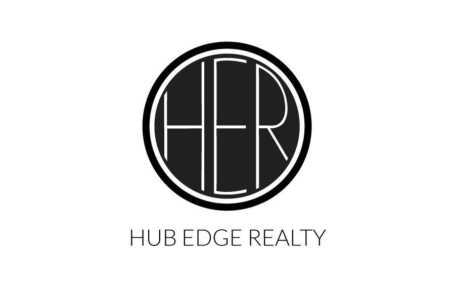
Hello. You've been very helpful so far. I'm almost done with my logo. I want to make the center of my logo look like a round window. That white cog would be the window frame. I want to add four white triangles to represent window panes and I want the outside of the triangles to perfectly align along the radius of the window. I've added two files for you to inspect. How do I do that?! Teach me! Thanks. Hub Edge Realty - Logo (20151007).pdf Hub Edge Realty - Logo, Edited (20151007).pdf
-
peter reacted to a post in a topic:
How do I make a three letter monogram in a circle?
-
I appreciate your work on that Peter. I've mostly given up on the monogram idea. The "R" is frying my brain.
-
Thanks. I watched both videos. The issue is that I need to create two separate instances of text on the same path; text above the horizontal plane and text below the horizontal plane. The videos don't address that instance. Thanks.
-
Hello. You may have read my earlier question. I think that I'm going to abandon the monogram idea for now because I'm so picky. I'd like to create a logo with text above and below the horizontal axis of the circle but I don't know how to do it in Affinity Designer. Here's an image that might help to help you understand that it is that I'm going for. I can get the text above the horizontal axis but I'm having trouble getting it below the horizontal axis. Any help would be much appreciated. Thanks.
-
Hello. I just bought Affinity Designer today. To say that I'm inexperienced at this type of stuff would be an understatement but I'm a relatively quick learner. I've watched a ton of videos last night and today. I'd like to create a three letter monogram in a circle. I hired a designer to make a logo but I'm unhappy with his work. And you know what? I want to learn something new. I've attached his latest design and I like it, mostly, but I feel like the lettering is lazy. I'd like to manipulate the letters so that they fill the circle but I don't want to distort the font so that it's unrecognizable. Can you give me some tips? Thanks!