

MoonaticDestiny
-
Posts
476 -
Joined
-
Last visited
Everything posted by MoonaticDestiny
-
Brush stabilization UX improvements
MoonaticDestiny replied to a topic in Feedback for the Affinity V2 Suite of Products
I disagree with you. It wasnt annoying. It was perfectly fine down there. The context toolbar in v1 was located at a reaching pencil distance and all your settings were there. EVERYTHING you needed was there. Now, in v2, everything has been split and divided. I dont know why they did that. I really dont like it. Its bad design. Really bad design. Everything has been redistributed around the screen. You got things at the top. Things to the left. Icons that serif expects us to know. Sliders that take up UI space. Buttons within buttons. Unnecessary icons for the sliders. Lots of buttons at the top. Its just all bad. It literally feels like they took the v1 context toolbar, redistributed everything around the interface, and said, "You figure it out." Its a mess. Honestly, the context toolbar in v1 was better. A simple bar with everything you needed. Those circle dials in v1 were awesome! You just hover over the dial and increase your vale. Super easy. Super awesome! Those dials in v1 took up waaayyy less space than the new long sliders here in v2. The dials from v1 didnt need to be turned into sliders here in v2. Now we have unnecessary sliders taking up UI space. And now you have icons under those sliders that we're expected to know. Its crazy! In v1, the context toolbar had every thing "spelled out" for you so it helped you know where everything was. It was truthfully awesome and so helpful. The v1 context toolbar was just so awesome! Literally go back to AD v1, try out the context toolbar, and then come back to v2 and see how its all a mess and confusing. Ugh! And all those icons at the top. My goodness. What are we doing? I never understood the difference between rope and window. I even played with both settings in v1 and they feel the same. I always said there should have been a 3rd stabilizer called "smooth stabilizer." Its a stabilizer that acts like the one in illustrator, fresco, and procreate where the app would do the smoothing for you. In rope and window the smoothing is done depending on the speed of your hand. Serif never implemented this 3rd stabilizer into the app. 😐 You can read about my post here. The solution to everything here is to go back to the way the context toolbar was in v1. It was never broken. No debate about sliders. No using an icon to toggle between things. No weird icons that serif expects us users to know. No cluster of icons at the top. Nothing is redistributed. Everything is spelled out for you in v1. The context toolbar in v1 was awesome. @Bryan RiegerHave you seen the rope and window stabilizer context toolbar in v1? The value input is literally right next to it. It doesnt get any better and easier than that. Now, in v2, we've moved and splitted everything everywhere. IDKY we're making these bad design decisions. You know its bad design when a user, you, says it took them AGES to figure something out. You know its bad design when a user, you, says something they need is too far away from them. You know its bad design when you call something confusing. You know its bad design when you have to look at 2 different areas of the interface for completing 1 basic action. -
I was going to clarify what I wrote by editing my post, but I got side tracked and I didnt. What I meant to say, and I didnt, was "this is something I really want to have a debate about WITH SERIF." I meant to have a debate with serif. Not you. This is a conversation I want to have with them. I apologize, my friend. Im sorry if it came off as me coming for you with this whole detailed paragraph. Sorry, again.
-
I totally agree, my friend. I literally said that while I was typing my response in my previous comment, so I know Im right now. ☺️ THIS. Ive said this so many times, and I'll say it again. Serif is playing a game with users and the game is called "Hide and Go Seek." I dont want to play your game, Serif. I dont want to seek what youre hiding from us users. Stop hiding things from us. We have space but its very limited. A second row will NOT hurt though. Thats what users having been asking for years. There needs to be a customizable toolbar at the top. Currently, serif already added buttons at the top that they took out from the edit menu for us. So they did the customizing for us when really it should have been us who should have done the customization less taps = good design several taps = bad design
-
Hey, walt. This is something I really want to have a debate about. I think all personas should be lined next to each other. How it was in v1 and how mrqasq here is asking for and the reason why I say that is because it makes it easier for the user to toggle between into each persona. These personas are very important. Users should be able to toggle into them easily with one tap. Now, users have to do 2 taps just to get to them. 2 taps slows workflow and it makes it less easy to toggle into them. Heres the REAL issue though. Serif thought it was a good idea to put the context toolbar at the top on the same row the personas are on. Bad idea. That row at the top now becomes full of icons and these context toolbar icons now clash with the persona, document, and edit buttons. Because they clash, serif now has to make room for the context toolbar buttons and has put the personas into their own little single button pop up menu. This was a bad design choice by serif. This design choice makes the user do more work to get to important personas. This context toolbar ruins everything. I hate the context tool bar at the top. It was fine at the bottom in v1 but serif said something about they needed to move the context toolbar because it was in the way of the users canvas. It was distracting so it was moved to the top. I truthfully believe that if serif wanted to put the context toolbar at the top, they should have made a second row and have this second row reserved for the context toolbar. THATS what should have happened. That way the top row is reserved for all personas, the document, and edit buttons. And then the context toolbar has its own row below for as many buttons it has. So now theres no button clashing going on and users can now 1 tap easily into their own personas. On top of that, the top row where the personas,document, and edit buttons are should have been where the customizable toolbar should have gone. Its what users have been asking for years. Serif made a mistake by putting the context toolbar there instead of the customizable toolbar. And you know why the context toolbar at the top is a bad design decision? Its bad when not all the buttons of the context toolbar can fit on the bar at the top that you have to do a swipe left on the bar to see the rest of the buttons of the context toolbar that are hiding behind the zoom preview mode and snapping. Thats when you know its bad. So all personas should be displayed. No pop up menus for personas. The context toolbar should have gone on a second row below the top row.
-
The hand graphic for the gesture Zoom In and Zoom Out on all 3 app gesture PDFs for ipad, theres supposed to be filled in circles under the thumb and index finger because you have to "hold" down to perform these 2 gestures.

-
V2 is a downgrade
MoonaticDestiny replied to shushustorm's topic in Feedback for the Affinity V2 Suite of Products
@Bryan Rieger yes to everything you said, my friend. I really, really wanted to like v2. REALLY. There are so many BAD design decisions, things that are confusing, things that feel half-baked, and things that just don't work. Normally I would post issues to the forum and wait to see what happens (spoiler: nothing ever happens), but I'm at a bit of a loss as how to proceed. I was hoping that with the BIG launch of v2 we might see a new, more communicative Serif There so many questionable design decisions Serif's consistently mute communications style has really eroded my confidence in Serif. ALL of this. 👆 -
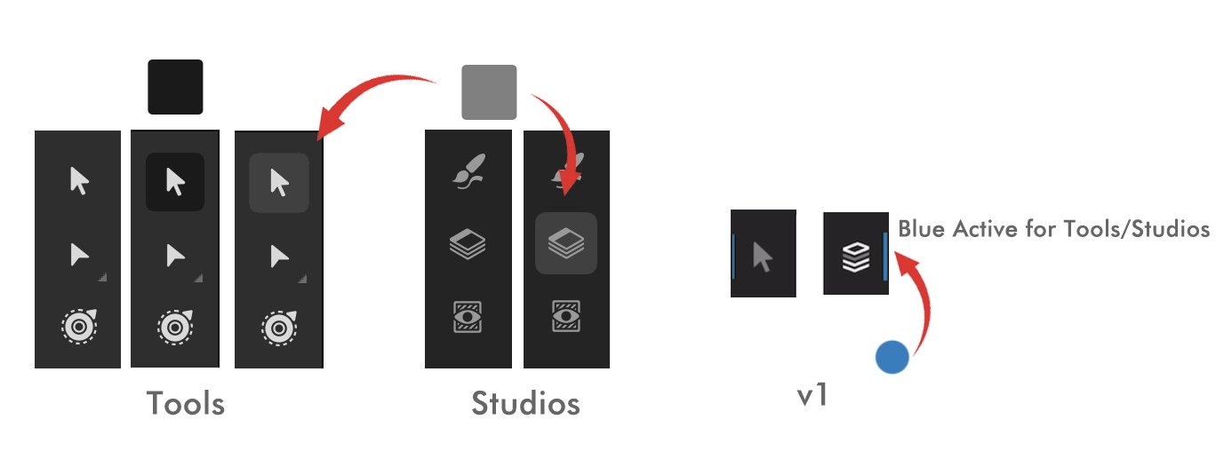
I just wanted to say that I love AD v1 more for iPad than AD v2. And you know what? I hated v1. I have been raging in the v1 forums for the past couple of months for the serif team to fix some design issues with v1 but now Ive grown to love it. I open AD v1 up and I get so…….happy. Theres a happy feeling in me. Which is weird because I despised v1 months ago. Like, theres now a grateful feeling in me. A grateful feeling that v1 exists. That it wasn’t replaced/upgraded by v2. Im happy they are 2 separate apps because I don’t have stick with v2. I can remember that v1 exists and I can go back to it. I go back to v1 and my middle blue line layer clipping mask drop zone is there. This little blue middle line in the drop zone of the layers is why I prefer the ipad app over the desktop app. This middle blue line in the layers is awesome! The gray/blue tool icons are there. Those icon are beautiful. So beautiful. Its like a gray and light gray color with an accent blue to go with the blue theme of affinity designer. Theyre beautiful. My goodness! I can’t get over them. I don’t have go into v2 and see the “game boy” style icons. The eraser tool in the pixel person in AD v2 is literally a dr Mario pill. The lasso tool is literally Woody’s lasso from Toy Story and the purple star wand is literally a Wizards wand. Its a gameboy-ie style. It doesnt go with affinitys dark gray sleek theme. I don’t like the style they’re in. I love the gray/blue icons in v1. My buttons in v1 are not active. They’re all turned off. V2s buttons are all turned on. The context toolbar! Ugh. Im so happy its at the bottom in v1. I don’t like it at the top in AD v2. A custom toolbar should have been at the top in v2. Not the context toolbar. Im so happy the context toolbar is at the bottom in v1. I can go back to it. Im so happy they’re not sliders on the left side of the interface like in v2. In v1, theres no command controller that doesnt turn on all the time when you open Designer. Theres a delete button in v1! In v1, I don’t have to see the object type icons in the layers. You can’t turn that off in AD v2 for iPad. Again, nothing really changed in v2 from v1. Nothing was dramatically new. Yeah, new features were introduced but I didn’t need those features anyway. I cared more about design issues in the app than new features. We need to fix those design issues to have a functioning app. Not much changed…….nothing changed. Im honestly……..giggling………giggling because nothing changed and this is what we got in 4 years. AD v2 for ipad is just AD v1 with several active buttons turned on with a context tool bar at the top that shouldn’t be there thats been split into sliders on the left side of the interface. Thats all AD v2 is. The only thing good "design wise" about AD v2 for ipad was the new quick menu and pulling things out from the edit menu and placing them at the top for easier access. Which should have been the custom toolbar. These are great starting design solutions the app needed. I still bought the v2 app to support serif, and I wanted to see what was new in v2.
-
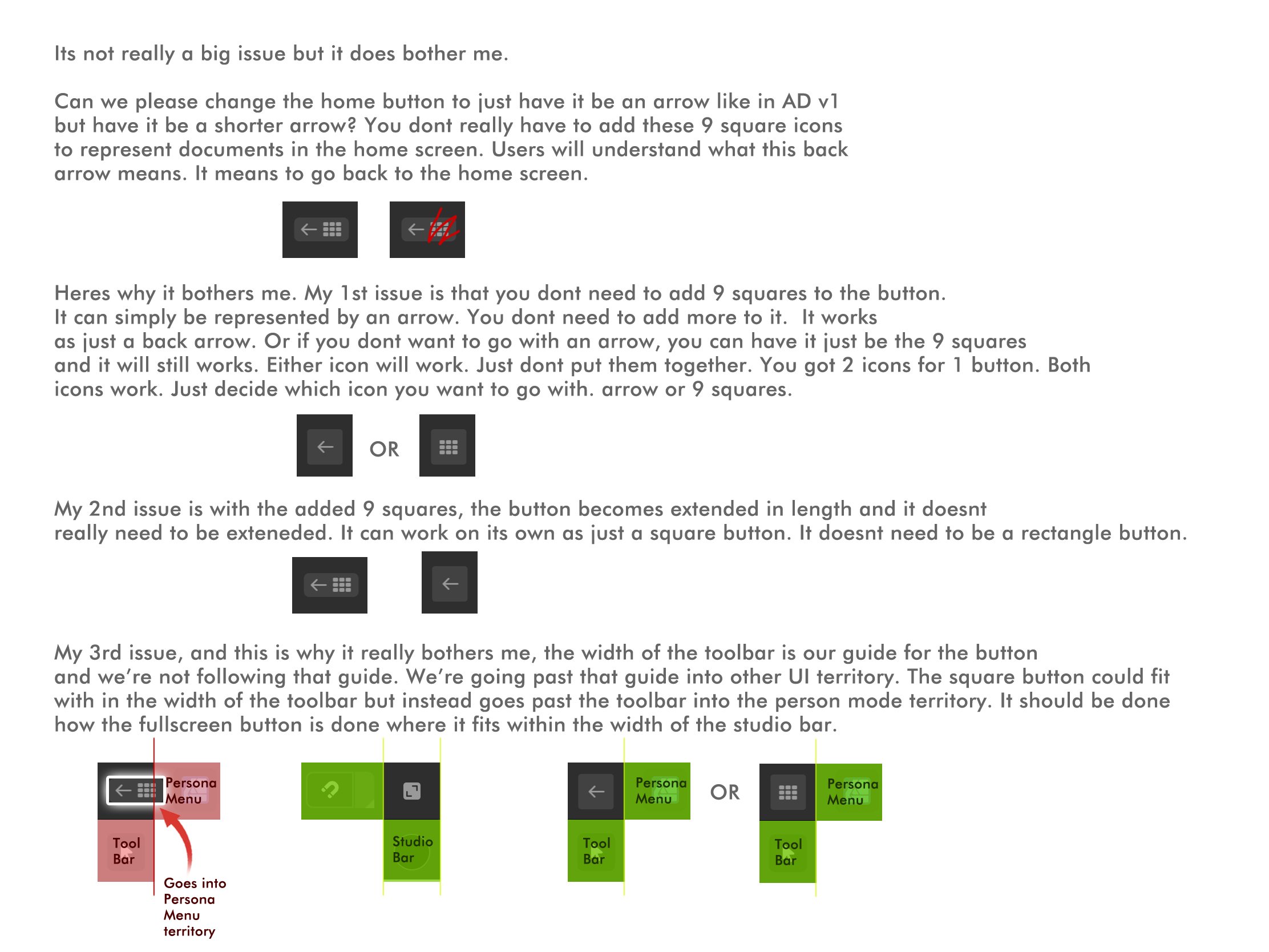
Its not a big issue but can we fix the home button?
-
Im not a developer. Im just a designer. I pay attention to how this app is designed. I dont have any work to show. I can only show a photoshop mock up of how I think the app should function when I see something wrong. I used to post several mockups in the AD v1 for ipad forums, but I stopped because serif was ignoring us ipad users and no updates were going to happen. With the new v2 update, I came back to see what changed and.....sigh. I figured I'd get to work since Im not doing anything.
-
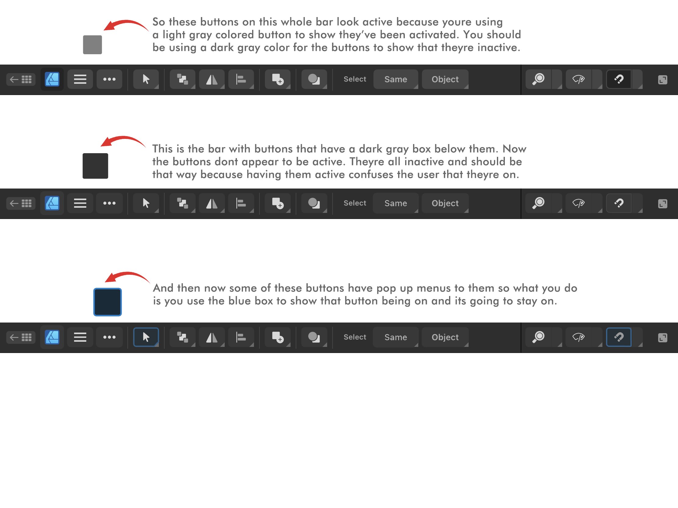
I think if a tool from the toolbar is active, then a "light gray box" should show that its active. Not blue. I say that because in the "STUDIOS" example at the very top, layers is active and a light gray box is used to show that its active. So if that light gray box is being used for the studio icons to show that theyre active, then that same light gray box should be used for the tools on the left side. Right now they use a dark gray box to show that theyre active. Look at the first example called TOOLBAR. It a dark gray box but it should be a light gray box. I do want to note that in AD v1 for ipad, serif did use "blue" to show a tool was active. They put like a blue line next to the tool icon to show the tool/studio was active. I dont think serif should be using the reverse darker gray box. Its weird and its confusing users.
-
Im trying to understand you comment. So....snap is a button that can be turned off or on (toggled). So making it blue shows that its been turned on. Tapping it again would turn it off. Its currently "turned on" in the last example. When its off, it will return to the way it is in the example before the last one. Snap has been "selected" and turned on. For the selection tool in the last example. I think i messed up. It shouldnt have been a blue box. It should have been a light gray box because now Im going back to how they currently have it with the reverse highlight dark gray indicator only this time I made it blue.
-
Heres an example of how how the top bar should look. You should also be using the color blue because it tells the user that something is on. Its like when you highlight text. The blue highlight lets you know what text youve selected. The blue box here lets you know what youve turned on. Its a good indicator. Kind of like the blue lines used for the drop zones in the layers studio.
-
Actually, theres 3 things going on. Theres inactive buttons, active buttons, and then active buttons that stay on. I didnt really talk about "active buttons that stay on." I only 86'd them because I dont like the dark gray reverse highlight style its in because it confuses the user as being active. I instead said to choose between light gray or blue when really you should be using both. Dark gray to show inactive buttons. Light gray to show a button has been activated. And then blue to show active buttons that stay on. The dark gray button that I titled "86" needs be removed from that app because youre using it as your active buttons and active on buttons and its confusing the user.
-
Oh! Thank you, my friend. Thank you, THANK YOU!
-
How come affinity photo v1 isnt in the apple store? Only AP v2 is available. I purchased AP v1 and I want to redownloaded it because I deleted it. I bought it though months ago. How do I download it? Its not showing up in the store.
-
So the buttons in AD v2 for iPad are showing that theyre all active. This is an issue because youre telling the users that these buttons are on when theyre not. Serif is using different button active indicators and theyre confusing the user with these active indicators. This needs to change by making all buttons "inactive" and having the serif development team decide which active indicator they want to go with. They can only choose 1 because they have chosen 3 active indicators here in the app. So I need the serif team to make all their buttons inactive and then choose 1 active indicator to go with, light gray or blue. Below is me explaining their button issue and providing a solution to this issue.
-
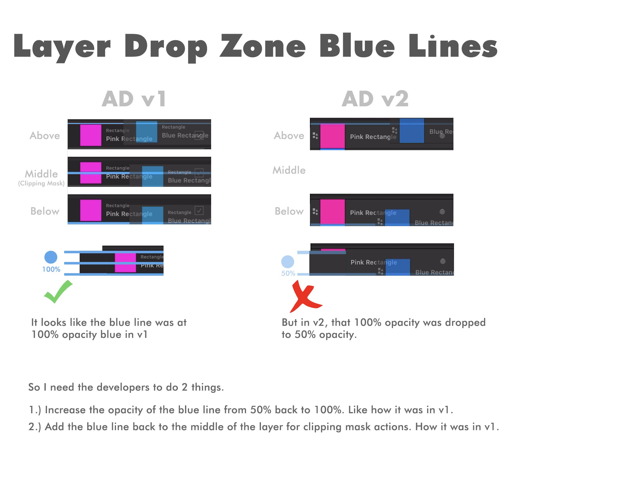
You know why else having the blue line at 50% opacity is an issue here in v2? Because the layer that your moving is also at 50% opacity. So you got this 50% opacity blue line competing with this 50% opacity layer and theres just no contrast. They're competing for visibility. What should be the most visible here is that blue line at 100% opaxity because thats the indicator you want to see while making these layer movements. So you need to increase that blue lines opacity back to 100% so it can stand out more than your 50% opacity layer. I also kind of feel like the layer being moved at 50% opacity is an issue. I kind of wish that layers opacity thats being moved would go down from 50% to 25% opacity. I dont know if yall can try that out. Below is an example of what i mean.
-
This was already mentioned here on the forums, but I wanted to post it again because I show you examples of the issue. In AD v1 for ipad, there were blue lines on your layers that showed up you when a layer was being moved above and below another layer or in the middle of a layer to show a clipping mask action. It was a thick blue line that was used as an indicator to show this above, below, middle layer movement. I loved it! It was easy to follow. Its a simple and easy concept to learn. A blue line above to show you moved the layer on top of another layer, below to show you moved the layer under that layer, and middle to show youre clipping something to that layer. Super easy. Now, in v2, that blue line has faded in opacity and theres no longer a middle line to show a clipping mask was made. The blue line has faded in opacity so now its hard to tell. Its hard to tell if you moved your layer above or below a layer. The middle blue line is also gone. I think now the clipping mask is a blue line at the bottom of the layer but moved slightly to the right. Its just......sigh😔. It was easier in v1. It didnt need fixing. I dont know why it changed here. I think it was changed to match the desktop version. The way it was in v1 was the best. Truthfully, it was the main reason why I used AD for ipad instead of desktop because that middle blue line to show a clipping mask action was such a good indicator for a clipping mask. I hate the way it is on desktop. I hate it. i dont know why its even like that. Why is this above, middle, below, concept hard to grasp? Sigh. So I need it to go back to the way it was in v1 because this was never an issue. This thick blue line in the layer drop zones was awesome in v1. I need it back. Lowering this blue line's opacity and removing the middle drop zone for a clipping mask action is a mistake. It needs to go back to the way it was in v1. Increase the blue line opacity back to 100% and bring back the middle blue line drop zone for clipping masks. Please look at the image below for reference.
-
Yeah. Theres like this whole issue with buttons looking a highlighted and not highlighted. Some buttons look active. Other buttons look inactive. its so confusing. I was gonna make a whole post about this and show examples of the different ways buttons are active and inactive and then have serif choose between 1 they want to go with. Its a little confusing but yes. This is an issue in my eyes.
- 1 reply
-
- 1
-

-
Layer group thumbnails?
MoonaticDestiny replied to donka's topic in Feedback for the Affinity V2 Suite of Products
I made a post about this here. I think "show group thumbnails" should be on by default. -
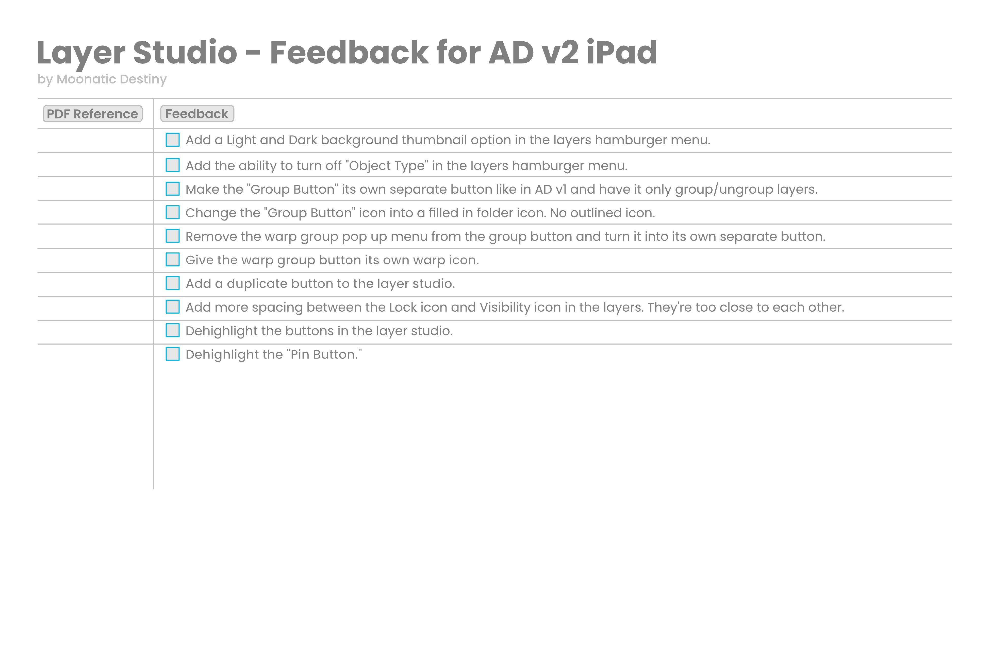
Im going to start a little roadmap/feedback list for the layer studio in AD v2 for ipad. I should have done this a long time ago for v1. I was just blurring it all out on here on the forums. I should have made a list of everything to keep everything organized and on track. Im only starting with the layer studio. Ill be adding more to it later.
-
V2 is a downgrade
MoonaticDestiny replied to shushustorm's topic in Feedback for the Affinity V2 Suite of Products
I agree but you can turn them off in the layer hamburger menu. Turn off object type. -
its really like that? 😱
-
😅😂👏 great britain 😅
-
I went to college for art and design and the number one lesson my professor taught me, and it still sticks me till this day after 10 years is, "Contact and Communication is key." If you just reach out and communicate the problem that you were so worried about will be easily solved and you can move forward.