

MoonaticDestiny
-
Posts
476 -
Joined
-
Last visited
Posts posted by MoonaticDestiny
-
-
6 hours ago, Alfred said:12 hours ago, MoonaticDestiny said:
30% faster.
I got 30% from this vectornator article where they talk about their version of this context toolbar called "Quick Actions." Have a read. It explains what I'm trying to explain in this forum post.
-
Yeah. They need to get rid of this. I hate when things are spelled out for us. Its unnecessary.
-
So if you rotate an object while holding down a 1 finger modifier you can rotate that object in increments of 15*. So rotate 15, 30, 45 and so on and so on.
However, if you move an object while holding down a 1 finger modifier you can move your object in increments of 45*. I dont like that. I want to change this. I want to move my object in increments of 15*. 15 degrees because I want my rotation and move increments to be the same and I want my brain to register and learn them as increments of 15 degrees. Not 15 and 45. I want to keep things the same.
In another post I had requested a gestures category in the preferences to change my resize gestures so now I need the ability to change these increments for my rotate and move to be located in this gesture category in the preferences.
-
On 6/25/2022 at 3:31 AM, Alfred said:
The screen being relatively small means that nothing is far away from your Apple Pencil.
Things are not really THAT far away from our apple pencil. Theyre not. Its a small little ipad screen. Its just that if some basic icons and actions were just a little close to the tip of our apple pencils and not at the edge of our screen then our workflow could be sped up just a little bit. 30% faster. I just dont want to be reaching to the edges of our screen for basic actions
-
On 6/25/2022 at 3:31 AM, Alfred said:
the context menu that pops up when you ‘long-press’ anywhere on the screen
See. Thats the thing. First youre making me go all the way to bottom left corner to delete my object. Now youre giving me the option to long press to bring up a menu and hit cut to cut my object. Its just too much for a simple action. I honestly hate that menu. Its such a weird menu. It feels like it doesnt belong in this app. Its out of place. Almost like the developers didnt know where to put it or design it and just quickly made it. I guess because of the way its designed and because of the gesture to bring it up. No other gesture brings up menus and the design of the menu is nothing like the design of the other context toolbars. Its just so random. So out of place.
On 6/25/2022 at 3:31 AM, Alfred said:there’s a ‘Cut’ option on the context menu that pops up when you ‘long-press’
I get you and i appreciate you showing me a different way to delete my object. I just dont want to do it that way because theres a faster and simpler way to do it. I dont want to have to wait for a long press gesture to finish to do the simple action of cutting something out. I simply should be able to select my object and hit the trash can icon on the context toolbar underneath my object to delete it or in this case a scissors icon to cut it. Its simple but its not available here.
On 6/25/2022 at 3:31 AM, Alfred said:We need a ‘Delete’ option both there
I honestly think this long press context menu that youre talking about IS the menu that im requesting here. The only difference is im requesting it to appear under an object when its selected and I need other icons to be added to it to change the properties of my object or icons that can do other actions related to building my design up. And I too want a delete option on this menu so lets add the trash can icon to it.
-
I wanted to add that the undo and redo buttons are also located at the bottom right corner of the app if you have them turned on. I personally dont have them on because i use finger gestures to undo and redo but if turned on the undo and redo buttons should NOT be at the bottom right corner. Its the same issue with the "?" tool tip icon. Youre going to be triggering them with your wrist as it lays on the screen. You dont want trigger them because it disrupts the workflow. I need the serif team to also move the undo and redo buttons else where. I'm not sure where you want to put them but they shouldnt be at the bottom right corner any more. Nothing should be at the bottom right corner of the interface.
-
Sigh. I dont even know where start. Its so, SO frustrating.
Do you know how in adobe illustrator for the app theres a little toolbar underneath each object and how in vectornator as well theres a little toolbar underneath each object with basic icons relating to that selected object's properties with other basic moving/building operation icons? Okay. I need that. I need it here in affinity designer. Its not a debate. Its needed and let me explain why. Because the current context toolbar for the move tool is not it. Its not. Its not because I'm not being given any basic properties or building operation icons for my object. None. Im being forced to go to my studios for basic operations and its decreasing my workflow.
Theres a reason why these 2 popular vector apps have this toolbar underneath their objects. Because it works. It helps users build their work faster, it speeds up their workflow, and its just a helpful way of working on an ipad. All operations on this toolbar are close to your apple pencil so that you dont have to reach the edges of the app to do basic operations in studios. It saves time. It cuts down seconds. It speeds up workflow.
Youre forcing me to go to the stroke studio just to increase my objects stroke width when a simple icon underneath my object could have done that. Youre forcing me to delete my object by making me reach the very bottom left corner of the app when a simple trashcan icon underneath my object could have done that. Youre forcing me to go to the color studio to lower the opacity of my object when a simple opacity icon underneath my object could have done that. Youre forcing me to flip my object vertically by making me go to the transform studio when a simple vertical flip icon underneath my object could have done that. All that work. All that time. All that reaching to the edge of my screen to get to studios to change basic properties and do basic operations. Its too much for something so simple. This is an ipad that we're working on. The screens are smaller so things need to be closer to our apple pencils to speed up workflow.
Sigh. And i know I make sense because some of these basic properties/operations are available on other context toolbars in the app for other tools EXCEPT for the move tool. EXCEPT FOR THE MOVE TOOL. The only difference is Affinity Designer's context toolbars are located at the very bottom of the screen where as the context toolbars I need are right underneath the object for quick picking.
I mean think about it. If I want to delete an object why are you making me go all the way down to the bottom left corner of my screen. Why? Why not add that trash icon to my context toolbar and place the toolbar underneath my object so that i dont have to reach so far down or to the edge for a basic operation of delete. Its head shacking. This new context toolbar is needed for the move tool and it needs to be placed underneath my selected object. Not at the very, very bottom of the app. Its needs to have your basic properties/operations.
If i select an object/stroke, I need on my move tool context toolbar a stroke width icon, an opacity icon, a deselect icon, a move icon, a trash icon, a flip vertically/horizontally icon, etc. Im not given that. I have to do all those changes in the studios. Which is fine but it shouldnt for basic, BASIC operations
Sigh. This new context toolbar for the move tool needs to happen. It works and I have 2 other vector apps to show that it works. I'm going to start sketching ideas to show what I mean because I'm frustrated with this workflow that youre making us users follow. The app is great. Mostly everything is there. You just need a designer to help design this app because some things are not working.
You cant make users go to the bottom left corner to delete objects. You cant put the "?" tool tip icon at the bottom right corner of the app because thats where users wrist go when they draw. You cant put studios within studios. You need a designer, Serif. I need to start making videos because this is too much type.
-
-
You know how in photoshop when you type out some text, you set the text to 100pt size, and then you can just toggle between all your fonts and your text changes depending on what font you’re on while remaining at 100 pt size?
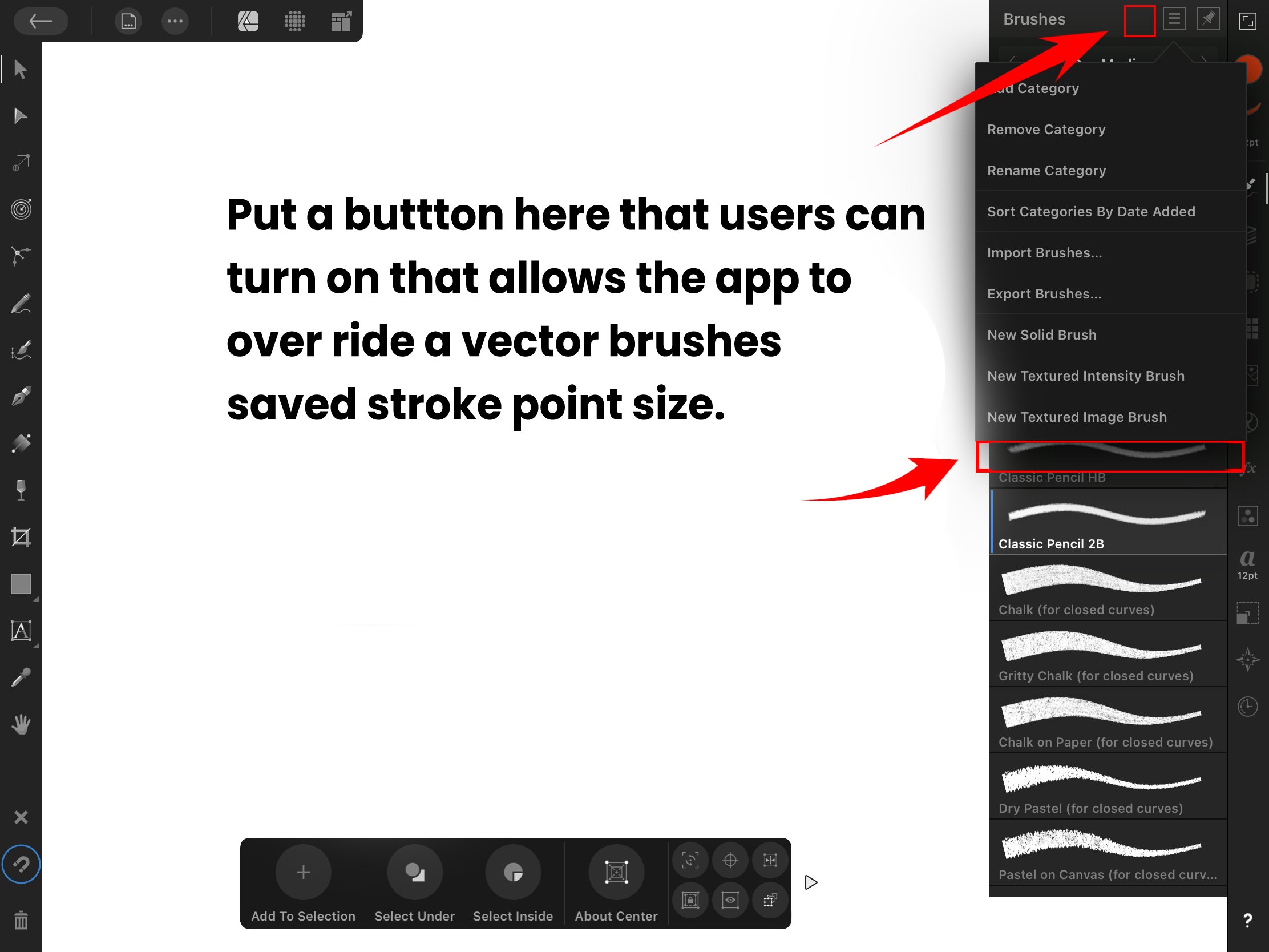
Ok. I need that but for vector brushes. Let me explain.
Vector brushes are presaved at a specific point size. Some are saved at 32pts and others are saved at 64pts. So heres my issue. Lets say I have a stroke at 100pt size on my canvas and what I want to do is toggle through my vector brushes so I can see which vector brush will be best for my design, at 100pts stroke size. So if I click on a vector brush what happens is that vector brush is applied to my 100pt stroke but my stroke point size has decreased from 100pts to 32pts. Why? Because of the pre saved point size of that vector brush I applied. So now when I toggle to other vector brushes the point size of my stroke is going to change depending on the vector brush pre saved point size. So my stroke is no longer at 100pt size. It has now has changed to 32pts or 64pts depending on the vector brush I applied.
So this is an issue because I really just wanted my stroke to stay at 100pt size and I wanted to toggle through my vector brushes at 100pt size because thats the size I need for my design. I don’t need my stroke size being changed but its being changed based on the vector brush I apply because of the presaved point size of that vector brush. And once I apply that 32pt or 64pt vector brush, I now have to manually increase my stroke size to 100pts in the stroke studio and I have to do that for every vector brush I toggle through just so I can see all my vector brushes at 100pts size. Its an issue. I just want to set my stroke at a specific size and I want to toggle through my vector brushes at that specific stroke size. I don’t want my stroke size being changed.
So heres what I need from the serif team. I need a button that I can turn on in the brushes studio that would allow the app to “ignore" or "override” pre saved vector brush “point sizes.” That way their presaved point size isn’t applied to my 100pt stroke and only the vector brush design is applied at 100pts. So now I can toggle through my vector brushes at 100pt size. All my vector brushes will be applied to my stroke at a 100pt stroke size. I don’t have to manually change my stroke to 100pts anymore because these vector brushes are not decreasing my stroke size. They’re all being applied at 100pt size. So please let me toggle through my vector brushes without changing my stroke size
-
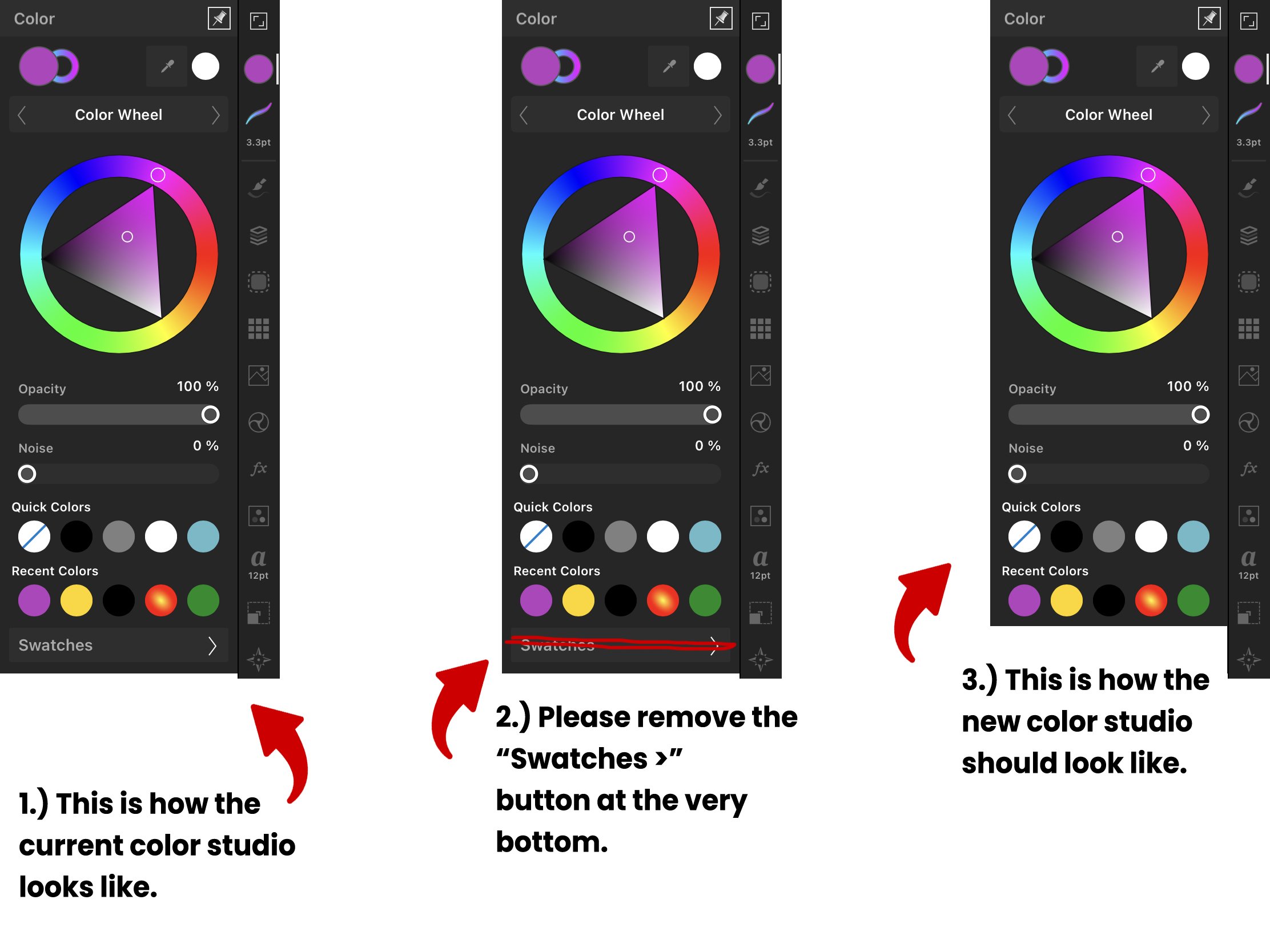
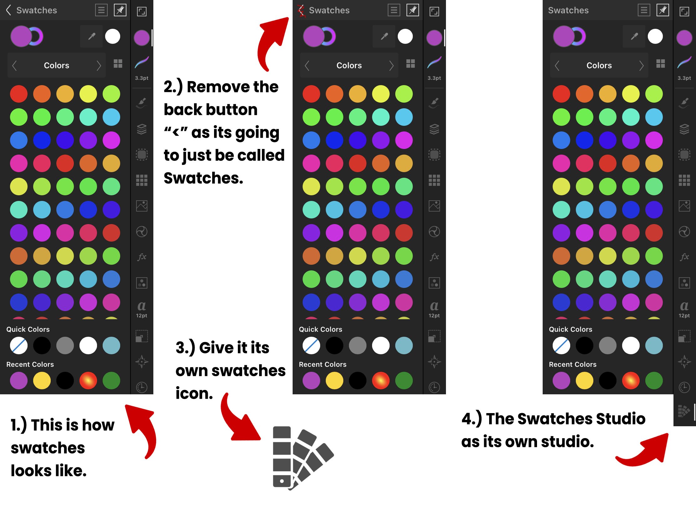
Swatches needs to be its own studio. I dont know whats going on. You individually have a color studio and a swatches studio on the desktop version of affinity designer. On the ipad app, you have swatches hidden inside the color studio and it shouldnt be like that. It shouldnt be like that because 1 is you have a WHOLE studio inside another studio. There shouldnt be studios within studios. And 2 is you have a back button "<" to go back to your 1st studio. It shouldnt be like that. There shouldnt be this back and forth workflow to get to one studio to another. You should be able to click a studio and get to what you need in that studio. I shouldnt have to click a studio to get to another studio to get to what I need. Its too much. It becomes this Hansel and Gretel breadcrumb trail of studios. Its also this game that the serif team keeps playing with users and the game is called "Hide and Go Seek." I dont want to play this game. I dont want to go seek. I dont want to go seek the swatches studio inside the color studio. I want what I need at first glance. Give users their studios at first glance of opening the app.
So heres what i need the serif team to do. I need them to go to the color studio, remove the "swatches >" button at the very bottom, and make that the color studio. Thats it. Simple
Then I need them to take whatever was inside that "swatches >" button(the swatches studio) and make that its own studio called the swatches studio, give it its own swatches icon and put it on the right sidebar with the other studios.
Below are images of what what I mean, Please implement it.

-
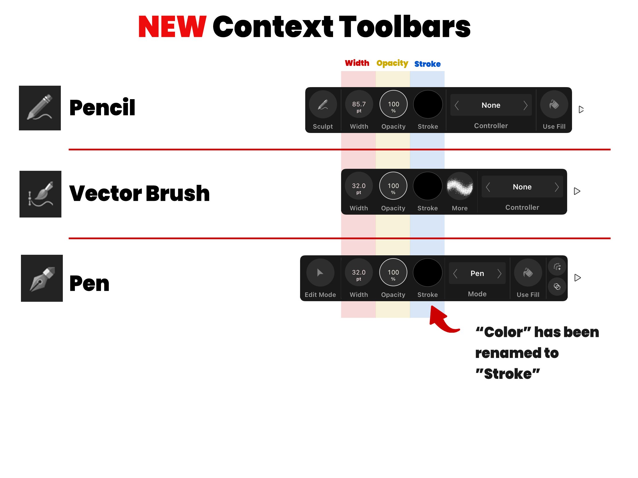
I wanted to revisit the design I did for the vector brush context toolbar. I had put "More" after "Stroke" and I dont really like it because its not the same as the other toolbars. So I went ahead and moved "More" to the beginning to go with "Sculpt" and "Edit Mode" in the other context toolbars. They are color coded green and each toolbar has a similar design. What ever you want to do is fine. Just make sure width, opacity, and stroke are available on all 3 context tool bars.
Please look at the Vector Brush Context Toolbar to see what I mean.

-
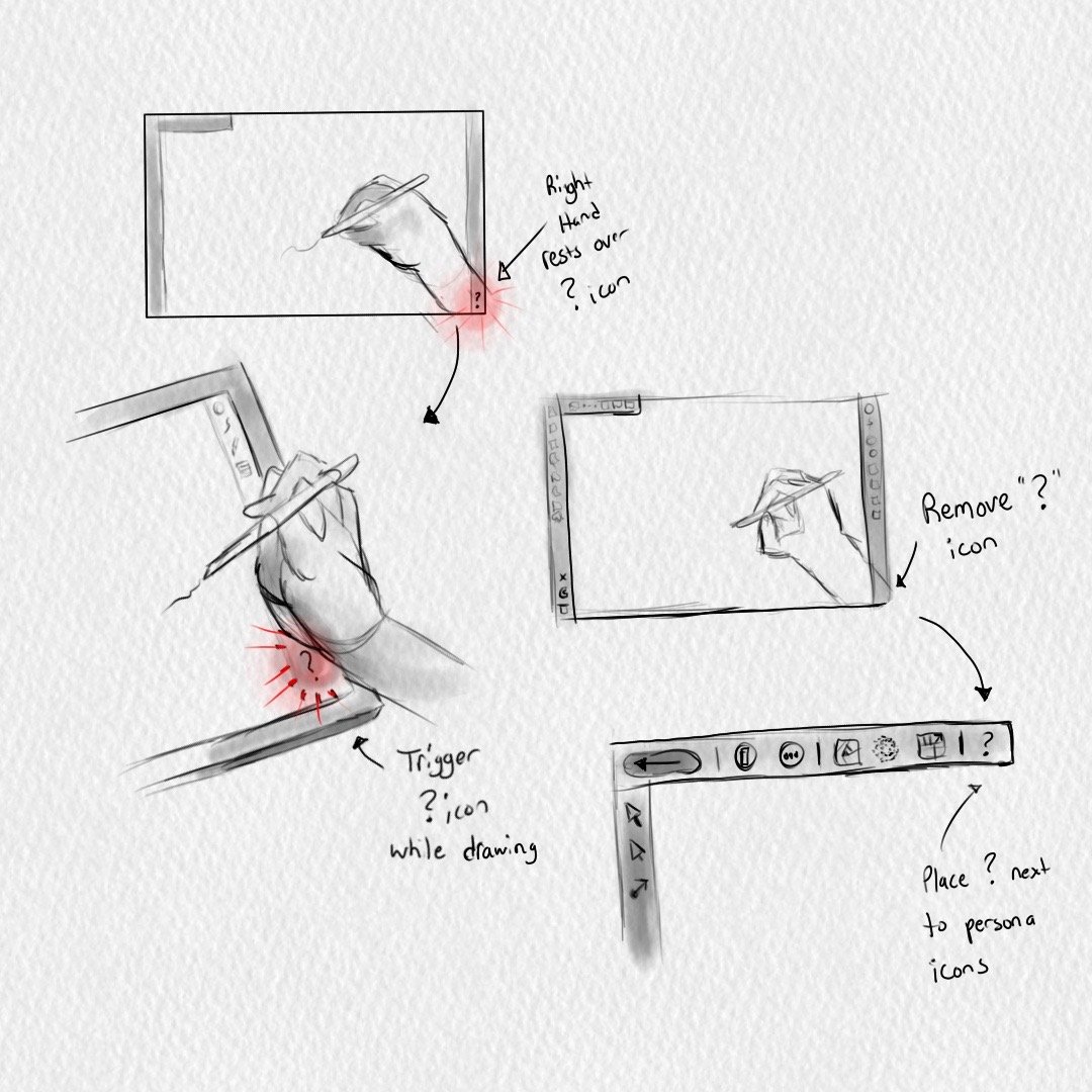
The "?" tool tip icon is currently located at the bottom right corner of the interface. This is NOT a good place to put this icon. This is bad design. The reason why is because I was drawing in the pixel persona the other day and since I'm right handed my whole right hand rests over the bottom right screen of the interface. As I was drawing, the bottom of my wrist kept triggering the "?" icon and it was "disrupting" my work flow. I just couldn't draw because all these tip menus kept popping up every other second on my interface. Its being triggered every time I lay my wrist down to draw. My workflow was being disrupted and thats not good at all. This "?" tool tip icon should NOT be there at the bottom right corner. Nothing should be there really. It should be a dead zone.
So I need the serif team to take this "?" tool tip icon and move it to the top left corner next to the persona icons. That way my wrist doesnt trigger anything while I draw or work. I just need it to not be at the bottom right corner of the interface because right handed users are going to be triggering this icon and its going to be disrupting their work. We dont want that.
I've sketched out what I mean below and moved the "?" icon next to the persona icons.
-
Why isnt there a gesture category? 🤔
-
2 hours ago, MoonaticDestiny said:
create a new category called "Gestures". There, create a Resize category, list the 3 finger gestures for resizing underneath and let me swap 2 for 3 and 3 for 2. Its that easy. And then list all the other gestures for other actions there.
-
When you resize an object you have 3 finger gestures that you can use. The gestures are listed below and a video tutorial from the serif site shows them being used.
1 finger - Resizes with aspect ratio
2 fingers - Resizes with NO aspect ratio from the center.
3 fingers - Resizes with aspect ratio from the center
--------------------------------------------------------------------------------------
Heres my issue. I dont like the gesture for 2 fingers. I dont think I'll ever use that gesture when resizing my object because I want to keep everything proportional. I do however like the gesture for 3 fingers because I know I will resize an object from the center with aspect ratio. So what I want to do is SWAP these gestures. I want 2 finger gesture to resize from the center with aspect ratio and I want 3 fingers to resize with no aspect ratio from the center. I want to swap these 2 finger gestures. I want the most important gesture 1st and the least used gesture last.
I appreciate the serif team giving me these gestures and assigning fingers to these gestures for me but i want to do my own assigning of fingers. So please let me change these 2 gestures. Heres what i need from you. I need the serif team to go into the settings of the affinity designer app and create a new category called "Gestures". There, create a Resize category, list the 3 finger gestures for resizing underneath and let me swap 2 for 3 and 3 for 2. Its that easy. And then list all the other gestures for other actions there.
So again, let me change the finger gestures for Resizing.
-
Here is an image of a redesign that I did of how each context toolbar for these 3 tools should look like. Look at how theres organization. Look at how I follow this order of width, opacity, and then stroke. This is how it should look like. Compare the two images and look how the current context toolbar is all over the place.
I swapped "stroke" with "more" in the vector brush context toolbar because I'm following the order of width, opacity, stroke, and then "more" would be left last. Or if you want you can make "more" first and then put a gray rule/divider so that it looks like "sculpt" or "edit node" in the other toolbars.
I also renamed "color" to "stroke" in the pen context toolbar. It should be named "stroke" because thats how all the others are named. Stroke is referring to the color of the stroke. You dont name it "color" because "stroke" and "fill" relate to the color of the stroke and fill. Otherwise youd have to rename both the "stroke" and "use fill" to "color" and now youre going to have 2 "color" options. Itll be confusing to users.
I hope this helps.
-
So theres 3 tools. The pencil tool, the vector brush tool, and the pen tool. All 3 tools have a context toolbar that appears at the bottom of your screen when you select 1 of these tools. All 3 context toolbars are very similar because they all relate to a stroke's properties since youre creating a stroke with these 3 tools. Properties meaning the color of the stroke, the width of the stroke, and the opacity of the stroke. Its really just those 3 properties. Width, opacity, and stroke(the color of the stroke).
So my issue is that "Opacity" isnt available for the pen and pencil context tool bar. These 3 properties (Width, opacity, and stroke) should be available on all 3 tool's context toolbars. So I need opacity to be added to the context toolbars of the pen and pencil tool. I dont know when users will ever lower the opacity of their stroke but it should be available to them on all 3 toolbars.
Below, I have attached an image showing all 3 context toolbars of each 3 tools and I use a color coded star to indicate what 3 stroke properties are available on each toolbar. Look at how some toolbars are missing "opacity(yellow star)", and look at how theyre all disorganized. Width and stroke are more to the left on 1 toolbar while width and stroke are more to the right on another toolbar. Lets get a little more organized here and keep thing consistent.
-
9 hours ago, LeeThorpe said:
range
Range. The word I was looking for is range. I want to be able to change the range of the slider. Hopefully this can be changed soon.
-
2 hours ago, NathanC said:
Preferences > User Interface
Hi. Thank you for the reply. This "Decimal Places for Unit Types" is only available for Affinity Designer on Desktop. This is NOT available for ADesigner on the ipad app. Which is why a made this post on the "Feedback for Affinity Designer on iPad." I need this feature for the ipad app. 😕 I appreciate you though for replying to me with a solution for desktop AD. ❤️
-
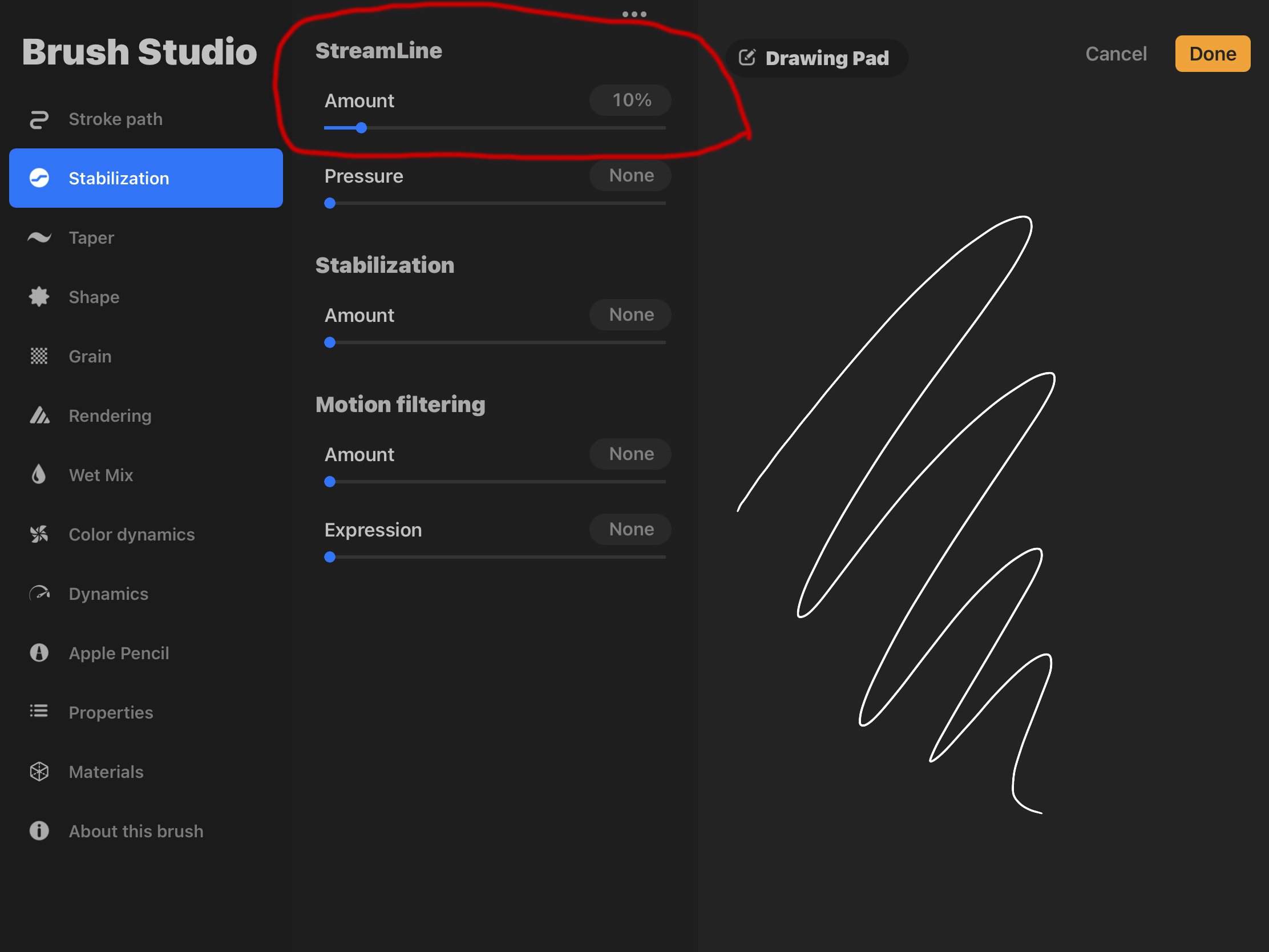
I wanted to add that when you use rope and window stabilizer the smoothness of your stroke depends on YOU. It depends on how slowly YOU move your hand. Youre still going to get a flimsy stroke. Its not going to be smoothed out for you. Its only going to be smooth if you traced out your stroke slowly.
I need the app to smooth my stroke when I draw out my stroke. Thats why im requesting a "streamline stabilizer" where the app smooths your stroke depending on the amount of streamline you have it set to. Again, its exactly how procreate works. Look at how streamline works in procreate. Your stroke is more smooth by the amount of streamline you have on. So itd be nice to have a 3rd stabilizer called "streamline stabilizer" where i can draw a stroke and the app smooths it out for me based on the amount of streamline I have on.
Streamline in Procreate below.
This streamline feature would honestly make me like working on affinity designer on the ipad over the desktop version and make me like using the apple pencil more.
-
So stabilization is already available for pencil and vector brush. I have an issue with that though. Its not the stabilization that I want. Theres rope stabilizer and then theres window stabilizer. The stabilizer that I'm looking for is the one like in Procreate called "Streamline." You pretty much increase the amount of streamline you want and then you can start drawing very smoothly.
You dont have that here on ipad. You have rope and window stabilizer where increasing the amount creates a gap between your stroke and pencil as you draw to draw a smooth stroke. I dont want that. I dont want to draw with a gap. I want to just draw smooth strokes. If I need VERY precise drawing then Ill use rope stabilizer. I want to just increase the streamline of my pencil tool and draw smooth strokes with no gaps.
I hope I make sense. I dont know what to call it. I guess "Streamline Stabilizer?" So you would have Streamline, Rope, and Window stabilizer.
-
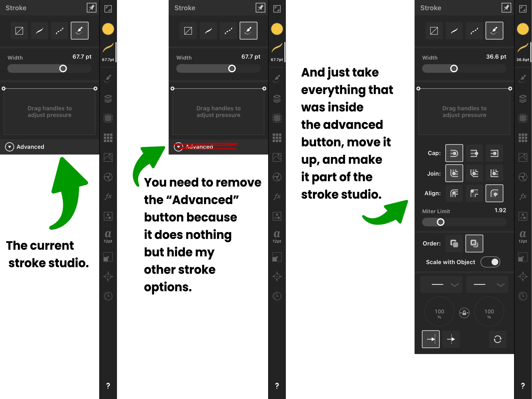
In the stroke studio, there is a collapsable "Advanced" button that when clicked on gives you more stroke options. I need the Serif team to just get rid of this "advanced" button because it does absolutely nothing but hide my stroke options. Absolutely nothing it does. And those stroke options that were inside the "advanced" button are not "advanced." Nothing about them is "advanced." They are basic stroke options that should be part of my stroke studio. So just take those stroke options that were inside the advanced button and make them part of the stroke studio. These stroke options are not hidden under an advanced button on affinity designer for the computer so why are you hiding them on the ipad app? Its doesnt work. Youre hiding options from users. Please remove this "advanced" button.
Ive attached a photo below.
-
I dont know why its like this. I dont know anybody that needs THAT VERY specific width of a stroke but please remove the decimals in the stroke width slider. Its sooo annoying. Like, I just want whole numbers from 0 to 100. I dont need a very specific stroke width. Its really annoying and upsetting to increase your stroke width from 10pts to 25pts but the slider gives you 25.9pt. And when you try to decrease the width you'll just end up getting 24.6. Or some random decimal number. You can never get it to 25pts. You have to slowy, slowy move the slider to get a whole number or you have to input that whole number. I would have to input 25 just to get to 25pts. Its really nonsense. I just wish it could just be whole numbers. I dont need decimals. No one works like that. No one is saying, " okay, i need to make this stroke 35.3pt exactly so let me slide my slider." No ones working like that. Just let me slide it to 35 whole. And if I DO need THAT specific of a stroke width then I will INPUT 35.3pt. But dont make my slider decimals. Please. Just make it whole numbers. Let me go from 0 to 100pts WITH OUT decimals. Its this game of can you make your slider reach the storke width you want. Keep playing because I'm always going to give you decimals. I dont want to play your game.
-
In the stroke studio, you have the width stroke slider. You can increase or decrease the width of your stroke by sliding the slider left or right. The max stroke width you can go on the slider is 100pts. My issue is the highest width it can go is 100pts. Why? Why am I limited or restricted to just 100 pts? Where can I go to change this? Im not talking about inputing a specific stroke width. I'm talking about making the max stroke width of the slider be more than 100pts. Like, i want the max width to be 200pts and have my slider go from 0 to 200pts. Not 0-100pts. So where can I go to change the default max 100pt width on my slider?
And you know why this is an issue? Because if you type in a specific width stroke, lets say 300pts max width, if you decrease your width using the slider because 300pts was too much for you and you need to go down to 250 some, the slider goes from 300pts to 100pts. Theres no in between. Theres no 100-300pts width on my slider. It just cuts straight to 100pts. So now you have to play and guess what stroke width you really need and now you have to input specific amounts. Youre playing this width guessing game because the sliders dont show you your 0-300 stroke width in real time.
So I need to know where I can increase this 100pt max width on my width stroke slider. I dont know when I'll ever need a 200 or 300pt stroke width in my work but i need to be able to go more than 100pts on my width slider because its limiting. Its restricting and yes. You can input specific amounts for now but I dont want that. I want to change my stroke width in real time using my slider without inputing specific pts and i want my slider to go from 0pts to 300pts.
Please allow users to change the max 100pt width on our width stroke slider.


The move tool needs a NEW context toolbar. Seriously.
in Feedback for Affinity Designer V1 on iPad
Posted
Looks like the serif team has ignored Fitt's Law here.