smadell
-
Posts
1,309 -
Joined
-
Last visited
Everything posted by smadell
-

noisy skies - here's the tool I wish I had
smadell replied to jimh12345's topic in Desktop Questions (macOS and Windows)
How about this? Select the sky (that is, omit land, vegetation, etc). Duplicate to a new pixel layer. Apply a Compound mask that intersects luminosity (everything except the brightest areas, like stars) and hue (looking for only blues similar to the sky). Apply an Average Blur (from the Filter menu) to the pixel layer. Adjust opacity and/or blend mode (darker color?) to fine tune the result. I’m not at my computer and this is all very off-the-cuff, but it seems like it might work. -
Also, sorry to nitpick, but (i) “cancellation” has 2 L’s, and (ii) “penal” is spelled without an A.
-
@AKM - One thing I noticed is the intersection of the lettering and the buildings. Are the letters behind the buildings (which I think would be better) or in front? As it stands, the stroke is at least partially in front, while the fill is behind. Visually very confusing. The one place where you did it “right” is the building I circled in green (see below). This seems like a small thing to change, but I think it would make for a better image.

-
Thank, @PMH. The book had its roots in my need to get a handle on masks - what they were, what they were doing, why everyone was going on and on about how important they were! (Now I know…) And, of course, it grew from there. So, it was not complete altruism that brought the book into being; it was my own need to learn these things. And what better way to learn them but to make sure I knew the details well enough to commit them to written word. Anyway, I'm glad you downloaded it and are enjoying getting down in the weeds with the crucial but not so glamorous details.
-
Feature request: Adjust curves and levels
smadell replied to JPS2's topic in Feedback for the Affinity V2 Suite of Products
By the way, @JPS2, I’m confused as to why you’d prefer to do things that way. Non-destructive editing is so very, very powerful and is Affinity Photo’s strongest selling point (or at least one of them). As they said back in the day, “Try it. You’ll like it.” -
Feature request: Adjust curves and levels
smadell replied to JPS2's topic in Feedback for the Affinity V2 Suite of Products
Good morning @JPS2. If you want to use an adjustment destructively (i.e., without adding an additional layer) use the adjustment panel as if you were creating a new layer. Once you get it to where you like, click the Merge button at the top of the panel. This will “bake” the adjustment into the pixel layer below it, and will not create a new layer. -
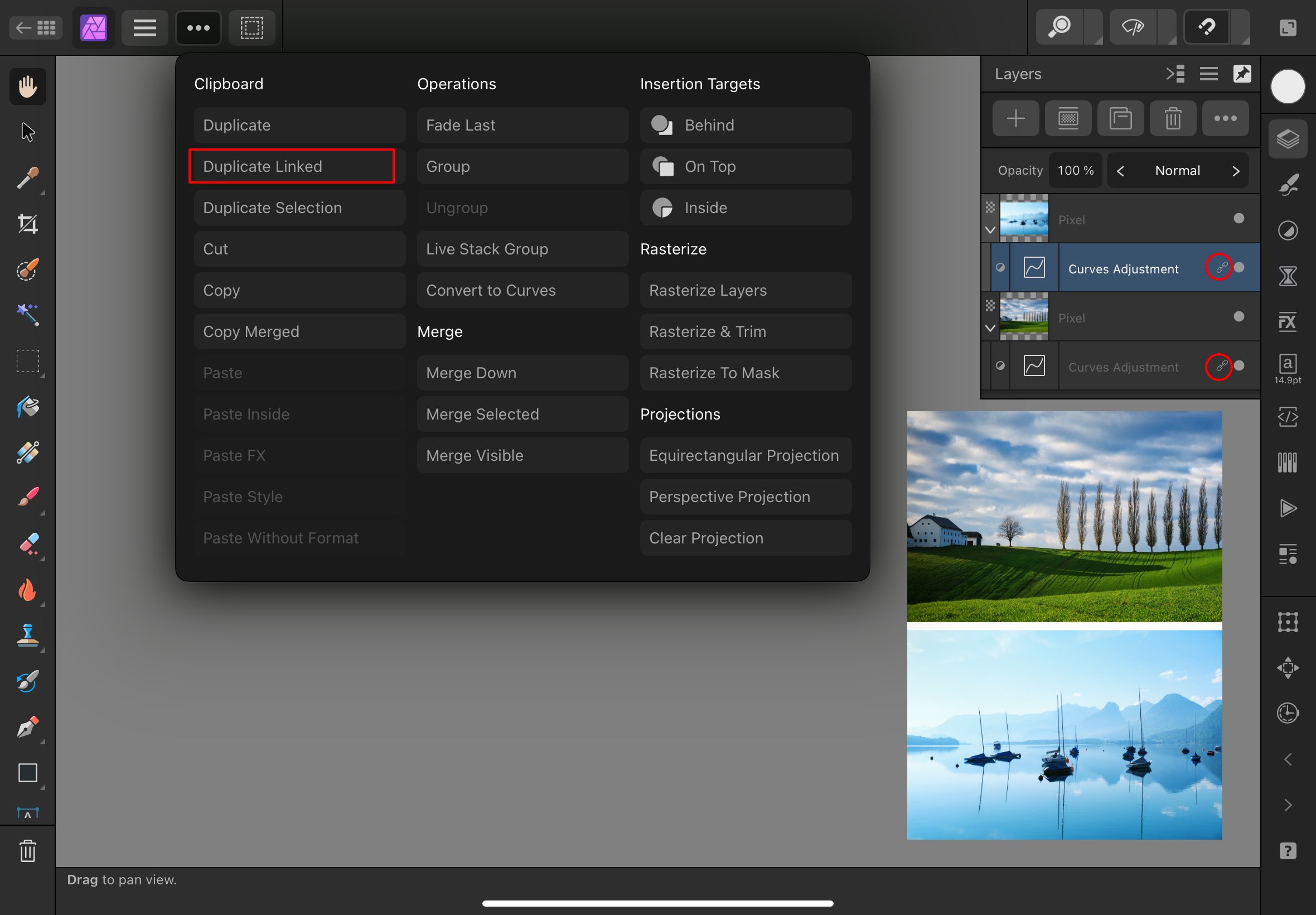
Hi @creativenomad. I believe you’re asking about “linked duplicates” on iPad, and this is actually quite straightforward. Choose the Layer menu (the 3 dots in the toolbar) and then “Duplicate Linked” from the choices. This creates a linked copy of your selected layer. A screen shot is included in which the Curves adjustment layer was created and then a duplicate link was created.
-
live stack group laayer opacity
smadell replied to Paresh's topic in Desktop Questions (macOS and Windows)
It took a while to find the article on "In the Round Photography" but I get it now. The only thing that is different between Affinity and Photoshop is that Affinity Photo cannot simply "open (multiple image files) as layers." Using Place… is one way to do this, but seeing what you're after leads me to believe that your best option is to (1) open all of the images as a Stack (using the New Stack) command; and (2) immediately choosing "Ungroup" on the Stack itself. This leaves you with all or your images imported as individual layers. Using the New Stack command is simply an easy workaround to the absence of an "Open as Layers" command. The stack, itself, will work against you; therefore, use it to open all of the images as layers, but then immediately get rid of it. So, one extra click. From there, the process in Affinity Photo would seem to be exactly the same as what the Photoshop-based article suggests. -
live stack group laayer opacity
smadell replied to Paresh's topic in Desktop Questions (macOS and Windows)
I am completely unaware of the technique. However, from what you describe, the use of a Stack serves only to complicate the issue. The only reasons to use a Stack (or, at least, the only ones I can think of) are for alignment purposes and to blend photos using the stack operators. (Think, for instance, star trails.) For those purposes, changing opacity on any of a stack's layers is not only unneccessary but makes things break down. Why not simply import your first image and then "Place" the other images as layers on top of that. You are then free to align them in whatever way makes sense to you, to alter opacity of any or all of the layers, to use whatever Blend Modes you like, and so forth. It certainly seems to me that using a Stack injects a lot of frustration and unwanted effects, with no real benefit for you. ps - could you attach a sample of an image created using the technique you described? It need not be your own, but I'm interested in seeing an image created in the way you describe! -
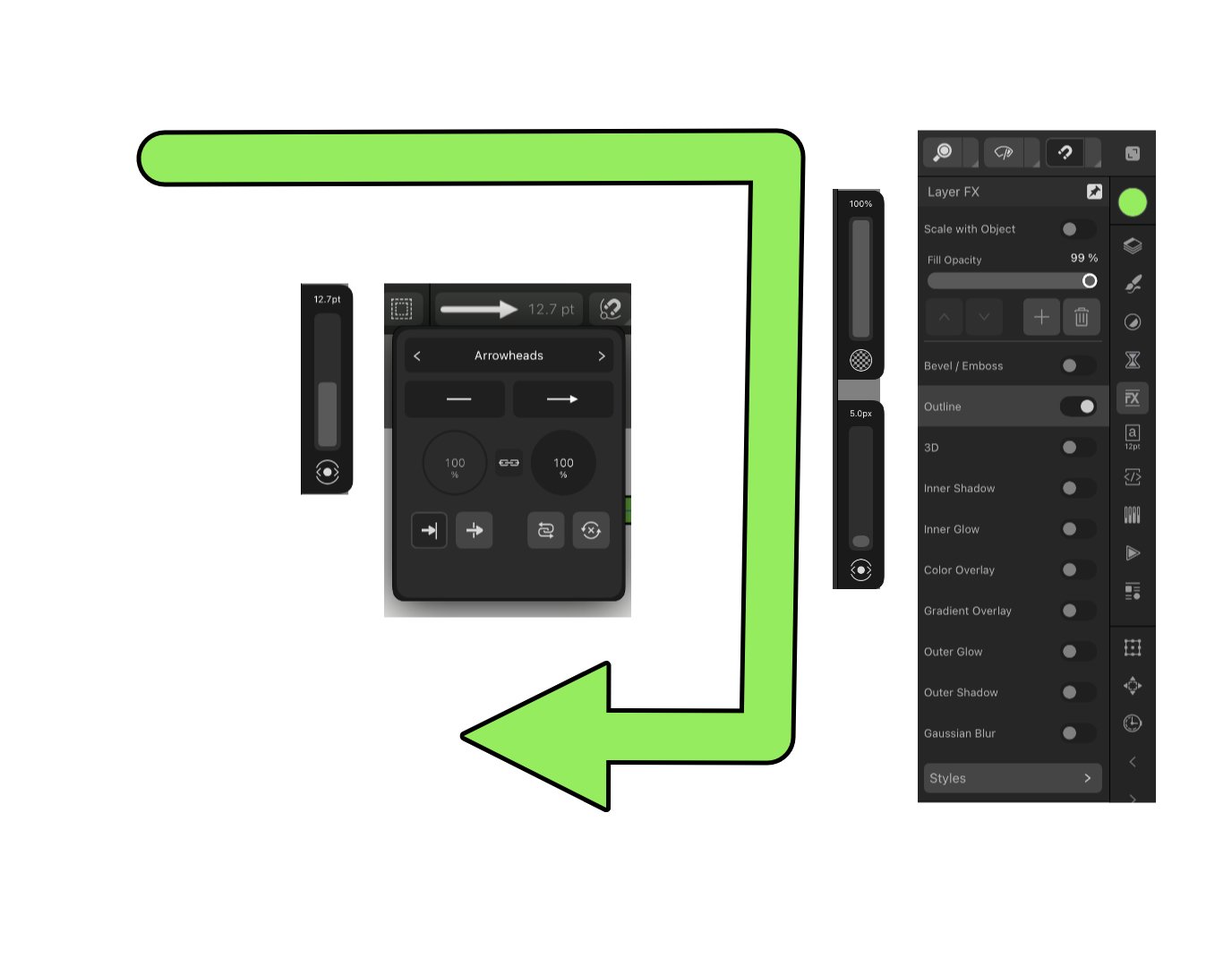
Screenshot(s) are from my iPad, using Photo, but the process would be the same on a desktop. I assume that using Designer would be essentially the same process. 1) Create a line using the Pen tool. 2) Set the width and color to your liking. For me, the color was light green and the width was 12.7 points. 3) With the Pen tool active, add an arrowhead to one end of the line (from the same panel in which you set the line width. 4) Add an FX to the line, using the Outline choice. In my case, I set the outline to black and the width (of the outline) to 5 pixels.
-
live stack group laayer opacity
smadell replied to Paresh's topic in Desktop Questions (macOS and Windows)
A Stack works, in some ways, like a Group. The blend mode of the stack might be Passthrough, but a stack’s power lies in its use of the stack operators (the little math symbol to the left of the Stack top layer). If you are stacking images to “blend together,” let us know what your ultimate goal is. Why use a stack in the first place? If it’s just to align the images, you can “Ungroup” the stack and work on each layer’s opacity and blend mode separately. In the stack you’ve created, what is the operator you’re currently using? Do things change if you switch up the stack operator to something different? In the long run, your goal will determine the best way to proceed. You may find out that using a stack wasn’t the best way to go. -
Hey, @Pšenda - anything short of "Hey you!" is generally OK!
-
A hybrid of what @GarryP and @walt.farrell have suggested. Completely non-destructive and it gets you right where you say you’re aiming. Add a Fill layer above the image. Set the initial fill to 50% grey. Set the Blend Mode of the Fill Layer to “Color”. (BTW, this is a great way to create a Black and White conversion with proper luminance values.) Change the Hue and Saturation of the Fill Layer to the color you’d like. Or, use the Swatches panel to change the color.
-
@walt.farrell - in the video, I did click. But dragging also gives me the anticipated results, i.e. nothing changes (slider values, image preview) until the mouse button is released. This is the same behavior I’ve seen since Macros were first released. And, click or drag, those slider changes survive the macro and can be updated using the Black and White panel afterward.
-
I am using 2.5.5 and I am seeing expected behavior. (I am using a Mac, and cannot speak to whether this is a Windows-only problem.) In creating the macro, I clicked on the "cog" to the right of the "Set adjustment properties" line. Then, I clicked on each of the 6 color sliders in the dialog box that opened. I had to save each of the sliders separately, and gave them their default names. But, having done all that, the macro executes as I would have expected, with all changes made during the macro surviving after the Apply button was clicked. Black and White Macro.mp4
-
The same way you manage to get to Carnegie Hall - practice, practice, practice. Seriously, though, if you are using Frequency Separation for facial retouching then think of the High frequency layer as pores, wrinkles, and other small details where there is high contrast. Everything else is likely going to be on the Low frequency layer - colors, highlights and shadows, etc. Even if there is some dark swelling under your eyes, this is not “detail” (at least in a photograph) but rather color and shadow. I would also refer you back to the exact same conversation you had with @Ldina earlier this week:
-
Same issue, @augustya. If you look carefully at your video, you sample from an area of low detail (less prominent pores, etc) and then paint onto a different area with more prominent detail. The coloration does not change, but you’ll see that you have made the small details much less prominent. Once again, what you are calling “eye bags” are what most would call “dark circles under the eyes”. This is still a color and luminance issue, and you need to address them on the LOW Frequency layer.
-
@augustya - What are you trying to adjust? The area of the High Frequency layer in which you are using the Healing Brush has very little detail (mostly pores, etc). That little red-brown imperfection on her left cheek is probably something that should be smoothed out on the Low Frequency layer, since it is mostly color and tone, not "high pass" detail. You are simply painting on the wrong layer.
-
In the Context Toolbar, change “Current Layer and Below” to “Current Layer”. The red color is a side effect of the Linear Light blend mode.
-
Error in creating panoramas
smadell replied to rstinghe's topic in Desktop Questions (macOS and Windows)
Hi again, @rstinghe. Both Hugin and PTGui are graphic interfaces coded on top of Panorama Tools (a free set of panorama-centric libraries). Because of that, both have similar capabilities. The problem with PTGui is that it's expensive; the problem with Hugin is that it has an extremely confusing interface. I've tried Hugin and found the UI so, so irritating that I abandoned it virtually immediately. It has a reputation that is similar to GIMP – powerful, but with an interface from Hell. I think it's worthwhile doing what @David in Яuislip suggested. That is, try to put your panorama together in smaller pieces and then stitch those pieces into a larger whole. It's bound to take longer, and might end up being frustrating. But it will save you the expense of PTGui and/or the pull-your-hair-out experience of Hugin's interface. If you're happy with the process and the result, well then - there's your answer. Both Hugin and PTGui can be tried out without cost. (Hugin is open source software, so it's free to download and keep.) If you get better results there, then you have to make the call between cost and convenience. Personally, I would buy PTGui rather than put up with Hugin; you may feel exactly the opposite. -
Error in creating panoramas
smadell replied to rstinghe's topic in Desktop Questions (macOS and Windows)
Good morning @rstinghe. I have been toying with the idea of getting a copy of PTGui for my panoramas. It’s not cheap, and it’s a bit of a “one trick pony” but I’ve found (working solely on their trial version) that there’s a lot less clean-up after a merge. And, it’s really fast and more complete than most mere mortals could ever need. There is a trial version (30 days, I think) that gives you watermarked results, but it’s fine for evaluation. If I were you, and no other suitable solution presents itself, I’d consider downloading the trial version and running your pano through that. See if it works for you. -
Adjustments Not Working with Strange Box
smadell replied to Afterword's topic in Desktop Questions (macOS and Windows)
I agree, @Hangman. The OP is obviously doing something when he creates new adjustment layers, which always start without an inverted mask. My best guess is that he is pressing Cmd-I without knowing it. He may also have a teeny tiny speck of the document selected, so advising him (this part is for you @Afterword) to choose Select > Deselect before creating the adjustment might work. -
Adjustments Not Working with Strange Box
smadell replied to Afterword's topic in Desktop Questions (macOS and Windows)
It’s deliberate if you understand what’s going on and choose to do it; it’s inadvertent if it’s not intended but you do it without knowing what you did. The latter situation is what the OP describes. -
Adjustments Not Working with Strange Box
smadell replied to Afterword's topic in Desktop Questions (macOS and Windows)
The real question is how you inadvertantly inverted the adjustment layer. Normally, a new adjustment layer does not do this. Did you press Cmd-I after creating the new adjustment layer? (Command-I, or Cmtrl-I on Windows, is the shortcut for Layer > Invert.) -
Enhancement request for Affinity Photo.
smadell replied to JpLaf's topic in Feedback for the Affinity V2 Suite of Products
@walt.farrell - it seems to work as you have said, which I discovered earlier (and for which I have found a couple of discussions on the forum, one of which prominently feature you). Somewhat anti-intuitive, but evidently “by design”.