JimmyJack
-
Posts
1,350 -
Joined
Everything posted by JimmyJack
-
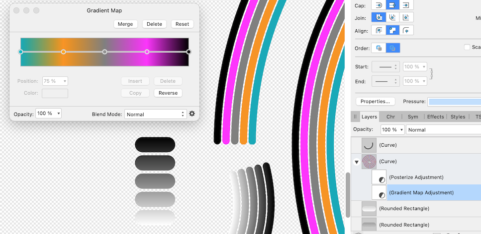
@sheriffderek, if you want to go the brush route here's a tip: Create the original brush with a simple black to white gradient. Then, when applied to a stroke, add a Posterize adjustment in order to quantize the grey into steps corresponding to the number of lines (* more on this below). In this case 5. Now you can use a Gradient Map and have full control over the color of each individual line..... as opposed to having to make a new brush with each color change. * Yes, I did try to make the original brush segments specific solid grey values in order to use the Gradient Map directly, but the colors, for some reason were not exact when mapped. Close but not exact. Anyway it's easier to just do a gradient and use the # of lines rather than trying to figure out the percentages of grey you'd need (beyond simple divisions that is).

-
In the shopping examples the text is different sizes on the page, so of course there will be tiny differences... even with the exact same export protocol.
-
Ahh, ok I get 50% of that. Clicking the individual ink wells does nothing. But the swap arrow does add a stroke. Can't image that's by design. Should be reported... at least to see what they say.
-
Pete, I don't get any of the results you're describing in working with your file (or in general). If you haven't tried already, perhaps a simple app restart will jog it's brain. If not then maybe a reset (start with ctrl. I think the first three check marks is all you need)
-
I think the spiral can be created in Affinity without too much trouble. (we still need a spiral tool!) The bigger problem is that the text itself decreases in size as it spirals inward. 😬 Don't think that can be done in Affinity.... except by hand. 🤯
-
If I understand correctly... Yes. Use the Move tool. With nothing initially selected, CMD drag around your whole design. This should select all the individual pieces regardless of being in groups or layers. Then hit Convert to Curves OR switch to the corner tool and hit Bake.
-
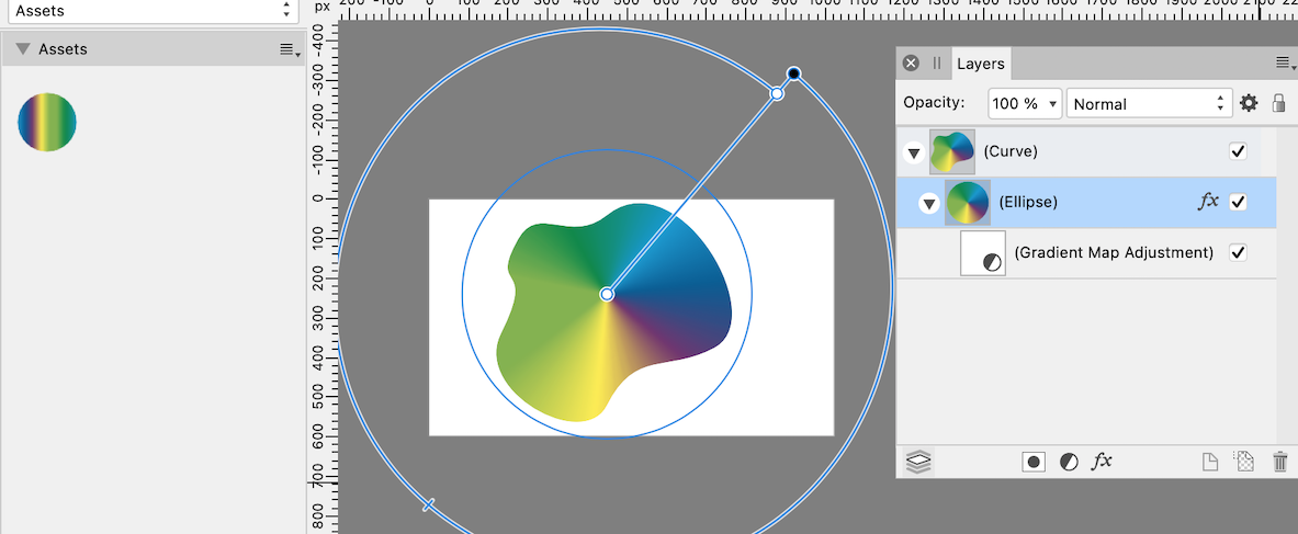
@Kim Panattoni, no you can't save a Gradient Map color spectrum to swatches as others have already said. BUT, you can save the rig as an asset! Sure you'll have to change the container or adjust the black and white stops on the primary gradient, but at least you won't have to reconstruct a many stop gradient. (also: no, no way to add actual midpoints in the Gradient Map itself. I haven't tried the curves suggestion.) Shown here as an asset and then used inside a different shape and used as a different gradient type. The gradient is there all set up and still editable. And importantly, it's visually identifiable in the asset panel as it would be in the swatches panel.
- 53 replies
-
- 1
-

-
- affinity designer
- gradient tool
- (and 2 more)
-
Looks like tearing to me. @NoobMan, I can recreate this. Take a look at the node handles at a problem corner. Do they double back in the same direction as each other? That'll cause a tear in the stroke. (ironically, if the handles are exactly on top of each other it doesn't happen) Furthermore, you're not seeing it on canvas because your Join, I'm guessing, is set to Round. But when saved to SVG and reopened they show up.... even if still set to round ( a little weird). Before export, if you switch the Join type to bevel or miter (i.e square) the tears should show on the original as well. Changing the Miter setting number won't fix it. It'll, at some point, just make the problem pointy instead of a hole. Ya gotta fix the handles (if that is indeed what's going on).
-
You CAN use the Gradient Map to drive a fill. Follow the instructions I gave in my first post 🙂.
- 53 replies
-
- 1
-
-
- affinity designer
- gradient tool
- (and 2 more)
-
@Wosven thank you! Much appreciated. Glad you had fun.
- 53 replies
-
- 2
-
-
- affinity designer
- gradient tool
- (and 2 more)
-
Sadly we don't even have that ability. Selecting a color stop on canvas does not select the corresponding stop in the gradient panel. Craziness 🙄. As for 37.03%, 37.10%, & 37.13%: I don't think any reasonably sized panel would accommodate being able to pick out each node individually. Perhaps the gradient in the panel itself could be zoomable! My decimal point example was just to let the OP know that those kinds of values are at least possible, it's just not displayed. There is, however, plenty of room in the input dialog for a decimal if needed (... or two. I can't really imagine the need for anything finer. I can see maybe 10ths, but 100ths is getting pretty nutty. We're designers/artists, not smoothing the mirror on the Hubble telescope (don't get me started on Million x zoom 😂🤦♂️). But, I guess, It could be a user option.... like a bunch of the other inputs. Another way to select crammed together (or for that matter ANY) color stop would be to give us the ability to step through the string by hitting the bracket keys.... that's already the way it works for nodes on curves now. How hard could that be? At the very least @Kim Panattoni is absolutely correct imho. The panel is way too small.
- 53 replies
-
- 1
-
-
- affinity designer
- gradient tool
- (and 2 more)
-
Yes, I understand. There is no way to do that. BUT...... This is what I was answering. If you follow the advice you can do the above and, at least, use the slightly larger gradient map window to control a fill.
- 53 replies
-
- 2
-
-
- affinity designer
- gradient tool
- (and 2 more)
-
I'm assuming that screen shot 4 is the "selected all the same" screen grab. But, everything was not selected all the same. Layer 2 was not selected (at 45%). The object inside was, but not the layer. I'm not commenting on what should or should not happen, just explaining was is happening. Select by transparency is going solely by the layer opacity setting. And it seems consistent in doing so.
-
Hi @Kim Panattoni, the Gradient Map is mapping it's colors to the L values of what it's assigned to. So if you want to use the Gradient Map Adjustment as a color fill (in order to utilize the larger info dialog) you must first assign a simple two point black to white gradient as the fill to (in this case) the circle first. Then the colors of the gradient map will appear like a fill gradient. Oh, and btw, if you type in 37.03% in the position dialog box (in both types of gradients) that is what you'll get in reality. It's not rounding to a whole number like you see.
-
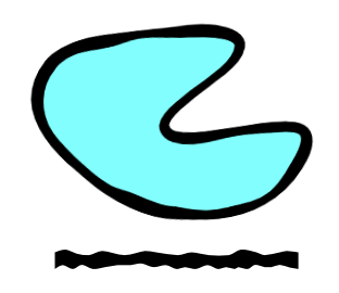
You could make a brush. This one is set to stretch. (caveat: stroke output will be raster)
-
Hmmm. If that little dot is is your brush at 319px, then your doc is about 29,000px wide (?). At that scale and brush size, it just might take a few passes to show up clearly. And by passes I mean drag and release and drag and release and drag....
-
I would suggest even a step further. Maybe a short vid of Sarah doing her thing. Or should I say, the tools NOT doing their thing. Edit: Sarah posted while I was typing. First thing I see is your opacity is under 50%. So you're staring out under half strength to start. Also, what exactly in that scene are you sharpening? The owl I assume?.... (why a vid might help more) You might also try changing the mode to Harsh, just to crank things up (after, of course, increasing opacity).
-
It seems you've changed the layer 2 opacity (layers panel) to 100%, but then changed the purple ellipse to a 45% color fill (color panel) which is a different "type" (probably not the best word) of opacity setting. The purple ellipse still has a 100% layer opacity. So it's being selected with everything else that has 100% layer opacity.
-
To be fair @G13RL was first to market with that advice. And for clarity's sake, I'm not advocating using Break Curve. Skip that step entirely and directly delete the unwanted segments 🍺.
-
Dear @Ben Faegan, please please please don't do it this way (...just a friendly suggestion 🙂). You're shoving around hundreds of little facets to make an outline? Take a few minutes and learn how to use the pen tool. You will be able to make an exact mask/clip with a fraction of the points AND a fraction of the effort. We're talking just a handful vs hundreds. Begging you 🙏.
-
Yeah, I think the word "continuous" is throwing me (et al) off. I think it's clear that the OP wants everything in one "object" and not consisting of one single uninterrupted line (how would that even be possible with the windows and such). It now seems apparent that your initial file was just fine....the construction's a bit disjointed, but it's fine. Do what @G13RL said, and everything will be in one object. The fill won't work as @firstdefence pointed out, but you say you don't need/want a fill. Your elements can be combined so the fill will work, but I guess that's a different topic. But a vector based icon doesn't need to be one object, or, "one continuous path", at all. Illustrator might be causing the confusion here. It's a little different when it comes to this. You can have what appears to be many different flavors of things in "one" object/layer, but the reality it that your AI prefs are such that it's just not showing you all the individual pieces as individuals. Change the setting and every little thing will be shown as it's own item within the layer. So, Affinity's booleans won't work (at least how you'd like them to) on single curves. And there is no trim or slice tool. You're going to have use the Node tool and add a point at each intersection and delete the crossing spans (ctrl clicking on it w the node tool... or whatever the pc key combo is.) Bottom line: You don't need to expand and Boolean add everything together. Use Layer > Geometry > Merge Curves instead. EDIT: Oh, and I did do a version of your first file where the entire plane body: fuselage, belly, tail and both wings is indeed one single long continuous line 💪 😅.
-
Have fun with the geometry nodes!! 🍩 🍩 🍩 🍩 🍩 🍩
-
Soooo, can someone please explain again why this needs to be one continuous path? Maybe a rephrasing will add clarity (..... for me 😝). What it the end result supposed to look like, or be able to do, that needs that requirement? You can't use an SVG of a few parts and just change the stroke color (you could even have different thicknesses)? If it's a solid fill you're after, isn't a whole other kind of construction needed?
-
Well, masking, imho, is more of a "designery" method than destructively lopping off pixels (which is more common in image manipulation operations, i.e in photo). But I digress 😉. Nevertheless, you CAN get a pixel selection from a path in Designer. It's a (or two) click more involved, sure, but it can be done. See my answer #2 in your other thread.
-
@ahnay The kicker is that the Appearance Panel isn't even the right answer for your initial question 🤪. And I'm not sure why there was all the confusion. You included the image in the very first post of the thread! It's a triangle (with some of it erased near two of its points ??) PNG with transparency. Which means it's a raster image with transparency. Which means that both the Stroke AND Appearance Panels will only add a stroke around its bounding box.... which is what you got. You then, in your journey, for some reason, drew a vector shape on top of the image and applied a stroke to that (using the Appearance Panel). That's fine and all, but a different scenario altogether. To answer the original question.... restated if I may: How to put a stroke around a raster image (as was the example given) with transparency? Answers: 1) Use an FX Outline. It'll be raster output, but that's what you're working with anyway. 2) Go to Pixel Persona (if in AD), make selection from the layer (edit: this is only available in AP)... in AD you CMD click on the thumbnail (also can be done in AP), go the Select dropdown > Outline, pick your stroke thickness and fill with a color. (also a raster result.) 3) If the question was actually how do I convert an imported image into a vector outline in order to give it a vector stroke, the answer is you can't in Affinity. You need to do the raster to vector conversion first elsewhere and then bring it in to Aff.