Kim Panattoni
-
Posts
31 -
Joined
-
Last visited
-
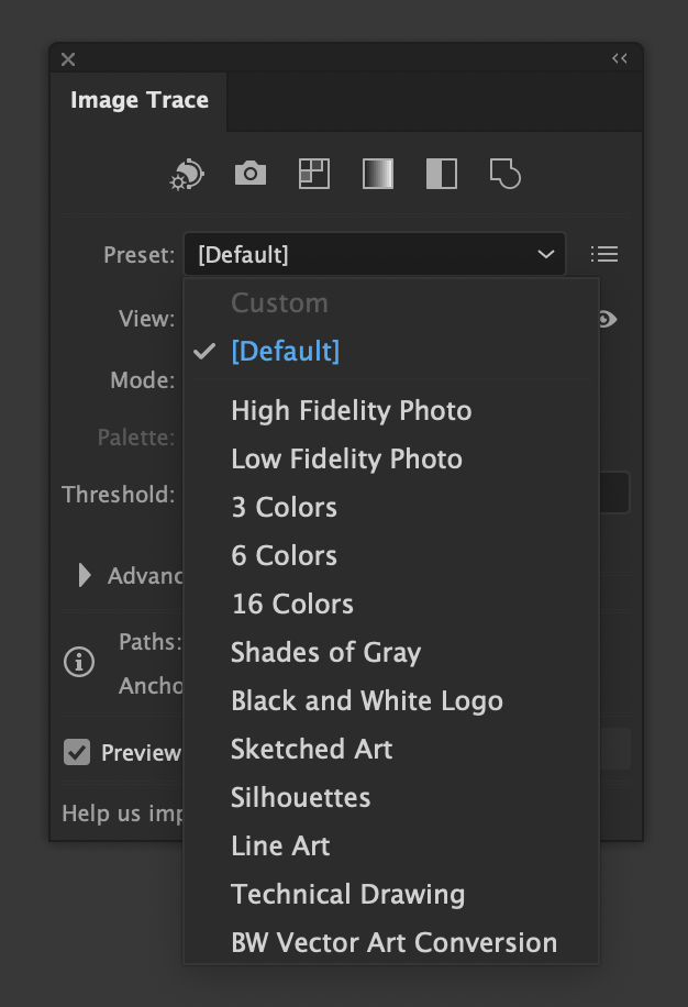
Hello again, everyone: After digging through the forums and YouTube a bit, I have not found a very specific answer to the subject of this post, and most of what I found was years old. I am asking how to do one specific function: Use Affinity software to convert a raster image into a vector image by using a built in tool with configurable options that works just like (or better than) the Image Trace tool in Adobe Illustrator. Now let's be clear: 1. Needs to be built into Affinity. No external software or paid plugins. 2. Needs to be an option with configurable settings that can be adjusted. See images below for the Illustrator process. 3. Optional: Non-destructive, so as to be editable with properties like any other adjustment in Affinity. For those of you who are not sure what I am talking about, I have attached some screen grabs from Illustrator to demonstrate the tool I am seeking in Affinity, as I am sure it exists but I have not found it yet here or on YouTube. Thanks!

-
Ah okie, that is what I thought you meant. So make sure that purposely creating a text style, it is named such so one does not have that happen. Thanks
-
I just discovered the fx vs. styles thing after trying what you mentioned last time.. In the case of the gradient, all it would save is the type of gradient, be it conical, linear, etc. I created a square for a simple linear gradient and a circle for a conical and saved each as a style, deleting the shape afterwards. I then tested the style on other shapes later and it seemed to do well enough. As to text, if I were to create a text style with just the usual greeked "Lorem Ipsum" text in it, formatted it as I want using some of the fonts I used most, would that work as a text specific style? I think that I am understanding what you are saying if I am reading it right. Have been a little off today. 🤕
-
 Kim Panattoni reacted to a post in a topic:
Gradient Tool Too Small, Cannot Detach Gradient Properties Editor
Kim Panattoni reacted to a post in a topic:
Gradient Tool Too Small, Cannot Detach Gradient Properties Editor
-
Kim Panattoni reacted to a post in a topic:
Gradient Tool Too Small, Cannot Detach Gradient Properties Editor
-
Kim Panattoni reacted to a post in a topic:
Gradient Tool Too Small, Cannot Detach Gradient Properties Editor
-
Kim Panattoni reacted to a post in a topic:
Gradient Tool Too Small, Cannot Detach Gradient Properties Editor
-
Kim Panattoni reacted to a post in a topic:
Gradient Tool Too Small, Cannot Detach Gradient Properties Editor
-
Kim Panattoni reacted to a post in a topic:
Gradient Tool Too Small, Cannot Detach Gradient Properties Editor
-
Kim Panattoni reacted to a post in a topic:
Gradient Tool Too Small, Cannot Detach Gradient Properties Editor
-
@iconoclastInteresting enough, seems like you and I have the same Mac Mini.
-
(re-reading this after your most recent comment, sorry) - Editing points on the object itself is a good thing and I can see the use for that in many places. The main reason I wanted a bigger window was because I want (and still will likely request the feature) to have a floating window that I could move around and size according to the complexity of my gradients in the event that like this one, I needed the colour points in specific places along it, so need to edit their position and colour each time without having to look at it so small or to not have midpoint control as with the solution I am working with now. Still not ideal for my particular needs, but a far better workaround, and the benefits you and I have discussed already make that an easier way for me to work. Thanks again about the info on saving styles with the basics so they can be used more easily on other projects. They remind me of something other apps call "Master Templates". Very cool.
-
Kim Panattoni reacted to a post in a topic:
Gradient Tool Too Small, Cannot Detach Gradient Properties Editor
-
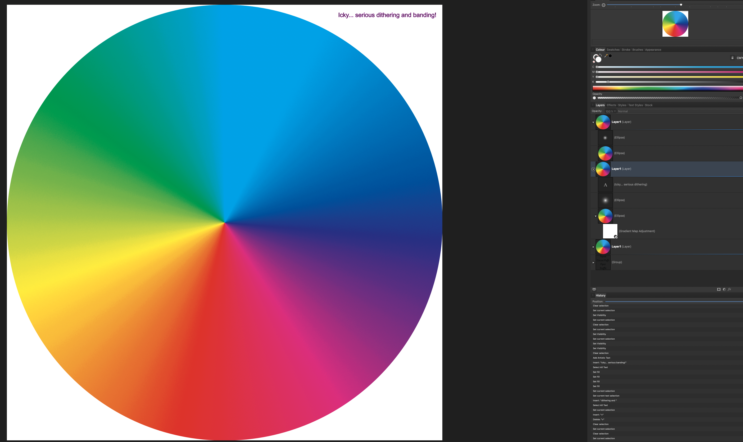
Oh wow, I did not know that they kept their shape or suggested shape when you saved them. That is cool, I can dump my conical back into a linear and change the shape so I can save it as a straight line (which I actually would need to do in this case, since the RGB version of it aligns to visual spectrum wavelengths and will not have an even distribution as this does. But in other cases, that will be good too. I did save this particular style calling it something like CMYK Colour Wheel for example, so I can also open the file and save one as a line for future use elsewhere. As to the effects, I have not tried them yet, but based upon this behaviour I was starting to wonder if you could do that as well. That is all great to know, and thank you!
-
Kim Panattoni reacted to a post in a topic:
Gradient Tool Too Small, Cannot Detach Gradient Properties Editor
-
As to not liking the dropdown panel... I know my screen resolution is huge, which does create some problems. The thing I do not like, though, is that the window width is small even on a lower resolution. I also do not like it because I cannot detach it into its own floating panel... The Layer FX method gives me a larger gradient to work with, and unlike the adjustment layer, gives me midpoints again, as we talked about. Just better control and a larger window to work with. The tools however, once you get used to them and all are very powerful. I just like this approach a little more, and when it comes to gradients themselves, they are embedded in the layer rather nested, so the gradients come out far smoother. I do realise, though, as @NotMyFaultmentioned, that 8-bit can have a less than ideal effect on this sort of thing. CMYK is 8-bit, and I needed CMYK for this example for more purposes than the forums, so it will be unique... But the styles thing! OMG! ❤️❤️❤️ When I saw that I nearly lost bodily control, if you get my drift. I was experimenting with the panels and as someone mentioned that saving as gradient swatches themselves would not work with the other approach, I thought I would see what the right click would offer. When I saw styles I jumped, and so I tried it. I went back and looked and I was so incredibly thrilled! The cat thought I was nuts. That is why after posting, I went and made that video showing me using it. I could not wait to show everyone, especially with all the learning everyone has helped me with here.
-
Okay: I put this comment in the wrong place. I was replying to @NotMyFault about the monitor depth and the monitor vs. image quality. OOPS! You are totally right. Though in this situation, the thing that really ensured me that it was not related to the display depth was pasting it into another app and seeing the banding as solid lines. When I use this method, that does not happen at all. As to screen display depth, I specifically chose this monitor for photography and ease of calibration. Totally valid, and it did fine in RGB as you mentioned, so good stuff there.
-
I know, right? That is one of the things that excited me so much. When you look at my comment I was very excited to mention that, and I even made a short video showing me doing that, as well as the ability to once again have midpoint control. I am really glad that came up.
-
Actually, this isi CMYK. CMYK Colour Wheel for a project I was doing ast year.
-
Wosven reacted to a post in a topic:
Gradient Tool Too Small, Cannot Detach Gradient Properties Editor
-
Kim Panattoni reacted to a post in a topic:
Gradient Tool Too Small, Cannot Detach Gradient Properties Editor
-
Hey everyone! So having been through a lot of the different processes here, I decided to make a colour wheel. Here is what happened: The method I used for this first one was to use a Gradient Adjustment Layer. Not a bad result, but I wound up with a ton of dithering noise and gradient banding. I tried all sorts of things to fix this, even just to fix the appearance of it and had minimal luck. Worse, if I were to copy the ellipse to another program like Photo, or even Illustrator, -even as an svg file- I would get that incredibly So I called that attempt good and took a break for a while. I came back later and was nosing around the panels and forgot that there was an effects panel right next to the layers panel. That got me thinking: Is there a gradient effect in there... well lo and behold there is! While the gradient panel here is around the same size as the one found in a Gradient Adjustment Layer, the effects window can be moved all around the screen... and there is a plus! This gradient editor contains midpoints, so you can adjust things with a lot more precision. Dang, if only I had seen this earlier! And by doing it this way, the effect copies along with it, no matter where you put it... even in some other random app. --EDIT FOR MORE COOL STUFF-- With this option you can create a style that you can apply to any object. I was fiddling around and suddenly it worked. You cannot make a gradient swatch out of it, but you have the ability to make and save a style. Y'all are great, thank you so much! Here are some pics along the way so you can see my progress... and a bit of a crummy video on doing this: Using Gradient Overlay Layer Effect.mov
- 53 replies
-
- 1
-
-
- affinity designer
- gradient tool
- (and 2 more)
-
Do you think that work on the gradient editor is worth asking for in the features request forum?
-
NotMyFault reacted to a post in a topic:
Gradient Tool Too Small, Cannot Detach Gradient Properties Editor
-
I appreciate the suggestion, and I know that it is important for new users to use YT to learn the ropes before asking questions on forums of any kind, even social media outlets. I admit that I often have terrible luck in searching for anything on any platform including Google. However I came to the forums after spending a couple of days -literally, not figuratively- on YouTube looking for answers to this particular question despite having been through a number of basics and beginner tutorial playlists. They are definitely good for new users like me, and I have learned a lot. I have been through more "introduction" and "the basics" videos and playlists on YT than I care to count. As I said, I really have learned a lot, which is what got me to this point. There are also lots of tips and tricks videos/playlists on a few YT channels, and those are helpful in general. My post here is not about basics but thinking outside of the box to solve a problem based upon basic tools. Basically using those tools to make the software stand on its ear to accomplish a goal. That requires a lot more of an advanced understanding of the software than what I can find on YT. To be honest, I have had very little luck on YouTube in finding solutions to my specific problems and or training needs. When it comes to Affinity Photo, I cannot seem to find videos that are relevant to using it as a design tool in addition to a digital darkroom. When it comes to Designer, well I have already gone into that above When researching gradients and adjustment layers, everything that I have been able to find focuses only on the gradient editor itself, or on the fact that there is a gradient adjustment layer and how neat it is. I had no idea that what @JimmyJack explained regarding how a gradient adjustment layer map interacts with a gradient fill on the object. I had no idea that it uses the two points. And I could not find anything regarding that in any of the searching I described above. Everyone here has been helpful and has worked to get through what initially boiled down to very poor wording and examples on my part in order to get this far with relative ease. I wish I could say the same about YouTube. *sigh* P.S. -The way I learned how to get creative in Illustrator was going through a very long and in depth training course from lynda dot com (now a part of LinkedIn). One of their 3 part courses with well over 100 videos for every level of understanding possible. This is just a learning curve issue I am dealing with.
- 53 replies
-
- 1
-
-
- affinity designer
- gradient tool
- (and 2 more)
-
Whew~~~ Waaaay over my head at my current level of learning the software. Um... I do know what curves adjustment layers are given Adobe products, but I am not certain about using the term "nodes" in relationship to them... Nor using the terminology "nested" in this context... But what I think you are saying is that somehow curves adjustments can affect the midpoints between colour points in the Gradient Adjustment Layer's actual gradient editor? I think that is what you are saying, but I am not sure I understand the way that curves would affect gradient colour points... Can you elaborate on that, assuming that I have only opened Designer for the first time in the last 7 days? Thanks!
-
Ok, I missed out on this somehow, I am sorry. I am going to tinker with this now. I am going to delete my other reply, though I will move its other question here: Adjustable midpoints in the Gradient Adjustment Layer?