Jered
-
Posts
14 -
Joined
-
Last visited
-
Struggling with this as well. I understand the value of keeping the whole apperance and therefore adding new text styles. However, there are numerous scenarios, where you want to keep the various styles (Heading1, Heading2, Paragraph etc; so plain text is no solution), but want the styles of the destination document applied. In particular, I’m trying to create a workflow for importing Markdown. It’s already working from MD → ICML (via Pandoc) → IDML (with a generic template) → opened with Affinity. However, I then want to copy my content into a document that already has everything (such as page format, master pages, all the styles) prepared, which would be a cumbersome job right now. So +1 for a pasting option with destination styles!
-
Purchased no hesitation (split)
Jered replied to Danie's topic in Feedback for the Affinity V2 Suite of Products
I also wanna give a Big Thanks to you guys from Serif! 👍🏻 Though I had hoped for some features that aren’t (yet) available, the Affinity Apps are getting better and better! Wouldn’t know what to do, if they didn’t exist! I also purchased without hesitation (before even knowing what’s included and what’s not) to at least show you my support! Thank you for such reasonable pricing! -
 Jered reacted to a post in a topic:
Variable fonts support
Jered reacted to a post in a topic:
Variable fonts support
-
Jered reacted to a post in a topic:
1 bit TIFF/Bitmap support please
-
1bit B&W images in Affinity Photo?
Jered replied to Dayfold's topic in Older Feedback & Suggestion Posts
+1 Ideally with CCITT Group 4 compression -
 LogosByDim reacted to a post in a topic:
Are you adding variable fonts anytime soon?
LogosByDim reacted to a post in a topic:
Are you adding variable fonts anytime soon?
-
+1! Over at DesignCuts they offer quite a few variable fonts, and I just bought some. They do also ship individual files with several widths, weights etc., but somehow it’s a pity not to be able to use their full potential.
-
Yep. You're right. 😅
-
vopash reacted to a post in a topic:
GREP Styles
-
+1 for GREP styles! I totally agree with everyone here. Starting with setting a different font for a certain character that’s not included in your font, to adjusting character spacing for particular combinations, to doing the whole styling just when inserting text, to all those other scenarios, people here described. Configure once and forget about everything, the flaws in your font, all the styling … I might throw a party when Serif implement this. This is my number one feature request for the Affinity apps! AND: By no means least, just a big applause to Serif for what the Affinity apps are right now! I get more and more excited about them, the more I use them!
-
combdn reacted to a post in a topic:
Define first baseline in text frame
-
+1 for scripting!! I’d suggest leveraging the existing MacOS Open Scripting Architecture (OSA), which allows for easy cooperation with and usage from other Applications. Scripts can not only be written in the old and odd AppleScript (I totally understand voices against that!), but since Mac OS 10.10 also in JavaScript for Automation (JXA). And basically interfaces for working with the underlying so-called “Apple events” should be possible from any language, certainly though from other MacOS Apps … The big advantage of this approach would be that it provides Scripting in both its meanings: as just Macros for repetitive tasks and as API for control from outside of Affinity.
-
Jered reacted to a post in a topic:
Define first baseline in text frame
-
Define first baseline in text frame
Jered replied to Jered's topic in Feedback for Affinity Publisher V1 on Desktop
No worries! I’m grateful for this solution now, as I will surely run into missing that setting again at some point, before the Affinity team have had the time to implement it! That seems to be a very valuable experience though! I suppose you approach typography a lot more considerately than us people who basically grew up with digital type. Still, I do love working with text styles and enjoy seeing changes being applied throughout an entire document! -
Define first baseline in text frame
Jered replied to Jered's topic in Feedback for Affinity Publisher V1 on Desktop
I wasn’t talking about a poorly set guideline at all, the guideline just makes visible that the left baseline is slightly lower than the right one … But I agree that with Arial and Courier the difference is pretty small and may not even be worth worrying about. I admit that I’m prone to perfectionism (in the negative sense) and I sometimes tend to lead discussions based on principles rather than results. (Still my motivation for opening up this thread was a feature request, and not so much a solution to one problem.) And with some fonts (and also the non-free ones, with which I originally stumbled across that topic) the issue does become more obvious and worth worrying about. While I’d still be happy to at some time see a first-baseline setting in Affinity, as it sometimes is the quicker approach (and I did use it regularly back in Indesign), the more I think about it, the baseline grid based on a common denominator of the used font sizes (granted that there be one, which however contributes to good design anyway) seems to be a good solution. I admit, that when it comes to baseline grids, I was only thinking of the full line height and not of subdiving it. So thank you very much, Old Bruce, for suggesting that in one of the previous posts. It did take some time for me to let it sink in, but now I can say, that for me this solution was worth the discussion – I hope you see it the same way! Cheers! -
Jered reacted to a post in a topic:
Define first baseline in text frame
-
Define first baseline in text frame
Jered replied to Jered's topic in Feedback for Affinity Publisher V1 on Desktop
Thank you for your reply! In my humble opinion, this matter not so much about font design, but rather about Affinity’s implementation of the leading setting. As far as I observed, if I set the leading to 120% "% Height" (not to 1.2 "Multiple"!) with a 12pt font size, I get an effective leading of 14.4pt, and this doesn’t change with the font family but just with the font size. It would have the very same result to set the Leading to 14.4pt "Exactly", but obviously would need to be readjusted with general font size changes. But ultimately this discussion isn’t really what this topic is all about. If Exactly did the trick, I’d be totally fine with it. But … My problem isn’t very well visible with Arial and Courier – I used Arial and Courier New for my example. (Btw, it’s not about any design consideration to use exactly those two fonts, I’ve actually come across this phenomenon with two completely different fonts, which are, however, not freely available, and therefore I chose two widely present fonts that also show this effect.) But even if you look closely in your example, you will see that the baselines of left and right aren’t exactly on the same line. This is a clipping of your first screenshot, where – if you look closely – you can see that the left baseline actually sits a little lower than the right one: Old Bruce, could you maybe change the right font in your example without the baseline grid to Courier New, to better see what my problem is? Thank you for your efforts!
-
Define first baseline in text frame
Jered replied to Jered's topic in Feedback for Affinity Publisher V1 on Desktop
G' morning! Came across another issue during this night's sleep If we only have the workarounds of either setting the usage of the baseline grid for only the first paragraph, or including a first empty paragraph, we still run into problems, when this happens in a text frame with the content overflowing from a previous one. We don't know for sure, which is goingto be the first paragraph in that text frame, and even if we did, we would use the baseline grid for the starting lines of that paragraph in the previous text frame as well. What about that? I still opt for a text frame setting for the first baseline! -
Define first baseline in text frame
Jered replied to Jered's topic in Feedback for Affinity Publisher V1 on Desktop
It seems to me you’re using two fonts that have a similar ascent height – the phenomenon doesn’t appear with just any two different fonts. But I might be wrong – did the difference between left and right baselines appear to you as well, and you did something to fix it? (What did you do?) The leading (above, I used the term line height for leading – I have the language set to German and poorly translated myself) doesn’t seem to do the trick. I like to define it as percentage to the font size, afaik it does the same as Exactly as long as you don’t change the font size. I tried using Exactly, though, and didn’t notice any difference. Thank you for your thoughts and time! -
Jered reacted to a post in a topic:
Define first baseline in text frame
-
Define first baseline in text frame
Jered replied to Jered's topic in Feedback for Affinity Publisher V1 on Desktop
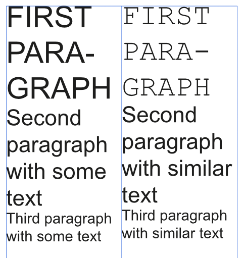
Thank you very much for your reply! I’m sorry, I obviously didn’t express myself very well. I’m trying to illustrating the problem I run into: For this example I used Arial and Courier New (on a Mac), the first paragraph is 24pt, the second 18pt, and the third 12pt. With "the same sequence of line heights" I meant 3 lines with 28.8 pt line height (120% of font size), 4 lines with 21.6 pt line height etc. That is the same in the left and in the right text frame. By synchronizing the baselines, I tried to express that the baselines of the left text frame continue on the same height in the right text frame. So, as visible above, the First Paragraph on the left (Arial) and on the right (Courier New) – although both the same font size – don’t start on the same baseline. And as the subsequent line heights accord to each other left and right, the error continues down. Setting the top inset just shifts everything down (just as it should), but otherwise makes no difference. Defining a baseline grid and only using it for the first paragraph does work, but the baseline grid needs to be adjusted to the line height of the first paragraph, in order not to change the line height of the second line. So it needs to be readjusted any time the font size or the line height factor is changed. Having a 1pt paragraph of one particular font at the beginning of each text frame (as described in my first post) would also do the trick, as the first baseline then is set to the same position. However, both ways are somewhat complicated and I rather consider them a workaround. Hence my feature suggestion to be able to define the first baseline, just as in InDesign (and afaik in Quark Express as well) Cheers!
-
Hello! I’d love to see an option to define the first baseline in a text frame – especially as "line height". The default seems to be some ascent height, which however depends on the font selected. So having two text frames next to each other with similar content (the same sequence of line heights) and just the font of the first line being different, it is very difficult to synchronize the baselines of the two text frames. The baseline grid is no good solution, as (if you have varying line heights) you have to disable it for all subsequent paragraphs, and further it is applied to not just the first line, but all lines of the first paragraph. Another "solution" for the described scenario would be to have an empty 1pt first line. Yet I would rather call both ways workarounds, not solutions. I’m very much used to this from InDesign: Looking forward to your thoughts! ––– EDIT: Summary of our discussion (thanks, Old Bruce!) ––– A viable solution for the scenarios I can think of seems to be a baseline grid based on a common denominator of the used font sizes (granted that there be one, which however contributes to good design anyway). (Also see the second screenshot in this post: https://forum.affinity.serif.com/index.php?/topic/106014-define-first-baseline-in-text-frame/&tab=comments#comment-572592) Still my feature request remains, as it would be a quicker approach in many cases.
- 12 replies
-
- 1
-
-
- text frame
- baseline
- (and 2 more)