LogosByDim
-
Posts
48 -
Joined
-
Last visited
-
 Elise Kleve reacted to a post in a topic:
Current Affinity Versions and 2.0 Release Date
Elise Kleve reacted to a post in a topic:
Current Affinity Versions and 2.0 Release Date
-
I agree with the above – buy the affinity suite if it works for you. Nothing more needs to be said. I don't understand why making such a discussion out of it and all that philosophical debate is necessary. It fills the forums. I jumped in because I've been receiving email notifications from this thread more than 8 times today. Muting them now.
- 72 replies
-
- 1
-
-
- release date
- affinity 2.0
- (and 2 more)
-
LogosByDim reacted to a post in a topic:
Current Affinity Versions and 2.0 Release Date
-
 LogosByDim reacted to a post in a topic:
Are you adding variable fonts anytime soon?
LogosByDim reacted to a post in a topic:
Are you adding variable fonts anytime soon?
-
LogosByDim reacted to a post in a topic:
Are you adding variable fonts anytime soon?
-
LogosByDim reacted to a post in a topic:
Are you adding variable fonts anytime soon?
-
Hi, maybe setting up a global color swatch with CMYK values 0 0 0 100 and making it a "spot color" with "overprint" could ensure the exported PDF has only 100% black? Assign this spot global color with overprint to the text and export the PDF. I read this in another thread but can't remember the output results.
-
Hi there @feelingprettyred Take a look at the Color Panel in Publisher, switch the color wheel to CMYK values and set all values to zero except black (K) to 100%. Export your PDF file from Publisher. Now use Adobe Acrobat to check if the text is exported in pure black CMYK value without any Cyan, Magenta or Yellow. Here's how to do that: “Using Acrobat DC: At the top of your screen you should see a Tools tab, click it and then find Print Production, then Output Preview. In the Output Preview panel, select Show: All and Preview: Separations.” Source: (Adobe Community) Now you should be able to click the text in the PDF and get an overview of the CMYK color values used for the text. Ensure only 100% Key (black) is used. I hope this helps! Let me know once you try it! — Dimitar
-
LogosByDim reacted to a post in a topic:
What's the difference between choosing "Assign" or "Convert" when changing color space from RGB to CMYK?
-
Hi there, I also want to add my support for the variable font technology in Designer, Publisher and Photo. + 1 Fonts like this one can be used if we can utilize variable fonts.
-
Mark Oehlschlager reacted to a post in a topic:
Congratulations with hitting the 1.9 mark!
-
Congratulations to the whole Affinity team with the launch of 1.9 and the introduction of so many new features I'm thankful to all those who have contributed with feedback for the Affinity apps, and to the Affinity team who takes our suggestions and concerns into consideration when working out each new update. It means a lot to the community - I'm certain about that. Focusing on Affinity Designer, many of us have been asking numerous times about a feature similar to the off-set path in Adobe Illustrator. Finally, Affinity has not only fulfilled this, but added a complete tool for the purpose. In my opinion, the contour tool could even be better packed with features than the one in Illustrator. Good work! It's worth to mention the new option to link images in the document in Designer and Photo, instead of embedding everything. A feature in Publisher that many have requested to be implemented in the rest of the apps. Now it is! I like how Affinity sets a major focus specifically on the performance of their apps. Hardware acceleration is important not only for those with powerful machinery, but also for those with rather decent computers who need to utilize their computing power to the fullest. Update 1.9 didn't miss that. These are some of the newly introduced features with the latest update that I'm happy to see. I'm sure many will find these improvements productive in their workflows and that Affinity will continue with the good work. Nice and steady, keep it up! Thanks to the team for the continuous help they offer to people struck by the Pandemic with the 90-day trial and 50% off on the whole creative suite. Wishing everyone a nice weekend and a happy new year with a slight delay! Cheers!
-
- 1
-
-
- thanks affinity
- keep up the great work
- (and 6 more)
-
There was a time when Adobe offered a version of their apps for a one-time-purchase of a specific version of the software. One could buy the new upgrade each year or something similar, or stick with the older version. Some people still have some of these programs, Photoshop, Illustrator, etc. As far as I know, at least. Maybe that's why @Elise Kleve is still wondering if she should invest in the affinity suite, and transition from the CS Adobe programs.
-
multi Link instead of embedding image
LogosByDim replied to Jugibur's topic in Feedback for the V1 Affinity Suite of Products
Fantastic, good job! -
LogosByDim reacted to a post in a topic:
Link instead of embedding image
-
multi Link instead of embedding image
LogosByDim replied to Jugibur's topic in Feedback for the V1 Affinity Suite of Products
Jumping in to re-enforce what everyone else here has said. Add an image linking feature to Designer just like Affinity Publisher. +1 This is quite needed! -
 Jowday reacted to a post in a topic:
Expand Stroke bug (not accurate)
Jowday reacted to a post in a topic:
Expand Stroke bug (not accurate)
-
Expand Stroke bug (not accurate)
LogosByDim replied to debraspicher's topic in V1 Bugs found on Windows
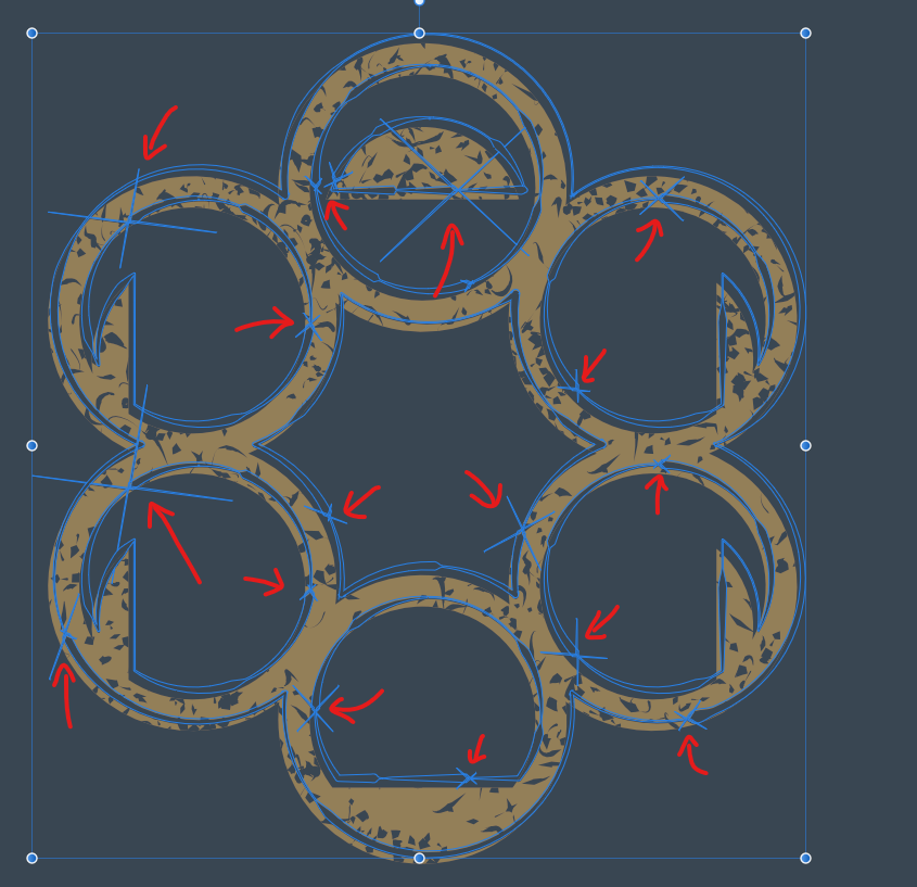
Hi, I am also here to add another extra vote to this issue because it just happend to me as well. I am following the Affinity Designer Workbook project Lace Frame Galleries 1, and when preparing the Distressed Look version of the logo for export in SVG, the book says the following: When I select the distressed stroke shape and use Expand Stroke, all of the lines become disastrously damaged. 1st image is before expanding the stroke, 2nd image is after the stroke is expanded. Notice how the most damage happens where the stroke pressure varied the most in terms of weight, which was done using the Pressure pop-up panel in the Stroke Panel as the Workbook instructed to do. Excuse me, but let this become first priority for the Development Team as this has been reported years ago. Absolutely disappointing!
-
AndyQ reacted to a post in a topic:
Deleting Swatches
-
Deleting Swatches
LogosByDim replied to AndyQ's topic in Pre-V2 Archive of Affinity on Desktop Questions (macOS and Windows)
The swatches panel user interface isn't very intuitive. In fact, most of the options are very labor-intensive. For instance, I would also like to delete several swatch fills with a single operation. Otherwise, deleting 10 swatch fills would require: first right click on swatch; then click delete color; then click yes to confirm. Imagine you have a base color of blue. You have 4 tints of the same blue for highlights, and 5 shades of the blue for shadows in a design. Deleting them all would require 30 (10 swatches by 3 clicks each) clicks to delete. Now imagine 20, 30 or 40 swatches in a large document palette. Hundreds of clicks. -
LogosByDim reacted to a post in a topic:
Deleting Swatches
-
LogosByDim reacted to a post in a topic:
Affinity Designer - "select similar"
-
Hi RedSonia, welcome to our sparse thread, thank you for sharing your input and concern. Could you explain in more detail what you are facing regarding the default of CMYK? If you don't like to use a "pess ready" preset each time you open a document to set the color mode to CMYK, why not try setting up a document "template"? You can create new document using a preset, open the tool panels you like to use and the layers you always have in a new document, as well as the color settings. Then go to file, export as template. You can then use this CMYK template in ever document. Just open AD, clik templates, click add folder (the one which you exported the template), and select it to be used as a new document. Could that help you default to CMYK? You have a good process of color usage, it sounds reliable with color guides. You can actually set up a standard CMYK color palette, I believe. You can go to the "swatches panel", in the options there, add a new palette, add in the fills or CMYK colors you use the most, and save export this document as a template. Every time you open AD and create a new document using this template you'll have these colors in that new color palette. I think this can be done that way. This was all on top of my head, If you need more in-depth guidance on any of these points feel free to ask in more detail about your concerns. Have a nice day!
-
LogosByDim reacted to a post in a topic:
Node Tool, Click+RightMouse is mechanically difficult
-
This makes the "make node smooth" feature accessible only by clicking on the corresponding button on the Context Toolbar when using the Node Tool. The Click + RightMouse feature is totally irrelevant. It's technically difficult to achieve because of the two mouse buttons need to be clicked simultaneously. Not to mention the right-click menu that shows up. If Click + Alt makes node sharp-edged, why not have Click + Control make a node smooth? Or vise versa. The idea is important. Whatever combination that includes a keyboard button instead of two mouse buttons is acceptable. That would make the "make edge smooth" much more accessible, just like the "force node into sharp point" feature. Do people here agree?
-
LogosByDim reacted to a post in a topic:
Node Tool, Click+RightMouse is mechanically difficult
-
I do agree with that now. My previous opinion was because I wasn't fully aware of the functionality.
-
Old Bruce reacted to a post in a topic:
What is this blue line in the layers panel?
-
This is so annoying. The worst combination of keys is to click left and right mouse buttons simultaneously because it almost always brings up the right-click menu or doesn't work because the keys aren't pressed exactly at the same time. Even if it may take time to find a fix to this, does someone know how to assign a differnt key instead of this awful combination? I didn't find a way around in the shortcuts menu because this simply isn't a shortcut.
-
h_d reacted to a post in a topic:
What is this blue line in the layers panel?
-
MattP reacted to a post in a topic:
What is this blue line in the layers panel?
-
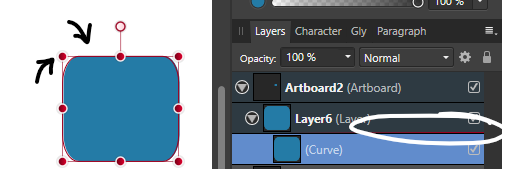
Oh I figured out the meaning behind the horizontal line beneath layers. Here it is for those who also want to know. The blue line beneath each layer indicates the color of the "selection lines" that appear around the object when selected with the Move Tool. Here is an example where I changed the color of the layer to dark red using: Right-click a layer → Properties → Click on the current color to change it. Only layers will have such a line beneath them. Thank you @MattP for the explanation, it just took me some time to figure it out.