

Michael Bobarev
-
Posts
51 -
Joined
-
Last visited
Posts posted by Michael Bobarev
-
-
Simple question …
when ? :)

-
Michail, thank you for your conversation with me ! -)
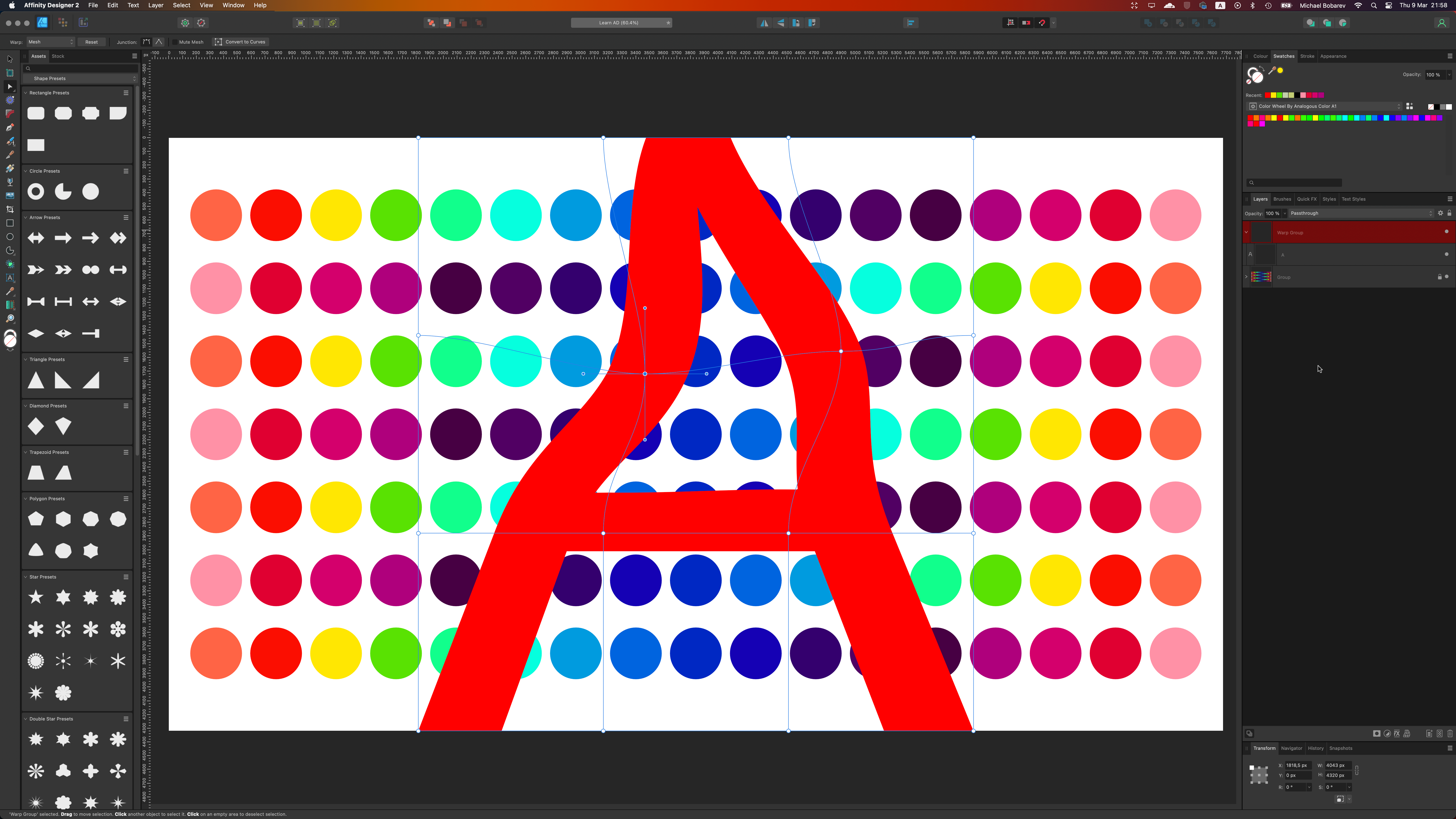
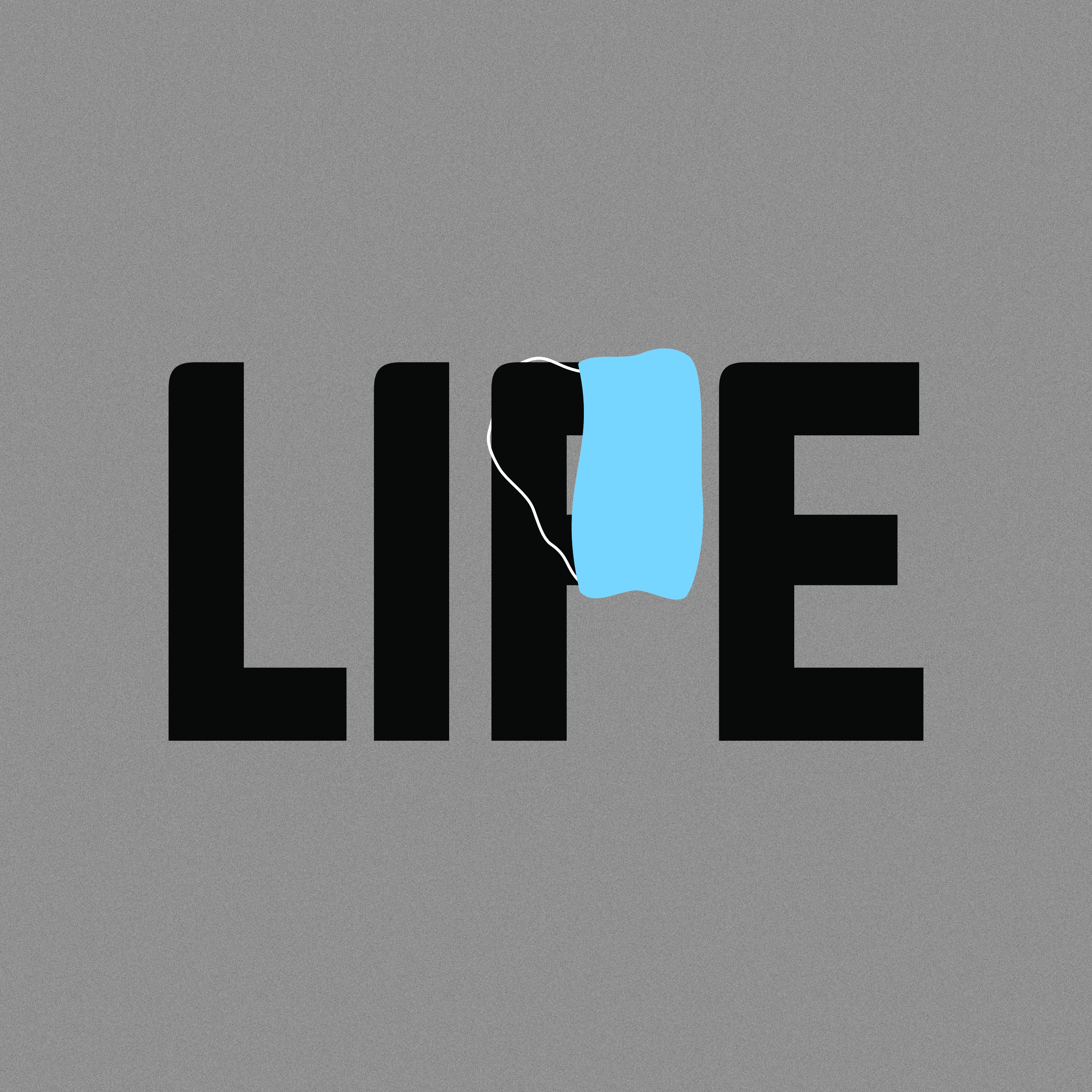
Mmm, i'm not about MASKING -)
Let's say i want to PUSH "A" ( Emboss ) into DOTS and move ( WARP ) borders of "A" letter in this case.
-
Hey guys,
interesting, how i can warping by using rectangles (or text ) to twist; embossing ... so i would like to use shapes as a borders of warping.
Is it possible? ( or feature request it is)
Thanks !
-
On 2/26/2018 at 5:55 PM, Bri-Toon said:
I forget what the exact wording was, but I remember a staff member saying something like if there were to be an Affinity web app, it would have to have a different approach because of how simpler website creation has gotten over the years.
I don't know what Affinity's take would be if they were to create one, but perhaps they could use similar tool as the ones in Blocs. I haven't used it for myself, but the promotion video sucked me in. Just a mention.
Hmm, Affinity ideas should be better …! 😁🔥
-
1 hour ago, DM1 said:
Unfortunately no 'import palette' available yet on iPad.
Sorry, I'm on "big Apple"
-
1 hour ago, madtho said:
Thanks for chiming in Michael, but this doesn’t address the request. What we’re looking for is to search for specific Pantone numbers within the existing palettes in Affinity on iPad.
Ummm,
I see.
-
Search, import ...
-
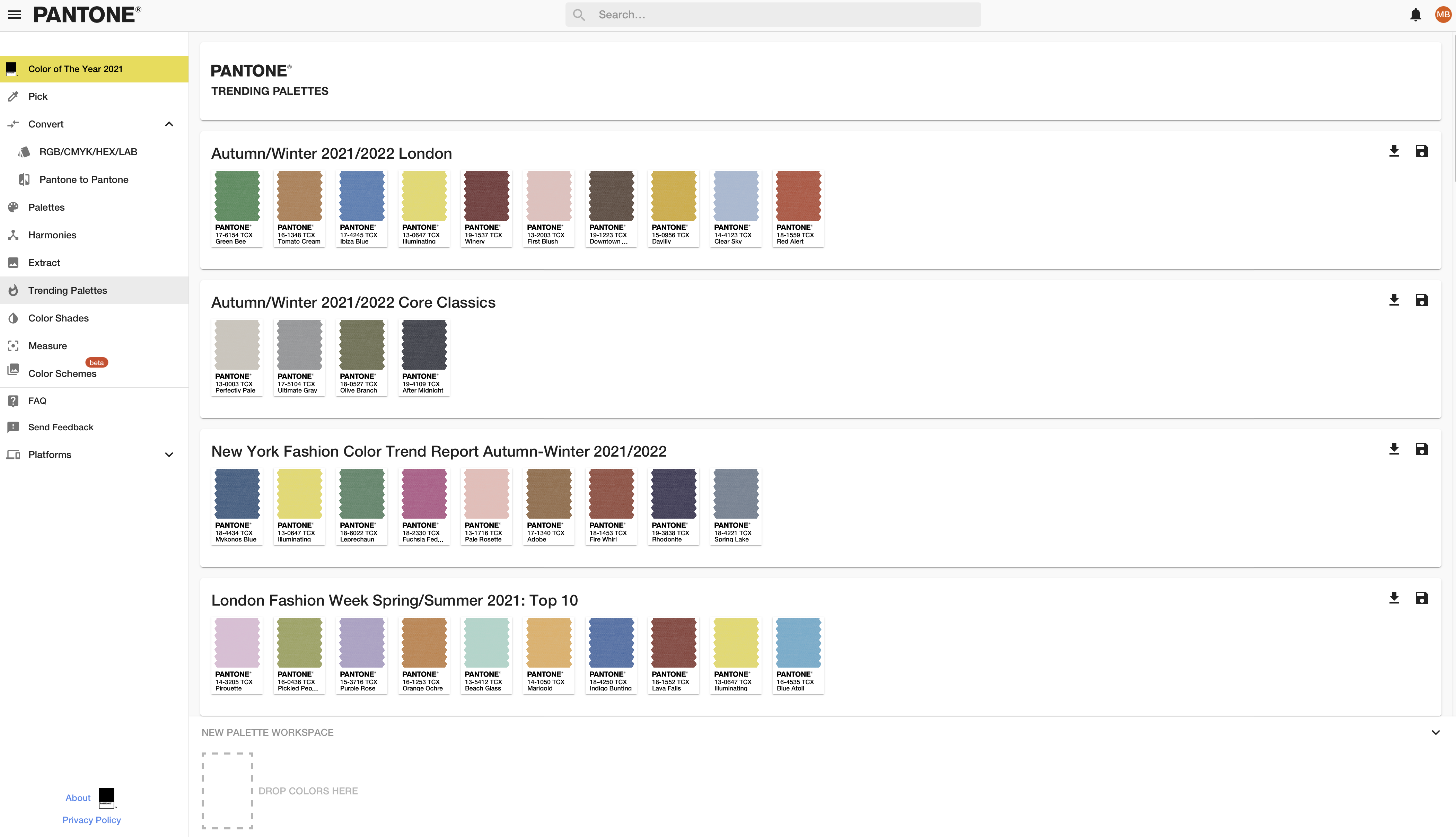
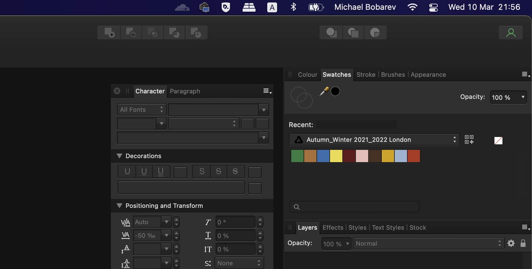
Hello guys!
Here are the steps:
1. Register @ https://connect.pantone.com/
2. Find your colors
3. Save and you'll get .ASE file
4. Go to swatches - import Palette
And create !
-
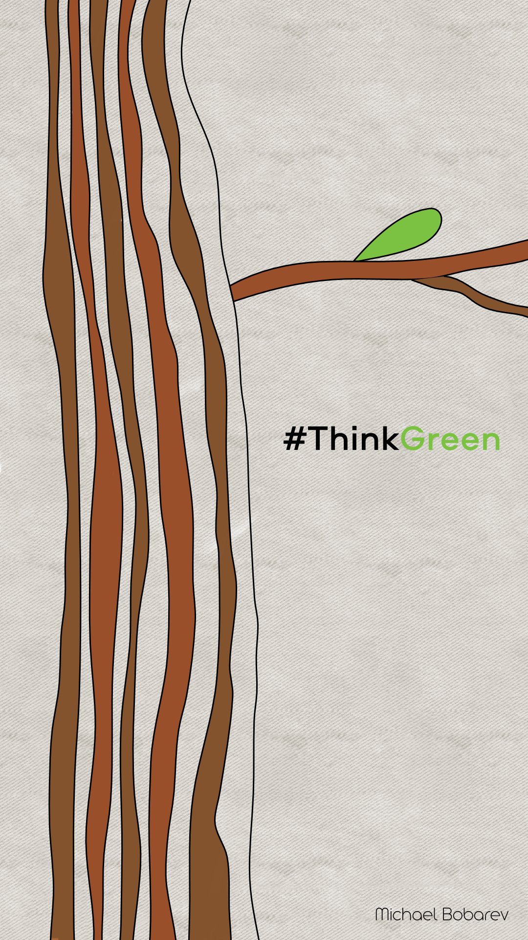
It's just about nature ! -)
- dannyg9 and Frances Proctor
-
 2
2
-
Amazing !!!
-
7 hours ago, Alfred said:
I see an eye, which is clearly a visual reference to the cameraman, but I don’t see anything relating to sound.
I agree with all of @postmadesign’s comments.
Sound doesn't matter -)))
-
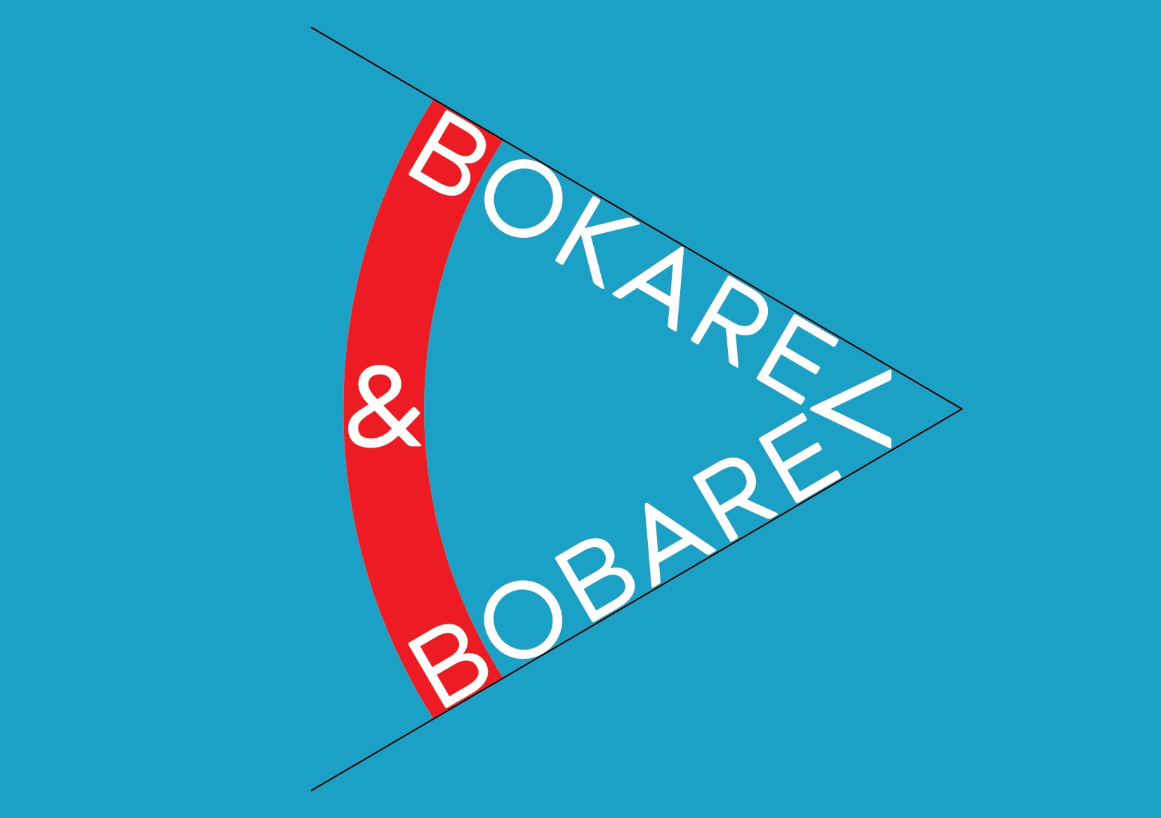
8 hours ago, postmadesign said:
An interesting idea that fits wel with the brand. I do think the colors need some work, as the red and the blue clash and create an unappealing look. I would be interested if the logo would work better if a Sans-Serif typeface was used?
Done ! Thanks ! -)
-
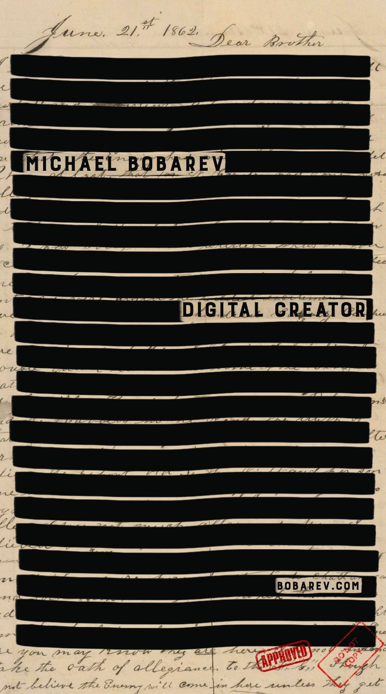
Fresh and secret contact card. Dont tell anybody ! -)
-
Hello ! -)
This is the brand logo of cameraman and soundman.
Your opinions ?
Thanks !
-
It's happening now ... globally ...
-
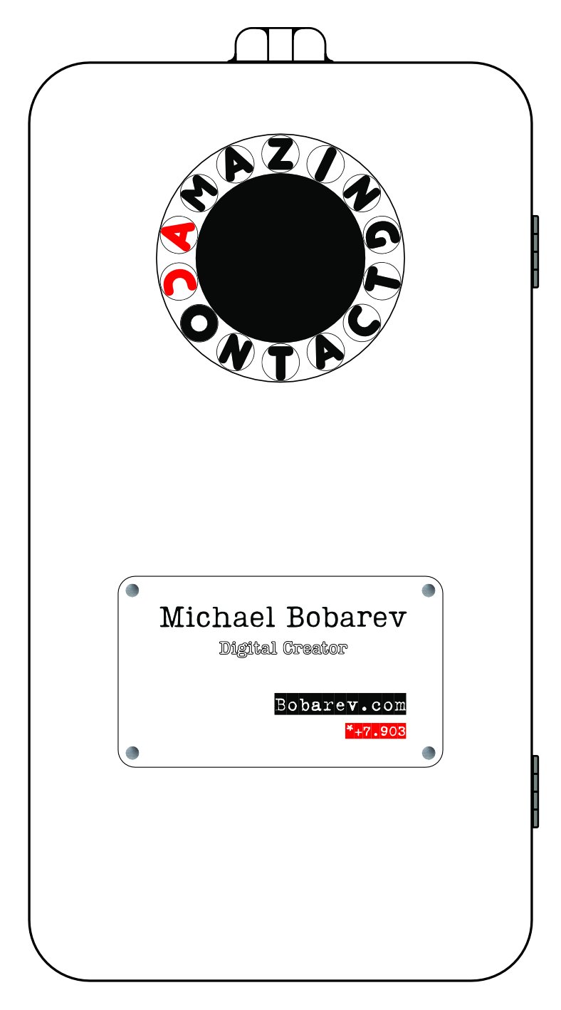
Hello everyone !
Here's my new contact card. Two vanity numbers "on board" -)
What do you think ?
Thanks !
-
It's happening now, isn't it ... ?!
-
-
On 3/18/2018 at 4:03 PM, v_kyr said:
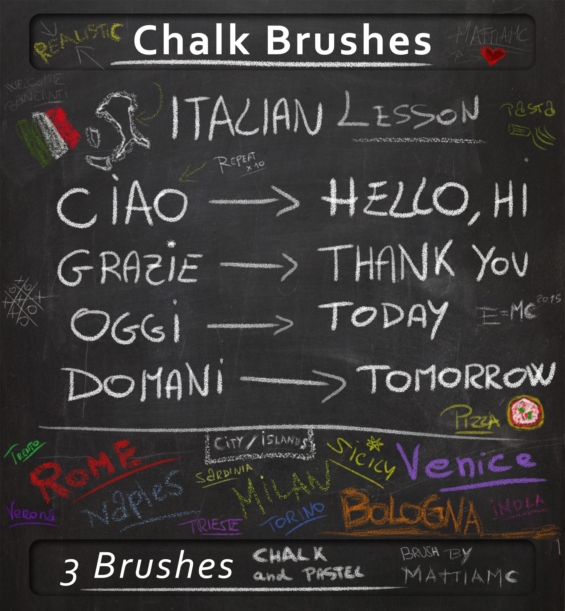
Well you can also import, reuse and finetune PS brushes (.abr format files) here, there are already thousends of those available. - Just some small chalk stuff you can play with ...
-
A chalkboard ...
-
Abr chalks
-
ABR file ...
Chalk MattiaMc.abr
ABR ... yahoo ! -) Thanks ! -)
-
A chalkboard ...
-
Hello to everyone, who loves Affinity ... !
Have created the group in the Telegram messenger to share your experience, free content and discuss knowledge.
Welcome: https://t.me/AffinityTalk
-
Less life and more prices ...
-
Future is IP -)
-
3 minutes ago, StudioJason said:
Nice....love the simplicity. Though hope it’s a ‘beautiful’...not ‘beatiful’ cats!🤪✌️
Thanks!
Sure, sure, sure !
-
4 minutes ago, dannyg9 said:
Not sure about the color scheme but I like the whole logo. Nice attention to letter spacing and balance. Aside from the color the only other bit I'd experiment with is the ampersand. I love type-centric circular logos that work and this one is just about there.
Thanks! -)


38 Gradient Maps for Color Grading
in Resources
Posted
Amazing !
Thanks !