

lacerto
-
Posts
5,783 -
Joined
Posts posted by lacerto
-
-
17 hours ago, macfloer said:
What can be the reason?
At least if you have any fonts originally embedded in placed EPS files, they will be converted to curves (already when placed). Some effects applied to text might also do it, e.g. using a gradient or bitmap fill within text (text format is retained until you export to PDF). More often, though, you would experience adjustments and effects in context of text resulting in rasterization rather than auto-conversion to outlines. Can you post an example, or a screenshot showing the contents of the Layers panel, as a reference?
-
I am not sure if it breaks anything but Layer > Ungroup all lets export the design without problems (but why complex grouping halts the processing, I have no idea).
-
8 hours ago, GeirSol said:
Can you explain a little more about pdf passthrough and K100black
I ran a test on Sibelius created PDF using one of the sample files and while the output is in pure RGB and its nominal DPI is 72, the output is so well structured that once you have the fonts installed, you should have no problems opening the PDF file and have full control of the score, editing it if needed, and adding whatever other content you wish to have in the publication, and create a good press-ready PDF output.
Basically you have the following options:
- Creating an empty CMYK [or RGB] Publisher document and place the Sibelius created RGB PDF page by page to be passed through. Your output, however, will be RGB (black being RGB 0, 0, 0), which the printshop could easily convert to K100, but whether they do this, depends on the printshop. Most require CMYK output, and if so, you cannot use this method. Basically placing a PDF in passthrough mode is the safest method to have actual score flawlessly printed as Affinity apps will not interpret the content in any way. But there is this color mode issue, and possibly also the fact that you cannot edit content that is placed to be passed through, that make this choice unsuitable for your purposes.
- Opening the Publisher created RGB PDF as a Grayscale document. The RGB black will be interpreted as Gray 0, and when you also export the document in Grayscale mode, the output will be DeviceGray (basically same as a CMYK file with output only on the K plate). The limitation with this choice is that you cannot have color content in the same publication. But when you open a PDF, the benefits are that you can edit the content as you wish, so you could e.g. fix those ligatures.
- Opening the Publisher created RGB PDF as a CMYK document and assign it the printer required color profile (e.g. Coated Fogra 39). Your all black would initially be interpreted as RGB 0, 0, 0 (which is same as Gray 0 in Affinity apps), but you can fix this with two easy operations: select an object that has "black" fill, then choose Select > Select Same > Fill Color, and in the Color panel, make sure that you have Fill assignment active, then switch to Sliders mode and select CMYK as the color model and then set C, M, and Y to 0, and K to 100. Then select an object with black stroke, like any of the staff lines and choose Select > Select Same > Stroke Color, make sure that you have the Stroke assignment active, and set C, M and Y to 0 and K to 100. Now you have all objects in your document set in K100. UPDATE: Using this method would allow you to place any content at all freely and have full-fledged publication suitable for printing press, and also easily producible for digital purposes.
- [UPDATE] Opening the Publisher created RGB document as RGB document if there are no needs for producing CMYK for printing press (but just produce digital media or print to desktop printers). If targeting to printing press and CMYK colors are required, using the Select Same command similarly as above but convert all RGB 0, 0, 0 fills and strokes to K100 would of course be available, but I do not think that there are any benefits of producing like this.
Please note that in order to use the Select command in whole document scope, you need to have Publisher version 2.
Here are example files to play with:
Choir - Full Score.pdf -- Sibelius 7 created PDF export in RGB format
Choir - Full Score_gray8.afpub -- the RGB file opened in Gray/8 mode: RGB 0, 0, 0 black will be interpreted as Gray 0
Choir - Full Score_cmyk.afpub -- the RGB file opened in CMYK/8 mode, and the RGB/Gray black is replaced with CMYK black (C0M0Y0K100).
Choir - Full Score_gray8_press.pdf -- DeviceGray output
Choir - Full Score_cmyk_press.pdf -- DeviceCMYK output
Btw, as for the ligature issue, the font is really part of the problem, but the problem might also be related to the way you initially created those ligatures. At least Sibelius version 7 cannot automatically create ligatures, even standard ones, like "fi" and "fl", so to have them you would need to replace regular "fi" and "fl" combinations with actual ligature glyphs (e.g. when importing lyrics from a text file). This is not the "correct "way to apply ligatures: it should be done by ligature formatting so basically "fi" and "fl" are used as true two-letter combinations but just marked as ligatures so that they get rendered with ligature glyphs in apps that support this. When using hard coded glyphs, instead, the kinds of problems you have now faced when editing the PDF content, are common. EDIT: Later versions of Sibelius might support ligature formatting and also advanced OpenType features to allow more sophisticated creation of scores, so what is mentioned above might not apply when using current versions.
UPDATE: I forgot to add as a conclusion that IMO Affinity Publisher does an excellent job in opening and processing Sibelius created scores. Now that version 2 has the powerful global "Select Same" command, problems related to color conversions are no longer critical and it is a quick job to make the required changes. It would require a more complex score and an expert knowing well the source material to be able to tell whether there are any serious rendering errors, but opening Sibelius score PDFs in Publisher at least appears to work very well.
-
As far as I know there is no way, other than selecting an object with the color to be changed and selecting separately the "same" fill color and stroke color (Select > Select Same > Fill Color and Select > Select Same > Stroke Color) and then assigning the fill and stroke of found objects the spot color swatch that you have already created. "Fill" seems to select also fills within text frames even if it does not visually appear so, so it is not too bad. But you cannot just change the type of color swatch from one color space to another (e.g. from CMYK to RGB/Spot color or vice versa).
-
As a workaround, you can place text frames and tables within table cells:

Objects placed within table cells however do not automatically resize when cell widths and heights change, so as with workarounds generally, there are limitations.
-
Why not let the tables do their best? Creating the bullet shapes using graphic tools and shape objects, converting them to text frames, controlling text frame vertical advance with fixed distance, specifying vertical center alignment for cells, and having at the same time all character and paragraph formatting available is a winning combination in these kinds of complex tasks, especially as the "macro formatting" can still be changed by using table-specific controls:
-
You have created the list differently from what is shown in the screenshot below, but disregarding how the bullet character is bound to the list, it is the text frame setting "Initial Advance" that determines where in the text frame the top row will start. The "Fixed" setting lets you specify an absolute distance so that the bullet character can exceed the frame edge, making it possible to align the first line of actual text to the top of the frame:
-
I just had a closer look on Academico Italic (I have version 0.81 by Steinberg Media Technologies GmbH, OpenType PS flavor). It does use a kind of doubly encoded fi and fl ligatures, in standard places and custom, which seems to confuse Affinity apps -- but not e.g. CorelDRAW, or Adobe apps, when opening a PDF using them:
Times New Roman, e.g., does not do so:
Affinity apps do not have problems with ligatures in e.g. Times New Roman, but cannot interpret them in Academico font, no matter if the font has been embedded in full or using sub setting, and no matter if the export file is created by Affinity apps or other apps:
So, as it is, there does not seem to be other way to resolve the problem than changing the font, leaving "fi", "fl" etc. as non ligatures -- or manually replacing them in the layout. EDIT: ...or, letting the file pass through, but then you might have an issue with the color space, and inability to produce K100 black.
-
2 hours ago, GeirSol said:
But, changing the font now will require me to go through every 350 pages of my opera.
I'm using Sibelius 2022.12In version 7 you can Select all > Filter > Lyrics, and then change the font for the whole selection in one go. But it may of course cause issues if the replacing font deviates remarkably from the currently used. Just an idea, worth testing anyway at least those ligature parts first.
-
Another thing worth consideration is whether your version of Sibelius can export PDFs in color modes other than RGB (or possibly Grayscale, which in a CMYK document will be handled as RGB and ultimately output as four-color black). Mine cannot so my method of using output from Sibelius has been converting to black ink in Adobe Acrobat Pro. If you are going to open the PDFs for editing, you have the chance of replacing all RGB or Gray black with black ink only. But if you are not producing to commercial press, this is probably not an issue for you. Some print shops can also accept pure RGB workflows and do the necessary CMYK conversions on site.
-
Please just try changing the font you are using for lyrics. I have Sibelius 7 so an older version but the fonts that it uses work just fine, including ligatures, and export fonts exactly similarly as shown in your screenshot (sub setted, Identity-H encoding). The fact that the ligature "fi" is replaced with another glyph, "v", is a symptom that ligatures have been encoded in a non-standard way in the font you are using. Sibelius 7 uses e.g. Plantin MT for lyrics and ligatures in that font open just fine in Affinity Publisher.
-
The reason your images look a bit desaturated might be that your display is wide gamut, which means that screenshots without a display color profile embedded, if opened in Affinity Photo, would be assigned with whatever color profile you have defined in Preferences > Color. Based on your screenshot, you are using the default sRGB. That would result in desaturated colors since your wide gamut display's color appearance cannot be fully represented in sRGB [and the colors within the spectrum of sRGB would be rendered with lower values than in sRGB so producing duller appearance when used in sRGB color space]. So you would get something like this (the difference can only be simulated here on the forum since all images are narrowed down to sRGB gamut, so the saturation below has been decreased by image manipulation):
If you want to open the screenshots in Affinity Photo in their original appearance, you would need to assign them your display color profile when you open them for editing. If you have a calibrated display this would typically be an .icm file that your calibrator has created, or something more generic indicating the kind of display you have (e.g. one provided by the manufacturer of the display). On macOS, screenshots typically have display color profile embedded and called just "Display".
If you then would want to have the screenshots in sRGB gamut (for public use), you would need to convert them from the display color gamut to sRGB.
UDPATE: At least system screenshots under Windows 11 do not have a color profile attached, and if they did, assigning sRGB would be totally wrong. Some screenshot apps might convert the display colors to sRGB, but this should happen on user's consent and be just an option and alternative to using display colors.
-
If you first determine the largest width you can have for the puzzle that has the longest word list, so that all words still fit properly within margins, and then place all puzzle images at the same top margin (below at 0.25in from top) using the Select command to select all images within the document, you can thereafter use the "Transform Objects Separately" option to scale the width and height of all puzzles simultaneously. Note that even if you specify a dimension in the Transform panel, you actually define a scale ratio between the current and determined size, but as you probably have the same width for all puzzles, you should get uniform results. [Similarly when you position using the Transform panel, you actually define a distance from a specified reference point rather than an absolute position, and therefore vertical alignment at specific point like on the clip is only possible if the top position of the objects to be moved is initially at the same Y coordinate.]
Just remember to have the dimension lock turned on so that the height gets scaled using the same ratio. When you have the anchor set at top middle, all puzzles get scaled so that the top margin does not change. If you would rather have each puzzle centered, this unfortunately needs to be done page by page, as alignment operations cannot so far be applied separately for each selected page.
At the end of the video I move the position of the page number on the master page more to the right bottom corner and change the Blend Mode of all puzzle image layers from Normal to Multiply so that the underlying page number on the master page shows through (otherwise you would need to manually force the layer containing the page number text frame on the master page to be above the image layer containing the puzzle).
- Wayne Burrows and firstdefence
-
 1
1
-
 1
1
-
I am not sure if I got what you are after but wouldn't Justify Right create something like that, and just using the tab character in situations where you want a shorter line to be left aligned? If you do not want to have fully justified lines, you would end each line with a tab character, except the last one.
- Old Bruce and walt.farrell
-
2
-
For this specific font the solution was to get the version of font where overlapping outlines were cleaned, but when I had a closer look on the issue, it does not seem that mere support of variable fonts of an app is the key to avoid the problem. E.g., CorelDRAW and VectorStyler both fully support variable fonts but both show the outline issue with Montserrat, and it also shows when exporting e.g. to PDF, on both platforms. The same issue shows also with many glyphs (but not all) in some variable fonts, like SF Pro, but not e.g. in Skia, where there are no overlapping outlines when the font is used stroked, nor are there any when the font is opened in font editors (Glyphs and FontLab 8 tested).
So it would appear that it is a font specific issue, both in context of static and variable fonts, as it does not seem that an app can resolve this problem -- whether it supports variable fonts or not; in some situations like one presented here, one possible workaround could be creating a curves object with cleaned overlaps and then place a text object behind with zero opacity fill and no stroke, if it is important that selectable / searchable text is included in the export.
-
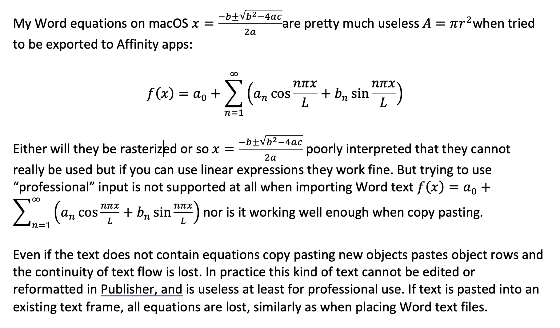
12 hours ago, jimrome said:
So the question is how do I make sure that the sizes of all these equations are the same?
Since raster format is ok for you, and you do not seem to need a tool that can actually convert already existing Word equations to whatever format that Affinity apps can read, you might want to have a look on the MathType Office 365 add-in. It is subscription based but its yearly costs is not too bad. I think it would be a reasonably useful tool in workflows that are based on text and equations imported from a Word document, and that works also on macOS:
a) When creating and editing in Word (all MathType equations stay editable while in Word):
b) When the Word .docx file is placed in Publisher, the font changed to Helvetica Now Text, paragraphs formatted fully justified, and equation numbering added:
-
Congratulations on finding a solution! Can you tell us a bit more: in which format(s) does it export? If in image format, how high resolution? If you copy paste, does it keep well the size (in relation to size it had in Word) so that you do not need to resize? Can you batch export just the equations?
-
18 hours ago, jimrome said:
Has anyone used Math+Magic? http://www.mathmagic.com/
I am just about to trying it out, I'll report back once I know more... MathType desktop version 7 that I referred above is no longer for sale as mac version (I have Mojave on an old mac and thought that. I'd try it but dead end there, too)...
UPDATE. Wow, the trial does not let me try out conversions or even copying via Clipboard -- not a good sign, and discouraged me from giving them any money to find out. To me the app appears convoluted, and it does not seem that it can convert modern Word equation objects in place and then batch export similarly as MathType does (unfortunately now available only on Windows), rather it (tries) to convert external equations. How successfully I cannot know, but I trust that if the equations are in dedicated equation format like MathML, LaTeX, MathType, MS Equation, conversion is done decently; but how about e.g. modern equations in PDF format, or equations in miscellaneous image formats? Pro version is also pretty pricy. It seems the app can also paste its equations in PDF and SVG vector format, which would mean good considering use in context of Affinity apps.
Hopefully someone using this app can comment!
-
Are you on post-Mojave macOS? If not, getting the legacy MathType 7 might be a possible solution as that version would allow conversion of all Word equations in one go first to native MathType equations, which when imported with Word document in Publisher, come as pretty good-quality Windows Meta File based compositions. In macOS version it is likely that the native MathType equations are in SVG or PDF format.
In addition, MathType would allow exporting MathType converted equations to one of the formats that macOS version of Affinity Publisher can read, possibly even PDFs (as math fonts and vectors). The version I have on Windows only writes EPS (the way in which MathType writes is poorly supported by Publisher) and WMF (which does not work on macOS version of Affinity app), but the latter works fine also when placed in Publisher, and the macOS version might well support exporting to PDF or SVG, instead. My version also exports monochrome GIF<sic>, pretty low-res, but the version 7 might write higher-res PNG. Just an idea, and worth testing if you have an older mac available...
-
I installed MathType Office365 plug-in on macOS Word and can say that it is not a solution: while it allows adding and editing equations using a similar editor as before, and does that job competently, the equations export as raster images, no matter whether transferred via Clipboard, within Word documents or exported as PDF. Individual equations can be saved as pictures, including formats like PDF and SVG, but sadly these, too, only include raster images.
The Office plug-in also does not seem to come with any of the features of the former desktop application, which allowed e.g. conversion of Word legacy and modern equations to MathType equations, and further exporting all equations of the document in one go to EPS files. They still have the desktop versions for Windows and macOS supporting these features, but as mentioned, as subscription based, and the macOS version it seems has not been developed past the 64-bit barrier so Mojave is the last version supported. So no macOS solution in this direction, either.
-
55 minutes ago, v_kyr said:
Sadly after Adobe took it over
They did not just take it over, but have continued to develop it strongly, now for nearly three decades, the most recent version was released in 2022, and the Macintosh version was dropped nearly two decades ago. Life seems to have continued for many in the industry despite this sad event, or might have even become better for some because of still being able to use this effective tool, which the former owners and developers nearly managed to kill. It is not a hobbyist tool but it is not pricy even for professional individuals, if it is enough to rent it only for the time it is really needed.
-
Interesting! What kinds of equations do you have? I was referring to inherent modern Word (latest version) equation objects and only simple ones can be transferred via Clipboard. I also cannot copy paste continuous text flows via Clipboard, and when importing Word files, all included Word equations are lost.
In Word:
And in Publisher:
Copy pasting the same document from Windows version of Word (latest version) to Windows version of Publisher (2.0.4, as new objects and as Enhanced Windows Metafile, using Paste As):
As shown, equations come pretty well but often need editing, and all text is pasted in parts so that continuity is lost.
If you have different experiences with e.g. older kinds of Word equations, or equations created with other methods, with third party apps, please share! It would be important to find alternative workflows and something that is not dependent on e.g. subscription based tools like MathType (or dependent on subscription based InDesign).
-
I have made a few posts earlier dealing with equations (related to Word, but also generally) and Affinity apps, and unfortunately cannot say that there has been any development.
On macOS the situation is particularly austere. If you have universal license and access to a Windows machine, you could open your Word document with equations on Windows and then copy Word equations and paste them as "Enhanced Windows Metafile" to get something workable (one would typically need to make adjustments like shown below, and also convert RGB black to K100), as shown on the clip below:
But you cannot import a Word document with equations (like you could when you use InDesign, at least to get placeholder equations to be replaced with file-based equivalents).
More practical solutions might involve getting a tool like MathType (nowadays only via subscription) and convert the Word equations en masse to PDF format and then import them into macOS Publisher. I have no experience of this workflow on macOS but can say that legacy version of MathType on Windows that only supports EPS and WMF vector exports does not work with Affinity apps (though still does work more or less flawlessly with Adobe apps) because Affinity apps cannot read properly either format.
On macOS there are probably SVG and PDF or raster based equation utilities that can produce something usable for Publisher on macOS, but if you need a workflow based on Word and Word created equations, I suppose you need to make a visit to Windows.
As a general note I think that dedicated utilities using something like LaTeX have smoother publishing workflows on Windows than on macOS, but more robust and versatile publishing routines might require something like Adobe FrameMaker (only available on Windows). We have long experience on using (LaTeX to ) Word to InDesign print publishing workflows and that works reasonably well though may require some additional manual work. I hope other users post some information on useful and actually tested workflows involving other apps and tools (on either platform).
-
I also asked this feature once, but at that time I had Apple Magic Mouse which was a particularly poor mouse and especially with this Affinity feature. I guess I have just learned to avoid scrolling inadvertently on top of controls, but my current mouse (MX Anywhere 3) behaves much better anyway (and anywhere :-)
Having app specific options like below might also alleviate how badly inadvertent scrolling changes settings:


Using images or characters as separators / dividers between scenes in a book
in Affinity on Desktop Questions (macOS and Windows)
Posted
One possiblility would be using a paragraph style (in this case center aligned) that applies a symbol within a font (in this case Unicode U+25ca LOZENGE in Arial) as a bullet character formatted with a character style (to get loser spacing and possibly different glyph size from the body text). The paragraph style is applied by using an assigned shortcut key Alt/Opt + B. Body Text style is defined as the "Next Style" for the Scene Break so that after the scene break (three lozenge symbols) has been inserted, just hitting Enter applies again Body Text style on the new paragraph.
Note that there must be any character following the auto-inserted bullet (in this case a space character is added) to be able to retain the bullet formatting.
EDIT: Having the bullet symbol in paragraph style would then let you change your mind and have basically any symbol at all in any font available to you to be used as a graphic element for the scene break, and have that change applied to all breaks within a document, like here changed to clapperboard 30pt in Wingdings: