Search the Community
Showing results for tags 'Blend'.
-
Being able to blend two objects along with their fill and outline colors would be very helpful in creating lighting effects.
-
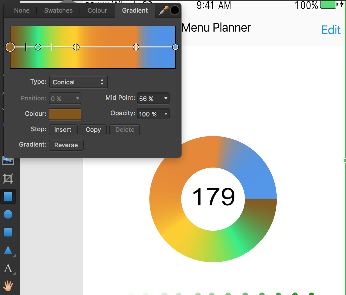
 As you can see in the image provided, the blue and brown colors are not blending. Is there anything I can do to blend them? Thanks
-
 Hello, First of all, thanks for all the great tutorial videos, they are a great help. I have watched and tried to follow the instructions in the Displacement Tutorial. Everything worked as shown until I try to change the blend mode. In the video the blend mode is set from normal to screen and the text changes from black to white. However when I try to do this the text goes from black to clear, in other words, it disappears. I can't see that I missed any settings so whee am I going wrong ? Thanks. Joe
 -
Vic Asecas on our Facebook page asked about creating a long shadow, it would be good to have in future. Here's the example effect Vic wants to achieve: When I had a play I struggled to make it look as good, it seemed to me that the effect can be approximated with dark shapes and a gradient transparency, but the gradient has a straight profile perpendicular to the gradient path. In Illustrator, this effect can be achieved using blended copies of objects that go from e.g. 20% opacity down to 0% with a blend spacing of e.g. 1pt. Even with a long shadow this produces vector banding like the bad old days, so I'm sure there's a nicer way we could achieve it. Mesh fills would be one possibility, obviously the Blend tool on the roadmap is another, but maybe a Long Shadow layer effect/tool is another possibility?
-
 Not sure if this is a bug, or if I'm misunderstanding something here, but I'm having an issue with blend modes and I was hoping someone could help me out. I have a gradient map nested in a photo (basically turning it black and white). The photo has a Multiply blend mode. Underneath, there is a blue solid layer. For some reason, this is turning out much darker than doing the same thing, just rasterizing the image and gradient map together (see attached images). The lighter version is how I expected it to turn out, but I'd rather not destruct my layers if I don't have to. Any idea why I'd be getting different outcomes here? Shouldn't the gradient map only be affecting the image since it's nested? Thanks!
-
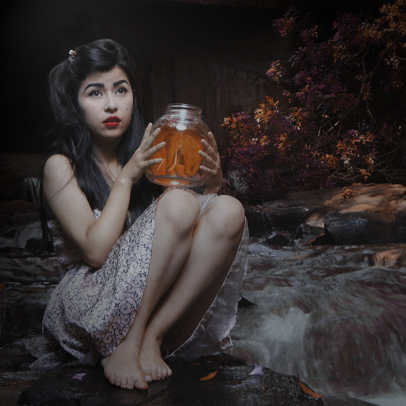
Here are a couple of quick composites created in Affinity Photo, changed the blend modes, added a lighting filter etc. 1. Elephant in a jar 2. leopard waiting to board Allan
-
 Hi everybody, at first i have to say that i´m deeply impressed of the Affinity products. Beautiful UI, beautiful features, good job. Personally i´m interested in digital painting and concept art. I try to use AP for these things. My problem is that i don´t know how to blend my shadows well. So which techniques and brushes could you recommend? Maybe you can give me some examples. greetings from Germany.
 -
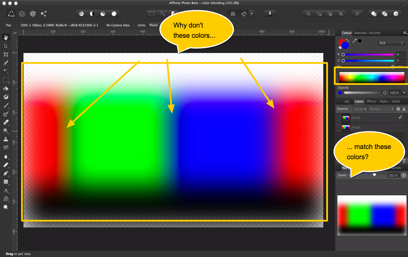
There's a new Minute Physics video about computer color that raises interesting questions in my head. The basic premise is that colors blend in strange ways on a computer because engineers are lazy and they do the math wrong. Take the attached screen shot as an example. Why don't the colors in my image match the palate? Can someone someone point in me the right direction to learn about why this happens, and why software wound up working this way? Is it actually doing the right thing, is it wrong but grandfathered in, or is there a good reason to leave it as it is? Thanks!
-
 The real-time previews of blend modes on hover from the layers palette is really nice (and fast). For that reason I am curious why this functionality wasn't added to the blend modes within the effects panel. It just makes sense that there should be consistency with the way preview blending modes function wherever they occur, and on-hover live previews in the effects panel would do that. Adam
 -
 Is there an equivalent method for Illustrator's blend (objects) along path? Perhaps the Power Duplicate does this? But does it work along a path? And if so, are the duplicated objects still linked to the original (ie, edits to one of these shapes updates the duplicated objects)? PS: As a designer for CNC/laser cutting, it's rather difficult to evaluate whether this is worth purchasing without a trial version.