William Overington
-
Posts
3,062 -
Joined
-
Last visited
Everything posted by William Overington
-
This thread has opened up some interesting topics. https://nameberry.com/babyname/Kazuko https://en.wikipedia.org/wiki/Kazuko There is a minor planet named kazuko. https://en.wikipedia.org/wiki/List_of_minor_planets:_6001%E2%80%937000#496 I looked up 'circuit tree'. There are various. https://www.etsy.com/uk/listing/550723782/circuit-board-tree-art-watercolor-print I am wondering as to what 'electronic prawn' refers. Looking forward to finding out what the artist does for that. What is the four lozenge logo on her forehead please? William
-
affinity designer Artwork for greetings cards
William Overington replied to William Overington's topic in Share your work
By viewing the fantastic.pdf document in Adobe Reader I have found that it was produced at 25/07/2014 09:42:42. William -
affinity designer Artwork for greetings cards
William Overington replied to William Overington's topic in Share your work
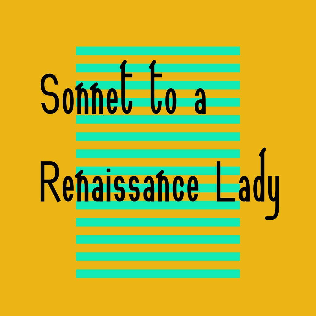
I recovered a copy of fantastic.pdf from the forum thread, opened it in Affinity Designer, and, as the font is installed, I could get a png out of it straightforwardly. Yet it was huge! So I have, as a test, made a reduced size one 1800 pixels wide. If readers want to have a go at the process the fonts are available from the following links by using a right-click to download to local storage. https://www.users.globalnet.co.uk/~ngo/SONNETRL.TTF https://www.users.globalnet.co.uk/~ngo/SONNC047.TTF William
-
affinity designer Artwork for greetings cards
William Overington replied to William Overington's topic in Share your work
I have just exported this image from CraftArtist 2.0 as a png file 1024 pixels by 1024 pixels. It is supposedly 85 pixels per inch, but I don't think that that will matter, it is the pixels that will be relevant as I am intending to paste it into a larger area and then export all of it as a jpg file at 300 dots per inch. It all seems a bit hairy, but ultimately if it prints to hardcopy at Papier that will be fine. The original png was 512 pixels by 512 pixels. I made this new export file as 1024 pixels b 1024 pixels. The idea is to paste it into a blank Affinity Designer document that is 2171 pixels wide by 1571 pixels high then centre it both horizontally and vertically. As the image is square I could use it to produce either a landscape format greetings card or a portrait format greetings card. I am choosing landscape as that means that I could produce another card similar to the one that I produced for the Gallery font showing the glyphs of the Sonnet to a Renaissance Lady font, and then frame the two cards together in one A4 frame so that the frame could be displayed portrait style with the two landscape greeting cards arranged per pale within the frame, with this colourful one at the upper position. William
-
Artwork for printing on objects
William Overington replied to William Overington's topic in Resources
Following the link to Tesco in the first post in this thread, Tesco is offering products called photo blocks. I have not known of photo blocks otherwise. Has anyone experience of seeing a photo block please? For example, do they have anything on the back so that they can be put on a picture hook? How thick are they? How do they usually get displayed, or what please? William -
Artwork for printing on objects
William Overington replied to William Overington's topic in Resources
Ah, this thread has been moved from Share your work to Resources. The thing is, I was hoping to find an object, then find out the correct size and then produce artwork using Affinity Designer such that it was suitable for the object. That is why I posted the thread in Share your work. Could the thread possibly be moved back to the Share your work section please? William -
There are some businesses that will produce one-off objects personalized photographically using customer artwork. There appear to be coffee mugs and other things. I am hoping that I can find a cylindrical ceramic vase, like a coffee mug but without a handle and maybe taller if possible. It would also be good to be able to get a personalized ceramic wall tile to a standard size so that one could include one within an array of plain white tiles. Here is one link to explore. https://www.tescophoto.com/personalised-gifts.html William
-
affinity designer Artwork for greetings cards
William Overington replied to William Overington's topic in Share your work
From time to time for over twenty years I have produced artwork and uploaded it to the web, either to my family webspace or to a forum. It is only recently that I have found that I can get one-off quality matt prints, as if photo greetings cards, at a reasonable price. I have thus far sent for prints of nine different designs, some recent new designs designed with producing a card in mind and taking the design requirements in mind, and some where I have tried to do the best that I can with what is extant in relation to older designs: for example, the original source files may no longer be available, so I do what I can with an extant image that may be of less resolution than would be best if the source file were still available if the design were originally a vector design. I have been looking through some old threads and I have thus far found two images of which I would like a hardcopy print suitable for framing. I am reasonably confident based on experience so far that I can probably get something, but I am trying to think of the way to get the best result. The first image is from over seven years ago, and is the fantastic one on page 10 of the following thread. There is a graphic and a PDF document. Maybe opening the PDF in Affinity Designer is a good approach to try. https://community.serif.com/forum/pageplus/13402/art-show-online-in-this-forum The other one is from a Serif forum thread that I cannot find where images 512 pixels by 512 pixels were produced, each highlighting one font. Fortunately I have the CraftArtist 2.0 source file for that image and it appears to be a vector design. I know that both Alfred and I posted in that thread. William -
affinity designer Open Air Fonts
William Overington replied to AdamStanislav's topic in Share your work
Possibly. Well, that is one guess. However, you could perhaps consider that I may have used it and forgotten about it. I don't remember using it, but I am not going to say that I have not because it is entirely possible that a High-Logic thread might come to light where I did. While writing this post, I now seem to remember that I did sometime produce a font named Kern Deco but whether I used auto-kerning I don't remember. https://forum.high-logic.com/viewtopic.php?f=10&t=1823 William -
affinity designer Open Air Fonts
William Overington replied to AdamStanislav's topic in Share your work
11,341 seems a large number. Can you say how you got to that number please? Is there some sort of software tool that does that or did you need to enter them manually? William -
affinity designer Open Air Fonts
William Overington replied to AdamStanislav's topic in Share your work
Is this using the same multi-font layering technique as I used in my Galileo Lettering fonts? https://forum.high-logic.com/viewtopic.php?t=859 The events of the first part of the backstory took place over fifty years ago. William -
Thank you for posting. I note that you used Affinity Photo. I have Affinity Photo installed but I have never used it. I could not get it to work in Affinity Designer. Before I first posted I got the PRIMROSE part at the top without using Artistic Text. In fact I had keyed the text in WordPad and did a copy and paste onto the path. William
-
I am trying to produce some artwork like a house sign using Affinity Designer. One of those signs that has a path of a half ellipse convex upper at the upper part of the sign with the word PRIMROSE on the path, and another half ellipse concave upper below it with the word COTTAGE on the path, so it looks like a landscape orientation ellipse path but in fact it is done with two separate half ellipses. I have managed to do the upper part fine, drawing an ellipse, convert to curves, break at the 6 o'clock point, delete two points, convert to a path, add the text. However, the lower part is the problem. I have produced the path in a similar manner to the other path yet breaking at the 12 o'clock point. That part is fine. I want the text right way up going from left to right along the concave up path. That is the problem. I seem to remember seeing a thread with this or a similar sort of problem and a clever solution, but I cannot find it and present. So either a solution or a link to that thread if it rings a bell with anyone would be helpful please. William
-
affinity designer Open Air Fonts
William Overington replied to AdamStanislav's topic in Share your work
Thank you. Thank you for the smiley appreciating the humour. Yes, it was my mistake, I clicked the link, saw the .ufo at the top and got in a muddle. I should have checked. My reply to Alfred was because I have written a novel, which Alfred has read as I published it on the web chapter by chapter and for which Alfred has provided very helpful reader feedback(including proofreader feedback!), and it is a recurring theme from time to time that one of the main characters often avoids saying 'Yes' when asked if she did something but replies with 'Possibly'. As it happens I answered 'Possibly' to a question by Alfred in a thread in another forum this morning in the same way, though perhaps not quite as obviously meaning 'yes', and we are now looking at associative meaning in the use of particular fonts in particular circumstances, as in that the font used for a florist shop is not usually the same as the font used for an ironmonger shop. You might perhaps like the thread, it starts off with a link to a video. I enjoyed watching the video all the way through. https://community.serif.com/discussion/116223/font-readability-not-what-you-think William -
affinity designer I (heart) science shirt
William Overington replied to segts's topic in Share your work
As a vegan I don't go anywhere near the horror of the type of shop that you mention, so fortunately for me I do not see it William -
affinity designer Open Air Fonts
William Overington replied to AdamStanislav's topic in Share your work
Possibly. William -
affinity designer Open Air Fonts
William Overington replied to AdamStanislav's topic in Share your work
I notice that the files each have a .ufo extension. What exactly is that and how does one use such a file in Affinity Designer please? Is this a font file in the usual style of using a font? Why are the files not .ttf or .otf files? William -
affinity designer I (heart) science shirt
William Overington replied to segts's topic in Share your work
In the upper picture the image of the heart seems to go outside the bounding box. Is that right? Also, is the heart that colour? William -
Thank you both. That template files can be accessed in any of the applications is good, because it seems to me that if I set up a template for a single page at 1571 pixels wide by 2171 pixels high at 300 dots per inch then it could be used in any of the Affinity programs to be the blank canvas of the right size to produce a jpg file to be correct for producing a customized greeting card using the following. https://www.papier.com/portrait-photo-315 That is, artwork for a card 7 inches tall by 5 inches wide with a 3 millimetre bleed area on each edge. I have found that the left-side bleed area is still on the card, so that it runs down the spine of the fold and so helps in the appearance of a framed card. However, although they say CMYK I found, because I forgot to set up CMYK, that if I send the jpg file in RGB that the colours come out bright so I continue doing that. William
-
A question please. Is the design idea that a .aftemplate file can be used in any of the three Affinity application programs? So, for example, if a .aftemplate file is produced in Affinity Designer can it then be used in Affinity Publisher? William
-
I don't understand. That is probably mostly because I don't have a printer at present. And that I do not have much experience with Affinity Publisher and most of what I have done with it resulted in images or a PDF for the web. William
-
The workshop is underway, four posts and fifty-two views thus far. William
-
In what ways please? I was wondering whether if the template is set up at 300 dots per inch, would an image used in the template need to be 300 dots per inch too. So if the template is set up at 300 dots per inch and an image that is 96 dots per inch is placed upon it, what happens to that image if a whole of document image is exported from a document that has been produced by the use of the template? Suppose that as a first template that we have a portrait format greetings card and that it has an image and below it a line of text with a message that says Greetings and that there is a white border around both the image and the text. William
-
Ah, issues to resolve. How large should the image be? Does that matter if the image is just a placeholder image, or is it a constraint on for what the template can be used? How many dots per inch does the image need to be? Does that matter if the image is just a placeholder image, or is it a constraint on for what the template can be used? William
-
I presently know nothing about Affinity Publisher templates. So, start up Affinity Publisher Help Affinity Publisher Help Search for template Ah, a link for Document templates Quite a lot to read So, it seems that our goal is to produce and share some template files each of which has a .aftemplate file extension. How about a first try, to get started, of a one page template that has an image and some text below it. The idea being that a user of the template can change the picture or the text, but that the picture included and the text are there so as to give an idea of what sort of result the template can produce. So we need a picture, one without copyright issues, so I suppose make one myself. So, while I do that, maybe someone reading this will post please and help get the workshop going. William