transitdiagrams
-
Posts
405 -
Joined
-
Last visited
Everything posted by transitdiagrams
-
affinity designer Sarajevo - Tram and Trolleybus Transit Map
transitdiagrams replied to transitdiagrams's topic in Share your work
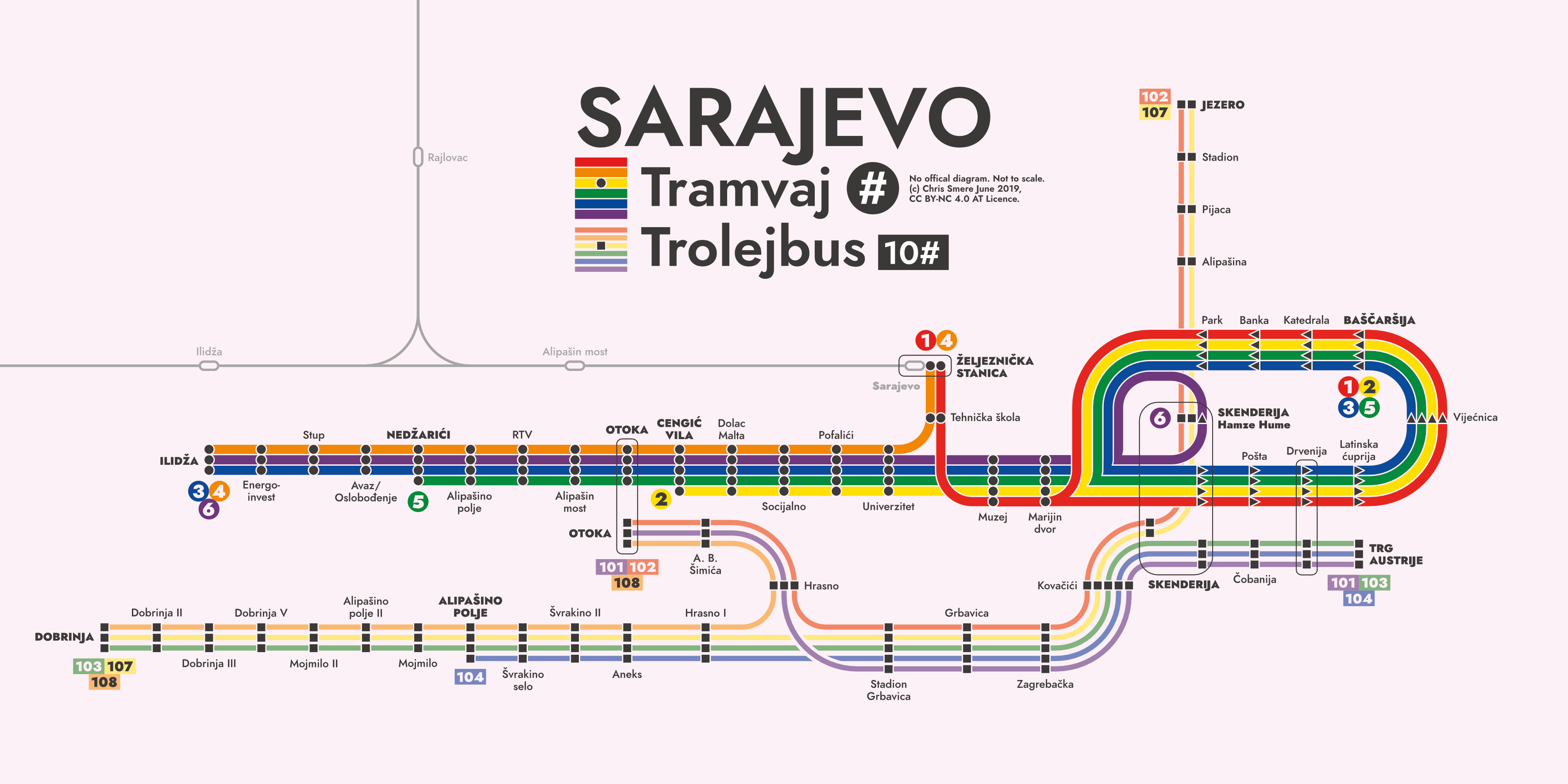
Hi @GarryP! Made an updated version thanks to your input and feedback! Main changes: Trolley bus station design is now reflected in the route numbering too (rectangular). And have added a little bit of information to the key. What do you think (especially about the key addition)?
-
Analyze files Dateien zu analysieren
transitdiagrams replied to Guzzi's topic in [ARCHIVE] Photo beta on Windows threads
Hallo, Guzzi? Hab früher Win 7 gehabt, aber nie so eine Meldung bekommen. Arbeite nur mit Win 10 und 8.1 und dort ebenfalls keine Probleme... Nutze die stets aktuelle Version. Ist das nach dem Update gekommen? Hast du das dann abgeschickt? Und ist die Meldung noch einmal erschienen? Windows ist aber auch manchmal seltsam ... -
affinity designer Sarajevo - Tram and Trolleybus Transit Map
transitdiagrams replied to transitdiagrams's topic in Share your work
Not sure about your key idea (would be problematic for the trolley bus numbers as the lines are smaller and the numbers are longer) but it has given me another idea for the key wich I am going to implement next time. Thanks! PS: Relaxation is a nice concept which fits perfectly as I do draw this maps to relax. :-) -
affinity designer Sarajevo - Tram and Trolleybus Transit Map
transitdiagrams replied to transitdiagrams's topic in Share your work
Thank you =) Really appreciate it! I see what you mean but I always try to keep the key as minimal as possible. The numbers speak for themselves in my opinion but you are right, people, so it could be wise to write them in the key as well. About the sorting according to colors: normally I try to do it. In this case I sorted them according to their value. In your mock-up the text label is now in the loop which I wanted to avoid. Like to have the labels on the same side whenever possible. Apart from that it looks good too. Will rethink that for any future iterations. Thanks! -
Hey again :-) I do transit maps (diagrams) for fun in my spare time to relax. Here is another one of my recent works: the Sarajevo Tram and Trolleybus Network in my own interpretation (unofficial of course). By the way: there is no official diagram and a pride month edition as there aren't official colors too. The whole map is entirely done with Affinity Designer. If you have any thoughts on it or feedack this is much appreciated. Have a great day! Chris
- 7 replies
-
- 9
-

-
- sarajevo
- transit map
- (and 3 more)
-
[Implemented] Data merge
transitdiagrams replied to CusumanoCasper's topic in Feedback for Affinity Publisher V1 on Desktop
I also do need data-merge +1 -
Thank you @Alfred! Wonderful function!
-
Unchangeable background color in Text Tools
transitdiagrams replied to transitdiagrams's topic in V1 Bugs found on Windows
Thank you! That is actual a simple work around. Opening in Publisher also helps as there is an option to remove that fill. And no, I hadn't used it as I do not know this function "Synchronize Defaults from Selection". -
What does power duplicate mean?
-
As stated above you might want to use the "Add Applicication Palette" function so you can set up collections of your most used colors and use it in all documents. off topic: being able to group colors within a palette would be a nice feature though.
-
Posted this in the Publisher forum but I think this might be nice for all apps:
-
Good morning! You have done a amazing work so far - thank you guys! Regarding the welcome screen I'd like to make a proposal: Would it be possible to add a list of the recent (3 to 5) docs? Maybe as an optional feature to turn off/on in the preferences? I use to open the program and then open the recent files which I have to select via File -> Open Recent. If it were on the welcome screen it would be just a click. Don't know whether I am the only one having this habbit. All the best, Chris
-
affinity designer Nottingham - Tram Network Transit Map
transitdiagrams replied to transitdiagrams's topic in Share your work
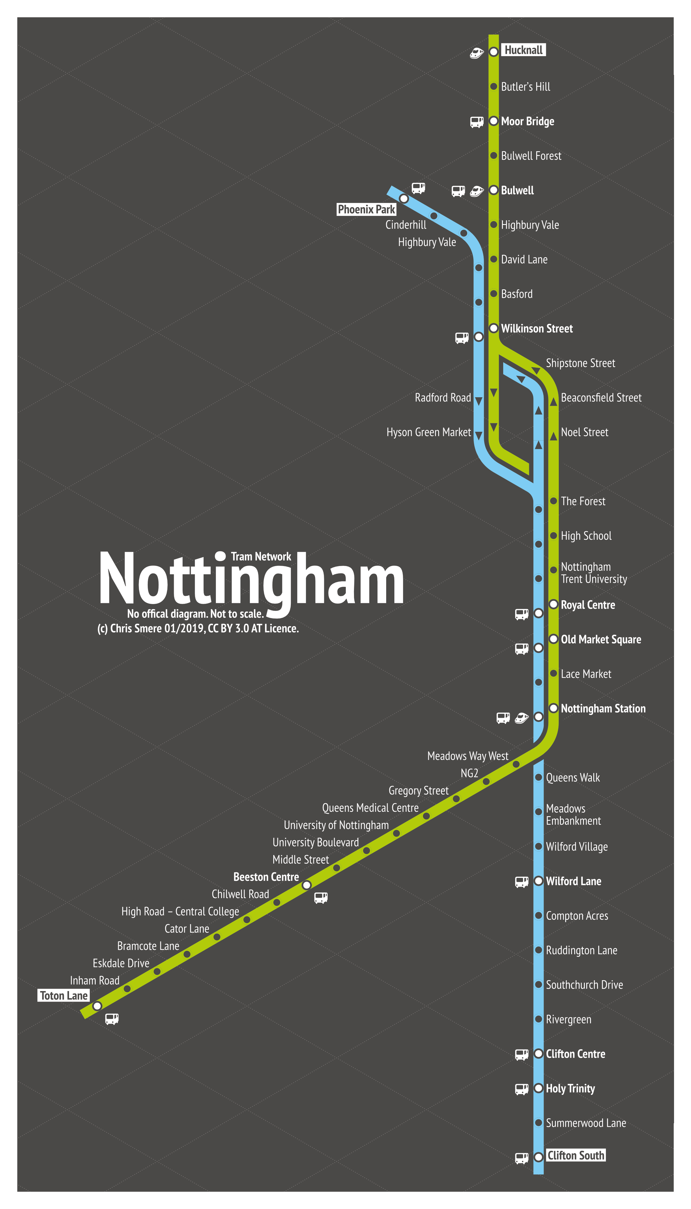
Of course (it's not my favorite at all, especially its recents iterations), but that's not my major influence. More important to me are Massimo Vignelli's transit map works (especially New York City MTA Map from the 1970s and his never used map drafts for the Washington DC WMATA).- 25 replies
-
- 2
-
-

-
- nottingham
- tram
- (and 5 more)
-
affinity designer Nottingham - Tram Network Transit Map
transitdiagrams replied to transitdiagrams's topic in Share your work
By the way: have done a pridemonth rainbow edition too :-) This one is highly experimental (gradient backgrounds are always problematic) and not intended for daily use. Just for fun :-) I love the result.
- 25 replies
-
- 3
-
-
- nottingham
- tram
- (and 5 more)
-
affinity designer Nottingham - Tram Network Transit Map
transitdiagrams replied to transitdiagrams's topic in Share your work
Hey @GarryP! Have exchanged the train icon and enlarged the icons overall a bit:
- 25 replies
-
- 3
-
-
-
- nottingham
- tram
- (and 5 more)
-
affinity designer Nottingham - Tram Network Transit Map
transitdiagrams replied to transitdiagrams's topic in Share your work
Hmmm haven't had a look at it yet but know this service and was never a fan of it. I guess I will have to set up a website for best control and experience. In the meantime I'll try to update my Behance portfolio with my published maps. -
affinity designer Nottingham - Tram Network Transit Map
transitdiagrams replied to transitdiagrams's topic in Share your work
That's all Instagram is capable of. I know it's not the best way to show my maps but I don't want to run a website at the moment. On Twitter it's better - they let you see more details. And some of my maps are also on my Behance portfolio - this is the best way to see (for now). :-) -
affinity designer Nottingham - Tram Network Transit Map
transitdiagrams replied to transitdiagrams's topic in Share your work
Thank you for your detailed explanation! you are right about letters as icons. I think the best would be to change the icons =) thanks for your input! I will post an updated version soon! :-) -
affinity designer Nottingham - Tram Network Transit Map
transitdiagrams replied to transitdiagrams's topic in Share your work
hey @GarryP! nice and interesting ideas you have. the last one seems to be the best one. my solution would be to use either other symbols which are not that similar to each other or use letters (B for bus, R for rail) in solid circles. what do think of my proposals? -
affinity designer Nottingham - Tram Network Transit Map
transitdiagrams replied to transitdiagrams's topic in Share your work
Hey @GarryP! Thank you so much! and also appreciate your feedback! I thought this one is self-explanatory but you are definitely right - people! Don't want to add more than needed... The icons itself could be more differentiated, though. My intention was to show every service (line) for its self. I know that connected station symbols are common but still I wanted to use Massimo Vignelli's idea of showing every stop with a dot (he designed the famous 1970s NYC Subway map). I don't do it in all my maps - so you can see other concepts. Would love if you have a look at my Instagram! And I am always happy to answer any question about my maps. Chris -
affinity designer Nottingham - Tram Network Transit Map
transitdiagrams posted a topic in Share your work
Hey :-) I do transit maps (diagrams) for fun in my spare time to relax. Here is one of my recent works: the Nottingham Tram Network in my own interpretation (unofficial of course). The whole map is entirely done with Affinity Designer. If you have any thoughts on it or feedack this is much appreciated. Have a great day! Chris
- 25 replies
-
- 14
-
-
- nottingham
- tram
- (and 5 more)
-
Unchangeable background color in Text Tools
transitdiagrams replied to transitdiagrams's topic in V1 Bugs found on Windows
Yes, opened the PDF in AD, did some editing, format changings, and saved it as a ADfile. The issue occurred before saving it as an ADfile. Thought by saving it and re-opening it the issue would have gone. Don't have the PDF with me. It's at work and in Austria it's a long weekend. On Tuesday I will have access again. Maybe something can be seen in that strange behaving file already. -
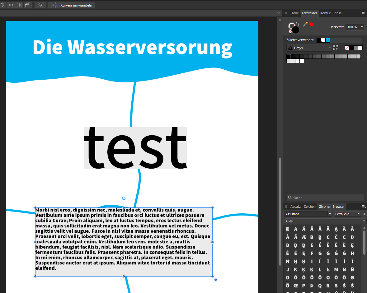
Hey! Thanks again for the good work and the nice recent updates! One of my files does something strange, though: Every new text object (not only the text frame) has an unchangeable background color. I know that it is by design when I convert shape into a text Frame. But this time I only use text frames or artistic text. Closing the application and Opening the file again doesn't help. Although only this file behaves like this. I can even copy text frames from new documents without a background color and it works. In the file there is a transparent frame text which comes from another file. The file was originally a PDF. Maybe this is important in this case too. In the screenshot you are seeing: the first field is an artistic text with grey background the second field is a text frame with the same Problem Never set any Background - the were created like this - only in this file! I have attached the file if needed for inspection. Seems like a bug only in this file - thought it might be helpful to know. All the best, Chris test.afdesign
-
I have used it for some flyers, posters and now using it for a booklet. So far no real problems - and if I encouter issues I notice them via the forum. For many issues I find work arounds (myself or somewhere online). They have done a great job! Looking forward to any future versions and new features.
-
What I've said is just the way as I myself see and experience it in my daily work life. The intended purpose and its actual use are two different things. :-)
- 14 replies
-
- 1
-
-
- placing pdf
- (and 2 more)