HuniSenpai
-
Posts
114 -
Joined
-
Last visited
Everything posted by HuniSenpai
-
Well, here's a way you can recreate a similar problem to his using a bug in the program. Here's how you recreate this issue: Make sure "enable assistant" is checked. Then turn on "apply tone curve." Then uncheck "enable assistant." Your image should now look punchy and high contrast, even though the assistant is not supposed to be doing the tone curve anymore. Click develop and watch as the adjustments dissapear and you're back to a neutral image. Obviously he's not going through those convoluted steps every single image develop, but perhaps this issue is in some way related to this. Also, @Cody Carson, try checking "convert opened files to working space" under preferences -> color. I have it checked on mine, and it doesn't appear to be checked on yours. Additionally, try turning on assistant, and then changing "exposure bias:" to "apply exposure bias as initial state."
-
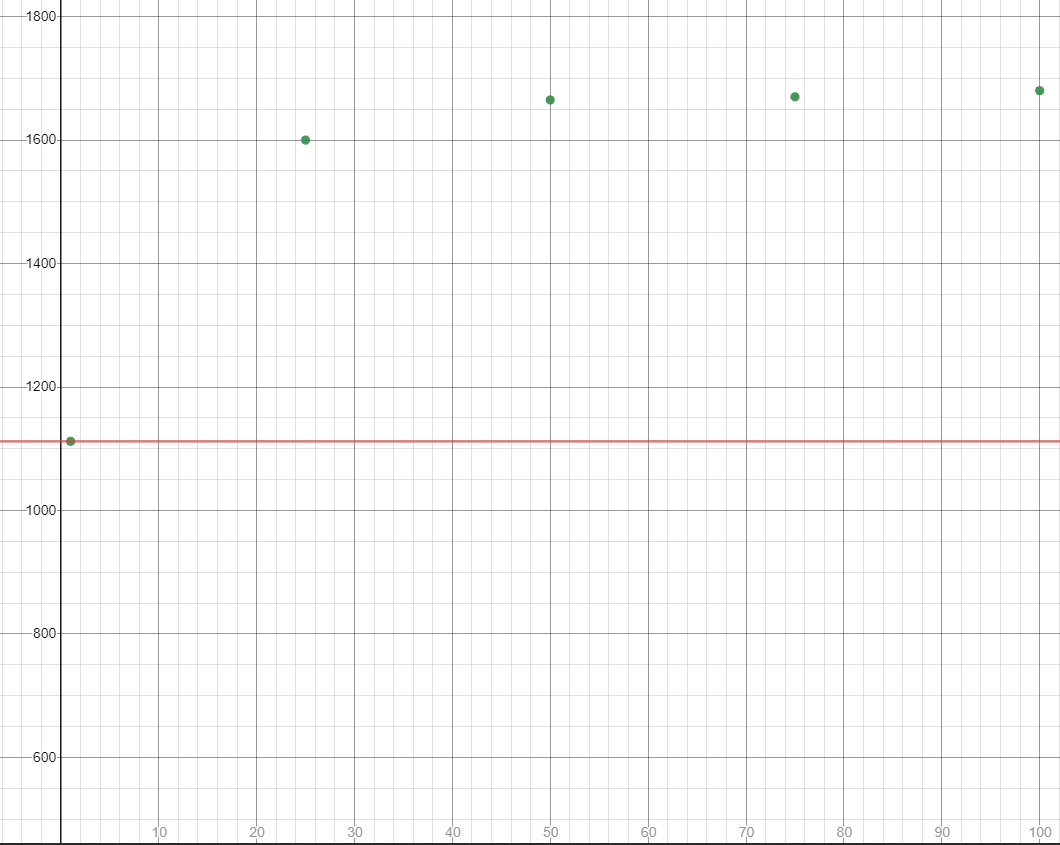
Got it. One question, what if you define the outer boundary as being the absolute limit if you jitter the brush slightly in the canvas, roughly in place? Because it seems to require some movement to start flowing. Also, I did some testing, and the preview circle is in fact incorrect. I did a brush size of 1381px, and the preview circle was actually about 1110px in diameter (dunno why they're different lol). Moving on, I decided to test the actual size depending on the flow. The results suggest that flow increases logarithmically, in a somewhat predictable manner. What I did for my very non-scientific testing is jiggle my mouse very slightly to get the ink to flow, and I did that for a while until the very outer edge stopped growing. About 30 seconds for each circle. I then measured the size using guides and noting down x coordinates and by using the transform tool to find the very edge of each circle. I did this test for 1% flow, 25%, 50%, 75%, and 100%. Here is a graph of actual size plotted against flow %. The horizontal red line represents the actual size of the preview circle that I measured. You'll see that, as the flow approaches 1%, the preview circle becomes accurate. Here's the graph: The actual brush size, according to Affinity Photo, was 1381px. I'm not certain where the program gets this number from, but I have a guess that it's just doing a simple average of the maximum brush size and the minimum brush size, which corresponds with 100% and 1% flow rates, respectively. So the size at 100% flow was 1680px, and the size at 1% flow was 1112px. The average of those two ([1680 + 1112] / 2) is 1395px, which is pretty close to Affinity Photo's size of 1381px. However, this is not a good way to do things. Because the graph is logarithmic, not linear, the size hangs around the 1600s and high 1500s most of the time, and this 1381px size is only accurate at about flow 14.23% (in this case). Not at around 50% flow, like you'd intuitively think. You can't just take the average of the two range extremes on a logarithmic graph in order to get the average value. You can do that with linear functions, but not with other types. The appropriate way is to take the integral of this function from 1% to 100% (area under curve), and then multiply that by 1 / (100 - 1). That will give you the true average value of the function -- it's called the Mean Value Theorem. Since I don't have access to the function (i'm sure it's written somewhere in the code, though, and if it's not, you can take a lot of data points by hand and interpolate), I will do an approximation. I used the trapezoidal rule in tandem with the mean value theorem to find the approximate average of this function. The actual average size across all of these different flow rate samples is about 1598px, and not 1381px. All of this is pointless though. All of this feels like a work around to the problem. The real solution is to have an outer circle, outside of the current preview one, that shows the very farthest that the brush stroke can land if you were to theoretically keep wiggling the brush back and forth forever. The size of this outermost circle would be dictated by the above graph, brush size, and by the hardness. You'd need to come up with a multivariable function that includes hardness, brush size, and flow, but it can absolutely be done. If you can't (it's understandably difficult to do) you can just do some sample points and interpolate, it'll be accurate enough. And, at the very least, something is better than nothing. Might be hard to interpolate a multi-variable function though. P.S I try not to use very low flow because of what seems to be an oversight; a very low flow only seems to use a few different value levels, and it results in a posterized effect when I do enough painting with that brush. I understand why you did this-- it's because these steps should be hard to notice if you're doing subtle brush strokes, as I imagine is intended with a low flow brush. However, if you go slowly with the brush and do a lot of brush strokes, you begin to see these steps. So, as of now, I have to do 100% flow for the best image quality. So, maybe we can fix this problem if we can't fix the flow-preview issue? This would improve the usability of lower flow rates.

-
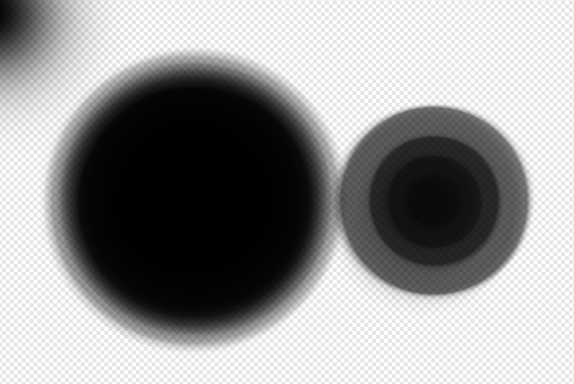
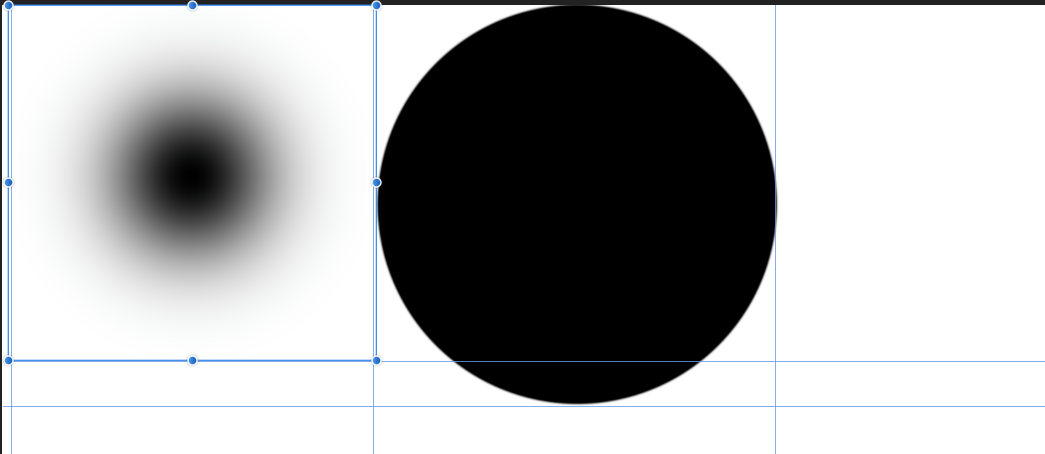
Here's a video exemplifying what i'm experiencing, and it's super frustrating when I need to do a shadow by hand, for example: I'm okay if it extends slightly beyond the brush circle, but this is way too much. I have to hold my brush a couple hundred pixels away from the edge just so it'll land where I want it to. This doesn't happen if I use a 100% hardness. In fact, the preview circle changes size as I change hardness! The only time where the preview circle size is correct is when the hardness is 100%. Moreover, the actual size of the circle changes significantly when changing hardness, which I guess is why you're trying to compensate by changing the preview circle (but the preview circle is actually still not quite right). Both of these are at 1817 px size brush, but the one on the left has 0% hardness, and the one on the right has 100%. Look at the size difference (the guides represent the extreme outermost bounds of the layers -- I used Affinity Photo's transform controls to get the actual size, instead of eyeballing it): I'm guessing this is because i'm just using 8 bits per channel, and, as such, the the steps cut off early? In short, I want the preview to show the absolute outermost bounds of the brushstroke, not just where its most intense or something strange like that. Is the preview drawing the circle where the brush is 50% alpha or something? I'm not sure.
-
Every time I open up a new photo in Affinity Photo, some things are saved, and some things aren't. Quick select, for instance, continues to have the same width as on the previous document. Same for brush tool. But I really, really wish the lasso tool and the refine edge menu would save settings. This means that, if I used polygon lasso tool on add mode with a 2px feather in the previous document, I want that to be the same in the next document. Perhaps even more importantly, refine edge should have a checkbox for "remember these settings." When I'm doing product photography for an Amazon listing, I want the refine edge to look the same on all of the images. Right now, in order to do that, I need to either memorize what settings I used or take a screenshot. That one program that starts with a P had a checkbox for "remember these settings" on the refine edge, and it was a life saver. There's a good chance that there's some logical reasoning why things are the way they are, but these are just my thoughts. Thank you so much :)! Edit: also, btw, when you finish making a selection and you have some feather turned on, can you separate out the "set current raster selection" and then "feather applied" when the person finally double clicks to make selection? I know it seems strange thing, but this is actually a pretty big deal. I don't know about other people, but I've lost 15 minutes of careful lasso selection all because, after finishing the selection, I realize I've had feather turned on, and there's no way to undo just the feather part. This is something that annoyed me both in this program and in that other Ph***sho* program.
-
Thanks for the reply :)! Love the program btw. It's got a few glitches but I do really appreciate the work that you and others at Serif do-- this program has saved me a lot of money over that one product from that one company beginning with A and ending with "we're going to steal your money with a monthly subscription now" lol!
-
sorry for the delay. I was busy on the weekend and today. I can't provide a copy of this file in particular since it's for a product photography client of mine, but here's a sample of the same image. It still exhibits the same problem. I'm sure you can go through the undo history but eh, i'm sure it's fine. For some reason it sometimes decides to not happen. I wasn't able to recreate the problem on a different photo. Which is unusual, because I used a .NEF for both of them. The file named "test" used the same kind of procedure (make a selection using lasso or quick select (i've tried both; neither seem to be correlated with the problem) and then copy and paste it onto a new layer.) Let me know if the file (sample.afphoto) does the same sort of thing for you. And "test.afphoto" is an example when the problem doesn't occur. Now that I look between the photos more, it seems like the only difference between the files is that sample.afphoto uses 32bit HDR whereas the test.afphoto uses 16 bit. So it seems to be a glitch pertaining to just HDR images. I am not using an HDR display, so perhaps that is the issue. sample.afphoto test.afphoto
-
You need a decent monitor to be able to see it clearly, but there's a white halo around my masked objects when put on a transparent background. However, as you can see when I overlap one object over the other, that white halo is not really there. This was concerning when I first saw it -- after spending 10 minutes editing a photo, I realized that I messed up my mask, leaving white on the edge, and I might have to start over. Turns out that it was just a rendering error. Here's an example:
-
When I use the picker for white balance in Affinity Photo 1.7.0.367, it doesn't correct tint. I feel like it should? Let me know if this is intentional. I feel like Photoshop and perhaps even some older versions of Affinity Photo adjusted tint as well. Edit: can confirm that Photoshop (even the old, old photoshop CS2 that I have) adjusts both temperature and tint. Here's a video:
-
I find myself going to press shift or control in Affinity Photo, but I so often find that it does nothing at all on certain tools, while working perfectly on others. I can hold CRL when drawing out a shape to expand it / shrink it from center. I can also do the same when transforming it. I can also do this when doing an image place. But I can't do this when cropping or when placing down a circular or rectangular marquee. Also, why can't I even use the SHIFT modifier key when cropping, in order to constrain aspect ratio? Why do I have to do two clicks in order to change the mode to "original ratio?" It's important to be able to crop from center so that you keep your crop, well, centered. And it's important to have the CRL modifier key for the marquee box and circle selection tools because say, for instance, I want to select something circular. How do I do this? I find the midpoint of the circle, which is the easiest thing to eye-ball, and then click and start dragging while holding crl. Trust me, it is very difficult to eyeball the imaginary bounding-box corners of a circle. And yes, I know that CRL is the modifier key to do a straighten in the crop tool; however, it should change to be the "transform from center" once a person starts cropping. And, you shouldn't have to go into some drop-down menu in order to maintain the original ratio; you should just be able to hold shift.
-
Hello! I recently downloaded the latest beta and it is truly amazing. Huge performance improvements, the addition of things that were missing before (like being able to negatively adjust the blackpoint in levels adjustment) and there are some neat new improvements to the HSL adjustments, where you can now pick a specific color and adjust its hue / saturation / luminosity. Cool. However: The picker should not be grayed out by default. Why do I need to select a color first, before I can select the picker? Here's my more important suggestion: add plus and minus color pickers in addition to the standard picker. Take a look at how it's done in Davinci Resolve. Here's how I think it would work behind the scenes: Firstly, let it be assumed that the picker would now not only select hue, but also would select by saturation and luminosity. It would function like the magic wand tool. On its own, this would suck. But read on. Now, add a + and - picker. With the + picker, you can click and drag to add to the selection. If you make a mistake, use the - picker to remove from that. Maybe add a "fuzziness" slider, too, to make the selection less harsh. This is how I imagine it would look like (ignore all of the nodes and stuff that Davinci Resolve does, of course; just look at the + and - color pickers in the color selection panel)
-
quick mas question
HuniSenpai replied to srg's topic in Pre-V2 Archive of Affinity on Desktop Questions (macOS and Windows)
crl + shift + i to invert your selection, so you can quickly swap between working on one section and working on another section. ----------------------------------------- //the long and annoying way of doing things, although there are a few cases where this method is useful: The other option would be to paste what you have selected onto a new layer, then just jump between the two layers. Only annoyance is that you'd need to do crl + shift + o to select just what's on that layer, without going out of bounds. Although this latter solution is probably more complicated in your situation, it can occasionally come in handy (say, for instance, you're painting and want to paint behind something... it's nice to have everything separated out onto individual layers. So I would do crl + j and starting working with two layers) -
This is a little pet-peeve of mine: make image dimensions automatically match clipboard's when you do crl +n for a new document. Affinity Photo has "New From Clipboard" (Crl + alt+ shift + n) but that's a two-handed hotkey and, oftentimes, I only get the object on my clipboard so that I can copy its dimensions. Say I want to make a banner for a webpage. I use Window's snipping tool, take an image, and then put it on my clipboard. Then I just do crl + n, press okay, and bang, done. It is subjective, of course, what's more important: having it be based on what settings you used last versus what you have on your clipboard. As such, this could be added as a setting, allowing users to choose between the two. I would certainly change it to the latter method the first chance I get. Thank you!
-
This tool is extremely important for photographers, such as product photographers like myself, who need to select a color and replace it with another, specific, color (throughout the entire image). At least 6 people on this forum thread are in need of this tool, 7 if you include me Affinity Photo has a tool for replacing color known as "Color Replacement Brush Tool". However, this tool is not the most useful for some tasks. For instance, what if you want to replace all blue hues in an image with red? Or say you want to adjust the saturation of a specific color in the image (rather than just using HSL, which doesn't let you dial in what specific color you want to affect.. say, for instance, you have an orange color that you want to affect. Or maybe a slightly red-orange color. HSL does not let you target those colors) I have been responding to questions on this thread right here for some time now, where a user was looking for a tool to replace color. The only solution that we've found is a lengthy workaround that involves select -> select color and then attempting to use HSL to get the desired color. However, it's near impossible to do this method with precision, and it's hard to tell just how the feathering looks when you're doing select -> select sampled color. This is what people are asking for: a filter or something like that by which you can use an eye dropper (or choose to enter in your own hexadecimal value) as the target. Then, you can change that selected color by using either HSL sliders or by entering in your own hexadecimal value. This is how Photoshop did it (and this was by far one of my favorite features of Photoshop that Affinity Photo lacks): Relative to the incredibly difficult features that the devs at Affinity Photo implement, I think such a replace color dialog would be rather easy? Half of it is already programmed in the "Select --> select sampled color" tool. The other half would be making that incredibly useful mask preview and adding the color replacement part. I would be incredibly appreciative if this features was added. I am already a huge fan of Affinity Photo -- I think it does a lot of things better than Photoshop (coming from a person who used Photoshop for 7 years). However, the lack of this tool drives me and others absolutely insane. Thank you for all of your work thus far on Affinity Photo, and thank you for reading through my post! P.S. No, the color replacement brush tool is not what we need. It's handy in some cases, but for a lot of people, it's a huge hassle compared to Photoshop's "replace color". For others, "replace color" is just about an absolute necessity.
-
Try using a feather or refine edge.I think you may want to do feather in your case since it's a UI design; use a small feather, like 2px. I assume the problem that your getting (since this is a UI design) is that your cubes and boxes and whatnot have anti-aliasing, which kind of blurs the edges. So maybe try to include those blurry bits in your selection, too. Are you using flow 100% and opacity 100% on your brush when your painting it in on the layer with the hue blend mode? The hue should change perfectly to whatever color your using. But yes, this method does not change the lightness; it only really changes the hue. If you wanted to change lightness, too, then make a selection and just start painting, no layer blend mode or anything. Or just use shift + f5 to fill instead of having to use the paint brush. The trick is that your selection has to be really good in that it is softer around the aliased areas by just the right amount. This is really difficult to achieve... you need to find just the right feather amount. Photoshop's "Replace Color" dialogue would solve all of your issues; it makes the "feathered" selection that you need and then can force the color replacement as you wish. Affinity Photo really needs to add this tool: You can click on that "result" and it pops up with a color dialogue, where you can paste in your hexadecimal. Affinity Photo does not have "Replace Color" and, as far as I know, neither Photoshop nor Affinity Photo have a brush-tool that preserves lightness like you described. Affinity Photo and Photoshop both have their positives and negatives. One of Affinity Photo's huge negatives (for me and, evidently, for you too) is that they failed to add in the darn "Replace Color" tool. As a product photographer, I really need this Replace Color tool for setting parts of products to particular colors. Hopefully it gets to the devs of Affinity Photo that they really really should add this feature.
-
Hey! The way that I would do it it (when a specific color needs to be forcefully set) is by just painting the color in by hand. You could also make a selection first if you want more precise control. Here's how to do that (and if you want to make a selection first, do that in-between steps 1 and 2 [make sure to play around w/ refine edge]): First, select the color you want in the color panel. So, this would be the specific hexadecimal RGB value that they gave you; just paste that thing into the #: field of the color selection window. Second, make a new layer. Set that layer to "hue". Thirdly, grab a brush [press b] and set it up the way you want. Then get painting on that new layer, making sure to be painting with the color you want. Since it's a UI and you may want more control, make a selection with the rectangular marquee tool before doing shift + f5 to fill or using your paint brush. If it's a more complicated shape, maybe use something like the polygon lasso tool. Using the color replacement brush tool may not be powerful enough in your situation, so that's why I offer this alternative. Let me know how it goes :)!
-
fail to print
HuniSenpai replied to Bobjob's topic in Pre-V2 Archive of Affinity on Desktop Questions (macOS and Windows)
Hello Bobjob! So does the print dialog window open? I'm assuming it does, since you say your printer shows up in the options of the print dialog. So what I'm going to infer is that you do crl + p, hit "Ok," and your printer proceeds to do nothing at all. As a start, I suggest pressing your start button and searching "printers & scanners." Select your printer, the HP Designjet 30. Now, I've only ever used Epson, so I'm not sure that it's the same, but see if you can click on "open queue." Is anything in the queue?- 1 reply
-
- 1
-

-
So I'm going to assume that they didn't just send you a screen shot of the logo with the checkerboard pattern, and instead I'm going to assume that they gave you the actual .png file with the transparency on it. Tip: If you don't have the same square selection tool as me (say it looks like a lasso or maybe a circle or something), just keep press m on your keyboard until you get the tool I use, the square marquee tool. In case you're wondering, what I did in the video was just cut (so delete and put on clipboard) the stuff you want to turn white, and then pasted what was on my clipboard. When you paste in Affinity Photo (and also photoshop, for that matter) it pastes it onto a new layer. When you do an effect like color overlay (BTW, you can do other effects with this process; you could do just an outline to the bottom text, for instance), the effect only affects the layer you have selected. As such, you're only affecting one layer, and that layer only contains what you want to affect which, in this case, is the text at the bottom.
-
First question, did someone give you this composition as, for instance, a .png or something, or did you create this on your own and thus have all of the various layers intact and whatnot? Put simply, does your layers panel look something like this, or is it just Background Layer? If you do have unique and individual layers like that, my second question is if the text layers have that A for the layer icon? If so, you can use to text tool (t) to go back and modify them.
-
In the layers panel, make sure to re-select the background layer before doing "select sampled color" again, as I said in my previous post. Here's a walk through I just made for you Let me know if this works for you :)!
-
After you do crl + u and set the color to whatever you want, Affinity Photo creates a new layer for the HSL adjustment (crl + u is just a shortcut for color adjustment, aka Hue Saturation Lightness). That's cool because it allows you to disable that adjustment layer if you decide that you don't like the effect. But you need to make sure you don't have that adjustment layer selected when you try to do "select sampled color." So, in the layers panel, make sure to select the "Background" layer before doing "select sampled color" (or, at least usually, it is the "Background" layer that you want when doing photo editing). Let me know if this works :)!
-
Shift + f5 is the key. It'll let you fill whatever you want, and it'll also let you do other kinds of fills if you want. You can also absolutely make a giant rectangle to cover the entire canvas, which is cool in the sense that you can go back and change the color in the future. Whatever works I made an unnecessary and uncalled-for tutorial on making a quick business card, for a fictitious character, Dr. Dolphin Ph.D. It showcases the shift+f5 fill dialogue, among other things that you may perhaps find handy!
-
Yup, agreed! It's called ClearType, and it was developed by Microsoft to add additional resolution to text. It can do this magical thing because every single pixel consists of three dots; a dot is just a red green or blue rectangle. So what they do around text aliasing is have red, green, and blue turn on procedurally. That's why if you take a screenshot in Microsoft Windows, and really zoom in on some rasterized vector text, you'll see some delightfully strange effects The antialaising implemented here is perhaps the most clever antialaising available. It effectively triples the 'pixels' on your screen by being able to put all of those dots to use by sending colors to your screen. As such, edges can be extra smooth as Windows and other operating systems are able to divide each pixel into a third. Problematically, no programs will really let you create this same kind of text, simply because it really ought to be done on the side of the operating system. This is what Affinity Photo will do: Both of these, however, are better than text with no anti-aliasing at all, which looks .
-
An unsharp mask, by using in fact a Gaussian blur (thus the "unsharp" component of the name) can indeed create the illusion of sharpness. But it is not true sharpness. Other sharpening methods, such as the RL (richardson-lucy) deconvolution that RawTherapee offers, may produce slightly superior results. Nonetheless, you cannot avoid the fact the a lower resolution inherently means pixelation, although I suspect you've already realized that. Regardless I note that the intense JPEG compression that you are using seems to be creating something known as macro-blocking. In simple terms, macroblocks are large, large 'pixels.' This can create a very pixelated effect, even if you have a really large image. And, although it's primarily a video term, it looks like your still image has what is called "Mosquito noise," since the varied macroblocking allows detail around the edges of the boats, but "smooths" (i.e. macroblocks) large areas in the water. Thus you get the "mosquitoes" swarming around objects. You probably wouldn't believe me if I told you this was a slight crop in on an over 6k photo, but it indeed is... Look at the pixelation at the bottom. Those aren't actually pixels; each one of those squares, or macroblocks, consists of 64 pixels! Here's a "microscopic" view, zoomed into the pixels of the image, of what's going on; And this is how it should look in about the same spot, with no compression: So, aside from exploring sharpening procedures that will merely fake sharpness, perhaps turn up the "quality" slider when your exporting your JPEG , even if it raises file size a bit. Doing a smaller image, like 600px, and using a higher JPEG quality, like 90%, might actually look better. PNG's are quite large, although they support lossless data compression. At the end of the day, though, there's no getting around the fact that a smaller image resolution is, well, lower resolution.
-
Is the file extension actually changing to an .afphoto or something like that, or is it remaining the same, such as .svg? It seriously sounds like Windows is set up so that Affinity Designer is the default program for SVG files. Here's an example; I just set my default program for SVG's to be affinity photo. This was the result: Notice, however, that it's still an SVG. The icon means nothing. It's not abnormal behavior whatsoever for all of your SVG files to take on the Affinity Designer logo; it's to be expected. You chose that when you installed Affinity Designer. No worries though; that's just Windows telling you that it's going to use Affinity Designer to open your file; it has nothing to do with the file type changing from .svg to .afdesign. The file is most likely completely unchanged and unaffected by Affinity Designer. Check the file extension and tell us what it is. Is it still SVG or did it change? Try opening the SVG in another software; see if the SVG is corrupt.
-
Unless it's changing the file name extension (e.g. from .png to .afphoto) it sounds like Windows is set up to open .png files by using Affinity Photo, which will also change the Icon to be the Affinity logo (which can be a little confusing). If you're on Windows 10, right click any old .png file that you've downloaded and then select "open with" ... "choose another app." Then select Windows' "Photos" or another app, and check "always open these files with this app." The fact that you're saying the file becomes unusable, however, is concerning. Does the above fix it, or did the file name extension literally changed and the file become unusable? You may need to, in Windows File Explorer, go to "View" -> "☑ File Name Extensions" Also, just as a side note (which is likely impertinent to your question) "Save As" in Affinity Photo, unlike Photoshop, will only let you save the program's custom file type, in this case .afphoto. You need to use "Export" to export as, for instance, a .png or .jpeg etc. You probably already realized this, though.