StevieB
-
Posts
75 -
Joined
-
Last visited
Everything posted by StevieB
-
Thanks for the reply. I’ll have a look when I’m back… Is there any chance that Publisher text wrap would be updated to include right and left offset? I found that if you copy and paste the text frame to a new page the text is there. These IDML files are from an InDesign file that gets updated every couple of years, so I couldn’t remember what I did when I set up the original files back about 8 years ago! Thanks for you help…😊
-
That's because I forgot to press the upload button...sorry!
-
That doesn't work... The the text doesn't appear if you make the frame bigger. It's an issue with the anchored frame in the InDesign text flow that is causing the the rest of the text to disappear.
-
Hi, I've uploaded the IDML file along with the InDesign file, if you need the Linked pics etc. let me know, they're 489Mb! I have couple of other InDesign documents and the same text is missing when imported into Publisher. It also is the same in the Beta version 1.10.2.1167. Thanks, Steve.
-
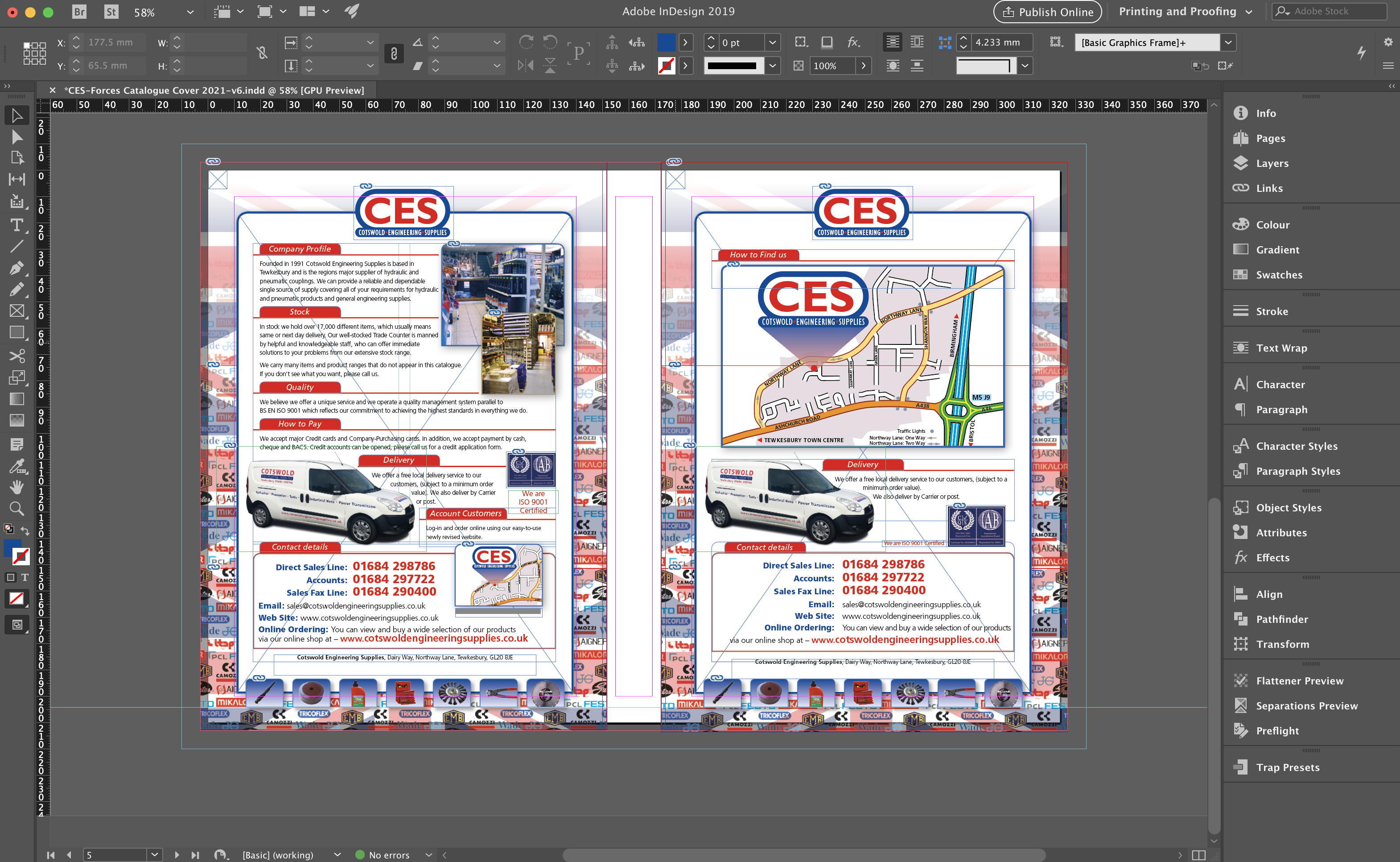
I have an InDesign IDML filer that when I import it into Publisher all the text areas are blank, although I can see where the text is in the layers menu. The text boxes have anchored box with the heading in, I think that might be causing the problem. I've attached 2 images of the InDesign page and the Publisher page I can send the Original InDesign file to you if you need to look at it.

-

Transform panel and type
StevieB replied to StevieB's topic in Feedback for the V1 Affinity Suite of Products
Thanks @dominikfor the info, I'll know next time to use the Artistic Text Tool, although it might be a bit awkward if you have a block of type to resize! Cheers, Steve. -
Hi, I don't know if this is a bug or "feature", but if you want to scale say a logo with some accompanying type, if you use the Transform Panel to scale the artwork (Grouping the two items) with the constraint selected and put in the size you want, the graphic scales correctly, but the type stays the same size although the bounding box is resized. In Illustrator there is a dedicated scale tool which can scale any object by a percentage with the option to scale corners and strokes by the same amount as well. The transform tool works as well if you want to scale to a specific size. Designer needs a dedicated scale tool that works on all objects, the inclusion would be a game changer for me and I expect many others who use this app. I'm using the latest version 1.8.6, and it still the same in the latest Beta 1.9.0.15.☹️
-
(584) IDML Import - infinite page scrolling
StevieB replied to StevieB's topic in [ARCHIVE] Publisher beta on macOS threads
I remember the first betas had this problem. It’s not a deal breaker but not ideal! The IDML import is great, I’ll soon be able to ditch adobe! Regards, Steve -
Hi, Just downloaded and tried the latest version of Publisher and found that when I import an IDML file there seems to be no stop on the scrolling beyond the pages area. The scroll bars at the side of the page also disappear when they get beyond the edge of their position. There should be a limit to how far you can scroll beyond the page area, it seems that this is missing. attached are the InDesign IDML file and the APub file. Hope that helps. Cheers, Steve. Cheltenham Races Refund Envelope.idml Cheltenham Races Refund Envelope.afpub
-
IDML imported file has transparency issues
StevieB replied to StevieB's topic in [ARCHIVE] Publisher beta on macOS threads
Hi Gabe, I've uploaded the collected InDesign document, the zipped folder has all you need including .indd and .imdl files along with a pdf. The InDesign version used is 14.0.2 (2019) not the latest which I haven't installed yet. (I'm trying to get rid of the Adobe rentware!) I know this is a long shot, but would Affinity Publisher ever be able to write IDML files. I only ask because in some circumstances if you're working with an outside agency/studio they often want the files you have created/updated back in a form they can use. i.e. if your client wants to amend the files in house, they would need either .indd or .idml files. Hope the files are useful for you. It's amazing what you have done with the .idml import already! Cheers. -
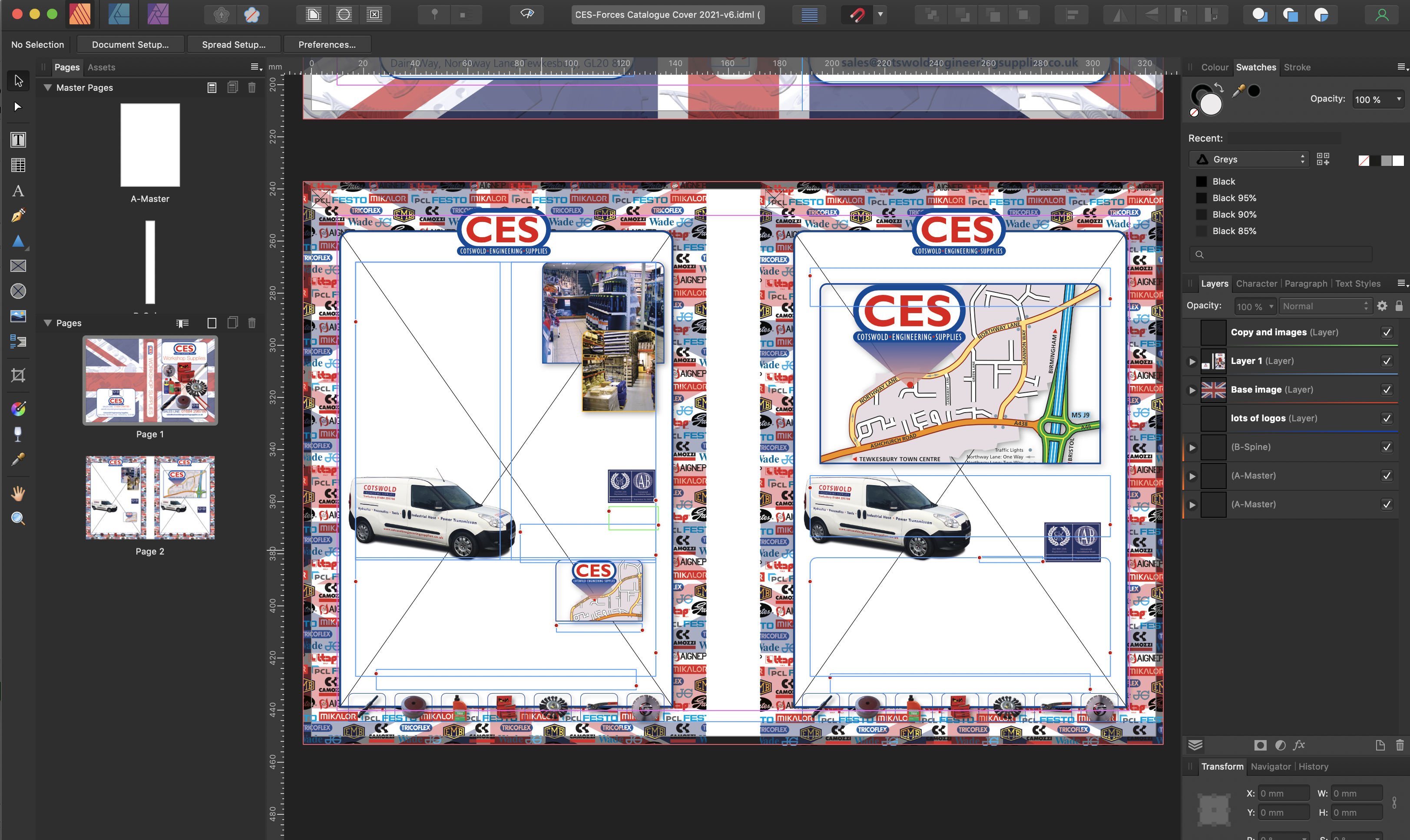
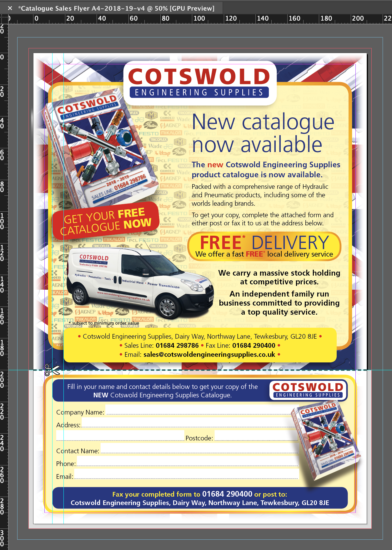
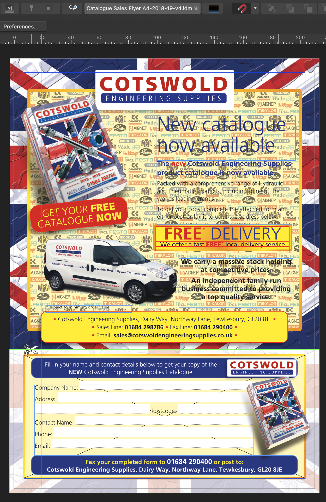
Hi all, I'm updating an original InDesign file to include new pics and copy so opened the Idml file in Publisher and noted that there were a few discrepancies, some of which have already been noted (Corner radius for one), but I noted that the original InDesign document has a directional feather of 10mm on all the edges from the bleed inwards. This has disappeared on the imported Idml file, as has some of the other transparency attributes to fade the tiff file of rows of logos below the text to let the copy be readable. The transparency is applied to the graphic layer (tiff logos) which has a multiply of 47%, the background of the frame is a pale yellow, thus letting the image fade below the type making it appear on the yellow background. See the attached screenshots of the respective files. Also the InDesign Idml file. If I open the Idml file in InDesign then all the file is there and the transparency and effects are all rendered correctly which is what I would expect. To the most part Publisher does a good job of rendering the file. It is the effects and transparency which I think it struggles with. Hope this helps to increase the usability of the idml import, especially as I want to drop InDesign etc! Steve. Catalogue Sales Flyer A4-2018-19-v4.idml
-
IDML Imported file and pdf output issues
StevieB replied to StevieB's topic in [ARCHIVE] Publisher beta on macOS threads
Hi Jon, I've just done a test with a new document and it seems that the pdf output is correct, but I'll have a go and make up the whole document and see if that makes a difference. I'm thinking that it won't! The test.pdf is attached, its just 2 pages... Cheers, Steve. test.pdf -
IDML Imported file and pdf output issues
StevieB replied to StevieB's topic in [ARCHIVE] Publisher beta on macOS threads
Hi Jon, Here it is... It was created with the latest version of InDesign. Hope it helps. Steve. BRC Legacy PREMIUM 2020 calendar.idml -
Hi, I was really pleased to see that IDML import has now arrived, so I took a file I did recently which is of a Calendar. The original InDesign document was created in the latest version. it has bleed and a slug area at the top with annotations of which page it is as it will be produced as 28 page A4 Landscape but with the fold along the long edge. (final size 14 spreads) Apub does the import really well, I haven't looked closely at everything but it did flag up a missing graphic which I haven't received from the client! The problem comes when I output the file to pdf. Although the type on the document is correct, the pdf output is garbled, it's like its in a different language! Enclosed here are the original InDesign pdf and the APub pdf. I can package up both the documents if you want to see where the problem lies. It's a very good start though. Just a comment, there are times when you need to supply an IDML file, for instance when the recipient doesn't have the latest version of InDesign, mainly because their computer isn't the latest so won't run the newest version of InDesign. Being able to send them IDML files allows them to work on those files. Regards, Steve BRC Legacy PREMIUM 2020 calendar-InDesign.pdf BRC Legacy PREMIUM 2020 calendar-APub.pdf
-
Well I got my maths wrong, it's a week until my birthday so I got confused... the launch is two weeks and a bit... Sorry, Patrick, for the confusion. (I'm easily confused!)
-
The Site's back up now. Publisher pre-ordered! Only two weeks and a bit to go...
-
Publisher Beta Released Far too Early
StevieB replied to Tadhg's topic in Feedback for Affinity Publisher V1 on Desktop
I think you misunderstand what Serif are doing, namely making a professional publishing program designed from the ground up. It is totally unrealistic to expect the new program to be a clone of the old Page Plus software as it has been developed as a suite of 3 programs that all have a common core code. The old 'legacy' software has a code base that was written (probably) in a 32bit environment, which has its limitations, namely that Apple are dropping the ability to run older 32bit software in its next release of Mac OS. See this link: https://support.apple.com/en-gb/HT208436 (I know that the Page Plus is Windows only) To expect a new program to have all the features of the older version, which has had many years of development, is unrealistic, especially as Publisher is aimed at the professional designer who doesn't want to be tied to the Adobe Subscription model. It is admirable that Serif has taken on this challenge and Publisher is the last piece of the jigsaw. Just cut Serif some slack! They're doing an admirable job and have achieved a suite of design, illustration and image apps that can be used to produce professional results. Publisher is still in the testing phase and should not really be used for mission critical work. -
What is so difficult about editing text in situ? This is what I do all the time in InDesign, it's just easier to see where the type is and how the amends affect the flow, especially in brochures and the like. (still waiting to make the leap to Publisher though!)
-
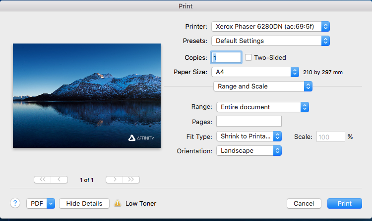
In the Print dialogue if you have crop marks selected to print and you have the "Fit Type:" set to "Fit to Printable" or "Shrink to Printable" selected, the crop marks etc don't get printed. The only way you can get them to print is if you scale the page to 90% (A4 document page and A4 print page). This would be useful if the The "Fit to Printable" or "Shrink to Printable" options did this to include the crop marks, colour bars, page information etc in the printout. InDesign has an option to "Scale To Fit" which will automatically scales the page to include the crop marks etc in the printout. Having this in Affinity Publisher would be useful, especially if you want to check that the bleed is correct, or you have an oversized page you want to check everything prints correctly.
-
Thanks for the that! Another lightbulb moment! There's a lot to get your head around and when you're used to the way another program works it take a little while to unlearn where things are and how it all works together. Does make sense though.
-
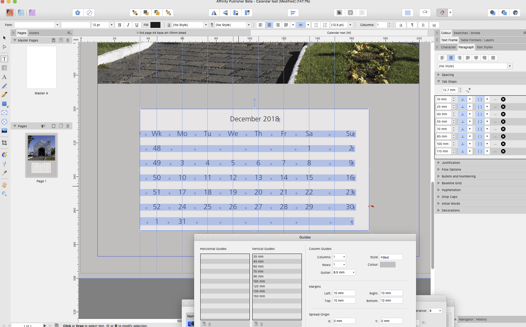
I don't know whether this is a bug or just the way Publisher works, but there seems to be a problem with the last tab stop in tabbed copy area. The last tab stop seems to be misplaced if the character is followed by a return, but if there is another tab then the character is aligned correctly. Attached is the screenshot of the document I was working on when I came across this problem. The tab stops are set at 15mm intervals, as you can see the last tab is not 15mm away from there previous one, but more than that. if you a tab between the last character and the return, the character is then placed at the correct position. When you import tab separated copy the last character is usually followed by a return, so Publisher should honour that convention.
-
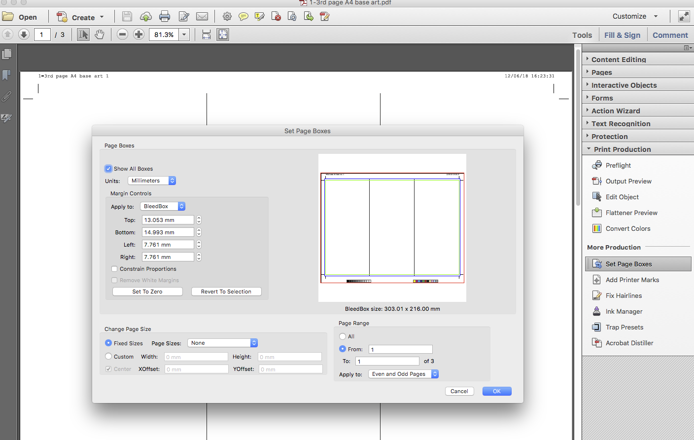
If there is an overall colour that bleeds, and you add fold marks (a dotted line that is underneath the base colour) that extend over the bleed area where your guides are, unless you have a slug area or you can include an area larger than the bleed then you're not going to see the fold marks. I set up an AfPub document with 3 pages to show what I mean. The attached pdf is the output from that document. Page 1 shows the fold marks over the whole page. Page 2 shows the fold area as 3 different colours, the fold marks are below the colour panels, although you can't see them you can work out where it folds. Page 3 show an overall colour that bleeds, the fold marks are there, but are hidden by the colour area. They will only appear on the pdf if the bleed area is increased beyond the current 3mm. In pdf terms that would make the bleed boundary box incorrect. The blue line on the attached screenshot is the bleed box, the red line is the art box and the green line is the trim box. 1-3rd page A4 base art.pdf
-
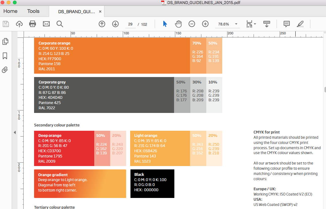
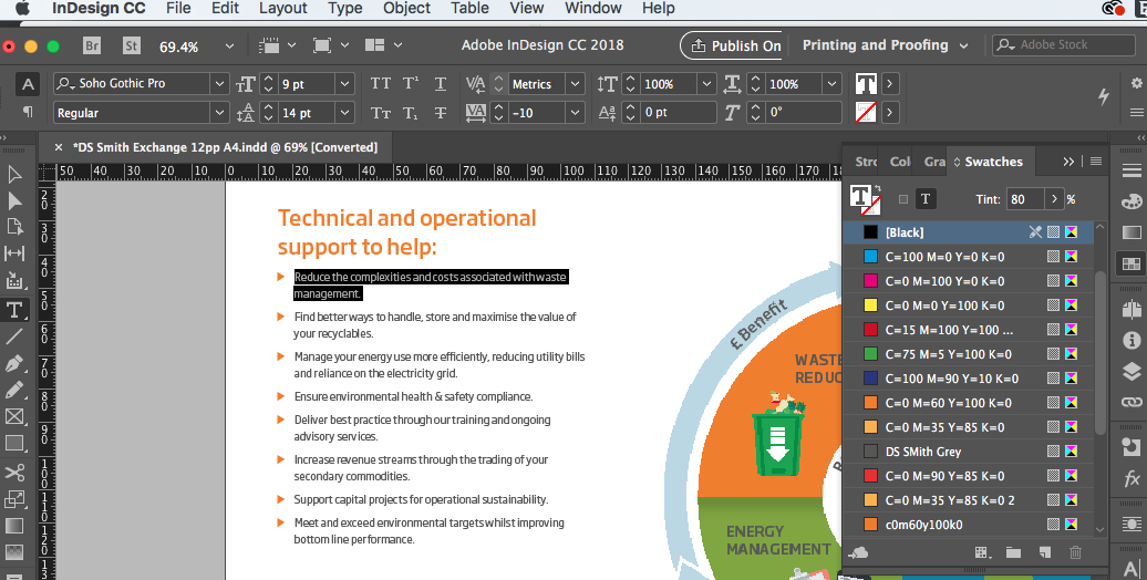
A tint of black is still black but with a screen overlaid on it to reduce the strength. An 80% tint of black is not a separate colour in cmyk. This can be seen with the Brand guidelines and an InDesign print job (see screenshots). The Brand Guidelines state clearly that all artwork should be set up in CMYK, and with the appropriate colour profile. This is standard if you are doing work for big companies. Publisher is being promoted as being a Professional Design/Layout App and as such should be able to deal with professional requirements otherwise it will fall short of peoples expectations.
-
Don't assume that text is always 100%K. Often it is defined as a tint of black. In quite a few of the Brand Guidelines for the clients I work for do not define body text as 100% black, but usually a tint of that colour. I'm coming from a Quark/InDesign background not PagePlus.
-
Bisect a shape
StevieB replied to Gaia-Sophia's topic in Feedback for Affinity Publisher V1 on Desktop
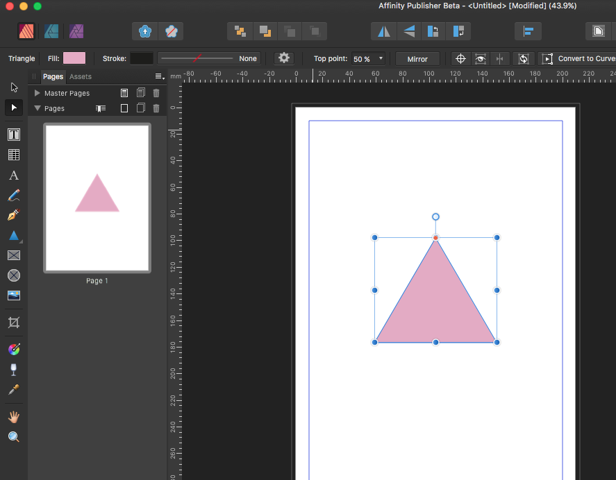
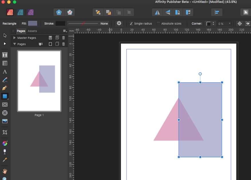
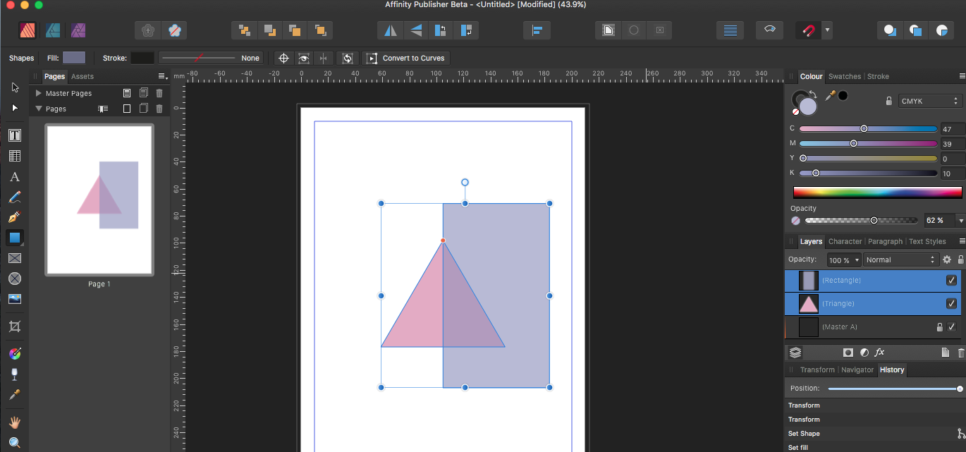
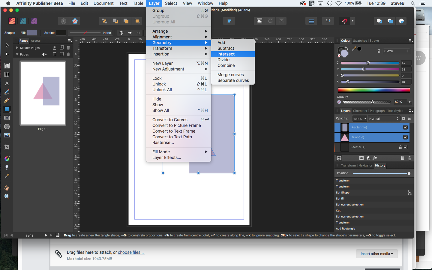
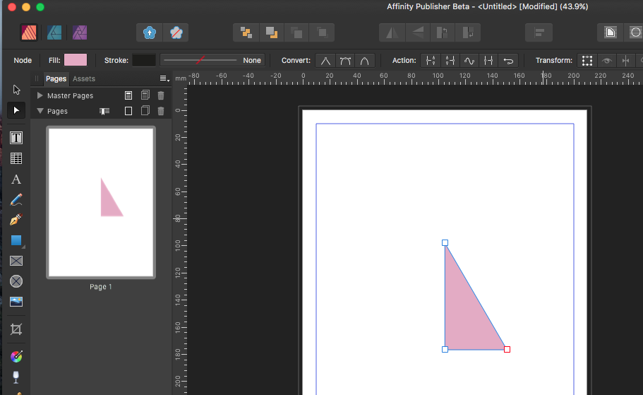
Here's what you need to do... Draw your equilateral triangle. On top of it draw rectangle that covers the area from the top of the triangle to beyond the right hand point. Select both objects and go to the menu Layer > Geometry > Intersect. The shape that is left is half of the equilateral triangle. Make sure that you have snapping on, this will help you line up the shapes. See the attached screen shots... Hope that helps!
- 1 reply
-
- 1
-