kenmcd
-
Posts
2,227 -
Joined
-
Last visited
Everything posted by kenmcd
-
 I do not see this issue with the trial fonts. @Hangman does not see this issue with the trial fonts. So my guess is the issue is with your font.
 -
Need to see your actual font(s). The trial fonts are kinda odd. The User Coordinates and the Design Coordinates are the same. For example the Medium instance is at 570 for both. Usually you will have a User Coordinate of 500 for Medium - which is what you are going to see in the interface - but the Design Coordinate internally points to 570 in the design space. You said you have used this font on the web... CSS wants to see 500, not 570. Which is why GF checks for proper mapping. And to make sure the variable Medium is interchangeable with the static Medium (500). The two axis trial font has 10 masters - which is very odd. And 12 instances. Makes no sense. The default master is Light at 300 - why? That is something you would do if you only have two masters - eg. Light and Black. But with 5 different weight masters... Makes no sense. The three axis trial font is even more odd. 20 masters. (WTF?) 36 instances. Your demo shows a font with only one axis - so you have a different font. Need to see your actual font(s).
-
@cthomsons Do you have the static fonts installed at the same time? Looks like the family name is the same in the variable and the statics. Which will cause issues.
-
Applications installed from the Microsoft Store will have different locations for different versions. Your link is to the v2.5.5 location. You will need to update the link to the v2.5.6 location.
-
Text Styles in Publisher gone rogue after latest Affinity update
kenmcd replied to Aliforce's topic in V2 Bugs found on macOS
The embedded font changed to a TrueType version. Which may have different vertical metrics. Your before PDF document shows the font as Type-1 (which could be an actual old Type-1 font, or an OTF version of the font). AFAIK Adobe has never released a TTF version of that font. In the old AFF11 it is only OTF. What type fonts and what versions do you have installed? Side note: always better to set a fixed line height (leading). Prevents issues like this when upgrading fonts, working cross-platform, etc. -
InDesign IDML Font Not Loading Properly
kenmcd replied to Xennrat's topic in Desktop Questions (macOS and Windows)
OK. Checked your font, and found other posts about it. The one above: https://forum.affinity.serif.com/index.php?/topic/163765-font-called-badwrench-not-displaying-properly-in-affinity-apps/&do=findComment&comment=965465 And this one: https://forum.affinity.serif.com/index.php?/topic/209064-pdf-import-mismatches-font/&do=findComment&comment=1250229 CityBlueprint is what I call a Franken-font. When it was converted from Type-1 there are two different encodings inside. For the Mac platform the encoding is MacRoman (old pre-Unicode). For the Windows platform the encoding is as a Symbol font. Neither encoding is going to work properly in APub. Appears I made a couple different versions of the fixed font (which I had converted to Unicode). Normally when I modify a font I always rename it (to prevent confusion later). This fixed version has the same name as the original font. So when the IDML file is imported it should not be reported as missing. CityBlueprintAF.zip Correction: these fonts are named CityBlueprintAF - so just do a find-and-replace. -
InDesign IDML Font Not Loading Properly
kenmcd replied to Xennrat's topic in Desktop Questions (macOS and Windows)
I think that CityBlueprint is an old conversion from a Type-1 font - and it was not converted to Unicode. It is still the old MacRoman encoding. On my phone at the moment so I cannot check to be sure. Can check it a couple hours from now. Try the version of the font I posted here: Think I converted that one to Unicode. So give that font a try and I will check back later. -
Fonts in Package not installing on Windows
kenmcd replied to geoffry's topic in V2 Bugs found on Windows
Kitari is a collection of eight OTF fonts in one file - Kitari.ttc. Apple has a habit of purposely breaking the TTC files so they do not install on Windows. So to extract the font files you need an application which will ignore the bad checksums and extract the fonts. I used FoundryTools-CLI to extract this TTC. https://github.com/ftCLI/FoundryTools-CLI FontCreator (FC) and FontLab (FL) will also open these broken TTC files. Usually the fonts inside the TTC also have bad checksums - and have to be fixed. Fixed as in a round-trip thru fonttools ttx, or an open-and-save from FC or FL. FoundryTools-CLI also has a roundtrip thru ttx command. But these fonts are OK and will install in Windows (which is unusual). And they are standard OpenType (not Apple AAT fonts which will not work properly). -
To avoid such issues, and font cache issues, use the FontCreator Test Font button (F5) to temporarily install the font. It adds a suffix to the font name of a random five digits. This unique font name will appear in the Affinity font menu. Installing multiple versions of a font is asking for problems. It appears from your video that you are repeatedly installing the fonts in your User Fonts folder, and ignoring the warning about the font is already installed. When a font is installed, and in-use (locked), Windows will add a number suffix (_0, _1, etc.) to the font file name, and install that additional font file (as the correct file according to the Windows registry). So you end up with multiple font files for the same font in the Fonts folders. Which is probably what is in your User Fonts folder. Affinity appears to scan the Fonts folders, and will find the multiple font files. This causes problems. Clean-out your Fonts folders and use the FontCreator Test Font (F5).
-
Highlight the text. Then in the Typography panel disable Superscript. In some fonts it could also be Ordinals. What font is that?
-
Bad example. Appears you are comparing with the broken Google Fonts version - which has no kerning at all. Here is the original Open Sans - which has good kerning.

-
Can you share those recommended export settings? Maybe that is the issue. There are others here who know far more about issues involving PDF export settings. So they can take a look at the recommended settings and provide some guidance.
-
What version of Windows 11? What version of Segoe UI Emoji? In Windows 11 23H2 the Segoe UI Emoji font changed from COLRv0 to COLRv1. Segoe UI Emoji v1.45 is now COLRv1. Affinity apps only support COLRv0. So you may be seeing a fallback font. Your first image is obviously a fallback font because it is not Segoe UI Emoji, or Arial, or Inter. Unless Affinity apps now support COLRv1 the Segoe UI Emoji font in Win11 is going to be an issue.
-
Does not appear to be anything wrong with the PDF. Opened it in multiple PDF editors. Ran it through a PDF repair tool - and it reported no issues. My guess is the PDF is damaged during the upload process. Maybe a temporary connection issue. (try different connection or computer) Or maybe their PDF ingester is having issues. That convert-to-PostScript round-trip thing is an old way to fix some broken PDFs. But there does not appear to be anything wrong with the PDF.
-
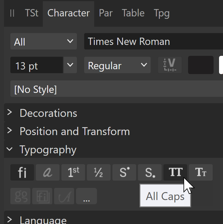
All Caps is selected on the text. Select all the text. And un-select the All Caps. All returns to normal.
-
Different encodings in Affinity & MS Word !
kenmcd replied to Yves Michel's topic in Desktop Questions (macOS and Windows)
That's how I got the Windows-1252 characters above. -
Reapplying paragraph style doesn't clear typography overrides
kenmcd replied to MikeTO's topic in V2 Bugs found on macOS
IIRC InDesign leaves all manually applied stuff alone when simply clicking on the new style. And if you Control-Click the new style it removes everything and applies the only the new style attributes. This method was discussed/requested here in the forum previously, but I cannot find it again. -
Different encodings in Affinity & MS Word !
kenmcd replied to Yves Michel's topic in Desktop Questions (macOS and Windows)
This was bugging me... those characters (ĀāĖėĢģĪīĮįĶķĻļ) are not in the Latin 1252 ANSI code page. And maybe that is why they did not work. I did not test your other characters, but if they ARE working - that means APub is now converting old encoding. Awhile back I did notice the cmap files used to translate the encodings are in APub. On Windows the files are here: C:\Program Files\Affinity\Publisher 2\Resources\Standard CMaps\ And String Encodings here (including 1252) C:\Program Files\Affinity\Publisher 2\Resources\String Encodings\ At the time I thought that was curious since APub did not support the conversion. That appears to have changed. So to test I got most of the 1252 and did the copy and paste from Word to APub. It worked. The problem with ĀāĖėĢģĪīĮįĶķĻļ is they are not in 1252. So Word identifying them as that is a problem. The characters I pasted into Word and then into APub are below. Windows-1252 !"#$%&'()*+,-./0123456789:;<=>?@ABCDEFGHIJKLMNOPQRSTUVWXYZ[\]^_`abcdefghijklmnopqrstuvwxyz{|}~€‚ƒ„…†‡ˆ‰Š‹ŒŽ‘ʼ“ˮ•–—˜™š›œžŸ¡¢£¤¥¦§¨©ª«¬®¯°±²³´µ¶·¸¹º»¼½¾¿ÀÁÂÃÄÅÆÇÈÉÊËÌÍÎÏÐÑÒÓÔÕÖ×ØÙÚÛÜÝÞßàáâãäåæçèéêëìíîïðñòóôõö÷øùúû I do not know if ĀāĖėĢģĪīĮįĶķĻļ are in any code pages. Have to check that and do some more testing - to see if the old encoding is properly identified (as it is not 1252) that it then works. But the big take-away is... Conversion of the Windows-1252 code page to Unicode is now working. Hmmm... have to test the old MacRoman encoding to see if it is working too. Those are the two most common old encodings. Windows-1252, and on Mac the MacRoman. Here in the forum we still see MacRoman encoding in PDFs from ID and other macOS apps. Which has in the past been a problem when opening those PDFs in APub. Guess that will not be a big a problem now. -
Different encodings in Affinity & MS Word !
kenmcd replied to Yves Michel's topic in Desktop Questions (macOS and Windows)
The plot thickens... I pasted this into a new Word doc: ĀāĖėĢģĪīĮįĶķĻļ (which is Unicode) Looks fine. Then copied from Word and pasted that into APub - and got the garbage. So I then tried to paste from Word to UltraEdit - and it warns me the text is not Unicode - it is Latin 1252 ANSI - the old pre-Unicode code page encoding. So Word is sending old Latin 1252 ANSI encoding to the clipboard with those characters. Which is bizarre (that is Apple sort of nonsense). Some applications understand the old encoding so they display the text fine. Pasted this into LibreOffice: ĀāĖėĢģĪīĮįĶķĻļ Then copied that from LibreOffice to APub - looks fine. Work-around - don't use Word for your sample text. -
Different encodings in Affinity & MS Word !
kenmcd replied to Yves Michel's topic in Desktop Questions (macOS and Windows)
Could also be an issue with how you entered those characters. As a unique character code-point, or as a base character plus a combining diacritic. We need to see that Word doc. -
Different encodings in Affinity & MS Word !
kenmcd replied to Yves Michel's topic in Desktop Questions (macOS and Windows)
This could be part of your problem. What font was selected in Word when you copied the text? Was it your font? The characters may have already been changed when copied. Was the Word doc an old document? Which could have been made with old fonts and old encoding. That could explain the different behavior in different applications. Some applications understand the old encoding (Affinity does not) and convert it to Unicode. The odd characters make it look like it could be an encoding issue. But that usually affects all the characters. Can you provide the Word test doc? And the font(s) from that doc if needed. Nobody else has had this problem, so it is definitely something at your end. -
Different encodings in Affinity & MS Word !
kenmcd replied to Yves Michel's topic in Desktop Questions (macOS and Windows)
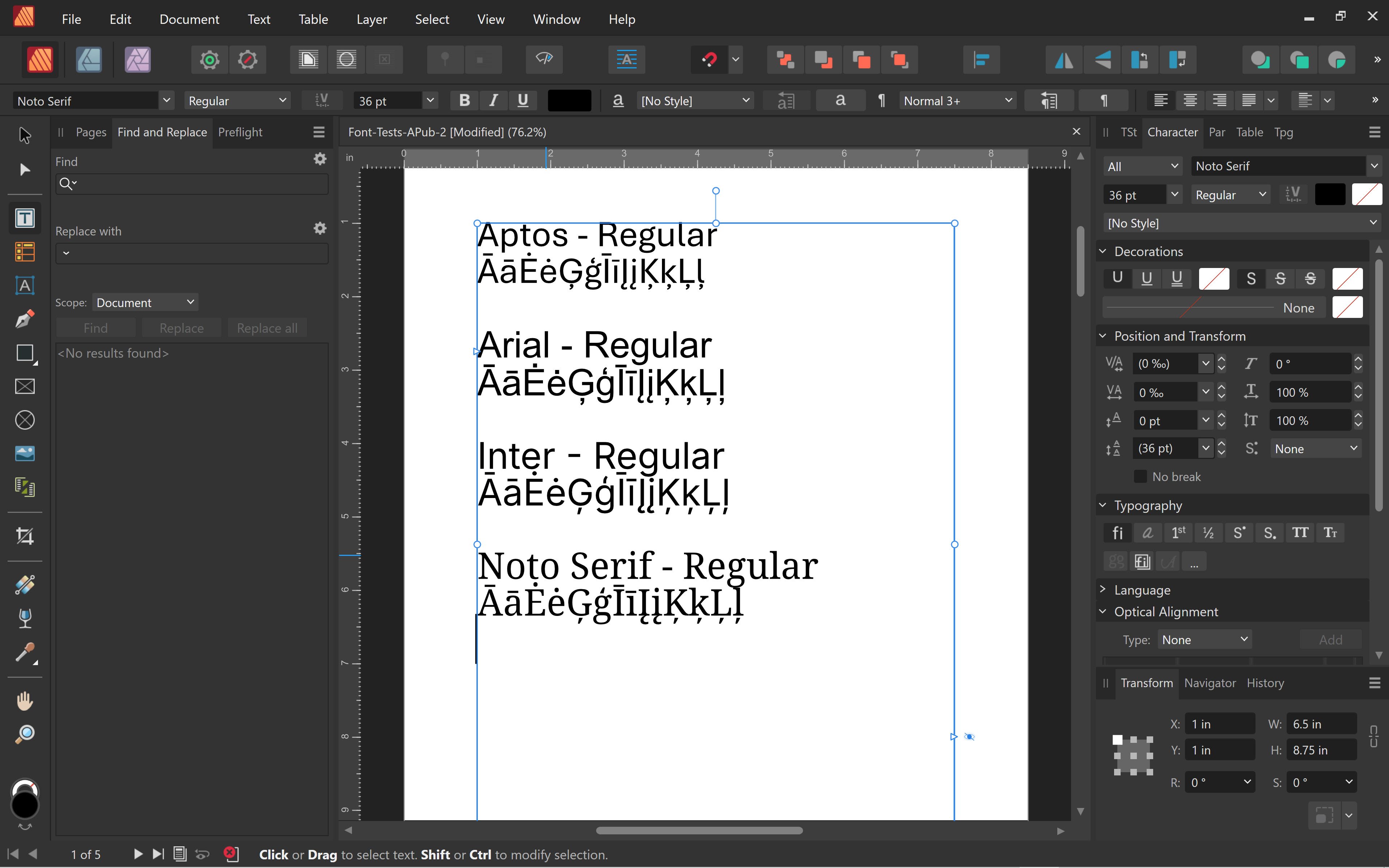
There are no "Ignored Unicode characters". See those characters in the image below - Arial, Aptos, Inter, Noto Serif. Inter is used in this forum: ĀāĖėĢģĪīĮįĶķĻļ My guess is you have some junk font installed which is based on Arial and it is causing this issue - because it still has "Arial" in some of the name fields.
-
Been requested many times. Kinda crazy it still does not exist.
-
Umlaute, Punkte verschoben
kenmcd replied to blackstone's topic in Desktop Questions (macOS and Windows)
Can you share this document? Given that those dots are square - they appear to be from a different font. They could be an old legacy dieresis character - which Alegreya does not have. So a fall-back font is shown. Could be a dieresiscomb character - which is set in another font. I assume this text came from some older document which may have used the old way of entering diacritics. Does this appear onscreen, or just upon printing? If we can see the document, we will be able to determine what it is. -
Strokes acting weird when increasing beyond size of shape/holes
kenmcd replied to Peter vw's topic in V2 Bugs found on macOS
What font is that? Some fonts have messy outlines which can affect the stroke. Cleaning-up the outlines can help.