
mykee
-
Posts
373 -
Joined
-
Last visited
Posts posted by mykee
-
-
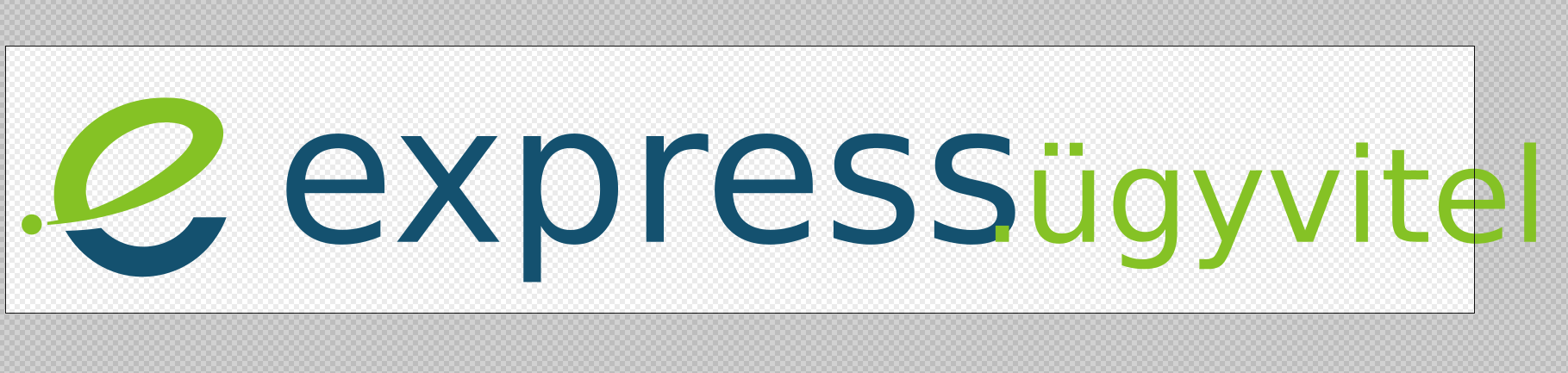
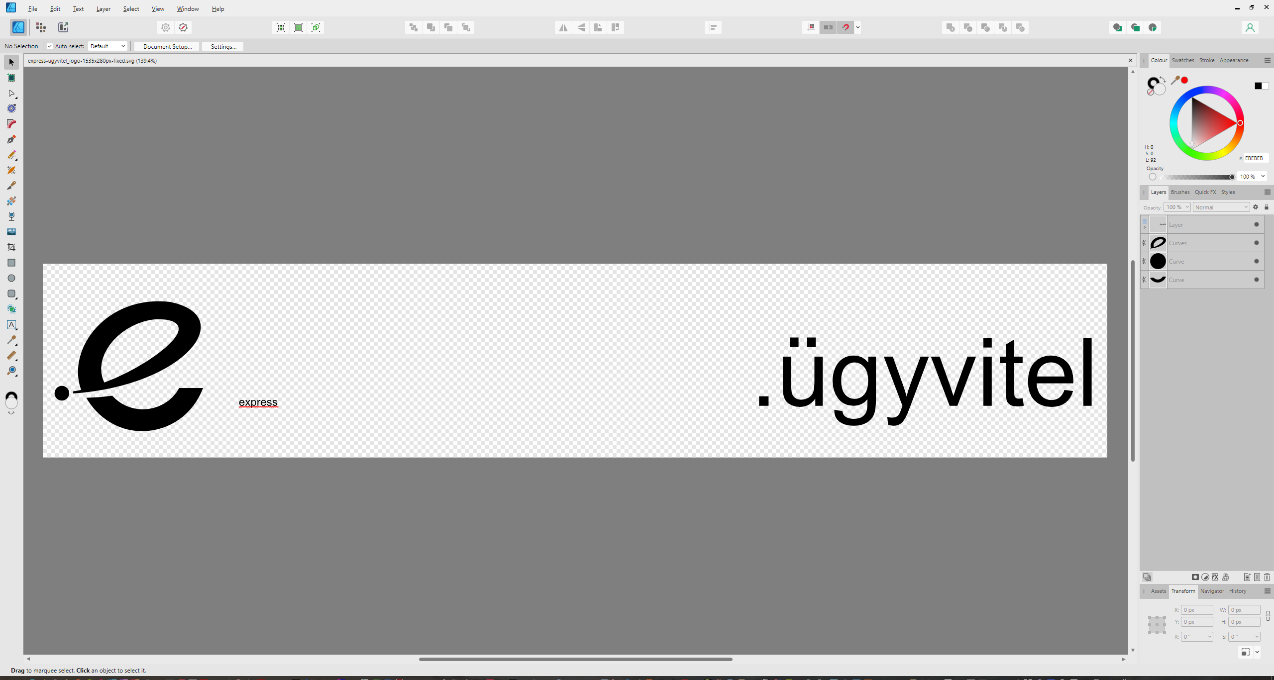
Today we also received the new program logos in SVG. When I open them in Edge or Inkscape, the colours show up well. However, in Affinity, it opens everything in black as if the colors in the 'style' block cannot be handled (I'll ignore the missing font for now).
Here are the two examples. First in Inkscape:

and Affinity programs (any of them):
and Microsoft edge:
Where have the colours gone in Affinity?
Here is SVG code:
<?xml version="1.0" encoding="UTF-8"?> <svg id="Layer_1" data-name="Layer 1" xmlns="http://www.w3.org/2000/svg" viewBox="0 0 1535 280"> <defs> <style> .cls-1, .cls-2, .cls-3 { fill: #14516f; } .cls-1, .cls-3 { font-size: 202.16px; } .cls-2, .cls-4, .cls-5 { stroke-width: 0px; } .cls-4 { fill-rule: evenodd; } .cls-4, .cls-5, .cls-6, .cls-7, .cls-8 { fill: #85c225; } .cls-3 { letter-spacing: 0em; } .cls-6 { letter-spacing: 0em; } .cls-6, .cls-7 { font-size: 119.59px; } .cls-9 { font-family: ITCAvantGardePro-Md, 'ITC Avant Garde Gothic Pro'; font-weight: 500; } .cls-8 { font-size: 136.67px; } </style> </defs> <path class="cls-2" d="M231.21,179.5c-13.89,37.38-47.98,62.19-88.01,62.19-34.52,0-64.15-19.83-80.26-48.08,13.34-.22,25.85-1.26,37.41-3.04,10.97,12.11,26.34,19.67,44.17,19.67,21.52,0,42.36-11.56,52.29-30.74h34.4Z"/> <path class="cls-4" d="M31.89,177.2c-5.35-2.26-11.57.3-13.85,5.7-2.28,5.4.22,11.65,5.57,13.91,5.35,2.26,11.57-.3,13.85-5.7,2.28-5.4-.22-11.65-5.57-13.91Z"/> <path class="cls-5" d="M55.51,182.29c-21.96-60.51,38.31-137.93,128.75-126.84,98.59,20.53,21.3,120.48-140.16,131.96l-.06-3.09c3.6-.45,7.45-1.12,11.48-2.03h0ZM154.84,81.38c-47.56,8.99-83.46,54.22-65.99,90.26,42.28-15.52,89.66-45.74,103.38-66.83,16.13-24.82-21.83-26.39-37.39-23.44Z"/> <text class="cls-9" transform="translate(282.77 205.12)"><tspan class="cls-1" x="0" y="0">express</tspan><tspan class="cls-8" x="737.47" y="0">.ügyvitel</tspan></text> </svg> -
@lacerto In the case of Soft Proof, if I select an ICC of 300 that is similar to the original, it does not noticeably degrade the colours (e.g. you can see in the video that if I select Fogra39, which is not 300) it already improves the shadows. Although it's strange, because the point of Fogra39_VIGC_300 is exactly that it takes the richness back to 300 compared to the plain Fogra39, it's still the wrong one.
For shading, however, it might be interesting to switch to CMYK color and not use rich black shadows. Although the ICC profile is supposed to soften, it doesn't for multiply. Or the other is that for a CMYK project, the program should offer CMYK black by default for effect shading, not RGB. Or convert them to ICC profile when exporting.
Here's the video where it turns out that you should work in CMYK for shadows too, not use the default RGB as a routine.I must admit, until now I thought that if I worked in ICC 300 profile, whatever colour I specify, Affinity would convert it to the correct colors. Apparently it doesn't.
-
@lacerto Yes, this could be a problem, because the shadows of the texts exceeded 260-300%, so it was not only the conversion of the images that was the problem, but also the text effects. So for PDF export these shadows were not converted according to ICC.
@NotMyFault Thanks for the article, I will definitely look into it!
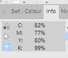
Update1: I uploaded the video where I show the shadow. What's interesting is that even at ICC 300, the Total ink ratio goes beyond 300, and even with Soft Proof, it only goes lower when using a different profile. Here are profile datasheets:
https://www.color.org/registry/Coated_Fogra39L_VIGC_300.xalter
https://www.color.org/registry/Coated_Fogra39L_VIGC_260.xalter
Update2: I also made a video about what happens when I change or convert an ICC profile. The shadows don't go below 300 in either case, even with the reduced profile.
-
@lacerto your video is very useful, and this is exactly the little tool I miss in Affinity (Total Area Coverage), which I could really use to easily check if I am exporting good color coverage or not. Here I use FOGRA39 for my prints, so by default I use the FOGRA39L_VIGC_300 profile and put the RGB images on that, but for some reason it still crosses the 300% limit and exports 325%. If I put a Soft Proof layer with ISO ECI 300 on it, it has already taken back the tints, which may be a temporary solution, but it can distort the colours a bit.
-
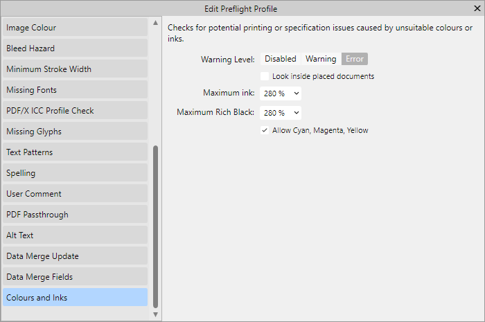
The printer returned the cover saying that the black colour strength is too high, the maximum CMYK fill rate is 280%. I am using FOGRA39L_VIGC_300 profile, but this is too much. I am currently using Soft Proof Adjustment with ICC 260, but in some places this goes up to 280%.
Where and how can I control the black fill ratio in Publisher (like in Acrobat) so that the printer doesn't send my cover back? How can I check which is the darkest point in an image?In the meantime, I found this option in Preflight (it wasn't in version 1.x), so I'll see how much and how it helps.
It seems this is really useful Prefligfht tool. Then the question is: if I use the FOGRA39L_VIGC_300 profile, why does the value go above 300% and Preflight does not report an error?
-
@thomaso Thank you very much for the video and the use of the switch is now clear. So even if the project is CMYK and the fill is only K, if the image color space is not converted when exporting, the switch is essential when using PDF export. It is safer to leave the switch always on. I added your step to my comment. Thank you very much!
-
I couldn't wait, so I tried your trick. It's brilliant. I would never have thought that by following these steps I could keep the K-only ability and still be able to tone down the greys. I'm posting the steps here for posterity:
- CMYK project
- paste the image
- K-only button pressed
- select the image
- in the Color panel, select CMYK mode and set CMY sliders to zero, K to 100
- in the Color panel you set the Opacity slider (not the opacity of the image layer!)
- when export your project use Convert image colour spaces option for perfect CMYK exportI tested the exported PDF, and in Affinity Photo, turning off Composite Black in the Channels tab makes the image disappear, i.e. it only contains K.
-
Great trick, I will check it soon, thank you! This would solve my image editing problems. I'll solve the PDF back-testing with the Channels panel (like you did in Acrobat), and then I can actually use normal effects on the embedded images later.
Does Total Area Coverage, which is in Acrobat, also exist in Affinity? Or should I add up the percentages in my head?
-
Interesting, but then it seems that masking can also cause such distortion in the colours, because I put in an image, masked the frame, and set it to K-only, and set it to 75% opacity. So the masking can be a problem on export.
Thanks for the video, I absolutely understand what to look out for then. -
However, the problem is that you can't really make any changes to a K-only image, because the program will export it incorrectly to the CMYK profile. So that means you should make any changes before you paste the image, then paste it, and then K-only. For example, in the case of opacity, why can't a K-only image be made to take x% of 100 as the export value, since black is greyed to white during opacity. So 100 opacity is 100 K, 25% opacity is 25 K, or no?
Or whatever I set on the image (contrast, opacity) it will first execute and then finally drag the K-only "layer" on top.
-
11 hours ago, pbasdf said:
As a quick visual check, you can switch to the Photo persona, then in the Channels panel, switch off visibility for the K channel. Then scroll through all the pages. If you have any rich black text/images, they will still be visible. Everything that is pure K will disappear. Remember to switch the K channel visibility on again before switching back to Publisher persona - I always forget that.
That won't overcome the export conversion issues highlighted above and elsewhere, but it will at least give you a visual check that you are starting the conversion process with pure K in the right places.
It works perfectly well, I have Photo, so that's what I had in mind when I raised the issue. I can also check the PDF file back with this, thank you very much!
9 hours ago, lacerto said:As stated above, if you have Photo, you can use Channels panel and/or histogram. But you can cope with mere Publisher, as well, as you can use the Color panel to check color values of text objects (and vector objects), and adjustments like Channel Mixer to reveal color in parts that look black (K-only) but involve multiple channels.
One further, very common reason, is applying any adjustment or blend mode on text or native K-only objects, causing rasterization to CMYK. Applying F/X effects will often also do that, even if outer effects and Gaussian Blur might survive non-rasterized. Using opacity percentage, too, would cause rasterization to CMYK in case PDF output does not allow live transparency.
Last but not least, Affinity apps by default embed document ICC in a PDF export, which will cause incorrect readings in tools like Adobe Acrobat Pro in case "wrong" simulation profile is active, or when using Ghostscript for separation.
The only thing I don't understand is that if I told the program to use only K-only for the images, it shouldn't include CMY when exporting, since the K-only option is inherently higher level, prohibiting the use of CMY (it was designed for that). So if I'm using effects or opacity, it should just modify based on K regardless of CMYK profile, even by rasterizing the image, since there is an option to rasterize what the PDF doesn't support. I don't usually use ICC embedding, I always turn it off because the press wants it that way by default, I guess because of the compatibility you mentioned. Is it perhaps worth turning off colour conversion when saving?
-
7 minutes ago, Old Bruce said:
Are you starting with a Publisher document that is CMYK?
Yes, of course. I working with CMYK only in Publisher. I made covers and interior too with CMYK profiles. (I use FOGRA39)
-
On 3/16/2024 at 8:04 PM, lacerto said:
In lack of proper preflight tool, you could open your exported PDF in an Affinity app, and get pretty reliable interpretation of color mode of objects in the PDF (things like overprint status would not be read, at all, but you should be able to detect things like K100 vs. four-color-black).
I wonder how I can test this. In Photo has a meter, but I can't measure each image one by one, and sometimes it also converts the vector strokes to CMY values. I read in one of your comments that other tools have such a tool that measures CMY values that don't match, one of these would be good for Affinity Publisher.
-
Thank you for your feedback! It was not clear to me in the first place why once I set a vector to 0,0,0,100, it converts it during the Affinity export, even though I stay in color profile. Or if I set the opacity, why does it convert the CMY values if only the K value was set in the first place (i.e. why is the opacity in this case not x % of the K value?).
So I'm reading the comments and trying to learn how to make a perfect K 100 only export from Affinity with CMYK profile.
-
If you could at least export directly to docx from Publisher, that would be good, because converting PDF back to docx is not so easy, especially because of the separations, which is not necessary for EPUB. This was perfectly solved by PagePlus for epub export. I was wondering how to get around PDF, but unfortunately I couldn't find any other solution.
-
I not only make covers, but also book interiors, where printing with black ink only is essential. So it can only contain elements that cannot contain CMY colours, only K.
Is there a preflight option that I can use to filter out elements that meet this requirement?
Unfortunately, the printer has repeatedly rejected the preflight because Publisher sometimes makes vector images stroke a non-CMYK 0,0,0,100, or if a K-only image does not have 100% opacity properties, the program will mix in a CMY value.Press can find these straight away using Acrobat, but I can't. It would be nice to filter this out before sending to the press.
-
-
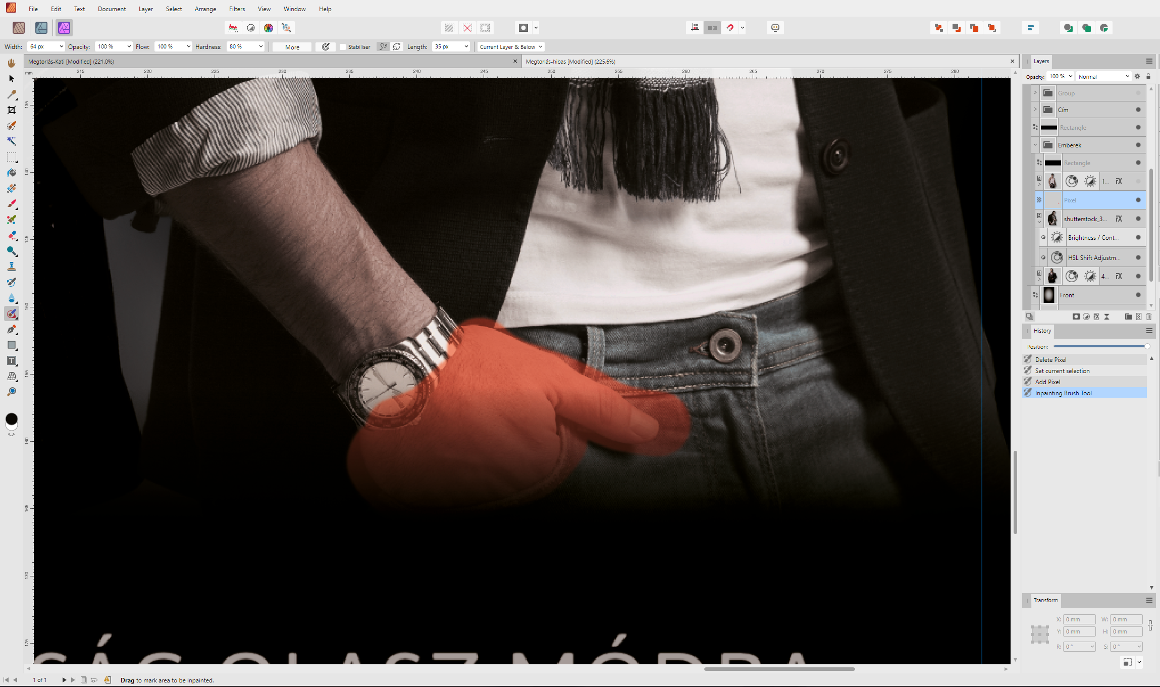
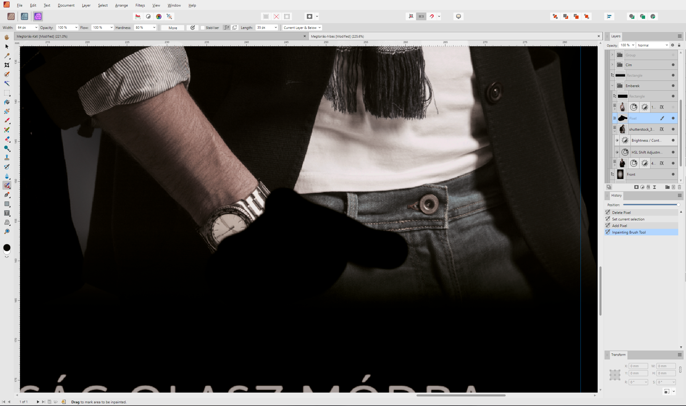
@MEB, @Dan C Thank you for your feedback! I reset the brush in the parameters, I used a masking brush. I tried it without and with rasterization. It seems like it takes the bottom, black layer and fills it with that as an inpaint image, and ignores the layer above it. The project is saved, I can upload it for testing (don't bother with the fonts).
-
I have a similar problem and I can't solve it:
- PNG image pasted
- rasterised
- added a new pixel layer on top
- In the Inpainting Brush Tool I set Current Layer & Below
- the device draws a black line.
- I reset it under the More button, but to no avail. Any other ideas?
And result:
I also tried putting just this picture in a group to do it within, but it didn't help. The base background colour is black (not visible between the layers, it's lower down), probably that's what you sampled from?
-
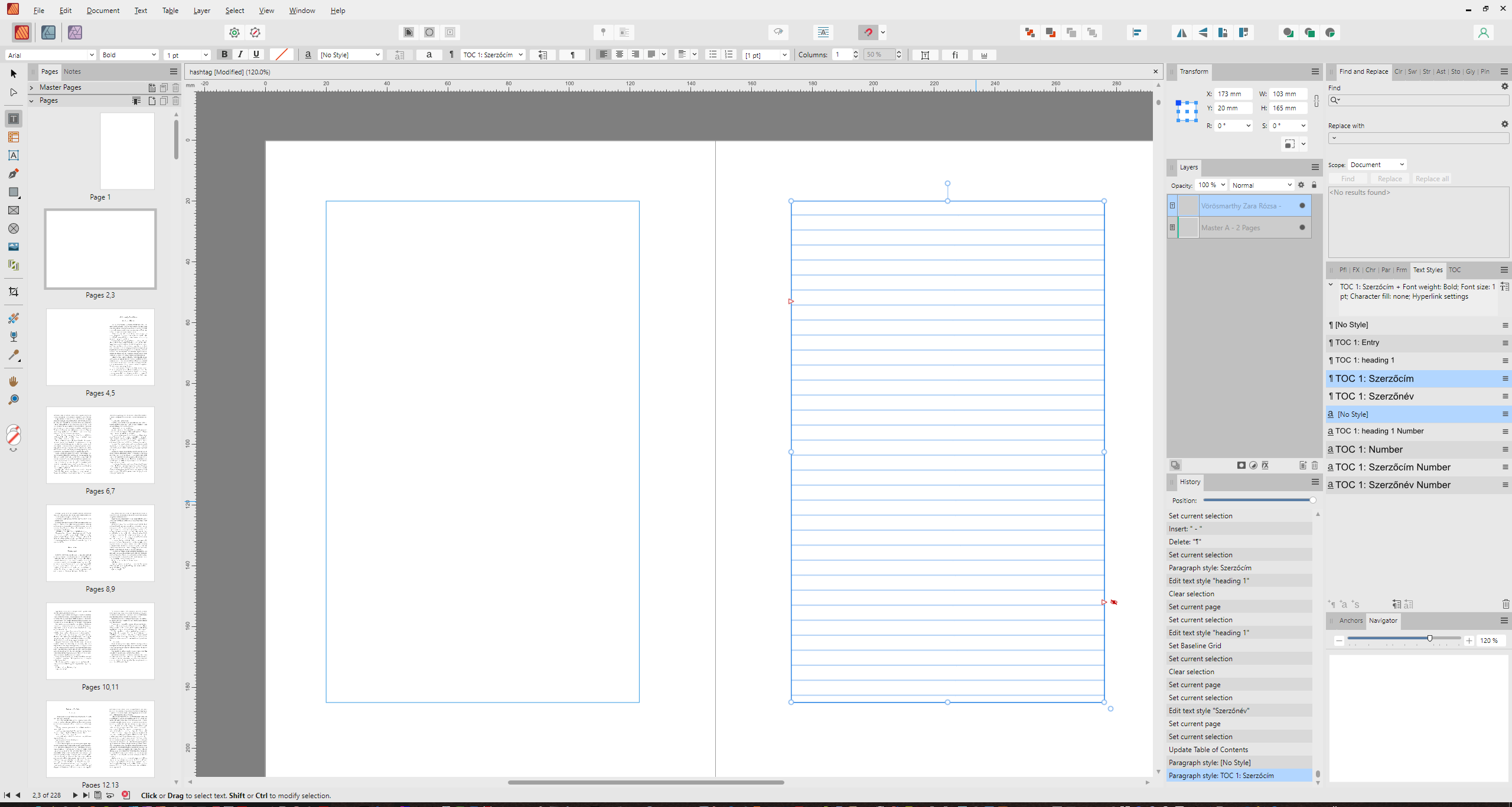
Here is the screenshot. In the other thread, we talked about having hidden text, and I set it to 1 pt, plus 0 pt line-height. I generated a TOC from it and got this. Hooray. It's getting frustrating in Publisher that it inherits the style when adding a new element.
If I press the Revert Defaults button, I get the text fine without formatting, but then it doesn't work as a TOC, but as plain text.
Okay, now I've tried it: if I press the button after adding the empty text frame and then generate a TOC, the letter will be correct. Annoying, but I'll try to pay attention to that from now on.
-
On 10/30/2023 at 9:05 PM, walt.farrell said:
Possibly Edit > Defaults > Revert (or the Toolbar gear icon with the red bar,
) would help.
I've just tried this with TOC (because it takes over the formatting of titles, I don't know why). As soon as I pressed it, the text formatting went back to the default, but it lost the TOC fields.

-
3 minutes ago, walt.farrell said:
The invisible text should be invisible in the PDF or when printing, too.
But in the PDF I think a PDF viewer would locate it if the user did a Find command. For that reason, I think my approach is a bit better. Plus, there's no duplication of the text which can make it a bit easier if you need to change one of the headings.
True, but if I have the author and title within a paragraph, I can't align them separately (for example, author to the right, title in the middle, or a line under the author name), because that's paragraph formatting. I was thinking about this, too, to have it within a paragraph, but then the formatting is more tied up.
-
Thanks for the ideas for making invisible texts. The question is how much of a problem it will be for the PDF export, or what will be visible in print. In any case, you have posted some interesting ideas. I was wondering if you could also have sections in TOC, but they might slip when you break them.
If you have more ideas, come, I look forward to it!
-
I would like a custom TOC structure.
I have two paragraphs: an Author Name, followed by a Title 1. When I create the TOC, I want it to be in the format Author Name - Title.
If I use Line break in Title this working, but should be the hyphen between the name and the title in the TOC.
The reason I would use two paragraph styles is because there is a different font and layout for the title and author name.How can I make the TOC not see it as a separate paragraph and include the hyphen after the name?


SVG colors with style problem in Affinity programs
in Desktop Questions (macOS and Windows)
Posted
Thanks, I'll have a look, I'm just wondering why if SVG is standard, why Affinity doesn't handle it properly.