
All Media Lab
-
Posts
473 -
Joined
-
Last visited
Everything posted by All Media Lab
-
 Hi @KGPX1, To start I would take care of the HTML& inline CSS errors on the site HTML VALIDATION your index page In your theme.css I see *: .logo img{max-height:46px;max-width:250px} .logo img[src*='.svg` You can change the size if needed. *You should create/export your logo as SVG (that is recommended anyway for a website). Not like a png as you did on your site. Just svg for export and no particular size of course. SVG (Scalable Vector Graphics) have a advantage in case of a simple logo over png and jpg because it uses vectors instead of pixels. Like @firstdefenceis saying your logo is way to complicated for a small logo. I always test my web logo's in Affinity Designer by zooming them smaller and smaller to see if it works or not. Hope this helps! David
 -
Yes of course! I agree!😉 But looking only at the so called "official figures" gives already a enormous amount of webp users. Imagine that your calculation is included even more!
-
fde101 If it's "only" 1.4% from the 1,197,982,359 websites that seem to be online at the moment it's still a lot!
-
https://caniuse.com/webp https://w3techs.com/technologies/details/im-webp#:~:text=WebP is used by 1.4% of all the websites. How many websites are there? It's the chicken and egg question, as long as nobody besides all current browsers support webp it will never be widely used by web designers/developers. If Serif gave it a change by supporting it that would help a lot promoting it. At the same time if AVIF/JPEG XL is become common ground in the future Affinity will be to late with introducing webp. We use webp with jpg fallback in every website we make! It's a missed opportunity!
-
Hi, I'm working on a geometrical svg and wonder how do I get the pen tool in the exact corners of the shapes. I have a rectangle that contains multiple shapes with colors, but I want to select the outlines to create a color layer on top of it. In simple words: How do I select that rectangle in the exact corners to draw the rectangle over it? Regards, David
-
@the_tux, I had a similar problem on my MAC m1 and it was caused by the fact that I had installed a AVG Virus scanner as soon as I removed that app things turned back to normal. Do you use any outside app for optimizing your Mac or Virus scanning?
-
Topaz Studio 2
All Media Lab replied to ColinG's topic in Pre-V2 Archive of Affinity on Desktop Questions (macOS and Windows)
REGARDING BIG SUR: If you have updated to macOS 10.16/11 Big Sur, please note that Adjust AI, Jpeg to RAW AI, and Studio 2 have not yet been updated to facilitate Big Sur yet. We are working on the next steps for those programs. The newest versions of Mask AI, DeNoise AI, Gigapixel AI, and Sharpen AI all support Big Sur with Intel processors. Please note that legacy programs that have been previously discontinued may not function with Big Sur and updates for M1/Apple Silicon processors may take several months. Thank you. -
Topaz Studio 2
All Media Lab replied to ColinG's topic in Pre-V2 Archive of Affinity on Desktop Questions (macOS and Windows)
Here it doesn't work in Affinity Photo Latest Big Sur and Adjust AI, Jpeg to RAW AI don't work as well. Did not try it in PS, but your question was related to AP. I have Sharpen, Adjust working. And Gigapxel works (stand alone) Just try it maybe you are lucky! -
Topaz Studio 2
All Media Lab replied to ColinG's topic in Pre-V2 Archive of Affinity on Desktop Questions (macOS and Windows)
Topaz is still busy creating updates for Big Sur. So no it doesn't work. https://help.topazlabs.com/hc/en-us It's ridiculous! -
webp I never optimize in https://www.xnview.com/en/xnconvert/ and still have a small file size and for jpg I use: https://www.jpegmini.com/ you can drag and drop a folder with 500 images that are optimized in sec.
-
Can you upload the original image? I work with both Photoshop and Affinity, but never noticed that big difference! I like to test what you say!
-
@Designer1, I agree a 100% with what you are saying! It clearly says "Smart Objects Supported" and it should be "Limited Smart Object Support"! This forum is full of posts about this subject so that it's limited supported is clear for me! I had the same problem with Photoshop stuff only half working it's very frustrating. And @Andy05 what would you think if somebody responded to you in the way you do to @Designer1 advising him to purchase other software!? Come on! David
-
If the issue only appears with copy and new from clipboard that's an other story. The clipboard only stores what it get's to store (for example in Photoshop). I can conform that the copy from Photoshop and Corel gives issues and from Gimp to Affinity Photo works only with only a different DPI. Copy to clipboard is the most unreliable way to copy something from one application to the other. Just Google it and you have endless hits with endless amounts of applications. There are always issues caused by the app where you copy to the clipboard, because what I have seen Gimp makes a perfect copy (but you don't know what happens with complicated projects) things can get lost. I'm a daily user of photo apps and always use drag and drop or file > open the stuff. To fix this it has to work at both ends. So maybe with a coming update?
-
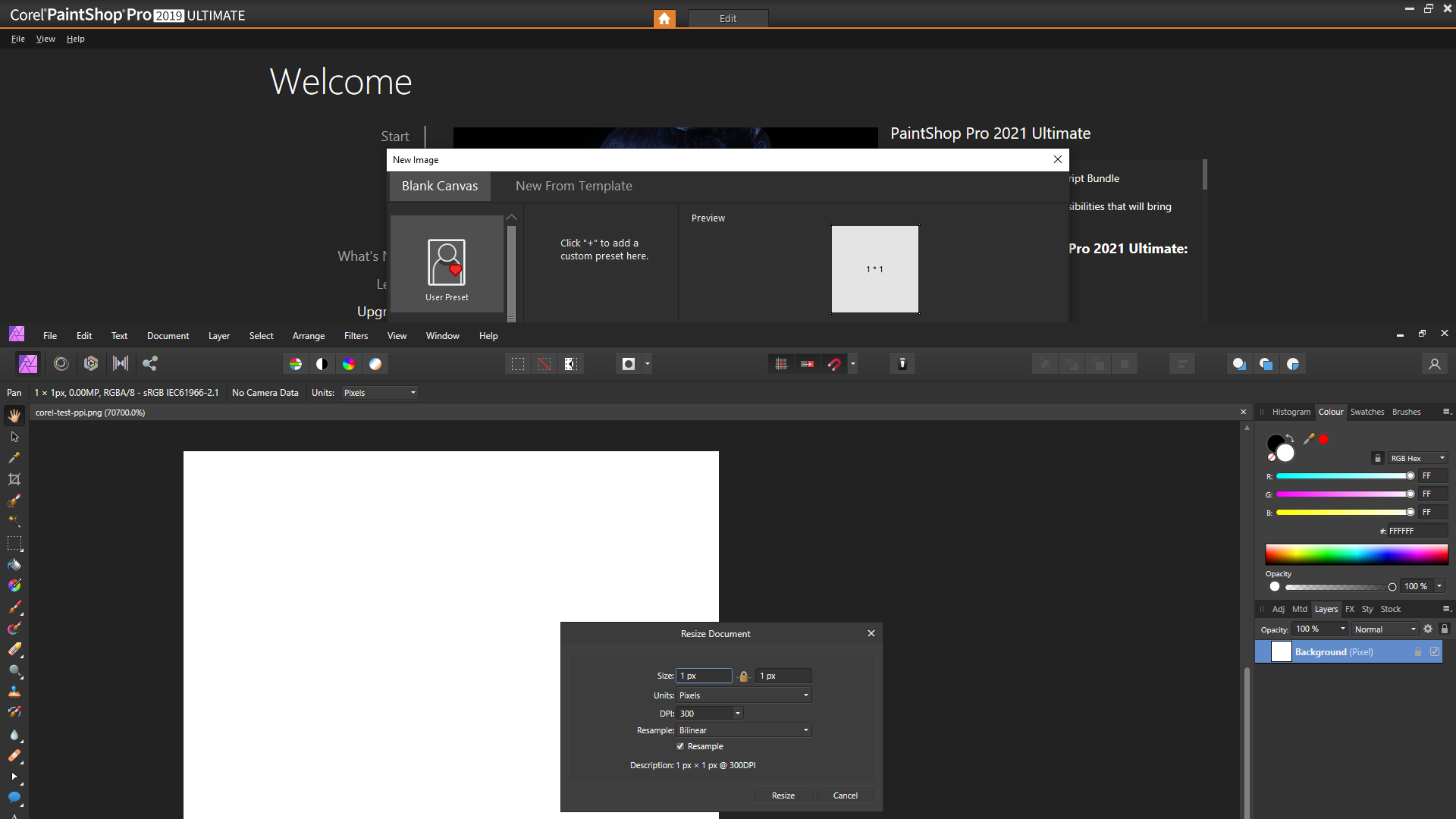
Hope you believe it now! This is Corel 300DPI. You must do something wrong for sure and despite the fact that I show you all these tests you don't change your mind!? As long that you don't upload an actual image for testing with screen shots to show how you created the image in Photoshop nobody can test your problem.

-
Here you have 300 DPI ! Could it not be that you do something wrong or that Photshop CC needs a update?
-
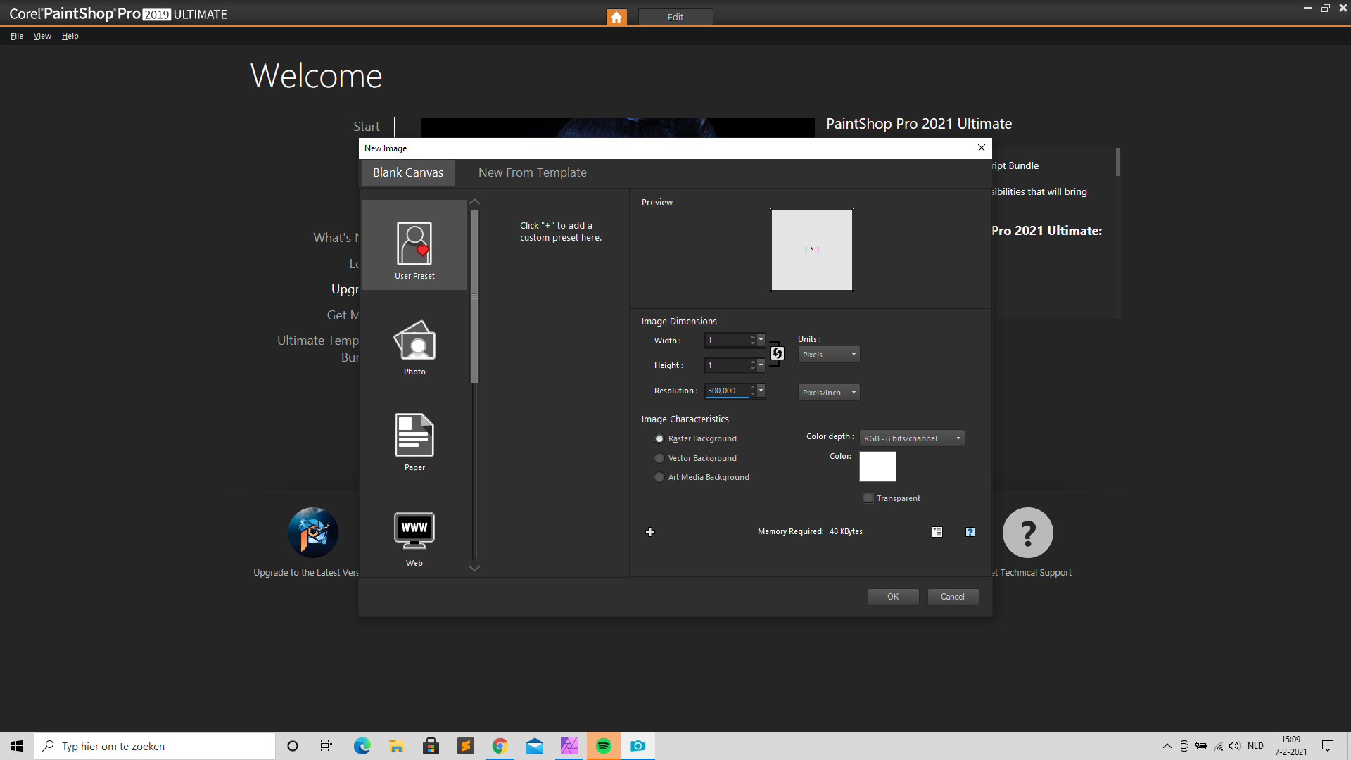
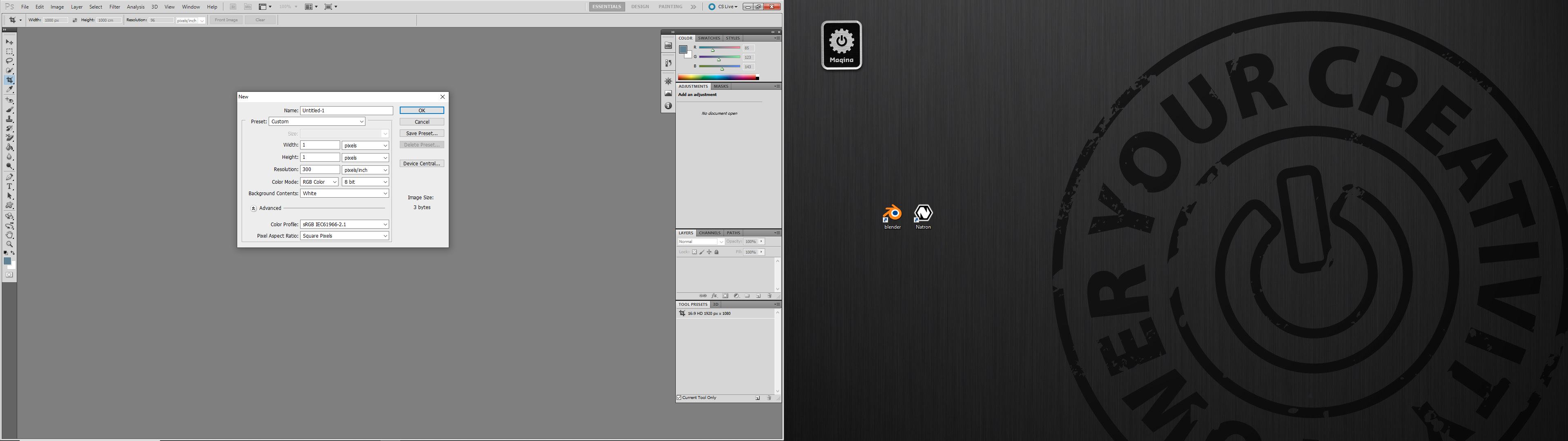
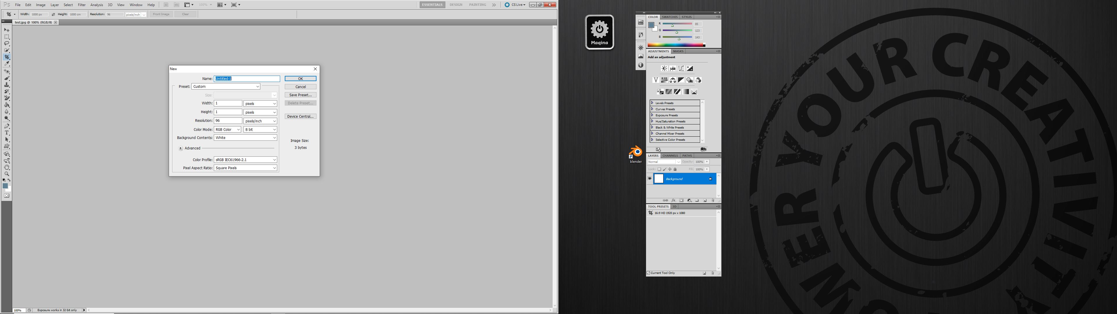
96 DPI was set in Photo Shop for this test. I can set it on any DPI the result will be the same only with a different DPI.
-
Did you look at my screen images? Windows Photoshop and Affinity. I can do the same on my iMac. I have all apps you named no difference!
-
I get exactly the same image and DPI when creating a 1px image in PhotoShop CS 5.5 and opening it in Affinity Photo. Can you upload a Photoshop image for testing and show how you made it in Photoshop? The one in the first post also opens normal in Affinity Photo.
-
Exactly what I try to explain!
-
There is nothing removed only the metadata is changed! Did you read the articles I posted for you? When you shut of "resample" to keep the same pixel dimensions and only change DPI you have what you want. I get images that are 1250 DPI from stock images companies, when they are used for print I just change that. Go to Document > Resize Document > Deactivate Resample > Now change the DPI > Click Resize and the pixel dimension will stay the same and your DPI is changed!
-
Hi, Don't see the problem disused here! 72dpi and 96dpi are (mis)used in the far past for so called screen resolutions. That made no sense anyway, because PPI and DPI mean nothing on screen all that counts are pixel dimensions. When I create images for the web I don't even look at it. When I import a image from for example Photoshop or Capture One and the images are ment to be used for print I change them in higher DPI anyway. The amount of DPI that it shows in multiple photo editors says nothing! You just have to adjust it to your personal situation. It's only meta data (for print only!) the actual image doesn't change. You can easily resize back or up with "resample" shut of (to keep the same pixel dimensions and only change DPI) or on depending of what you want if that makes you feel better. Regards, David http://www.rideau-info.com/photos/mythdpi.html https://www.photoshopessentials.com/essentials/the-72-ppi-web-resolution-myth/ https://theeagerlearner.com/dots-per-inch-and-all-that-nonsense/
-
Hi @Wilson Tarbuckles, It's also interesting to read this old article: https://blog.alexdevero.com/html-rapid-prototyping-facts-need-know/#:~:text=and rapid prototyping.-,What is HTML rapid prototyping,to user's problem or need. and https://medium.com/@andreas.johansson.dev/do-you-find-yourself-designing-the-same-screen-over-and-over-html-prototyping-may-help-f87d45787e11 and https://blog.prototypr.io/stop-designing-in-sketch-design-in-the-browser-c102bcdcdbb You can of course make a mock up in Photo or Designer, but I think it makes no sense for web design it simply doubles your work for no particular reason. A very common way of creating websites nowadays is HTML Prototyping . I use Affinity Photo And Designer aside to create the responsive images, logos etc. and do my HTML prototyping in Bootstrap. Have used Sketch too but it's to much extra work. A very good editor for this is https://www.pinegrow.com It spits out: Bootstrap, Tailwind and Foundation or normal HTML websites. You can even export your site to WordPress if needed. It installs a complete Bootstrap or other framework setup in seconds and you can start building your design. It works perfect with Sublime Text, Atom or VS code next to it. SASS is implemented and more. At the end you have your website ready for upload to the server or to show your client how it really is going to look like. Regards, David
-
Save for Web?
All Media Lab replied to pbolger's topic in Pre-V2 Archive of Affinity on Desktop Questions (macOS and Windows)
Excuse me? I run a web design company and use Affinity products for years. I also happen to have Photo Shop and Illustrator and your tone and the assumptions you make including the way you expose your self on this form makes you look like a 14 years old trying to get some attention in the wrong way! This is a users forum and people try to help in a positive way. Not the way you try to solve your problems. There is Affinity staff watching this forum all the time and when you ask a question (the normal way) they may answer you! affinityreturns@serif.com -
Save for Web?
All Media Lab replied to pbolger's topic in Pre-V2 Archive of Affinity on Desktop Questions (macOS and Windows)
That is utterly nonsense! I use Designer on daily bases and create vector based designs that I export as JPG, PNG, TIFF and SVG without a problem, maybe you should use SVG, TIFF or PNG instead of JPEG? It depends of the media you want to use it for. https://blog.hubspot.com/insiders/different-types-of-image-files Or study the documentation before making false assumptions. https://blog.filestack.com/thoughts-and-knowledge/complete-image-file-extension-list/