UncleMonkey
-
Posts
36 -
Joined
-
Last visited
Recent Profile Visitors


-
creating a template
UncleMonkey replied to Shell's topic in Pre-V2 Archive of Desktop Questions (macOS and Windows)
Thanks! Makes a ton of sense… but maybe it would be good to have the search function conspicuously mark really old posts, too? -
creating a template
UncleMonkey replied to Shell's topic in Pre-V2 Archive of Desktop Questions (macOS and Windows)
Huh!?! I'm signed into my Affinity account, signed into Vimeo, and still get the message "Private Video Sorry, you don't have permission to watch." (Chrome, MacBook Air earkt 2015, Monterey 12.7.6) -
 PaoloT reacted to a post in a topic:
Please add multi–font text styles
PaoloT reacted to a post in a topic:
Please add multi–font text styles
-
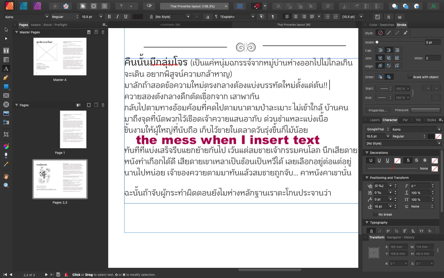
In much of Asia, it is usual to have bits of Latin-script text in a block of Thai, Chinese, or whatever. Right now I'm working on a restaurant menu where one field requires both Thai and Latin script. The next version will need Chinese, too. To make this look good I need a different font for each script. In Microsoft Word I can define a style that uses an entirely different font for each script. From the posts I've seen, in Affinity Publisher I would need to override a paragraph style with a manually applied character style for two of the three scripts. This is a pain, and since I'd have to do it over again whenever my merge data changes, I can't really use Publisher for this job. This problem must be hurting Affinity sales all over Asia, and I would think that applying a font according to a range of Unicode code points would not be a big programming challenge.
-
Vertical Text Layout
UncleMonkey replied to Hiran Sye's topic in Feedback for Affinity Publisher V1 on Desktop
Vertical, right-to-left is the how the most important texts of about 1/4 of humanity have been written for 2,500 years, and how they've been typeset since movable type was invented in China about 1,200 years ago. Right now I have to use Word to produce a .pdf to embed in Publisher document if I want it to look properly Chinese. Bummer! Programming this should be an awful lot easier than getting CJK line breaks right, which requires some complex rules to handle punctuation. (I'm assuming Publisher can do that correctly with horizontal left-to-right CJK, but I don't know for sure — I never write Chinese that way.) -
andmocychmen reacted to a post in a topic:
Space between letter and accents / diacritics
-
Affinity's inability to break lines of Thai Text was a minor irritation on graphics projects, but now that I'm laying out a book, it's a BIG problem. Any time I inset text, I have to redo all the line breaks in a paragraph. If I change a style definition late in the job, I'm going to have to go back and manually change the lineation in every paragraph. Not fun! I wonder if the Thai government hasn't published code you could use for this. Hope you can fix this soon.

-
deekay reacted to a post in a topic:
Batch Processing in Affinity Photo
-
Vertical Text
UncleMonkey replied to capturleat's topic in Feedback for Affinity Designer V1 on Desktop
Publisher needs to support right-to-left vertical Hanzi (Chinese character) text! So does Designer! Don't know if I'll buy Publisher without. in Designer, if you don't want to wrestle with multiple one-character-wide text frames, there is a laborious workaround using a spreadsheet: paste your text into a Google sheet. (Excel will probably work as well) use SPLIT(), TRANSPOSE() and INDEX() to get the order you want - you'll have to add spaces to get line breaks right. adjust font and column width to taste. "print" the rearranged text to a .pdf on your machine. place the .pdf in your Designer document The embedded .pdf will be editable , but anything you insert will push text right instead of down, so all you can practically do is replace characters one-for-one. This approach is troublesome, but it keeps all your text together. TTC text - 第十章.pdf -
Select Same Colour
UncleMonkey replied to Mark Levy Art's topic in Pre-V2 Archive of Desktop Questions (macOS and Windows)
After half an hour, I'm just about finished cleaning up a very small .svg layer by layer. If I'd been using Illustrator, it would have been a two-minute job. Not everybody needs to select objects by attributes, but when you need it and it's not there, you're left with about the most tedious task there is. -
Yes indeed, it's v e r y noticeable that Serif doesn't reply to feature requests, or commit themselves to delivering particular improvements. Giving firm dates would be imprudent, but assuming they *do* have a development plan, it would be great for users to see what to expect in Wave One, Wave Two and so on — not as absolute commitments, but as goals. There are a bunch of pretty basic features Adobe and others offer that we're still waiting for, entirely in the dark. So far nothing that's going to make me move away, but in my book this unresponsiveness verges on arrogance. At the very least, Serif could maintain a Top 10 Feature Requests page with brief notes about what to expect.
-
Pink Panther reacted to a post in a topic:
Batch Processing in Affinity Photo
-
Really needed. How about a reply from Serif here?
-
I agree (in more restrained language) with @doolderboy — it's weird that after 3½ years the feature isn't there and there isn't even an ETA or a reason why not. Surely lots of users, probably most, have cameras that need the same RAW adjustments over and over? Not to mention that all the images from a shoot under fluorescent lighting… and so on. Could we ask for a Yes, we'll add it [when?] or No, it's not on the cards [why?]
-
Support for Thai text!
UncleMonkey replied to UncleMonkey's topic in Older Feedback & Suggestion Posts
Hi, Hiswe, I'd say Microsoft's Angsana New is pretty close to schoolbook text; TH Sarabun New (a Thai government font available free on the 'net) is clear and unstyled, too. -
Support for Thai text!
UncleMonkey replied to UncleMonkey's topic in Older Feedback & Suggestion Posts
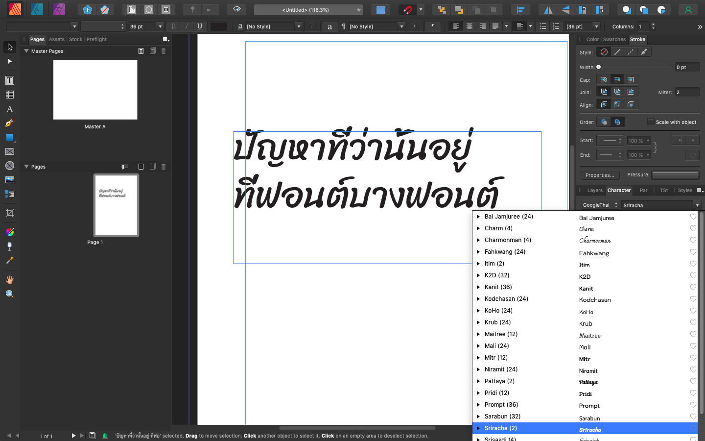
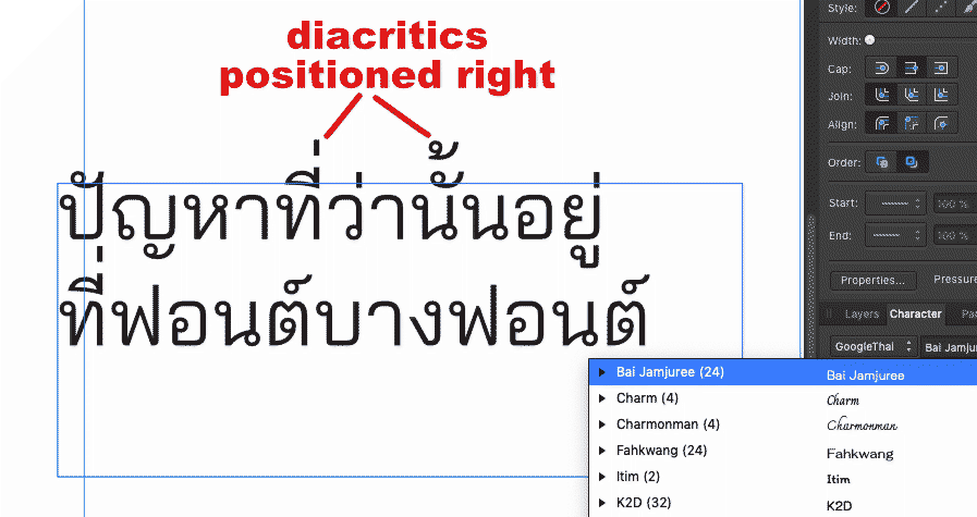
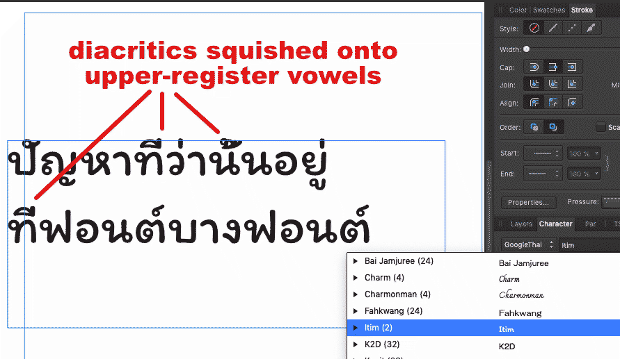
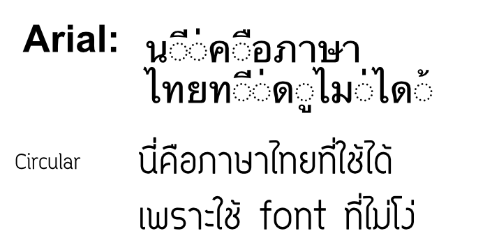
That problem occurs with font that don't have proper data (dunno the tech term) for positioning Thai floating vowels and diacritics — not only Arial, but a couple of old Mac Thai system fonts. If you use modern Thai fonts, things work as they should. You can get a bunch at f0nt.com (that's a zero before the "n"). See the sample comparing Arial with circular below. It's not a black-and-white issue: some fonts look fine until you want to typeset something like ปิ้ง, where the diacritic needs to be shifted from its normal position to keep from overlapping an overhead vowel. When I used to do Letraset and bromide typography, the mai ek needed four different positions to look good; I haven't found a font that handles ปู่ the way I like, with the ่ over the stem of the ป.
-
Okay, I've already bought Affinity Photo and Designer, so there's nothing to gain from me here. But I'd really, really, like to see this feature. Sometimes, it's just plain essential. Designers who talk about the superiority of hand tracing have not, I suppose, ever tried to make a 256-color hand tracing of a large photograph. Adobe Illustrator does this amazingly well; Vector Magic well enough. And there are valid reasons for doing it — how else can you get a totally sharp, almost photorealistic image that still has a non-photo feel? For the full-time designer, having to turn to another app for just one process may be only a minor irritation. For someone who has the occasional rush job, but spends 90% of her/his time on other things, getting the whole job done in one app is enormously better. If Serif can produce a tool 90% as good as Adobe's Live Trace, it should be in the app.
-
フィリップ reacted to a post in a topic:
Support for Thai text!
-
Support for Thai text!
UncleMonkey replied to UncleMonkey's topic in Older Feedback & Suggestion Posts
Hi, Dave, Oops! I didn't experiment long enough. Sometimes Thai text works flawlessly in both artistic and frame mode, in Photo and Designer. Sometimes it works in one and not the other. Sometimes I have to paste from a word processing application; sometimes nothing at all will produce correctly composed text. After I upgrade to OS X El Capitan, I'll post an update.