

Wosven
-
Posts
4,130 -
Joined
-
Last visited
Posts posted by Wosven
-
-
Leading is in the top bar as it should be, and since Leading override is a character option, that's in this panel that you'll find it. Clicking on the "a" button on the top bar will bring the character panel in view if it's not.
If you need to use it a lot, perhaps a character style with a shortcut would be better.
-
This bug keeps on with APub 1.8.3
"L ›auto-école" instead of "L’auto-école"
-
It's only usefull when drawing, to simulate less pression on smaller stroke perhaps, but in all the other uses, it's a flaw.
-
Perhaps it's saving each time the export's path (or export settings), not checking first if it's the same as before?
-
An example file would be more usefull!
Perhaps some paragraphs are set to keep with the next one? Did you use Text styles or did the formatting locally? This way, you can have unwanted properties on your paragraphs.
-
We had the same discussion about not understanding this variability in AD. It's the same when you save the effects as styles. When added to another object, the values can be completely wrong.
You can draw another object, hoping the values will be the same, but they'll be lower or higher once the syle or effect pasted on a smaller or bigger object.
Try dupplicating the original object to be sure it keep the same values, and hope you won't have to modify them later.
We lack the ability to keep the exact same values, and to be able to modify an object style instead of needing to select them all and modify the effects when we want changes and to have consistency.
-
I've got coworkers working on "legacy" illustration for books for children that need to vectorize old drawings to be able to enlarge and use them (to meet modern printing standards), without redrawing them.
I can use it for some logo not simple enough to be fastly redraw manually, or part of them.
I know some people using it to redraw low resolution logo too, when they don't have the time, patience or skill to do it themselves.
That's some examples, but I'm not asking particulary for this feature since I don't mind using other apps if needed and waiting, just my 2 cents
")
-
Hi,
To move the arrow heads, you need to [convert to curves] (button at the top while having a shape selected), and cut the curved where you want the arrow head to be. For this, use the Node Tool, add a node where you want, select this node and hit the Action [break curve]. (You can break more nodes.)
Also, you can simply rotate the oval.
-
If possible, select different objects and set the final values of the effect if you don't want them to be different. It's a long know issue with the effects or other styles that change value when pasted on some other objects.
If the effects are simple ones, with few values, it a good exercice for the memory… perhaps one day we'll have an option to keep exact values.
-
1 hour ago, richard gold said:
to recreate a project performed in Photoshop in a tutorial I watched and it was way too difficult, confusing and ultimately unsuccessful.
Perhaps doing AP tutorials would help better first, and trying to translate Photoshop tutorial to AP can begin when you'll feel more at ease with AP.
You can always ask the forum for help too.1 hour ago, richard gold said:Affinity needs, perhaps, a series of small books that can be referenced if you wish to perform a specific editing goal or project or more thoroughly understand some of the functions right down to the most basic
There's a lot of tutorial about feature or "how to do this", usually, they give link to the pictures used so we can do it too, and as suggested by some book or as a lot of people do, writting down tips and tricks or procedures can help memorize them (with keeping a file from the exercise if notes aren't enough).
Reading the help about some tool after using it in an exercice can give ideas how to use it too.Yeas ago, I spend a summer holidays with 3 small books about Photoshop, Illustrator and QXPress, without any computer, only to be more focused and try to understand the apps, the menus, the tools, etc. It was really effective and I keep on reading documentation or help files when I strugle with something I don't understand enough to be proficient with. It's the hard way, but sometimes it's better than playing around with a shiny app and going nowhere: going back to basic methodology can help.
Perhaps you can read and test if this site is the sort of explanations you need, https://theeagerlearner.com/ he did a ebook and give some courses (some a offered with the book). There's a lot of other books, but I don't know them, you'll have to read the comments, the previews, or if the authors have a site with tutorials to check if it suits you.
Oups, I forget to mention the author that posts in this forum too: @drippy cat
-
I suspect 'Arial 12 pt' is the default for "no style" since Arial is on all computers from the start with about ten other fonts, and Arial can display a lot of alphabets, as the Times New Roman used by default on some apps (or other fonts for some apps that install them automatically).
Since they are well known, it's easier to spot, or easier for the app to substitute for missing fonts.
You can use Base styles, set them as default, and use them instead of "no style" when you want to clear attributes on some text, using the "T" icons or the options like Apply xxx and clear characters styles".
-
7 minutes ago, Markcq said:
Linked files instead of embedded files will also be amazing. If a file is edited outside of Publisher it would be good if it could update
Perhaps you need to follow more about the updates and features:
https://affinityspotlight.com/article/affinity-publisher-to-embed-or-to-link-files/
-
When multiple objects are selected, displaying a "?" would be better, like in some other apps, the same for colours or text, since it can be misleading to read an inacurate value.
-
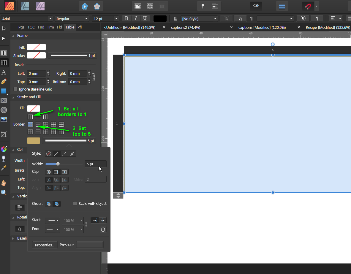
Or a 1 cell table with different settings for the borders:
-
14 hours ago, William Overington said:
What are the four small logos near the lower edge of each card please? Do they have meaning or are they just logos? Are the coins 'value for money'?
- The crosswords grid one is for pixels
- The strange glasses one for vectors
- The T column for text
- And the coins for price
-
3 hours ago, Asfak Mahmud said:
How does it works? Could anyone attach screen video?
Hi,
You need to put the file Spaceman.bat in a new folder where it'll be able to create new folders for the backup files.
And you run it clicking on it or right clicking and choosing "open". It'll ask you which operation to do, for which application, and report the results.
-
Hi,
AP give you the option to work with channels, (live) filters and macros, and more options with pixels and selections that you can find on AD Pixel persona, for example.
And there are other Personas not available in AD.
-
Some frames can get a percentage when resized with the wrong handle, or when opening a PDF, etc. I'm not sure how it comes when we are careful, but it's disrupting the workflow, since there's no visible display of this percentage and no way to correct this.
When it happens, I use a trick that's the fasted way to keep sane and working: I copy the previous correct frame, put it at the same position, width and height of the one I want, delete the text inside and link the previous frame to this one.
With long documents it's a pain, but without doing this I would just stop using this app (and I only do tests or personal works with it, I wouldn't accept this with my main app).
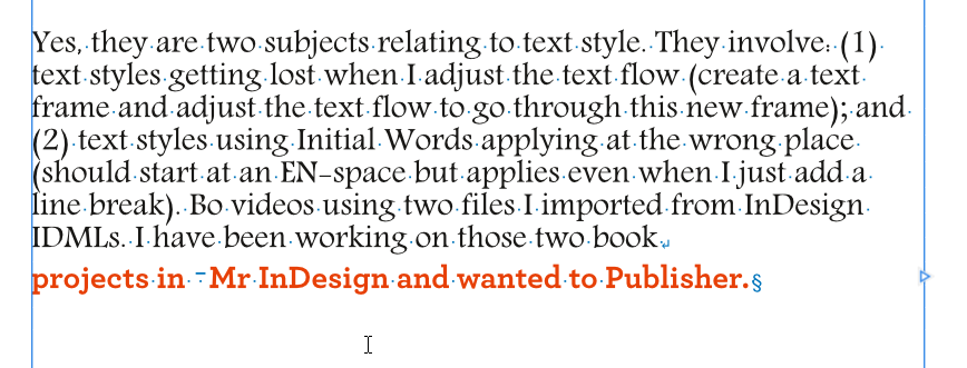
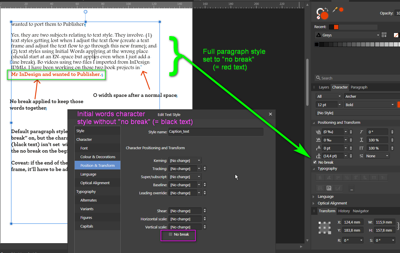
About the Futura and Initials words problem, a sample of your pages could help find the problem. But APub treats line breaks as paragraph breaks.
I've got an uggly trick for you: using "no break" on the paragraph style, and not in the character style. It'll keep the last part together with the right font and colour, and disable the "no break" on the previous text. And using "0 width space" instead of en-space.
-
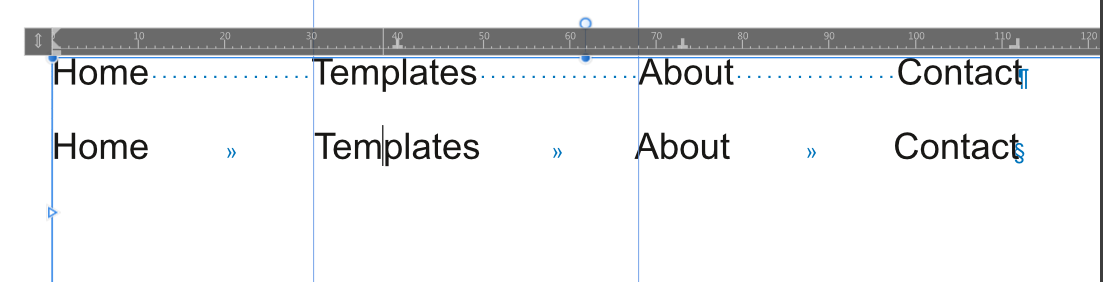
Another option, using the same amount of spaces before spacing tabs:
-
Excellent idea, since those infos aren't in the metadata and that's where I usually put them manually.
-
As @walt.farrell said,
You can explain (to readers) that the pages are better view in "book mode". Usually PDF viewer allow to have the 1st page independent and the others as facing pages, but if reader need to zoom to read, they'll prefer having single pages.
Some smart apps or online viewers allow to see full pages or facing pages, and clicking the text will display a special view where texte is flowing as HTML, so it's easier to read, zoom, etc.
-
-
51 minutes ago, jjk said:
And it would be still better if they were inserted when importing text.
It only should be an option easily enabled or disabled, I don't like program messing my text without being able to check what is done (I usually prefer smaller fixed width spaces, when an automated app will add different ones), or use scripts where I can check what is done or not.
-
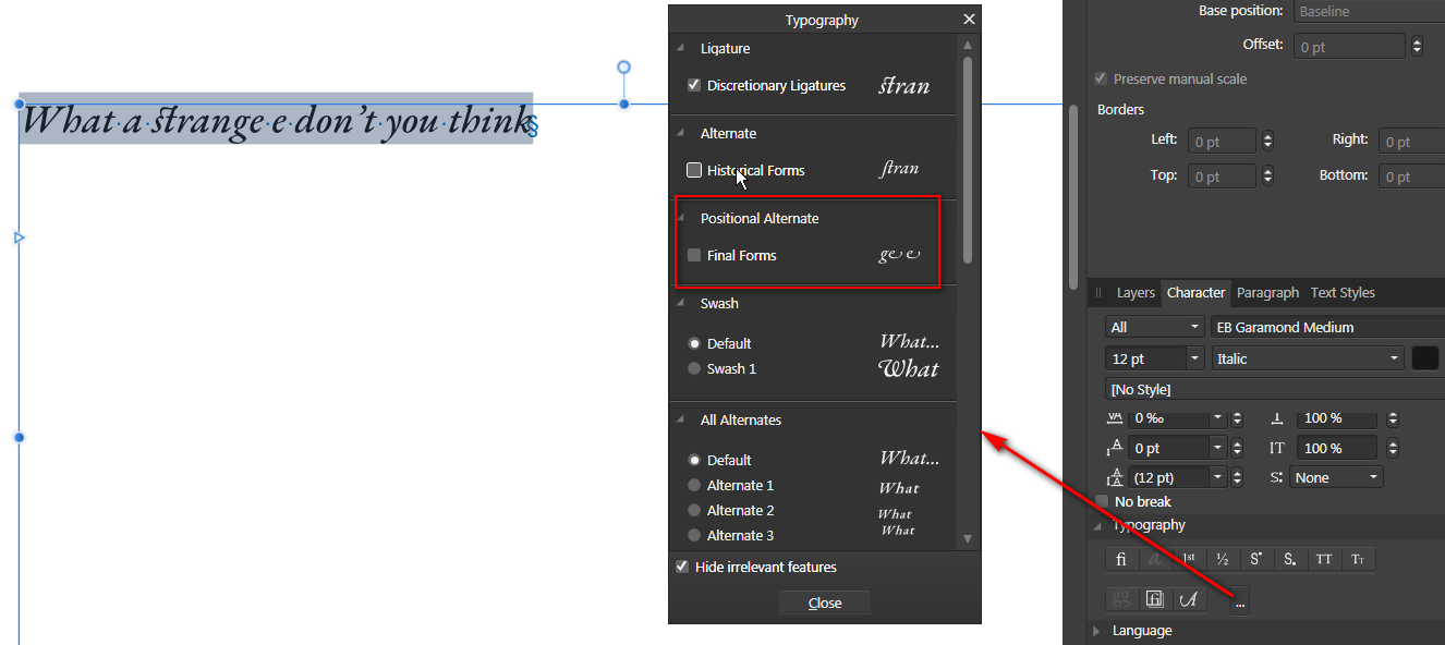
Hi,
Uncheck Alternate final forms in the Typography features.


How to move pdf crops marks outside of bleed area
in Pre-V2 Archive of Desktop Questions (macOS and Windows)
Posted
When I test with a file, the marks are out of the bleed with 3 or 5 mm bleed.
bleed_and_marks.pdf