Checkmate
-
Posts
133 -
Joined
-
Last visited
Everything posted by Checkmate
-
 Ah yes, I remember it being referred to as YDB Syndrome now. I appreciate an effect like Blur being a raster effect, but it would be great to have true vector FX for Drop Shadows, Glows etc. Maybe in a future update...?
 -
Thanks for the reply. Is there any advice on how to avoid this altogether, as in what export settings I can use to guarantee the result isn't in the hands of the printers?
-
I've noticed an counter-intuitive result when editing text in Affinity. If I highlight a section of text, then type over it, I expect the resulting text to maintain the styles of the previously highlighted text. However in Affinity, only the first typed character keeps the style, the following characters use the styles of the text AFTER the insertion point. Example: I type two lines of text. I make the first line bold I highlight the whole first line (triple click) I type to replace this line with new text. The resulting text has a bold first character, but regular thickness for the rest. I'm not sure if this is by design, but it's really annoying!
-
Here is the original .afdesign file along with a photo of the final print. Printing Issues.afdesign

-
Hi there, I have an issue that I've also experienced with other design packages, but I was hoping to get some tips to help. When printing to certain types of printer, images that combine plain vectors and rasterised fx, don't always match up exactly. For example, if I set the background of my document as a blue square, then place an object over it with a drop shadow FX applied, I often get a noticeable division around the object where the raster graphics meet the non-raster areas. This only applies to the final print and doesn't happen with all printers. I guess it's related to how bitmaps and vectors are processed by a printer and I realise I could print the whole document as a bitmap to avoid this. However documents sent to printers may not always be processed in this way.
-
Any news on the vertical guides bug with multiple artboards? Both dragging guides and manually entering values still doesn't work.
-
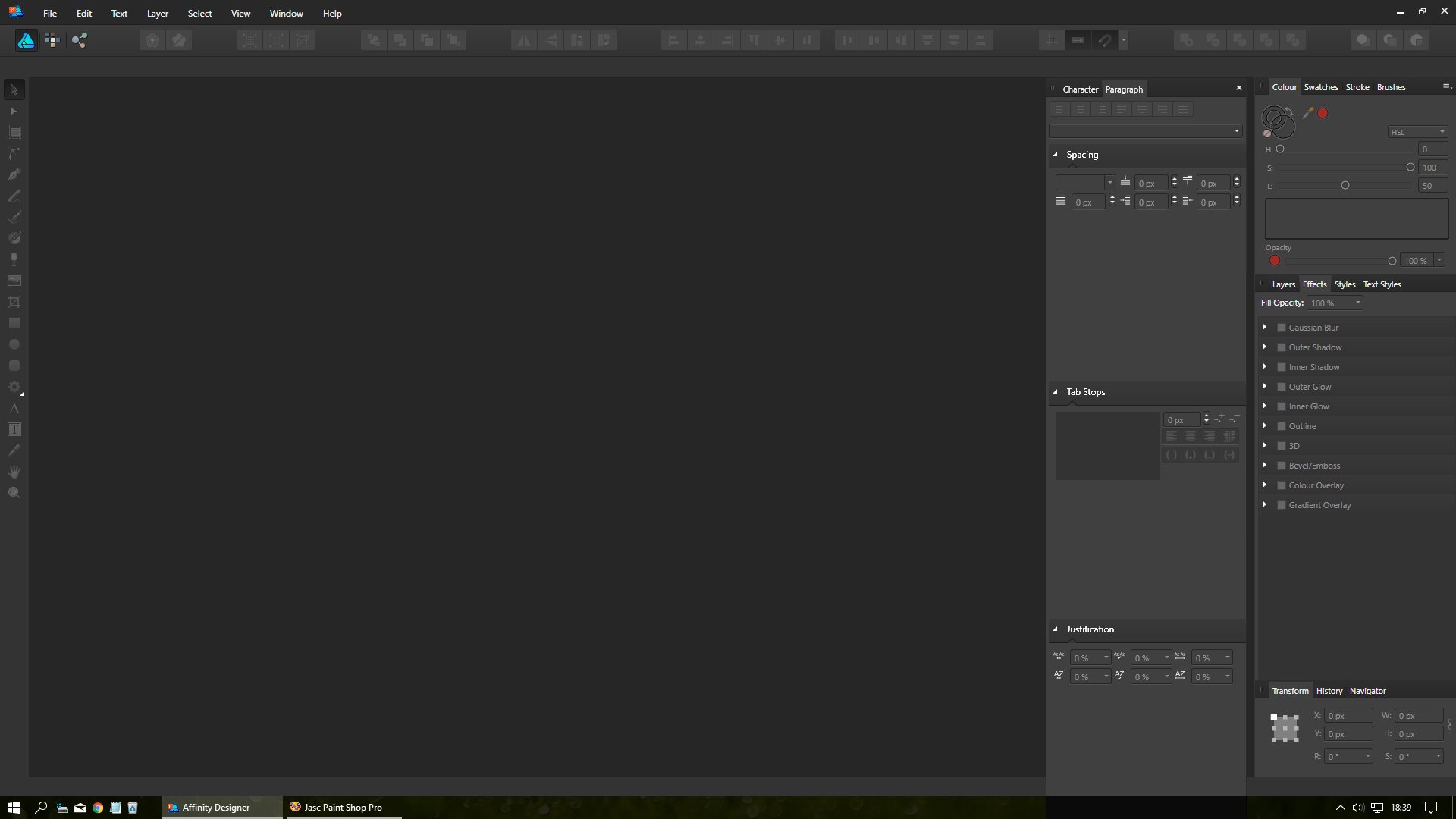
[1.5.0.24] Paragraph Panel is too long
Checkmate replied to Checkmate's topic in [ARCHIVE] Designer beta on Windows threads
Turns out it's both panels. To replicate the issue Dock both Paragraph and Character Panels together and leave them floating on the workspace. Close Affinity and restart it. Click whichever tab is not currently selected on the floating panel. I've attached a photo of the issue with the Character Panel.
-
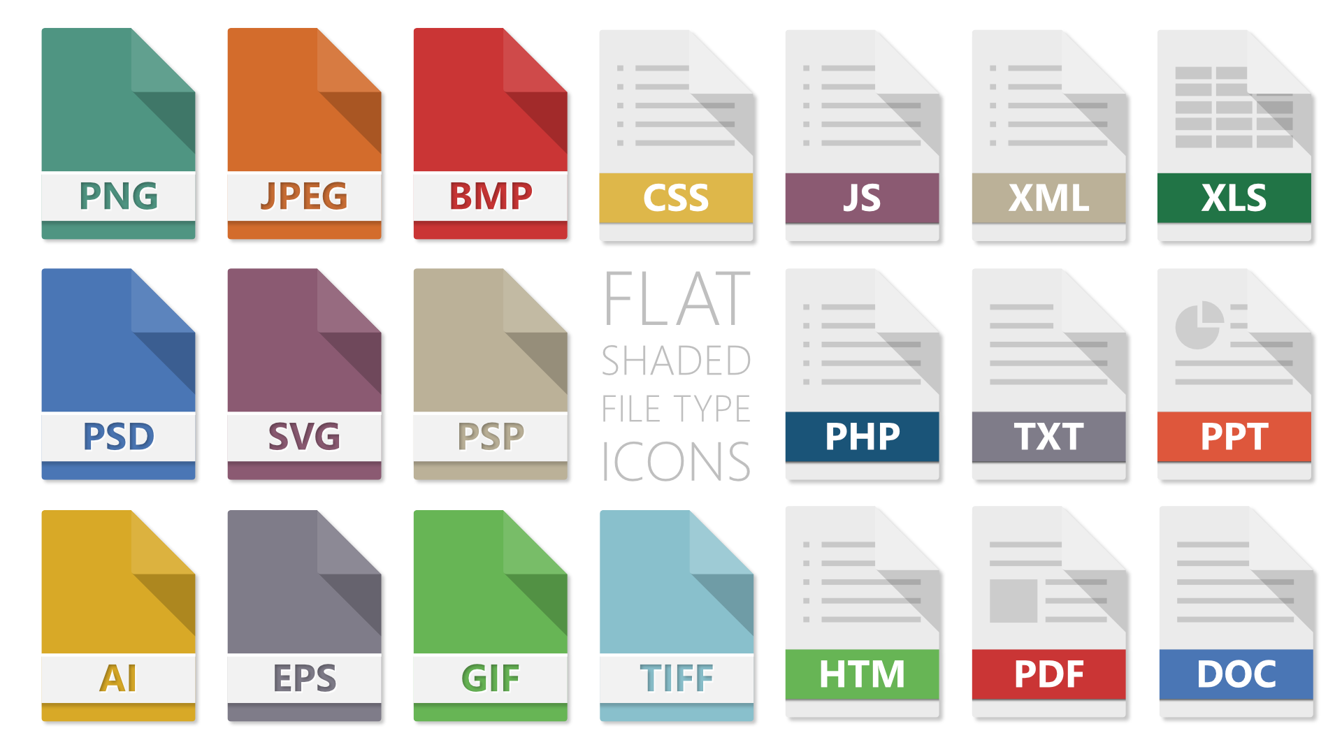
affinity designer Flat Shaded Icons for Windows Explorer
Checkmate posted a topic in Share your work
Inspired by the icons on the Affinity Designer export panel, I thought I'd design some icons to give my Windows 10 install a refresh. It's the first time I've experimented with the 'Export' Persona. Combined with IcoFX Portable I can batch process the icons really quickly. I've attached the .afdesign file, plus .ico files for anyone who wants to use them on their PC. I use a great free app called Default Programs Editor to change the icons on Windows (amongst other things). Flat Shaded Icons.zip
-
I've noticed this in previous betas too. When I first load Affinity and click on the Paragraph Tab (docked with the Character Panel), the whole panel is stretched very long. The only way to shorten it is to contract then expand the 3 sections (Spacing, Tab Stops, Justification). Please see screenshot for a 'before' shot.
-
Ah yes, I had no idea about that feature! Does it update the exported files as you edit, or whenever you save the affinity file?
-
I'm not sure where this option is? Is it available in the Windows Beta?
-
I agree. I used the Export Again option a LOT with Freehand.
-
I think it was my misunderstanding of what happens when you 'place' an .afdesign document into another. I figured it would place the whole document, artboards and all. Now I realise I have to make artboards under any placed .afdesign documents. Could there be an option to include a document's artboard(s) when importing it?
-
I think the confusion was where I created a blank document, then imported my 12 pages, but none of them were placed on the default 'page'. So I had 13 items in total. But I now realise I had to create artboards under the embedded files to get them to export anyway, which removed the default page! I guess the default 'page' is not an artboard but sort of behaves like one? What actually is it?
-
I'd like to clarify the role of the 'Document' when using artboards. I've created a number of files to combine into a single brochure and each one is on an artboard (to ease the final PDF export). To create the combined file I wanted to start with a blank document and embed all the files as kind of 'pages' in the order of my choosing. The problem I find is that the default 'Document' on a blank new file can't be deleted, except when you create an artboard, then it disappears (superceded by the artboard). So I have to start with one of my 'pages', then add more artboards, then re-save the file. But the starting 'page' won't be embedded in the same way as the rest. It just feels slightly disjointed and I wonder if I'm approaching this wrong?
-
I think a really handy option for the 'export' dialogue would be 'Space around image'. I regularly send logo proofs to customers as JPEG or PNG. When exporting selections, the resulting image always perfectly frames the objects selected (which is good). However sometimes I like to add a border to make the image more easily viewable to the client. Could there be an option to add a certain number of pixels evenly around an exported bitmap? I don't always want to adjust the artboard or add another object to achieve this.
-
Problems with fonts in PDF exports
Checkmate replied to Checkmate's topic in [ARCHIVE] Designer beta on Windows threads
Oh yeah - duh! That is in fact how I had it applied on my original file :-) -
Problems with fonts in PDF exports
Checkmate replied to Checkmate's topic in [ARCHIVE] Designer beta on Windows threads
In the end all I did was cut all the white vector and text elements and paste them above/outside the mask. Quick and simple. In future i would just copy the rear element and paste that inside too, behind the other items. That way the inner glow can show on the top edge only, as was intended (hence the mask). -
Problems with fonts in PDF exports
Checkmate replied to Checkmate's topic in [ARCHIVE] Designer beta on Windows threads
Here's an example: I create a coloured rectangle I have some text and an image I 'paste inside' the rectangle (CTRL + ALT + V) I then want to apply an 'inner shadow' FX to the rectangle, to create an 'inset' effect. In this example I get rasterised text and the image will also follow the raster DPI of the parent rectangle. This is because the FX covers the whole group of nested items. So how do I apply FX to JUST the rectangle? The only method I can see is to create a second rectangle with the exact dimensions of the original and also paste that inside, behind the text and image. I appreciate that the parent layer is effectively now a mask, rather than a regular object, so I don't see this as a bug, just an opportunity to save time. -
Problems with fonts in PDF exports
Checkmate replied to Checkmate's topic in [ARCHIVE] Designer beta on Windows threads
Well spotted! I have no idea how the gradient got applied to lots of the text. Do gradients show in the recent swatches? How would you go about applying fx to an object where contents have been pasted inside? Would I have to add a duplicate object inside itself with the fx applied? -
I'm experiencing some issues with exported PDFs and display of fonts in AD 1.5.0.19 When I export the document with the WEB setting, fonts are rasterised when in groups where layer FX is applied to ANY object within the group. (See attached Leaflet for WEB) If I select the PRINT profile, occasionally fonts disappear entirely, also (I think) related to being grouped with other layers. (See attached Leaflet for PRINT) I've also attached the original file for you to look at. I removed raster images from the file to make it quicker to upload, otherwise it was 35MB! Leaflet for PRINT.pdf Leaflet for WEB.pdf Leaflet NO IMAGES.afdesign
-
I currently use Inkscape for my Bitmap Tracing needs (and perspective distort), like a number of other users here. It's a bit of a clunky interface, with mysterious and enigmatic options, but once you get used to it, it works really well! It's very easy to then copy and paste directly into Affinity. I regularly have to recreate client logos from years-old low resolution jpegs and a trace function eases the burden somewhat! I think a Simplify tool is definitely required in conjunction with Bitmap Tracing.
-
Font list usability improvements
Checkmate replied to Clayton's topic in Older Feedback & Suggestion Posts
I was about to post about the recent fonts list too, but found this thread. We definitely need to be able to exclude the 'recent fonts' from the results when you type in the font list. I remember this bug in Microsoft Publisher and let it slide because it wasn't 'professional software'! On a side note, it would be great to be able to categorise fonts as 'serif', 'sans-serif', 'symbol' etc. to make selection easy. -
I know it has become the 'industry standard' to have recent files in a sub-menu called 'Open Recent', but I've never been a fan. In older design apps, the recent documents list was always at the base of the 'File' menu, avoiding a second step to access them. Take Paint Shop Pro 7 for instance (which I still use daily) - this has the 'old' method and there is also a preference that allows you to choose how many files are shown. The File menu only uses a third of my screen height so I'd love the option to use that wasted space.
-
Add Negative Values for 'First Line Indent'
Checkmate replied to Brett Stebbins's topic in Older Feedback & Suggestion Posts
This is definitely a regularly used feature for me, especially for bulleted lists as mentioned above. To adjust the entire text frame just to have an exception seems like a clunky workaround to me.