Roberto1972
-
Posts
83 -
Joined
-
Last visited
Everything posted by Roberto1972
-
Light UI has already been worked on for a great deal: wow! I thought they would wait until all Affinity products would have been released and updated... until it would require so much work they would silently hope everybody wouldn't nag about light UI's anymore :-) I don't understand why they took the dark UI hype risk in the first place for a new product (safer to start light and add dark later; even better to clean start with both at all, knowing many people hate one or the other). However, the fact that they decided to create a light UI already is something I HIGHLY appreciate for the sake of all users, thank you so much! File formats: I haven't been using PP that long at all (since X6 I think) but I did switch brands several times with different software due to unacceptable price rises. Hoped to be settled with Serif for ever now because I really don't look forward switching and wasting time on getting familiar with new software again. Particularly because I love the logics Serif uses for their UI's so much: almost perfect layouts and use of real estate which many others can learn from a great deal. Not to mention the flexible UI customisability! I never can understand if someone states they find Serif software hard to use: then I only can think of them they are looking for something identical to what they are used to without having tried to look at it with a neutral eye. Actually, personally I always found Adobe was king in messy and time (click) consuming UI logics. Anyway, the software realm has been incredible restless last decades: they keep changing looks rather than only updating in order to give false 'improved' impressions. Good things are replaced for the sake of commerce. I do understand and embrace the fresh start that opens up tons of new opportunities for developers. Sticking to old and continuously patching doesn't bring out the best. On the contrary in the long term. The new Affinity format being designed to cover whole product range compatibility sounds really interesting! But at the same time I feel sorry for those who have huge projects not compatible anymore. Yes, I'd be very pleased if that format would last an outstanding 25 years :-) Oh my, then I'm close to 70 years old :-( Hope new OS's won't spoil the life expectancy of your Affinity file format like forcing an other useless 64bit to 128bit bus size. 32bit to 64bit is only useful for a very minority and yet everybody had to bleed. But commercially very profitable. Long startup time is annoying but bare-able; light UI being fact now (with some patience) sounds very hopeful for me sticking to Serif ;-) Roberto
-
Hi, It looks like the crop tool in Affinity Photo is not as flexible as in PhotoPlus. With the latest crop tool update in PhotoPlus we were able to go anywhere we wanted like creating a fixed dimension crop from any size crop marquee: Constrained 658 x 498 -> crop marquee became this dimension and could be manually dragged bigger and moved. When applying the effect the selected area was cropped and automatically downsized to 658x498 (image size). This seems not possible in Affinity. Additionally, when recording a crop in a macro there is no way to select an image area to be cropped: Affinity just crops the area recorded, period, while no way to select the area to be cropped. This makes the crop tool useless for macro recording. That truly exciting crop flexibility was very useful for quickly transforming (part of any) images to required sizes like website uploads, wall papers, optimizing images for DTP purposes, etc. Hope PhotoPlus crop power is going to make it in Affinity :-P Roberto
-
Hi, Today ordered a copy of Affinity Photo afterall while I was close not to (contradicting my usual Serif support: update = buy without checking if I would need the new features). Have been a loyal Serif supporter for quite a while (actually an active one sometimes on other forums and email lists). So far I was always very pleased with the Plus series despite some issues here and there. Even bought additional products like kits and books just for the sake of supporting Serif financially to help keeping them in business. Affinity betas and apparently the final releases of Designer and Photo haven't shown (much?) improvement in long startup time. Together with the horrible dark UI it turned out I always was reluctant to run Affinity rather than Plus. Don't think that reluctance will change, though. Other than that so far Affinity seems to be an affordable treat. Even Photoshop Plugin support seems to be better than in PhotoPlus which is awesome. I understood a light UI is being worked on or at least on the to do list. Not sure if startup time CAN be improved much with the bloated .net dependency of Affinity for Windows. Both issues are real game spoilers for me. Initially decided to wait with buying until a light UI is included but somehow I wanted to stick to support Serif ... for now. Will wait and see what happens but considering my reluctance to starting up an Affinity product todays purchase might be a waste. I hope Affinity DTP won't have the dark UI as well! That would be totally insane although I find a dark UI for a constantly used tool the worst idea in general anyway. Good-looking, totally unpractical and only useful for things that are occasionally looked at. For constant use it's eye-straining with the high contrast between project and UI around it as well as low contrast between UI background and hard to recognize tool icons. Same for the dark hardware hype: 'cool looking' black keyboards, video recorders, telephones, car dashboards etc. with white tiny letters on them (or blue light emitting!): white text on dark background can be read if you focus but black text on white or light grey can be read from further away or even if you don't totally focus on the text. What's next? red keyboards with orange text on them? Serif, developer of an outstanding piece of DTP software: PagePlus ... is straying away in several areas as it seems. E.g. the -cool looking- website: huge, I mean HUGE screen filling USELESS images in the background as well as foreground with here and there text in between or put over, which can be found if you browse 10 screens down (after you first click the '>' button on the main page which on itself contains no info at all. There's no visual overview to perceive; there's no way to go quickly where you can find the info you need. Serif, DTP guru's totally missing the point: what's the holy main rule in DTP? It's that content, true information is the main focus and that images should ONLY be added if they supplement the content while use of images should be as less as possible. Definitely no use of too many images and images that do NOT any value to the text. Yes, today we have the means for stunning effects and exciting electronic entertainment. But old websites, movies and educational books are BETTER: they supply information, content in efficient ways leading to more effective use of time, information and perception of the message trying to be shared. I don't know what Serif is up to. They tend to stay humble and focus on practicality: (customisable) well thought effective UI layouts, well thought-through tools, avoided bloat, strived for consistency between products and , All highly aimed at workflow efficiency, productivity and even affordability. Now they seem to stray away from their initial highly appreciable professional principles with going for aesthetics over efficiency. Anyway, I'm excited they started from scratch with Affinity, that it supports PS plugins, disappointed in it's bloaty .net dependency, still humbly waiting and see what happens with Affinity but I cannot deny the fact I don't like where Serif seems to be going. Hate the fact AGAIN switching file format after having switched between brands over the years and finally satisfactory set myself with Serif. Don't really mind their website but it's interesting to see how Affinity is developing. Once there's a light UI I might like Affinity better eventhough I already like the recognisable tools and improved tools in it as well as the smooth UI performance (so far). Not having used it much yet no idea how stable it will be (forum bug reports can give a frightening impression but that applies to any forum about bug reports: Plus series also isn't nearly performing as bad as the forum messages imply). I still am not sure already to switch to Affinity (perhaps stick to Plus but how long will plus be able to install?) for my more important projects (file format): it kind of sucks file formats come and go over the years: old projects I can't open anymore at all due to old software not even installing anymore and due to price increases I several times switched brands. Everything digital seems temporary and not lasting. Glad txt, csv, tiff and jpg are still in business; wish there was a lasting image format supporting layers. I don't really trust on lasting pdf because it is Adobe: they act too commercial. Roberto
-
Hi, When executing a Photoshop plugin (.8bf) effect nothing shows if anything is happening or not. Usually image editors supporting Photoshop compatible plugins feature a progress bar of the plugin rendering the image. Even though that bar isn't always showing actual 'count down' (sometimes the progress bar starts over a couple of times, depending on the plugin) but at least it indicates the plugin effect is still being processed. Particularly Filter Forge effects consume considerable rendering time: I can't tell whether Affinity is either still busy or has ignored the rendering task. The circular 'busy' cursor isn't always showing; sometimes it just shows the ordinary arrow cursor. Don't like to depend on the circular 'busy' cursor anyway since it also shows when software has crashed. In short: it would be very helpful if Affinity Photo would feature a plugin progress bar, just like any other image editor does. Roberto
-
...syndrome: :D Wow, you did some serious bug hunting there, Alfred! Is Arial Black just Arial with a different font weight?? I always assumed font designers obsessively reconsidered each and every character with releasing each related font type. Interesting to read that the complex pdf format is working as a source file while a common format on its own (svg) fails! Until now I never was font (uhh...) of importing pdf because in the past I regularly experienced compatibility issues (read: only simple files converted successfully). So far I think I only used pdf for export; never for import even though I did copy objects from pdf occasionally. Roberto
-
Hi Sean, Attached a screendump and the file in question. The attached file is one I saved in AD after pasting or opening the DrawPlus export image; it's not a native AD file. When importing/pasting the image AD complains about a missing font (Arial Black). I changed the font of the objects having the initial Arial Black font in AD to FONT Arial, TYPE Black. After reopening the file AD still complains about the missing font and refuses to let me select objects properly. Using either selection marquees or the Layers tab I can select an object properly but not by using the mouse cusor (only few objects in the top of the drawing). Alfred, I have the system font set at 100% (Windows 7) Roberto EL-USB-3-terminals.afdesign

-
Naah, I'll better wait until AD is up and running. I asked for in case I overlooked how to achieve it. Likely pretty much all features of xxPlus products are going to be implemented in Affinity anyway. Bold assumption based on the fact that so far AD reminds me a lot of the other Serif products, really. :rolleyes: Roberto
-
(1.5.0.14) Ctrl + Shift + 2 = Crash
Roberto1972 replied to Highvoltage's topic in [ARCHIVE] Designer beta on Windows threads
Hi, The Ctrl+Shift+2 crash is still happening here. too and consistent. I use US keyboard on a Dutch Windows 7. If I toggle keyboard (Ctrl+Shift) nothing changes with regard to the crashing of AD. More software using Ctrl+Shift+2 I found in the mean time are: - DirectoryOpus (if I remove that shortcut AD still crashes) - Opera browser (if I change that shortcut in Opera 12 AD still crashes; in Opera 25 I cannot find the shortcut). Roberto -
Hi, Can custom (new) toolbars be created in AD? Is it possible to drag a Studio Tab to a side and let it auto-hide or collapse/expand (arrow button)? Or is that sort of stuff just something for later? Roberto
-
Yep, here as well.
-
Deleting snapshot - dangerous!
Roberto1972 replied to Roberto1972's topic in [ARCHIVE] Designer beta on Windows threads
Is there a particular reason?... Roberto
-
Oops, my latest reply (to Alfred) somehow seems not have made it into this thread. Was telling the bright UI examples Andreas came up with in the thread you linked to looked very exciting. As told eventually there will be an optional non-dark UI for AD so it's just a matter of patience. In the mean time I'm sure they'll treat us with many other development gems to be impressed with :-P Roberto
-
Wow, Andreas' concept looks really exciting. Well, still tons of things to be done before Serif actually is going to put resources on any brighter UI but I'm definitely looking forward to that. In the mean time, there's still DrawPlus :D but sticking to that won't really help shortening beta time of AD, hmm... Icon recognizability is my main issue, Hopefully AD will feature custom icon size as well. Especially convenient if the icons remain useless detailed full color artworks. They look great, don't get me wrong, but size and type don't go along with a dark background in particular. Sometimes two nice things simply don't go together. Usually IF software opts in for larger icons I do so; I don't mind sacrificing minor real estate for the sake of major usability. Roberto
-
Hi, Out of curiosity I made a screendump of the AD UI and inverted the image: wow, that's pretty close to a nice UI :D Still the icons suck, though: too tiny for using full color artwork images but unfortunately that's common behavior these days. I prefer icons to be clear, read: abstract and simple. Color and detail can be added when running out of variety. E.g. the first image editors managed achieving that beautifully: couple of black outlines used for spot on representations of the tools functionality. Example of simple b/w image editor tool icons: https://www.dreamstime.com/stock-illustration-set-line-icons-vector-tools-editor-thin-image68679901 Recognizable even without reading glasses on. Really no need for squeezing 16 zillion colors and details artwork in a 30 pixels image. I think simple and clear doesn't attract the pro's, though: simple is for kids and lesser fokes. Same for dark UI: main pro argument is that it eases the eyes with long usage. Well, it sure helps preventing constantly looking into a big rectangular light bulb one might get a head ache from. However, constantly finding the right icon among a bunch of hard to recognize icons more like appearing as slightly different colored lights on a dark background. Dark on bright is better perceived BUT the bright shouldn't be too bright: like text on paper. Everybody sees well on paper: black on a modest bright background; a brightness begotten from environmental illumination. Reading a paper lit by the sun is a pain in the arse, especially if bright white. Books and newspapers are grayish white which already prevents too bright paper. Bottom line is that best perception is achieved with black on modest bright background (actually the very best contrast perceived is black on orange tinted yellow). Therefore a UI on a display should be like paper: brightness adjusted to environment thus -not too bright- and large areas grayish tinted instead of white. Yes, looks boring, oh my! But it's a TOOL not the final esthethical attractive product. If one needs to screw often each day and can choose between nice looking neon high gloss grip screwdrivers or matte black rubber screwdrivers, which one would you choose? The cool looking slippery first ones or the high grip latter ones? Or choosing a steering wheel for a car: a boring round one or a cool looking Night Rider cockpit steering u-shaped 'wheel'? You tell me. But on the other hand, depending on the project you're working on sometimes a bit brighter or darker dialog is convenient, avoiding too much contrast between UI and workspace. Perhaps a novelty feature would be useful: a slider setting the brightness of the UI alone which does not affect the brightness of the opened document. Roberto
-
Just set to theme 'IP Board': like it much better this way! Thanks for bringing up choosing themes :-P ...just still no luck finding any AD themes :ph34r: Roberto
-
Ow, right. I didn't think of the lower res. displays for a moment. Perhaps a better way is making practical use of wide screen: narrow input column on left, wide output column on the right. Or leave as is; yes it works but if... :-P Roberto
-
Hi, Either if I copy contents of a DrawPlus file and paste in a blank AD A4 document or when I export a DrawPlus file to wmf and open it in AD something weird happens: If I click on an object or blank space then a seemingly total 'random' object is being selected (not that random: looks like AD suffers from some consistent wrong mouse location reference point syndrome). However, if I create selection marquees (with or without including right mouse button) than the correct objects are being selected. If I save as AD file and reopen nothing changes. Note: I have the font Arial Black installed but AD complains it can't find the font. It's also not in the AD font list (but it is present in the list of font types under Arial itself). Any physician around specialized in CWMLRP syndrome? What are the odds for total cure? Roberto
-
Hi, After reading a post the top bar of the forum has scrolled out of the screen; that top bar often contains useful links for a next planned action. Instead of scrolling up again or hitting the Home button on the keyboard it would be more convenient if the three bars on top always stay visible/ where they initially are. Thus when scrolling it would be ideal if only the area below the three top bars actually is scrolled. Roberto
-
Issues with scrolling
Roberto1972 replied to Michail's topic in [ARCHIVE] Designer beta on Windows threads
Just noticed a scrolling issue in the layers tab: 'usually' just mouse-over layers tab already allows scrolling through layers. Only not when a layer is selected/highlighted (but I might recall having seen scrolling even with a layer selected but I'm not sure). However, last time I noticed scrolling only worked when I first toggled a layer visibility.Otherwise (mouse-over or layer selected) it refused to obey my scoll wheels commands :-P Roberto -
[1.5.0.14] Opening any .EPS = crash
Roberto1972 replied to af-user's topic in [ARCHIVE] Designer beta on Windows threads
The black family file opens here without problems. I always did clean installs (uninstal old, install latest) on Win7. This beta .14 didn't ask for rebooting, by the way (think it only is required when .NET also is being installed). No accounts on Windows, by the way: just admin. Interesting is that e.g. keyboard shortcuts and recent files history remain unaffected by clean installs. Haven't looked into it yet but I hope those are stored in files rather than in the registry (convenient backing up preferences, workspaces, etc.). Roberto -
Can the NET software be installed separately in order to leave it there when installing a new AD beta? I assume .NET stays the same while only AD gets updated. Saves a lot of beta (un)installation time. Never mind: AD beta 1.0.5.14 installed quickly as it skipped installing .NET. Looks like the latest .NET that was installed with AD .12 wasn't uninstalled when uninstalling AD .12 before installing the latest beta .14. Roberto
- 51 replies
-
- 1
-

-
- designer
- public-beta
- (and 3 more)
-
(1.5.0.14) Ctrl + Shift + 2 = Crash
Roberto1972 replied to Highvoltage's topic in [ARCHIVE] Designer beta on Windows threads
Same here: AD Win crashes when Ctrl+Shift+2 Not when using numpad 2; only when using keyboard 2 It's not a total freeze: the crash is nicely catched by an error handling system; message : Unhandled Exception error. Clicking OK the message goes away and AD is closed. Restarting AD an error report is sent. Dutch Win7 Home, US keyboard, Wacom Graphire 3 tablet -
Ah, ok; makes totally sense. I know consistency is a very hard task when two or more people are involved. Therefore the 'long shot' :-) And you all are right: first priority is turning the beta into an income generating one. With the Affinity series starting from scratch Serif had/has to rely on limited savings or even loanes anyway with less income from the usual product updates. It's a big move to start from scratch so best to get through it as fast as possible :-) Don't get it anyway why Affinity for Mac costs only 40 bucks; it's just way too low for such software. 'Hopefully' that price is temporary in order to get a name out there. Too cheap isn't taken serious by the pro sector anyway. Oops, now I'm drifting off topic... and worse: none of my business :-P Roberto
-
Perhaps a long shot but is there any chance WE TESTERS can volunteer for work involved with setting up a non-dark UI? I don't suspect a bright UI is top priority for developers but for users on the other hand it likely can be. Would it require programming or can we take a lot of the work over by sending in image files, or perhaps modifying numbers in a lenghty 'ini' file? I suspect it would require icon modification as well: often dark UI icons don't look well on a bright one. Roberto
-
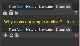
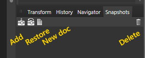
Hi, Playing with snapshots I noticed a potential risk of deleting a snapshot instead of creating one: deleting a snapshot occurs without confirmation. The icons for adding and deleting are placed next to eachother; kind of tricky that way. Perhaps the trash bin icon should be placed at the far right of the tab. Attached a logical order of icons. Roberto