loukash
-
Posts
6,949 -
Joined
Everything posted by loukash
-
I don't have Big Sur to test it, let alone a compatible Mac to run it, but in theory, it could be installed manually by extracting the individual archives from the installer app /Volumes/Nik Collection/Nik Collection.app/Contents/Resources: AnalogEfexPro2.tar.gz ColorEfexPro4.tar.gz Dfine2.tar.gz HDREfexPro2.tar.gz SelectiveTool.tar.gz SharpenerPro3.tar.gz SilverEfexPro2.tar.gz Viveza2.tar.gz Those contain the respective Nik Apps and the corresponding PS/Aperture plugins that can be moved into appropriate folders manually. One may also want to inspect a bunch of shell scripts in the same directory, and correspondingly copy a few Nik/Google files and folders from /Library/Preferences of a pre-Big Sur installation. However, not sure if such an installation would run in regular mode and not just in demo mode only…
-
 I'll check that out. Currently toying with the brand new 1.9.1 beta!
 -
The hard part is that you can't save adjustment presets in APu, thus for Black & White you'll have to learn the "30/89/59/70/11/41" mantra by heart. Alright, actually just 30/59/11, the rest is simple math. And 30+59+11=100 But still, it took me at least 5 years to learn my cell phone number by heart. And only in Czech…
-
Follow the link and watch the video. Even an old cat like me can sometimes learn something new Other than that, some other adjustments will apply the same conversion rule as this one, see my followup posts there.
-
PDF/X-3, K plate turned off:

-
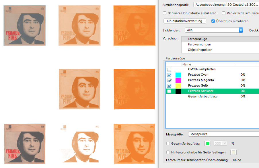
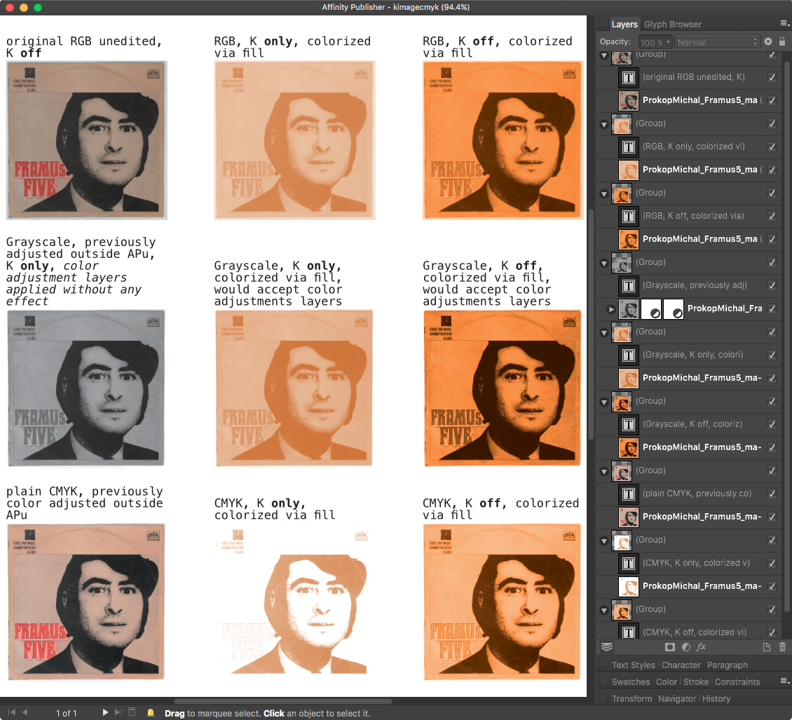
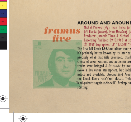
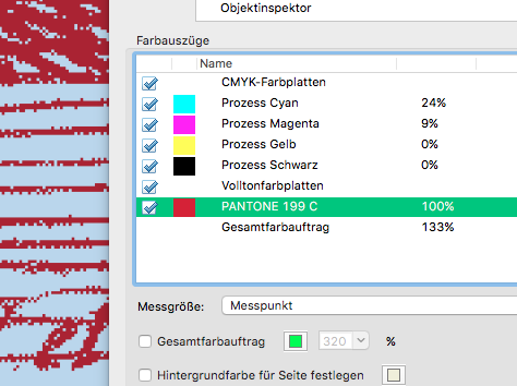
Diving further into it to understand "K only", let's sum up this way: If you place a CMYK image, it will disable CMY. Seems logical to me, as in: "it does exactly what it says it does". If you place a Grayscale image, "K only" is on by default. That's definitely a Good Thing™ as far as I'm concerned! But you can turn it off and then it becomes a composite image. That again means that you can apply color adjustments like Curves or Color Balance to colorize it in a way that's not possible on a K-only grayscale image. That's a Good Thing™, too! If you place an RGB image, there's literally no "K" to turn on or off, so it has to do a conversion. The question is: How? Comparing an RGB image turned gray via "K only" and via adjustment layer Black & White "30/89/59/70/11/41", the result was the same. So that's a Good Thing™ as well. Here some examples what happens in APu with RGB, grayscale and CMYK version of the same image which I've once used in a "real life" layout – done in Illustrator CS5 then – a few years ago: ^ Frankly, I like what I see. From what I recall, I was struggling a bit to figure out how to handle this in Illustrator to achieve this "washed out bad print" effect (screenshot from the final PDF/X-3): (On the other hand, I'm not sure yet if APu could handle all my "fake overprint" effects the way that Illustrator does. To be investigated another time… )
-
I can't tell at the moment while on El Capitan. I'd have to reboot my Mac to Catalina to check that out myself.
-
Works for me, El Capitan on MBP 2012. Make sure it's a placed image and not converted to a pixel layer. That makes sense, to me at least. Yep. This thread inspired me to this post: If I want to have full control, I will always, always convert an image in a bitmap editor of choice before importing. I.e. previously in Photoshop, these days more and more often APh while I'm beginning to understand how it works, and from time to time only double-checking the result in Photoshop – as long as it works on El Capitan – if all is as expected. And then double-checking the exported PDF/X in Acrobat for separations. (Still no idea what to use if I eventually move on to Catalina. I guess I'll build me a Ghostscript workflow, as suggested in another thread here just recently.)
-
@Dan C, this appear to be the actual issue:
-
Ah, I see. I'm avoiding the Dark UI wherever I can, let alone letting the MacOS to decide for me; not available on El Capitan anyway. In Affinity I'm currently only using the Dark UI because of bugs affecting the Light UI that are hiding several important buttons and fields. Even though… that applies also vice versa. So for me it's Dark UI in APu & ADe at the moment, Light UI in APh. That looks like a bug to me then.
-
1 bit TIFF/Bitmap support please
loukash replied to Chris L's topic in Feedback for Affinity Photo V1 on Desktop
Inspired by another thread, I just reran a few tutorial videos from affinity.serif.com/en-gb/tutorials/designer/desktop. So let's take the Gates-of-Heaven-DP891322-Jacques_Callot JPEG again: open JPEG in Photo; would be a good idea to upsample to 1200 ppi but let's keep it @ 300 for now it's got too many shades of gray, so let's add a few curve adjustment layers to increase contrast Layer > Merge Visible = creates a pixel layer copy Filters > Color > Monochrome Dither – looks pretty much 1-bit to me, even though it technically isn't Let's remove the white pixels! Flood Select Tools > Tolerance 0, Contiguous OFF > 1 click > delete = transparent 1-bit image File > Export > PNG > More > Grayscale > Nearest Neighbor > Matte transparent > […] > Palettized > Automatic > Colors: 2 open Designer > new CMYK document add your Pantone spot color swatch to document swatches, set it to Global and Overprint import the 1-bit Gates-of-Heaven-DP891322-Jacques_Callot.PNG from previous export select the image > context toolbar > click the K Only button > Fill: the Pantone swatch you've added in #8 take note of the 1-bit image resolution, in our example it's 580 ppi add whatever other content/background you wish export as PDF/X-3 or X-4 with Raster "DPI" set to 580 Voilà: And the Afdesign doc: Gates-of-Heaven.afdesign.zip
-
I've hardly ever used this feature myself in the past two decades. But I rarely work with long blocks of justified text.
-
IMPORT/EXPORT Studio Presets
loukash replied to bogarguz's topic in Feedback for the V1 Affinity Suite of Products
a Pilsner Urquell please! Really? The Affinity support files on Mac are all some binary gibberish except for the MacOS standard plist file in ~/Library/Preferences -
IMPORT/EXPORT Studio Presets
loukash replied to bogarguz's topic in Feedback for the V1 Affinity Suite of Products
No idea. You may want to contact some of the users who post in the Windows focused forums here: forum.affinity.serif.com -
Transparent Background Isolation
loukash replied to Krout's topic in Feedback for Affinity Designer V1 on Desktop
Frankly, it's not always all that obvious. I've been a Photoshop user since the mid-1990s – but sometimes I still have too look up many pixel editing concepts like masks over and over again because I rarely use those tools. Then a year or so later, I'd already forgot how I did it the last time! Those Affinity tutorials are a great resource to grasp the basic concepts of what's possible out of the box. Take your time to watch them all: affinity.serif.com/en-gb/tutorials/designer/desktop And there's even more user made Affinity tutorials on Vimeo and YouTube. -
It's the "Desired Letter Spacing" that's broken on v1.8.x
-
forum.affinity.serif.com/index.php?search/&q=group text size&search_and_or=and&sortby=relevancy
- 2 replies
-
- 1
-

-
- transparency
- text
- (and 1 more)
-
Transparent Background Isolation
loukash replied to Krout's topic in Feedback for Affinity Designer V1 on Desktop
Alright, that makes sense. That's actually more of a job for Affinity Photo, but it can be done in Designer's Pixel Persona as well. Follow this tutorial: affinity.serif.com/en-gb/tutorials/designer/desktop/video/301820880 Then merge all pixel image layers to one layer first where possible. -
How to save my own Pdf preset?
loukash replied to uscherr's topic in Pre-V2 Archive of Desktop Questions (macOS and Windows)
For the record, you don't need to do a full revert of the MacOS. All you need is to copy the older Affinity versions from the Applications folder via Time Machine menu > Enter Time Machine > navigate to the Application folder before the date you've downloaded v1.9. You need to have admin priviledges to do so. -
How to save my own Pdf preset?
loukash replied to uscherr's topic in Pre-V2 Archive of Desktop Questions (macOS and Windows)
Then your option is to revert the Affinity apps from your Time Machine backup. You do have a Time Machine backup, right? -
Content sync location and sharing
loukash replied to nanoamp's topic in Feedback for the V1 Affinity Suite of Products
You might be interested in this discussion then: -
How to save my own Pdf preset?
loukash replied to uscherr's topic in Pre-V2 Archive of Desktop Questions (macOS and Windows)
MacOS or Windows? Serif Store or Mac/Win App Store? -
Transparent Background Isolation
loukash replied to Krout's topic in Feedback for Affinity Designer V1 on Desktop
This doesn't make sense to me: why would you add a solid background, only to remove it in the next step? If you'd like to get help with your workflow, please post example files. Abstract ranting alone isn't really helpful. -
Oddly enough, if you have set a linked image to K-only and copy it into an RGB document, it will retain the K property with no way to change it directly, except for clicking Replace Image to reload it in color. Interesting feature otherwise. Haven't even noticed it yet.
-
features to beat up competition
loukash replied to Colorado's topic in Feedback for Affinity Publisher V1 on Desktop
I don't remember how many times I've typed a "w" into an InDesign text frame while having the text tool active. Luckily for me, all of them seem to have been catched in proof reading thus far. So thank you, Serif, for choosing a default shortcut with a modifier! Now… That all said, is there anything that prevents you to go to Preferences > Keyboard Shortcuts > View and changing the Preview Mode shortcut from "ctrl-W" to "W"? Since basically any *.indd document can be losslessly converted to IDML by some means – be it by asking a buddy working with CC or via a paid online service if you can't run InDesign yourself (anymore) – I don't really see the benefit either. *.indd is proprietary and would likely require reverse engineering while IDML is in fact a compressed archive package of plain text human readable XML files, neatly organized in subfolders. Just open one with BBEdit and read for yourselves. Currently I'm in the process of backing up all my *.indd layout archives as IDML, just in case I'd need to come back to them later once I've left my 32-bit compatible MacOS partitions behind. (Not that it's gonna happen anytime soon though.) ~~~ Oh, and +1000 to points #1, #4 & #5, of course!