DaveLawrence
-
Posts
38 -
Joined
-
Last visited
-
 bures reacted to a post in a topic:
Harfbuzz and How It Can Improve Fonts in Affinity
bures reacted to a post in a topic:
Harfbuzz and How It Can Improve Fonts in Affinity
-
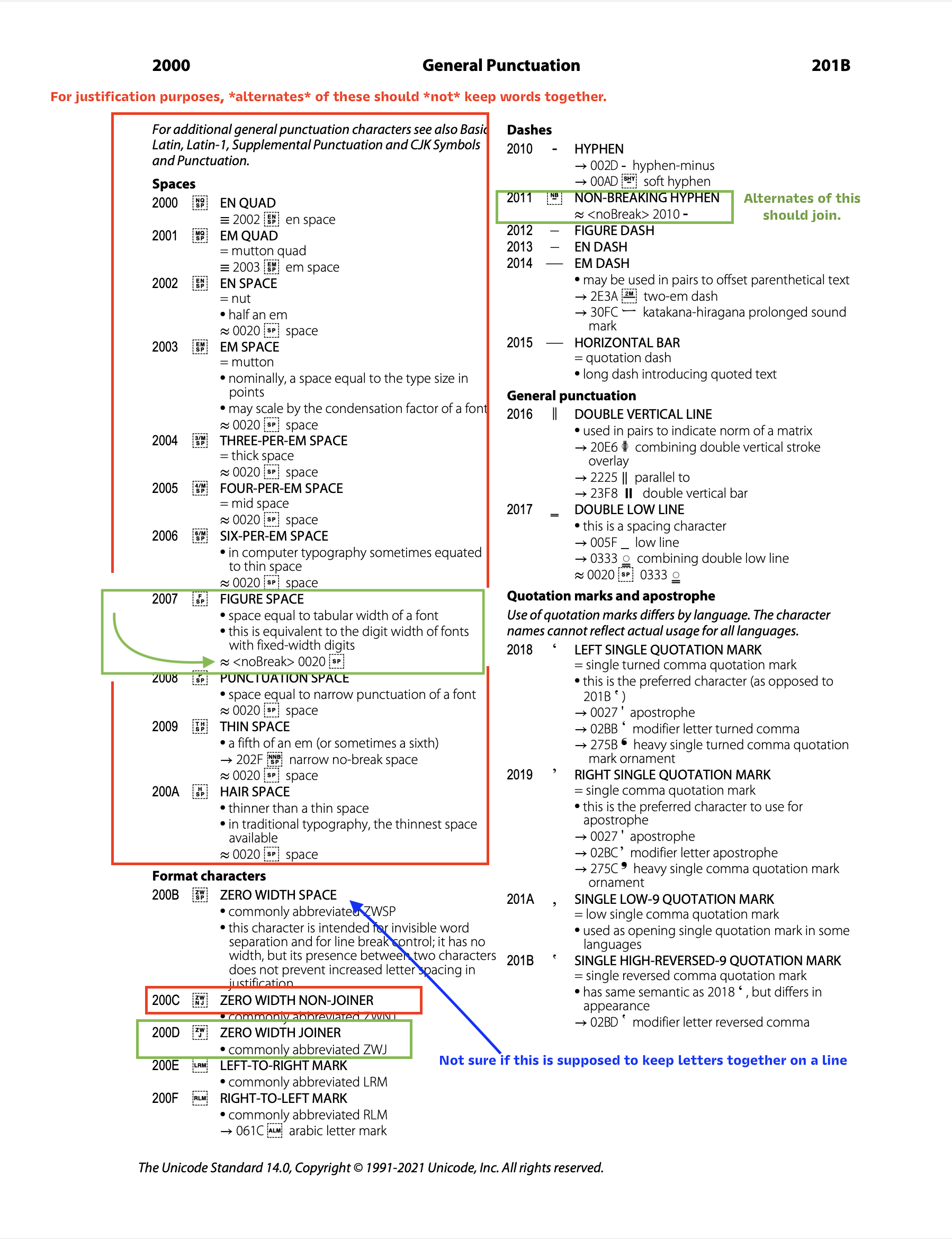
Hi @stokerg, Thanks for logging! And just to show the scope of this error, besides the regular "space", there is also many other "breaking" or "non-joining" spaces. (Meaning that they should not keep words together.) Find them here at the beginning of the unicode page for general punctuation. In red, I have labeled here the spaces whose alternates should break—these spaces don't keep words together. In green I labeled the alternates that probably should join glyphs together. These should not become separated by justification. These are also called non-breaking. In blue, not sure. Also I don't know what the LRM and RLM marks are used for. Does anyone know the use of those glyphs? Also, it seems that the figure space should not break, since it would keep the numbers together, when a language uses a space as a number delimiter. And just as a reminder, we are talking about ALTERNATES of these spaces. Such as space.alt, enquad.alt etc. But also any other suffix or multiple suffixes such as space.case, space.sc, figurespace.onum, space.smcp.ss03 etc. Besides these, please also consider the alternates for these spaces: U+20A0, no-break space (Joining) U+202F, the narrow no-break space (Joining) U+205F Medium Mathematical Space (non-joining?) U+2061–U+2064 (not sure about these) ------------------------------------------------------------------- Also....If the developers want....I can make a font that has all these spaces, plus alternates. And I can make a Publisher test file.

-
Hi @A_B_C, Thanks for the reply. Hmmm... Interesting There's not interpolation of GPOS features other than kerning, at least in the font software that I know. Parenthetically, in 2018, I had talked about Adam Twardoch about interpolation of GPOS, especially interpolation of contextual positioning. He said that there is no native solution in font specs, and so it would require FontLab to do the interpolation through a proprietary means. It seemed like I was the only one who had asked about this, so probably not much demand. So yeah since, in this example, spaces need to be different for different masters, GPOS won't work here. (Although it would seem to make the most sense.) Have you gathered your results about GSUB and GPOS-based spaces for different scripts and softwares? Here is a sheet I made at the end of 2022 for app support of features. (and I have a more complete spreadsheet). This PDF is after ilovetypography's old feature support table.Features Support In Publishing Apps.pdf
-
UnbreakableAlex reacted to a post in a topic:
Harfbuzz and How It Can Improve Fonts in Affinity
-
A_B_C reacted to a post in a topic:
Harfbuzz and How It Can Improve Fonts in Affinity
-
 Bryan Rieger reacted to a post in a topic:
Harfbuzz and How It Can Improve Fonts in Affinity
Bryan Rieger reacted to a post in a topic:
Harfbuzz and How It Can Improve Fonts in Affinity
-
 My intent with my threads is to make Affinity apps have the best darn support for all fonts! I have had the privilege to make videos and written tutorials on the offical FontLab Channel and website, teaching thousands of font designers. I want to teach font designers to use Affinity Apps and make great fonts for your apps! ----------------------------------- As I'm making fonts and trying them in Affinity, I'm finding a certain problem. Alternate characters don't work correctly. Currently, I am reporting this on a case by case basis. Case by case is not optimal. First, I'm probably missing many problems. Second, scattered problem reporting doesn't fix the underlying problem. -------------------------------- There are essentially two main processes that make fonts work. Font Renderer The renderer takes the vector outlines and turns them into pixels. Rendering can be visualized thus: Different operating systems and programs have different renderers. Microsoft uses ClearType (the example above). Apple uses Quartz. Adobe apps and Acrobat Reader use a proprietary rendering. I'm not sure what renderer Affinity uses. (Or if it uses the default Microsoft or Apple system renderers.) The renderer of Affinity seems to work fine. 👍 However Affinity has problems with the next process. Font Interpreting (Text Shaping) This does something entirely different. The confusingly named interpreter (or text shaper) reads the feature code. For example, it reads this code from the font designer: and changes it to this panel in Affinity: Text shaping is the process of converting Unicode text to glyph indices and positions. The specification which it reads can be found here https://learn.microsoft.com/en-us/typography/opentype/spec/ The feature file specification is found here: http://adobe-type-tools.github.io/afdko/OpenTypeFeatureFileSpecification.html Interpreter Problems in Affinity In Affinity GPOS LookType 8 doesn't work correctly. Also, GSUB LookupType 6 doesn't work correctly. If you look at this page there are many more types of "Lookups". I have not tested all of these. The basic ones seem to work. The more complex ones might not. ---------------------------- What Interpreter Does Affinity Use? Not sure what interpreter Affinity uses. However, as shown above, it doesn't seem to be working correctly. If it is a custom solution, it seems like it would be difficult to update. What Would Be a Good Interpreter? A good interpreter would be: Widely used Updated on a regular basis Open source Easy to implement Widely Used If you think about programming languages, when something is widely used AND widely used by large companies, it seems to stay around. Harfbuzz seems to be widely used. It is used by these UI libraries (source😞 GNOME (GTK+ KDE (Qt) ChomeOS PlayStation 4 Android Java Flutter It is used directly in these apps: Chromium Firefox LibreOffice Scribus Inkscape Adobe Photoshop Adobe inDesign (requires script to enable) Why Frequent Update? Opentype is continually being developed, with frequent new versions. Unicode is updated every year. If the feature interpreter doesn't get updated frequently, the app won't be able correctly use the newest fonts. Harfbuzz seems to be updated frequently. There is an active community here: https://github.com/harfbuzz Open Source? Not sure. The license is found here https://github.com/harfbuzz/harfbuzz/blob/main/COPYING It seems to have originally been open source. It seems like there is attribution involved and some individual files have copyright notices. Easy to Implement? I don't know if Harfbuzz is easy to implement. I don't know much on the technical side of fonts. I'm not connected in the font world as well as I want. However, I communicate on a regular basis with FontLab's Adam Twardoch. He originated Variable Fonts. He has been working on font technology since the early 90s. I also know Laurence Penny, a founding member of MyFonts.com. He is also the proprietor of some websites for font developers, including this one for variable fonts. Between those people, I know that they could find someone to help you implement a solution like this. Or maybe any questions can be asked directly to the font people on Harfbuzz's GitHub. Also, there might be other solutions out there. Thank you for reading! Dave Lawrence, California Type Foundry
-
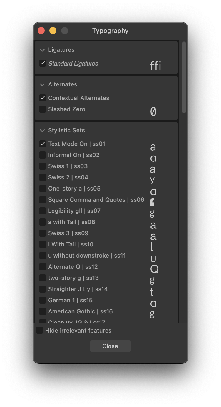
Hi everyone, enjoying working in Affinity Publisher. Getting some great results for our Font Specimen documents! -------------------------------------- The problem: When there is an alternate space character, affinity does not recognize it. The sample font has this code: Affinity does not recognize "space.alt" as a "space" when this ss05 is turned on. An entire paragraph flow together like it is one word: Steps: 1. Install the attached font. AffinitySpaceTest-Regular.otf 2. Open the attached document.Affinity Space Test Document.afpub 3. In the typography panel, make sure that "Stylistic Set 05" is on. 4. Justification doesn't work.
-
Font Error: OpenType Contextual Chaining Substitution
DaveLawrence replied to DaveLawrence's topic in V2 Bugs found on macOS
Thanks, Walt! -
Font Error: OpenType Contextual Chaining Substitution
DaveLawrence replied to DaveLawrence's topic in V2 Bugs found on macOS
With messages, communicated further with @Callum but it seems you were unable to reply? Callum, did you understand the error, and the information about OpenType interpreters (text shaping) and Harfbuzz? -
DaveLawrence reacted to a post in a topic:
Problems with Fonts
-
Font Error: OpenType Contextual Chaining Substitution
DaveLawrence replied to DaveLawrence's topic in V2 Bugs found on macOS
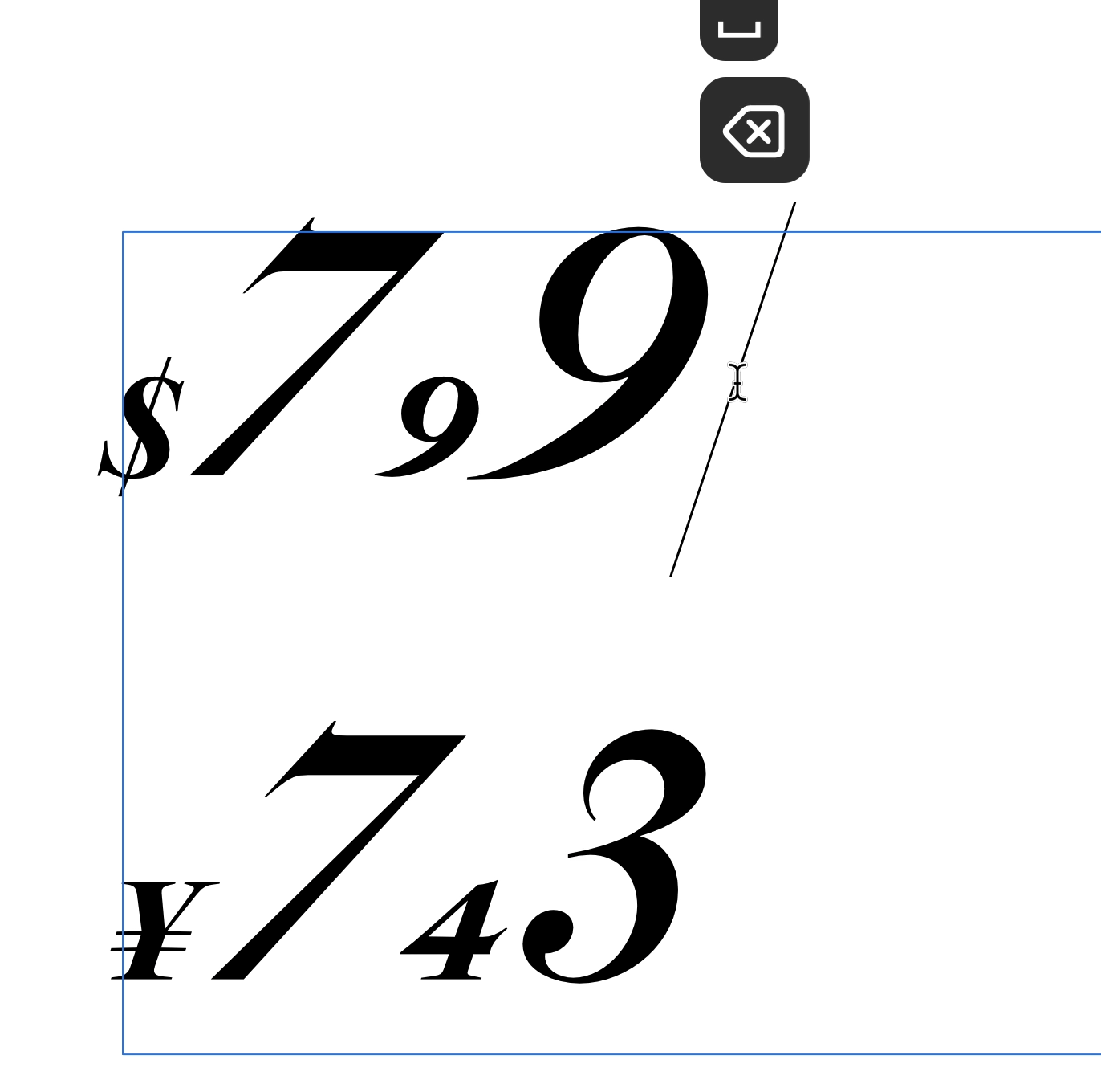
Definitely a contextual substitution problem. Here's about the simplest file possible. Here's a couple ten glyph fonts for testing this, and the corresponding Affinity File. The first $7.49 has the substitution code plus an ignore command. The second $7.49 has only the substitution code. Contextual Font Test.afdesign Contextual Substitution Test.otf ContextualSubstitutionTest-Rg No Ignore.otf -
DaveLawrence reacted to a post in a topic:
Font Error: OpenType Contextual Chaining Substitution
-
TheOtherRoland reacted to a post in a topic:
Problems with Fonts
-
Font Error: OpenType Contextual Chaining Substitution
DaveLawrence replied to DaveLawrence's topic in V2 Bugs found on macOS
And if it gives any insight, the context substitution does work if a space comes after. And it's possible that there's some error on my end, but I'm doing further testing and might make a simple file to test context subs.
-
Font Error: OpenType Contextual Chaining Substitution
DaveLawrence replied to DaveLawrence's topic in V2 Bugs found on macOS
Additionally, contextual substitutions need to refer to a "lookup" (simple set of instructions) in the Prefix (the portion after class definition, but before the features). (This is common practice.) So it's possible that there is some interpretation problem here. -
Font Error: OpenType Contextual Chaining Substitution
DaveLawrence replied to DaveLawrence's topic in V2 Bugs found on macOS
So to summarize: Last member of Contextual Substitutions doesn't sub. Positioning doesn't always work when put with Contextual Substitutions. Order of feature processing. (Sometimes positioning seems to come before substitution?) -
Font Error: OpenType Contextual Chaining Substitution
DaveLawrence replied to DaveLawrence's topic in V2 Bugs found on macOS
While contextual positioning/kerning did not work above with contextual substitution, it does work, when there are no substitutions involved:
-
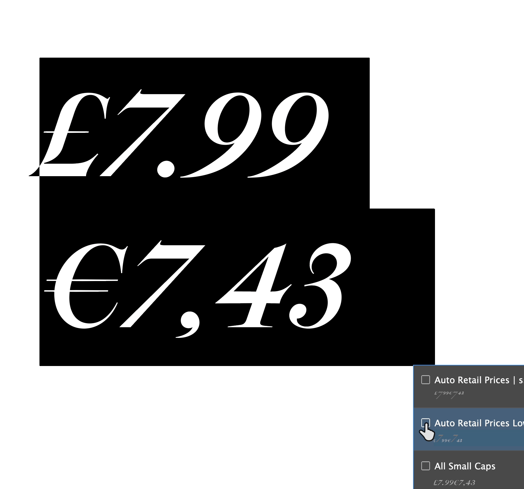
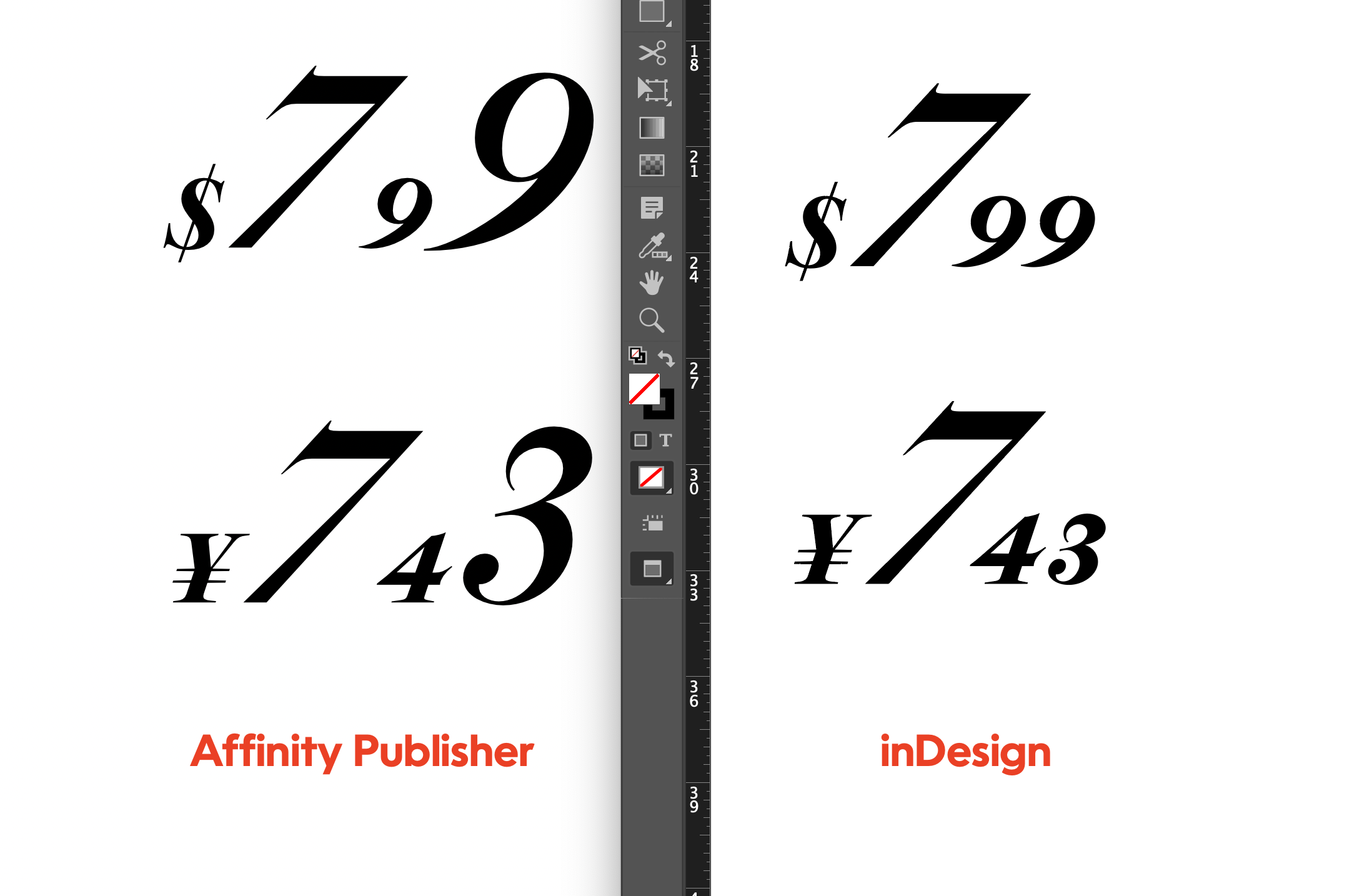
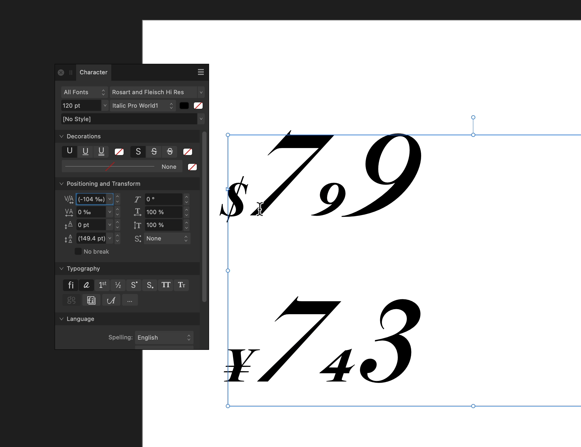
First, thank you for such great apps! I find your programs easy to use. Also, publisher gets incredible results easy and quickly! CONTEXTUAL CHAINING SUBSTITUTIONS Adobe Spec here. First, just a refresher on what contextual chaining substitutions do. They change a group of characters based on what surrounds them. Here is an easy example where the currency and fractional amount of that currency get lowered.▼ 1 Problem: Last Member of Chain In Publisher, the last member of a chaining substitution does not substitute.▼ (Sorry to compare it to inDesign. I love your guys software. I'm comparing this to inDesign rather than something like mac Pages because Publisher and inDesign are in the same software class/category.) 2 Problem: Kerning after Contextual Chaining Substitutions But if you look at the above example again, there is unfortunately another problem. Notice the space between the 7 and the 9. Also the 7 and the 4. In Publisher, these are not getting kerning (this is contextual positioning). ------------------------ What makes this weird—the kerning shows up in the Character Panel. But it does not do anything different from zero. Example▼ Maybe contextual substitution is getting processed after positioning features?
-
I'm not sure if I understand. Make a new thread for each issue?
-
DaveLawrence reacted to a post in a topic:
Story editor - mandatory
-
Oufti reacted to a post in a topic:
Problems with Fonts
-
Hi I'm a font designer for the California Type Foundry, and have done the tutorials for FontLab.com. From the font designer side, there are many good things about Affinity Apps, but also some bad things, including errors in Opentype Feature interpretation. Also, there are some problems from the user side as well. 😕 Should I spend the time to put these problems here?
-
Thanks! Found it in windows, but yeah, I was originally looking in View. And I'm not used to the term "Studio" but "Workspaces". I guess programs like Da Vinci say "Studio"? I'd still recommend the Affinity team for something to move panels back on the screen if the monitors change. Thanks Red Sands!